The Electric Effects Of Colour In Dark Spaces
Like Architecture and Interior Design? Follow us…
Just one more step. Please click the confirmation link sent to you.
![]()
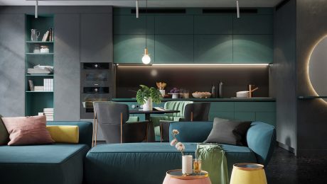
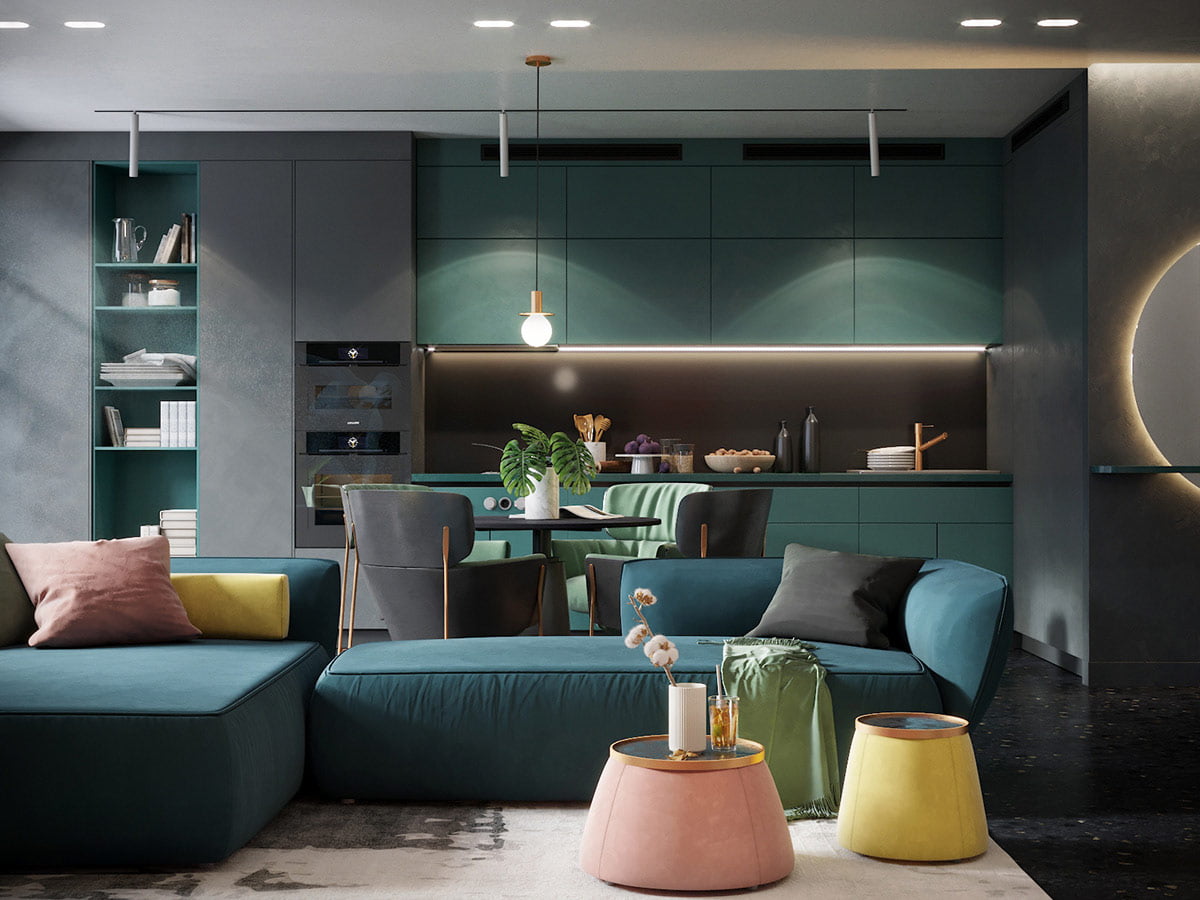
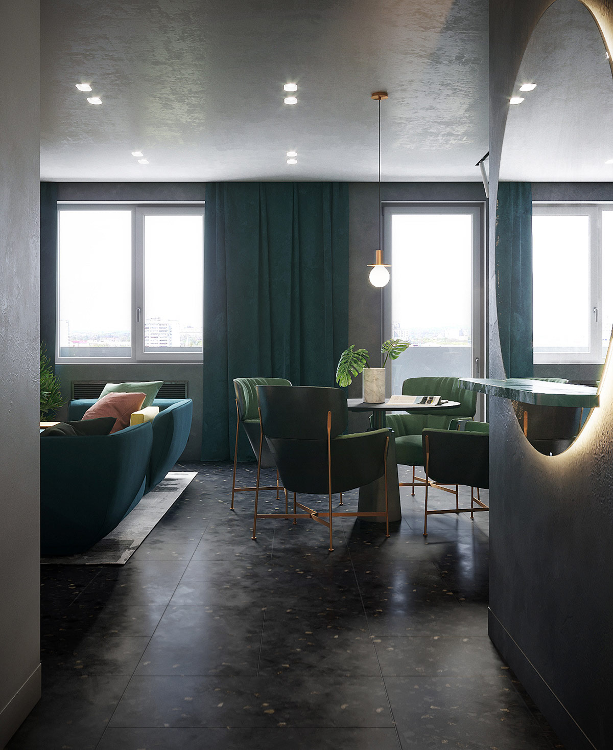
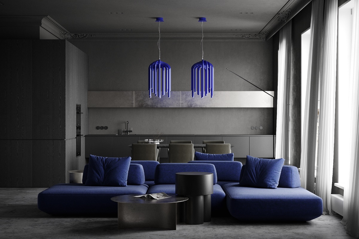
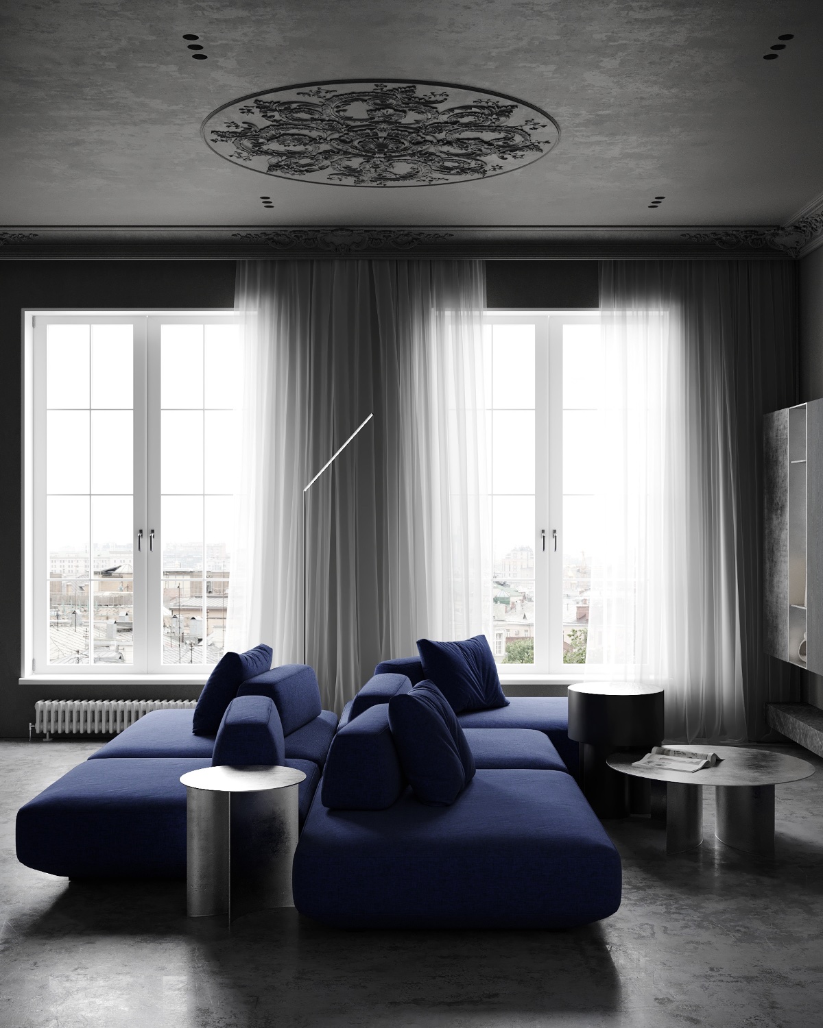
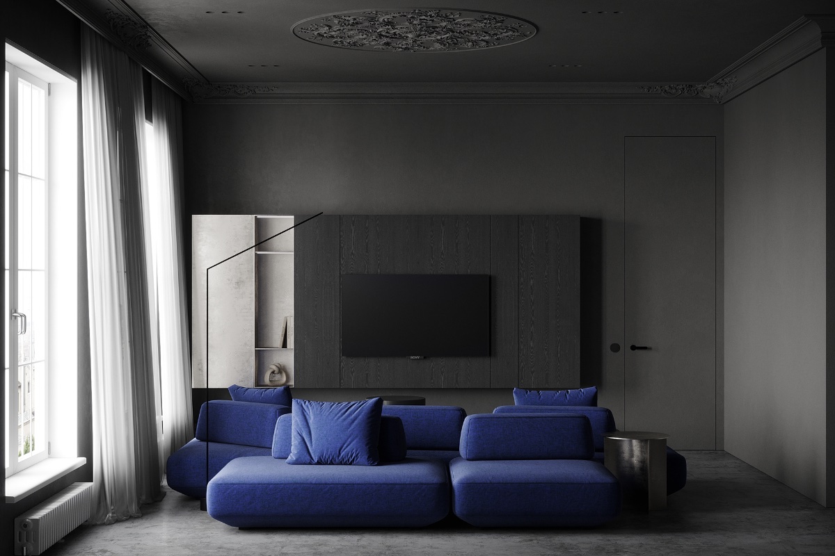
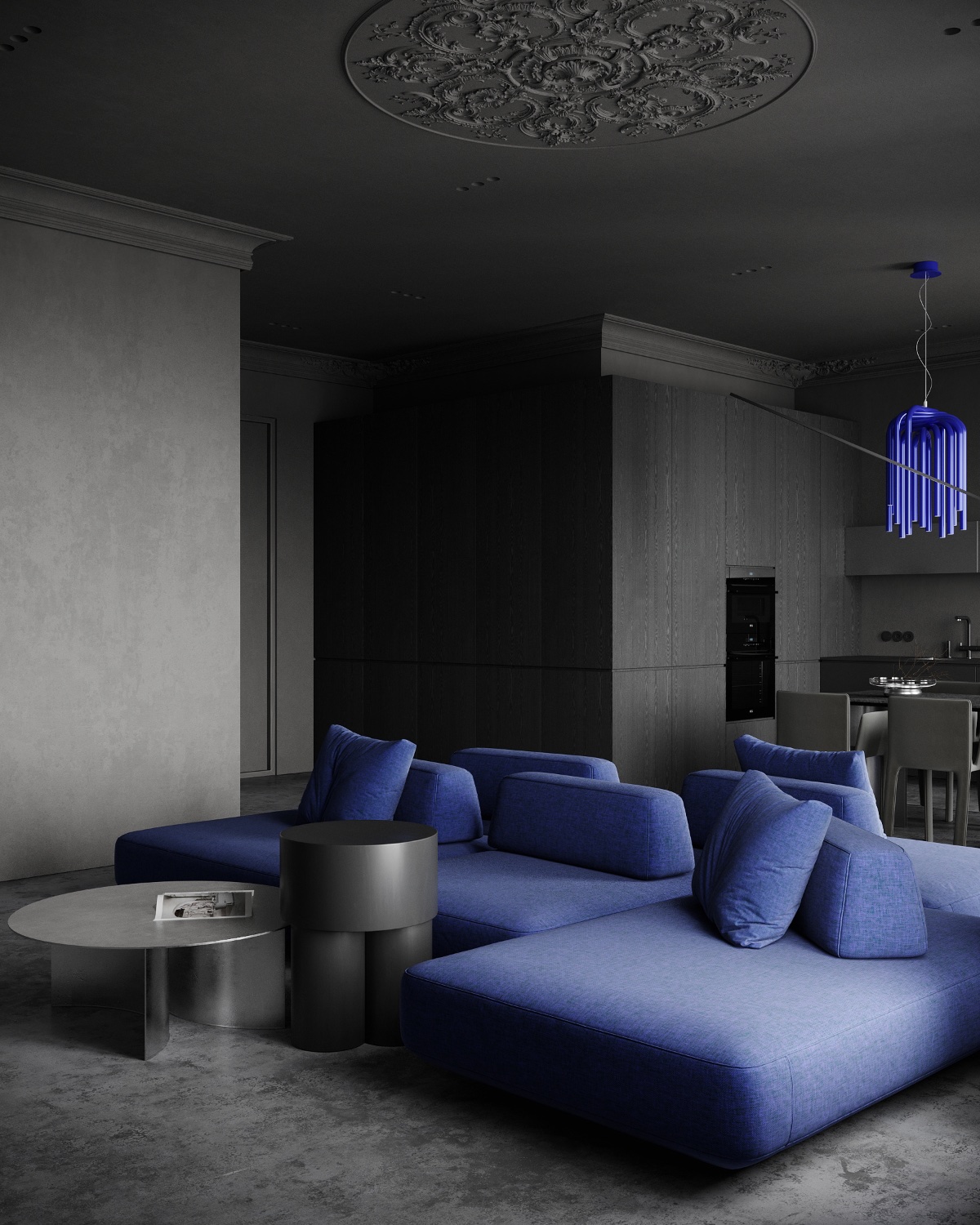
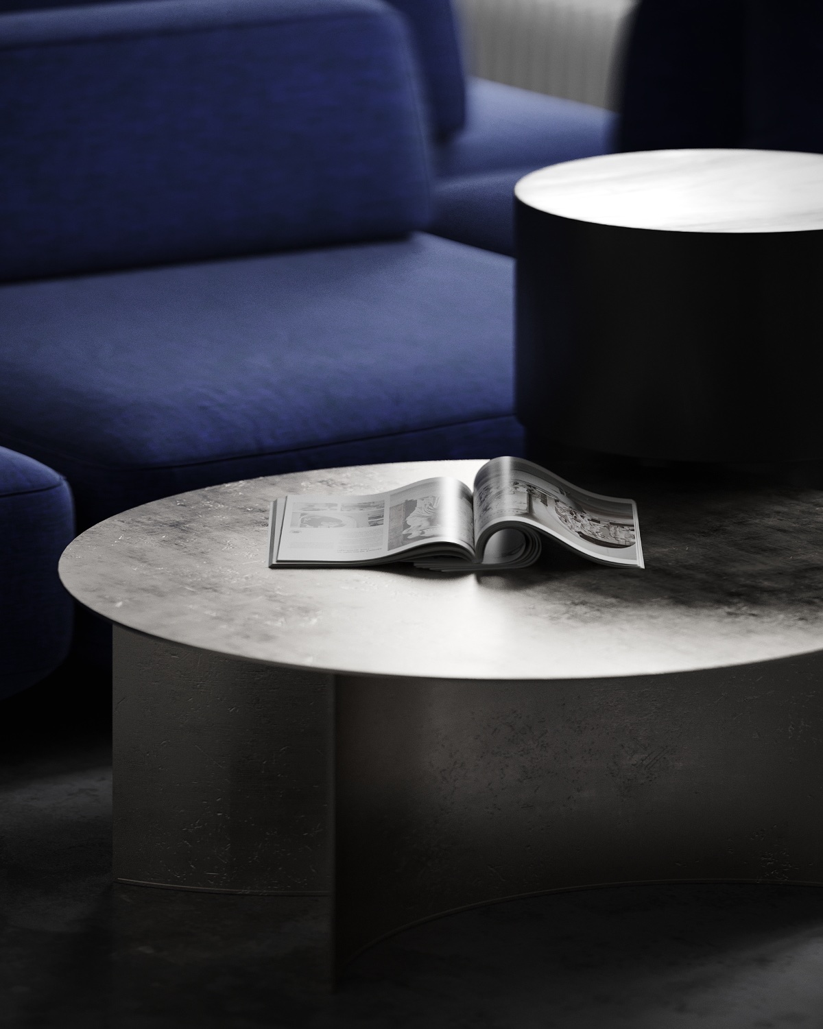
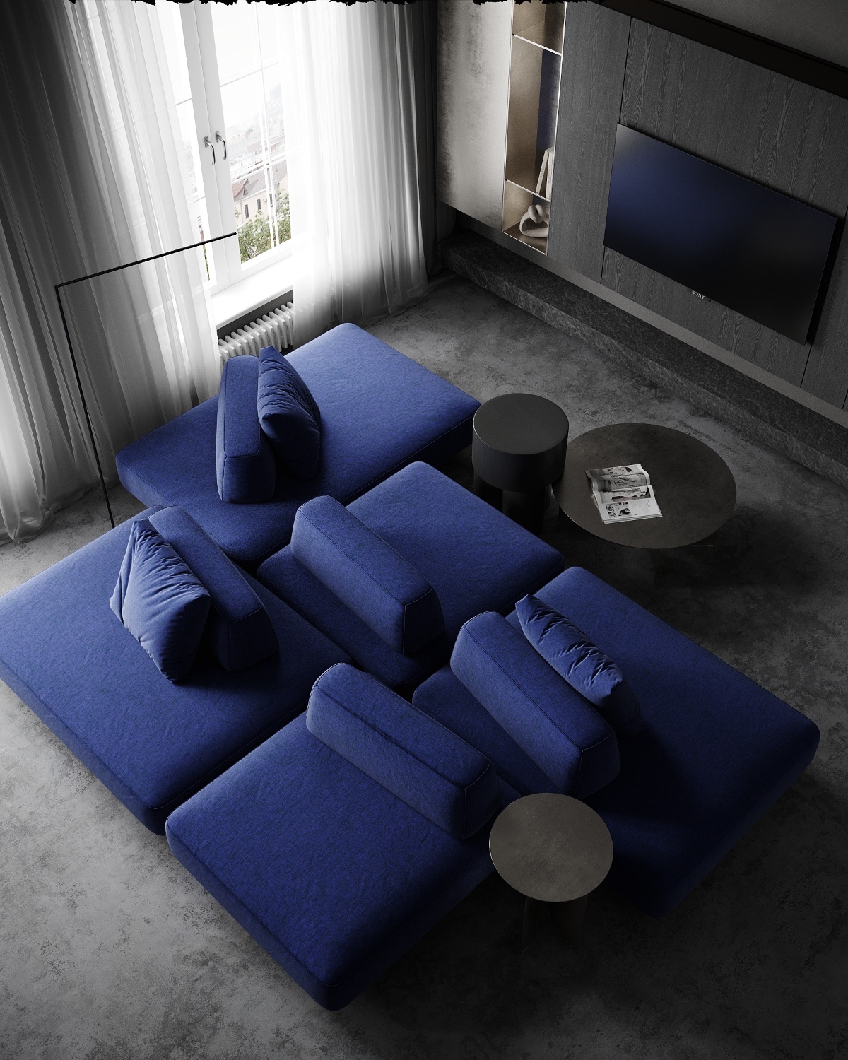
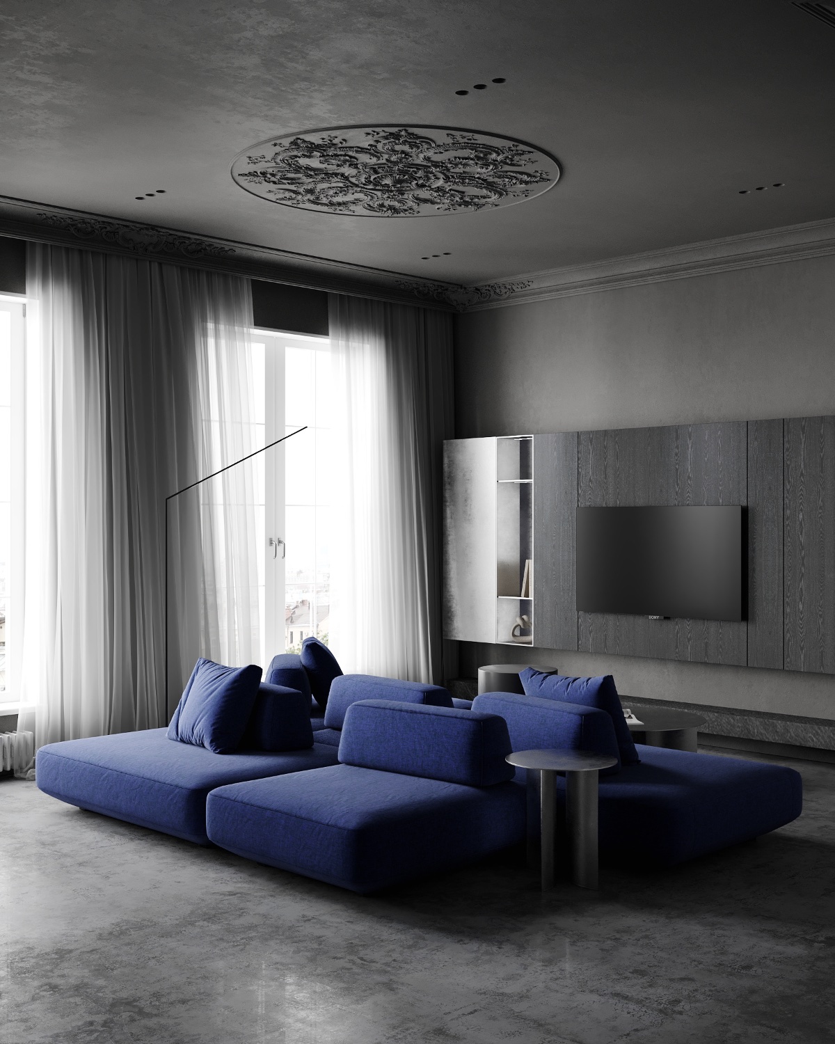
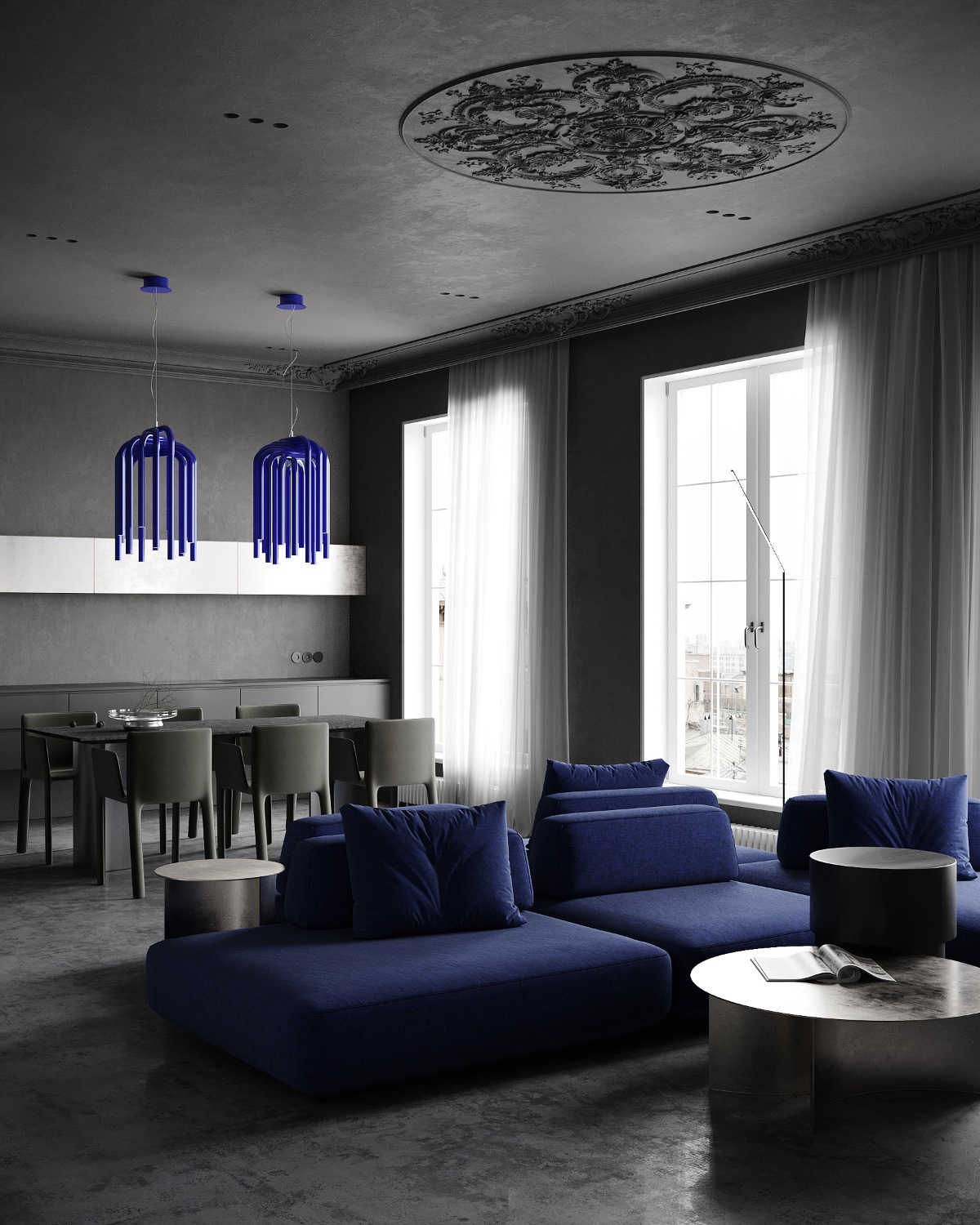
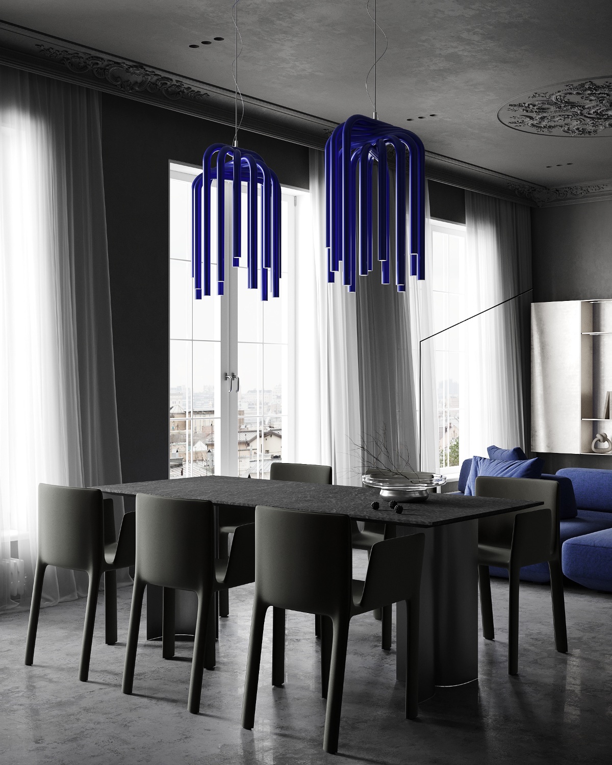
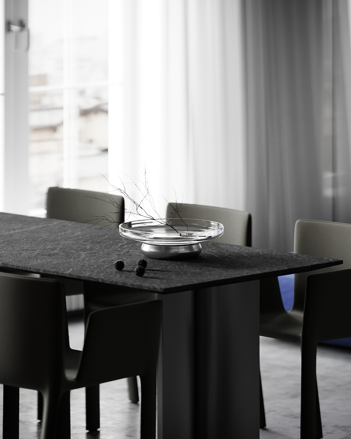
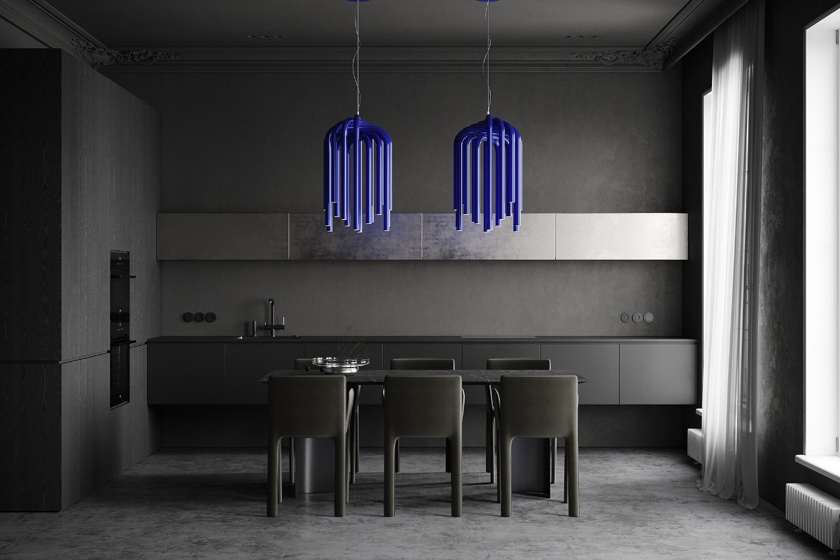
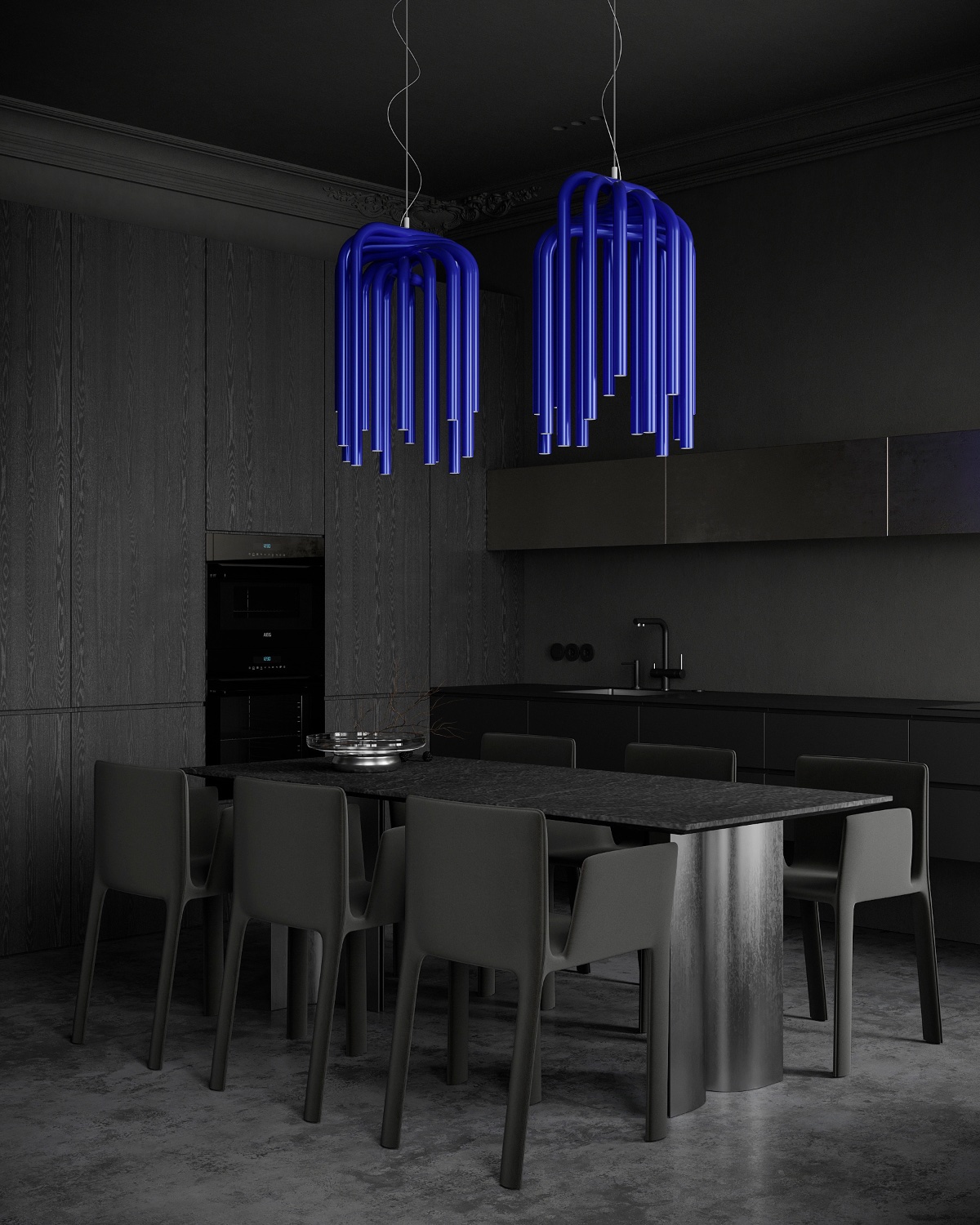
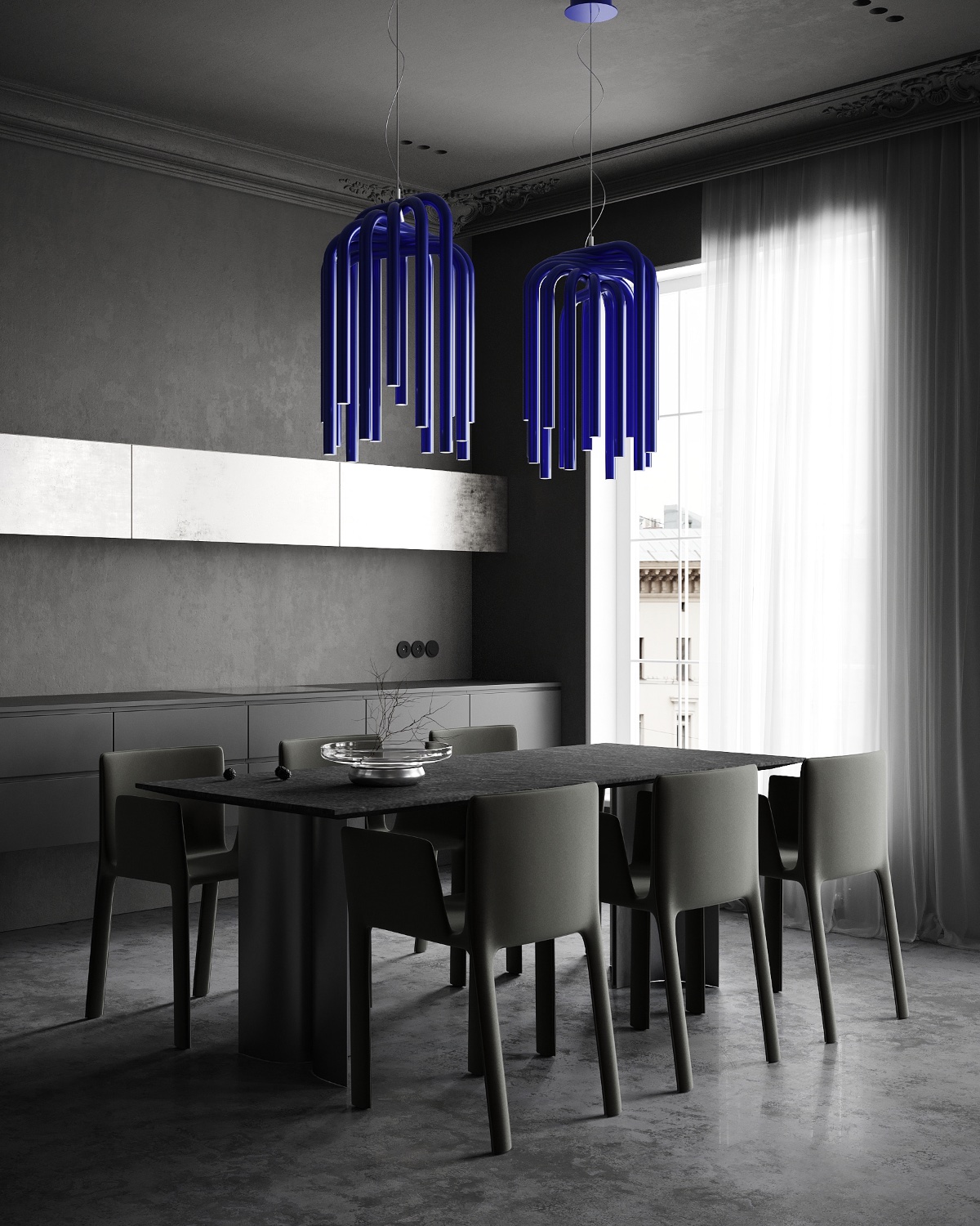
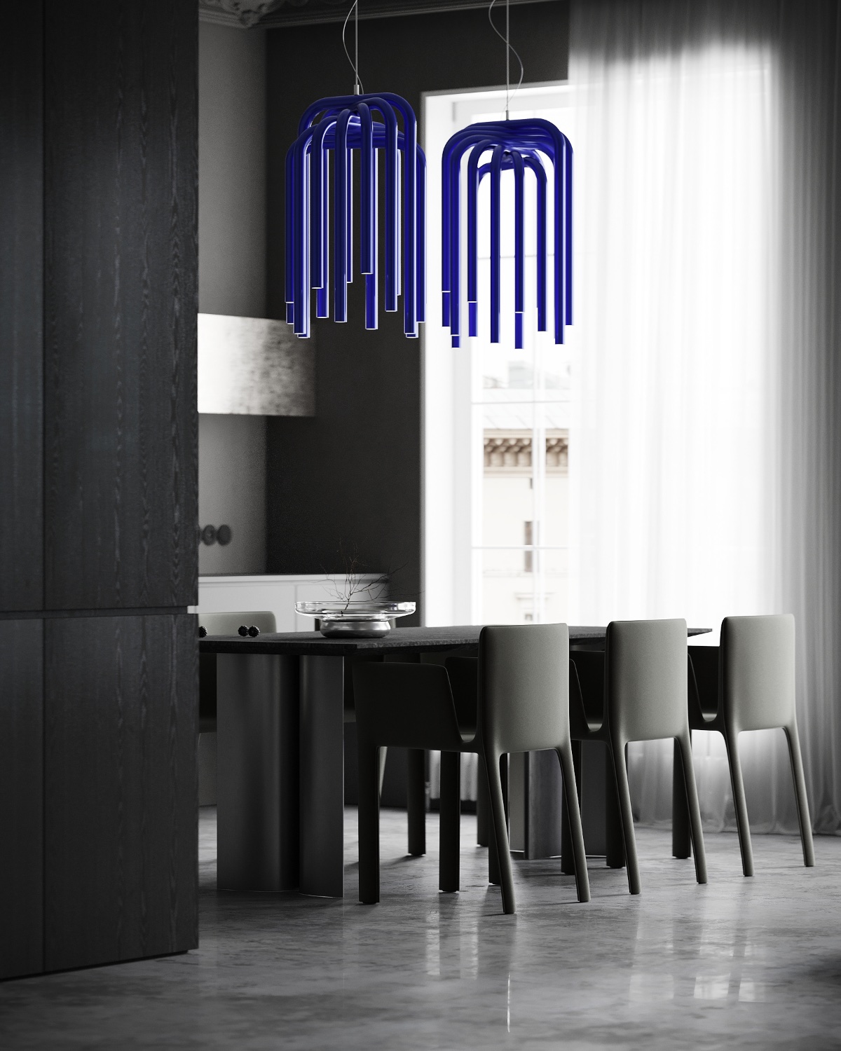
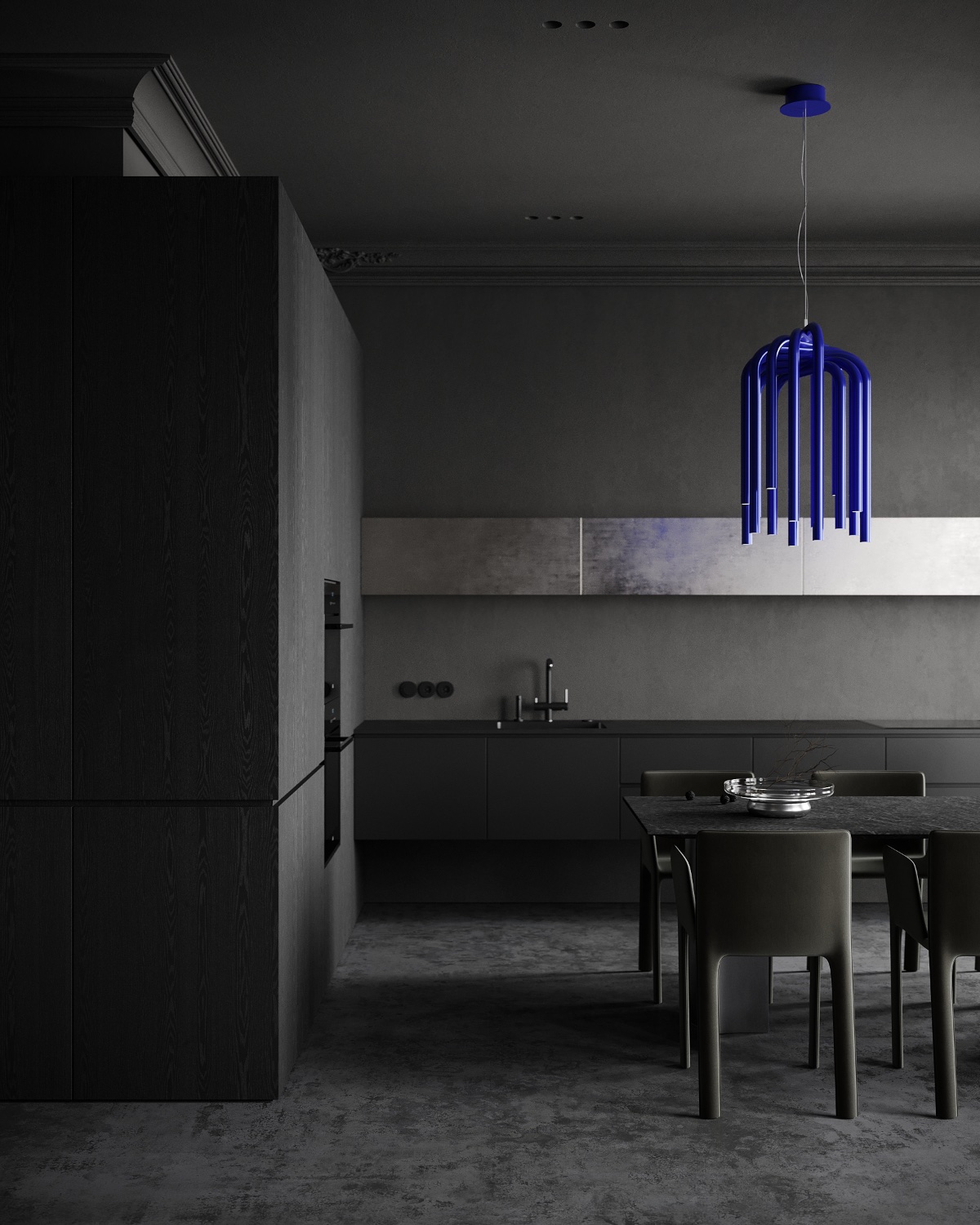
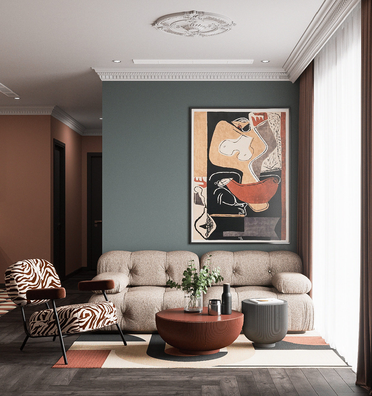
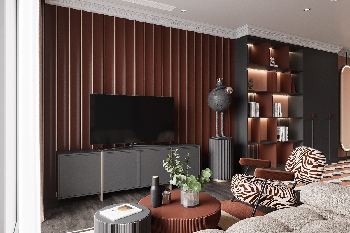
Colour In Dark Spaces set a strong image with a heavy mood. They seem dramatic and serious, cool and confident. So, what happens when you inject a little color… Or a lot? These two modern home designs explore the combination of colorful lights in dark spaces, showing how to strike the right balance. Our first home tour takes place in a charcoal gray home interior that is elevated with a set of punchy furniture to achieve a 50/50 mix. In contrast, home design number two uses only a few electric blue interludes to shake off the shadows of a gray and black background. Each offers a different proportion of color to achieve an exciting aesthetic.
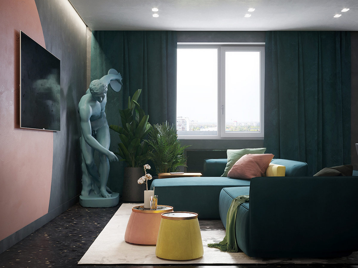
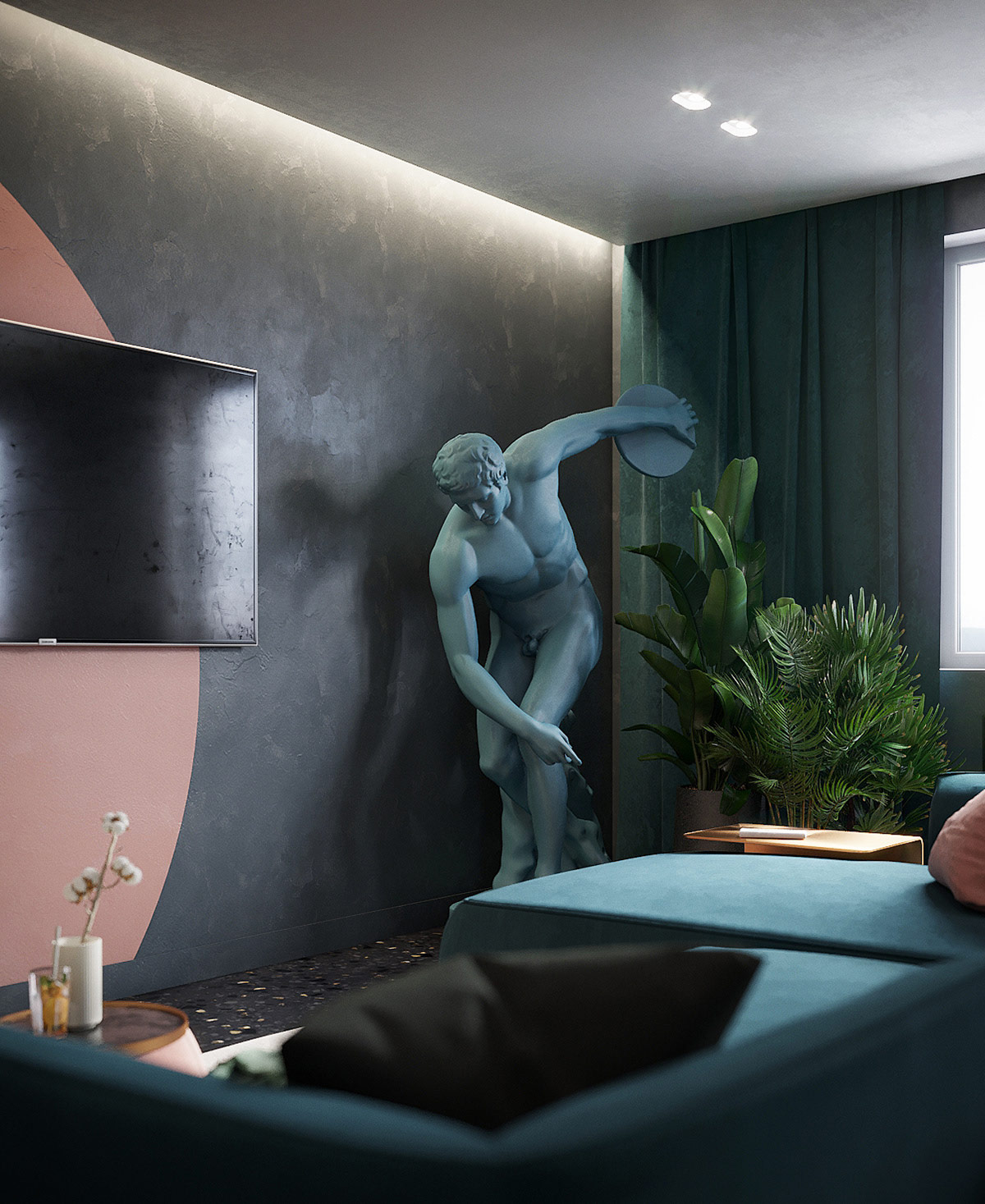
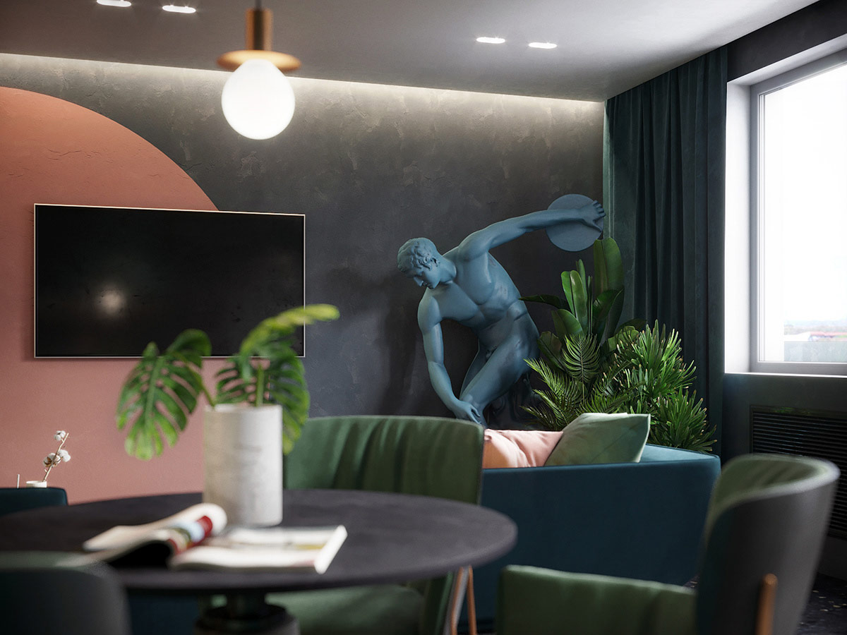
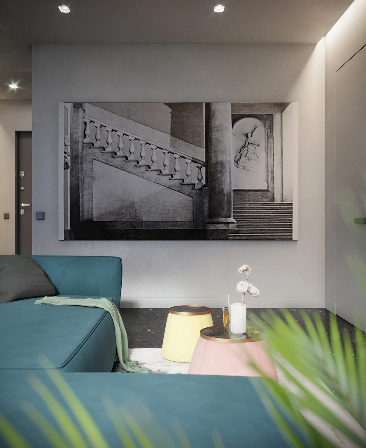
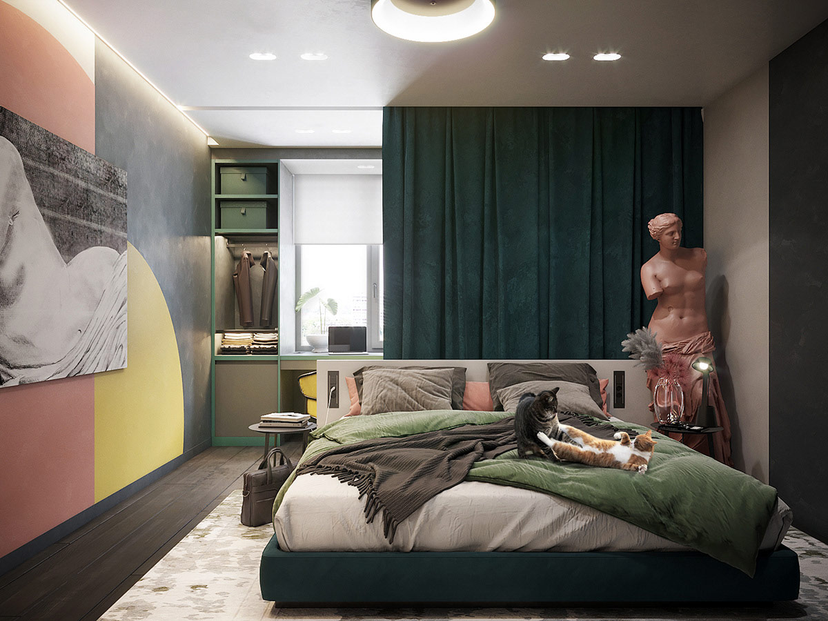
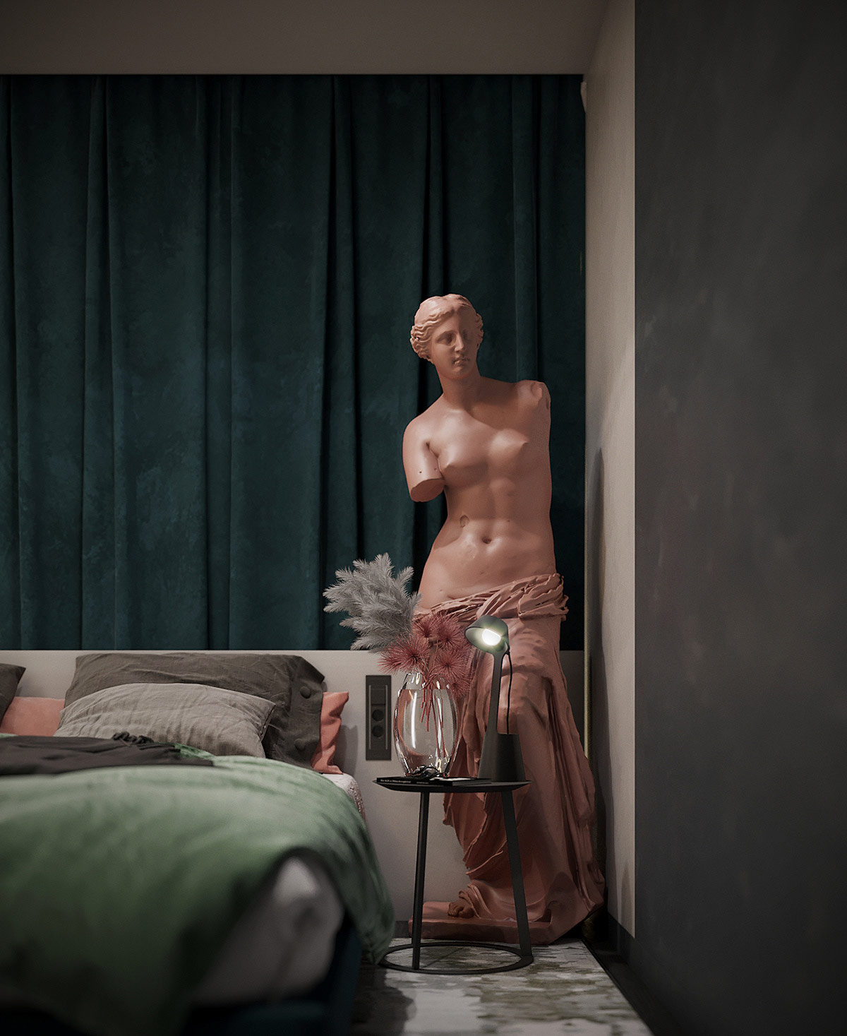
This two-bedroom apartment design was created for a young and enthusiastic homeowner who teaches art history at a university. That is why the interior was formed on a concept of modern style that meets historical elements. In this dark interior concept, a modular sofa and an ottoman coffee table introduce punchy green, salmon and yellow interruptions.
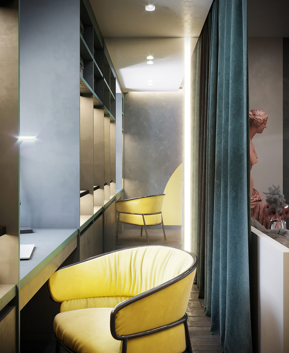
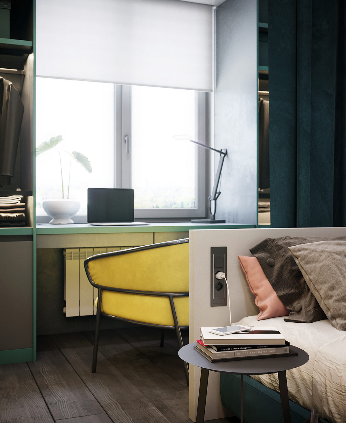
In the home office, a custom green desk is contrasted by a striking yellow desk chair. The workspace runs directly under the window and is flanked on either side by two open-front wardrobes. An LED table lamp provides focused working light to the study area when the sun goes down, and a potted plant provides light decoration.
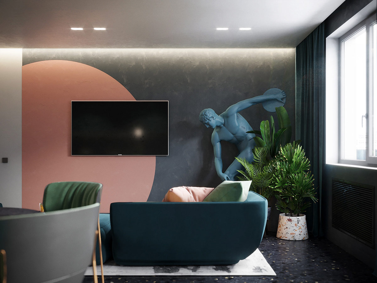
The couch is arranged to face two directions in the living room. One faces the kitchen-diner, while the other watches a TV and wall-mounted media. The wall-hung cabinets are black wood grain to blend darkly with the moody gray background. Contrasting silver shelving catches the sunlight by the window.
Did you like this article?
Share it on any of the following social media channels below to give us your vote. Your comments help us improve.
Watch this space for more information on that. Stay tuned to Feeta Blog for the latest updates about Interior design.
The Electric Effects Of Colour In Dark Spaces
- Published in color, dark, Decoration, interiors
A High-Ceiling Home with Bold Pops of Color
Like Architecture and Interior Design? Follow us …
Thank you. You have been subscribed.
![]()
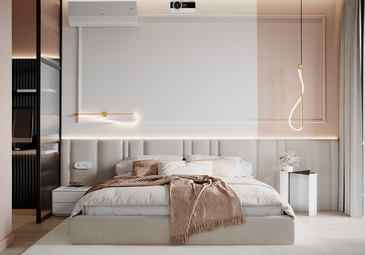
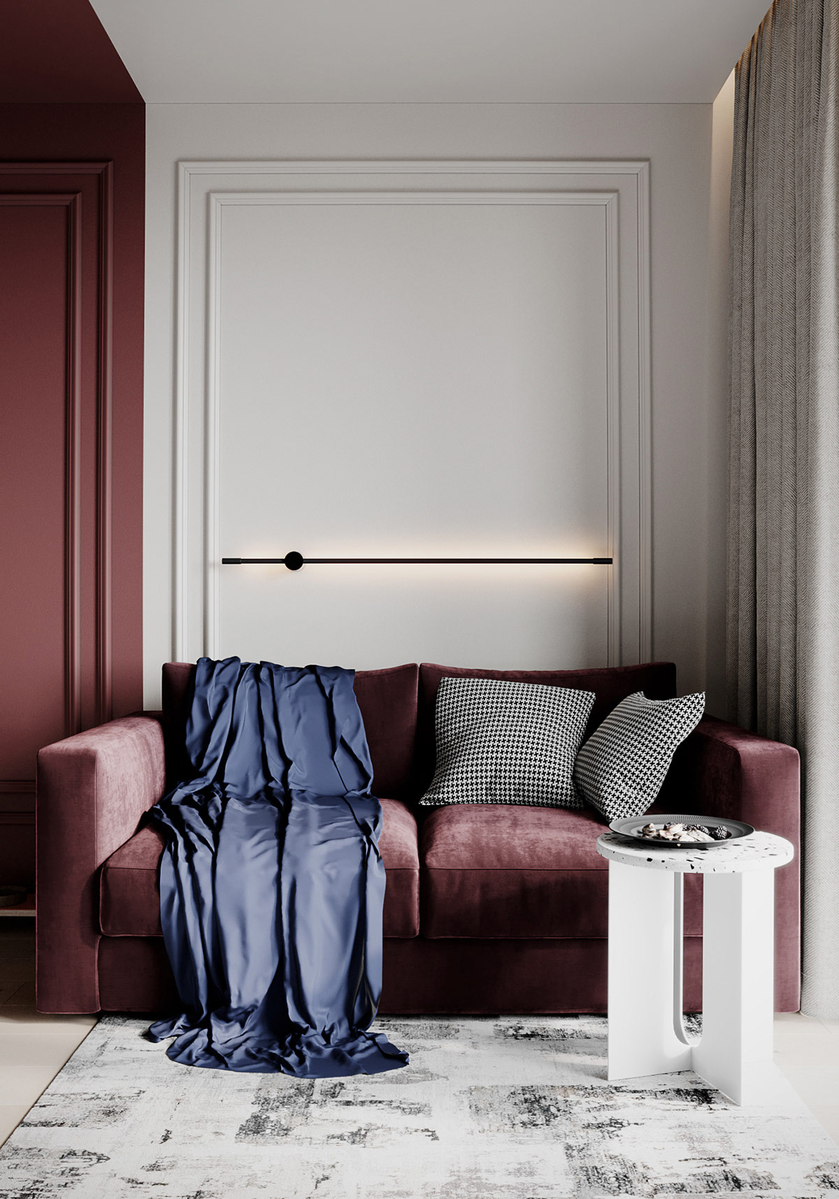
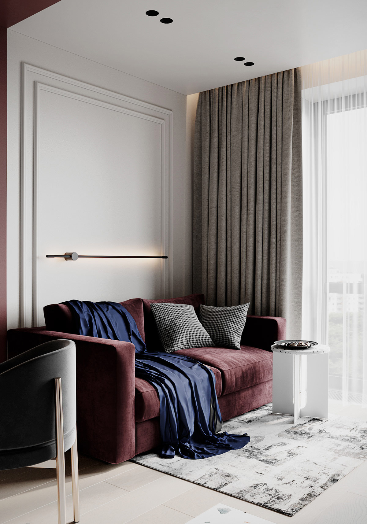
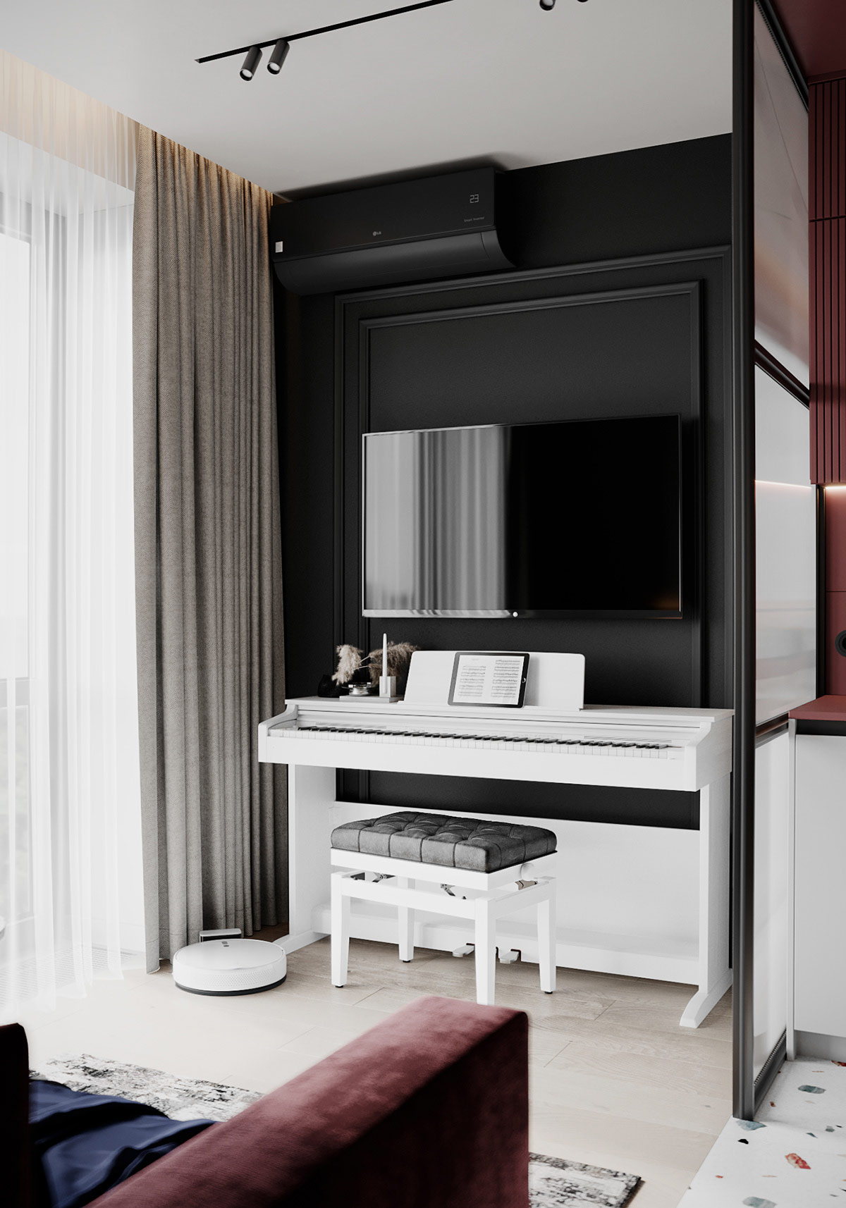
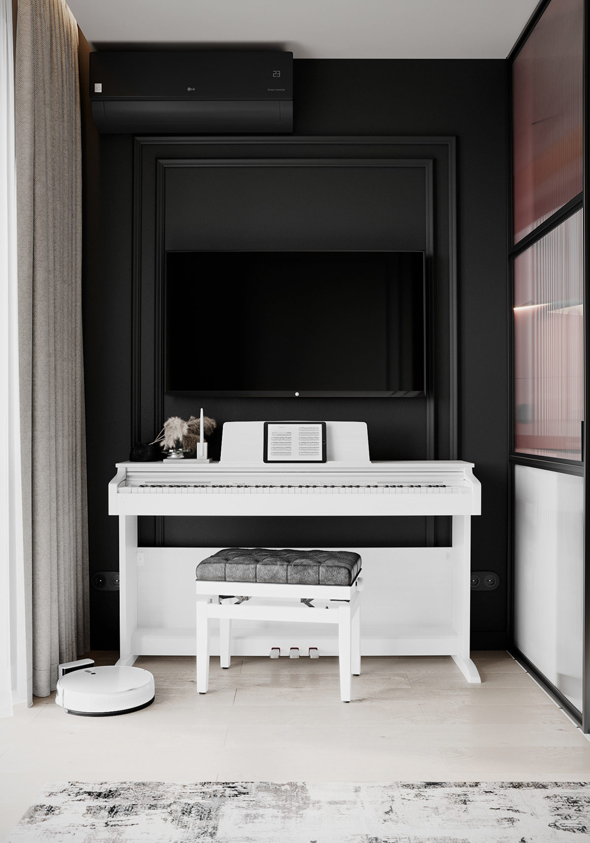
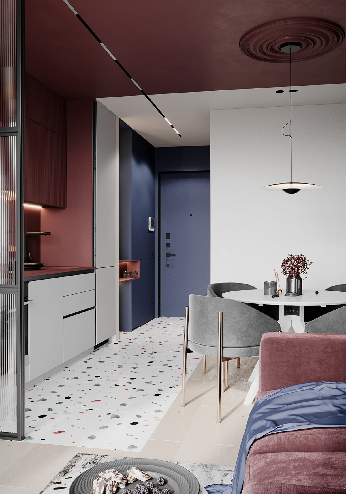
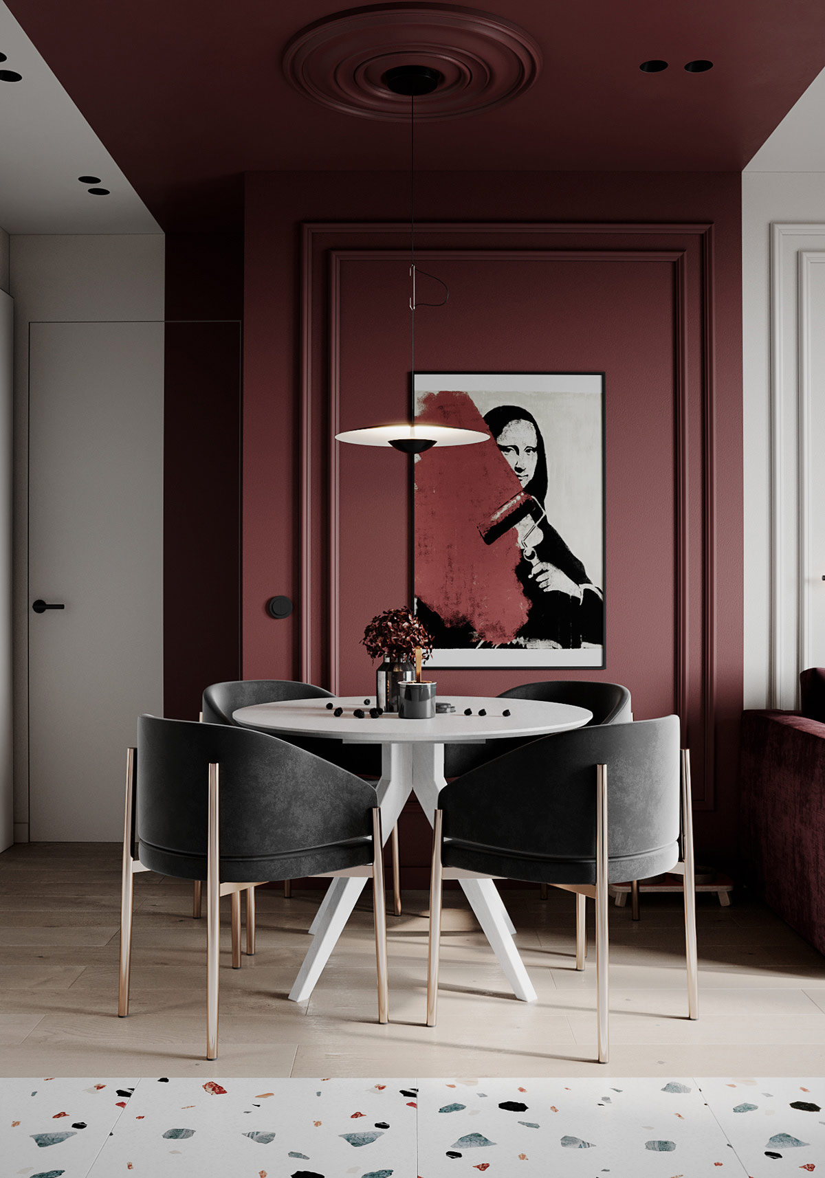
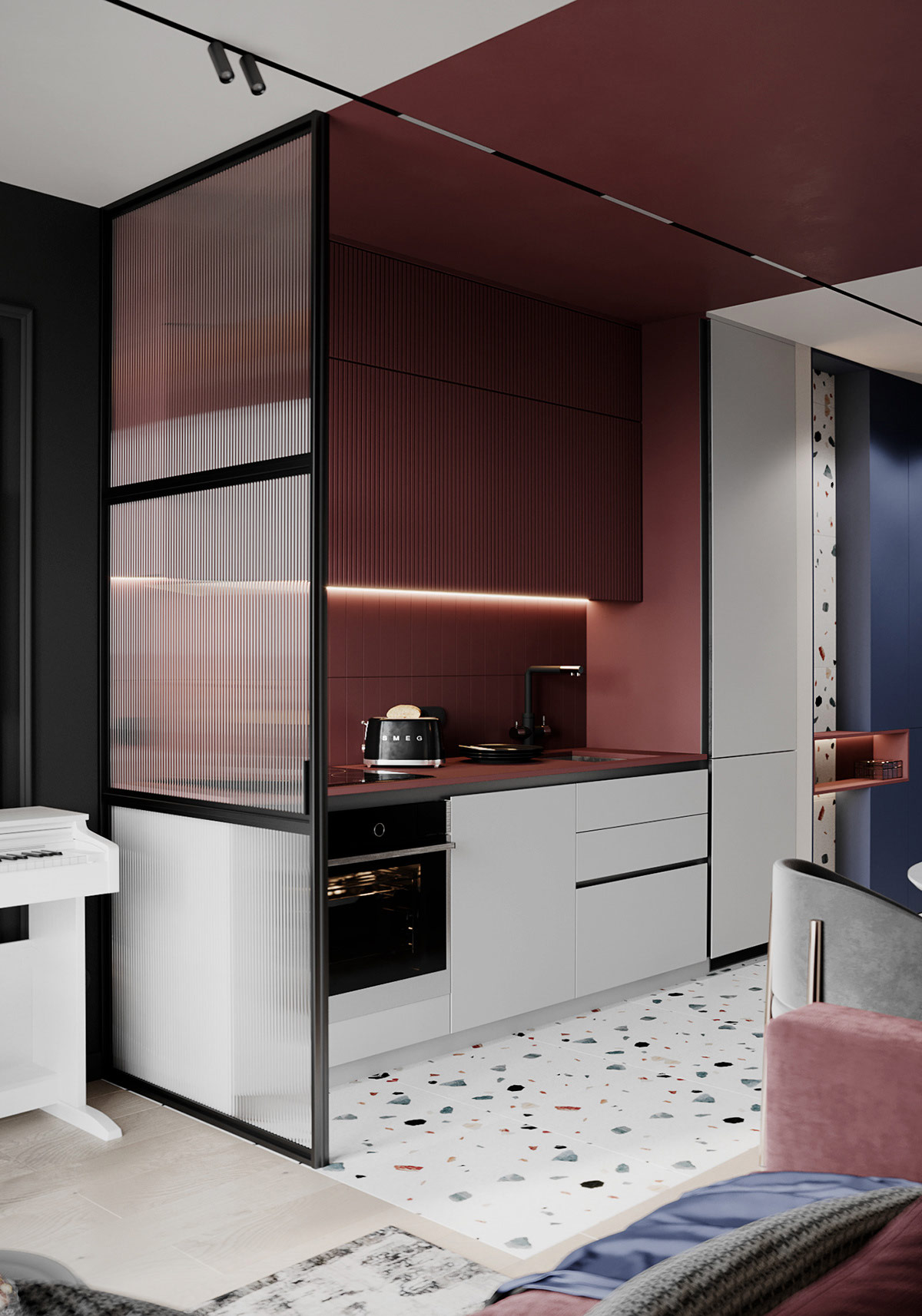
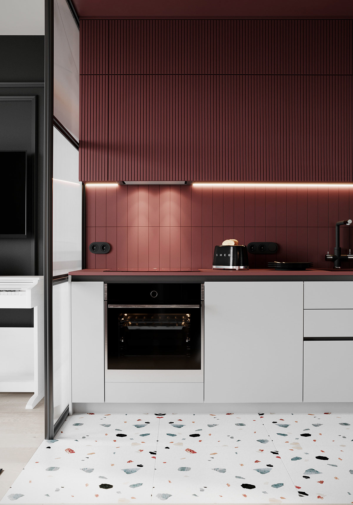
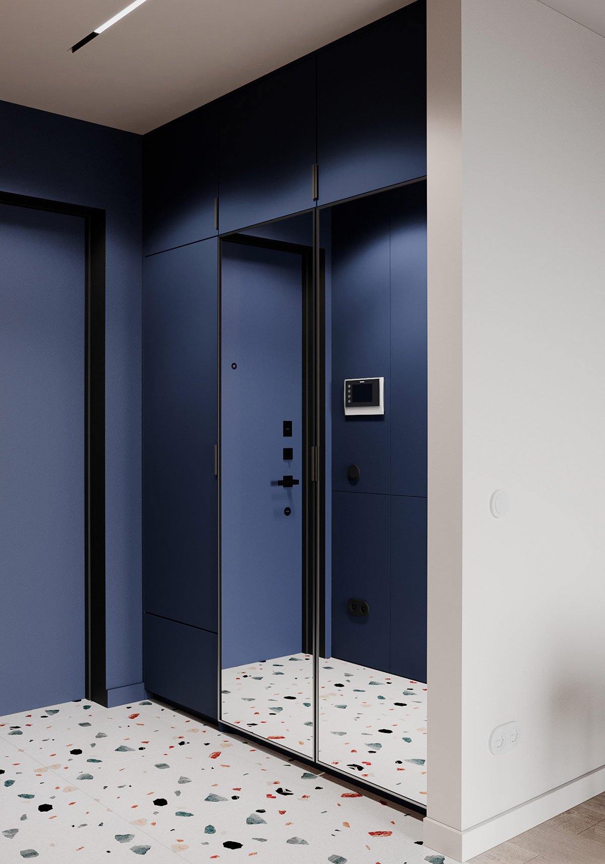
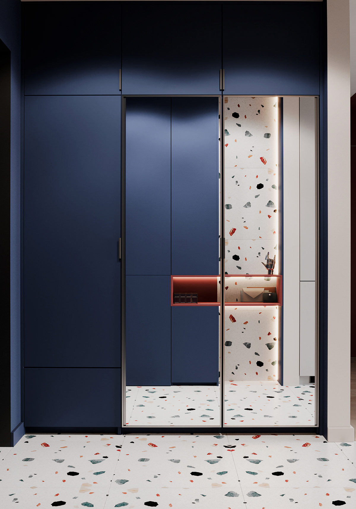
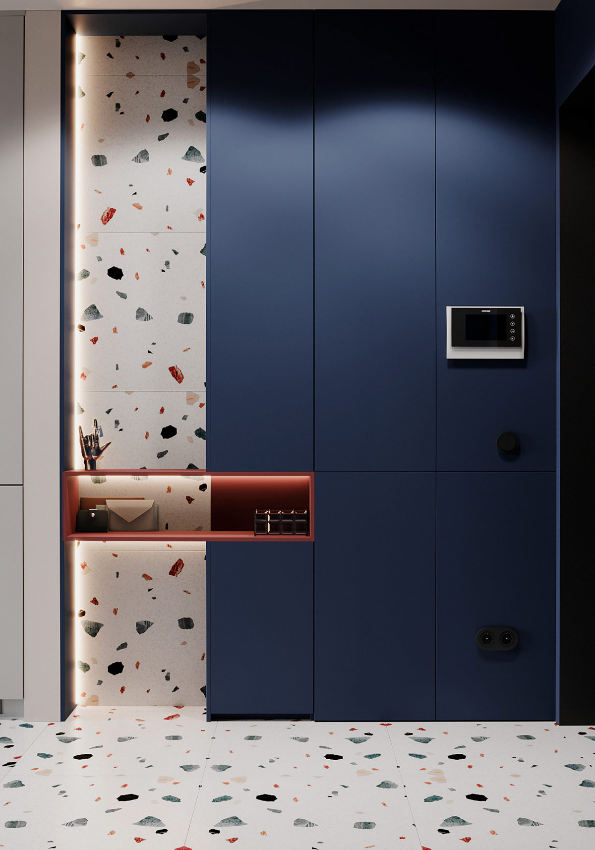
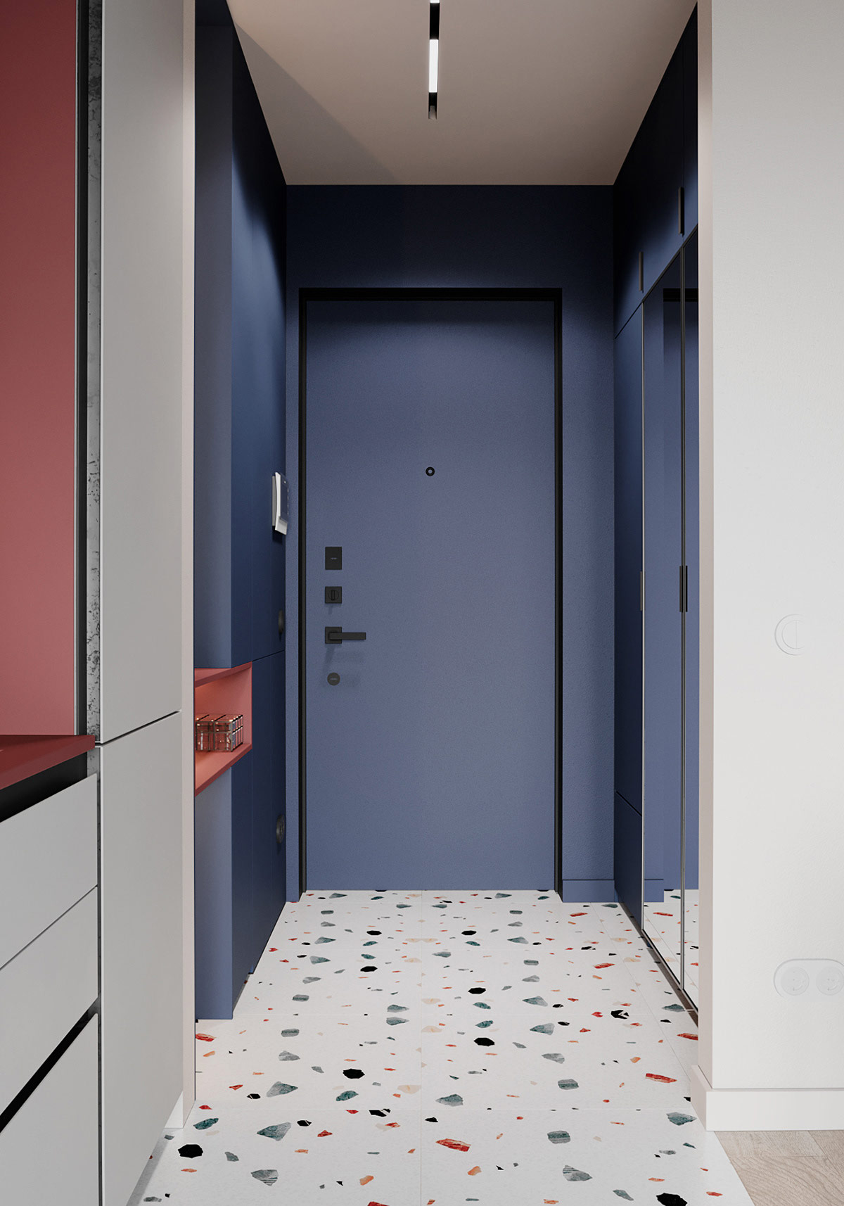
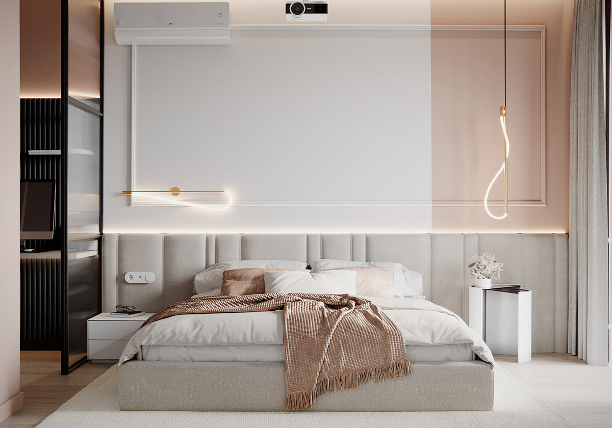
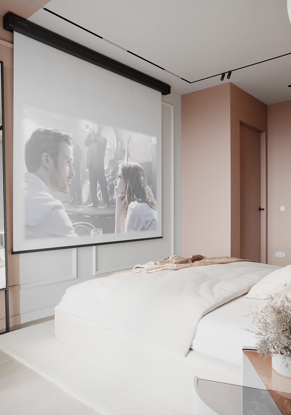
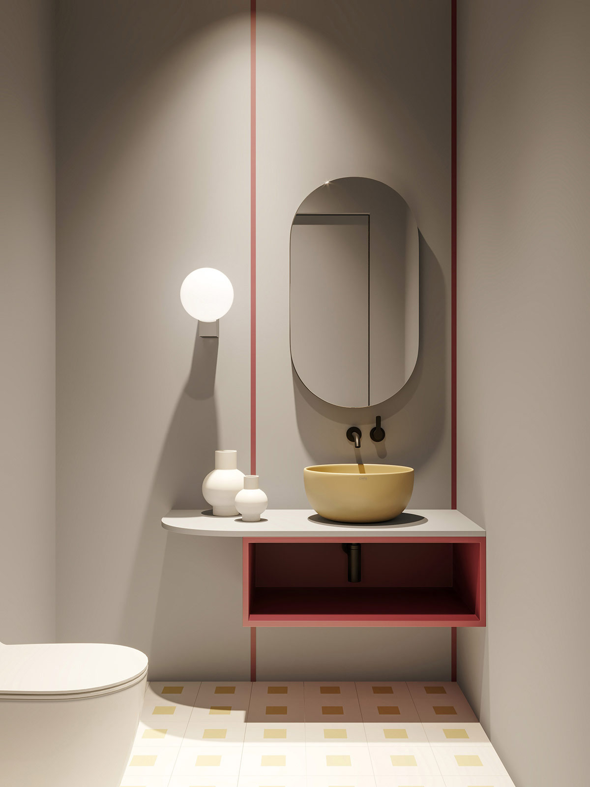
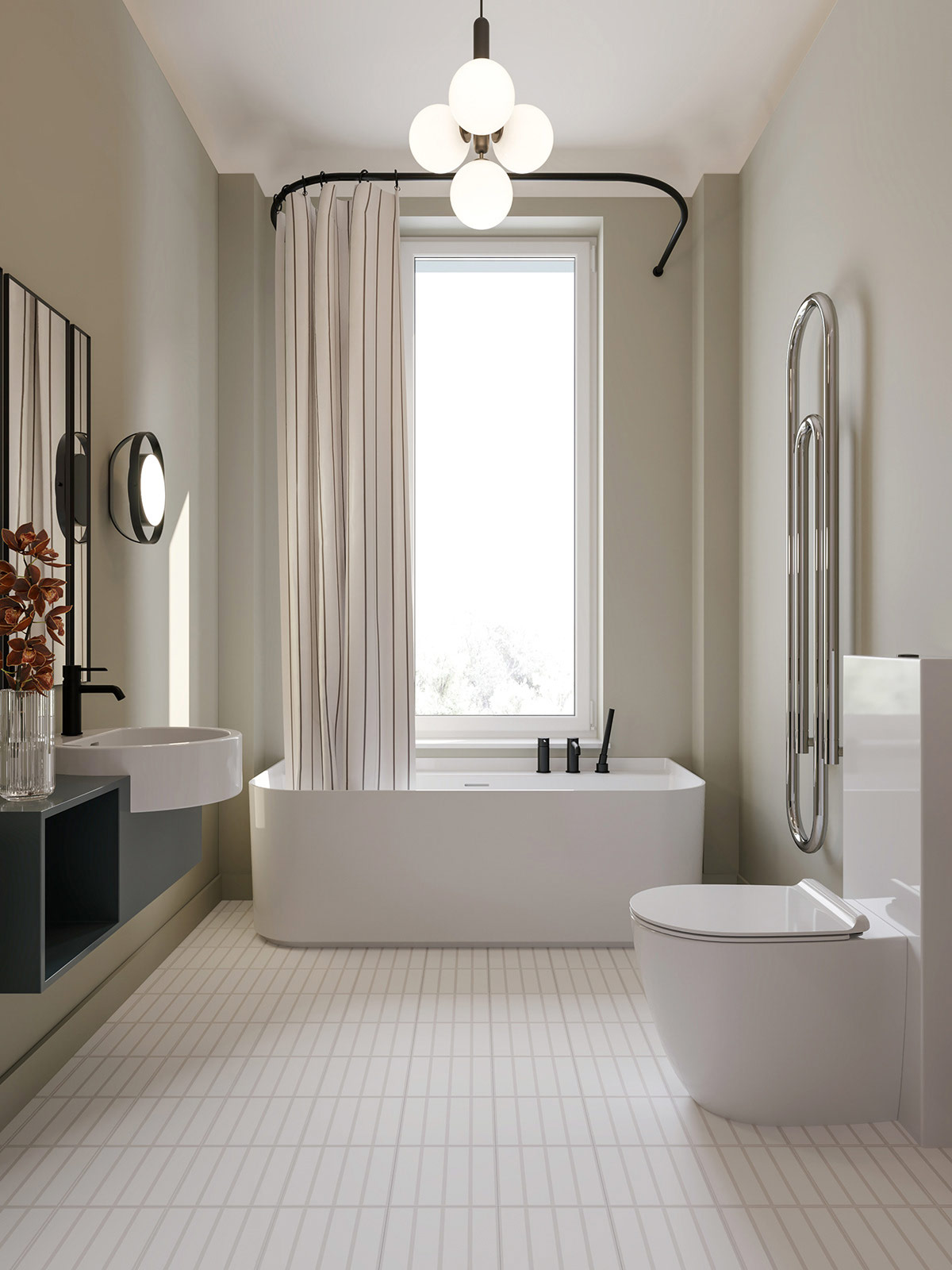
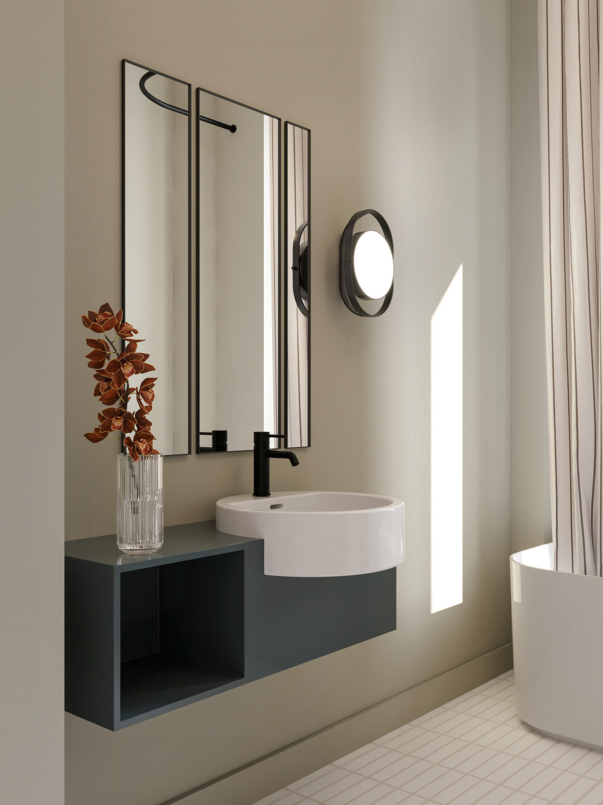
A neutral color palette is usually the safest choice when it comes to clean, modern design. But in the right hands, neutral tones can serve as a simple foundation from which the designer can make big bold jumps. In this home, whites and whites triggered large bursts of burgundy red, deep blue, and even black. Without the reassuring neutrals, these bolder choices might appear to be too loud or blurry, but here, a balance is struck and the result is complex with a pop of playfulness.
Did you like this article?
Share it on any of the following social media below to give us your voice. Your comments help us improve.
Also, if you want to read more informative content about construction and real estate, keep following Feeta Blog, the best property blog in Pakistan.
A High-Ceiling Home with Bold Pops of Color
- Published in #architecture, #style, color, dark, decor, Decoration, decorations, decorative objects, Design, Design Gallery, furniture, Furniture Design, home, Home Decor, house decoration, house design, house tour, House Tours, interior, Interior Decoration Ideas, Interior Design, interiors, International, modern
Melding Muted Colours Into Modern Decor
Do you like Architecture and Interior Design? Follow us …
Thank you. You have been subscribed.
![]()
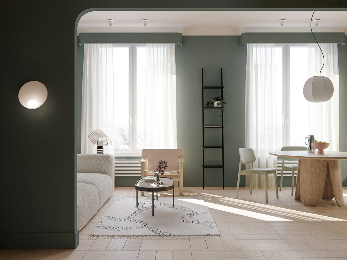
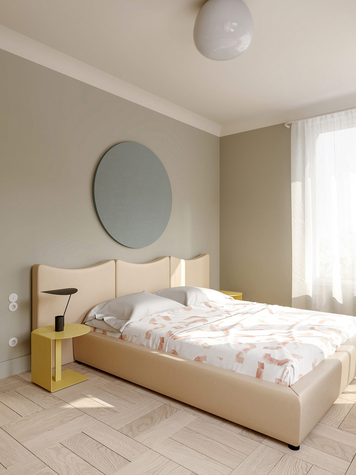
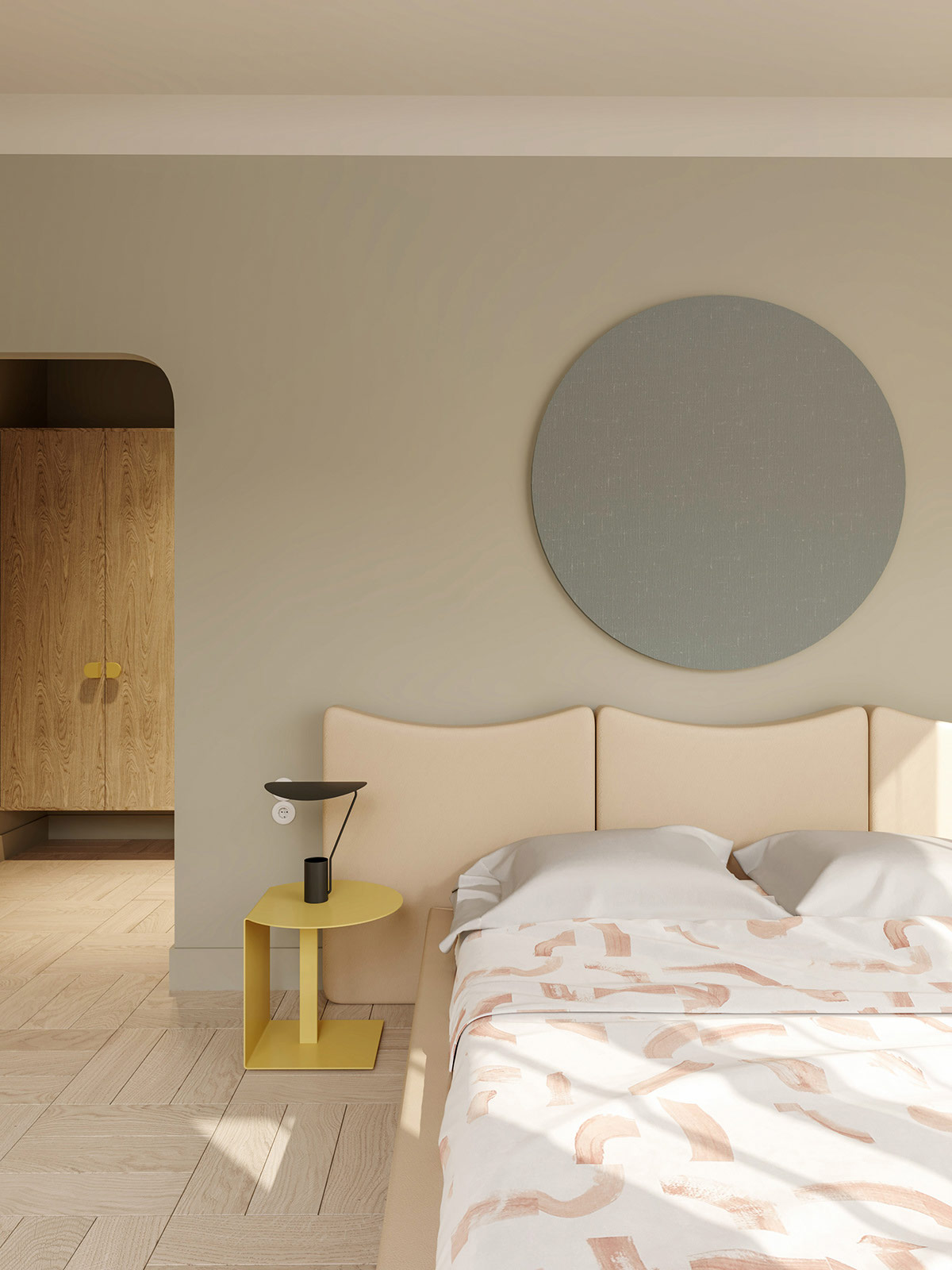
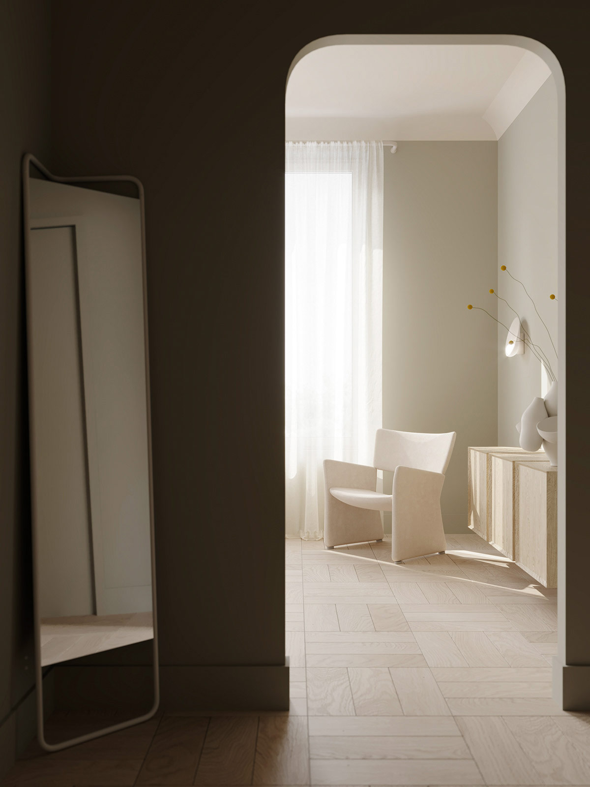
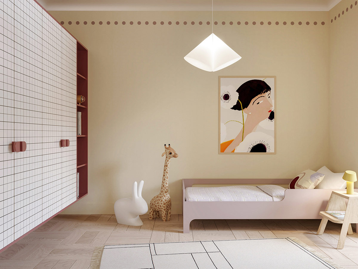
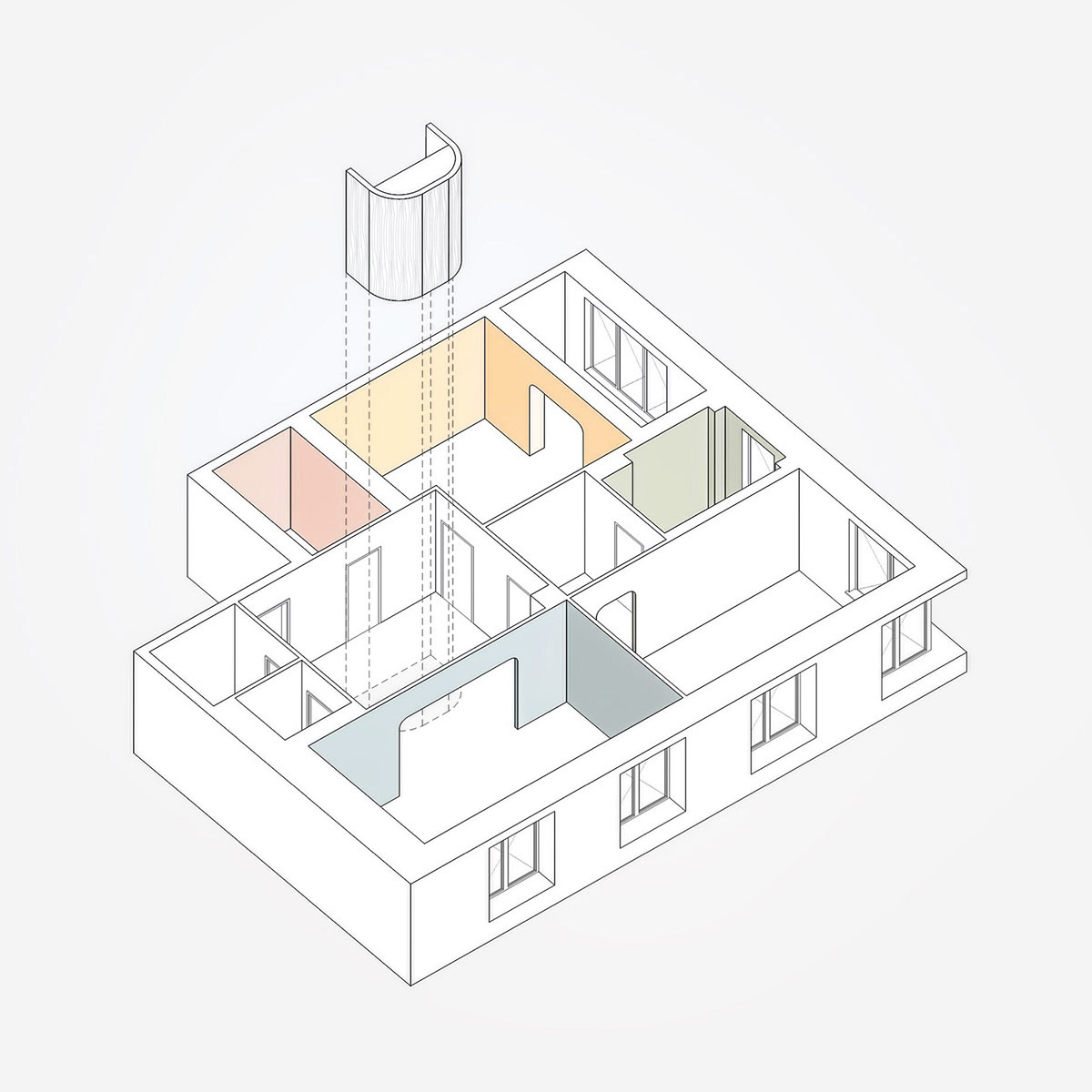
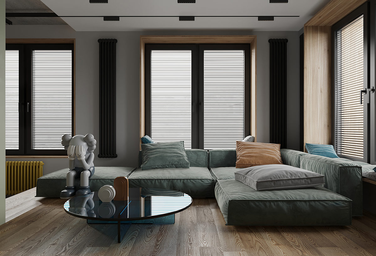
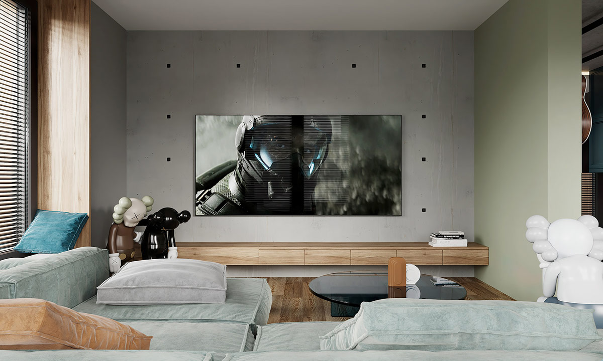
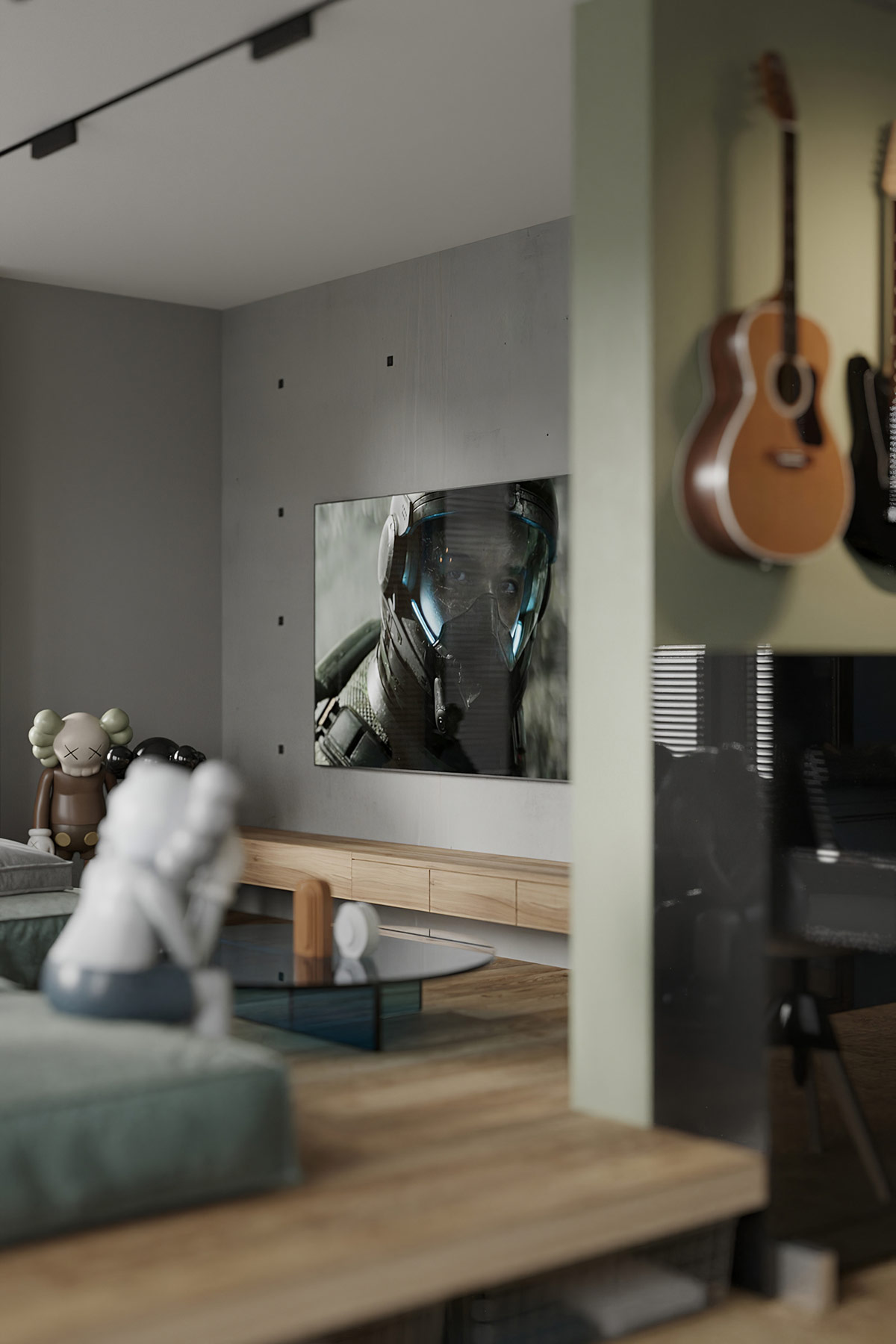
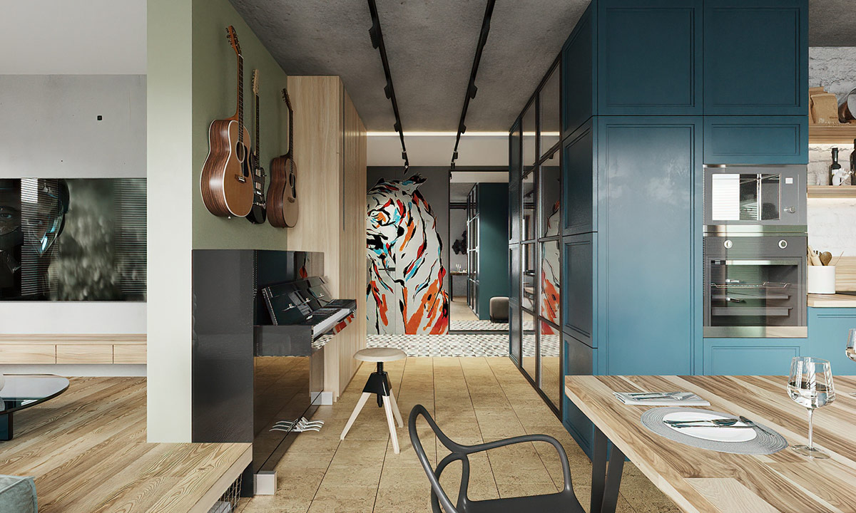
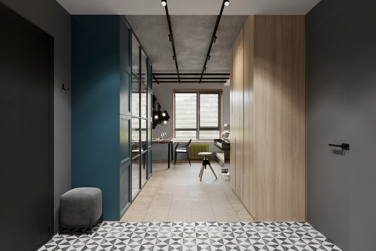
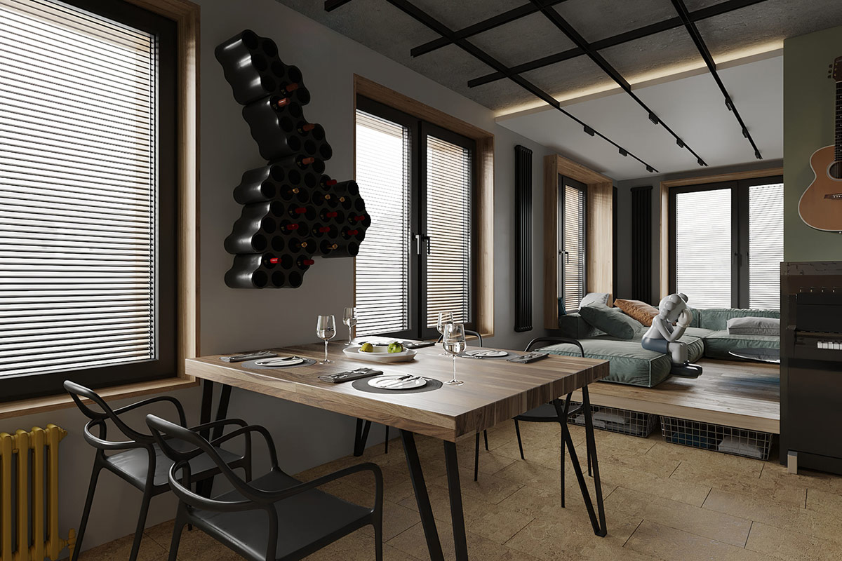
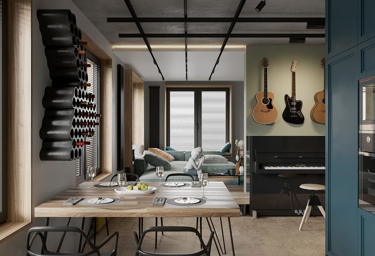
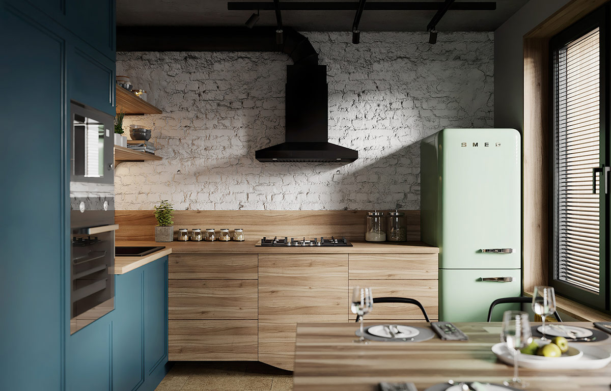
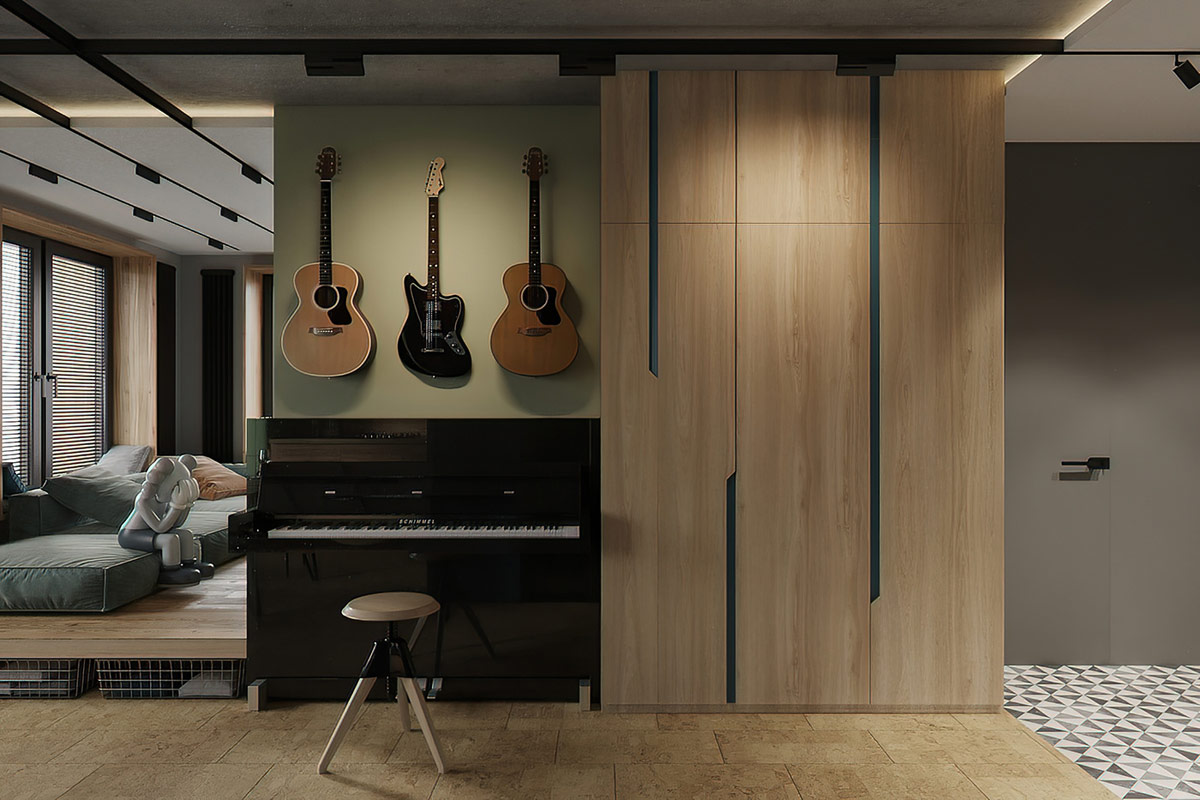
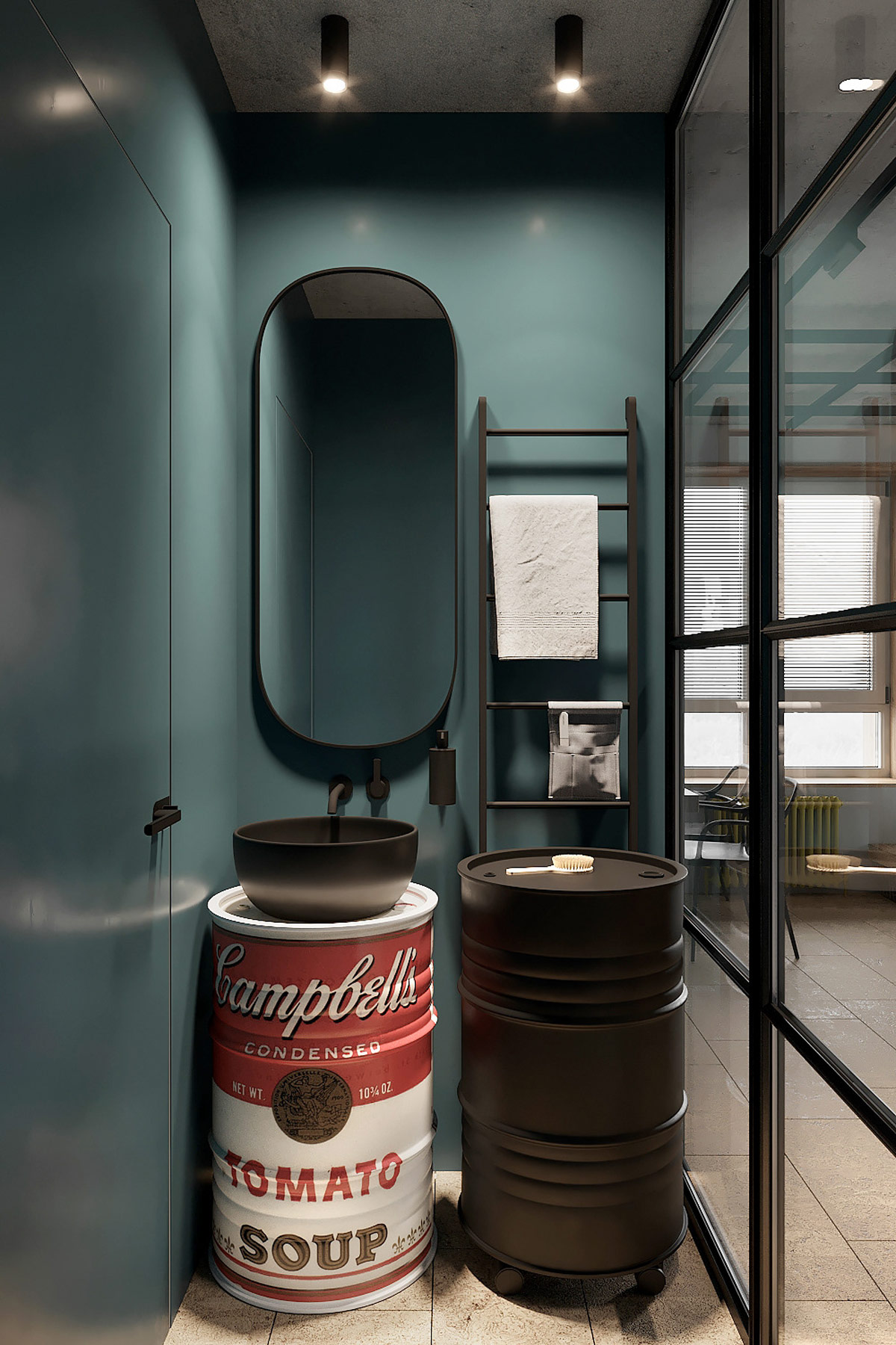
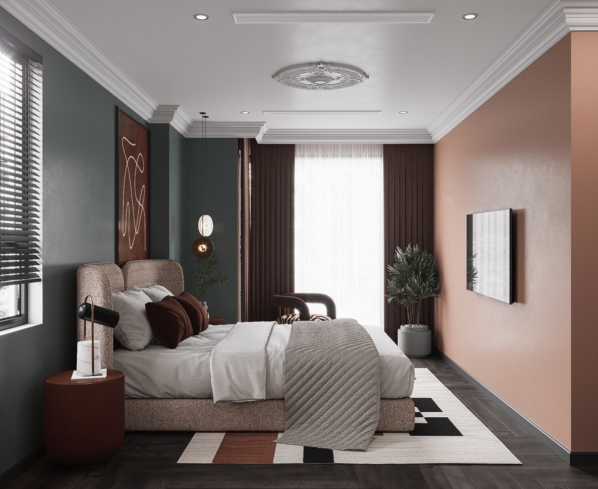
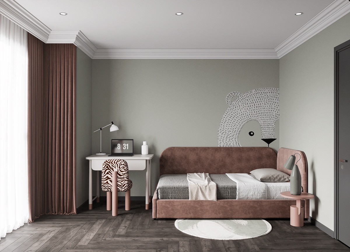
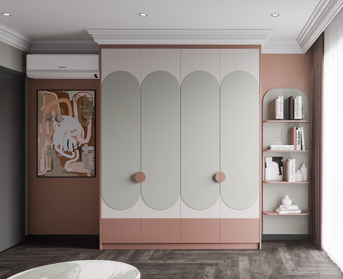
How do you embody interesting color accents in interiors without it becoming distractingly dazzling? Well, these three modern home interiors set the tone right with a bunch of muted color shades that add uplifting accents without causing a headache. We first look at a Russian contest entry that has a color-coded home layout to define each living block. Our second prominent interior is a home suitable for a creative mind, with a well-equipped music area and a gallery of KAW statues taking over the living room. Lastly, we look at a bold home project that delves into a geometric pattern while pushing back shades into the muted spectrum.
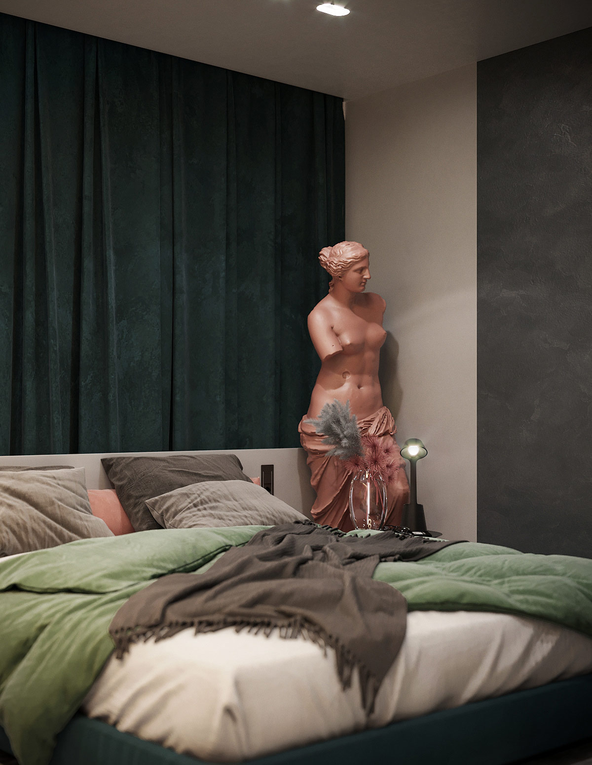
This creative home design talks about artistic appreciation. Great CAUSE a statue stands on the end of a modern sectional sofa, where it puts the ottoman out of use. The project object gives the room an immediate character and an unusually incredible factor.
Did you like this article?
Share it on some of the following social networking channels below to give us your vote. Your feedback helps us improve.
Meanwhile, if you want to read more such exciting lifestyle guides and informative property updates, stay tuned to Feeta Blog — Pakistan’s best real estate blog.
Melding Muted Colours Into Modern Decor
- Published in color, decor, Decoration, home, Home Decor, home design, house, house decoration, interior, Interior Decoration Ideas, Interior Design, interiors, International, modern

