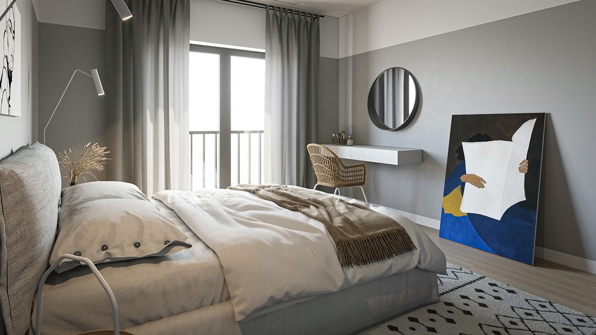
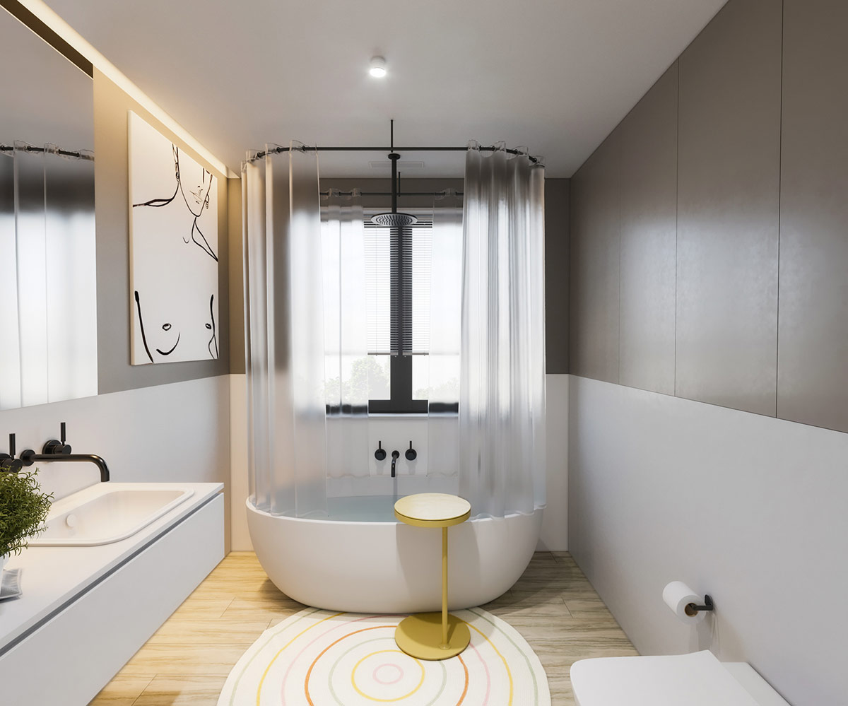
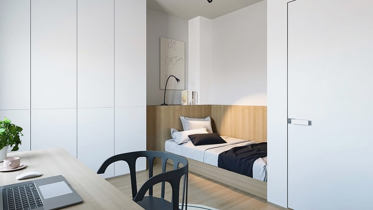
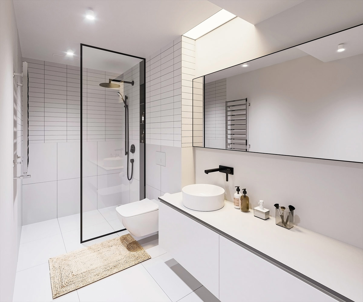
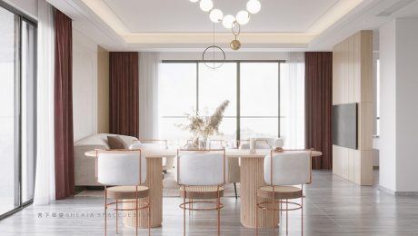
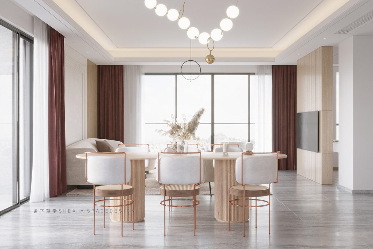
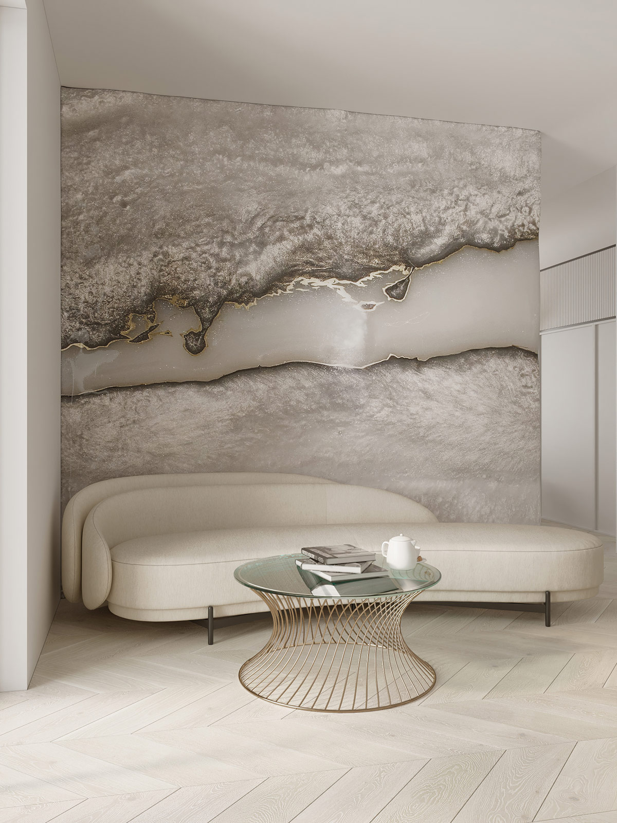
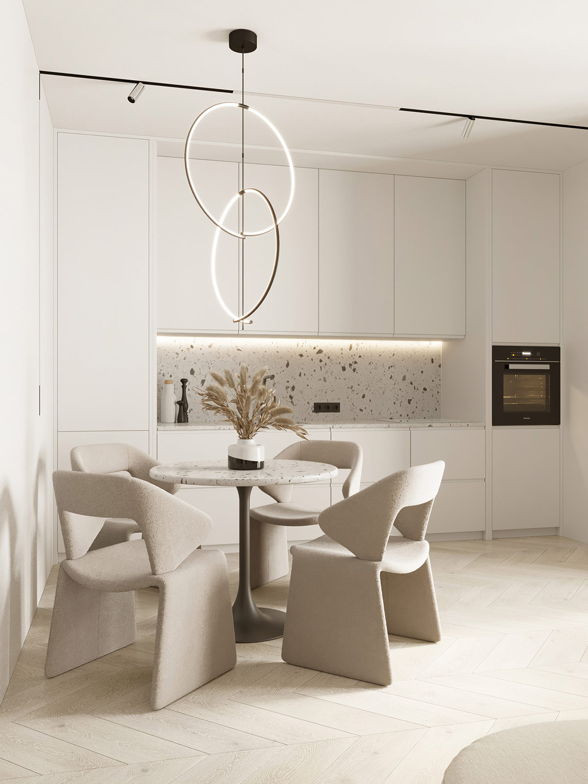
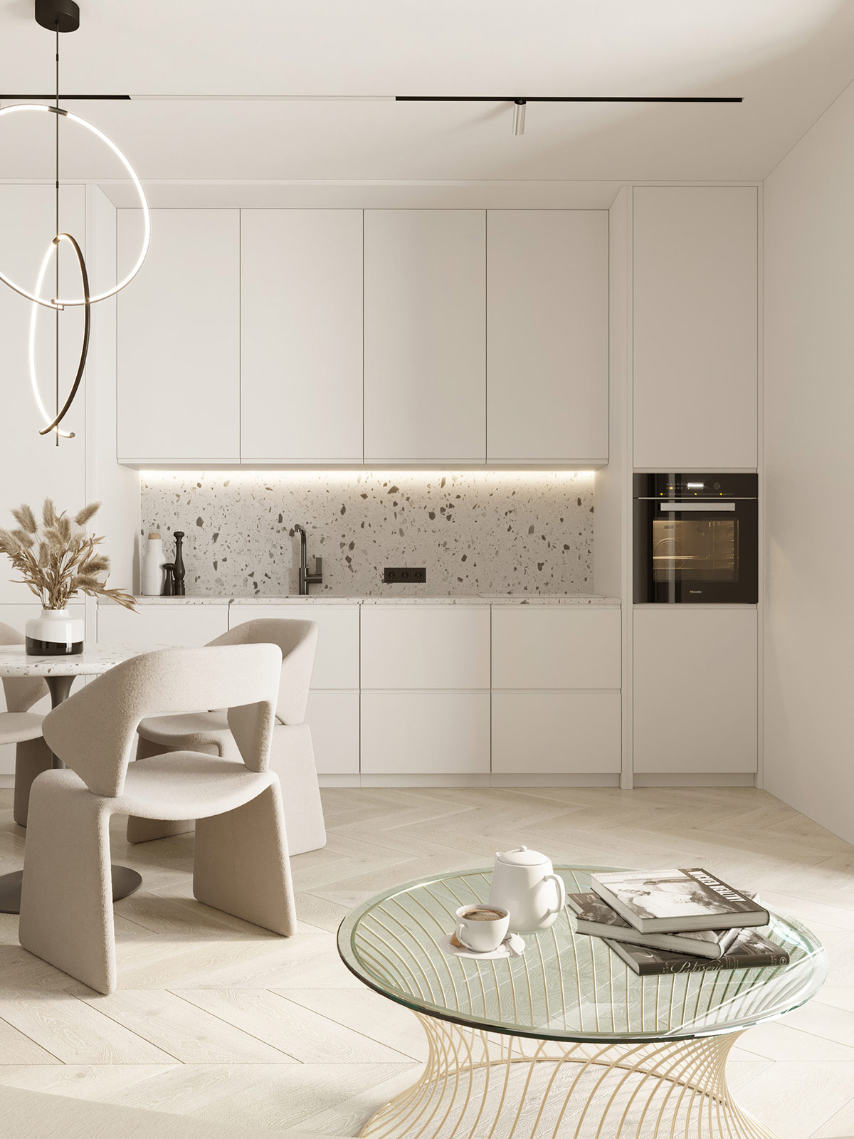
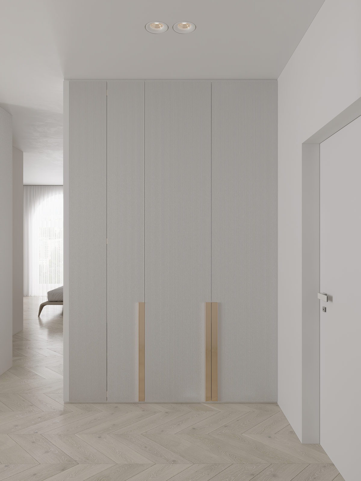
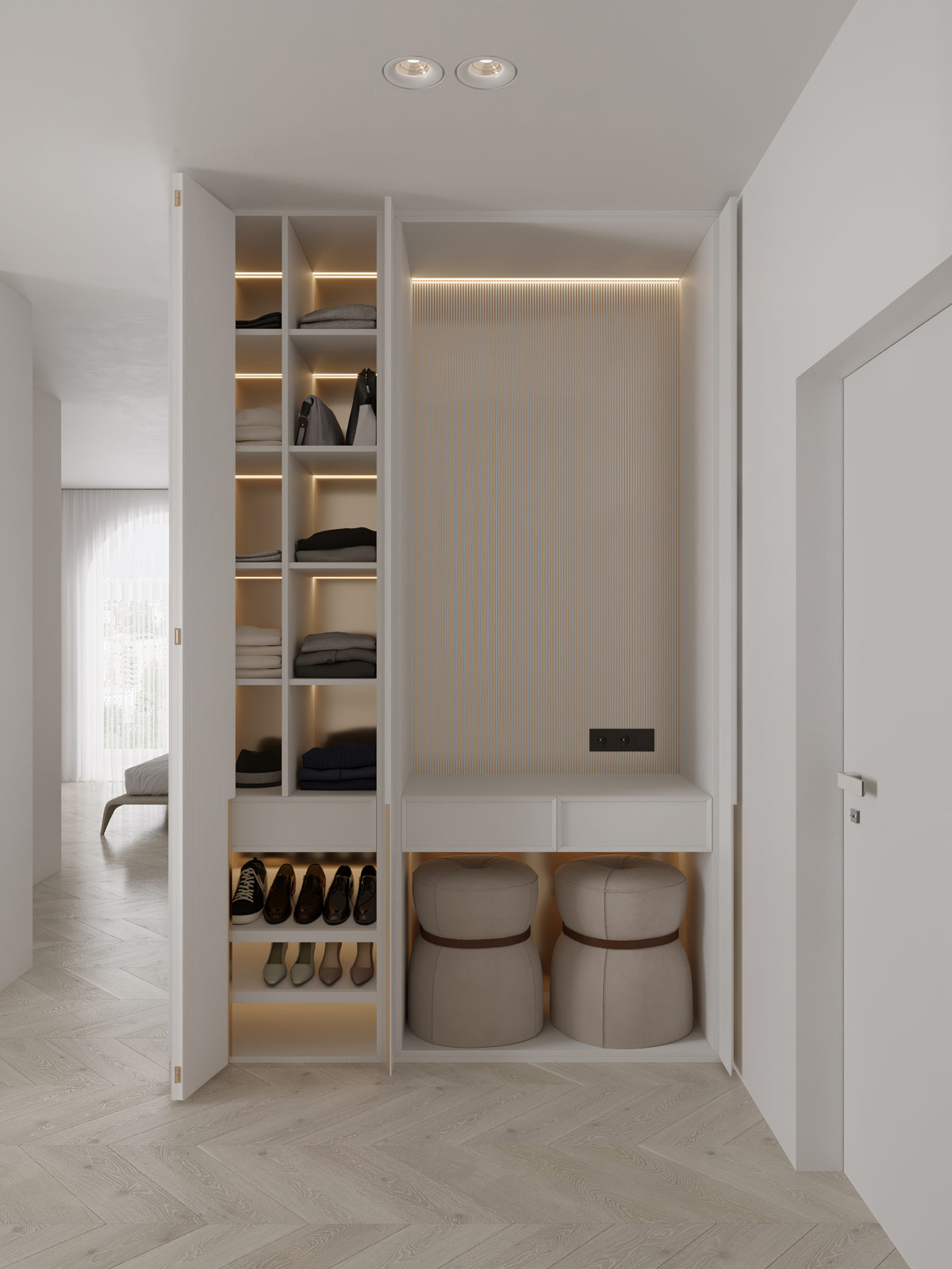
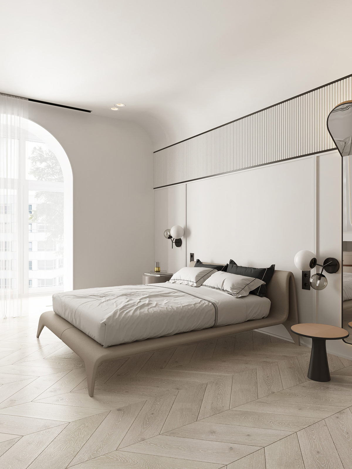
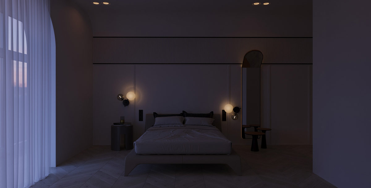
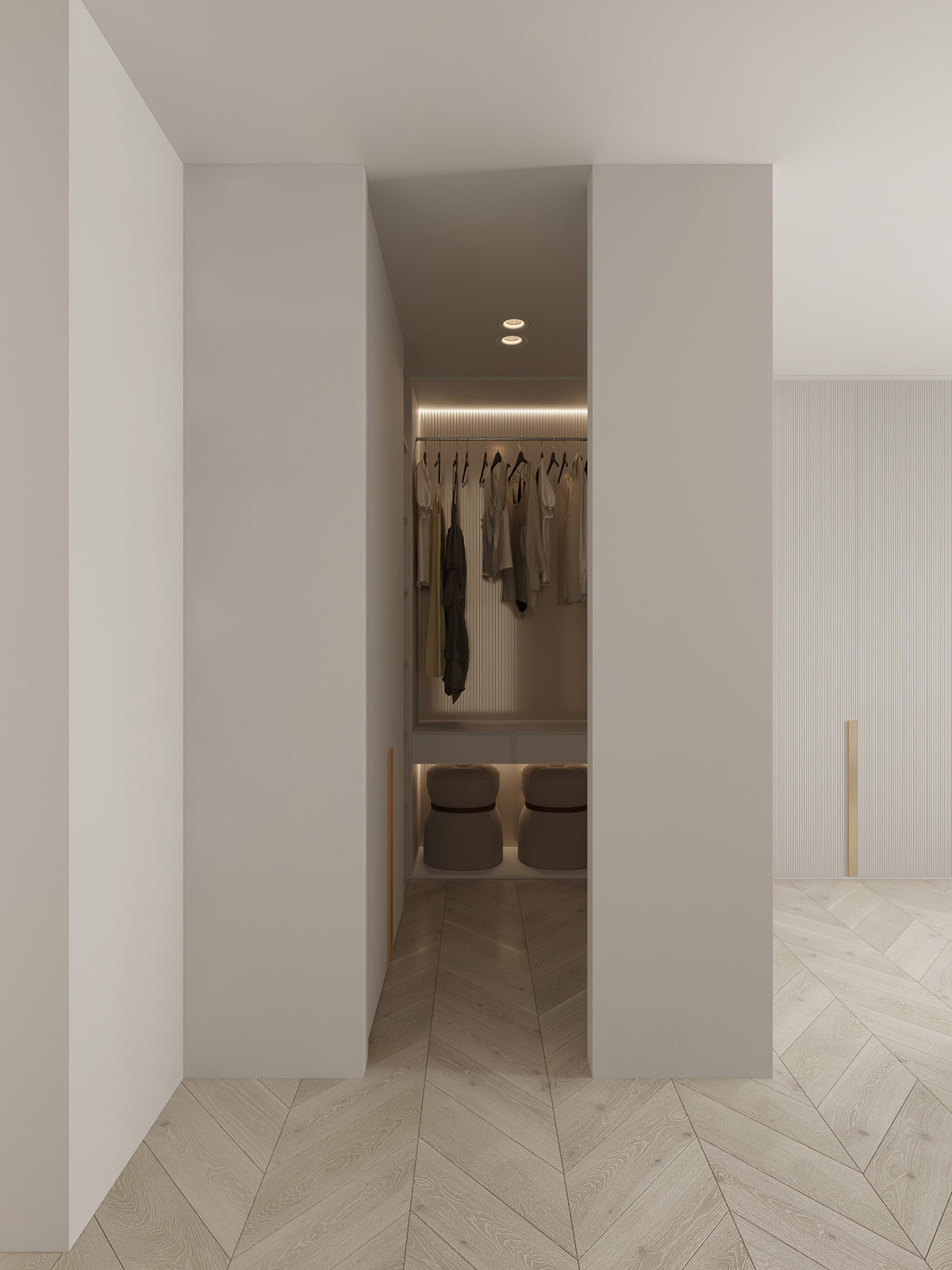
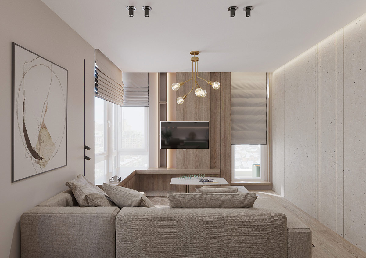
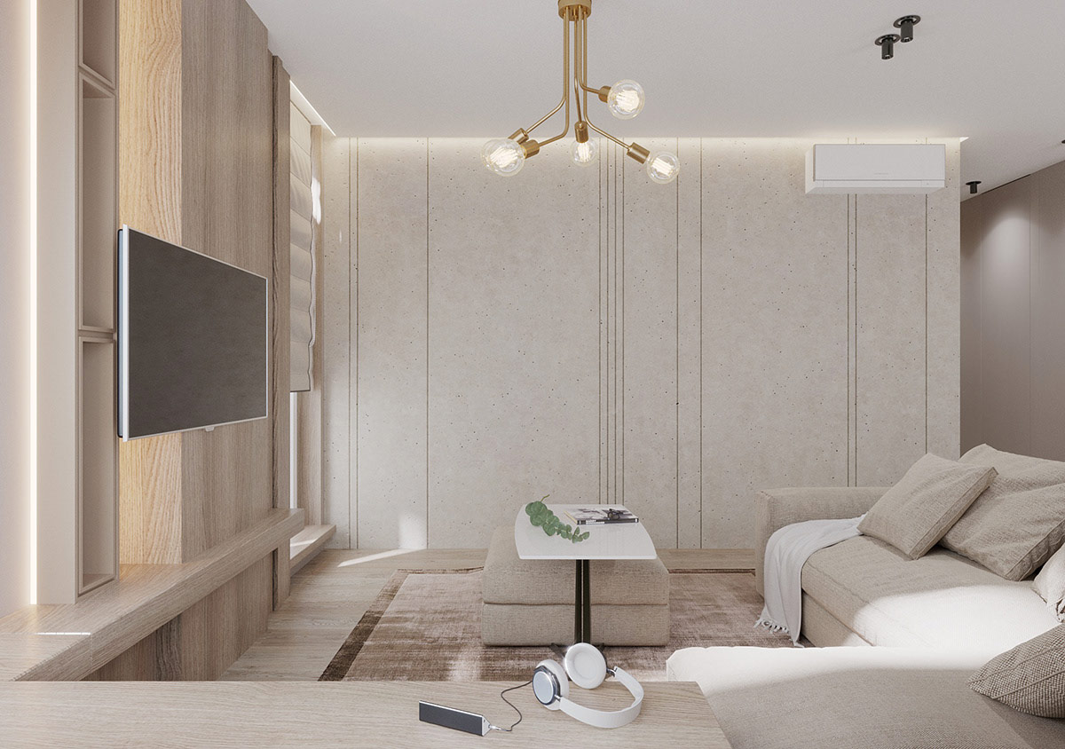
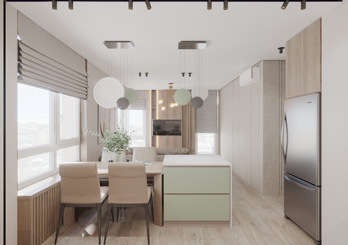
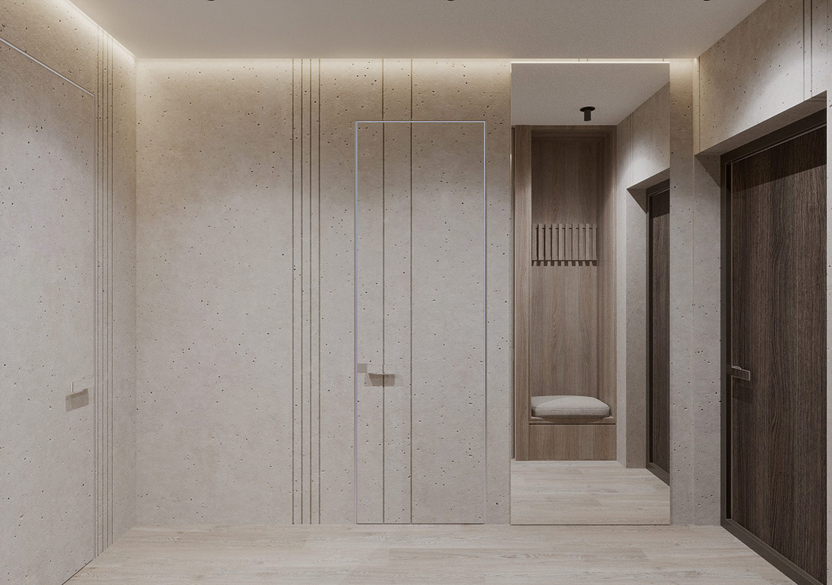
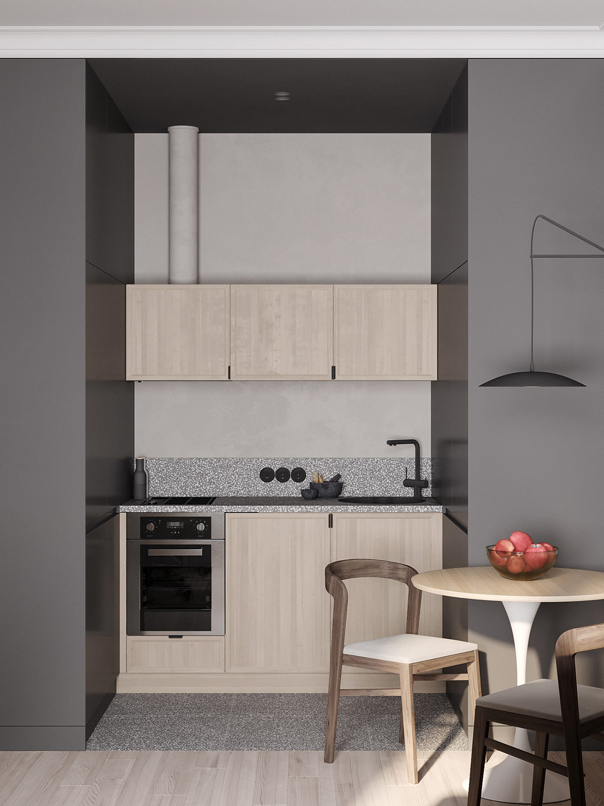
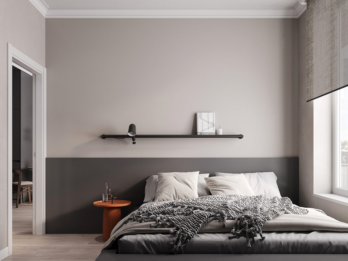
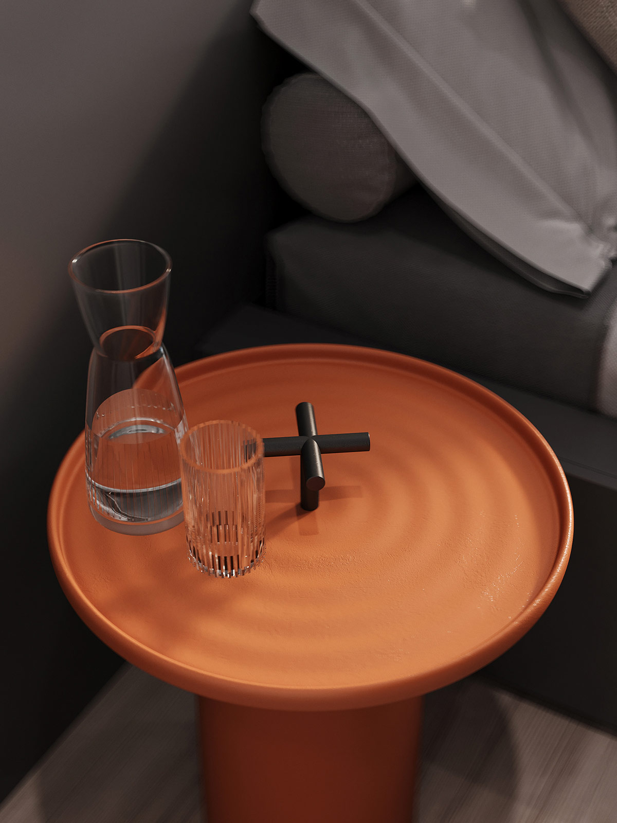
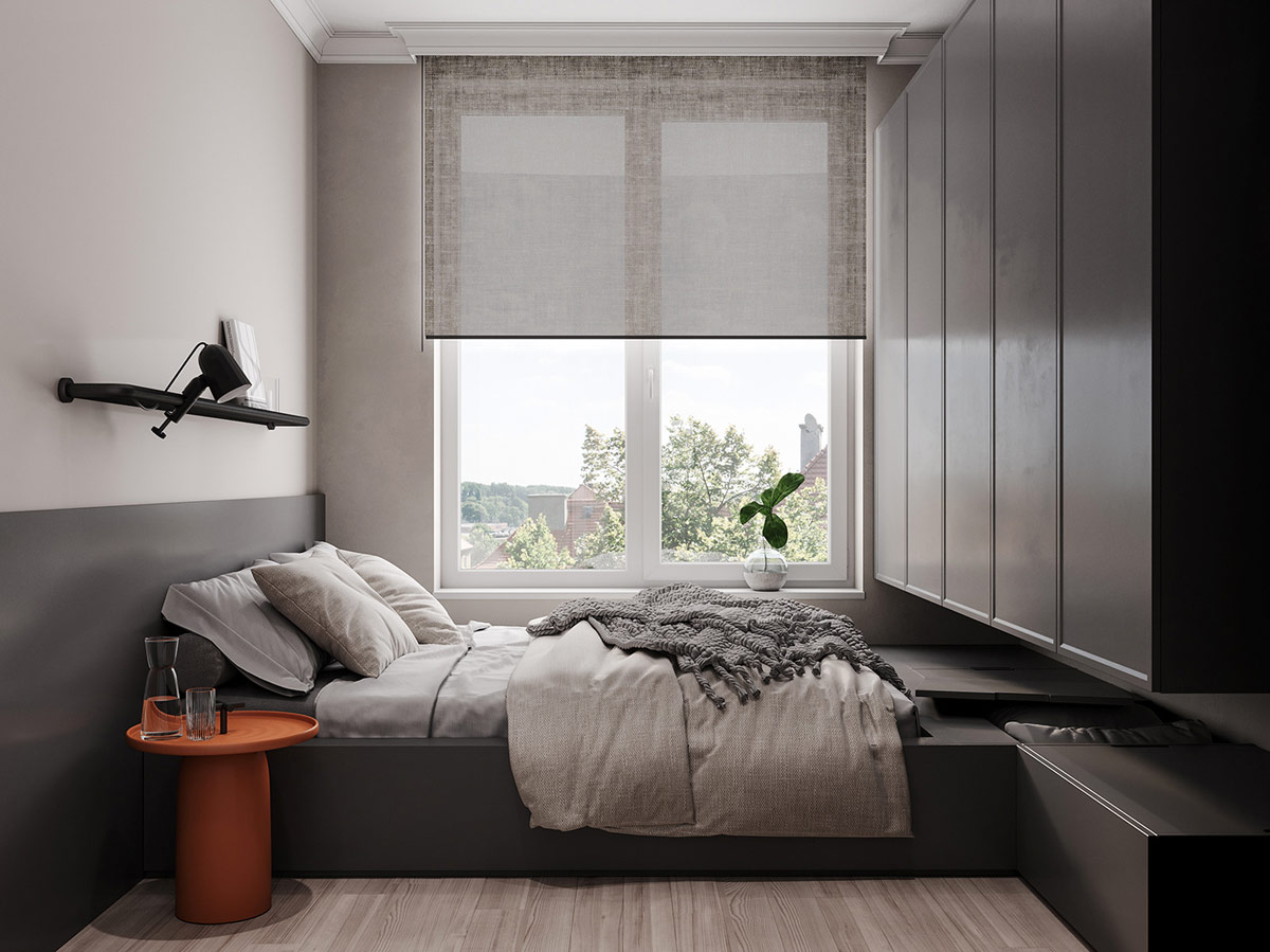
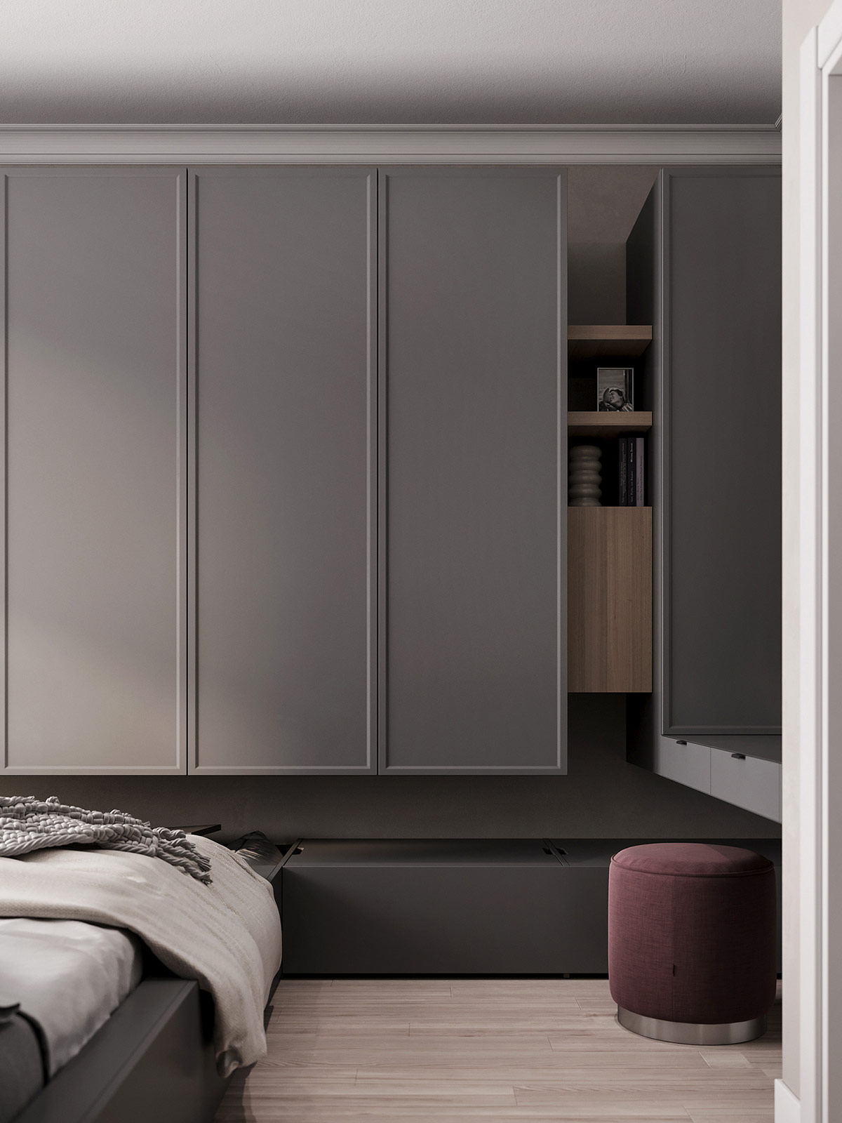
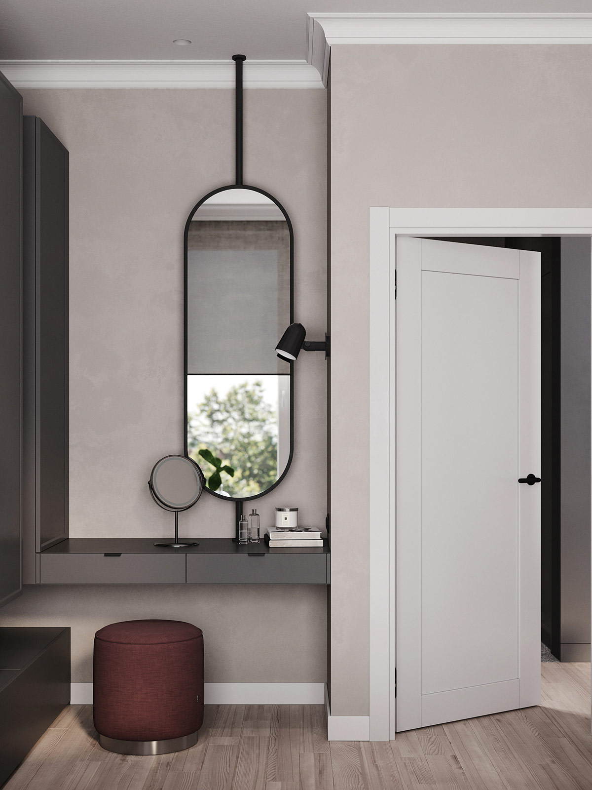
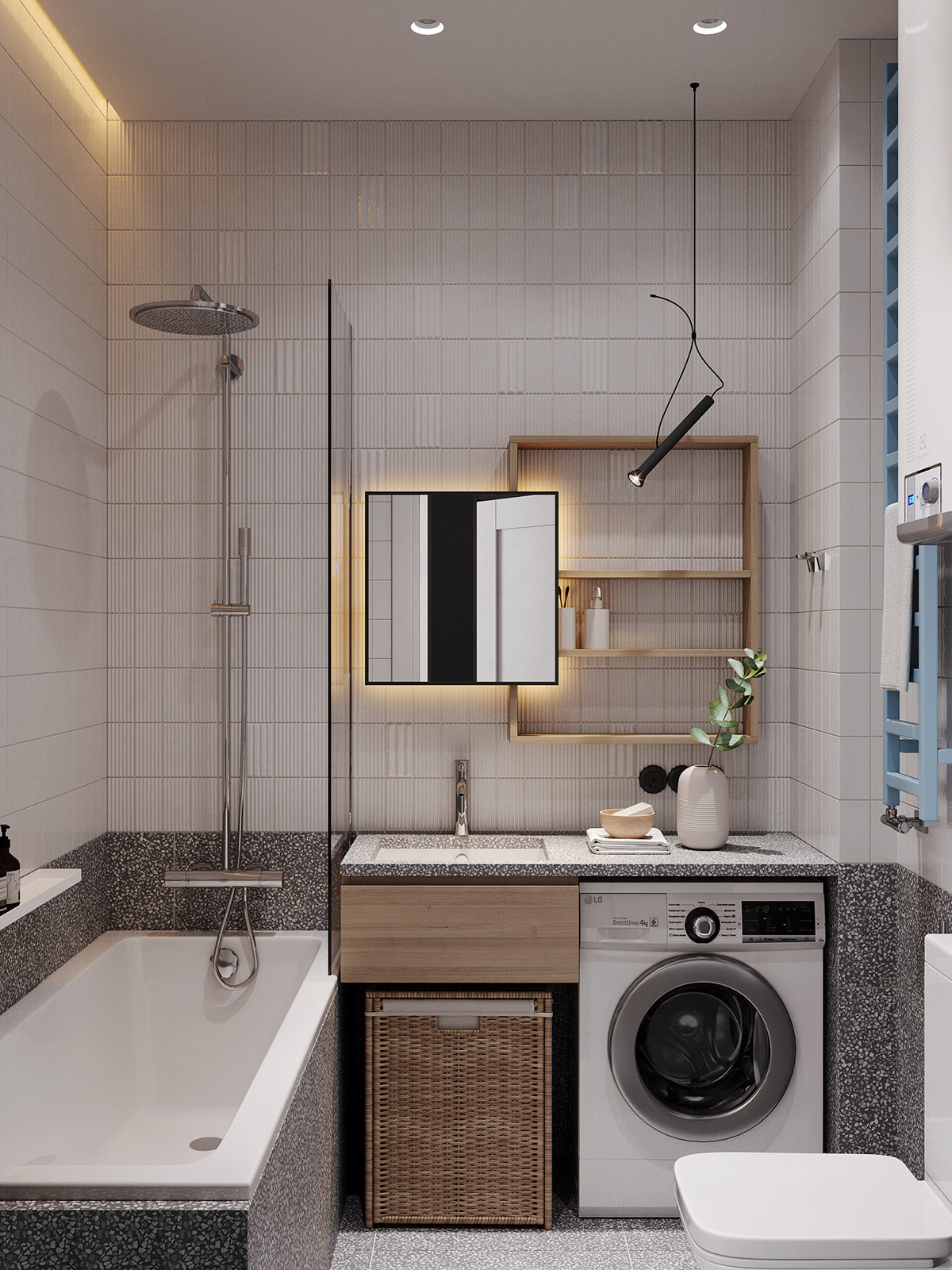
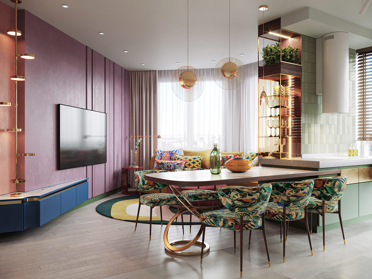
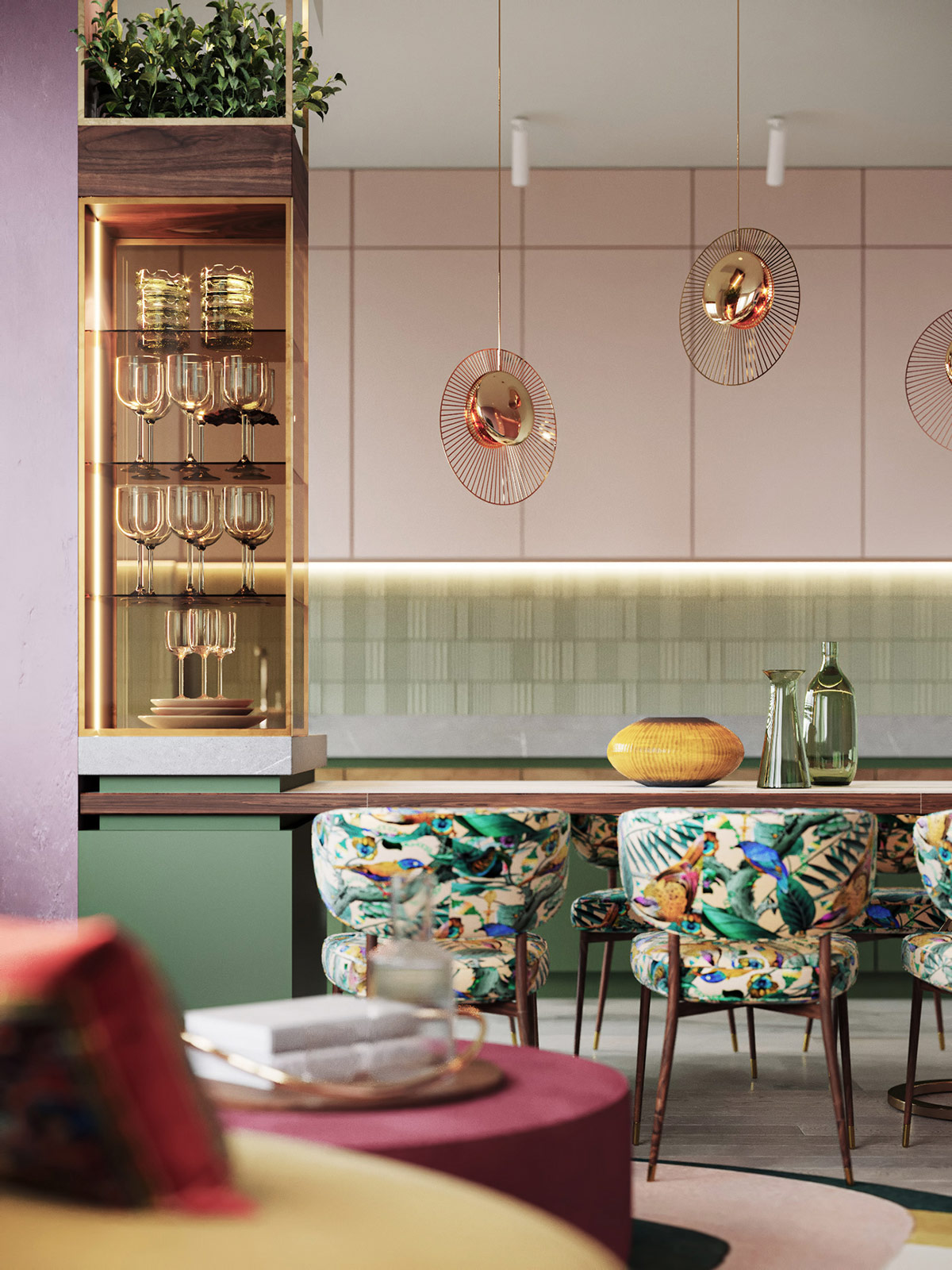
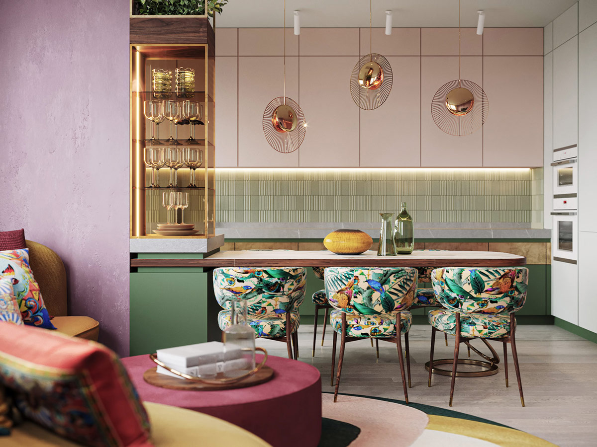
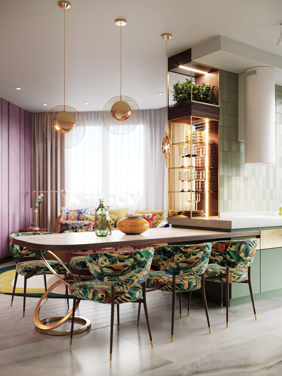
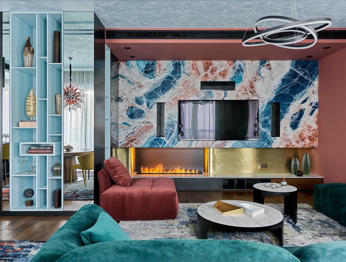
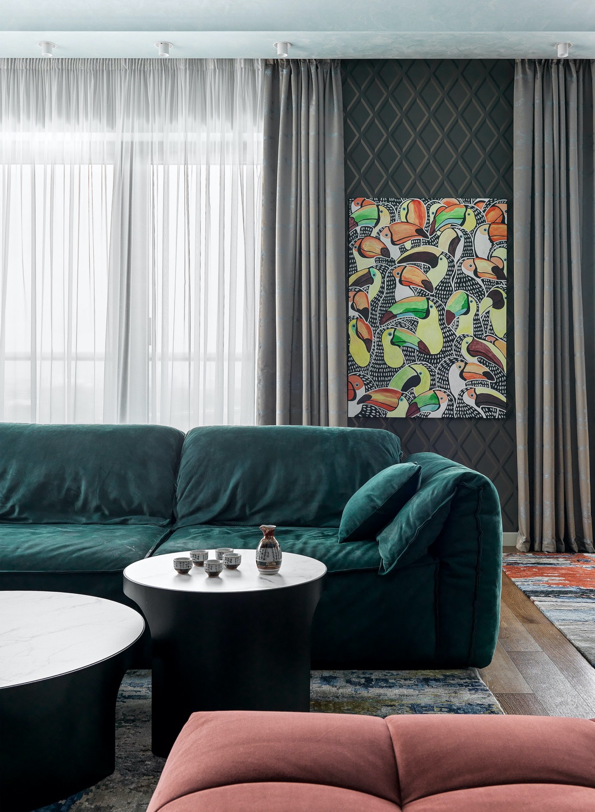
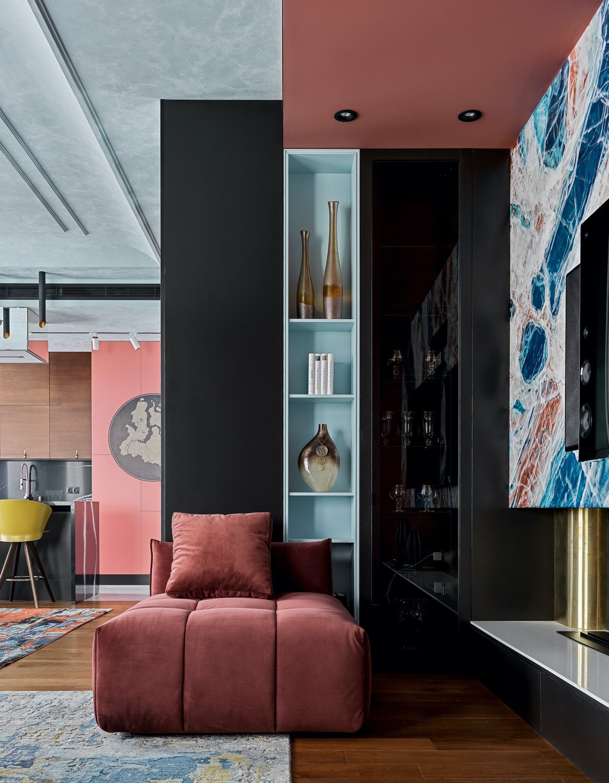
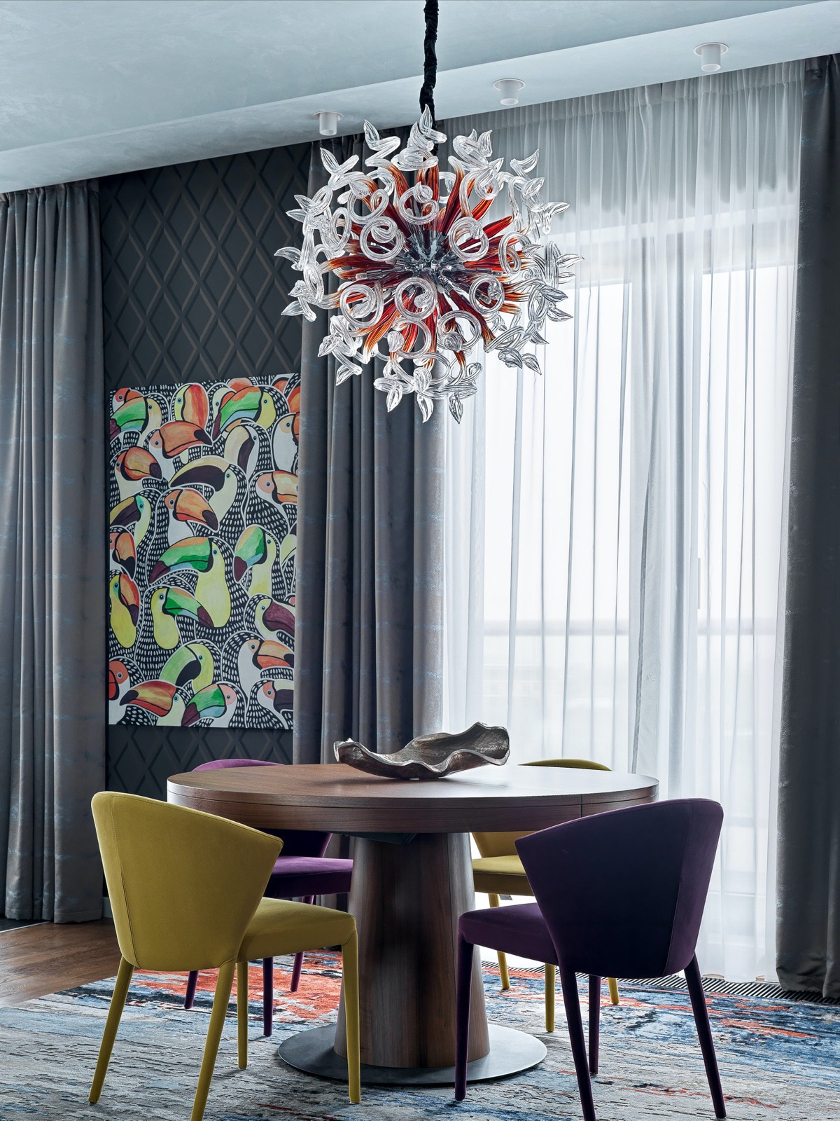
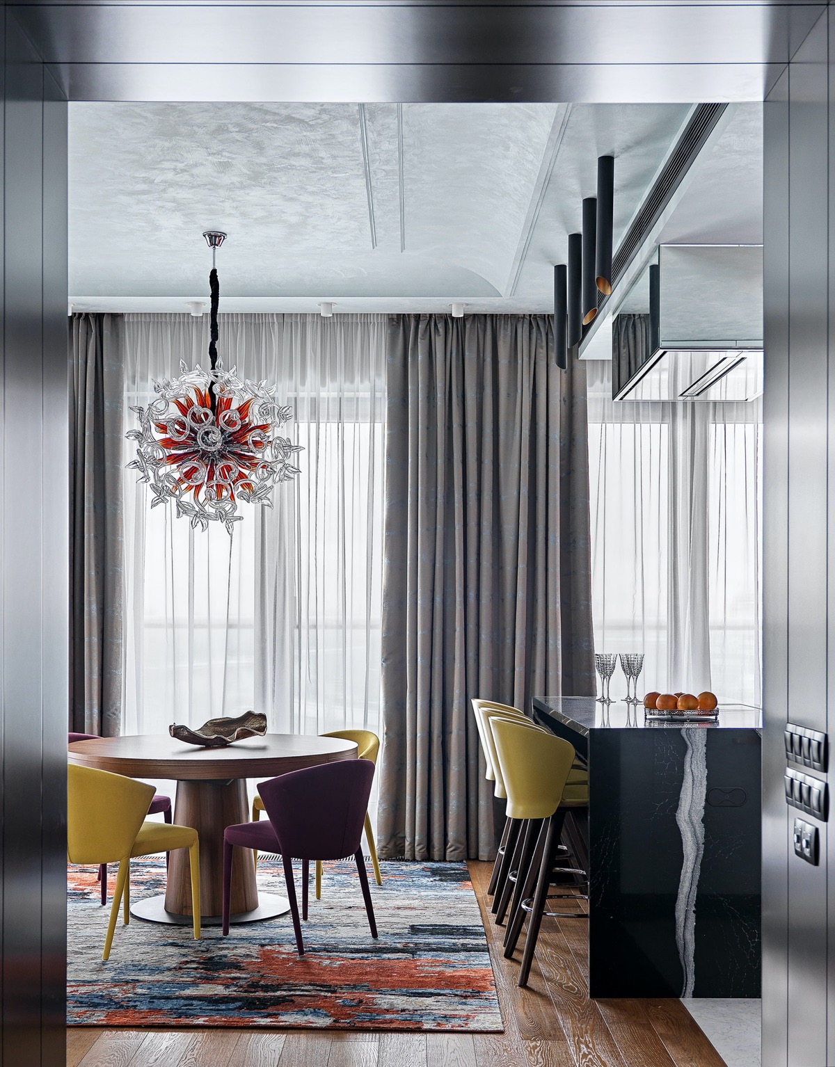
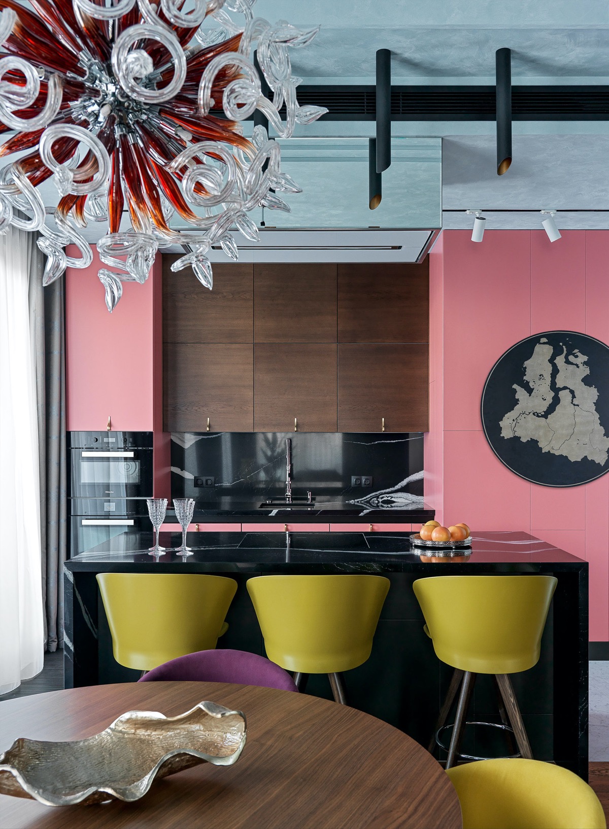
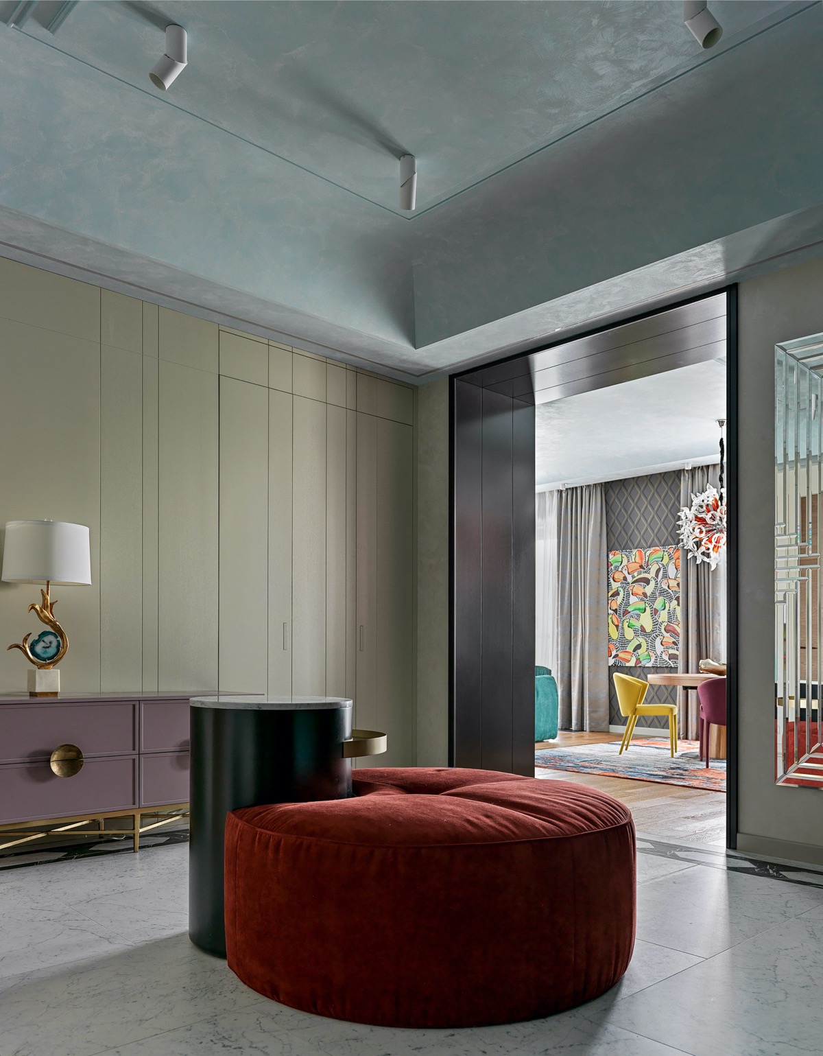
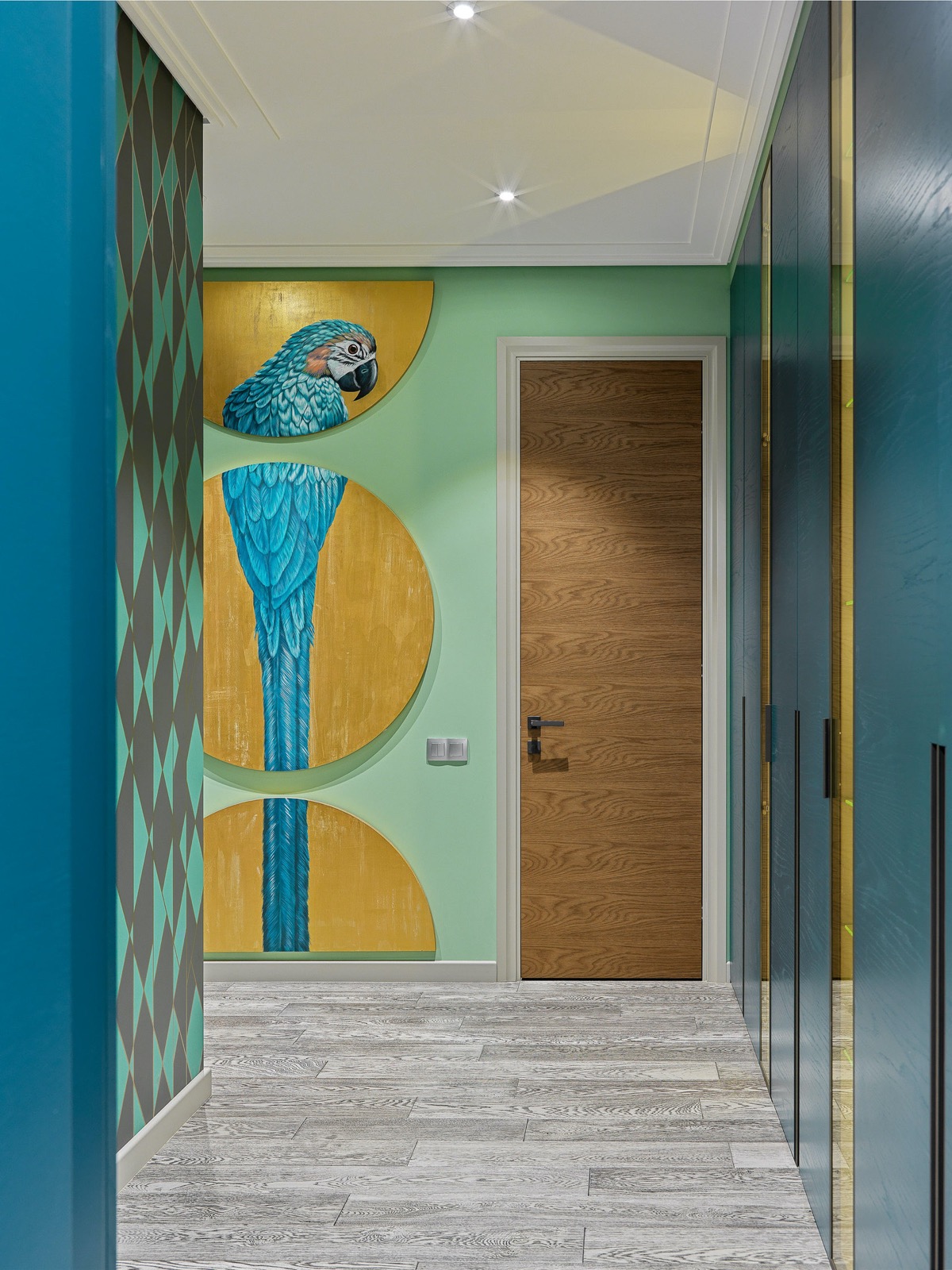
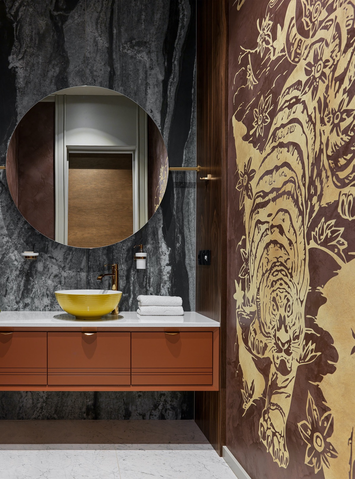
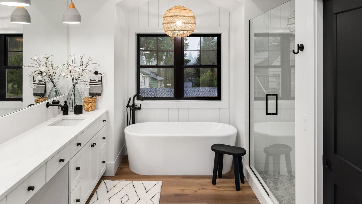
What’s in the ever-living fudge – one step is, eh, but this one has three different levels plus the added detriment of the world’s worst architectural details around it. Please have someone else tell me that you hate this as much as I do. I know it’s probably more interior design, but it’s so ugly.
Lively Yellow and Blue Accent Decor
Do you like Architecture and Interior Design? Follow us …
Thank you. You have been subscribed.
![]()
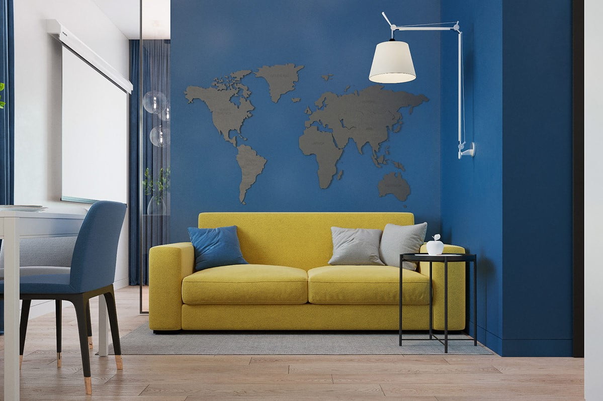
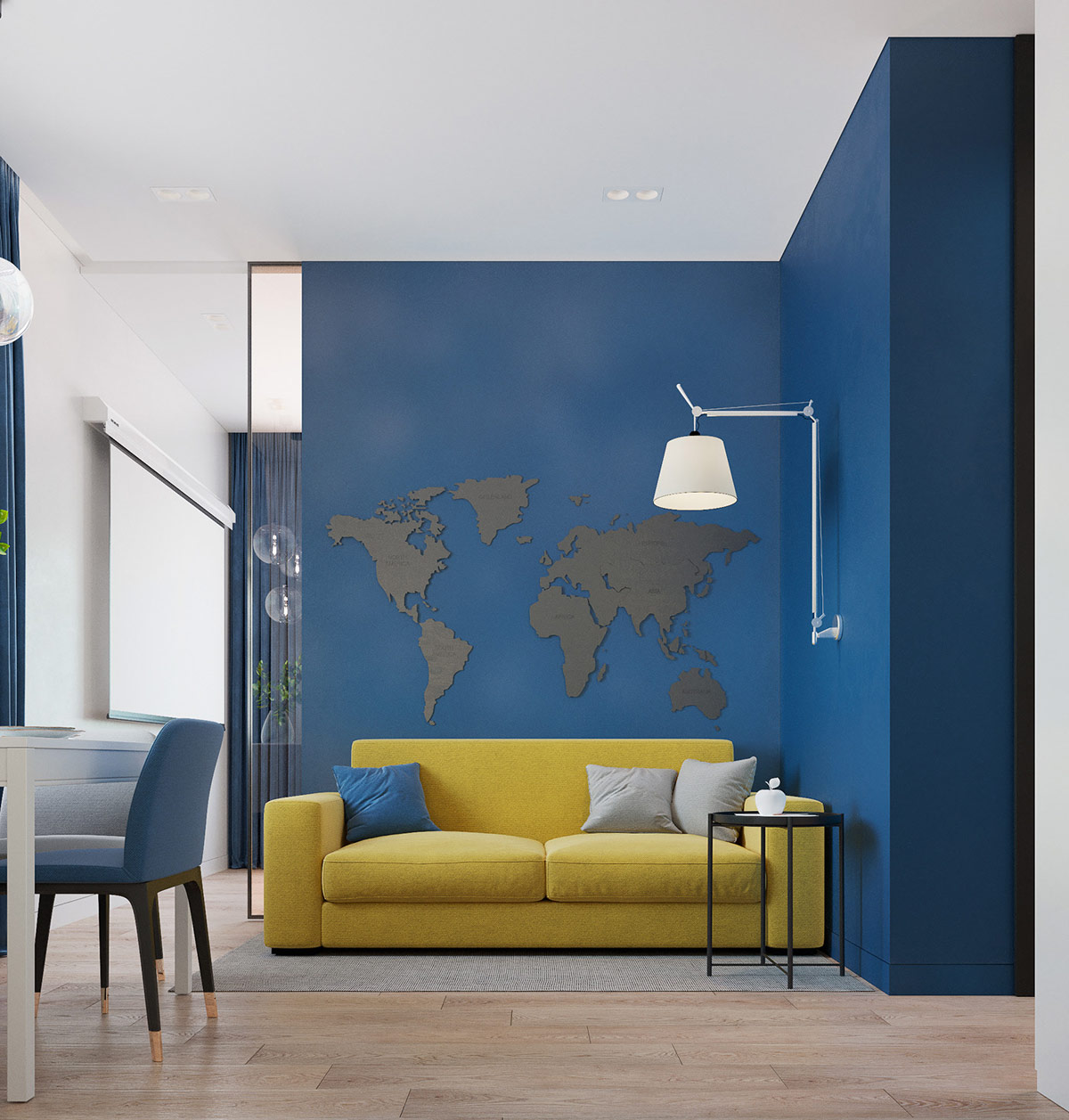
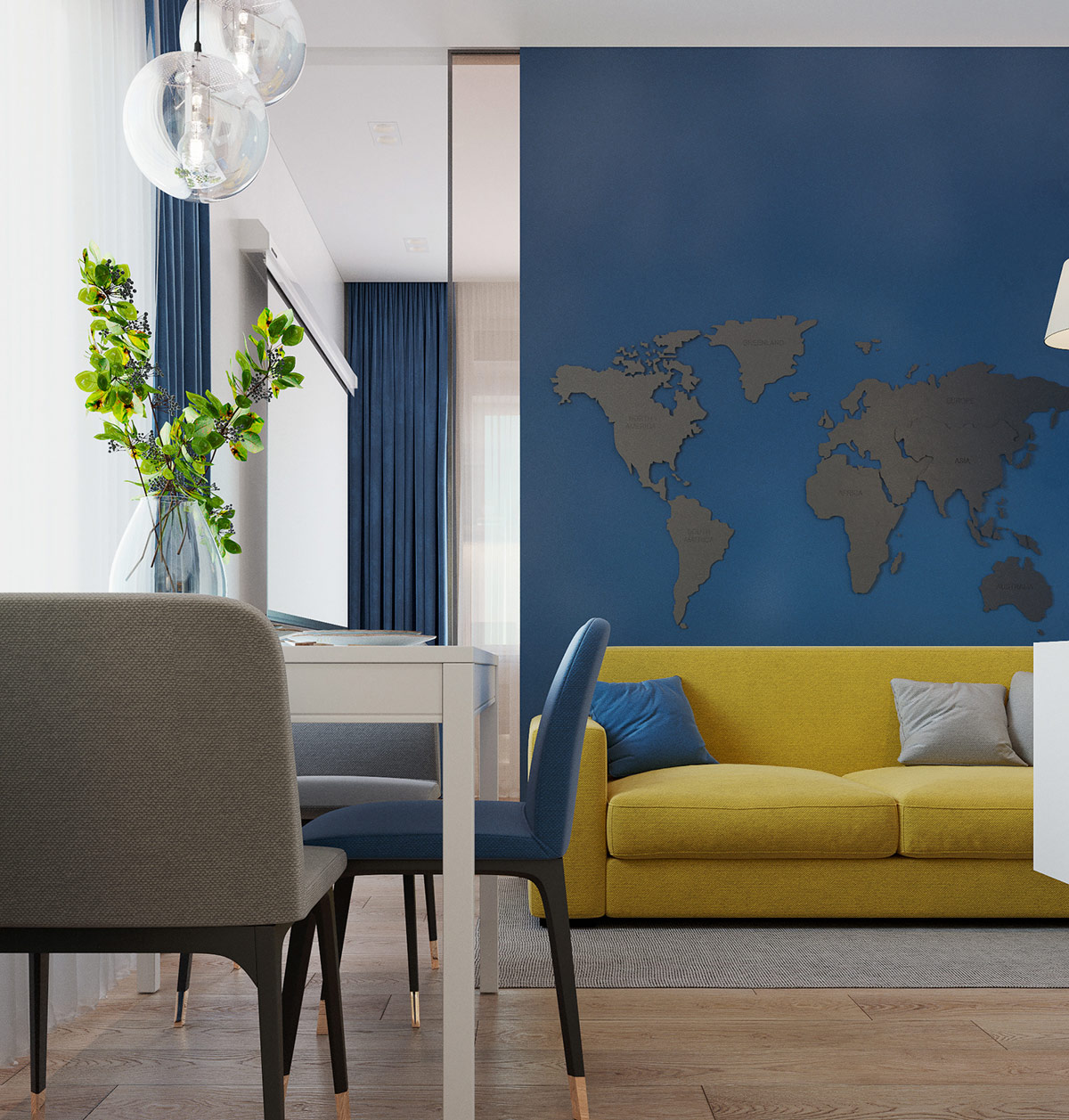
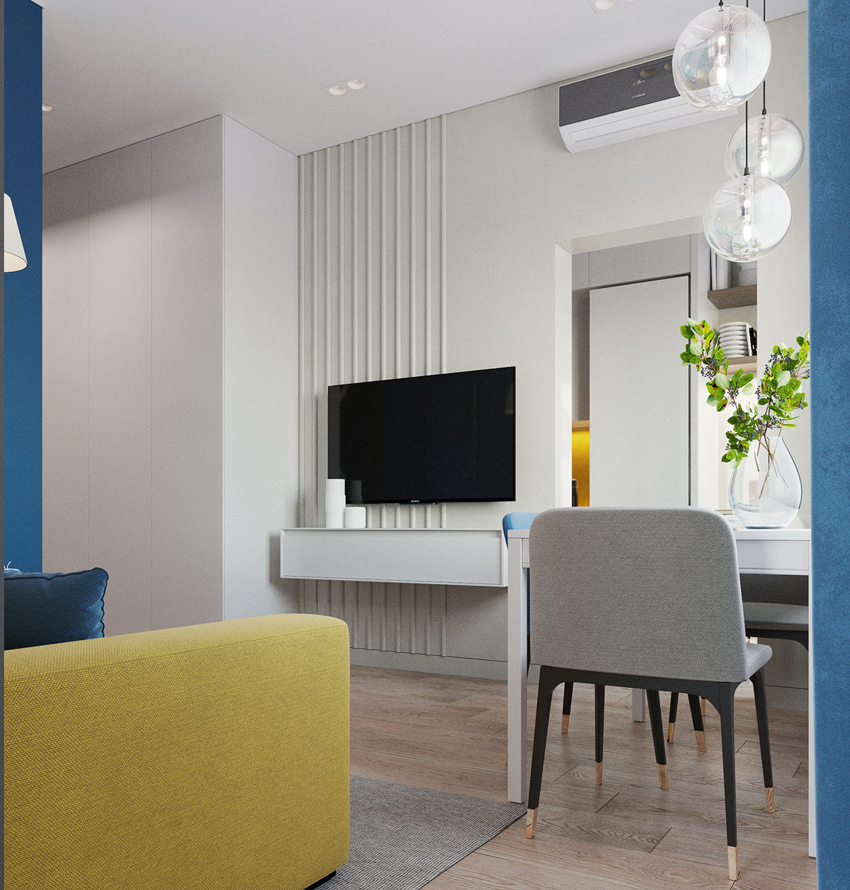
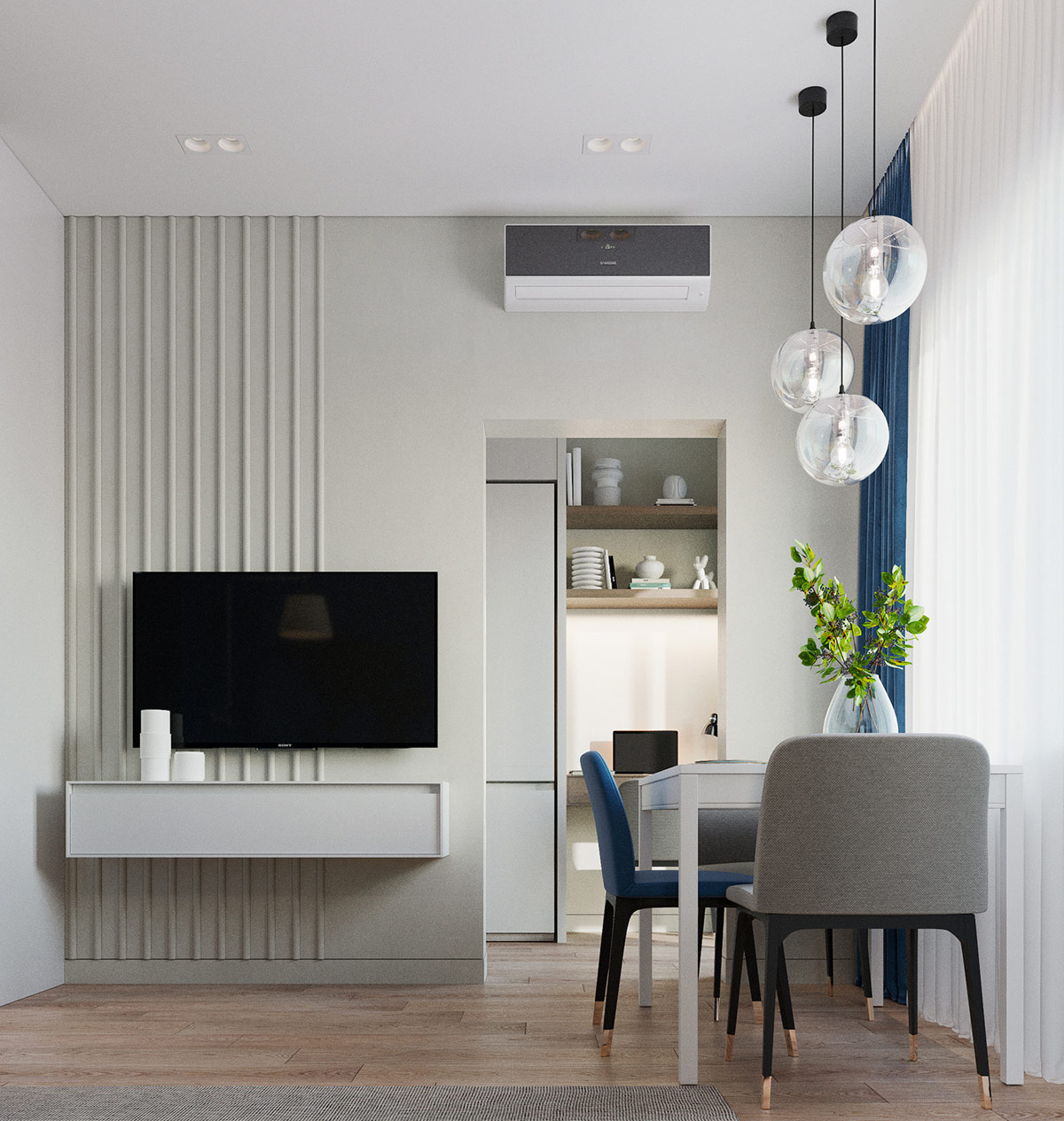
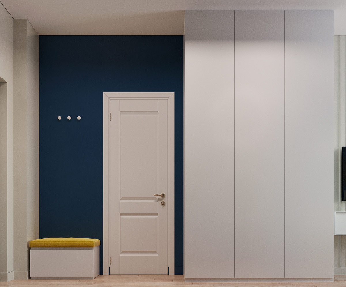
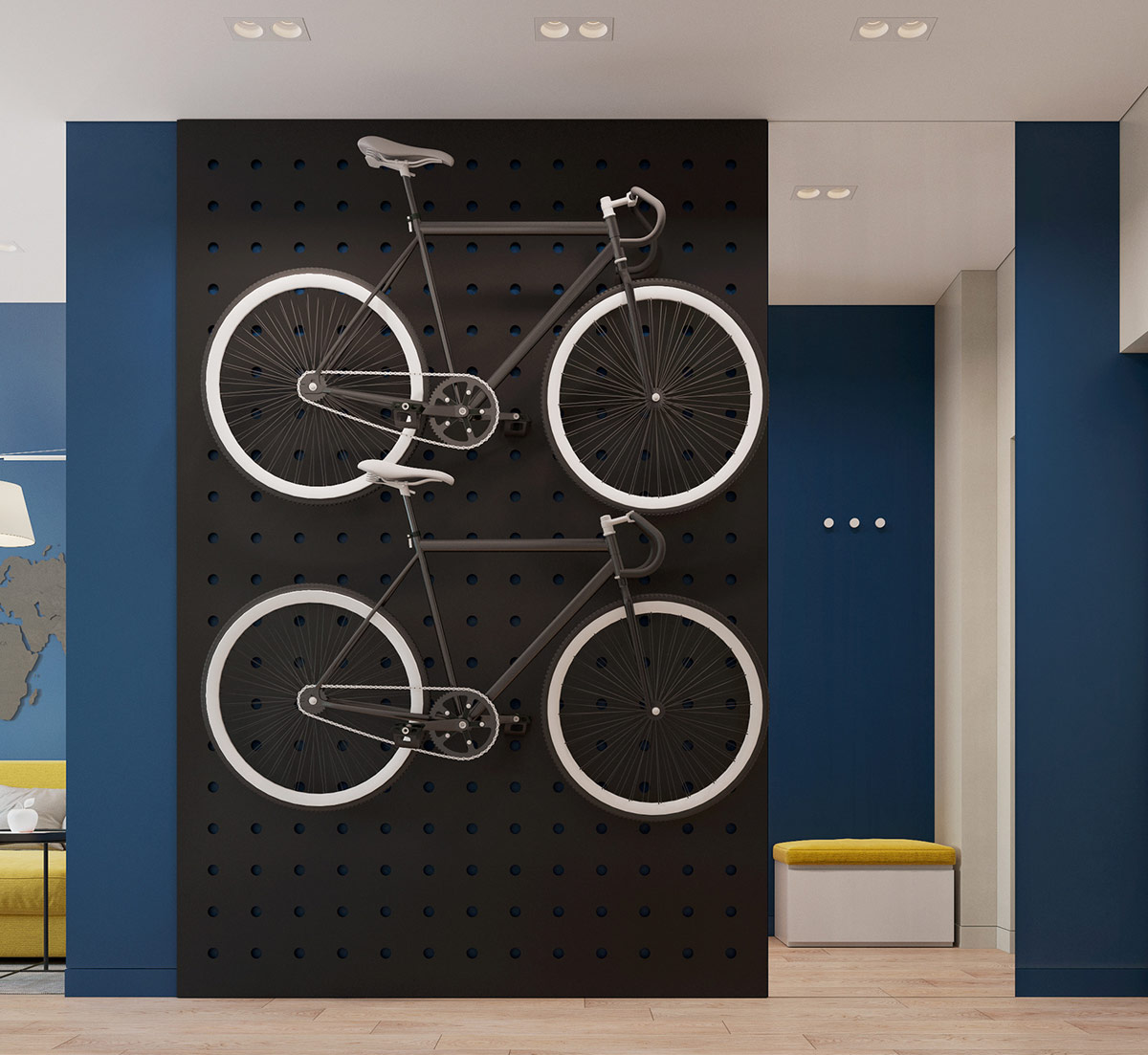
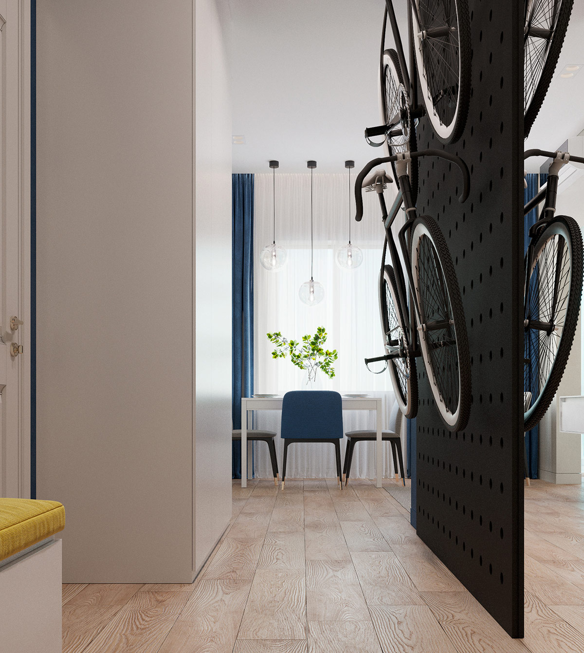
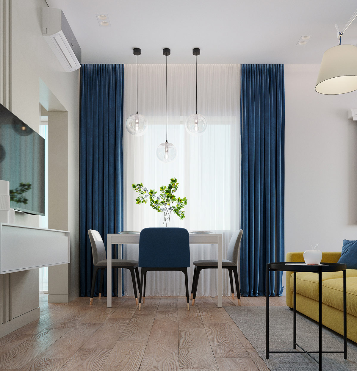
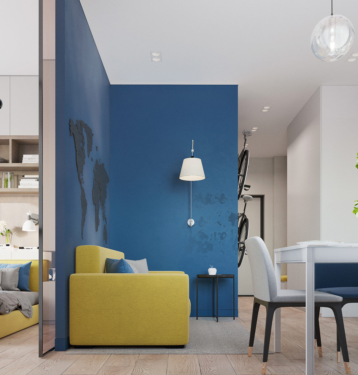
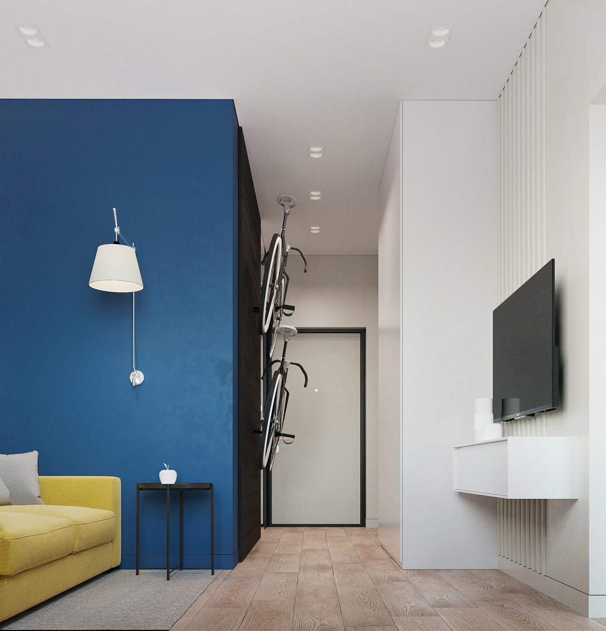
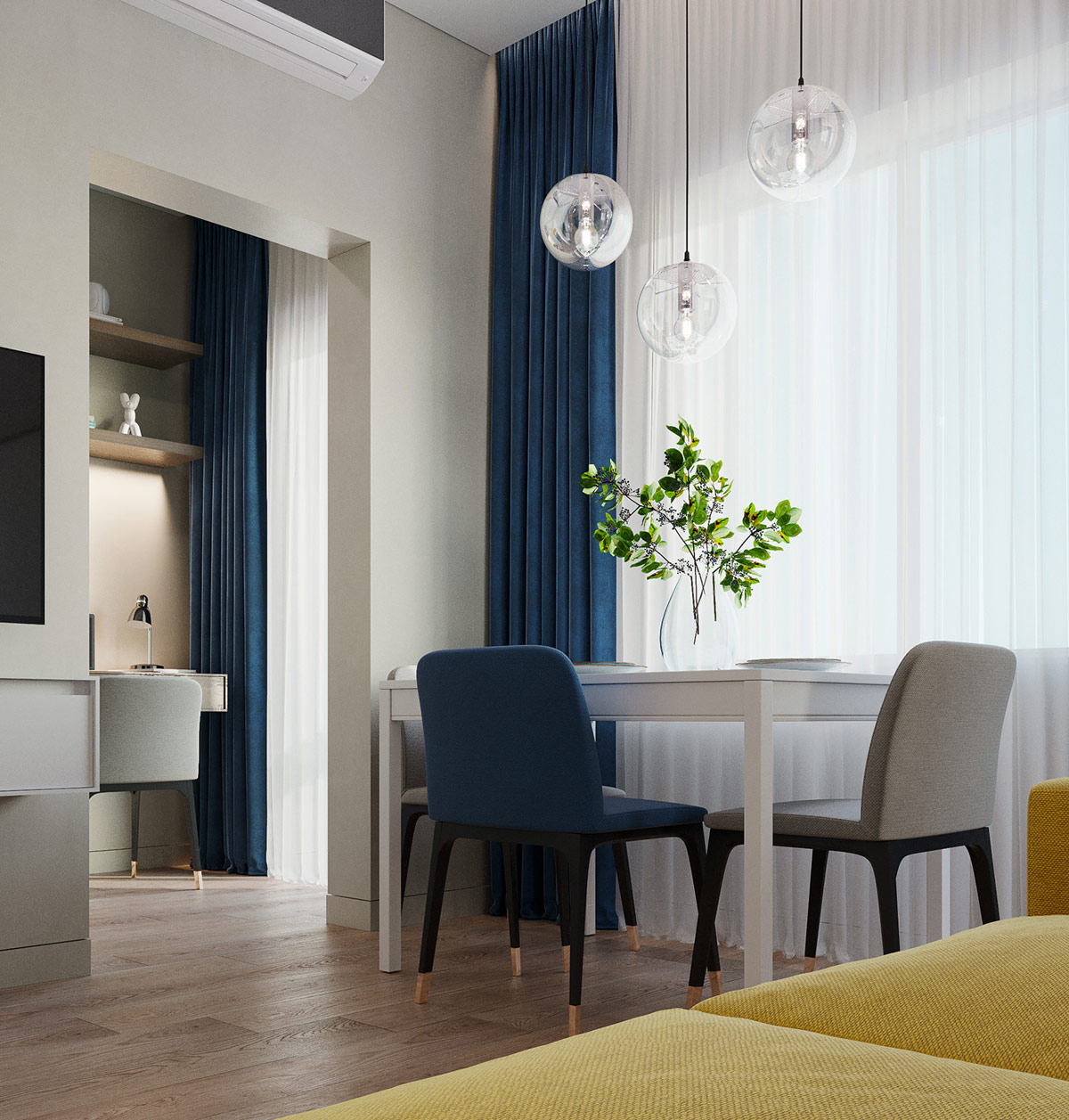
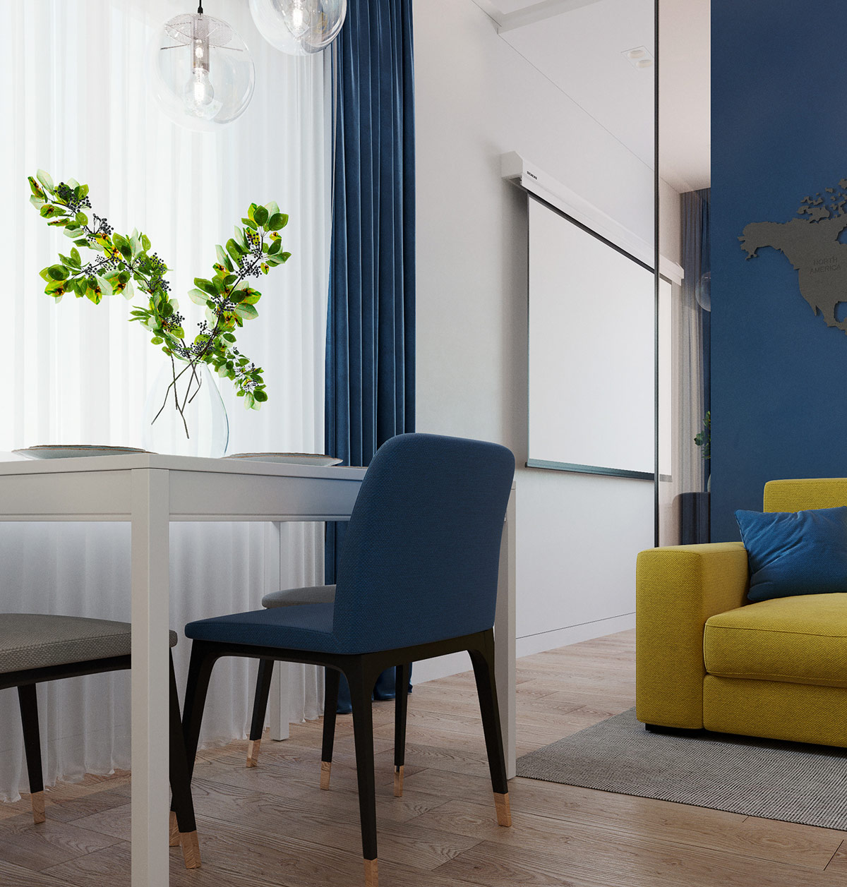
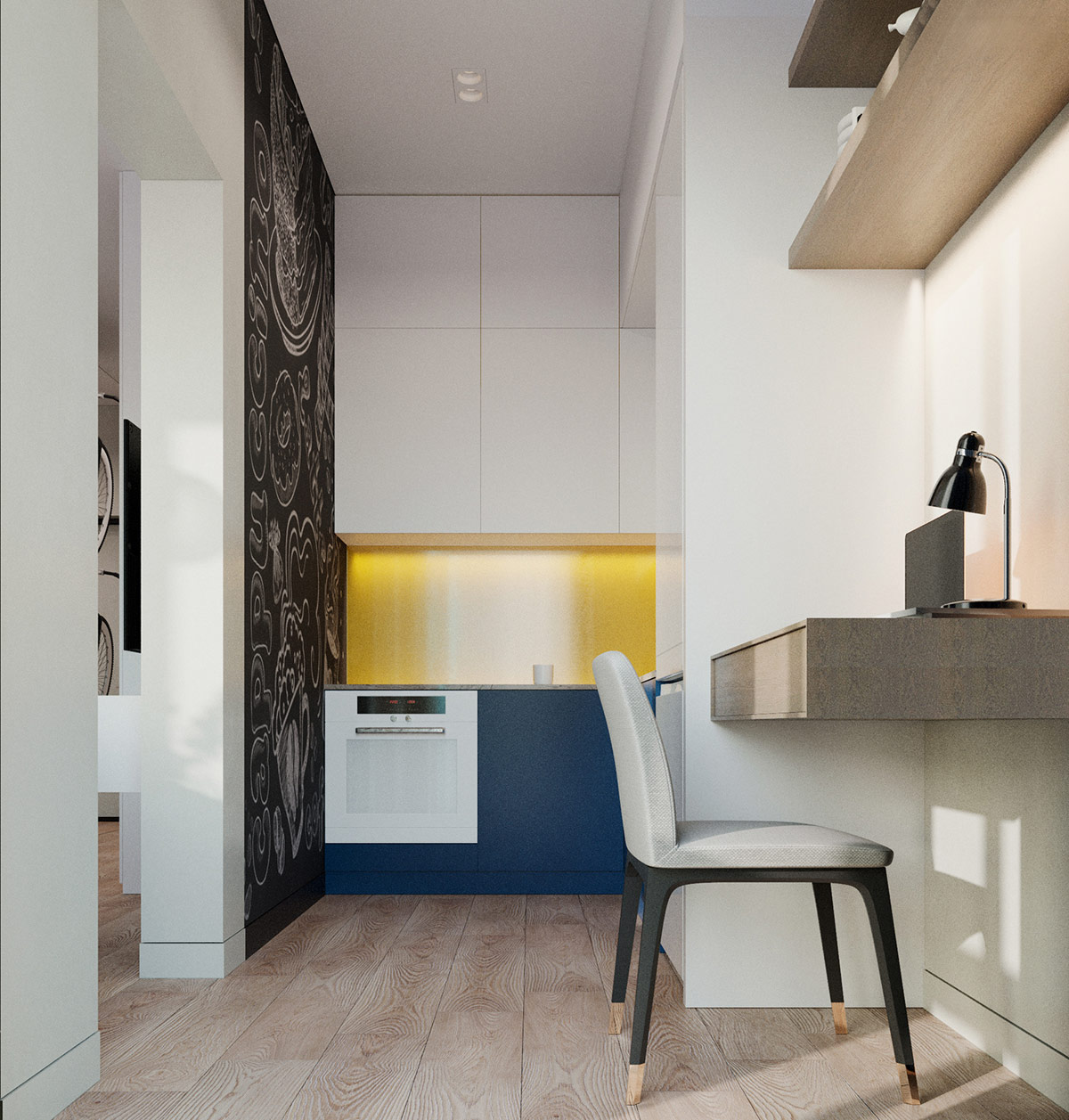
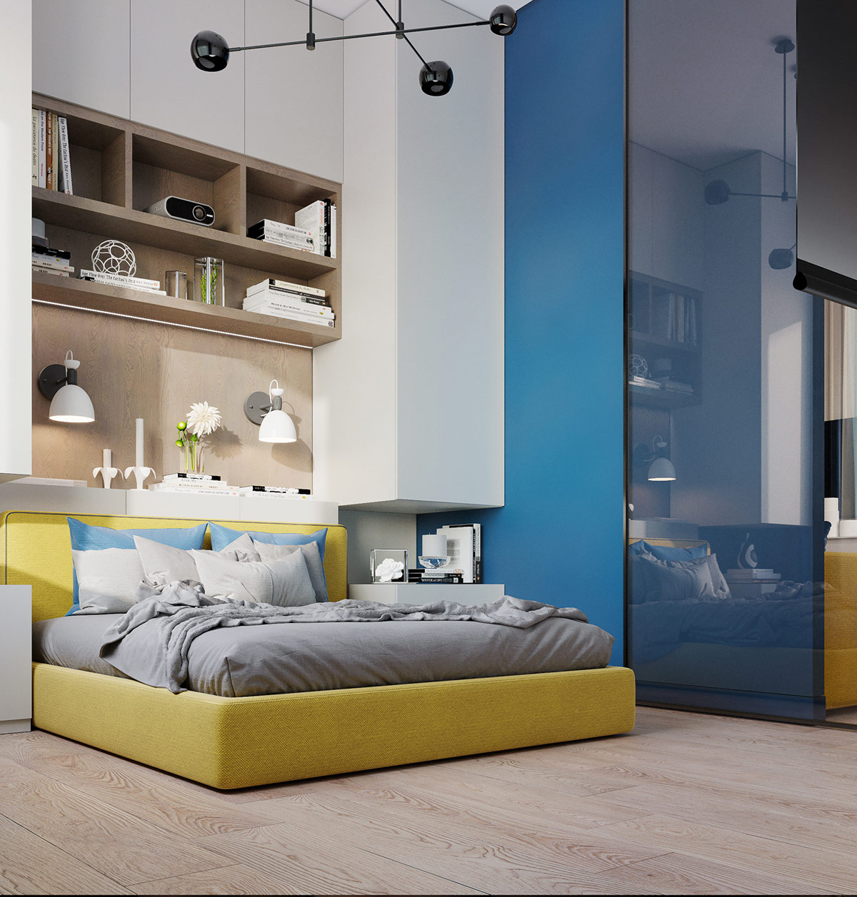
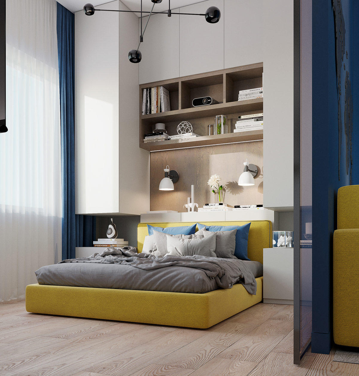
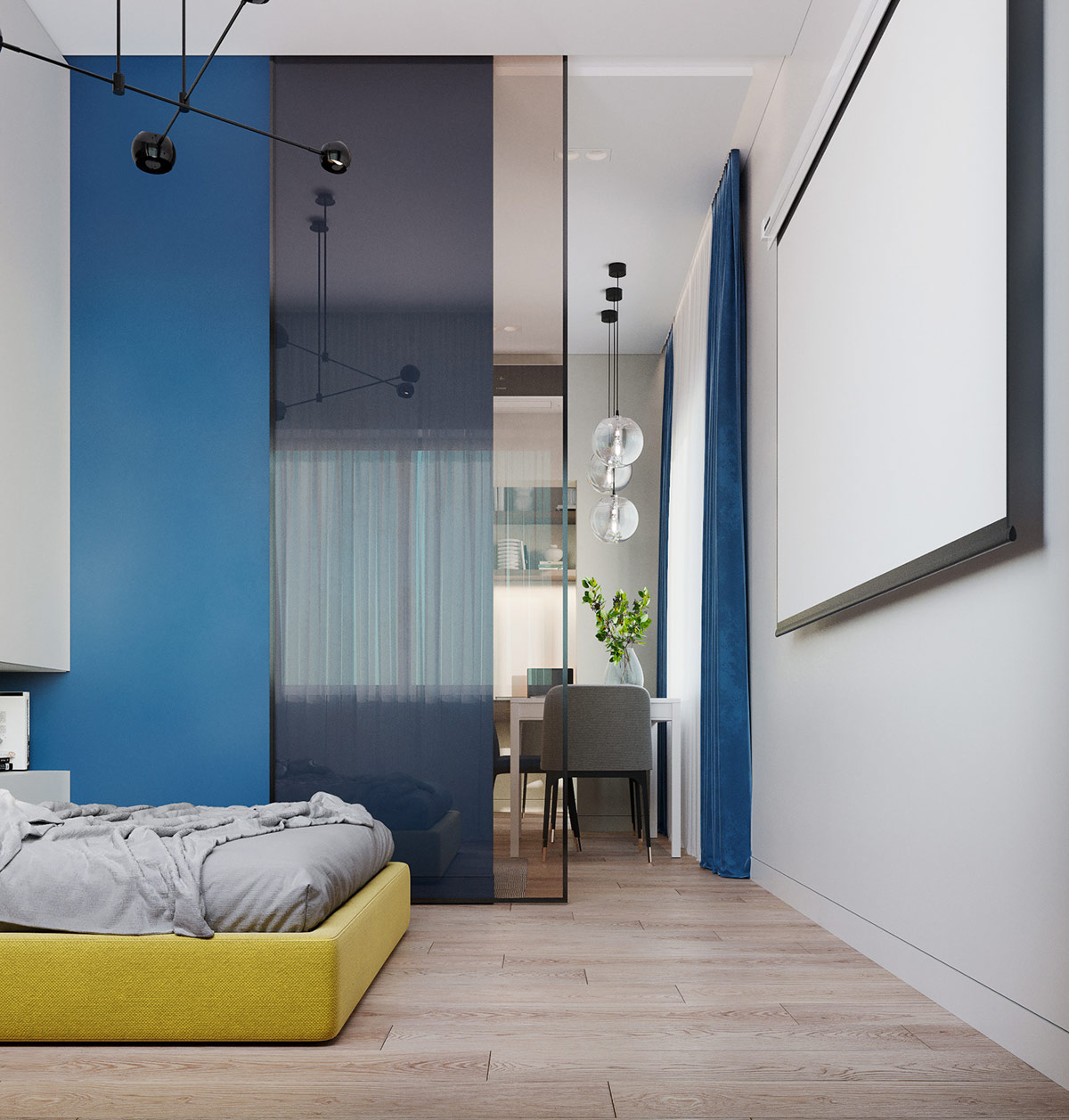
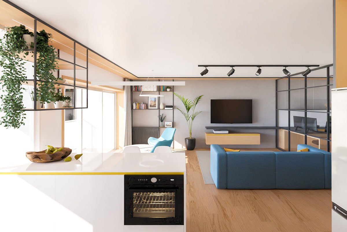
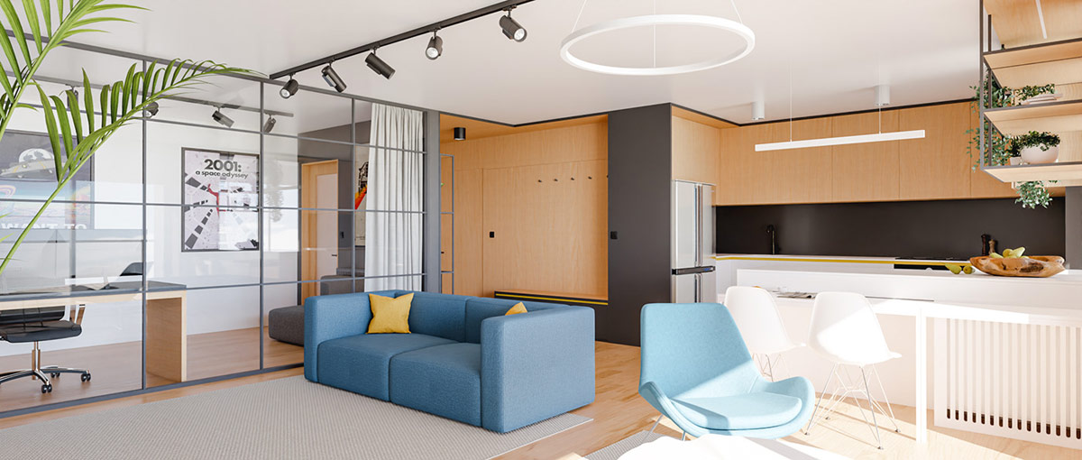
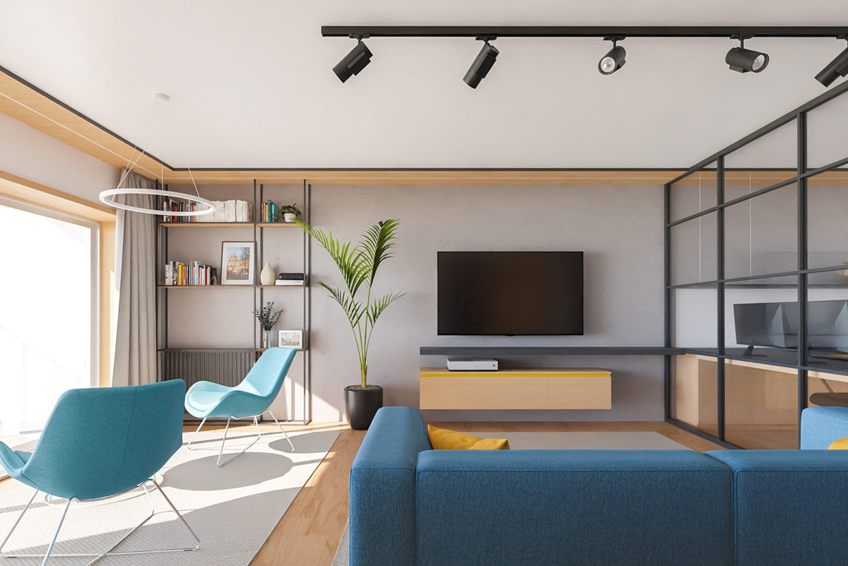
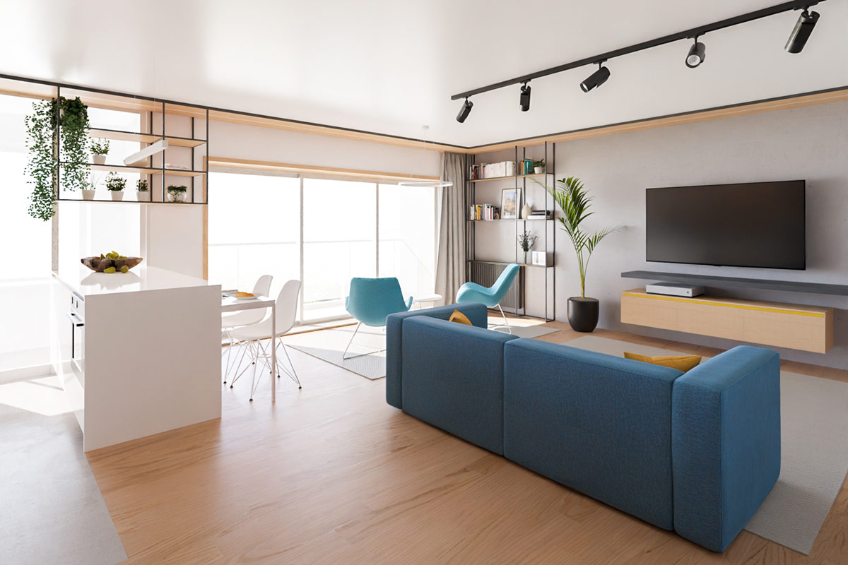
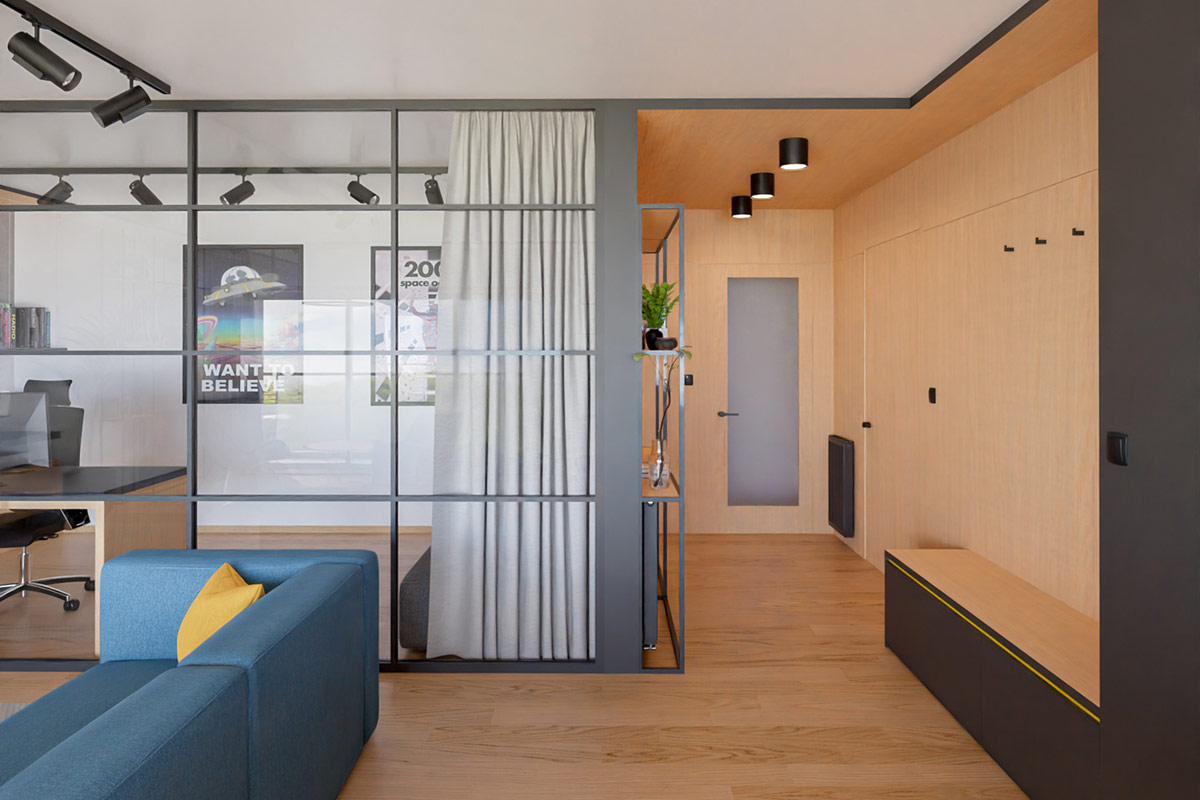
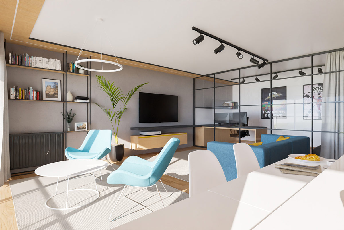
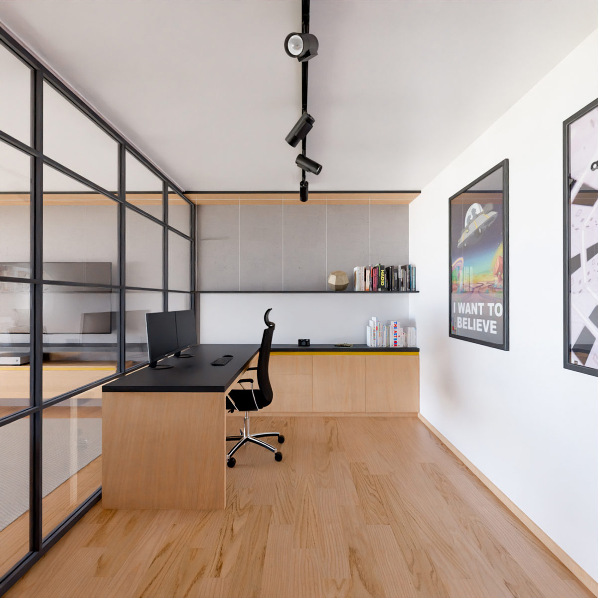
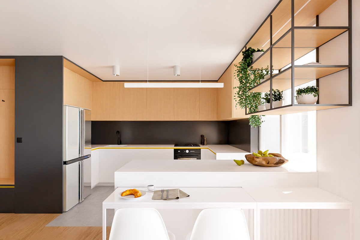
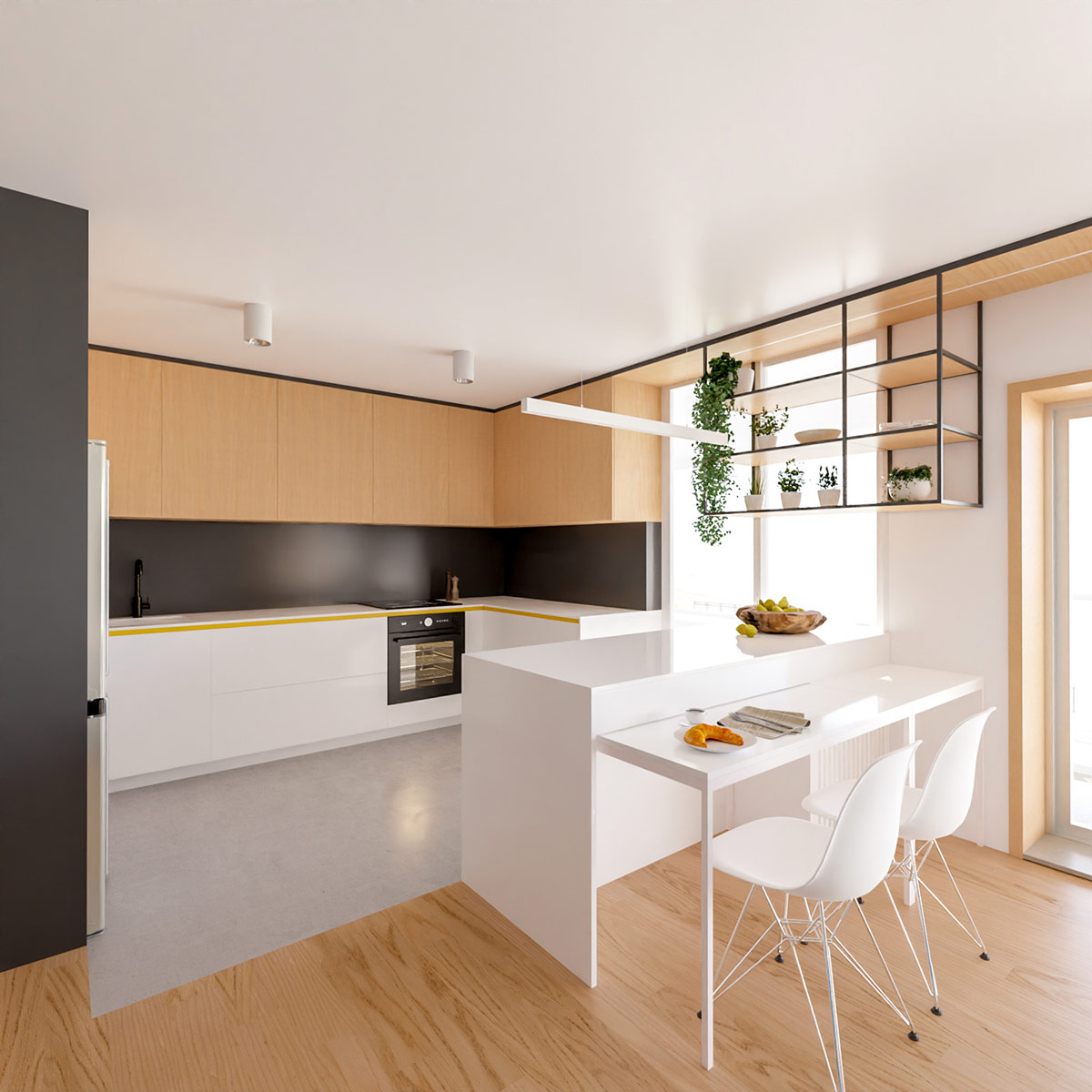
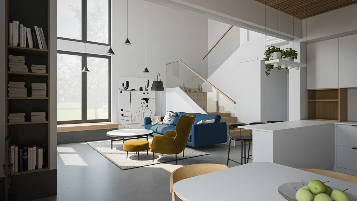
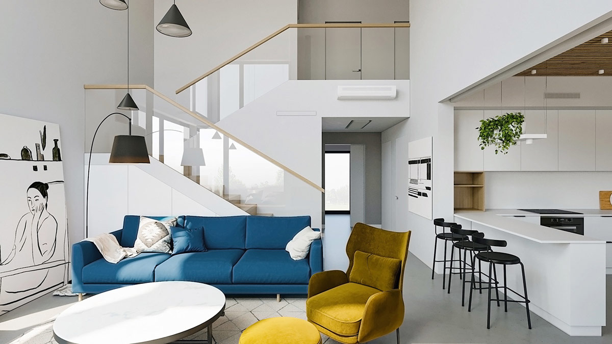
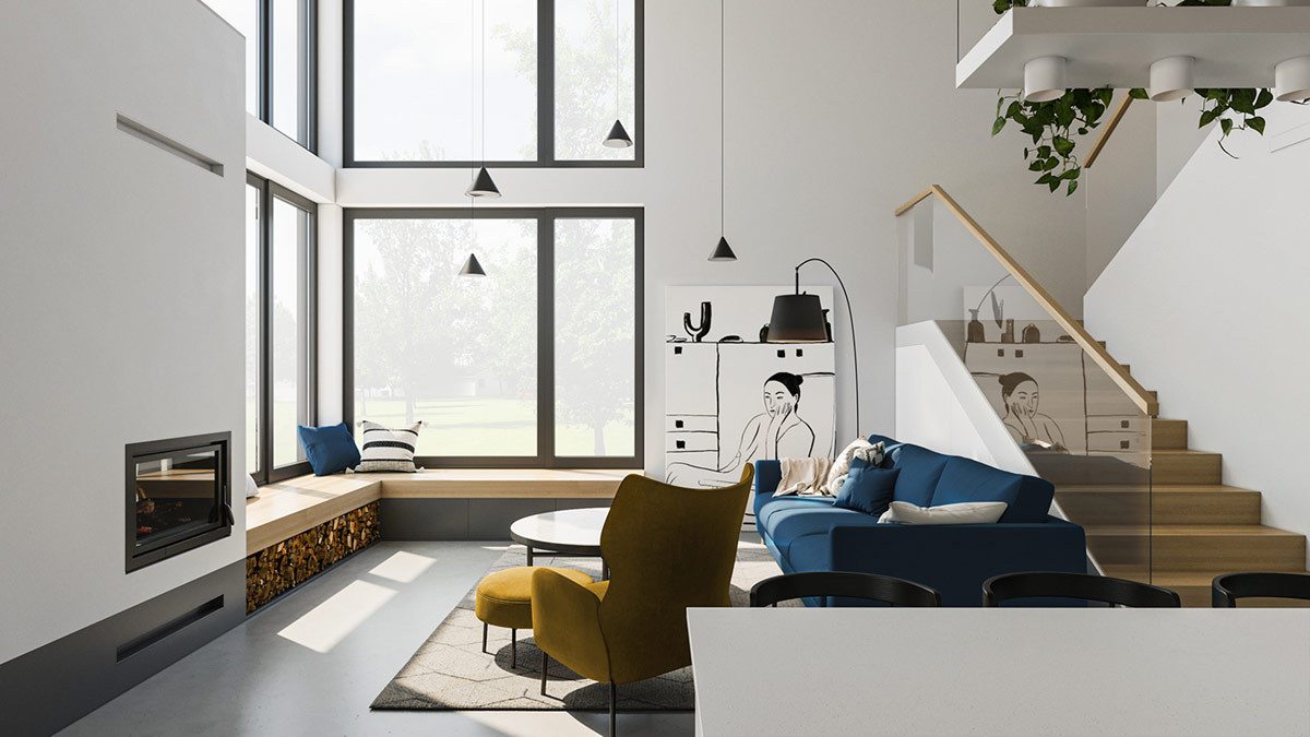
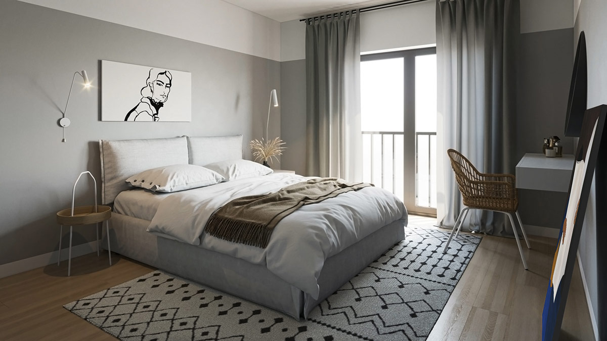
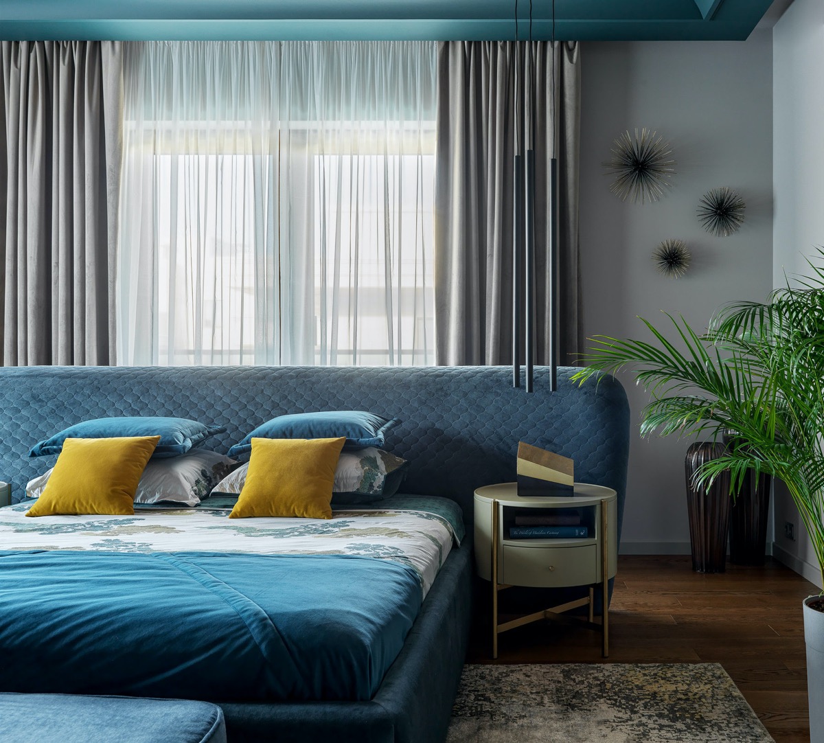
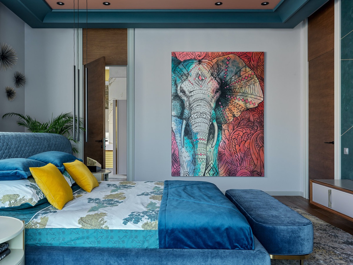
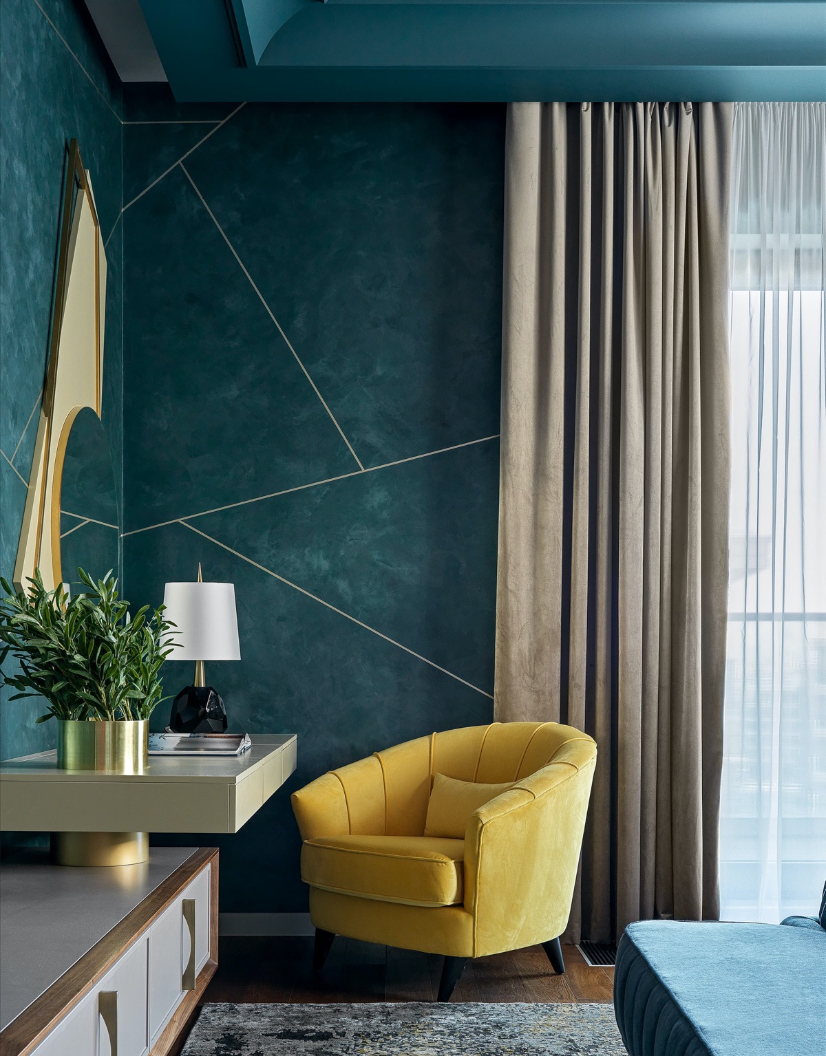
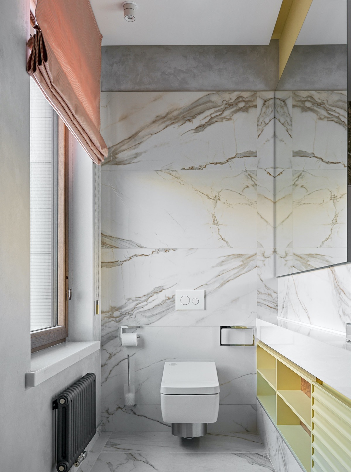
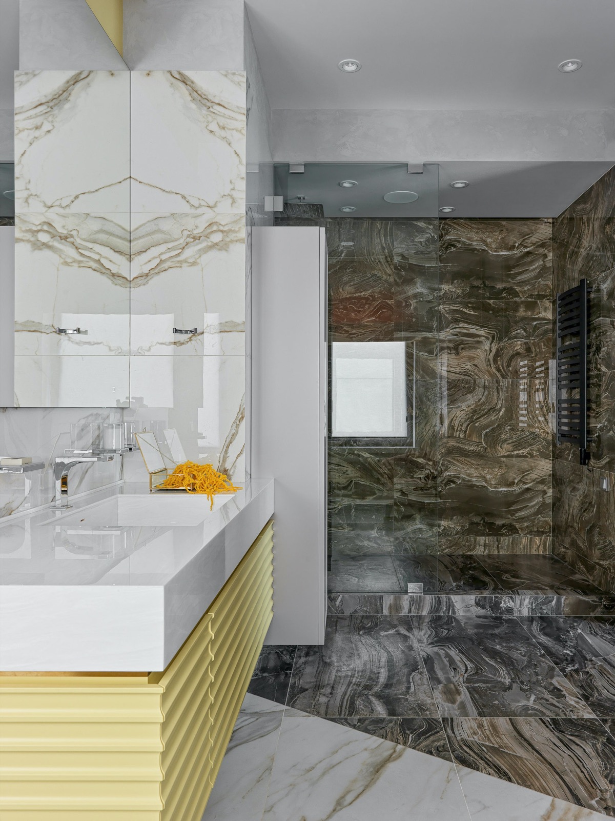
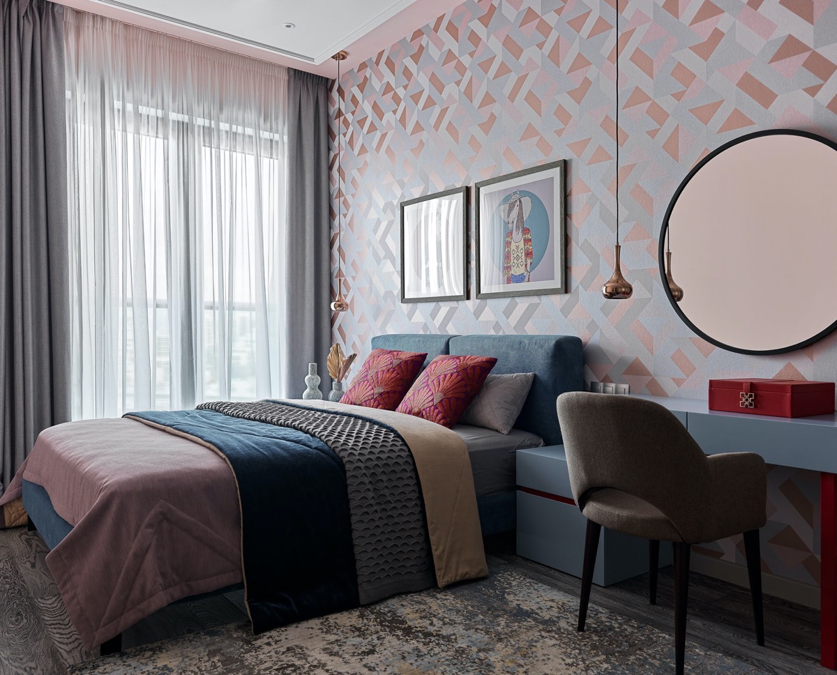
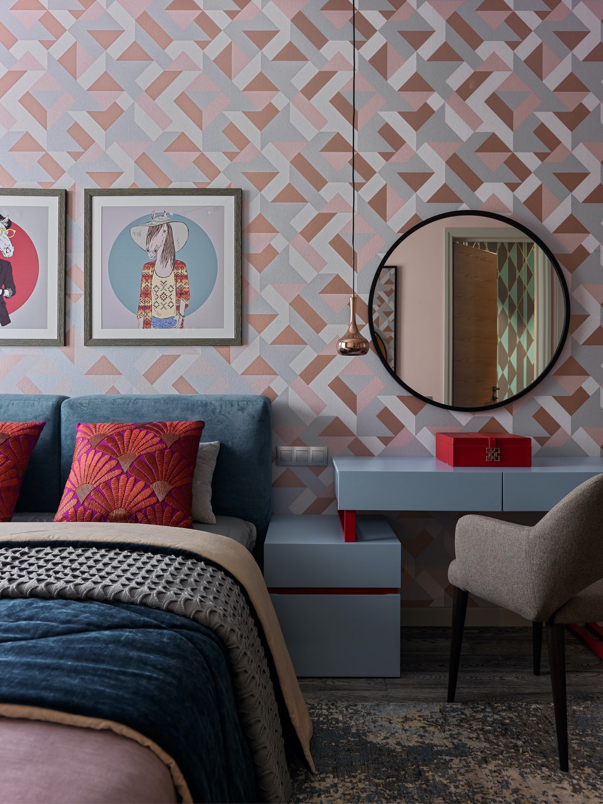
Vigorous combinations of yellow and blue decorations create invigorating spaces. These three inspiring home projects don’t drown in color but balance and build vibrant spaces for an upbeat living. We will study interpretations of this optimistic color scheme through open conceptual interiors, from narrow and compact proportions to a spacious and airy double-height living room with an open modern staircase design. Don’t miss out on ideas for a tiny L-shaped yellow and blue kitchen design, an open plan yellow accent peninsular kitchen, elegant blue and yellow accent bedroom projects and an abundance of tailored furniture to bring out the colorful aesthetics.
Did you like this article?
Share it on some of the following social networking channels to give us your vote. Your feedback helps us improve.
Watch this space for more information on that. Stay tuned to Feeta Blog for the latest updates about Architrcture, Lifestyle and Interior Design.
Lively Yellow and Blue Accent Decor
- Published in #interior design, blue, Decoration, Design, Designs by Style, Home Interiors, yellow
Upscaling Homes With Subtle Modern Glam Decor
Do you like Architecture and Interior Design? Follow us …
Thank you. You have been subscribed.
![]()
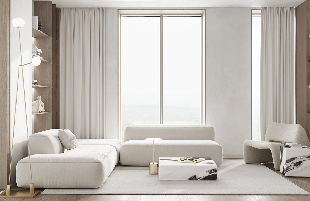
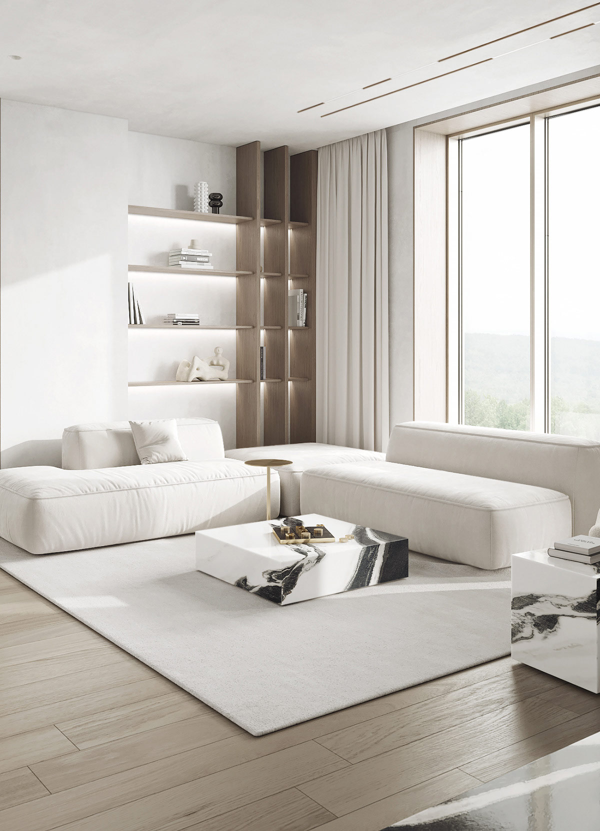
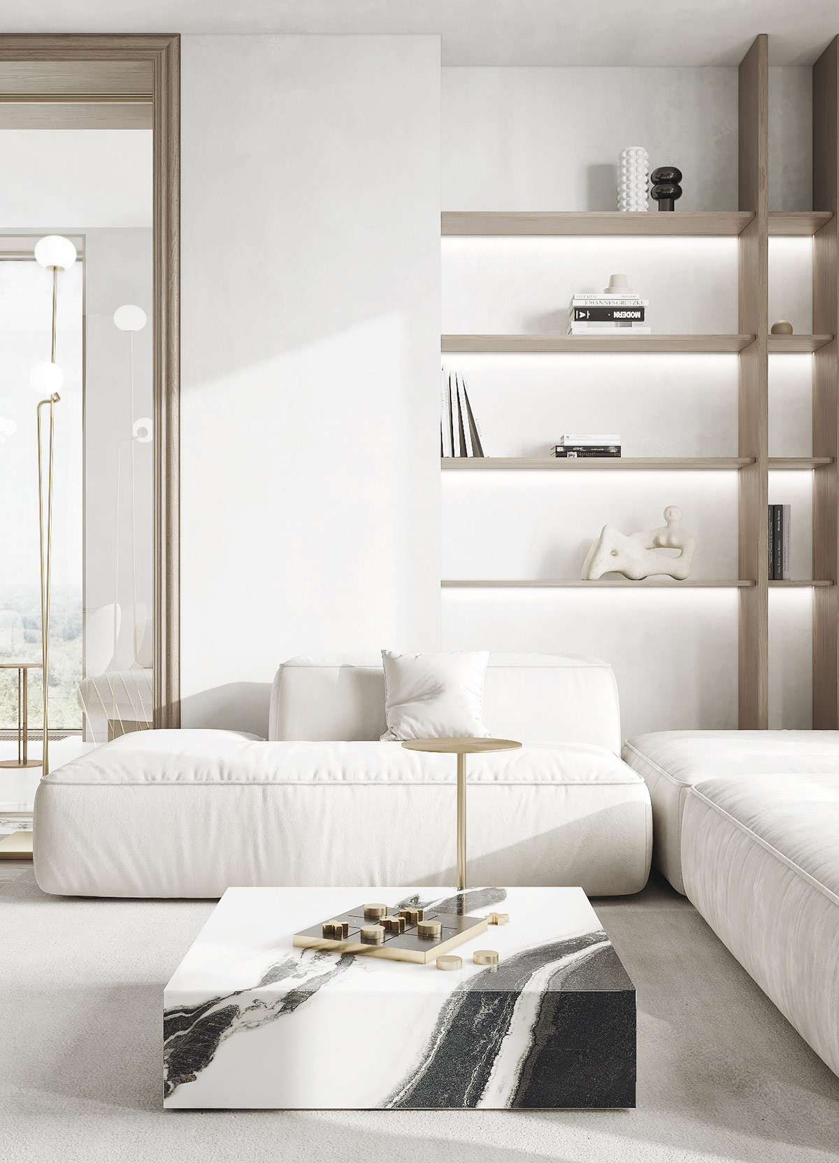
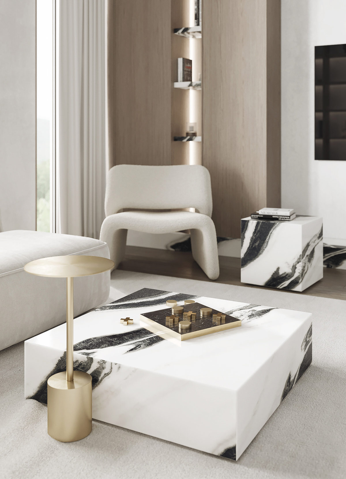
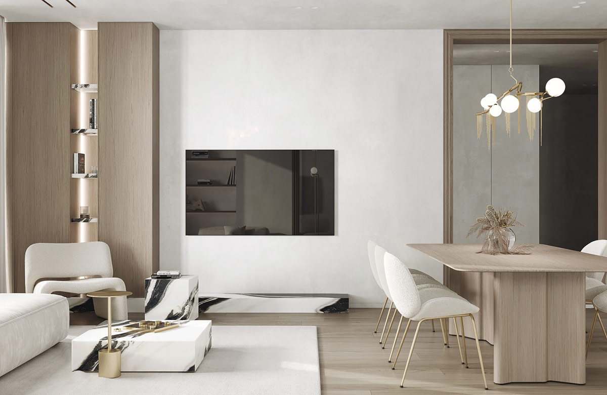
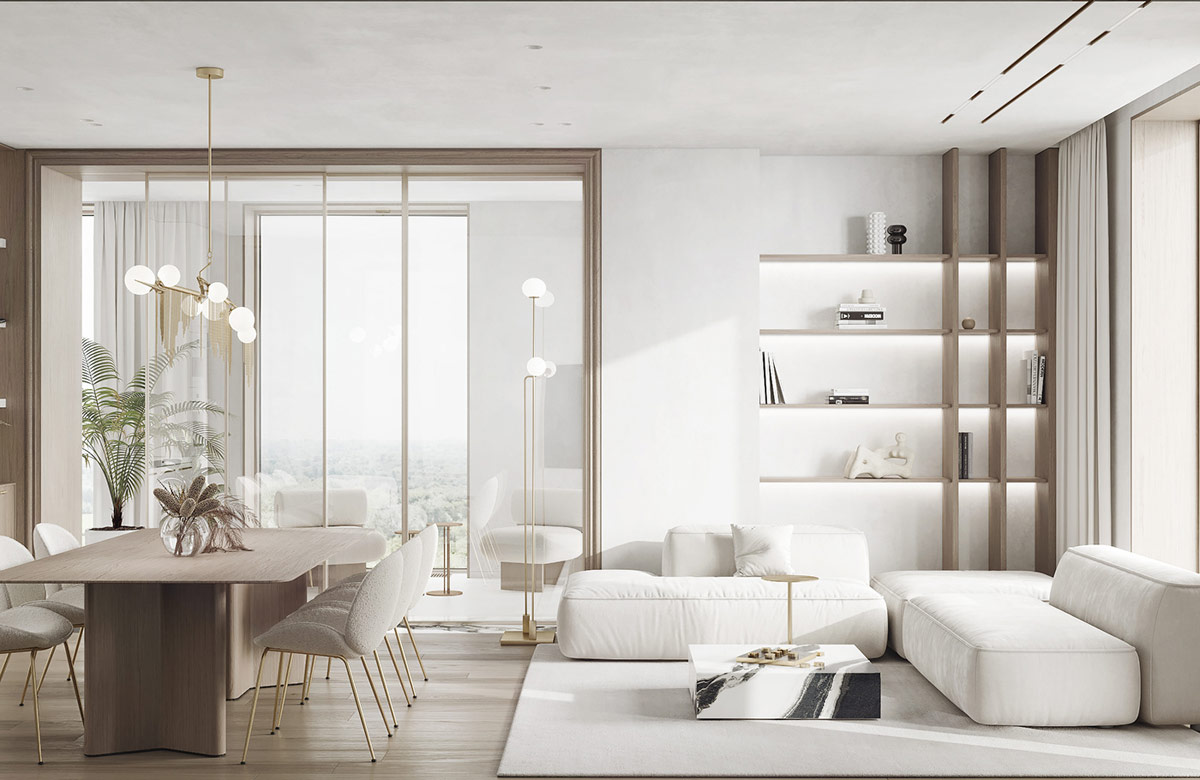
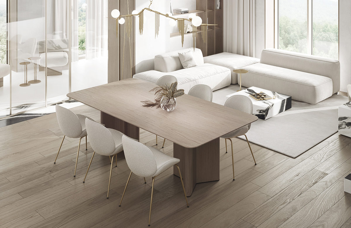
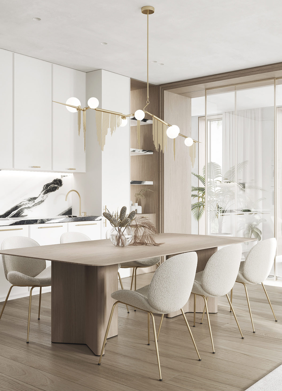
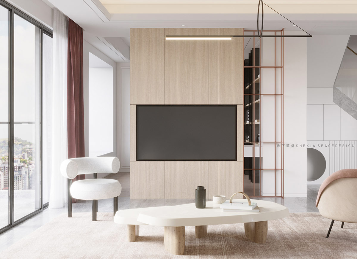
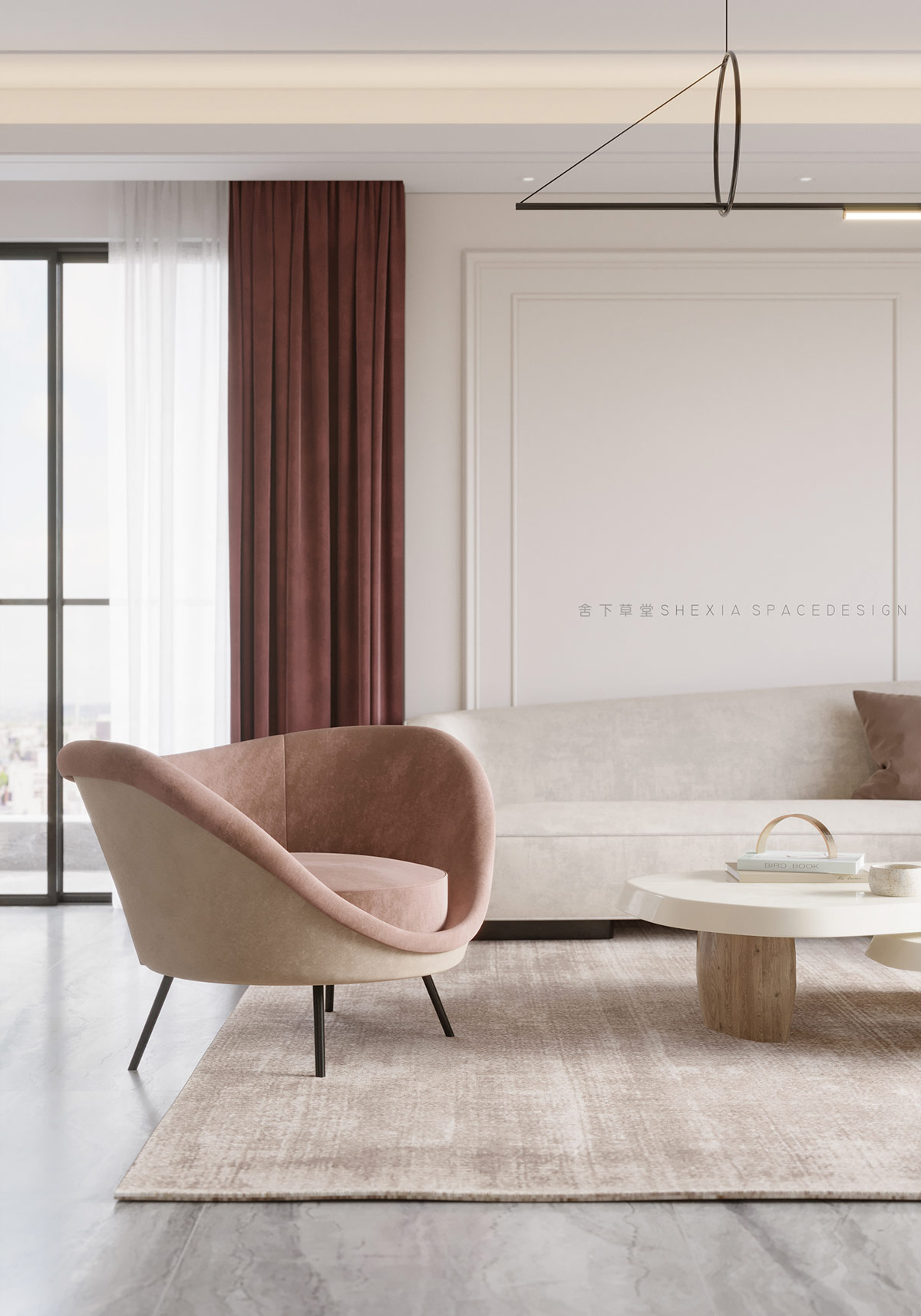
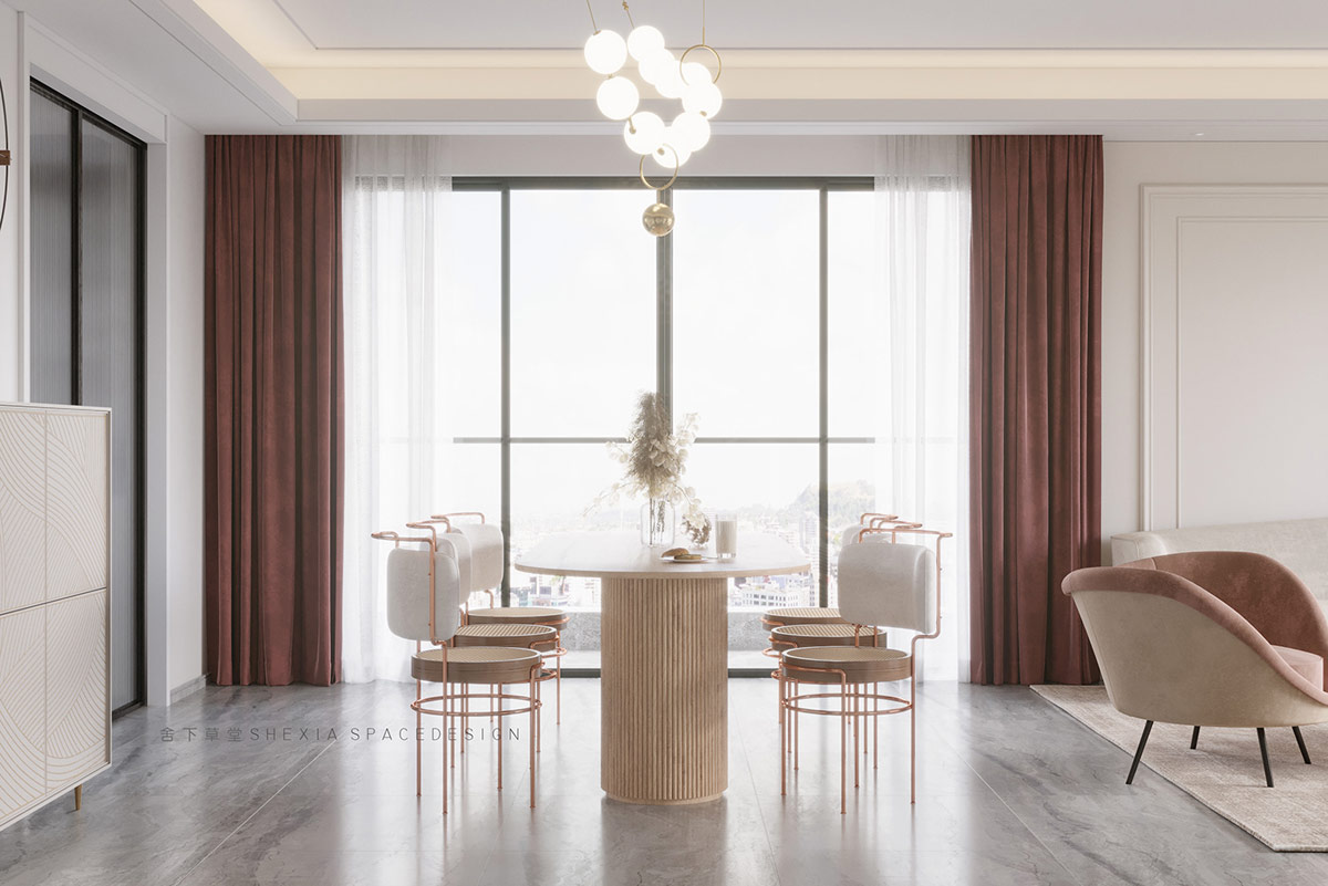
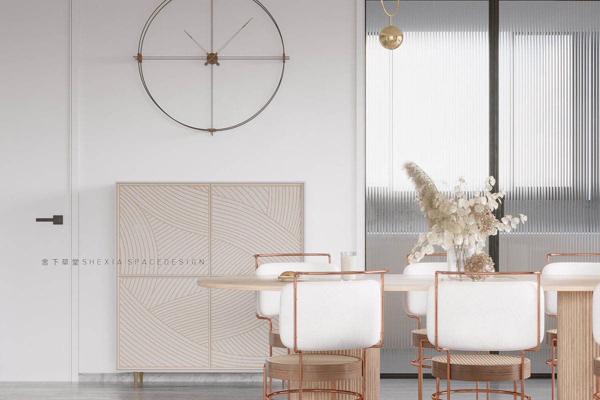
Modern glamorous decoration puts charisma into contemporary interiors. Bright metallic accents and luxurious marble elements look luxurious, while neutral white and wood-toned backgrounds remain calm and serene. The four refreshing home projects we look at today address the modern chic decor aesthetic with a subtle approach, leaving room to breathe around key pieces. Attractive furniture choices favor the elegant over the highly decorated ones, and high-end light choices are good without whispering. This is a key aspect for competent homeowners who appreciate all the better things in life, without a desire to be pretentious, eye-catching or loud.
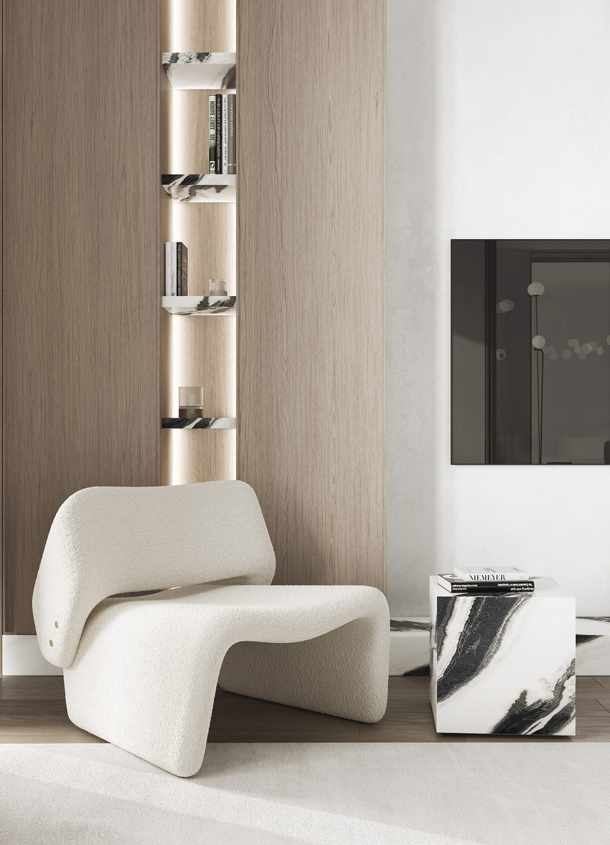
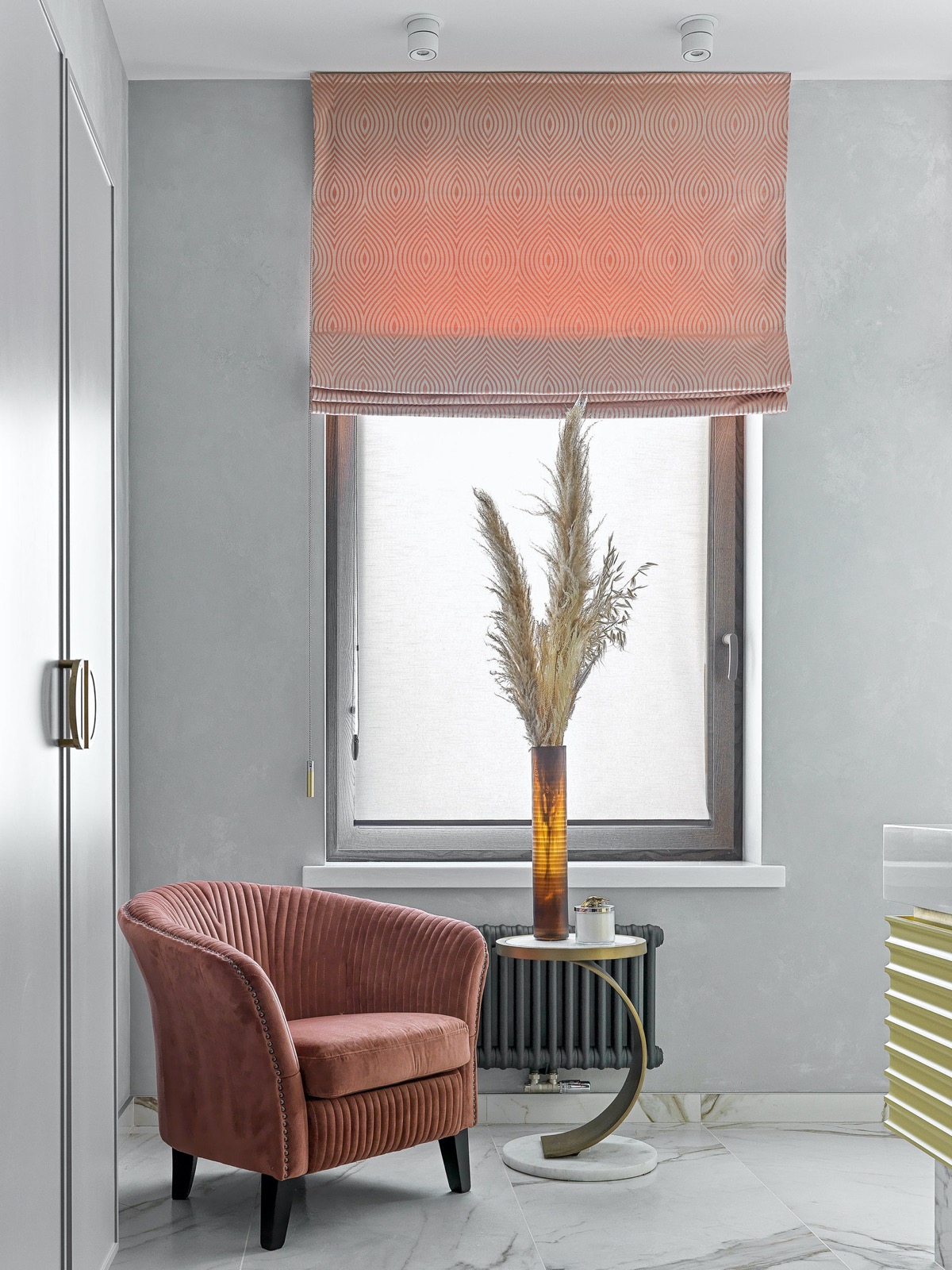
The marble side table is paired with a projected saddle chair, to make an elegant reading area next to another bespoke bookcase design. On this side of the room, the bookshelves are cut from solid white marble and placed within the boundaries of a smooth, soothing tone of the wood. Recessed lighting gently highlights the narrow tower.
Did you like this article?
Share it on some of the following social networking channels below to give us your vote. Your feedback helps us improve.
Stay tuned to Feeta Blog to learn more about architecture, Lifestyle and Interior Design.
Upscaling Homes With Subtle Modern Glam Decor
Portraying Personality In Interiors Under 40 Sqm (Includes Floor Plans)
Do you like Architecture and Interior Design? Follow us …
Thank you. You have been subscribed.
![]()
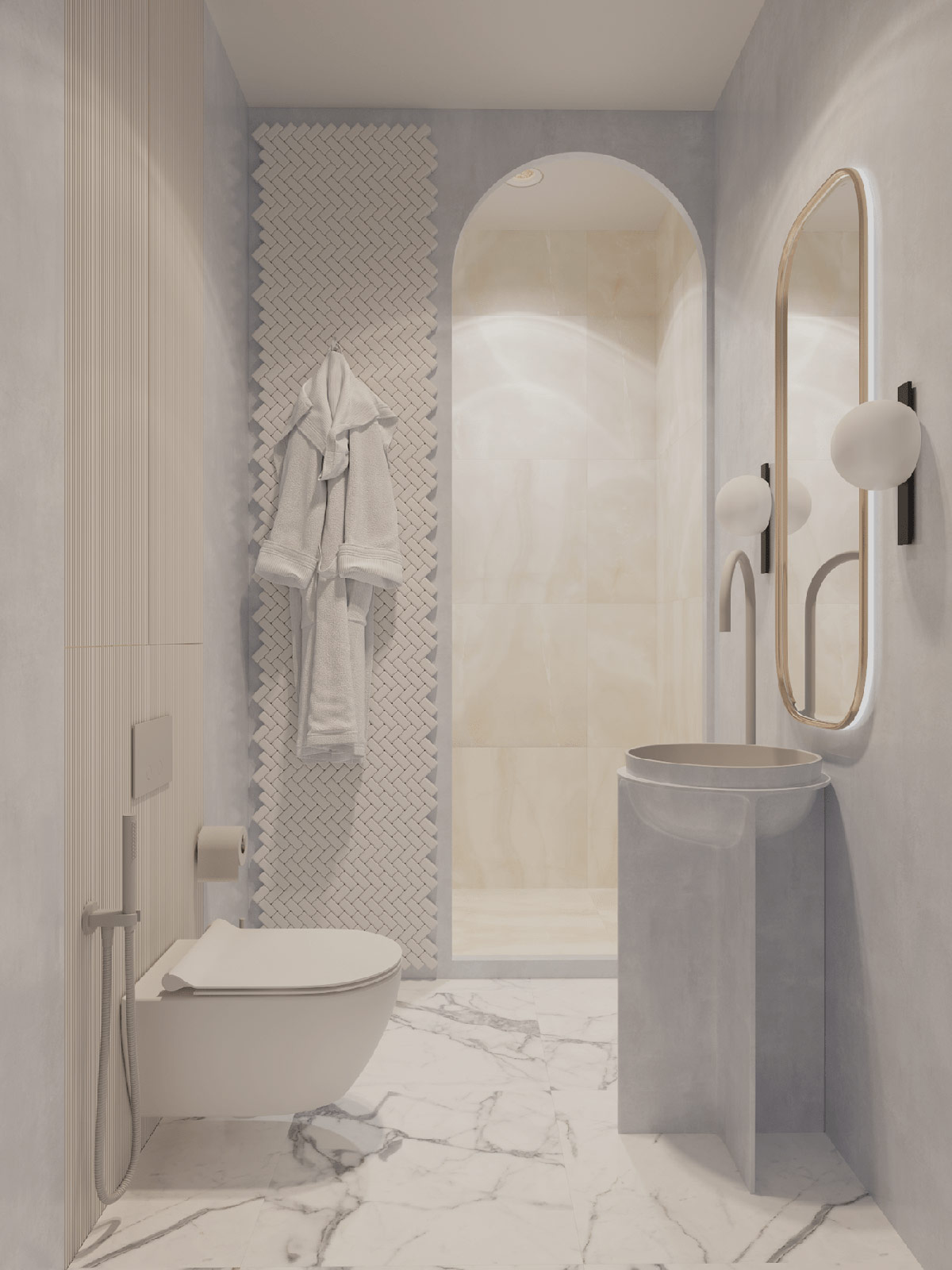
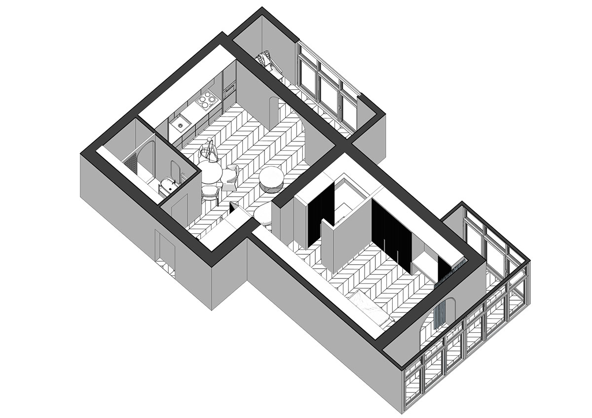
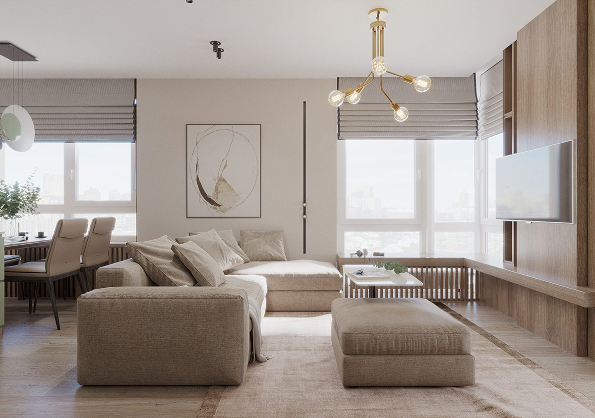
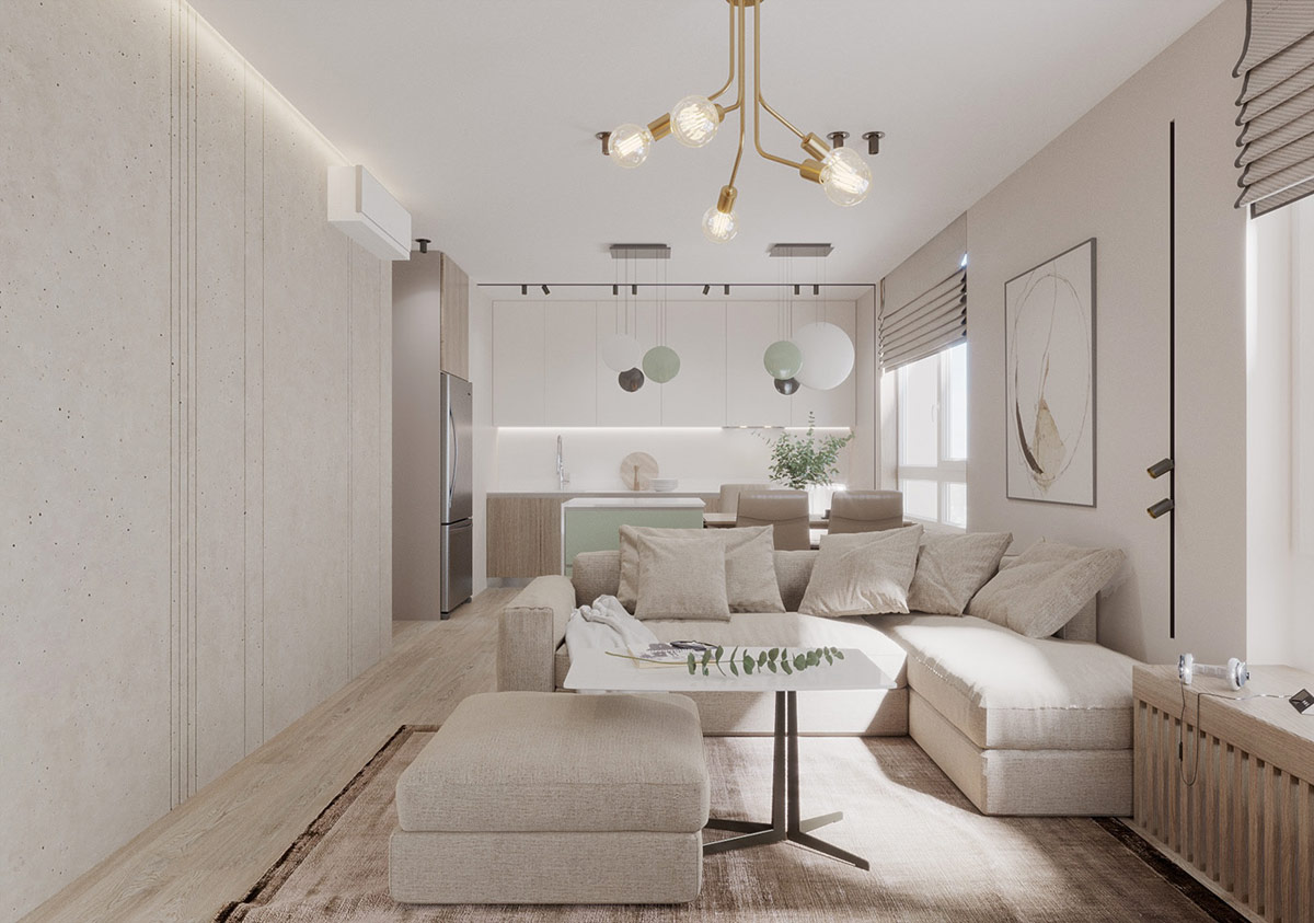
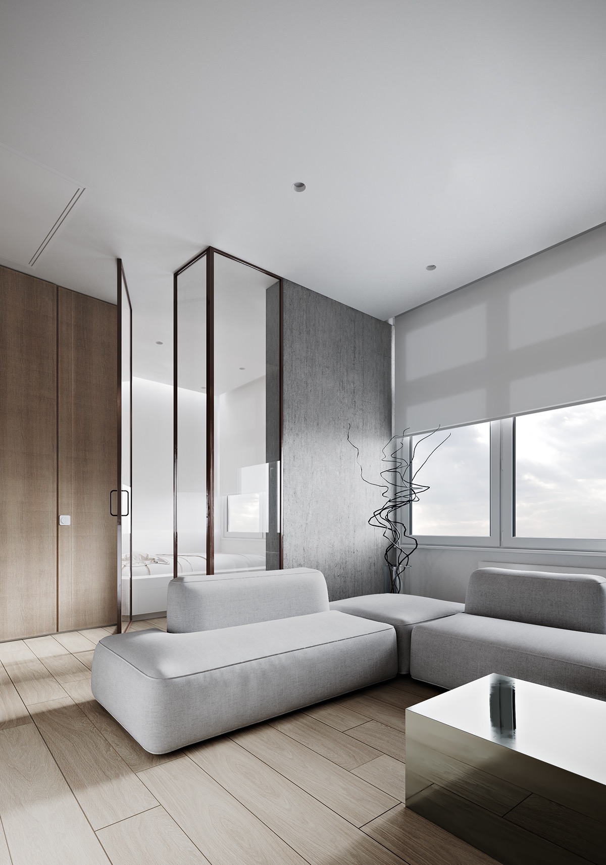
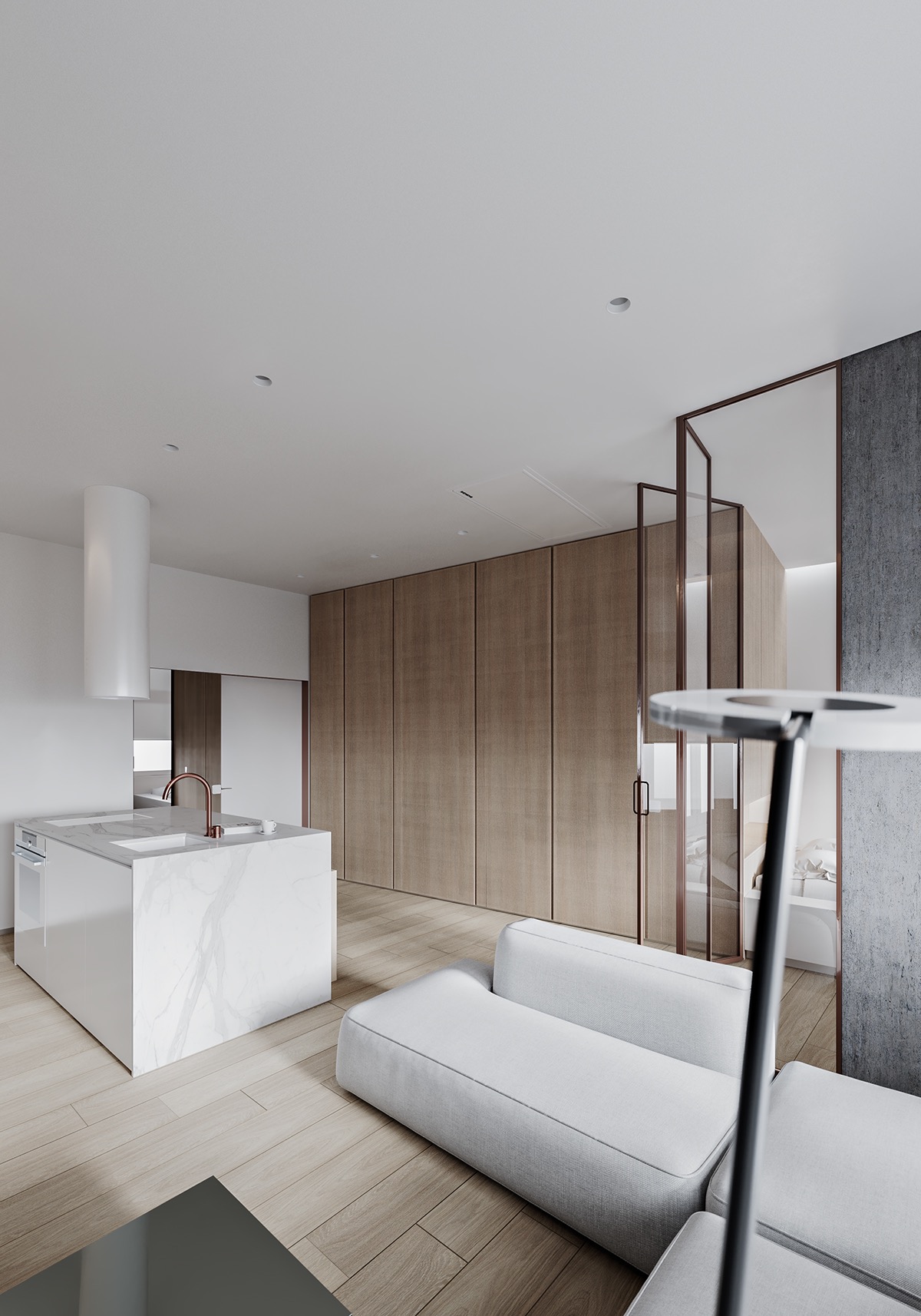
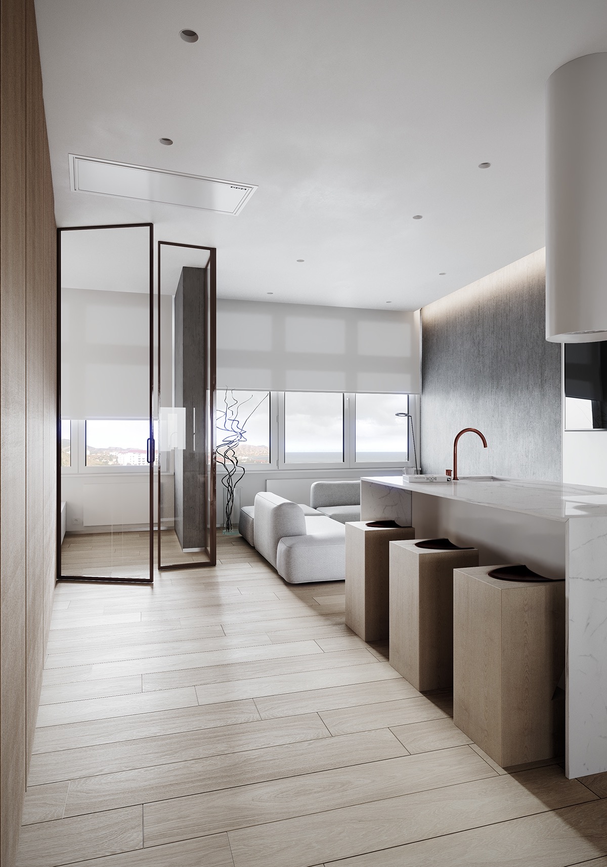
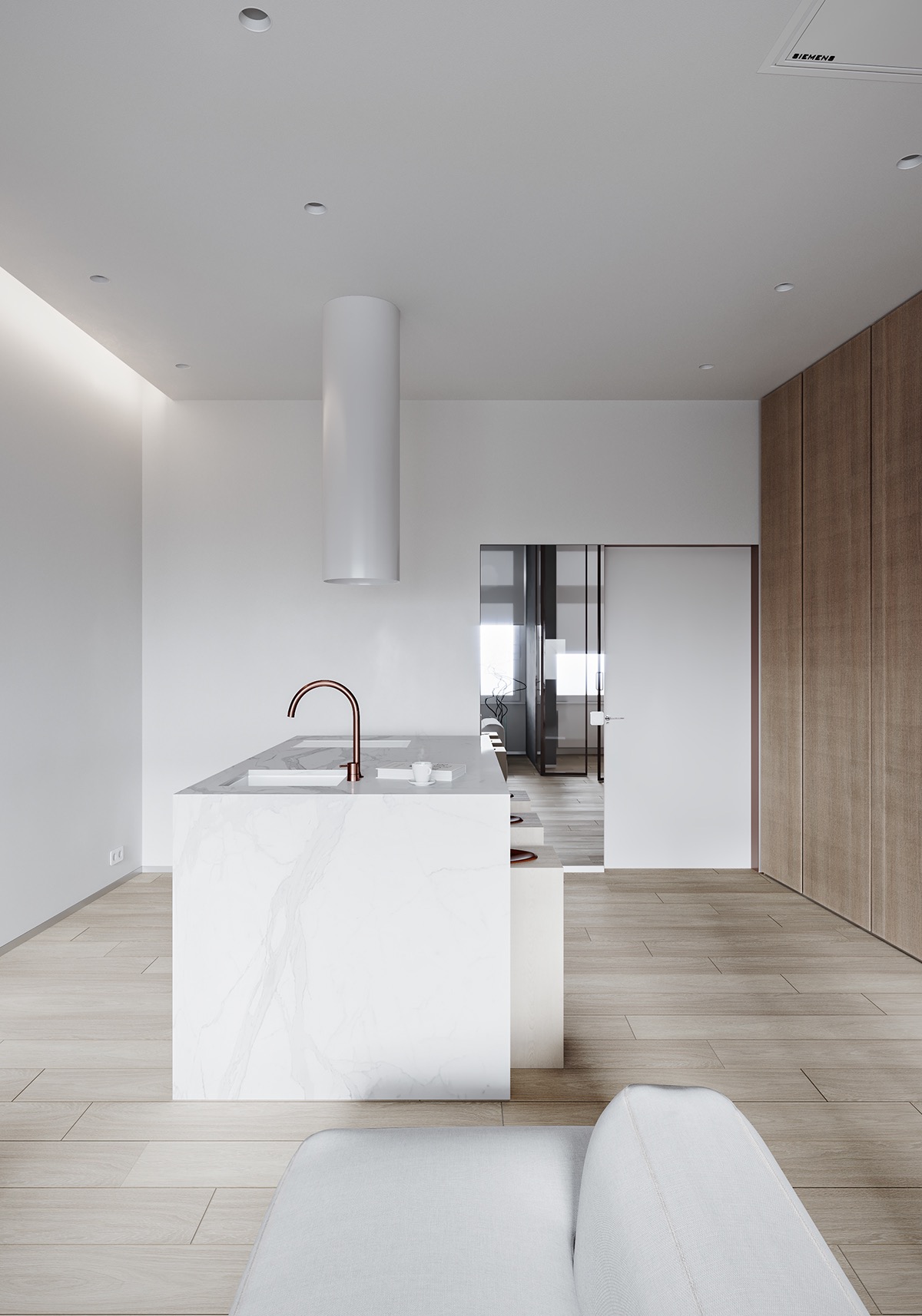
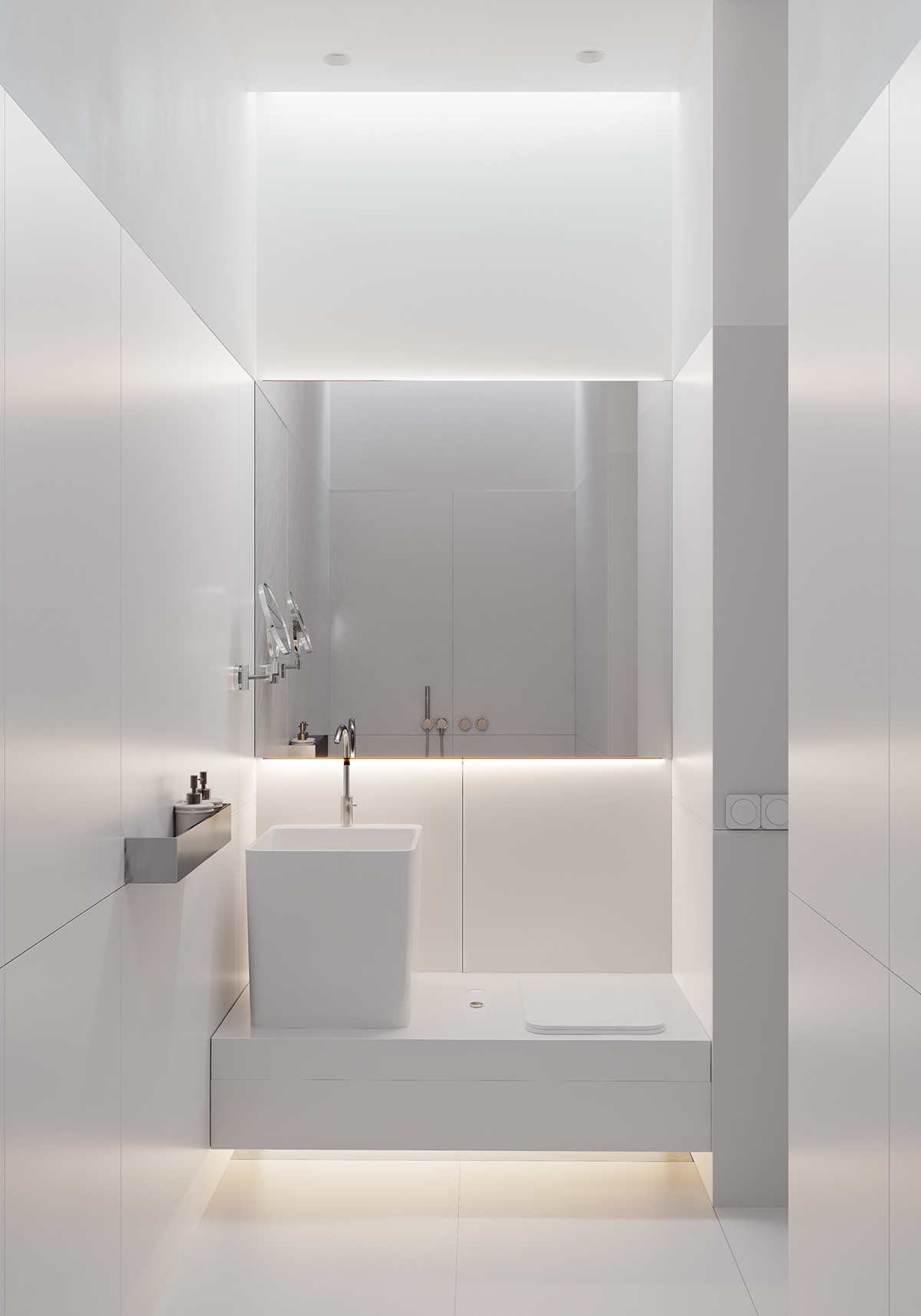
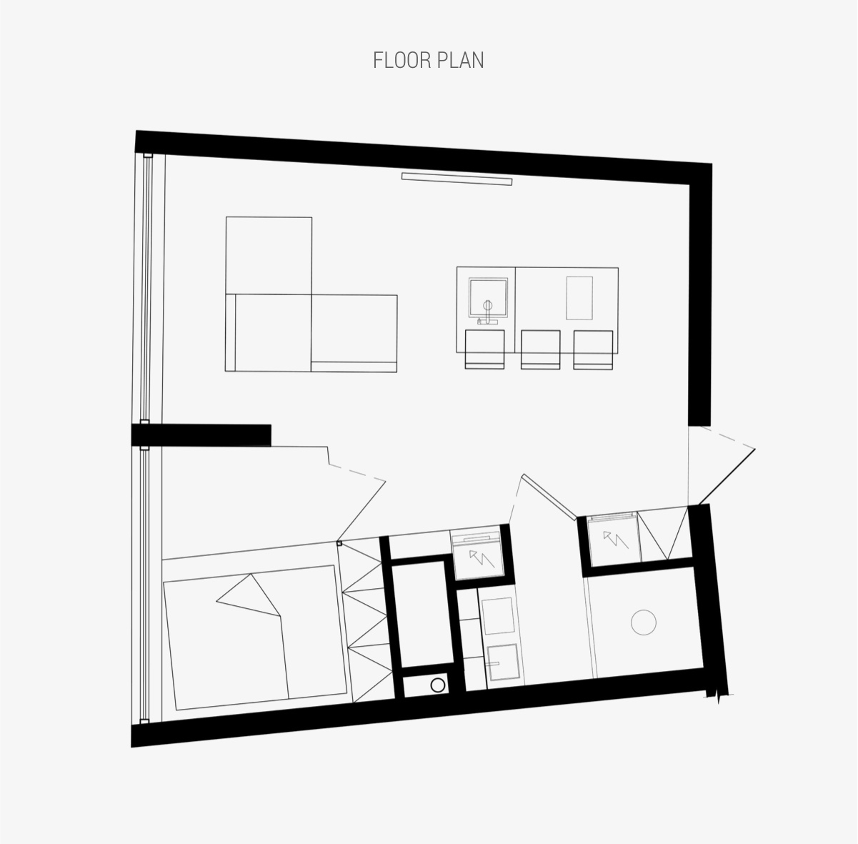
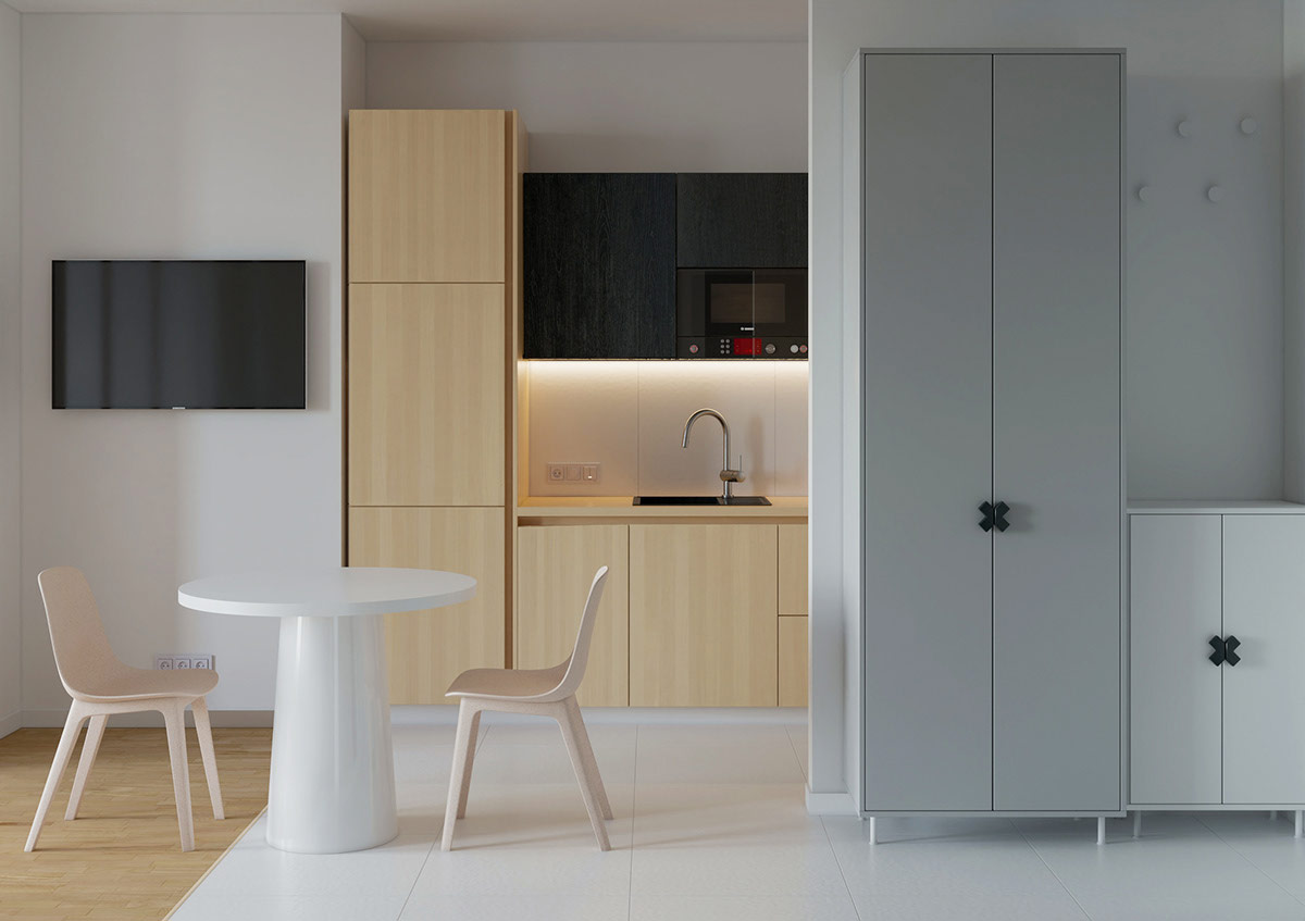
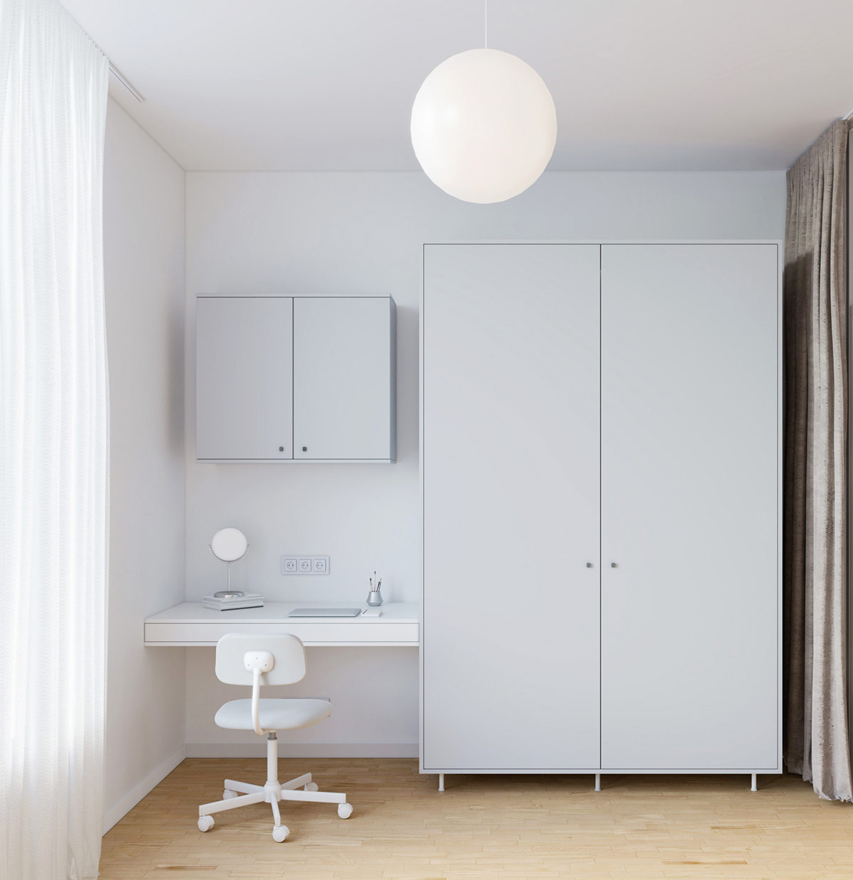
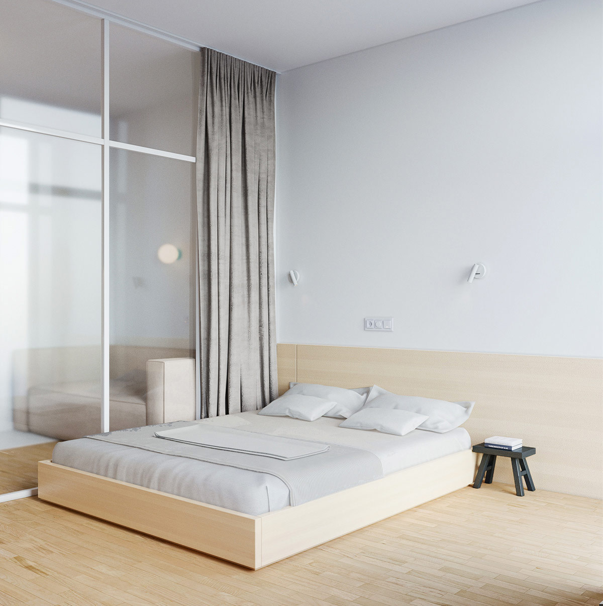
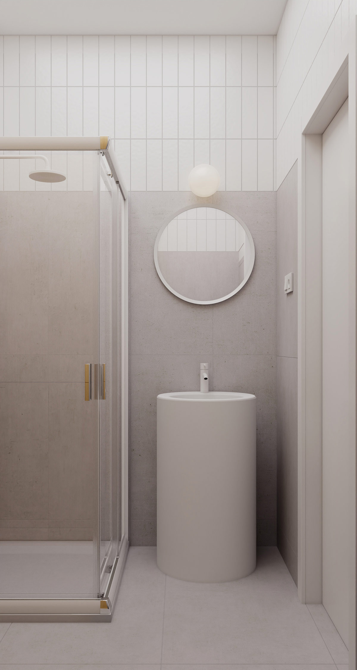
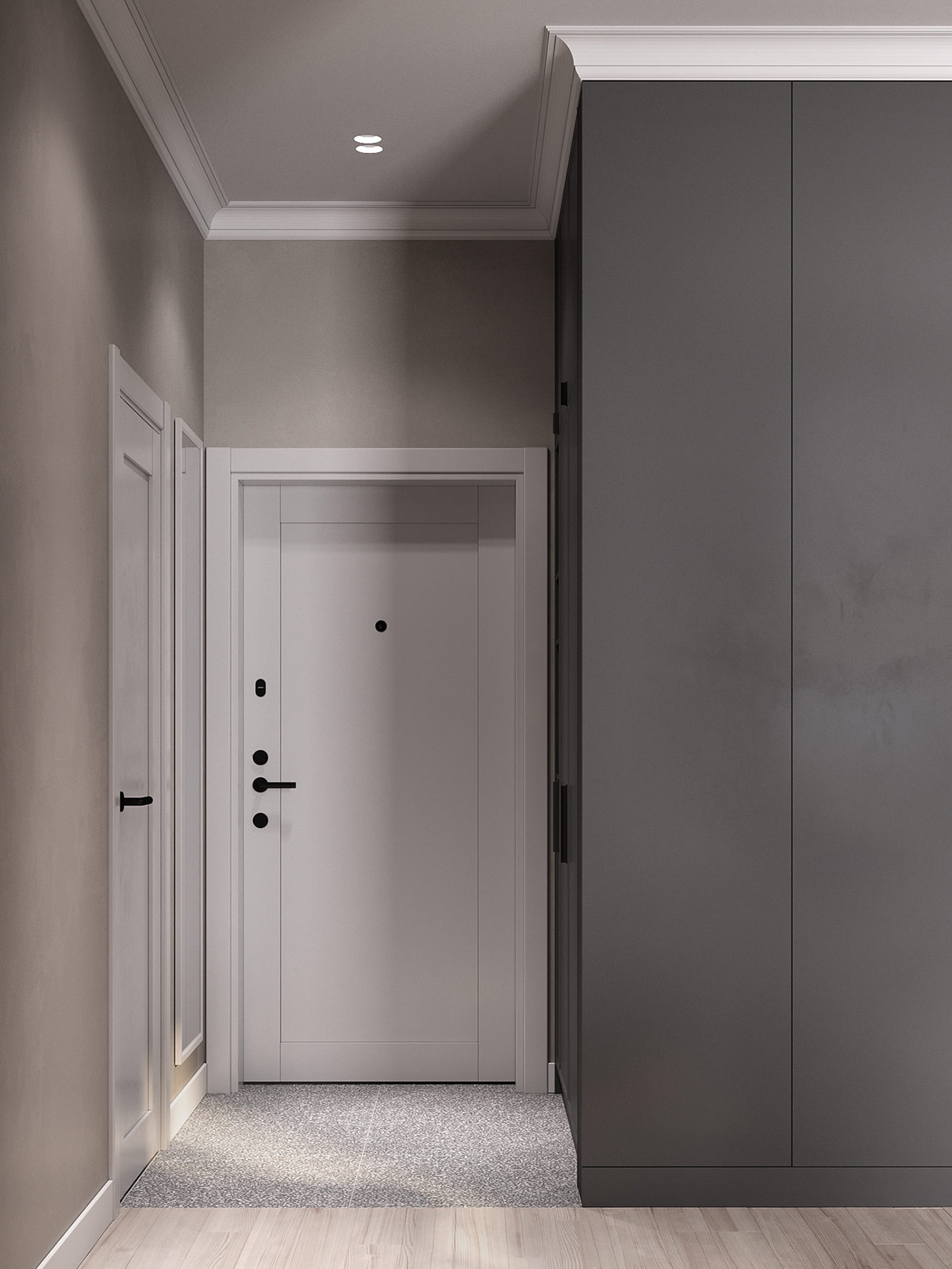
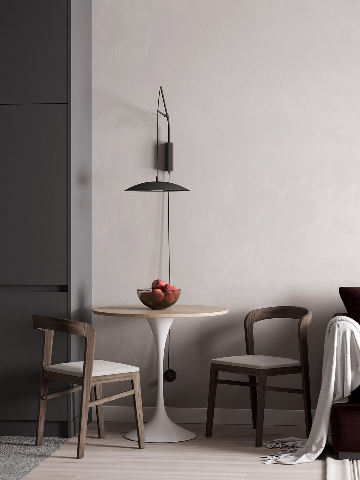
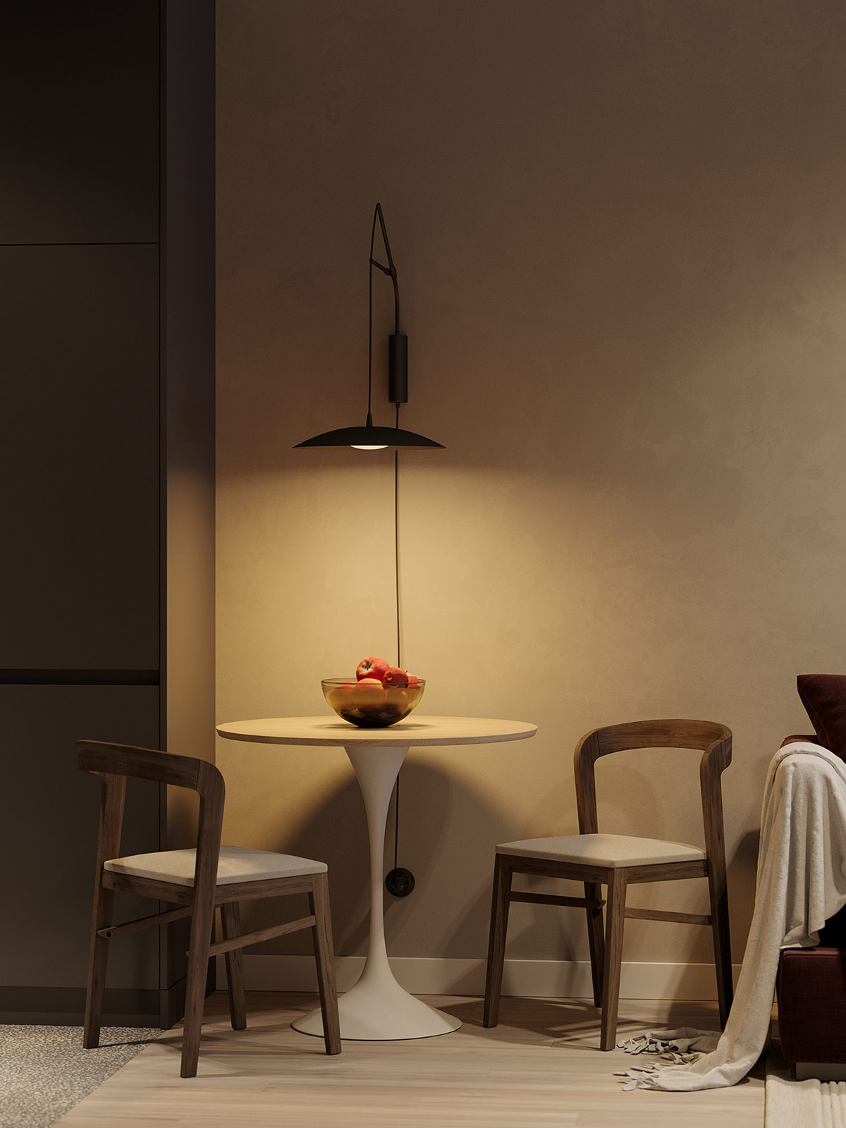
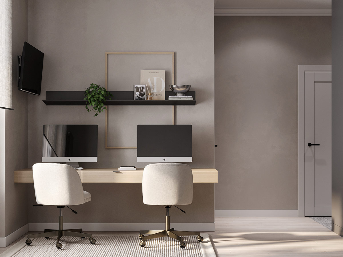
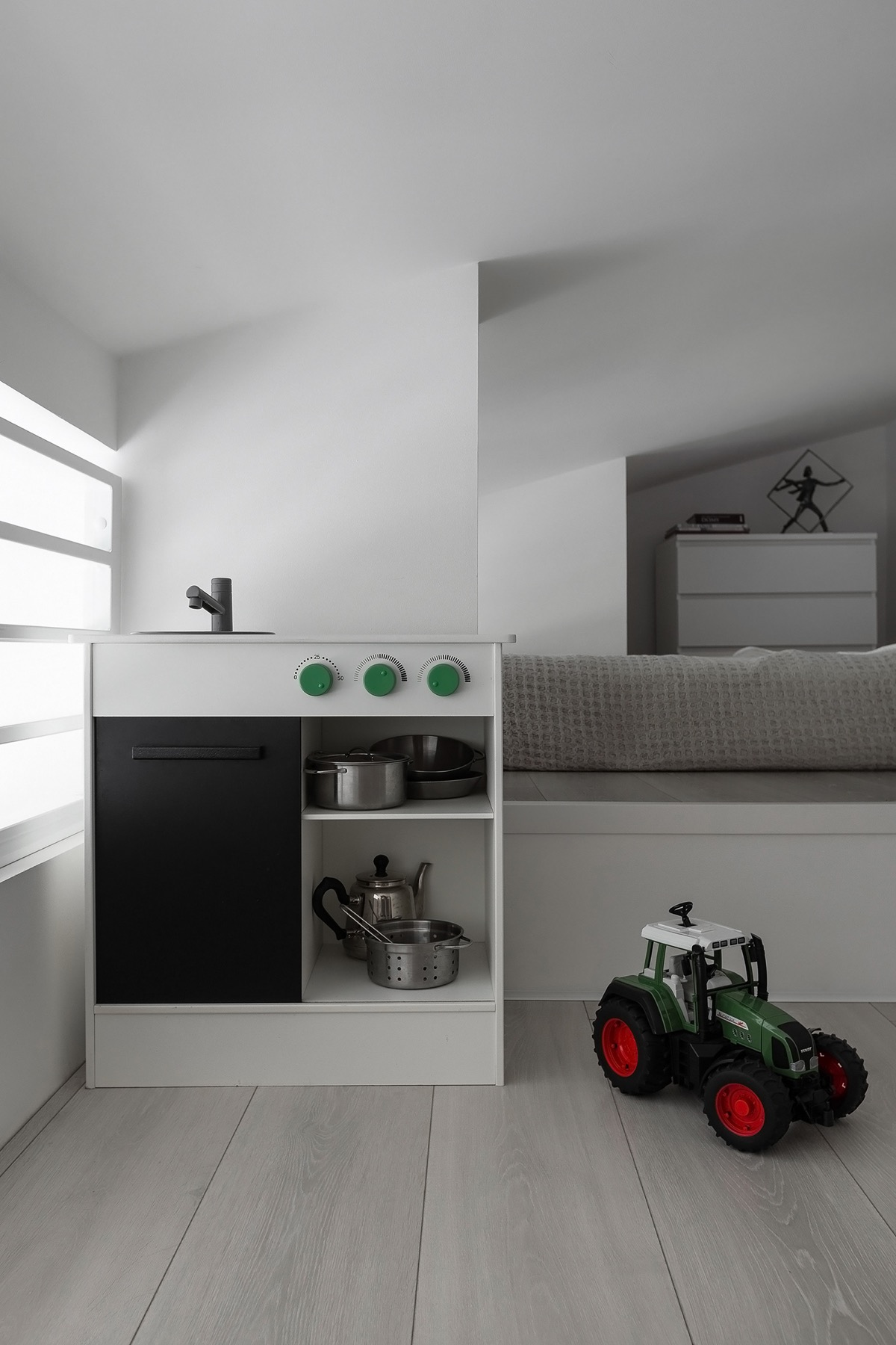
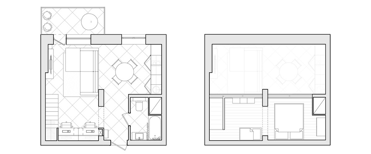
Each measuring just under 40 square meters, these three apartment interiors in Odessa, Ukraine, inspire three different personality types. Our first tour takes us to a sophisticated home with a bronze framed glass wall design, unique modern furniture ideas and an unquestionably luxurious kitchen project – despite its small proportions. Our second stop is made at a simple, young and sturdy apartment interior, designed for tenants, with another glass wall project that lends light to a multi-purpose living room. Color seekers may like our final prominent interior, where rich color accents add a touch of the unexpected. Floor plans included at the end of each tour.
Minimal amounts of furniture, a hollow decor and a limited material palette allow emphasis to fall on the remaining high-quality elements and sea view. Thanks to the glass wall, the ocean panorama flows unhindered throughout the width of the apartment, creating an immediate factor entering the home.
- 19 |
- Designer: aesthetic design
- Display: Dmitriy Li & Anna Prokhorova
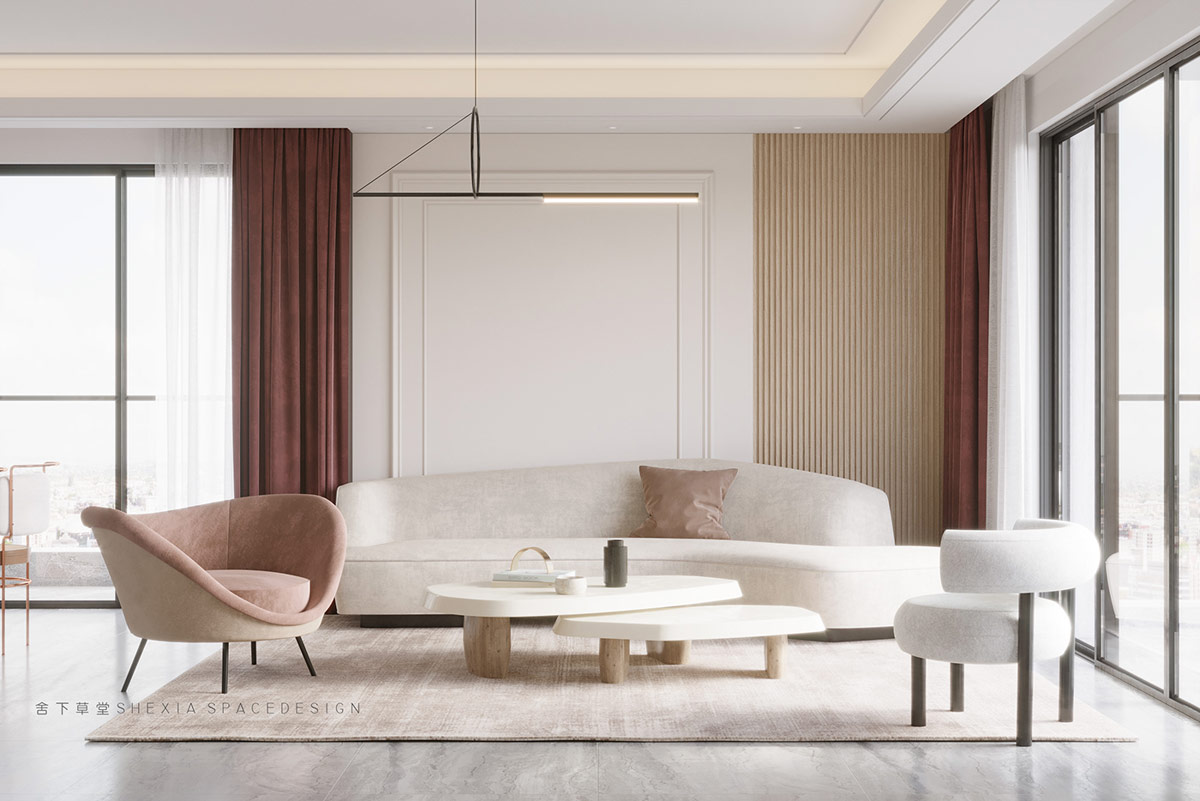
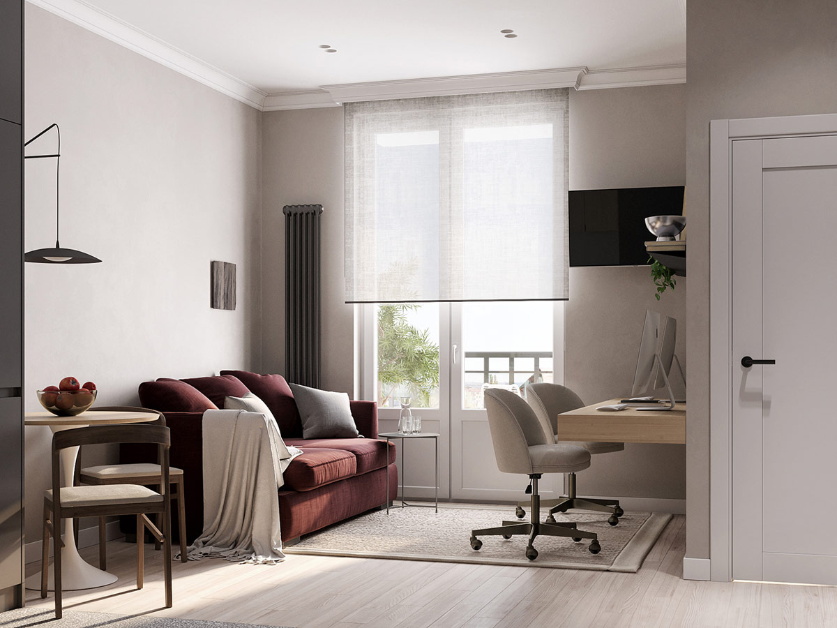
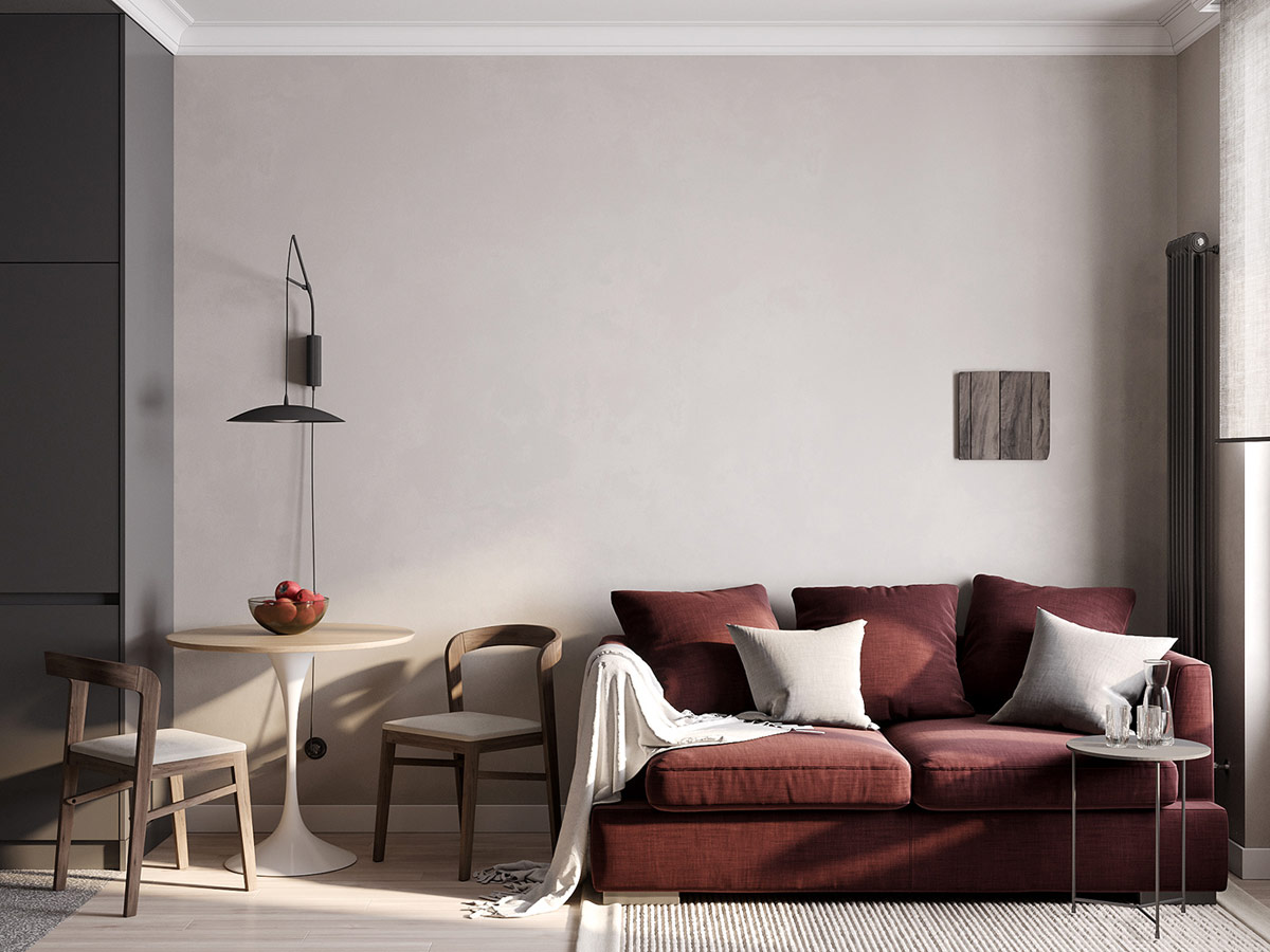
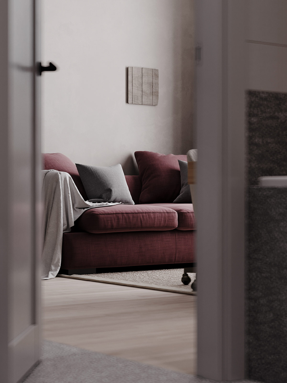
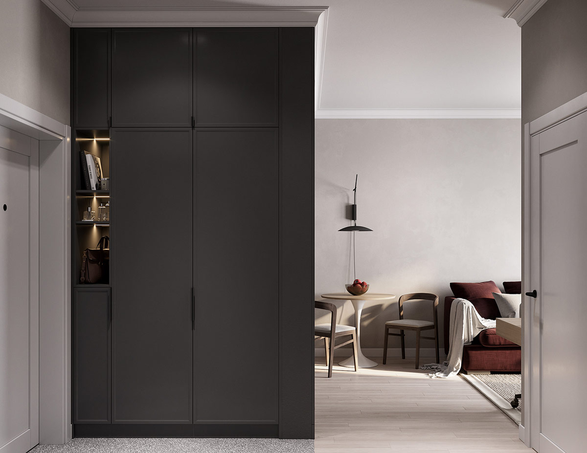
Our third small home tour in Odessa, Ukraine, takes place in a 35-square-meter apartment. The customers asked for a subtle monochrome decoration scheme but short colored moments made the final cut. Burgundy softening visually warms the small living room, and sets it apart from the nearby dining room.
Did you like this article?
Share it on some of the following social networking channels below to give us your vote. Your feedback helps us improve.
Also, if you want to read more informative content about construction and real estate, keep following Feeta Blog, the best property blog in Pakistan.
Portraying Personality In Interiors Under 40 Sqm (Includes Floor Plans)
- Published in #architecture, #interior design, architectural wonders, Architecture, build, building, building plan, Design, Design Gallery, Designs by Style, designs that stand out for all the wrong reasons, Featured, financial model, Furniture Design, General, home, home building, Home Decor, house, house decoration, house design, House Tours, interior, Interior Decoration Ideas, Interior Design, International, Real Estate Trends, Trends, under 40sqm
Lithuania And Poland Built A ‘Portal’ Connecting Two Of Their Cities And People Are Loving It
Society is evolving and we have gone a long way from slavery and women not being able to vote. But we still have room for improvement: stop discriminating against different people, accepting people who think, dress, speak differently than we do.
Separation between people is a problem as old as the world, but it needs modern solutions. The internet is now everywhere in a “portal” open in two European cities, Vilnius and Lublin, which was built just to shorten the distance between us and them. Not only is the meaning behind this project amazing, but it also looks so cool and futuristic.
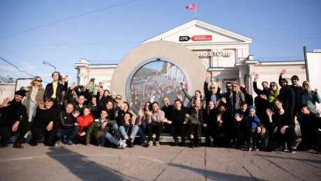
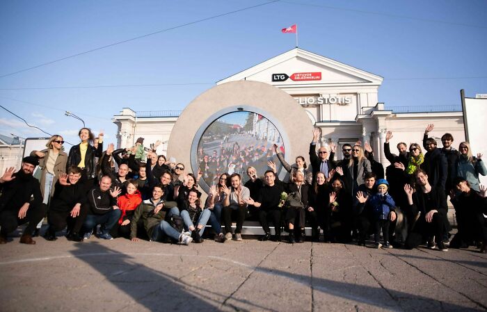
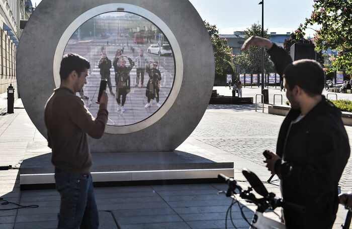
The city of Vilnius in Lithuania and the city of Lublin in Poland are now linked by a portal in which they can see each other.
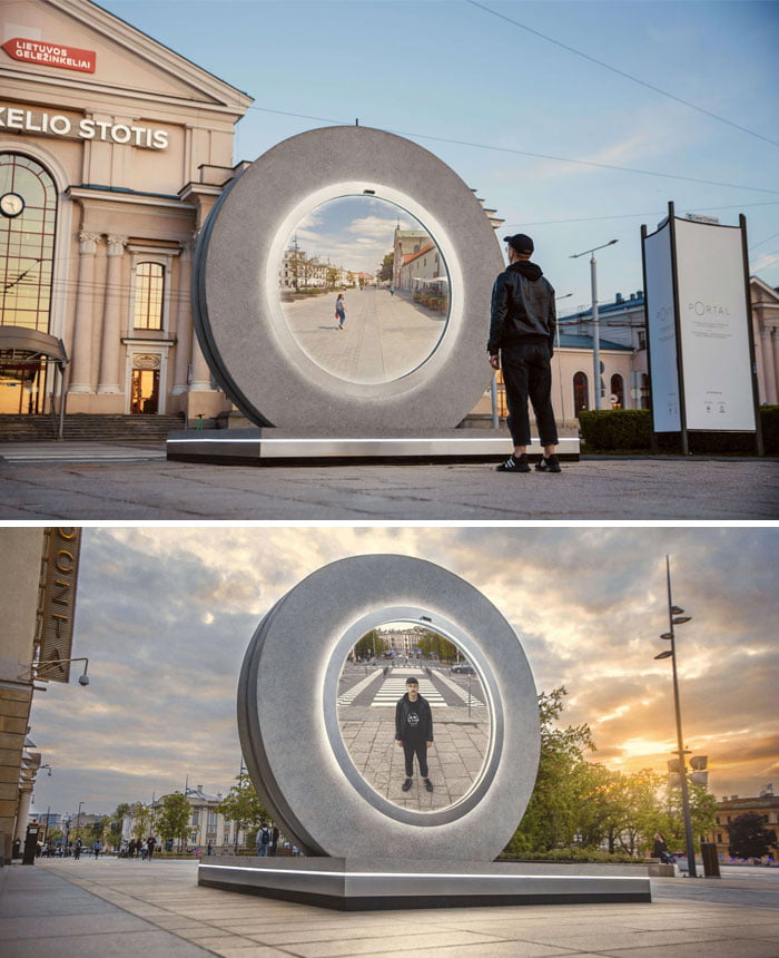
The portal has a circular shape that symbolizes the wheel of time, and in science fiction, it represents space and time that link back to the circle as a portal. This virtual bridge between the capital of Lithuania, Vilnius, and one of the oldest Polish cities, Lublin, is the first of its kind. In Vilnius, the portal can be found next to Vilnius railway station. Meanwhile, in Lublin, he resides on Plac Litewski.
These 2 cities have a historical connection, as the Lublin Union was signed on 1 July 1569 between Poland and Lithuania in that same city. This union created a single state, the Polish-Lithuanian Commonwealth, one of the largest countries in Europe at the time. Bored Panda contacted the PORTAL team and asked if this was planned. Apparently, it was an unexpected coincidence. They contacted various cities abroad that would collaborate for this project and the circumstances lead to that city being Lublin. It is truly symbolic that these two cities are spreading the message behind the project, which must be unified and not separated.
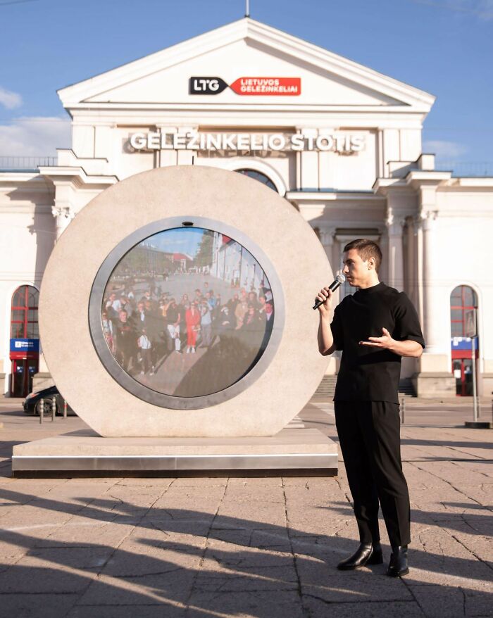
This circle with a screen that looks like a portal to another dimension actually allows you to see people in the other city and wave at them
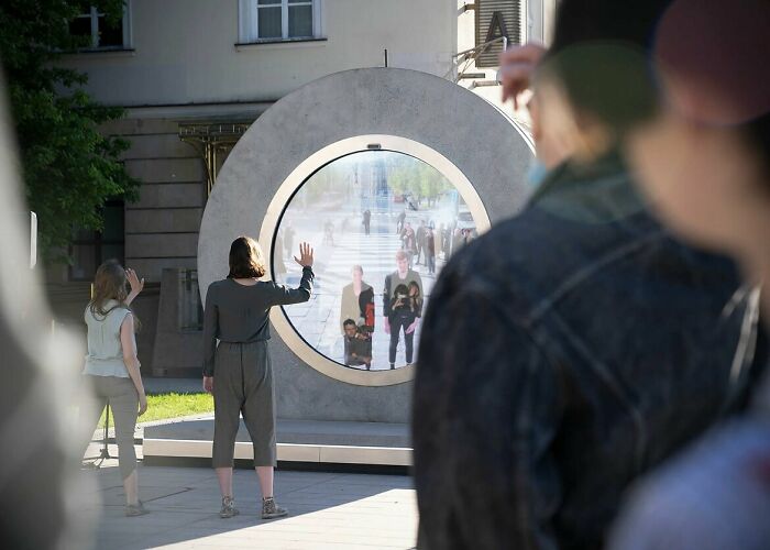
The ‘portals’ both have screens and cameras to broadcast the other city live. The view you see on the screen is similar to what astronauts see looking at the world below.
It’s called a “surveillance effect” and astronauts experience it when they see Earth in space, so little, so delicately in this big world.
Hazzaa Ali Almansoori, the first person from the United Arab Emirates in space, said “It’s amazing how space brings everyone together. No matter what country you come from, no matter what your religion or background, it unites everyone … Our goal is one: it is for humanity. ”
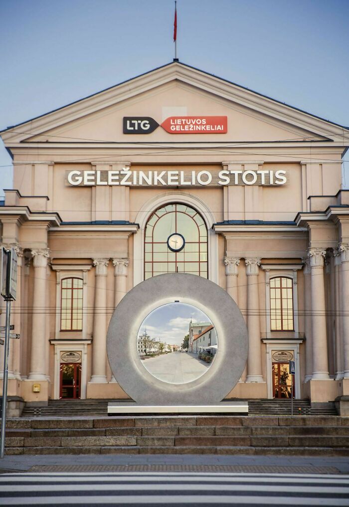
The portal is now silent as it would be technically difficult to have a sound 24/7, however, it is possible and for special events, it will be done.
Despite this, the creators of the project believe that people will find a way to communicate. They’ve noticed people waving, sending kisses or doing push-ups, so they’re still involved.
The team told us that “it seems that with physical measures like the PORTAL the internal psychological barriers disappear and people enthusiastically participate in the activity in front of the portal and are friendly to each other. Most of them do not need encouragement and access the portal with curiosity or maybe they just crave a human relationship during this pandemic. ”They think that starting a conversation with complete strangers only on the street would present difficulties and it seems that the portal makes people more relaxed.
The message behind the PORTAL project is to make people forget about the separation between us and them and just see our planet united
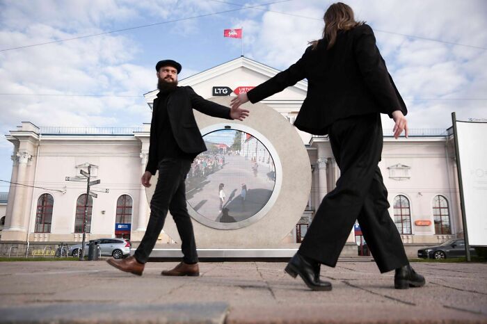
The main goal of the project is to connect people. On the official website, they say “Surrounding ourselves only with those who are close and speak the same language gives us comfort and a sense of stability. It also limits the worldview to our narrow inner circle. Slowly it becomes a perfect space for awakening insecurities to outsiders and a perfect excuse to be careless about the world that belongs to them. Every day there is less room for dialogue, empathy and compassion to feel and be united in our home – a tiny spaceship Earth rapidly decaying because of too many of them and too few of us. It’s so easy to believe we’re all a wave and forget we’re an ocean too. Let’s transcend this sense of separation and be pioneers of unity. ”
It almost seems like we welcome aliens to Earth, but sometimes we treat humans as if they’re not from this planet and don’t deserve to be here. The person behind the idea, Benedict Gylys, says many of the potentially deadly challenges humanity faces, such as polarization and climate change, have been caused by a lack of understanding of others and of the world at large. So the PORTER must unite people and it is an invitation to rise above the illusion of division that we ourselves have created.
This cool idea was shared on Reddit and the post received 140k likes in less than 24 hours

Although it is not a portal that we see in movies or read in books, it is nevertheless the closest to teleportation and it is so cool that you can only communicate with random people on the street who are hundreds of miles away.
It caught the attention of Redditors like the post about it got 140k votes in less than a day. People joked about Stargate and that if you go through it, you will end up in Poland. It seems that people liked this idea, but others shared that something similar happened where they live, but it didn’t last long as people started abusing the portal.
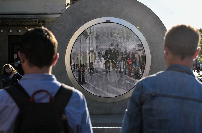
The project had its challenges, “First, it was a challenge to draft a project for the PORTFOLIO, which is minimal and simple, but able to fit all the complex electronics inside and prevent vandalism and negative environmental impact.” Then the project had to be carried out and after many tests, it was chosen to use “concrete, stainless steel and tempered glass to build these 11 tons wide two meters by two meters.”
It all came true because the people at Vilnius Gediminas Technical University Creative and Innovation Center “LinkMenų manufactures” were crazy enough to believe in the idea and were able to realize it.
The brain behind the project is Benedict Gylys and it took 5 years to realize the idea
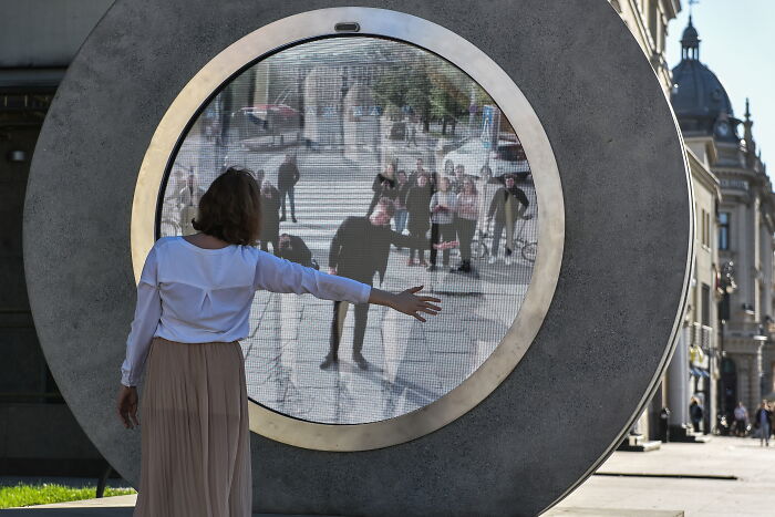
The project was completed during a pandemic, when travel within the borders may have restrictions, so travel to other countries is hardly disputed. The creators of Vilnius Technique have been working on the portal for 5 years and now was the best time to introduce it publicly when everyone is so isolated and eager to taste something new a bit.
There are plans to open more of these portals in various cities in the world and connect even more people
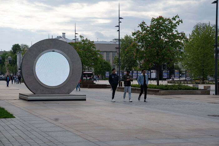
The portal between Vilnius and Lublin was the first in the world, but it will not be the last. The creators of the project hope to connect dozens of cities around the world and two new ones are expected to open soon: one in Reykjavik, Iceland and another in London, United Kingdom.
The team revealed that Reykjavik was chosen because of the very important historical story that links it to Lithuania: Iceland was the first to recognize Lithuania’s independence in 1991 and Lithuanians appreciate it and want to continue the partnership between the countries. Also, Reykjavik contrasts perfectly with Vilnius.
London is important to them as they begin a friendship with another international initiative.
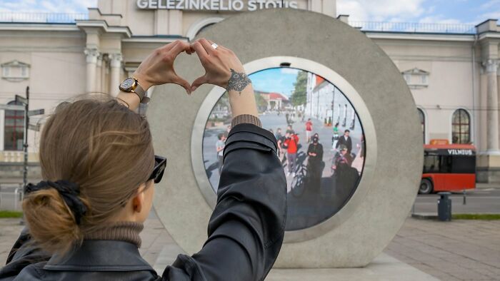
Image credits: Benedict Gylys Foundation
Now Vilnius is linked to Lublin and will last until August. Then it will move to another city. The project creators think that maybe in the future the portals will change cities every 10 minutes more or less because they are open to anyone who would like to join.
Although the cities will have a limited connection time, the project has no time limit, “the project will continue until the destruction of the planet or the end of the problems that cause the separation between people.”
What do you think of this idea? Would you like to see such a ‘portal’ in your city? Let us know your thoughts on this project in the comments.
More than 2k people shared their reactions to this “portal” on Reddit and most of them thought it was a cool idea.
Meanwhile, if you want to read more such exciting lifestyle guides and informative property updates, stay tuned to Feeta Blog — Pakistan’s best real estate blog.
Lithuania And Poland Built A ‘Portal’ Connecting Two Of Their Cities And People Are Loving It
- Published in 700-page, Architecture, Art, Benediktas Gylys, Design, Homepage featured, Lithuania, lublin, News, News & Updates, News and Update, People, Poland, portal, portal between cities, project portal, reddit, stargate, Technology, vilnius, virtual bridge
Colorful Interiors That Feel Like Spring & Summer
Like Architecture and Interior Design? Follow us …
Thank you. You have been subscribed.
![]()
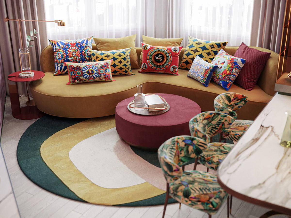
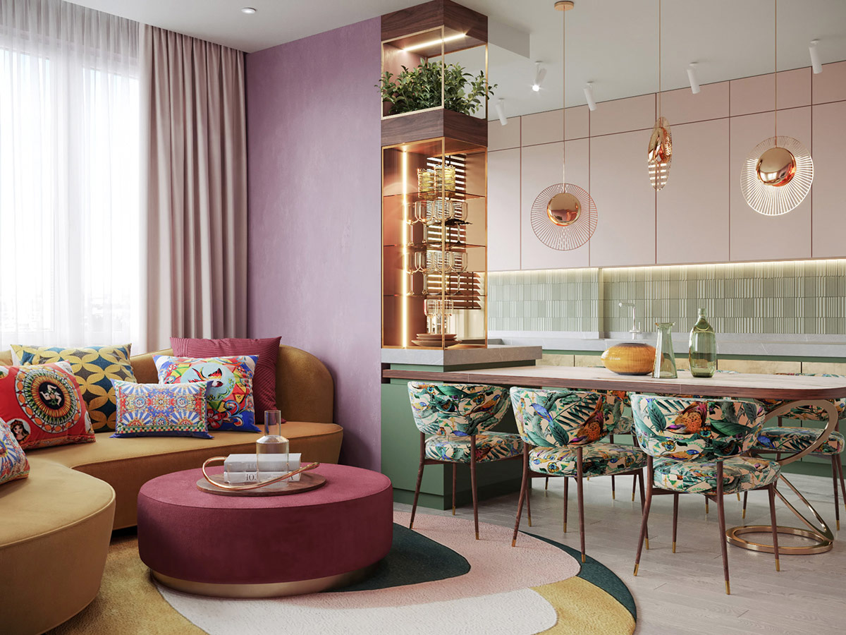
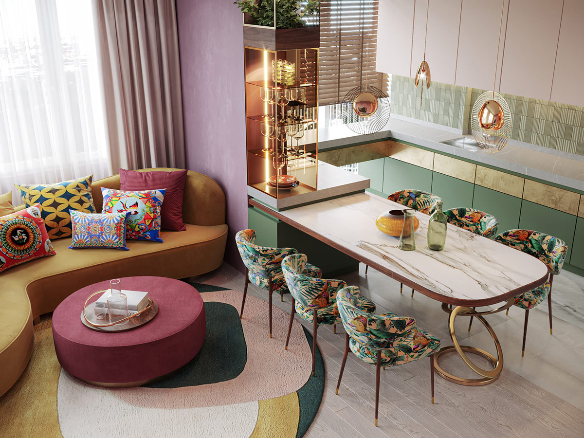
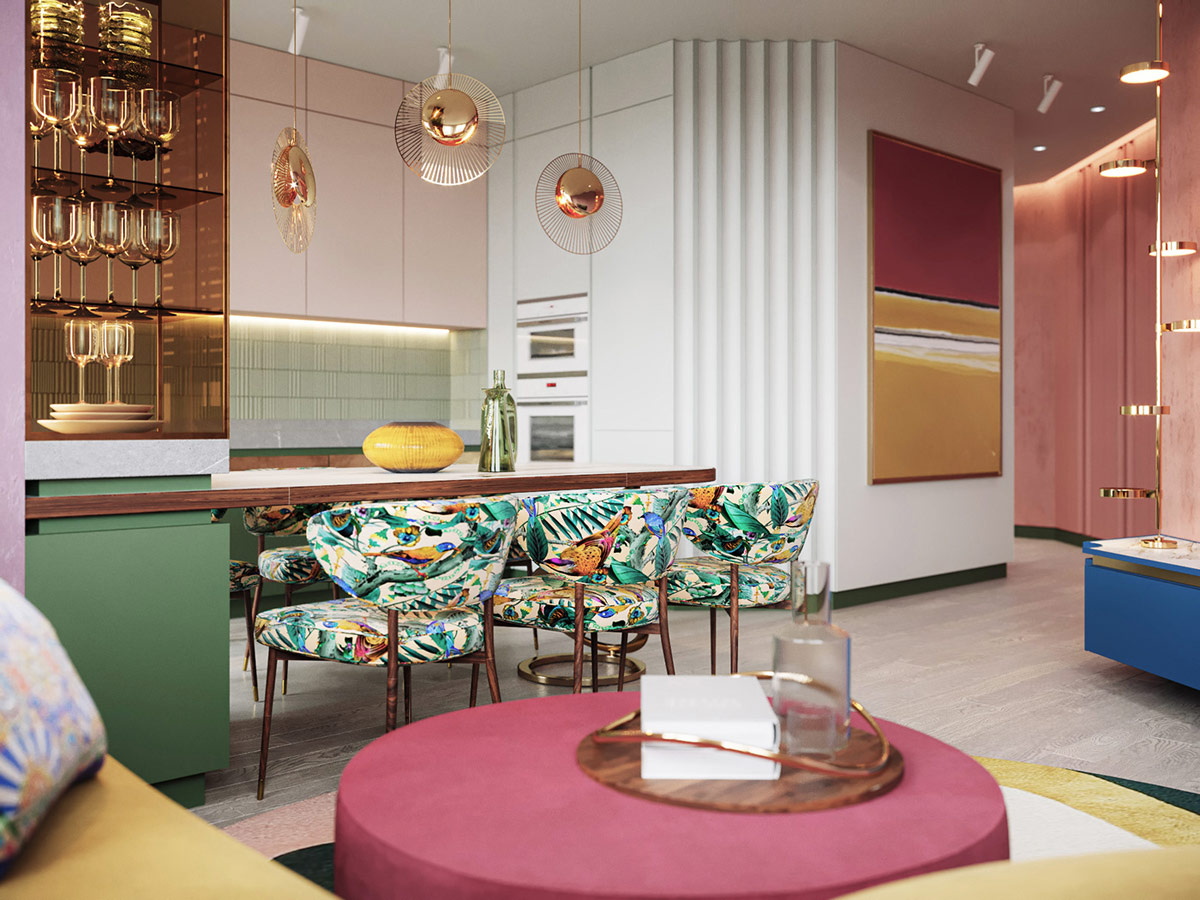
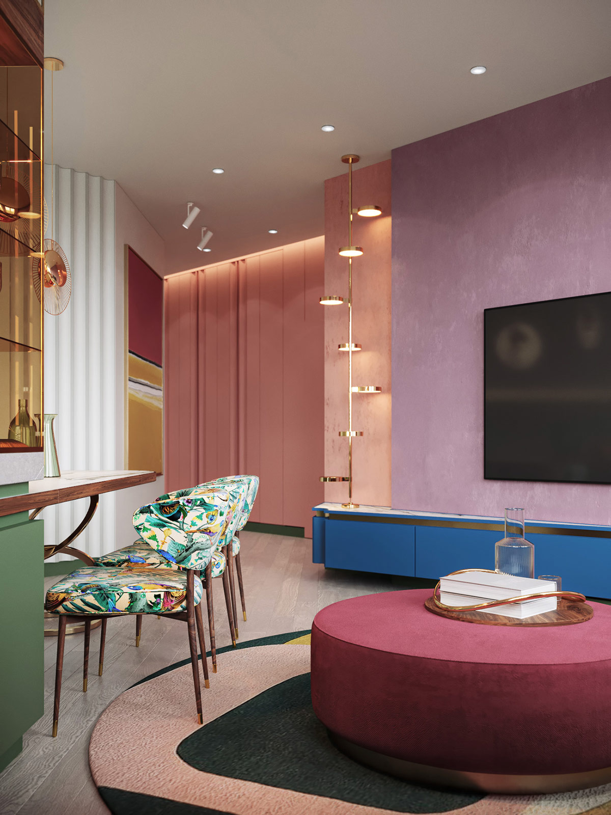
If the world outside the window is gloomy, transform your interior into an eternal spring or summer extravaganza of color, pattern and uplifting energy. Forget the oppressive gray city streets that surround, draw a stream of flowers and botanical prints that free you from the harsh reality of making your soul sing. This is your home, you can have it however you like it. Here, the homeowners of our two prominent interiors did just that. With the help of AR 1 Studio, delightful artwork, adventurous furniture collections and experimental collisions come together to build spectacularly unique spaces that feel like a holiday, every day.
A pattern further enlivens the vibrant color palette, playfully raising a sort of sofa cushions, dining chairs and a graphic round rug.
Bold wall art, geometric wallpaper and parrot blue cabinet fronts color the hallway to the bedroom. Privacy was an essential consideration for the client, so this corridor separates as much as possible the master bedroom from the common area. Entrances to the guest and the laundry room are hidden inside the entrance wall.
Did you like this article?
Share it on some of the following social networking channels below to give us your vote. Your feedback helps us improve.
For the latest updates, please stay connected to Feeta Blog – the top property blog in Pakistan.
Colorful Interiors That Feel Like Spring & Summer
Crafting Cool Clarity With All-White Interiors
Do you like Architecture and Interior Design? Follow us …
Thank you. You have been subscribed.
![]()
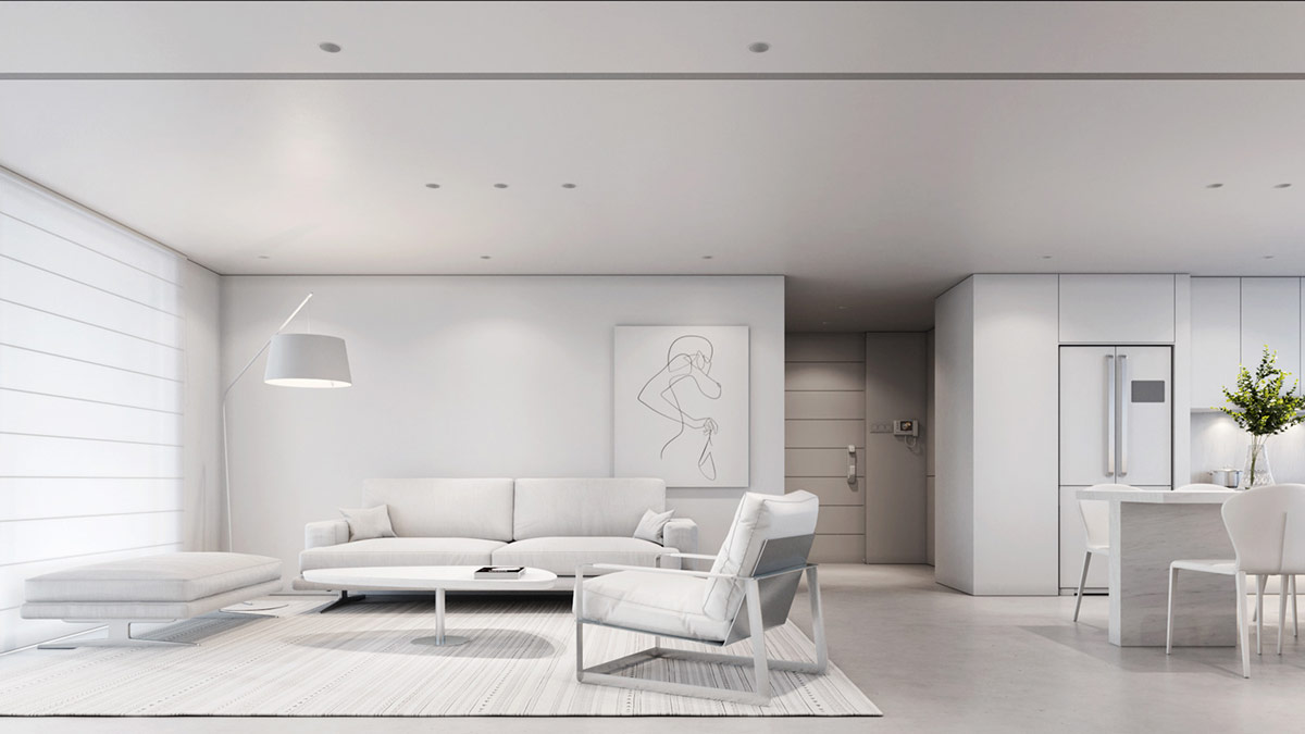
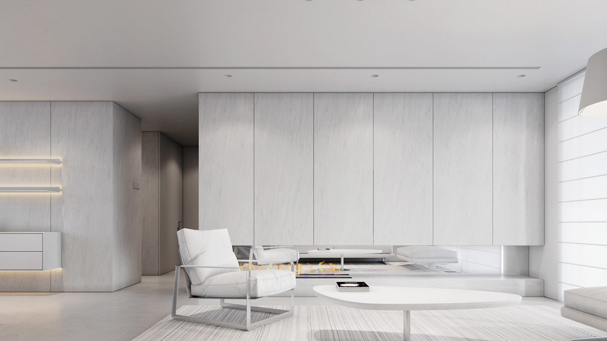
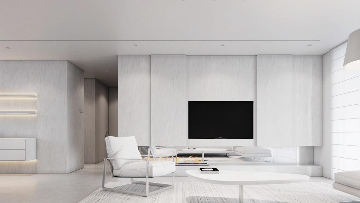
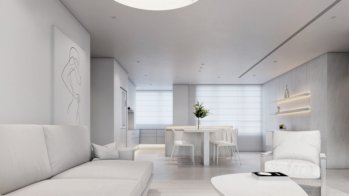
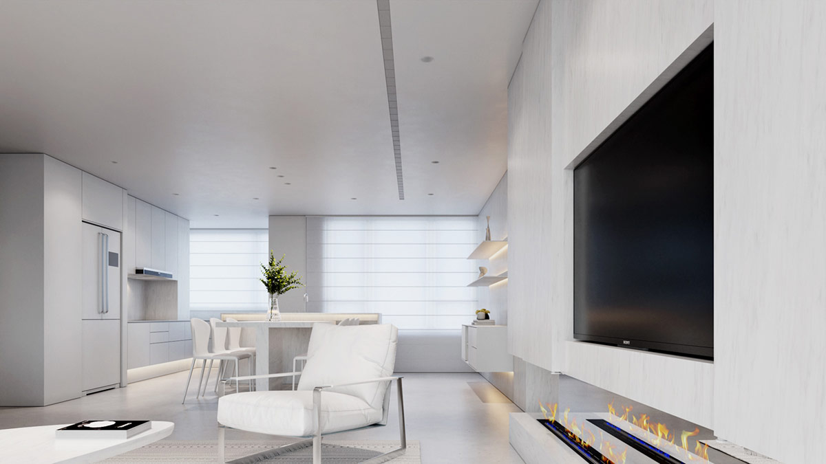
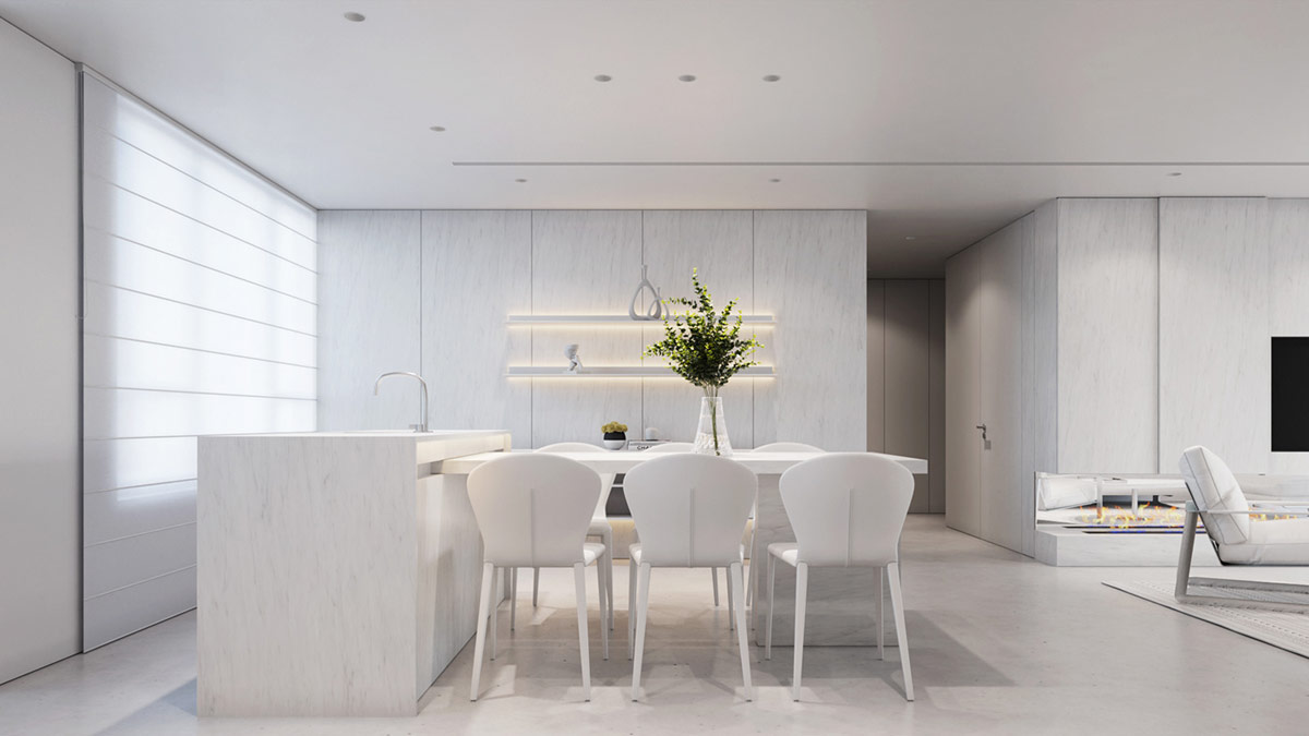
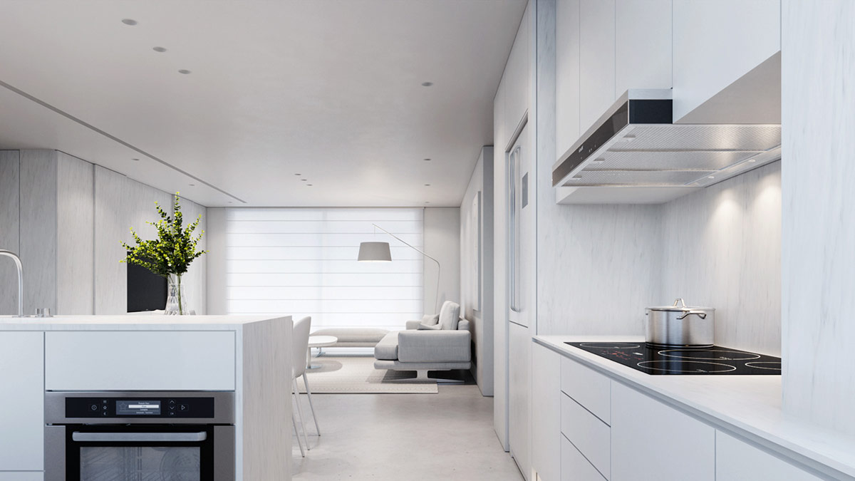
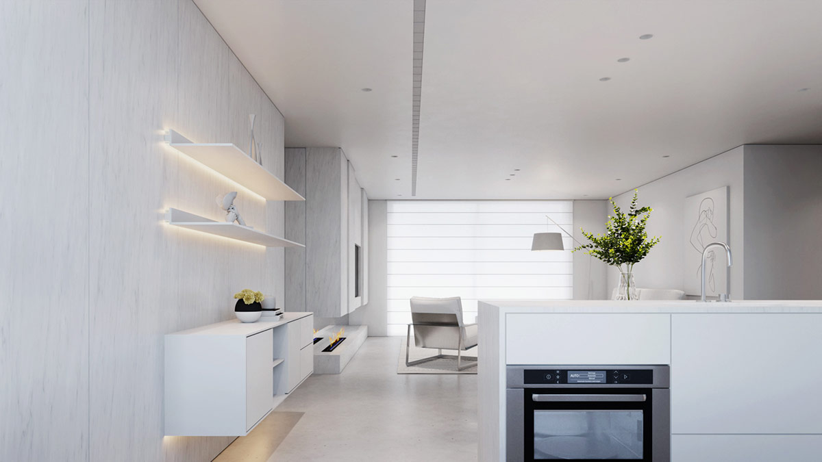
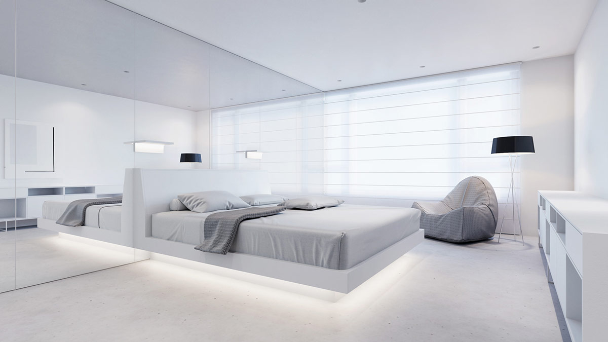
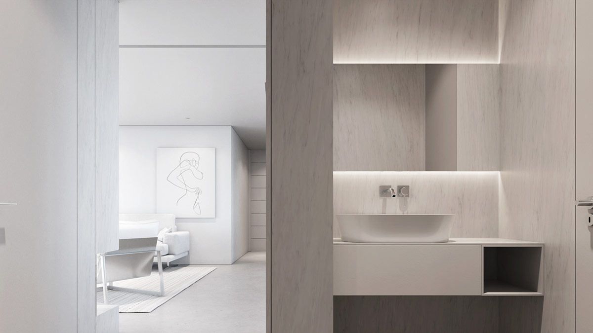
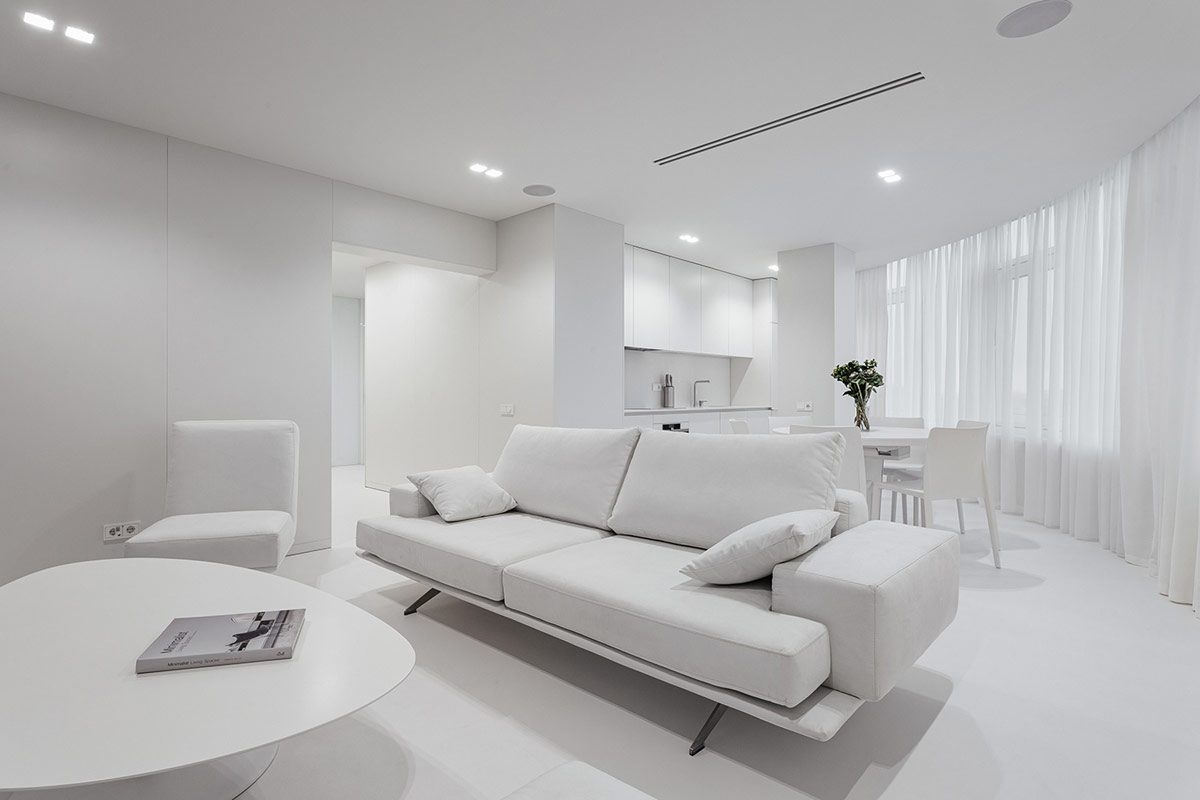
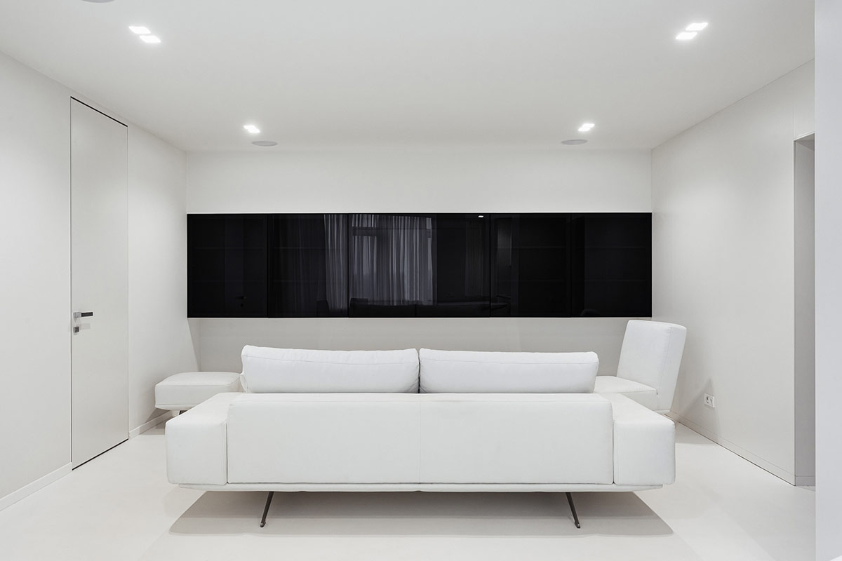
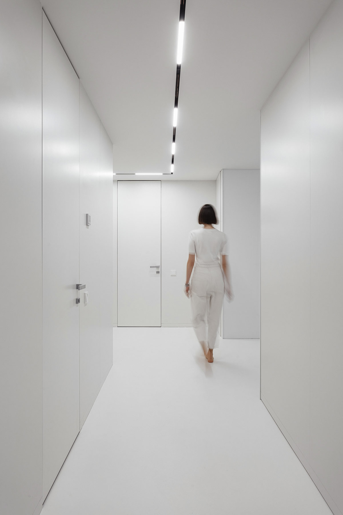
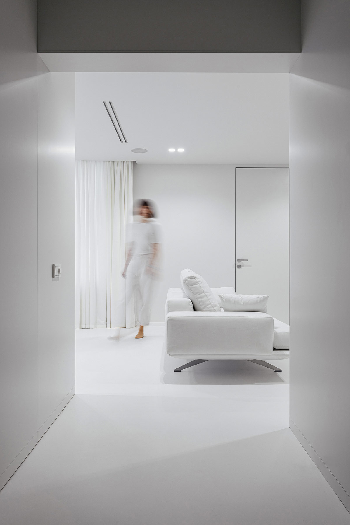
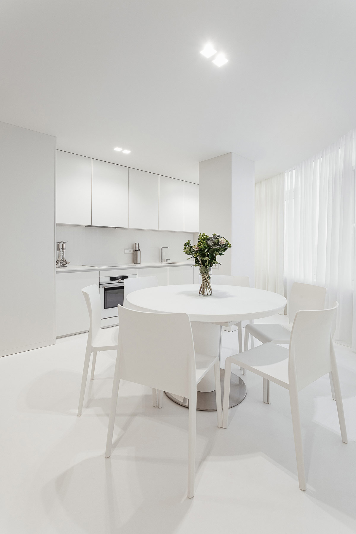
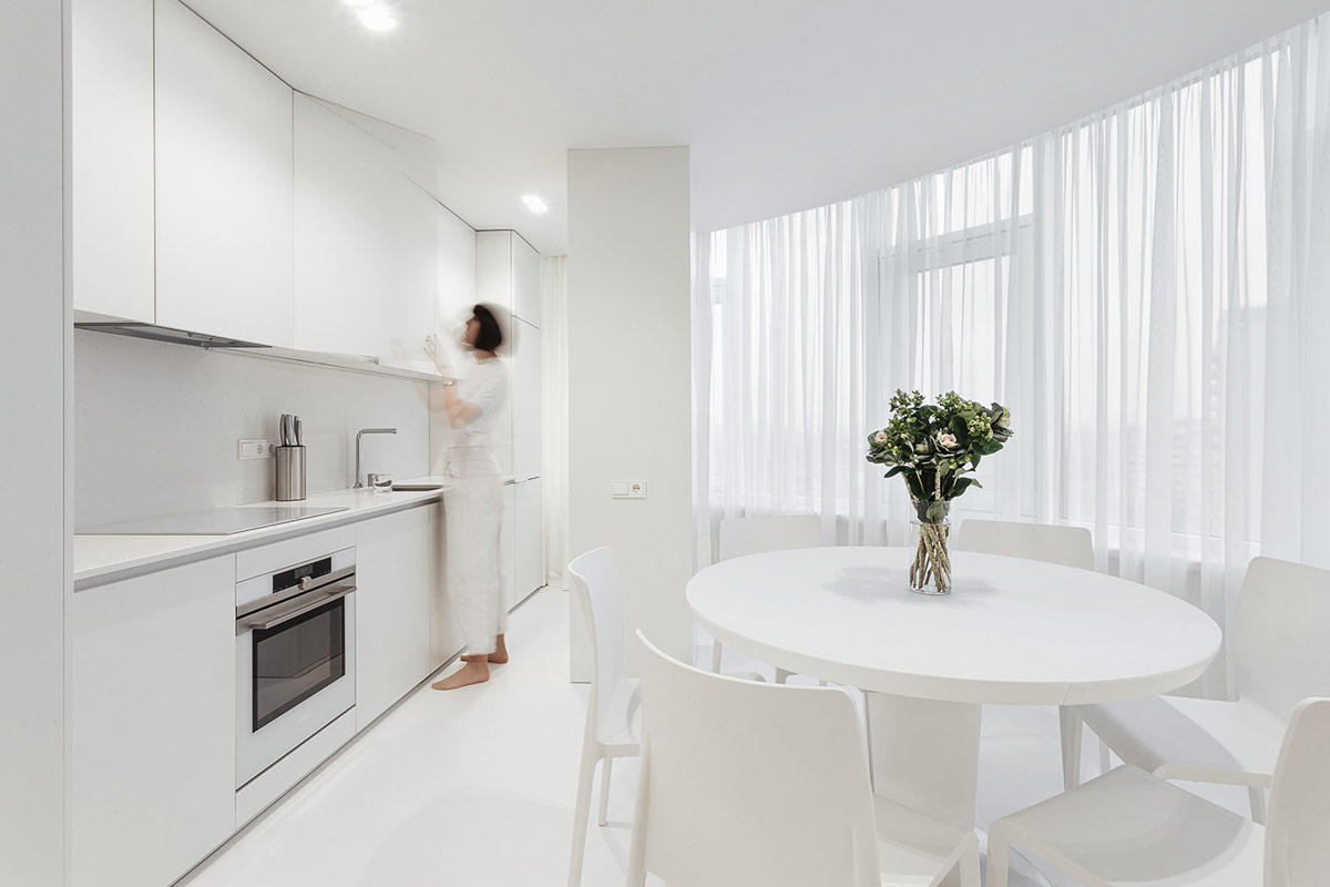
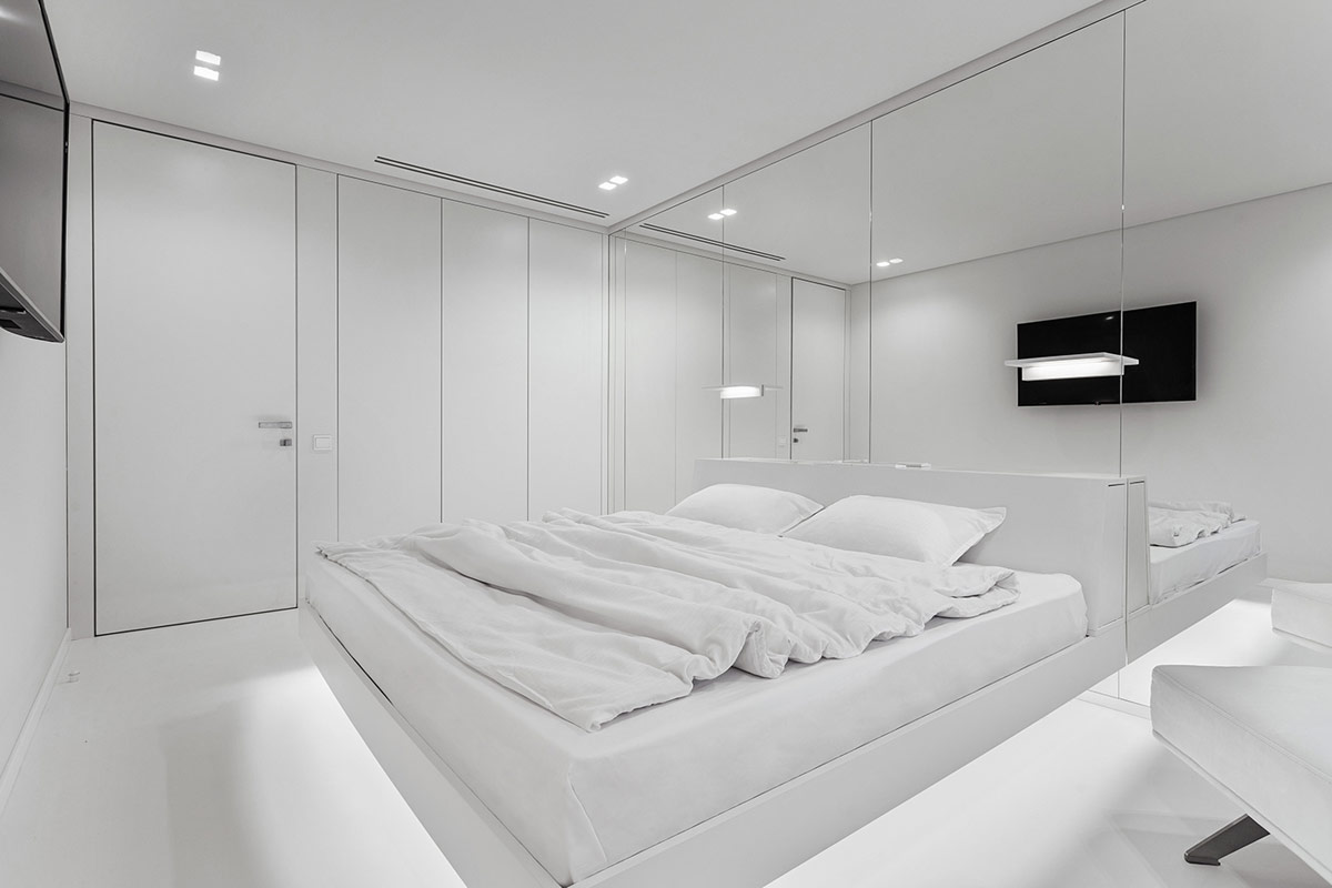
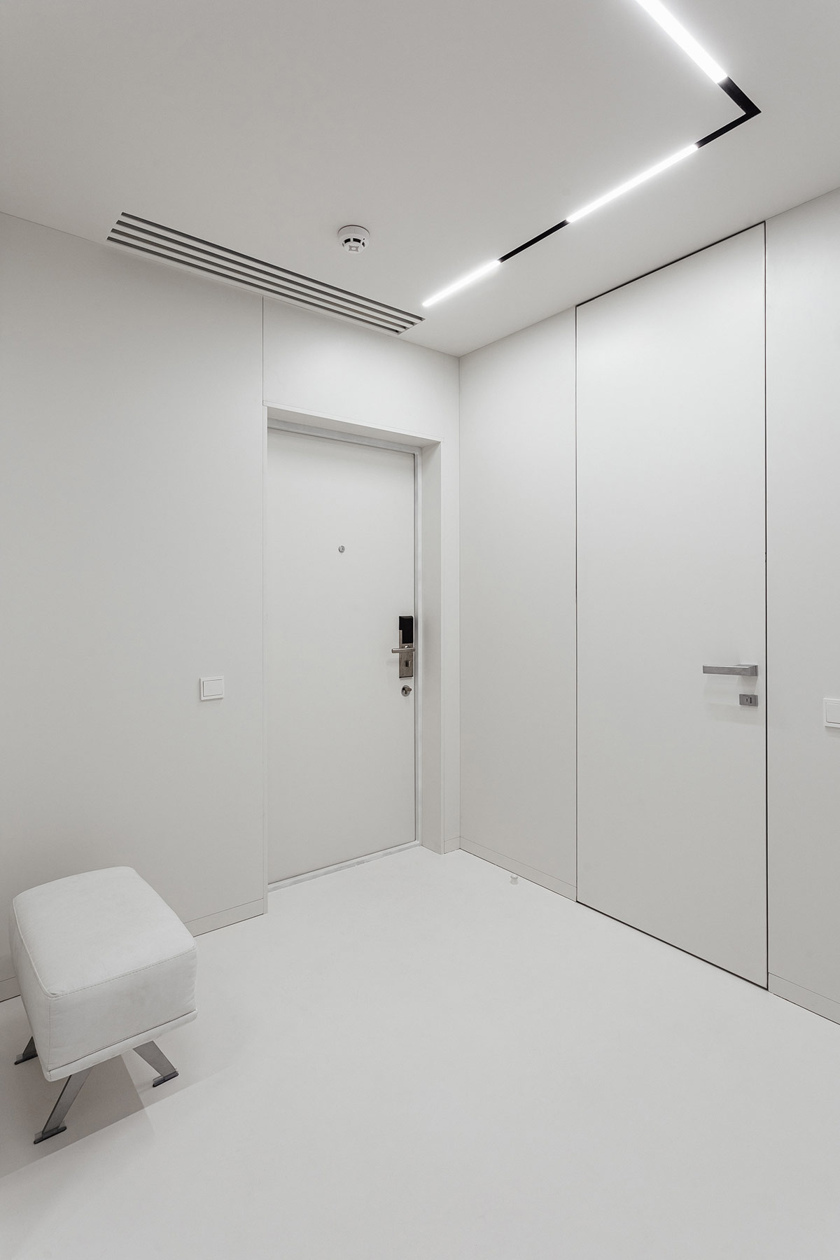
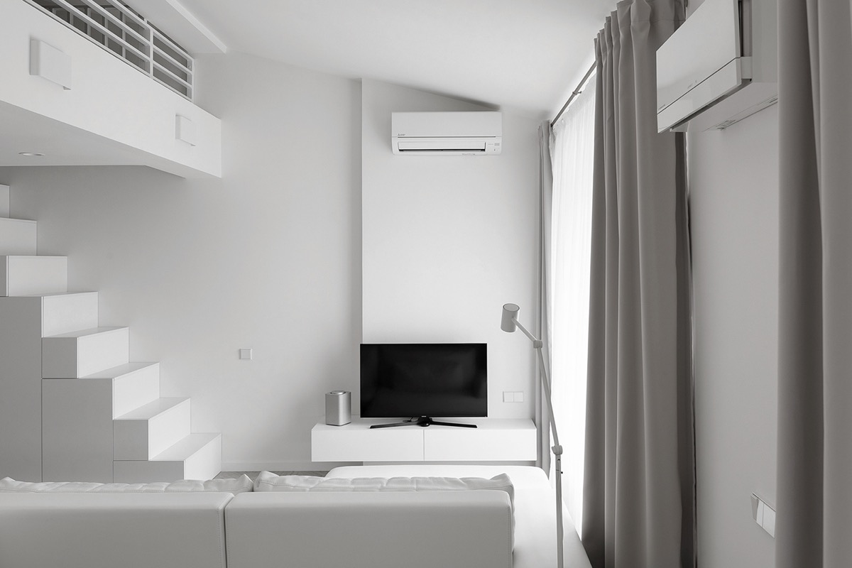
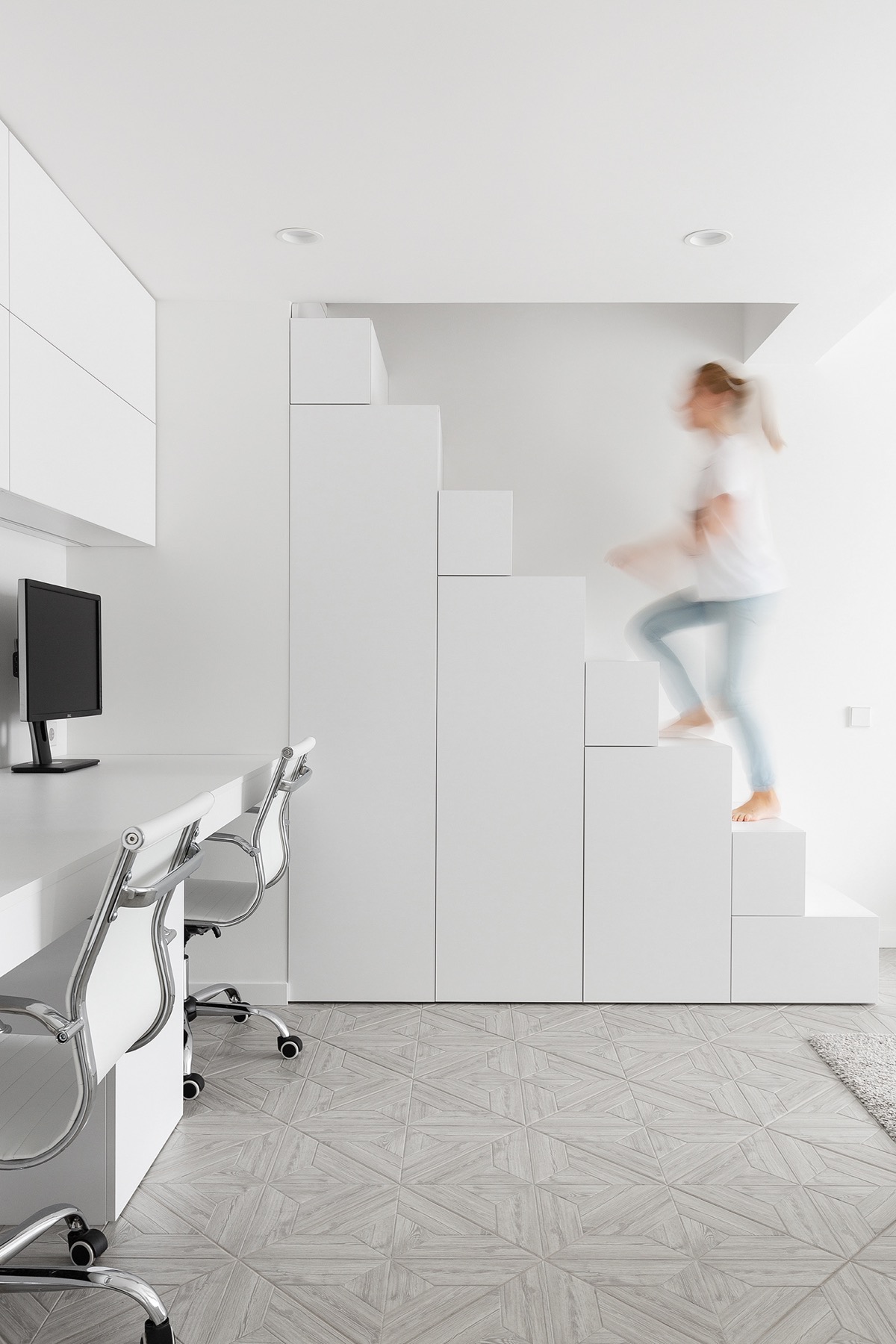
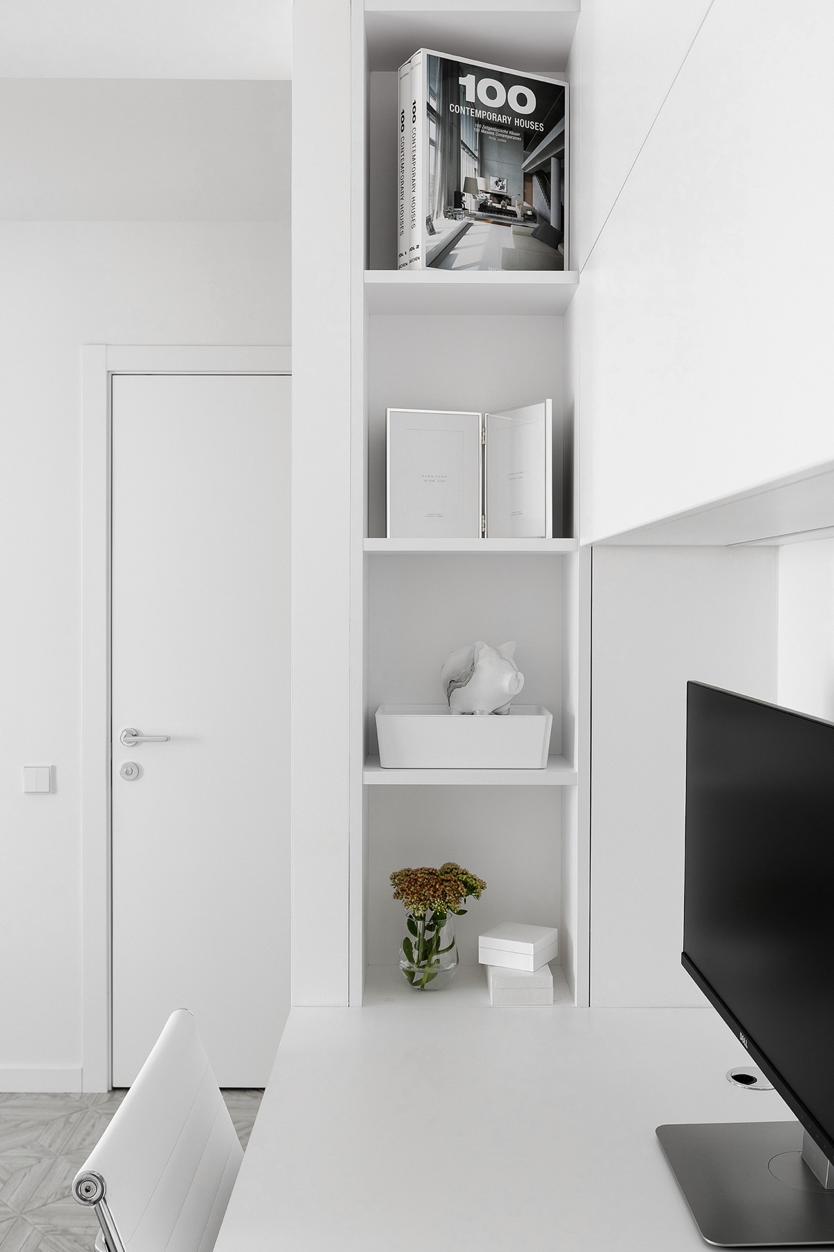
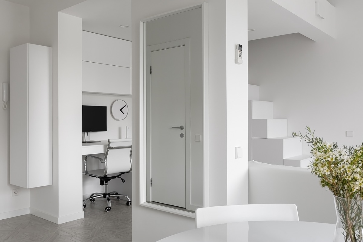
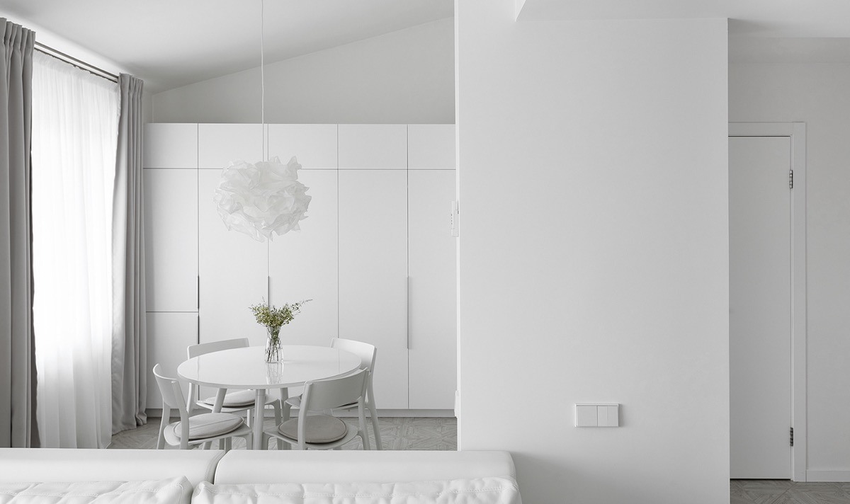
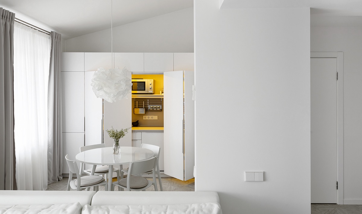
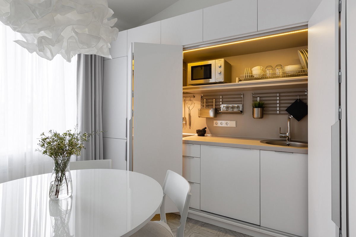
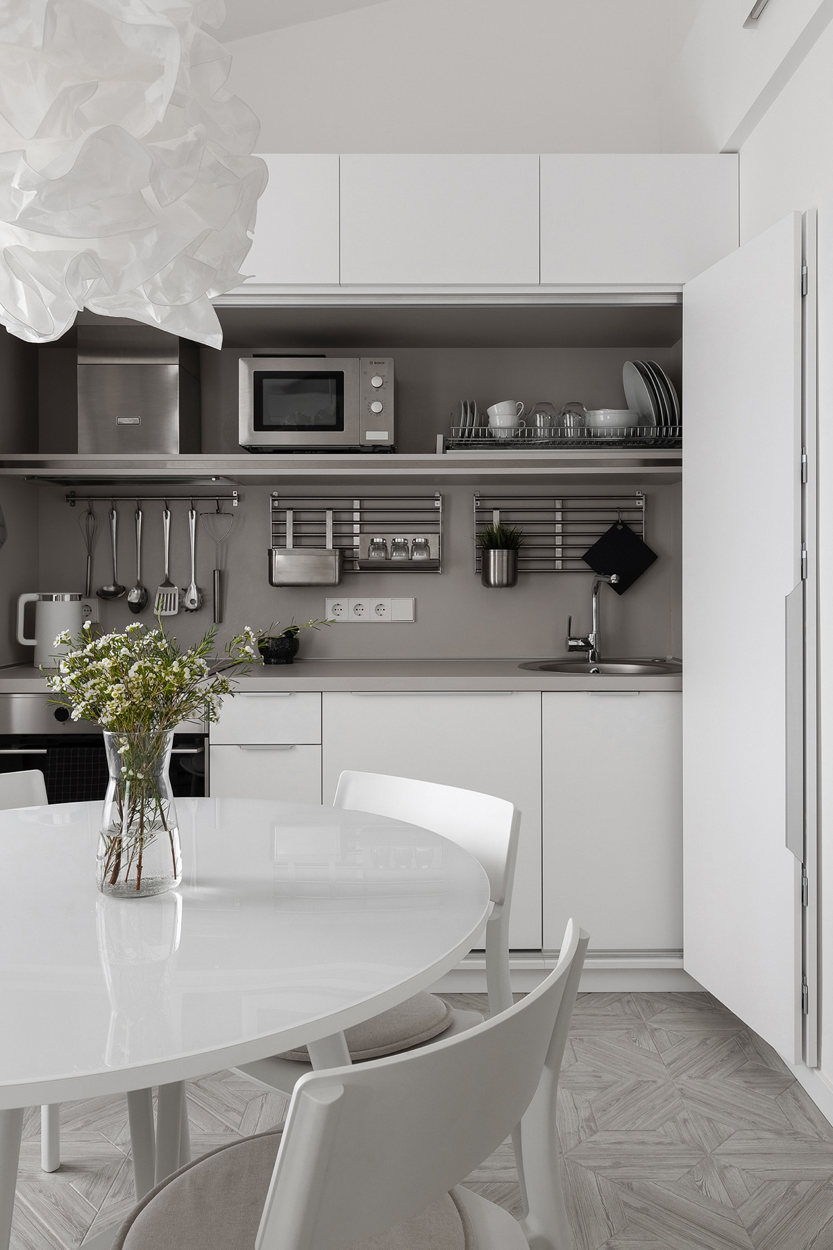
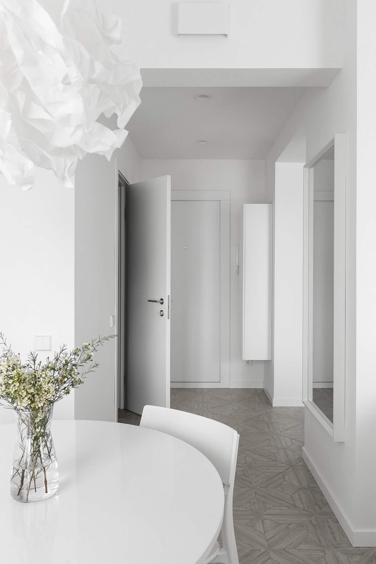
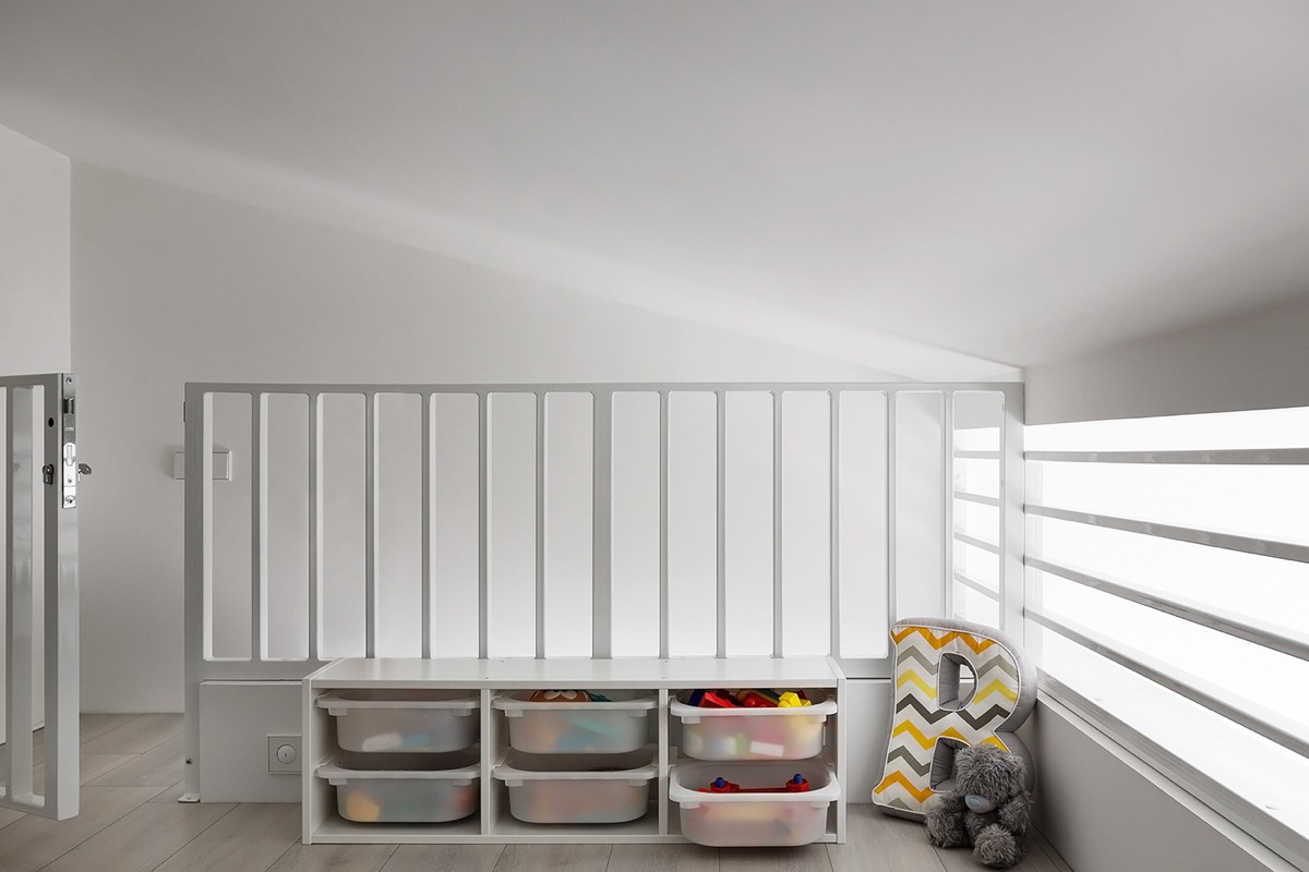
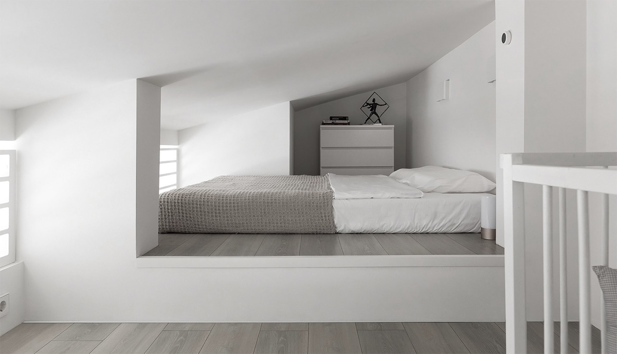
White is the color of purity and perfection. Some color matches white, but do you have to have a completely white interior? Well, the short answer is yes! All-white interiors are timeless, white walls highlight architectural features and white décor makes homes larger and more spacious. For art lovers, there is no better background than pure white – just ask a gallery owner. Some people might think that white is a priceless choice, but any color decoration can cause a boring result. The truth is that white interiors retain clarity of design. Pure white slate offers the opportunity to play with furniture shape, texture and light design without distraction
Solid white modern dining chairs and a matching round dining table almost disappear from the center of the room as they blend seamlessly with the clean white floor. However, a burst of invigorating natural greenery is always a welcome addition, whatever the room palette, and is used here as an elegant table centerpiece.
Did you like this article?
Share it on some of the following social networking channels below to give us your vote. Your feedback helps us improve.
Stay tuned to Feeta Blog to learn more about architecture, Lifestyle and Interior Design.
Crafting Cool Clarity With All-White Interiors
How To Balance A Grey and Dark Blue Interior
Like Architecture and Interior Design? Follow us …
Thank you. You have been subscribed.
![]()
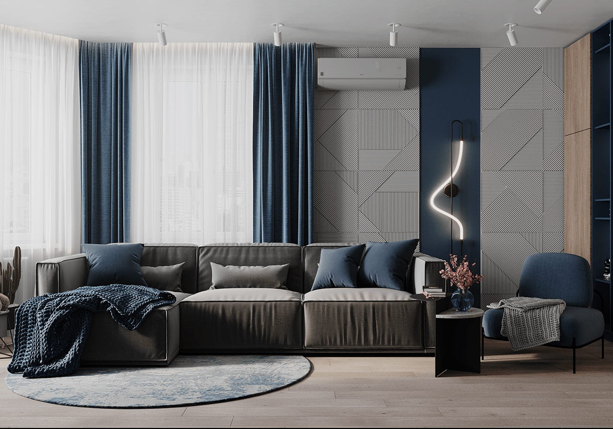
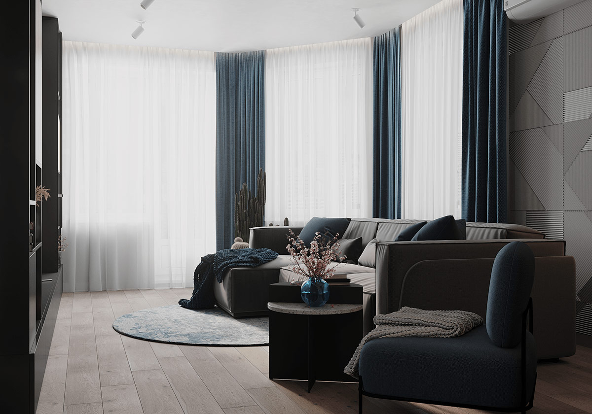
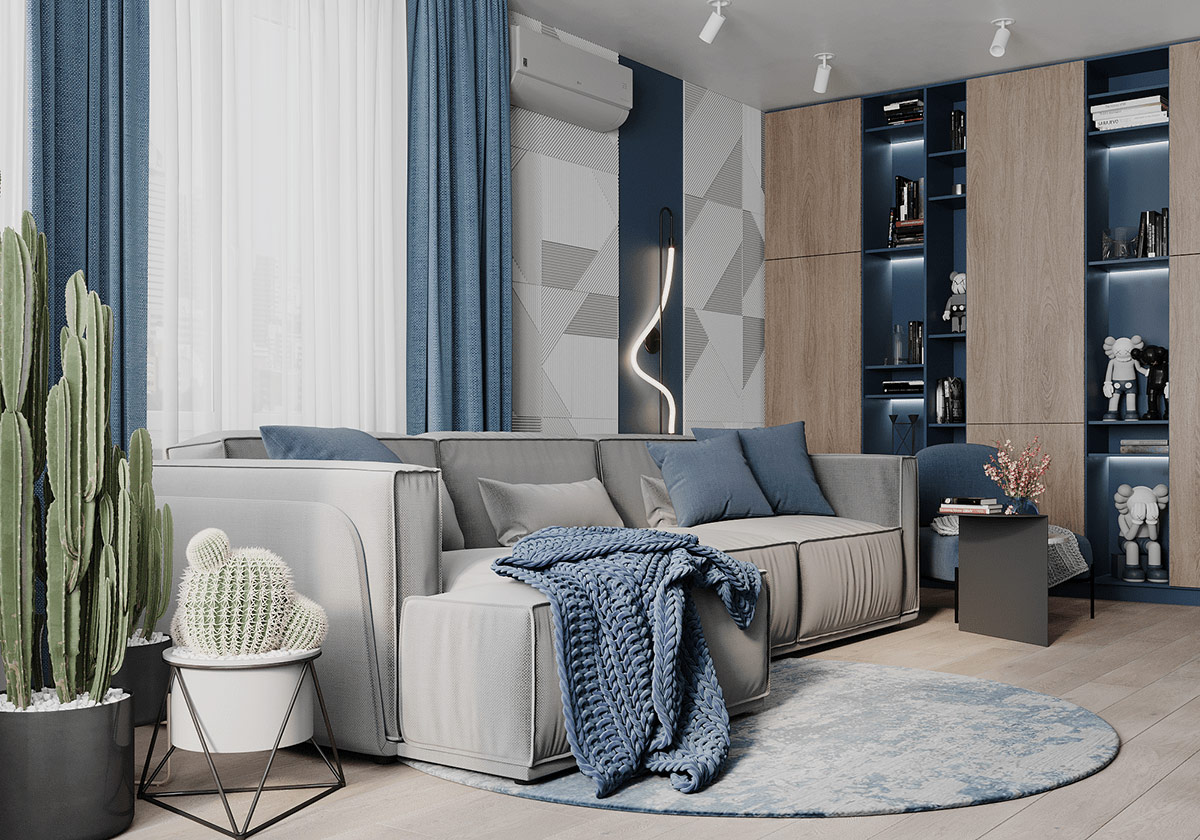
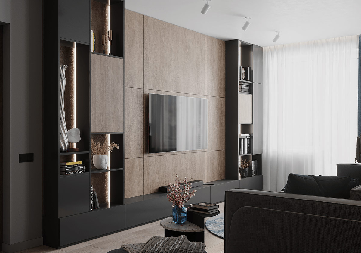
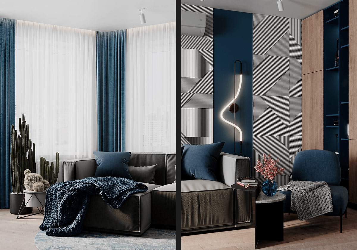
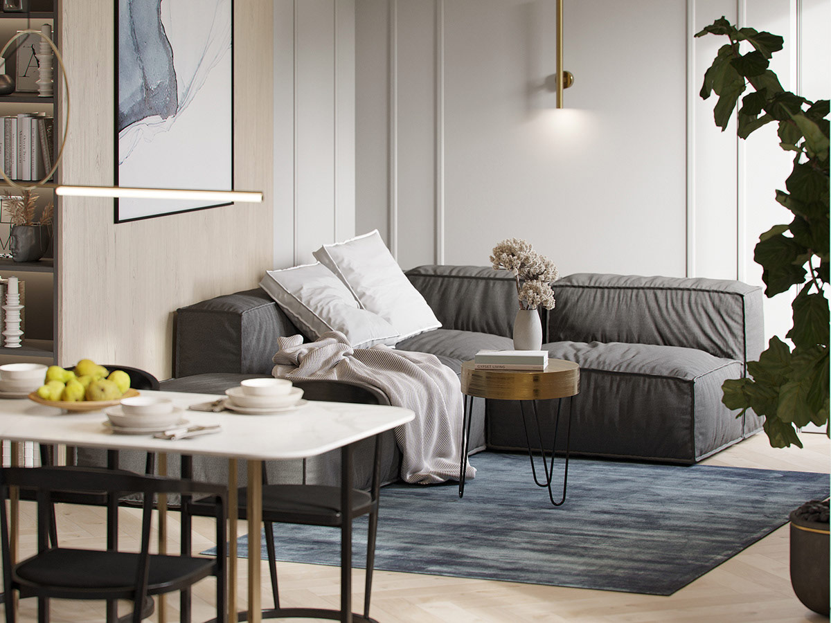
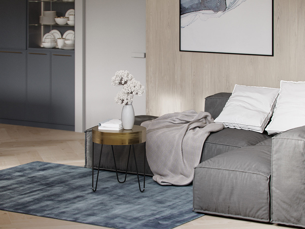
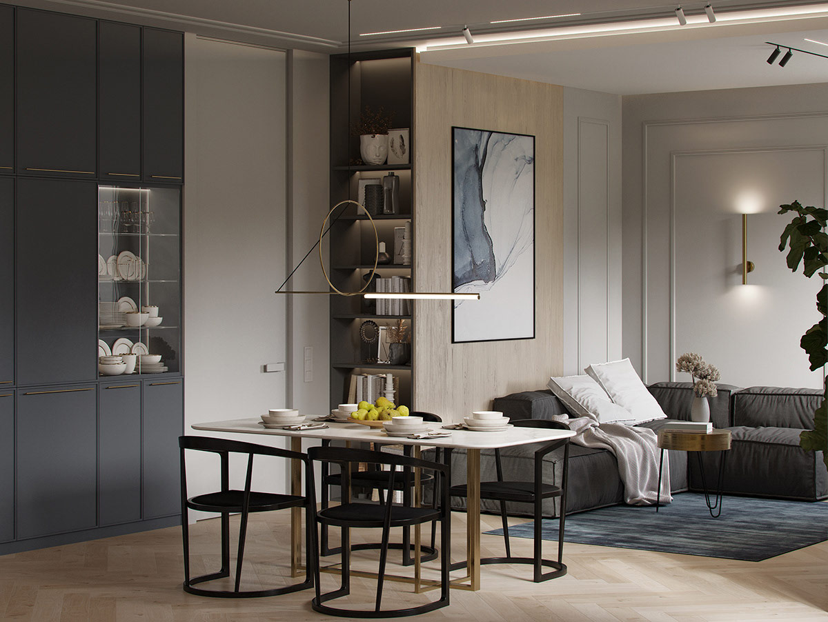
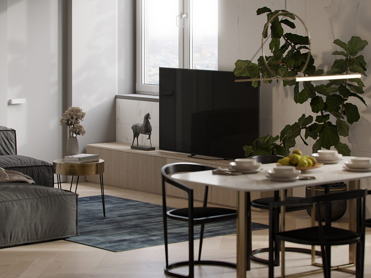
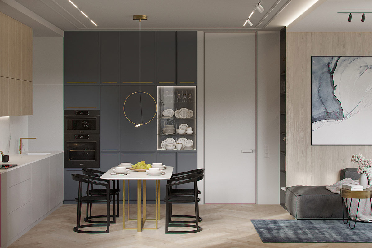
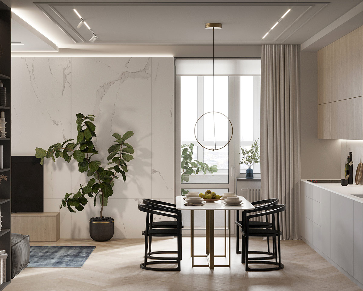
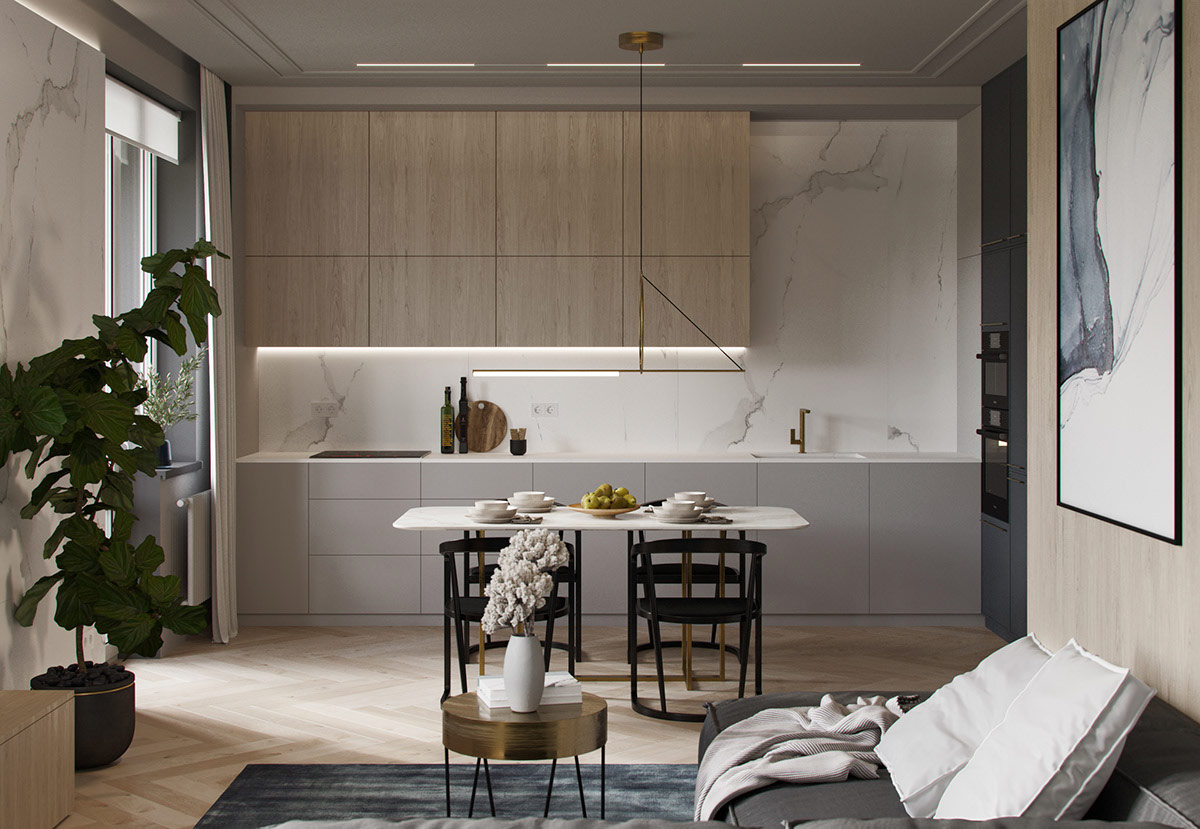
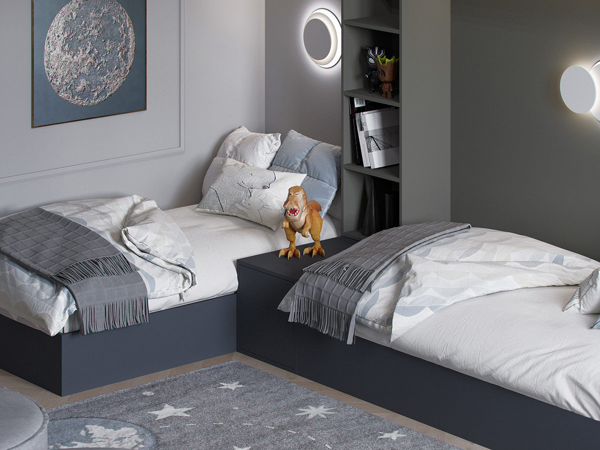
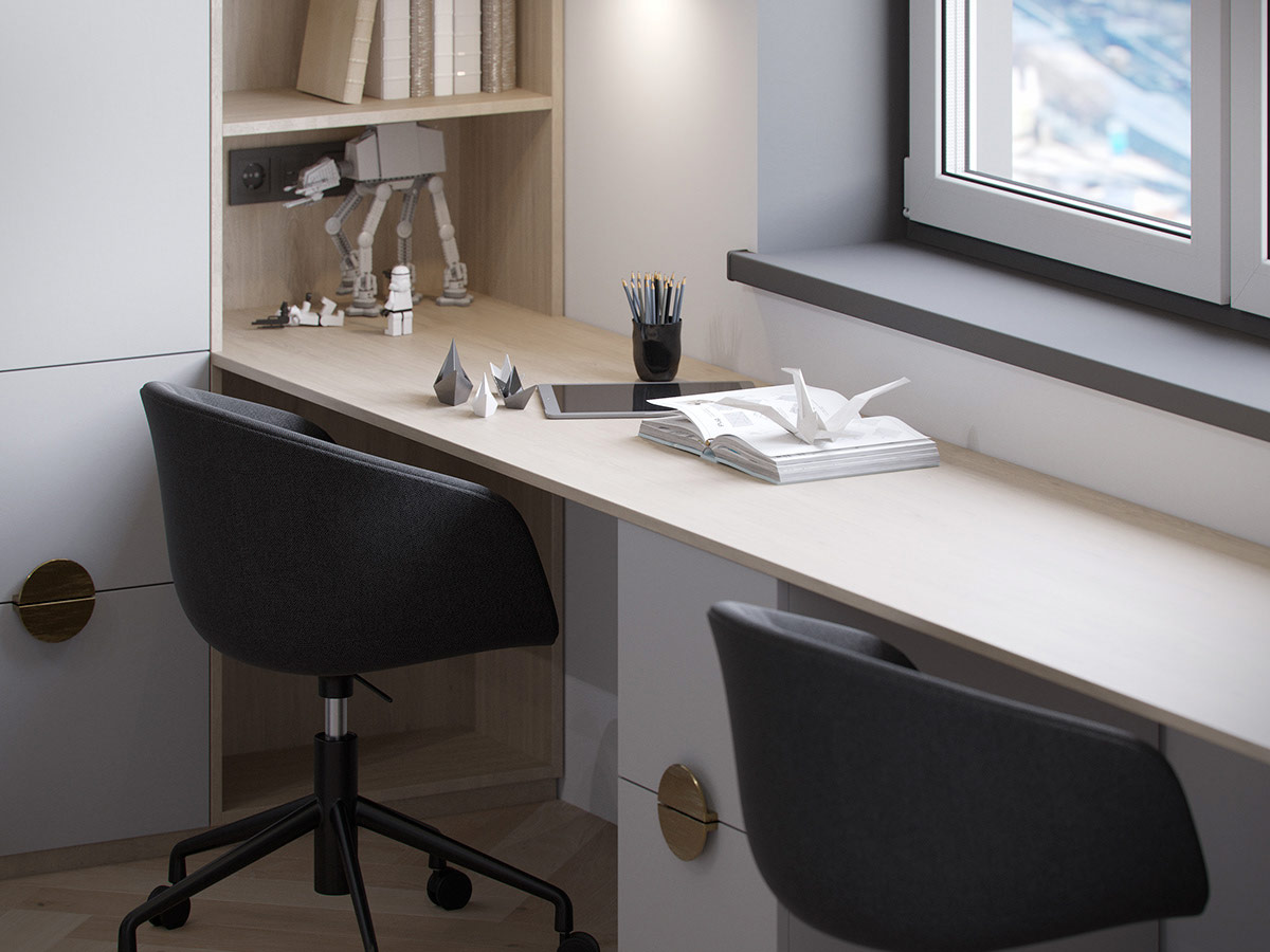
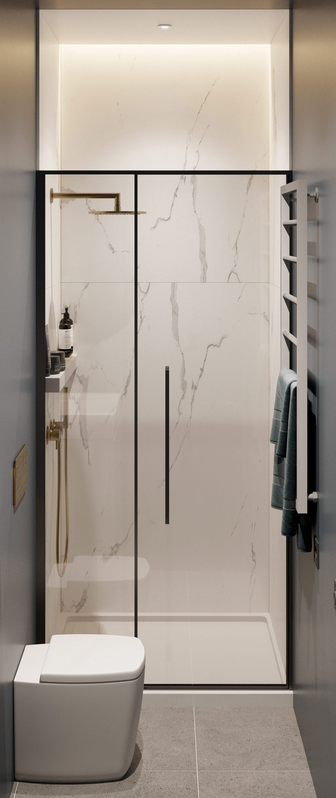
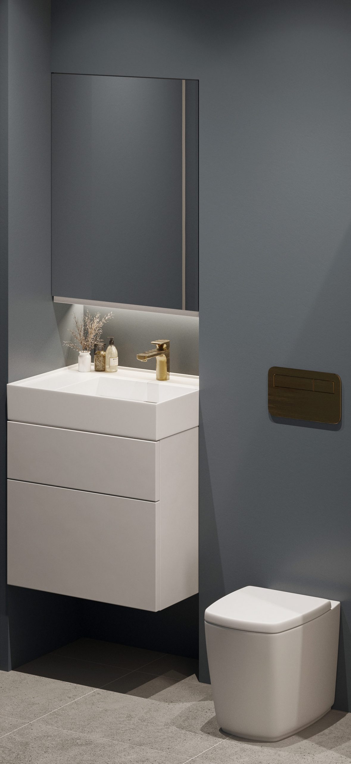
Dark blue shades present a fabulously high-end accompaniment to a trendy gray color scheme, whether in the living room, bedroom, or even the children’s rooms. That said, these two deep shades together can reverse the scale from soft and soothing to oppressively sober without the right balance to keep the aesthetics under control. The following two chic, modern home interiors, located in Moscow, hit this powerful color combination right. One home design absorbs breaks of playful texture to bring energy to the setting, along with atmospheric lighting schemes. Meanwhile, the other dominates the blue hue into inky blue-gray elements, surrounded by a light wood tone, classic panel molded walls and bright brass accents.
The theme of our first interior color study is a project that uses striped geometric panels to cut gray breaks between dark blue stripes. The change in texture effectively lightens and invigorates the shady aesthetic. A round carpet compensates for the sharp geometries and fuses dark blue accents with lighter shades of gray.
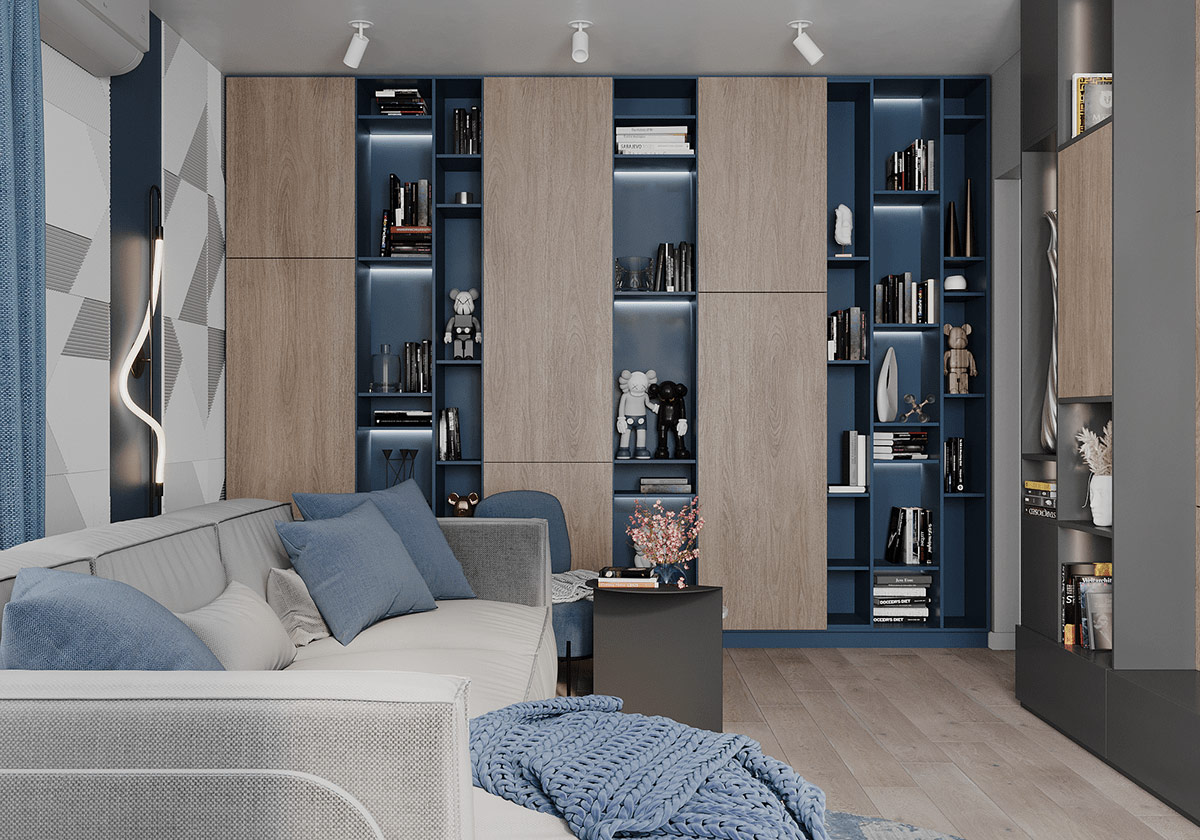
A striking blue bookcase makes an elegant inspiration for a deeply colored saturated decorative scheme like this. LED strips are installed to lighten the look, while decorative objects naturally break the large extension. A series of walnut cabinet fronts elegantly interrupts the color continuity and simplifies the abundance of eye-catching things.
The slate-gray fabric sofa freshly cuts between an ink art poster and a matching blue-gray area carpet.
Did you like this article?
Share it on some of the following social networking channels below to give us your vote. Your feedback helps us improve.
Watch this space for more information on that. Stay tuned to Feeta Blog for the latest updates about Architrcture, Lifestyle and Interior Design.
How To Balance A Grey and Dark Blue Interior
40 Architecture Examples That Look So Bad, People Just Had To Shame Them
Some buildings will absolutely captivate you with their amazing projects, ingenious architectural decisions and the power of their aesthetics. This article, however, is not about such buildings. No! See, not all buildings are the same, and the “bad guys” should be publicly embarrassed so that others don’t copy their projects. So we will focus exclusively on simple terrifying architectural decisions.
Remember to vote for your favorite photos you love to hate and be sure to follow the arrogant Facebook group if you like their stuff. They are a growing community with awesome content.
Bored Panda talked about what separates good and bad design, the need to democratize access to strange projects on private property, and also the roles that architecture plays with an expert in Sweden’s field that has a background in urban planning. You will find our full interview with her below.
1. I Dunno, Slim Doesn’t Seem To Be Digging This Situation
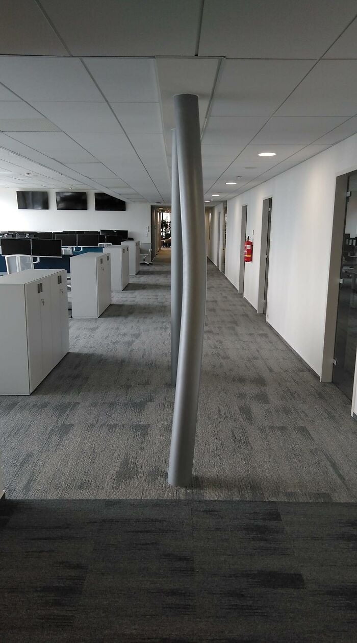
2. This Pillar Was Straight Last Week. This Is The First Floor Of A Seven-Floor Building
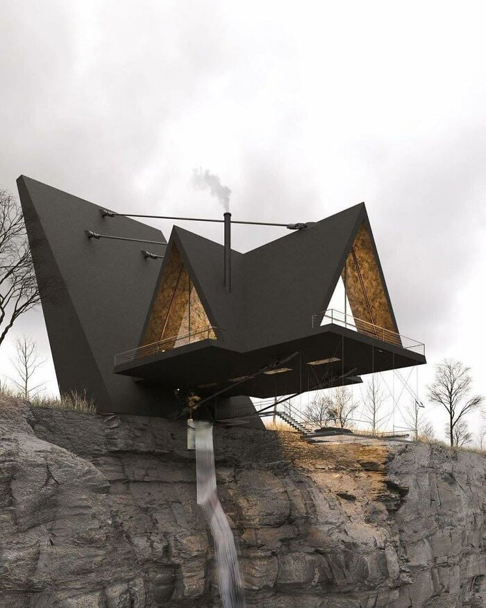
3. I Do Not Give A Damn How Well It’s Cantilevered Or How Strong The Struts Are. I Do Not Have The Kind Of Luck It Would Take To Set Foot In This House
The Swedish planning expert with Bored Panda explained to Bored Panda that while public spaces must meet safety and accessibility standards, aesthetic standards can be much more fluid for buildings. The expert spoke to Bored Panda on the condition that she remain anonymous. (Remember, just because you’re an expert at something and want to help doesn’t mean you always like fame … as opposed to a weird architecture that just asks you to look at it!)
“Most often the elements of the built environment must be in harmony with each other and with the environment. However, sometimes something more daring and ready can form an attractive contrast, “she said. However, the urban planning expert shared with Bored Panda that, in her personal opinion, our built environments should engage us, as well as stimulate our minds and senses. In fact, she believes that the ability of architecture to make us think is one of its most powerful aspects.
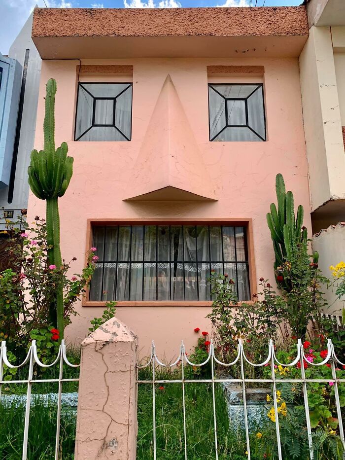
4. The Cactus Is *chef’s Kiss
5 . This Is Not Photoshopped
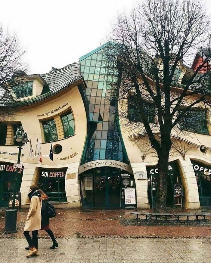
6. That Gives Me Anxiety
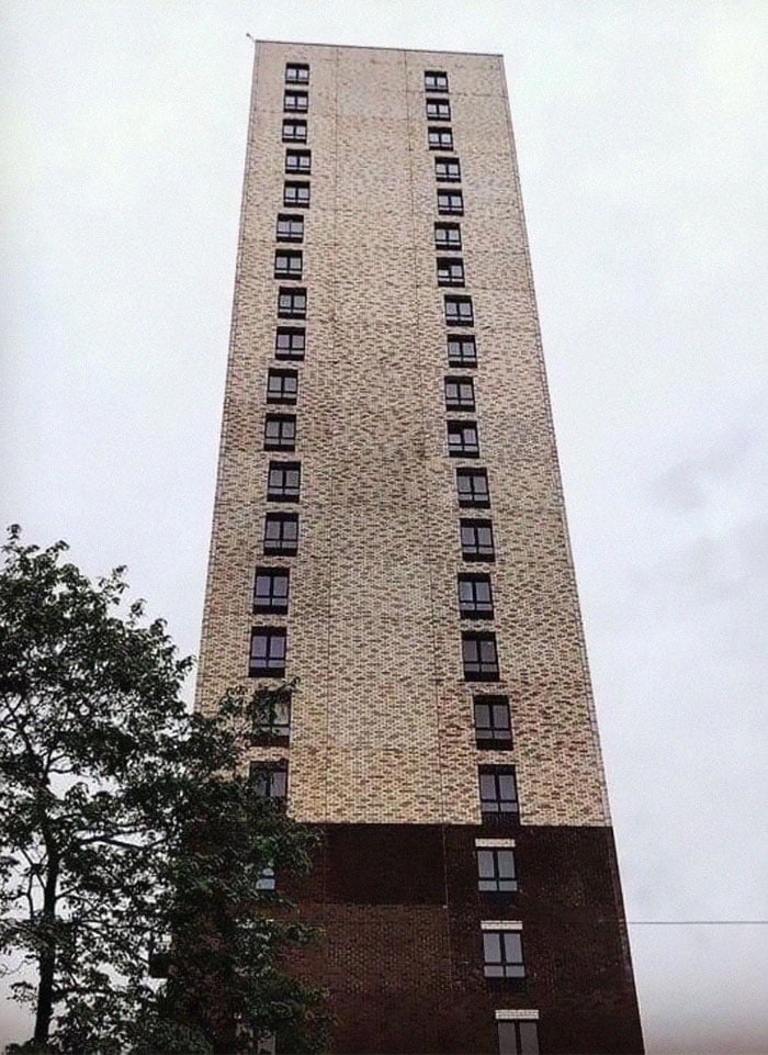
“There are circumstances when architecture has to create a sense of calm and security, yet there are cases where it’s not bad if the architecture provokes us and makes us think, ‘Why don’t I like the look of this building?’ ”
The city planner said we need to give people the freedom to express themselves the way they want when it comes to designing their private property. As long as they have the resources, almost anything is allowed, in her opinion.
7 . Opera And Ballet Theatre Of Cheboksary (Russia)

8. A Friend Of Mine Cross-Posted This And It Made Me Think Of Y’all
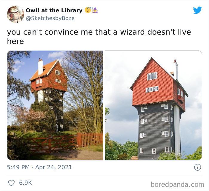
9. I Might Like This If Those Were Slides
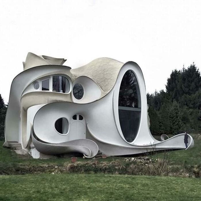
“Strange architecture comes from our innate desire to prove our uniqueness. However, not everyone who has the resources has a medium taste for aesthetics. However, if it’s for the people who live or use their private space, I mean why not? “she told Bored Panda that as long as you don’t actively harm anyone, no matter how bad your projects are, you have to be as unique as you want to be. Even if it lacks objective aesthetic standards.
10. Who Remembers Those Gerbil Enclosures That Look Like This?
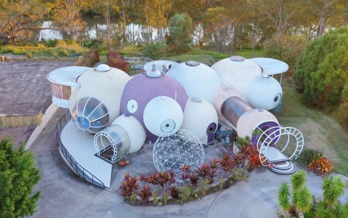
11. This Looks Like A Place A Villain Would Live
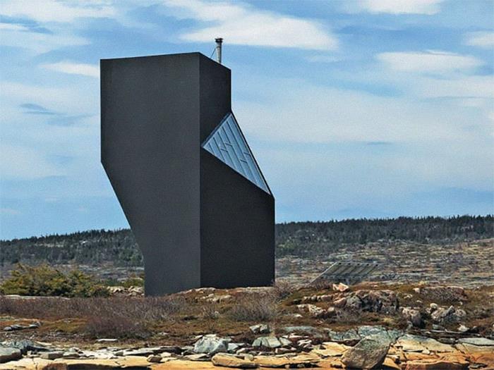
12. I’ll Meet Your Brutalism, And Raise You This
However, the expert acknowledged that others in the industry may not see things the way she sees. Others, she said, believe private property should harmonize with the surroundings.
“But I don’t think we should cross that thin line where architecture becomes reserved only for the rich and for those with good taste ’(whoever decides that). I’m only talking about the private property here. When it comes to public space, there has to be a consensus between public and professional on the design, ”she said, as the rules for the private and public spheres are very different.
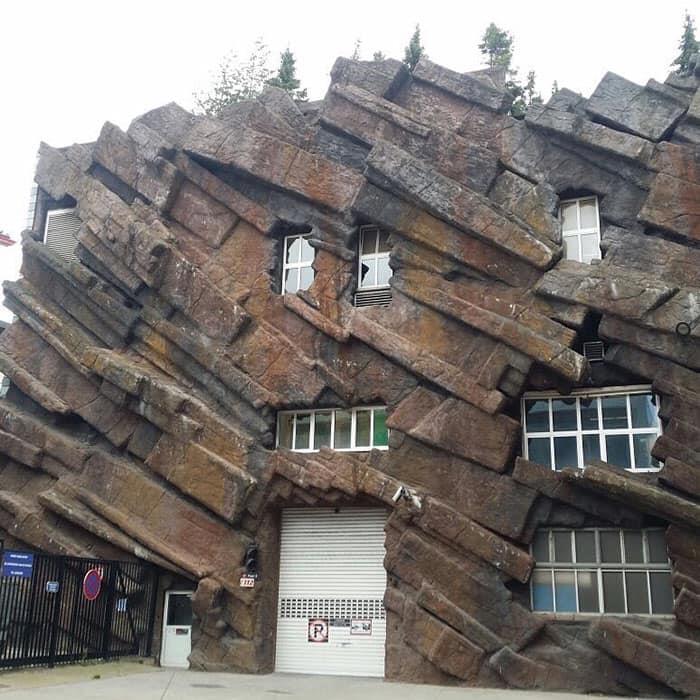
13. Um… What Is This?
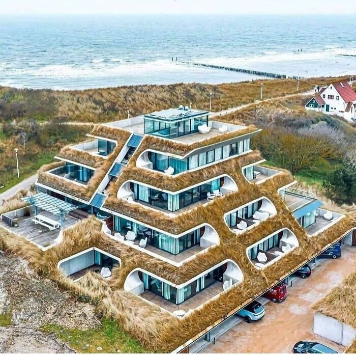
14. Art Nouveau On Psychedelics
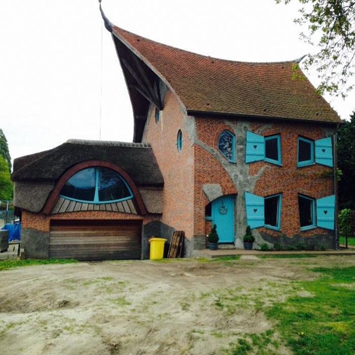
15. I Wonder Who Thought This Would Be A Good Idea
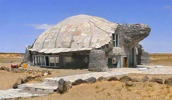
The town planning expert also had some design tips. “First, although I often advocate for unconventional-looking buildings, I do not purposely encourage provocative architecture. The building must be designed with the intention of housing and protecting society. It should create a sense of security but not be boring, ”she told Bored Panda that we need to balance uniqueness and service, expression and community.
16. “Sharkitecture”

17. Can We All Just Take A Moment And Acknowledge That Prince Produced Some Great Music, But He Lived In A Water Treatment Station

18. The “Snail House” In Bulgaria Actually Does Look Like A Snail
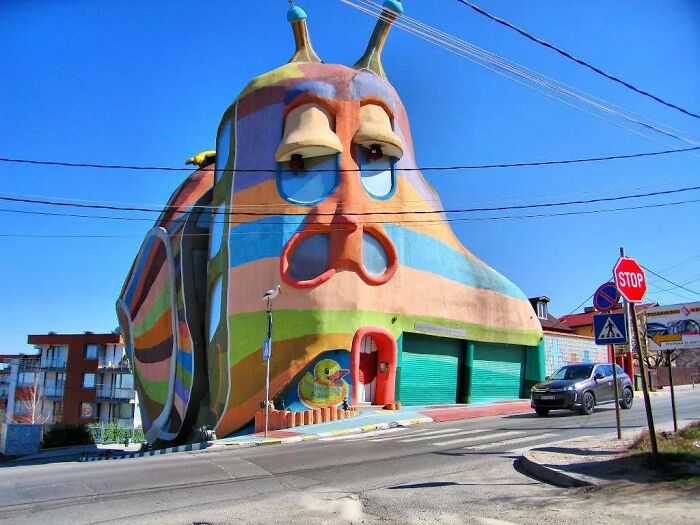
In addition, the expert from Sweden pointed out that accessibility, inclusiveness and empowerment should also be key features of any architectural project. “I also prefer somewhat complex but systematic projects. Minimalist and box floor plans are good in some cases when easy access is needed (e.g. hospitals) however they can be completely untrue while more complex floor plan plans are more stimulating (e.g., good for schools, in my opinion). ”
19. Toilet-Shaped House (Named Haewoojae), Built By Sim Jae-Duck, The Chairman Of The Organizing Committee Of The Inaugural General Assembly Of The World Toilet Association
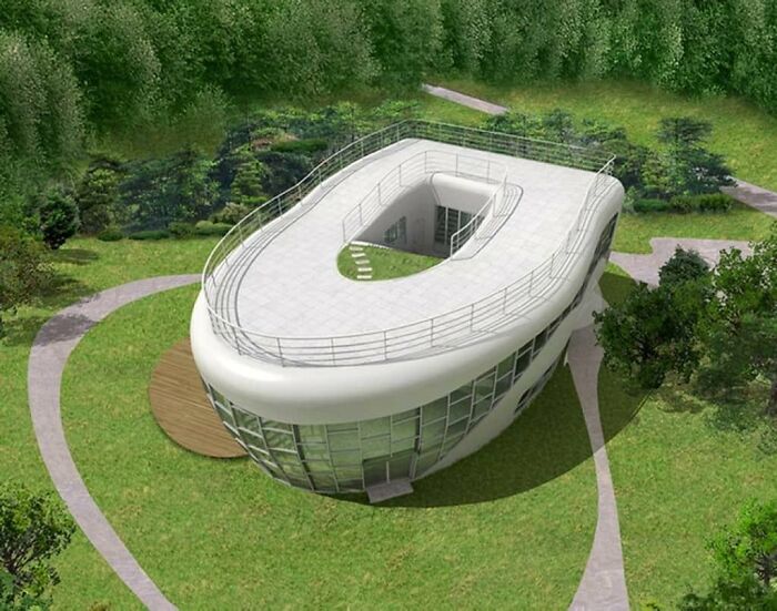
20. Interesting Concept
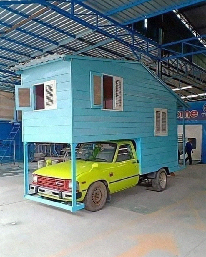
21. A House I Used To Drive Past In A Little Iowa Town. All I Ever Heard From Locals Was That This Place Had A Terrible Leaking Problem When It Rained
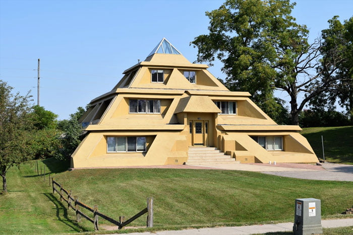
At the time of writing, the ‘Here It Is, I Shaming Architecture’ community had 64.1k members. However, it is growing so fast that when you read this, dear Pandas, that number could be much, much higher. In the last week alone, the group has grown by more than 7.3 thousand members. And they have created more than a thousand posts in the last month.
22. They Drew The Line At A Fountain In The Kitchen
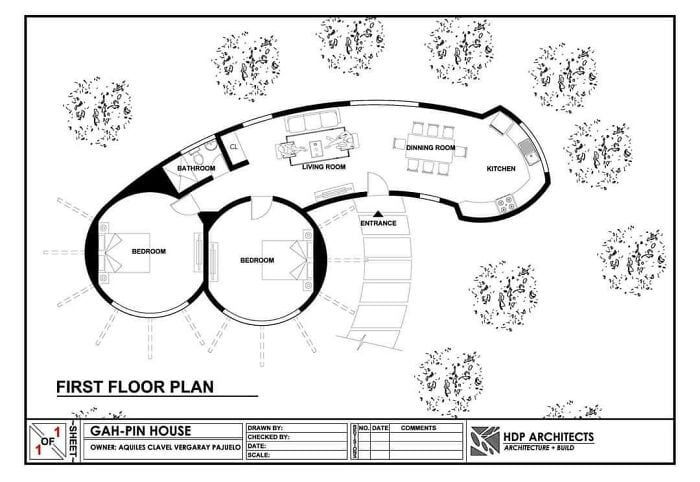
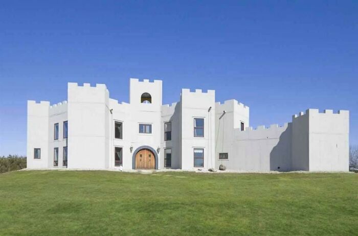
23. You Too Can Have Your Own White Castle
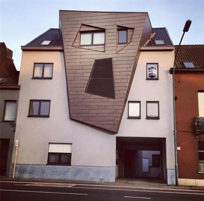
24. I Will Haunt Your Dreams! Residential Building In Belgium
Because of this rapid growth and the problems with it, the manager of the “Architecture Shaming” group, Oregon-based Matthew Brühn, addressed the community and the changes that took place in April. Basically, the rules are now much more structured.
25. I Think Syndrome From The Incredibles Lived Here

26. Bangkok’s Elephant Building. The Tusks Are A Bowling Alley In My Imagination
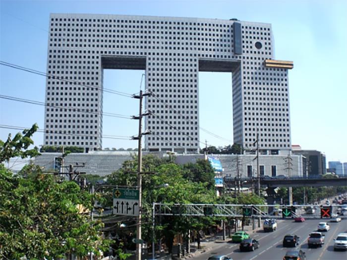
27. Why?
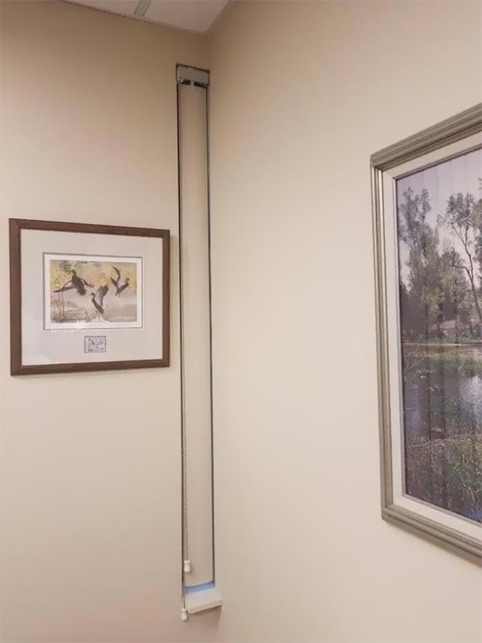
Matthew pointed out that the administrators were tired of the “massive influx of negativity,” which came with more and more members joining the community. While the manager expressed his admiration for how amazing many members are, he also noted that the group will start filtering out too aggressive posts.
28. Saw This On A Walk Today. A Table Lamp, In A Glass Box, Hanging From The Roof Of A Carport
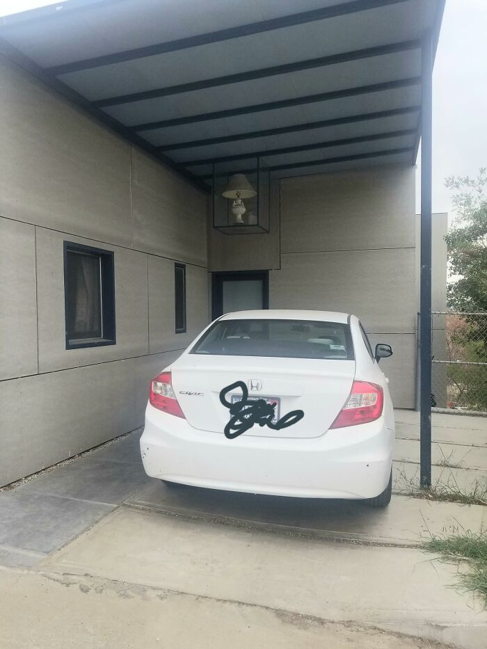
29. This Is Plane Awesome
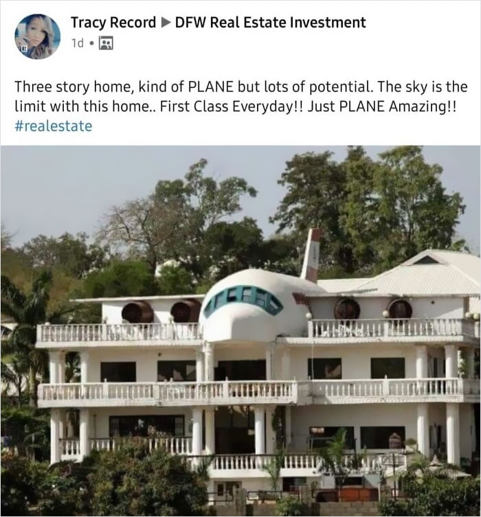
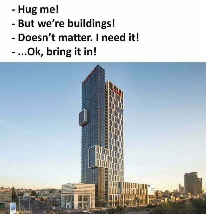
30. Spotted This Gem In Tel Aviv

“Don’t take it personally; we’re just trying to create an atmosphere where we can all have fun and be kind. Now is the equivalent of a small town of us all here now, so that will be harder, “Matthew pointed out. He added that mentions of politics and religion will be removed, while all potential new members will have to answer some questions before entering. at the end of the day leads to a friendlier and happier community that, we are sure, abound of you pandas will want to join.
31. Kind Of Reminds Me Of A Church (Granted, A Strange One) But It’s Actually A House With A 6,000 Sq. Ft. Garage… And Its Own Car Wash
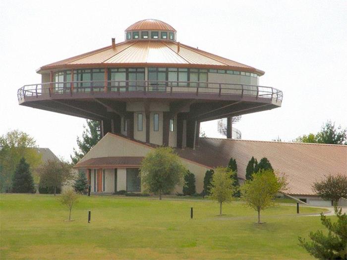
32. Surrealist Neighborhood
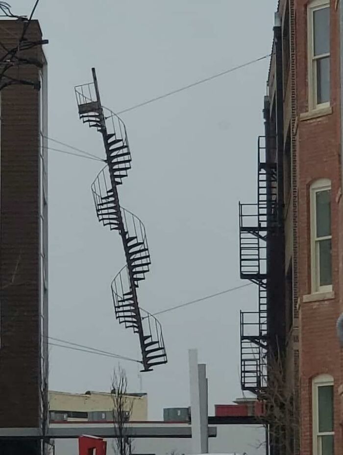
33. Forbidden Waffle In Santiago

34. This Building Has My City In A Uproar
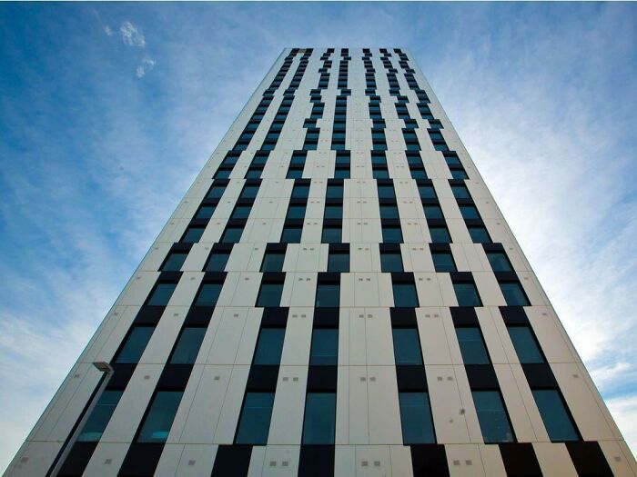
35. Please Don’t Take It Too Seriously, Just A Surprised House
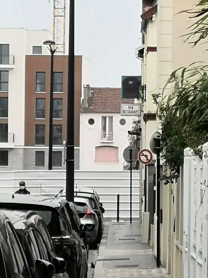
36. This Place Is All Curb Appeal
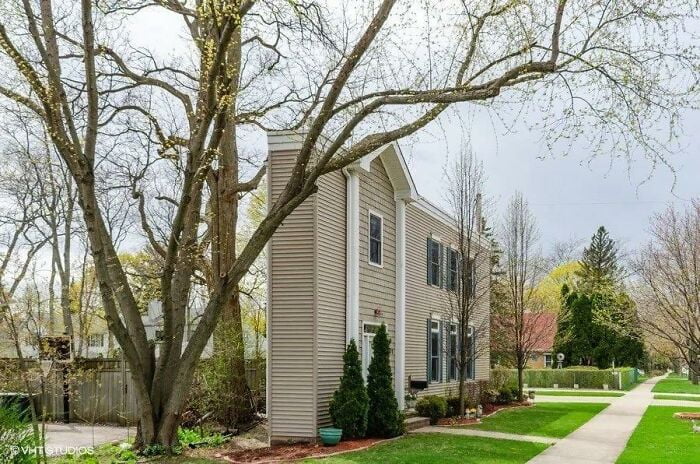
37. The Glorious Flower Of Communist Brutalism That Is The Former Central Post Office In Skopje, Macedonia. Some People Want It Preserved

38. Just
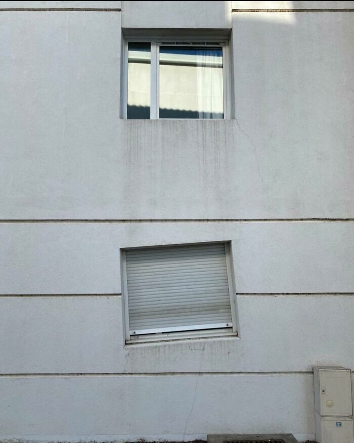
39. I’ve Been Looking At Homes Trying To Get Ideas For When We Move In A Few Years And I Came Across A House That Was Perfect In Every Way Except One
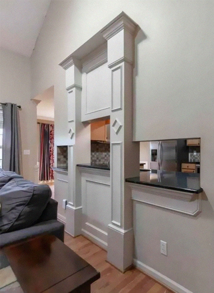
40. Car Dealership Trying For More Of A Classy Look!
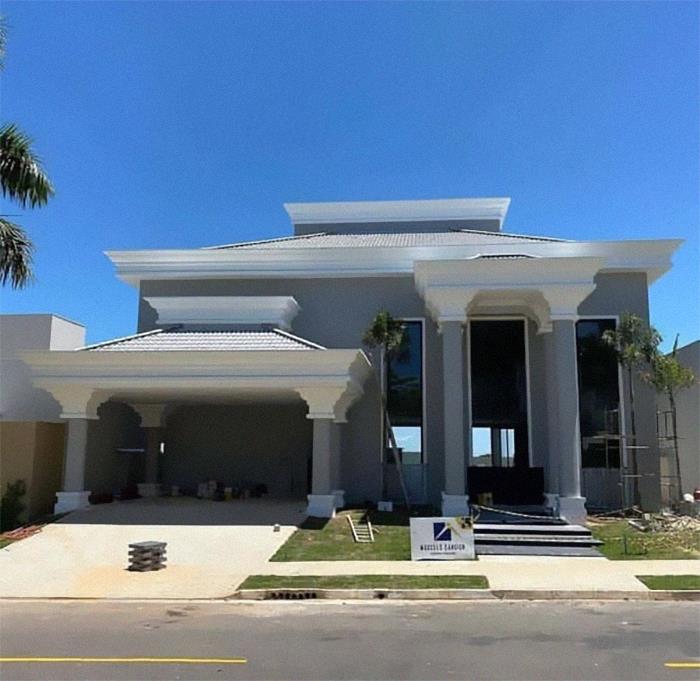
Watch this space for more information on that. Stay tuned to Feeta Blog for the latest updates about Architrcture, Lifestyle and Interior Design.
40 Architecture Examples That Look So Bad, People Just Had To Shame Them
- Published in 700-page, Architecture, bad architecture, bad design, blueprints, bp-exclusive, building plan, Design, design fails, designs that stand out for all the wrong reasons, Fails, Funny, good and bad design, Homepage featured, Pics, quirky architecture, shaming architecture, That's It I'm Architecture Shaming, weird buildings
A Breathtaking Shipping Container Transformation
Have you ever considered living in a “Container House”? What would be the lifestyle of living in a Uja House? Can I also live in a Container House?
So, guys, we are here to answer all your questions.
Let’s start by knowing what a shipping container is?
Container houses are made of steel shipping containers that carry the shipping goods of ships and you can usually see them in any Port. They are made of steel, so they can handle the burden of home and carry all the things necessary in home.
In the era of today’s world shipping container houses are in trend and it is most attractive for those people who have an interest in doing adventurous things. Do they want to prove that they are capable of living in a shipping container house or not?

Currently, the increase in housing in a shipping container house continues to trend. People want to discover new things and this experience will be great to live in a shipping container house. These shipping container houses can be at any location suitable for you and your neighbors. Due to the pandemic interest of people growing about shipping container houses due to their unique structure and design and their special qualities. People are bored living in the city lights.
They want to stay away from the noises, pollution and many other problems related to cities and they want to live in a beautiful environment and they also want to carefully experience the beauty of nature and environment.
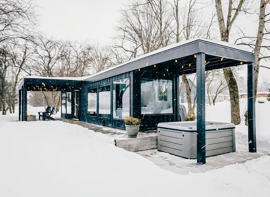
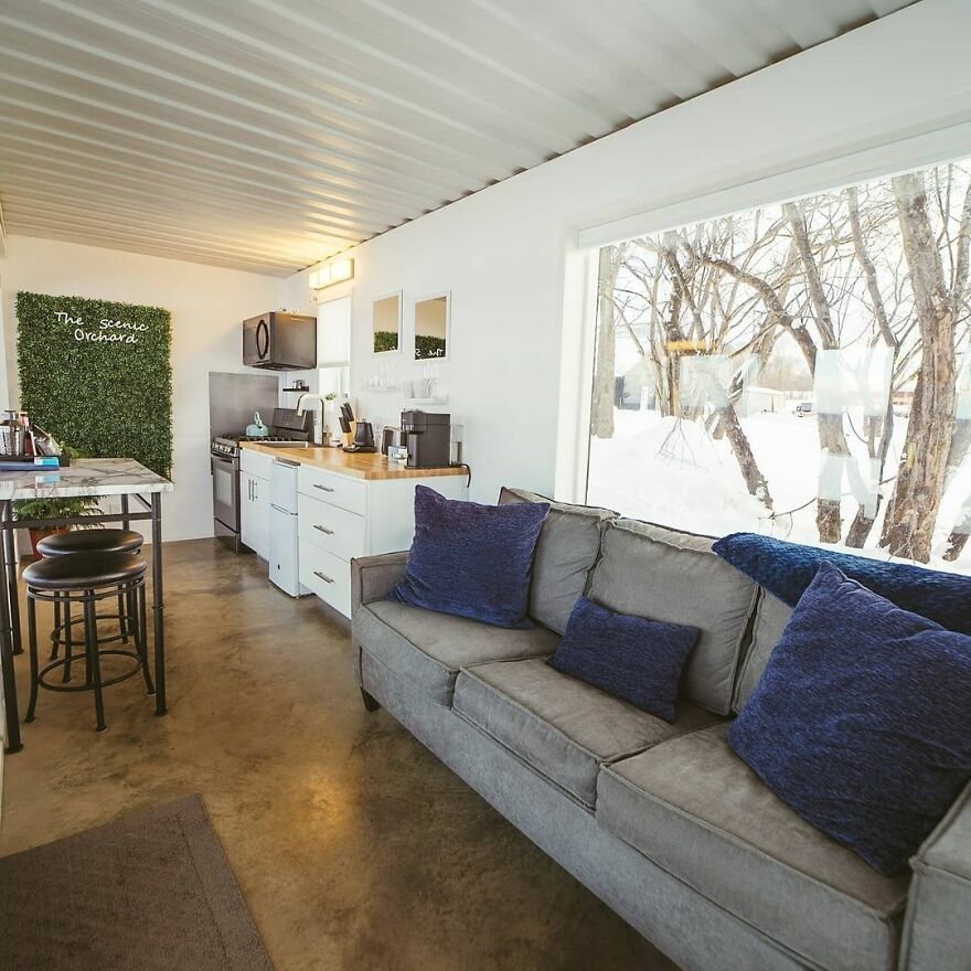
Today we will talk about the Akaydia container built by E. Broomfield with the help of a 1x40Ft shipping container.
These containers had a unique look and effect on people who wanted to live in it.
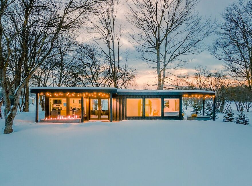
It also has a unique concept and structure of a normal house and it has all the qualities needed in a home.
In today’s modern world a 40-foot container has so much space that you need to do everything you want to do in the cargo hold. I’ve also added some pictures for you and after you look at them, I’m sure you’d like to experience living in a shipping container house.
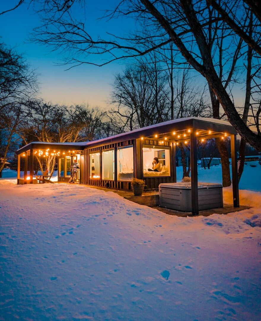
The color of this shipping container is chosen according to the atmosphere and environment from where it is located. As you can see in these pictures that this is a nice atmosphere all around and that this place is free of noise and away from the city lights. Stay calm and free from the busy schedule of your daily routine life. You should try to live in a shipping container house with your family to experience and add beautiful moments to your life.
Container Houses have become a trendy choice for a holiday with a family and some families are very familiar with what they want in shipping container houses for years.
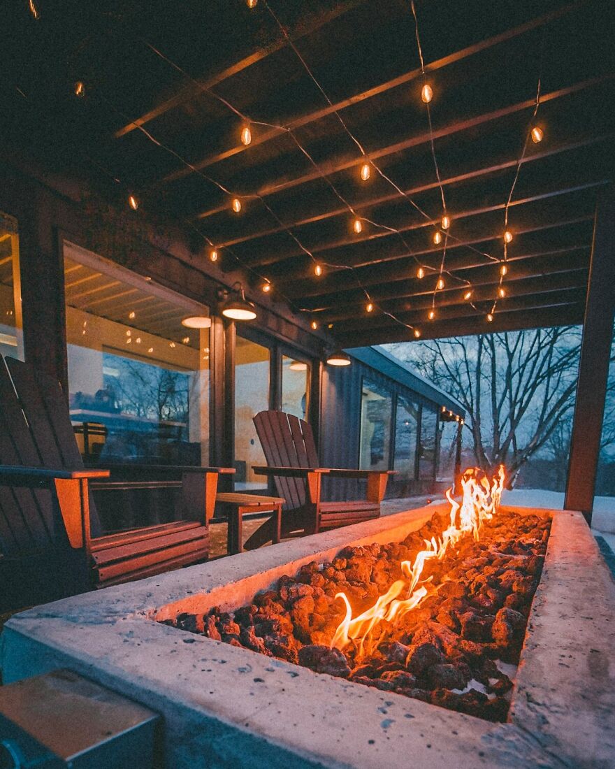
Most of the shipping container houses include all the necessary facilities in home, such as- Kitchen, Bathtub, Firepit, and many more. This trend is impacting very rapidly the growth of the small houses market and container houses market in a positive way.
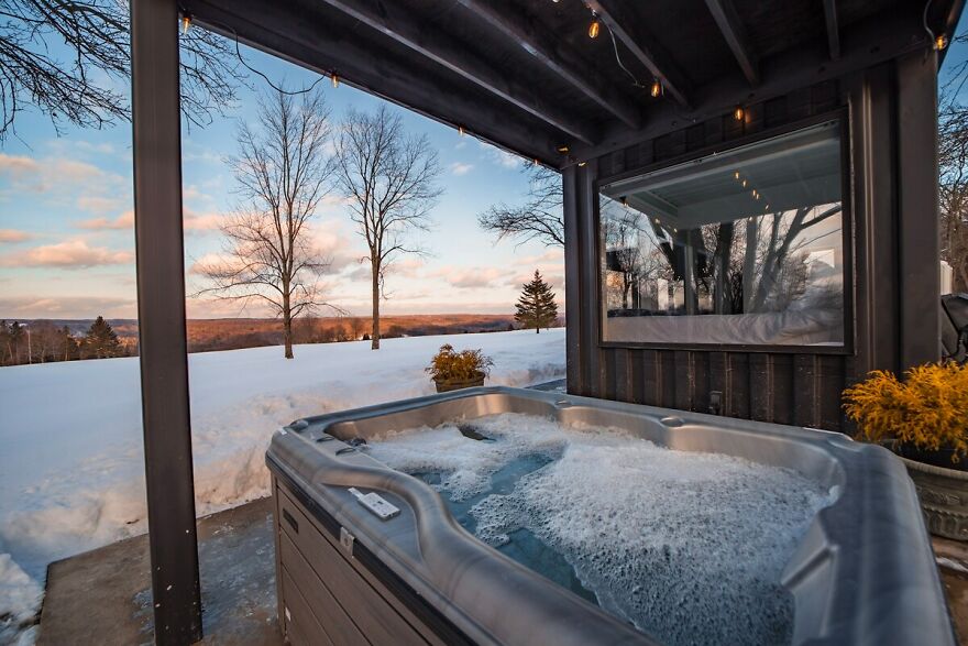
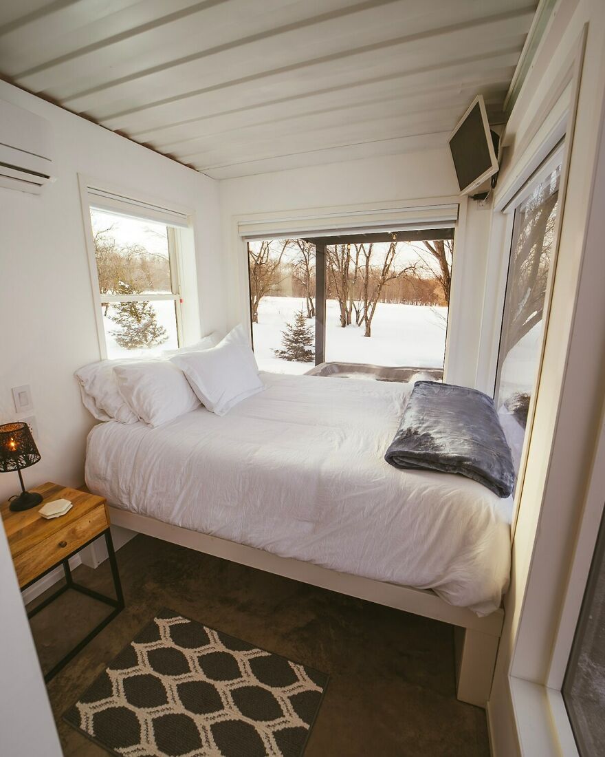
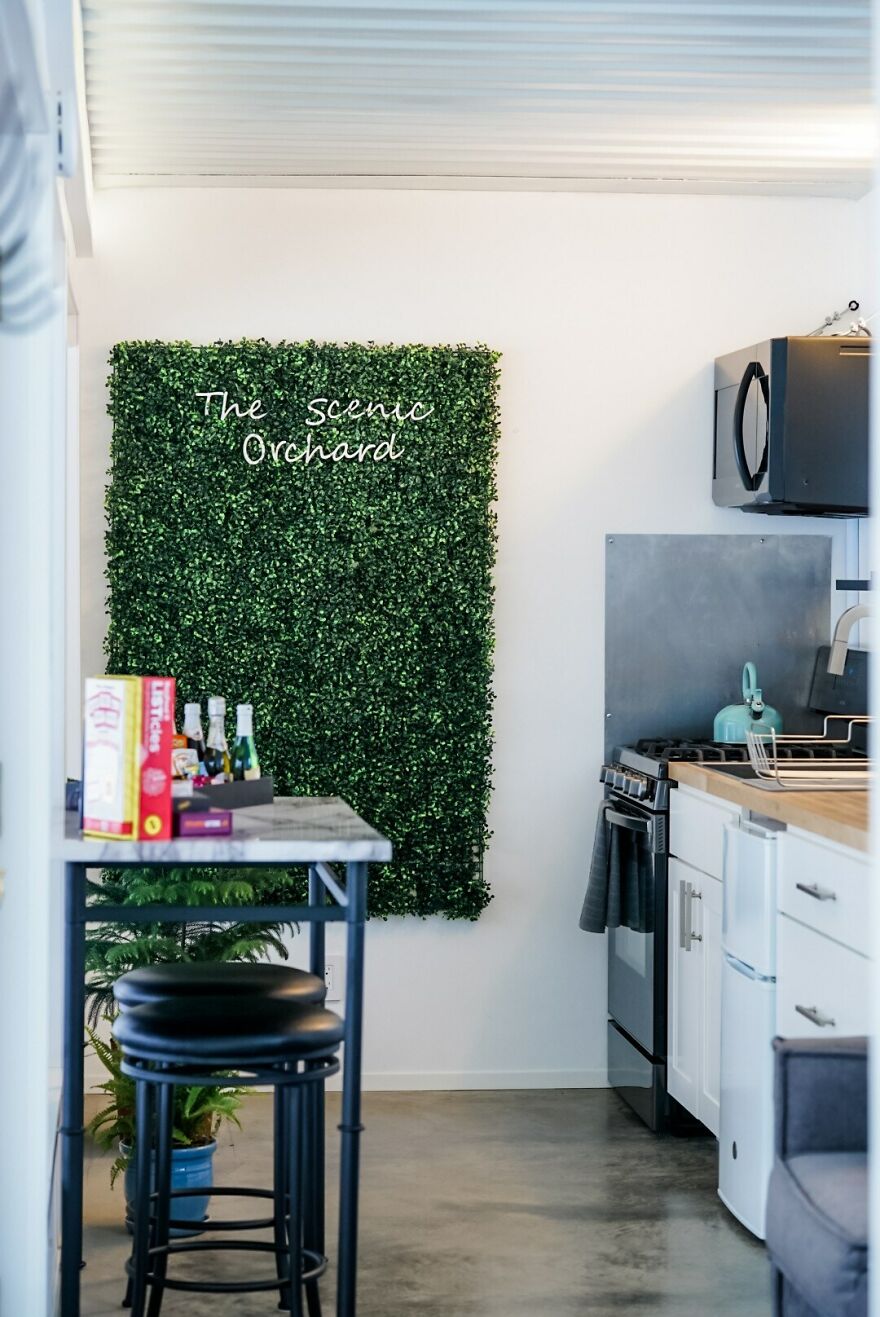
As you can see due to snow, you can enjoy and experience a beautiful experience of Hiking and Skating close to your boat. This house also includes a very spacious and comfortable Kitchen in which you can cook your favorite food anytime. In this house container, you can customize the things according to touring needs and also to your pocket. In this spacious house container, you can also have a fireplace in winters to have a warm environment near you and you can feel and enjoy the beauty of nature.
In this container house, you can have a good conversation with your family while having dinner.
In this type of house, you can make changes according to your mind as you experience a new world every time you make changes in it. There is also a bathtub located in the back of the shipping container. You can bathe whenever you want. There is a spacious hallway in it for you to sit, talk and spend quality time with your family. This container consists of cheap compared to an average normal house located in a city. You can experience the sunset in detail and the surroundings close to this shipyard.
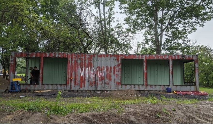
To transform a steel shipping container into a house will take up to 3-4 weeks and then you will be able to enjoy and take advantage of the facilities that were in your home during the construction of your container house.
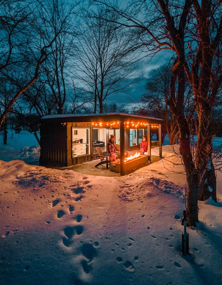
The look of shipping really adds a classic touch to the modern house which helps us to remember classic houses and their simplicity. The glasses transform the classic container image outside the building modernity and bring a cool spirit to the shipping container house. When we look at this container, we see a color combination and everything is adjusted to its ideal location in such a small space. I personally suggest that you try and experience this unforgettable experience and add some moments in life for the future. Shipping containers are one of the innovative and amazing things for adventurous people.
Boredom houses are very much preferred from past years and they are increasing day by day due to their very well maintained structure and their special facilities and in this pandemic time, this is the best choice to protect yourself and your family against this pandemic. I hope you enjoyed today’s article as always and we will continue to write about unique and interesting container houses for you to discover and explore new things and adventures.
If you want to have a great experience in this unique container house located in Barneveld, New York, we recommend you stay here.
A Breathtaking Shipping Container Transformation
- Published in container home, Design, house renovation, Modular Homes, Shipping Container House
Best Color Schemes For Bathrooms in Pakistan
Design a colorful bathroom with styles that really speak to you. It’s important to create a space that increases your energy and offers you a quiet rest from your busy schedule, as it’s the room for which you spend time getting ready in the morning and getting ready for bed.
Consider customizing your color scheme and decor if you want to create a new look in your bathroom, but want to avoid a complete interior overhaul. Without an excessive budget, a few quick adjustments will produce a whole new vibe.
Bathrooms can challenge a lover of home design, they are an expensive renovation proposal for most of us with a budget, and it can be difficult to justify a remodel if everything works. But how can the room be decorated? It can make all the difference in how much you enjoy your bathroom … and the good thing is that you can learn to love your bathroom again, or for the first time.
How To Design Your Bathrooms That Give An Attractive Look
We have hand-picked bathroom paint plans that will help transform your space if you are looking for inspiration during the remodeling process.
WHAT YOU CAN DO WITH A WHITE COLOR SCHEME
Pale blue and white
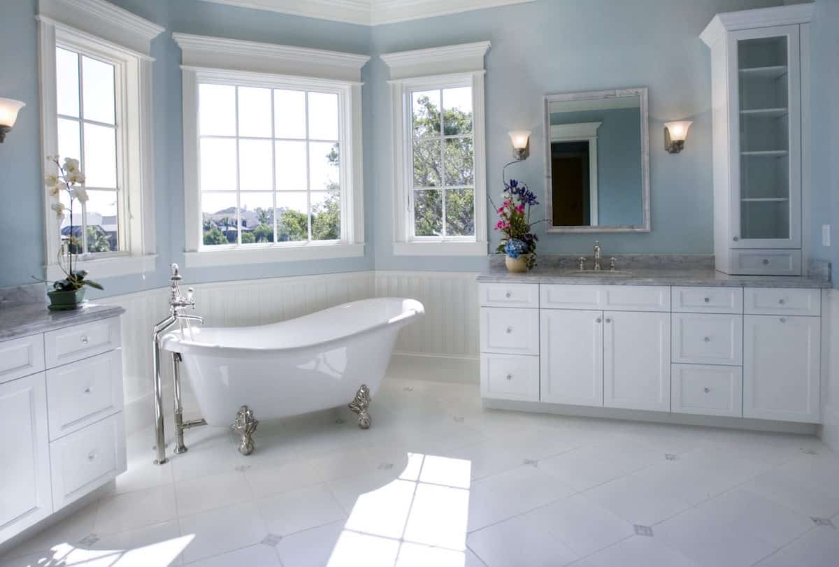
It is wet, traditional and absolutely serene. Pale blue and white as a combination of colors, I mean. It looks great as a bathroom color scheme, especially when brightened by some natural light. (And we can’t help but fall in love with the claw-foot tub with toilet!)
Red and white cherry
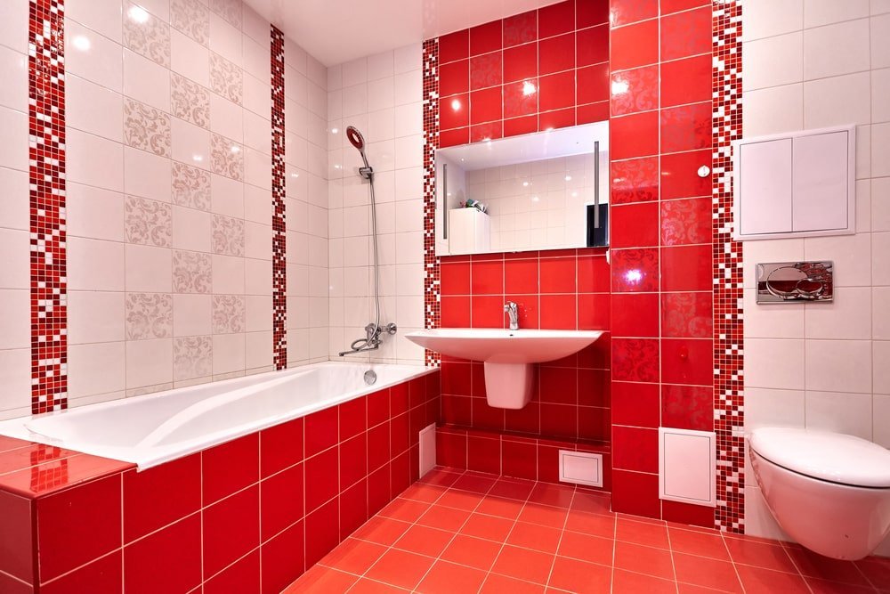
A cheerful and bright way to add spunk to an otherwise white bathroom is to add bright red wall tiles and red bathroom mats. The color scheme is hospital-esque, probably because it produces a clean and germ-free appearance.
Kremblanka
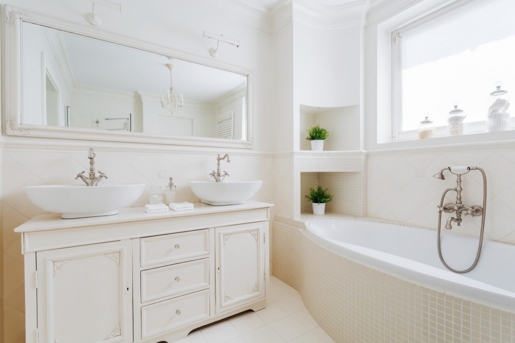
Traditionally bathrooms were not very bright spaces; traditionally in the sense of decoration/color, they did not seem to attract much interest. If your bathroom is a conventional model, you may enjoy keeping the color scheme, creams and whites very neutral. The look is not only new, but it is also light and bright.
Amaranth and white
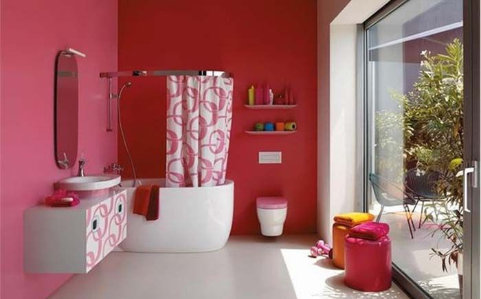
Right now, it’s just a warm color, and with good cause. It’s not a peach amaranth, it’s not red, but it’s a nice, rich cross between the two, not too cool or too masculine. We love the unexpected coordination of the cabinet doors and the shower curtain.
Mint and white
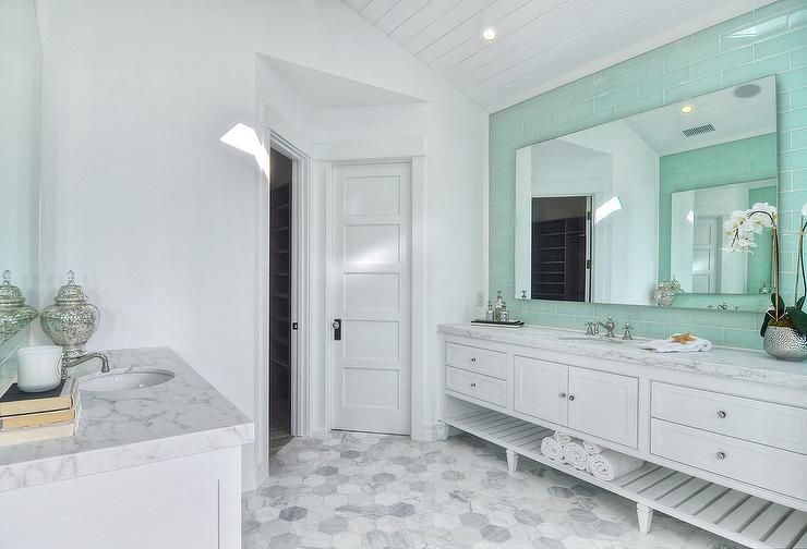
Mint and white are fresh and unmistakably cheerful, making a beautiful color scheme, especially in tiny bathrooms, where every square inch matters. A small-scale wallpaper print in the paint scheme destroys the unity of the walls and leaves the room feeling larger. And added to the fresh appeal are side silver and white lamps.
WHAT YOU CAN DO WITH OTHER COLOR SCHEMES
Wood look
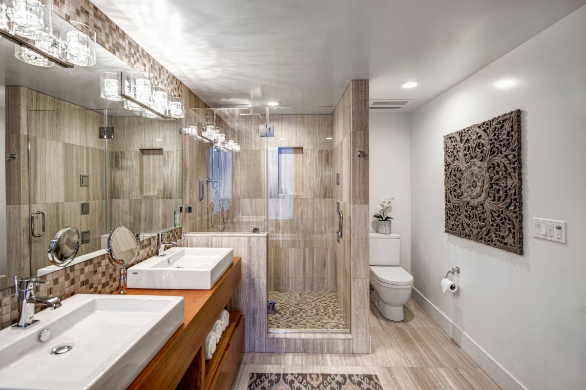
Mix a more luxurious bathroom, a double-tap tub and a linoleum floor with a rustic look. To round out the room, play with the natural tones of the forest with oats and brown paint. With this rich color scheme, white and silver accessories augur well, so the natural browns can be mainstream.
Turkish and green apple
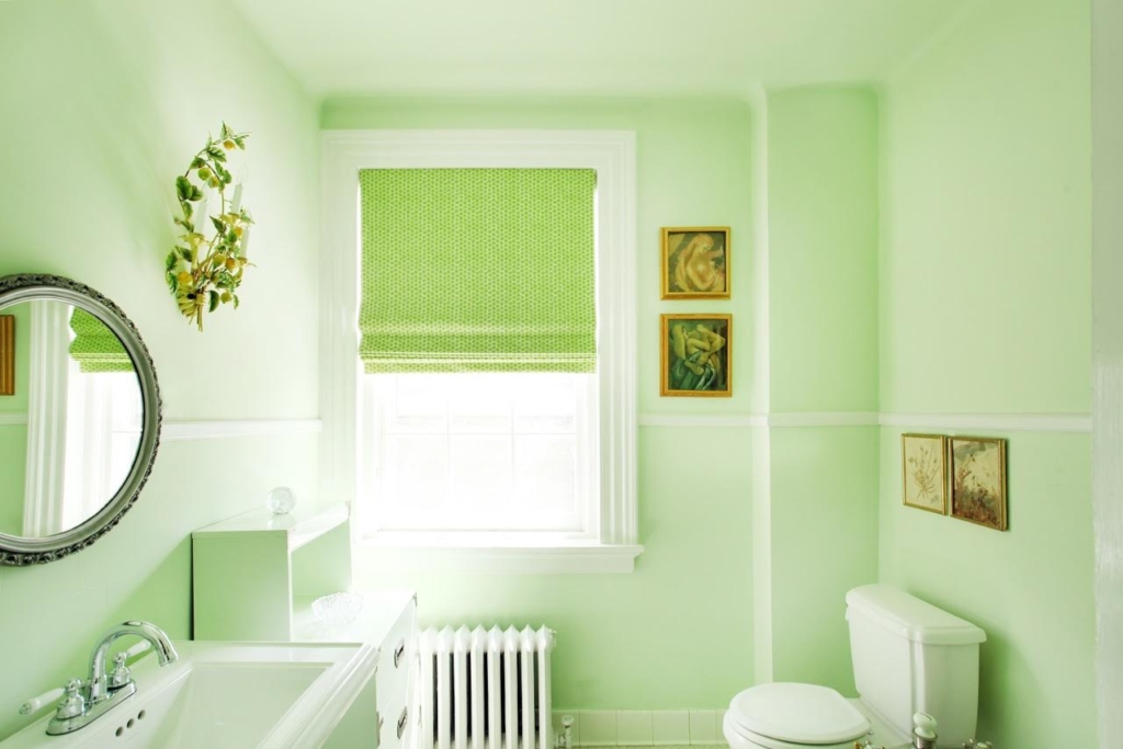
One wall of drawn wallpaper in the middle bathroom is enough to dare an ad. For a one-color paint palette, neon green contrasts with turquoise and soft blue. Although white accessories brighten the room, the rustic wood vanity brings character to the room. The flower-designed wall can be imitated by the circular mirror and make the room larger. Ideas like these for bathroom remodeling are perfect for a guest or teen bathroom.
Clear Green Relaxation
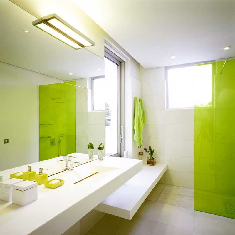
You can include your liking for nature in other aspects, including even if you don’t have wide windows scaling your bathroom wall. The natural look will be exuded from stone or wood, while mint green and white colors guarantee a soothing feeling. These square sinks work well in rectangular rooms and panel windows, and clean lines will help repeat the modern theme you’re aiming for.
Thanks to the generous use of warm, earthy tones, this rustic traditional townhouse bathroom style immediately looks friendly and attractive. We appreciate the fact that brick tile varieties are used so as not to overheat, and with occasional doses of pine woods, things break down.
Gray love
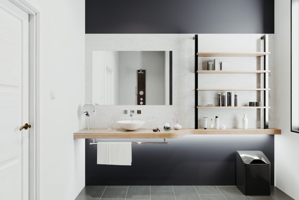
Neutral colors, such as gray ash, give a soothing feel to your bathroom. A welcome contrast can be provided by mixing the gray walls with whites and browns. Install a separate tub, shower and sink for a completely luxurious touch and complete the look.
Tangerine Vibes
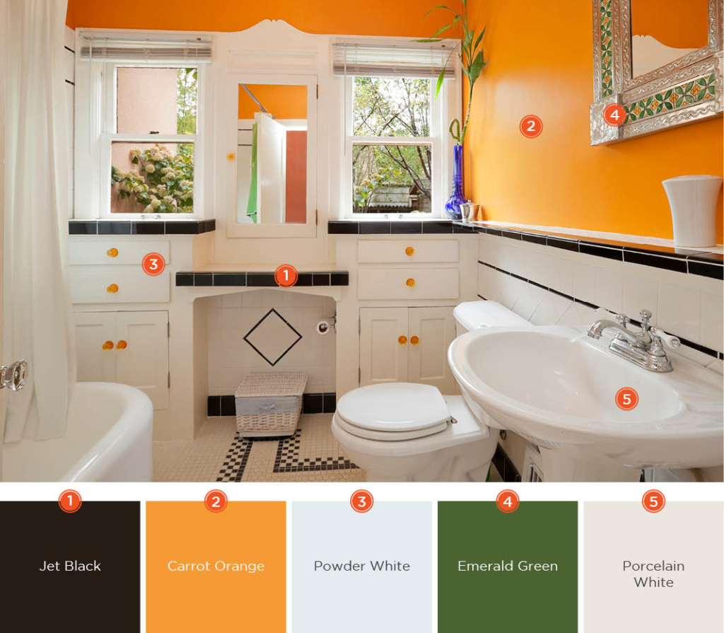
When it comes to color, don’t be afraid to illustrate your artistic hand. This mandarin orange and white bathroom combination gives a space full of flavor. To replicate this look, you can paint your favorite style or use wallpaper, just make sure to contrast the top with a solid color panel under the chair rail to match it.
Chocolate and cream
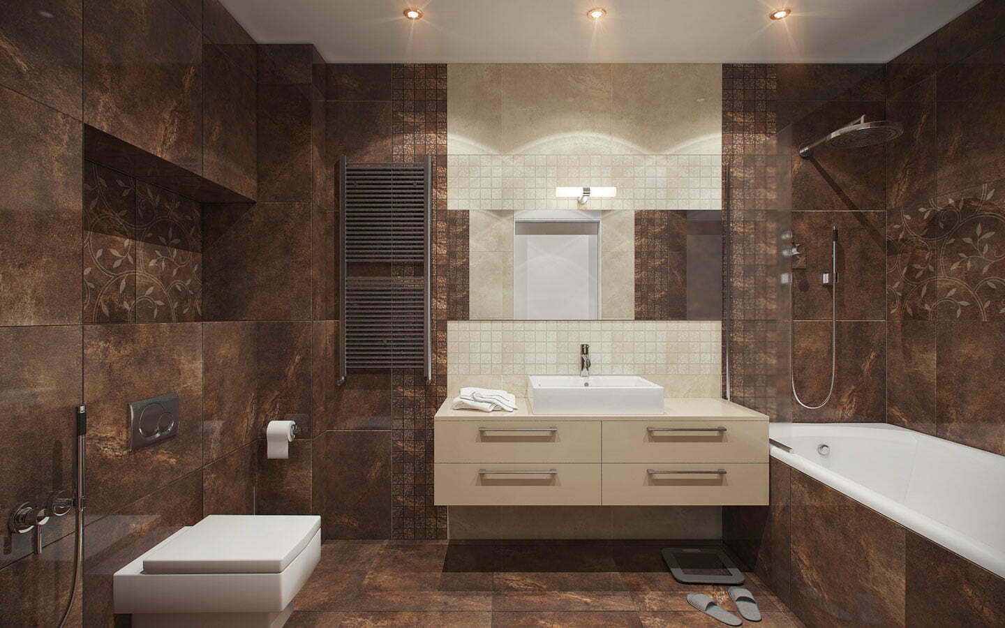
No, we don’t just care about ice cream sandwich ingredients. The rich tones of a chocolate brown bathroom make an even smaller space feel spacious and comfortable at the same time. It is a smart choice to separate the brown expanse with a geometrically designed bathroom rug, as well as the use of colored cream tiles between the mirrors.
Strong contrast
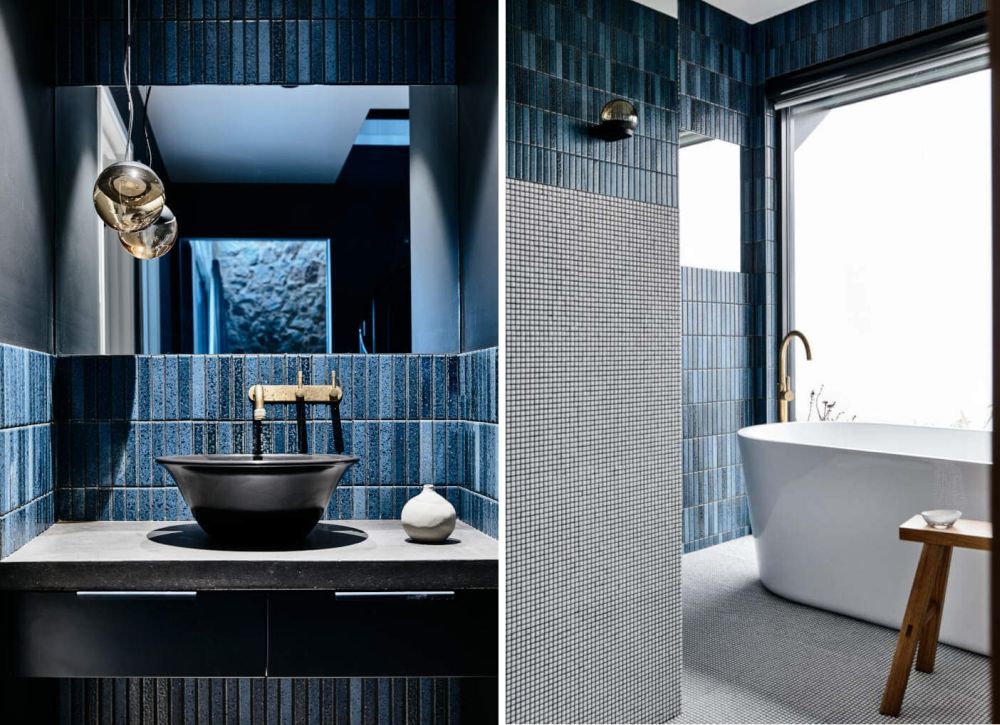
Various interiors have a lot of character and present options to mix textures, finishes, shapes and colors that would otherwise overlap and look less good together. To create a unique design, strong rustic accents can be complemented with clean and minimalist contemporary elements. This bathroom, for example, has an elegant oval tub and high-end chandelier, but in general, the walls, ceiling, doors and surroundings have a durable look.
Advantages Of Using Paint As The Core
- If you don’t have proper ventilation, paint can eventually leak out
- Easy for anyone to use
- Usually more affordable
- Easier to change along the way
Advantages Of Using Tiles As A Core
- Easier to clean
- Grout may need to be replaced over time
- More lasting
- Usually associated with higher quality
Wrapping It
Remember that the whole feel of your bathroom can be changed with different colors. For example, a warm pitch will emit yellows, reds, and oranges; while blues, greens and purples will help a bathroom feel more relaxed and cooler.
If your bathroom decor has a natural theme with materials like wood and stone, you can use warm colors. If you have a nautical or ocean-inspired bathroom, cool colors are ideal. You certainly have a favorite shade, but that doesn’t necessarily mean it’s on the walls of your bathroom. Put some effort into the color of your bathroom and you will be forever happy about the result.
Meanwhile, if you want to read more such exciting lifestyle guides and informative property updates, stay tuned to Feeta Blog — Pakistan’s best real estate blog.
Best Color Schemes For Bathrooms in Pakistan
- Published in Bathrooms, Construction, Decoration, Design, Design Gallery, Home Decor, Real Estate, Real Estate Trends
- 1
- 2

