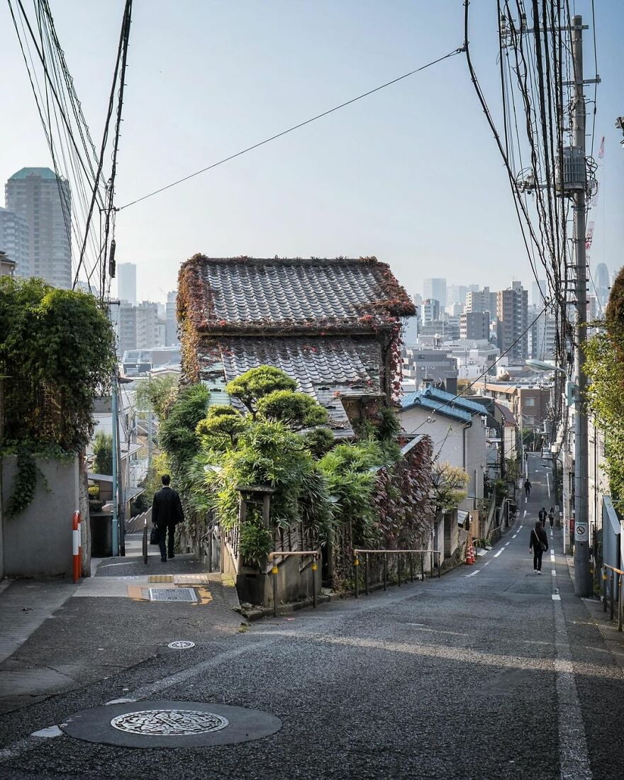
“Hinashizaka Slope on the left, and Fujimizaka Slope on the right. Apparently you could see Mt Fuji from here on the early 1900s. Likely blocked nowadays.”
Old Architecture Looks Like In Japan (30 Pics)
History, although not always correct, is very important to our society. Without it, there would be no traditions to follow today, culture to appreciate, or memories of our ancestors that we can learn so much from.
Instagram account Japan Property Central shares a really important part of history—architecture. Their photographers travel around Japan, capturing the oldest buildings and how they look. How they’re being used today. Many of them have been repurposed to be something else, like hotels, shops, or even homes.
The buildings are really beautiful and unique. The way they harmonize with the modern world around them is an amazing sight to see. These buildings are like monuments of history, a portal which transports you to old times.
More info: Instagram | japanpropertycentral.com
We got an interview with Zoe. She told us the main goal behind these photos: “To share the interesting buildings and homes in Tokyo and other parts of Japan, and the history and stories behind them. The older homes may be at risk of being demolished and redeveloped, so I want to try and document them while they are still standing. Sometimes I am too late.”
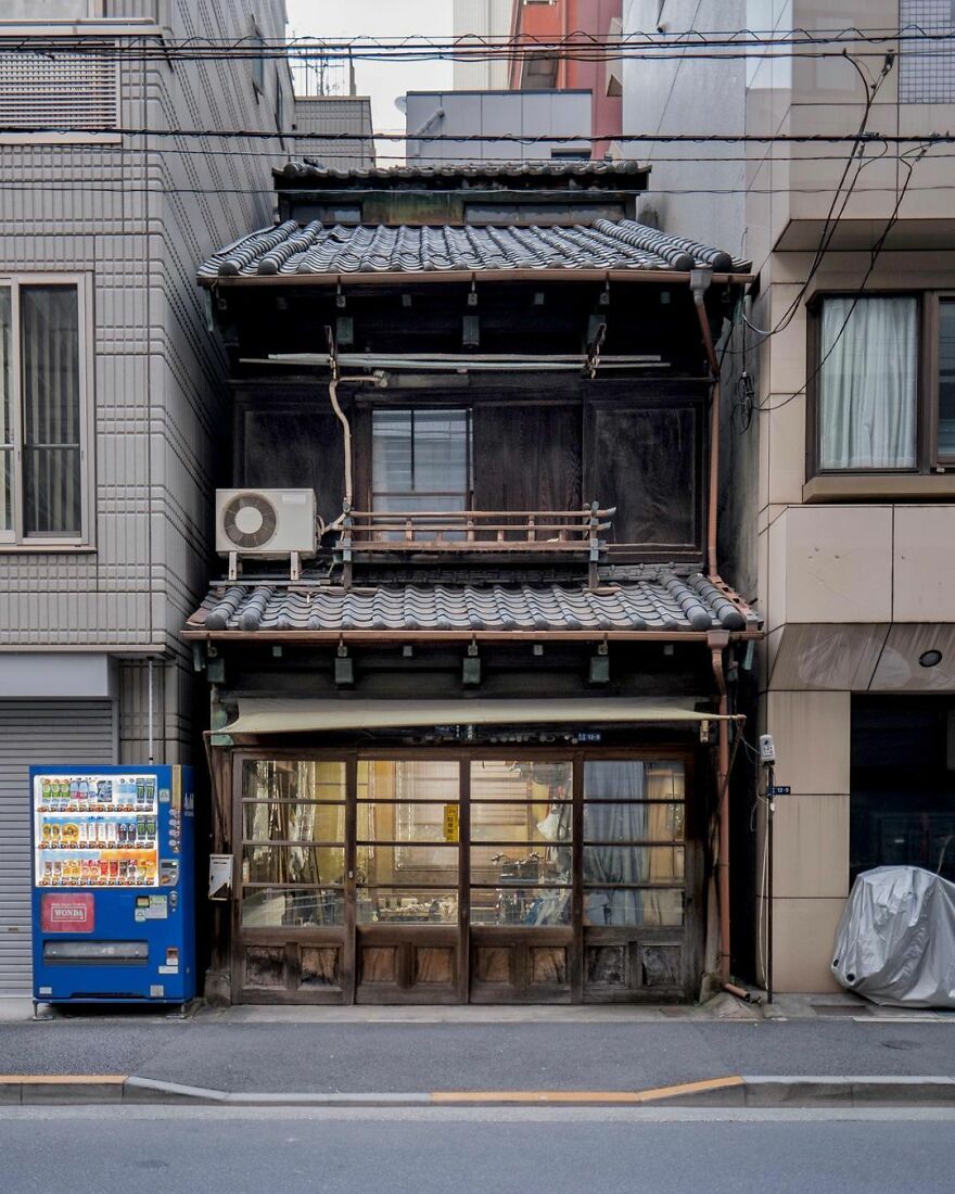
“A tatami shop in Tsukiji, Tokyo. Built sometime in the 1920s or 1930s, and still seems to be operating today. The building is a great surviving example of the pre-war shophouses found in Tsukiji and around Tokyo’s other historic merchant districts. If you look at the roof line you can see a line of windows showing a 3rd floor or attic that may have been added at a later date.”
japanpropertycentral Report
Here’s how Zoe got into photographing these buildings: “Out of necessity. I run a real estate brokerage and the property photos we receive from listing agents do not always show the property in the best possible light. Many times there are no photos at all. Many of our buyers are foreigners and expect high-quality photos before they will decide to inspect a home or apartment, especially if they are flying in from overseas. Often I will have to go and take the photos myself. I am still very much a beginner at photography.”
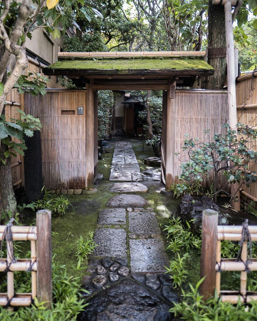
“The entrance to the Edo Senke tea ceremony estate in Ueno, Tokyo. The buildings are historic, having been shifted here from a Daimyo’s mansion in the 1860s. Wooden tea houses are relatively easy to dismantle and relocate, and it wasn’t unusual for old buildings or even parts of them to be moved and reused. It still happens today on occasion. When people talk about Japan’s scrap-and-build approach to buildings, they are not referring to the traditional construction methods that last centuries. Alas, the grounds of this estate are privately owned and not open to the public.”
japanpropertycentral Report
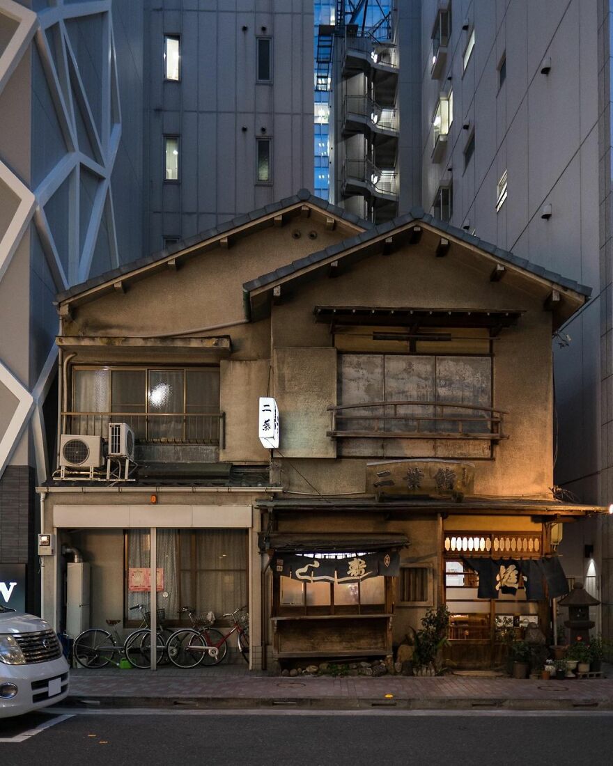
“Futaba Sushi, Ginza. First opened in 1877. The current building dates from the 1950s. Note the sushi ‘yatai’ cart built into the ground floor, right in the center. Sorry, no photography allowed inside the restaurant.”
japanpropertycentral Report
Zoe shares the difficulties she runs into while capturing the photos: “Trying to get a shot without a car or van blocking the building. I usually wait until there are no pedestrians or cars in the frame. It might only be a few minutes, but other times I have to come back later. Another challenge is that the streets are often very narrow (some streets are just 2 meters wide), so you need a wide-angle lens for some locations.”
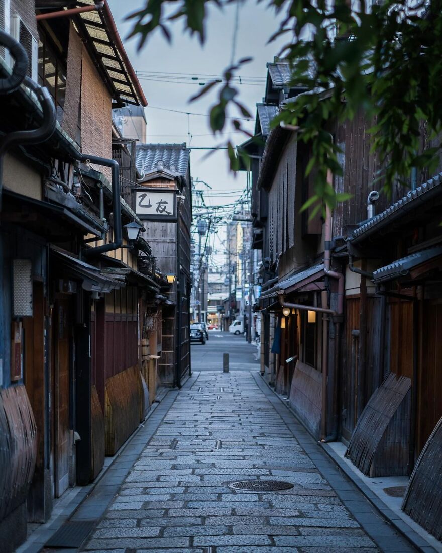
“Gion Shirakawa at dusk. This laneway is a cobblestone shortcut near Shirakawa River. If you follow it you’ll end up at Shijo Street.”
japanpropertycentral Report
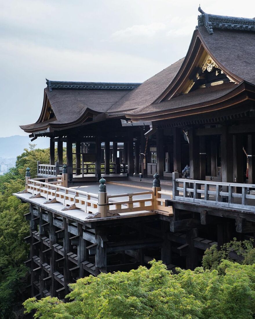
“Kiyomizu-dera Temple and its hinoki wood stage. Founded in 778. I wonder if this is the quietest it has ever been in its 1200 year history. The main hall and stage were built entirely without the use of nails (or screws) in 1633. The wooden foundation pillars below stand 13 meters tall and are made from 400-year old trees.
The main hall was covered in scaffolding for over three years while the roof was redone, and only just removed in February 2020. It had been 50 years since the bark-thatched roof had been replaced.
Many of the buildings within the temple grounds date from the mid-1600s. There were a few fires up until that point that had destroyed the even older structures.”
japanpropertycentral Report
“In my free time, I like to explore different neighborhoods and share some stories about the interesting buildings I find along the way. If I have an afternoon or an evening free, I’ll go for a walk around all the back streets of a neighborhood in search of some interesting buildings. You are almost guaranteed to find a few no matter where you go. Sometimes I will have a particular house in mind, or be in the neighborhood checking out listings for sale and use it as an opportunity to explore a little and take some photos.”
Here is how Zoe describes her style: “Chaotic. The city is just a jumble of power lines, street signs, bicycles, and construction. I would love to take clean and uncluttered photos but I am realizing that it is impossible in Tokyo. I no longer notice all the transformer boxes and power lines anymore.”
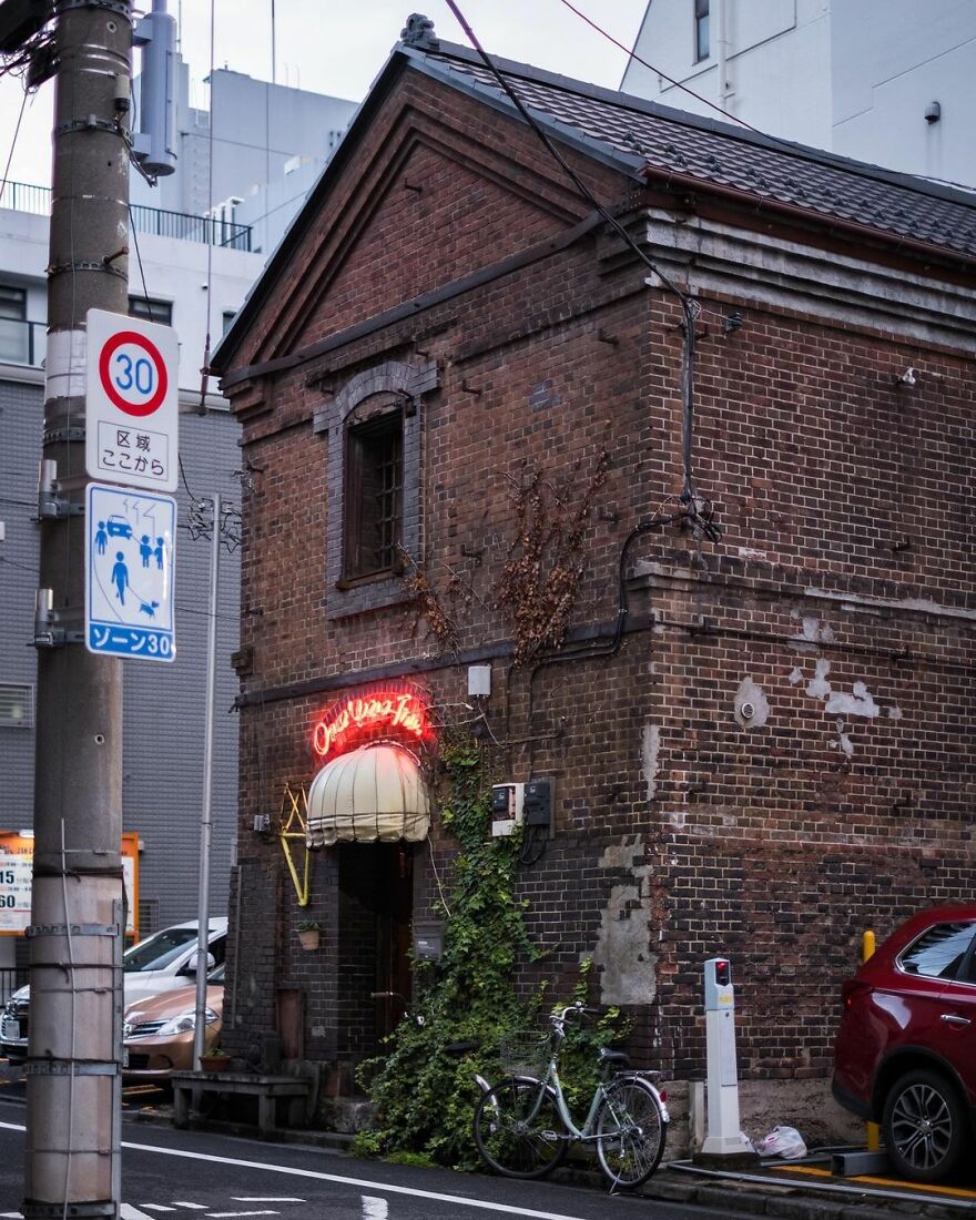
“Once Upon a Time. A bar in a historic brick storehouse in Yushima, Tokyo. Built sometime in the late 1800s. The bar owner has been renting this space since the mid-1970s. Downstairs has a bar counter and tables, while the 2nd floor has an event space.
Not sure how much longer this historic building will remain standing. The property owner wants to demolish it rather than repair it, with news of its potential future demise first reported back in 2013. Last year there were stories that it would close in 2022.”
japanpropertycentral Report
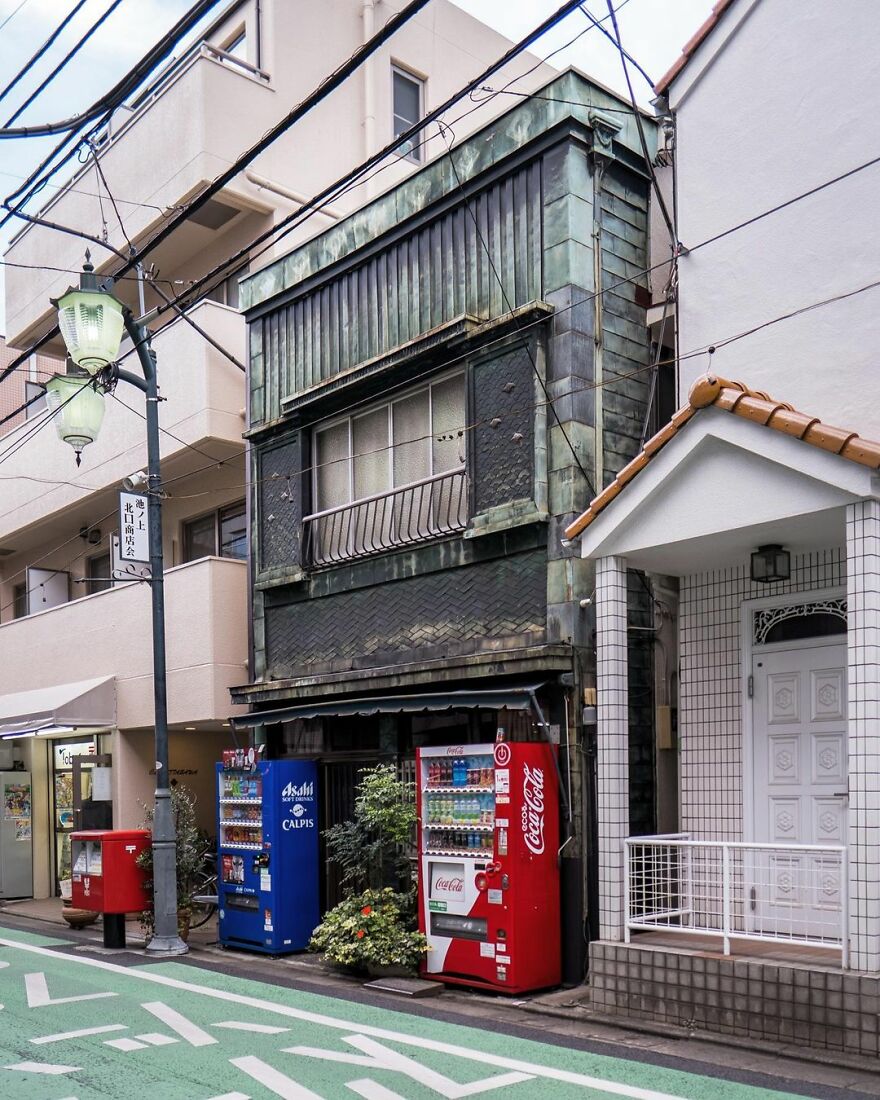
“An old shophouse alongside the Ikenoue Shopping Street in Tokyo. This would have once had a shop on the ground floor, but has been converted into a private residence some time ago.”
japanpropertycentral Report
“It has always been a personal interest. There’s an assumption that Tokyo is a big metropolis of shiny glass buildings and neon lights, but it’s a very old city with lots of more humble, older, and traditional streets that don’t get featured in the tourist guides. Something is charming about them, especially when they have a very worn patina and are lived-in and cared for,” said Zoe about how she came up with the idea to photograph old buildings.”
I started putting more effort into my company’s Instagram account about three years ago. I still have a very long list of places to share and neighborhoods to visit. I don’t think I will be stopping any time soon.”
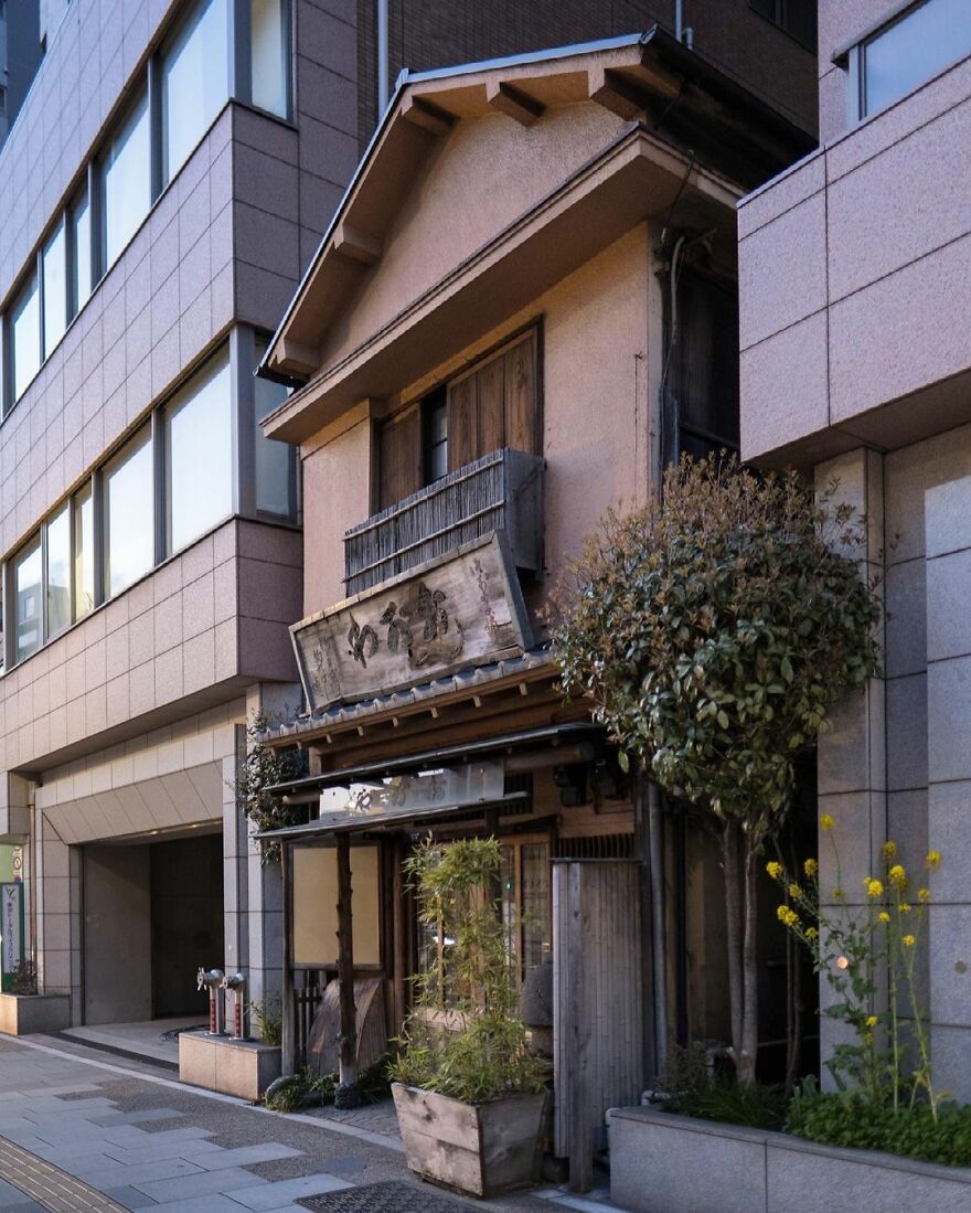
“The Ogawa Dorayaki Store alongside Asakusa-dori Avenue. Dorayaki is made from two pancakes or pikelets with red bean paste filling. This little shop was a hold-out, and is now sandwiched between a 13-story office building on all three sides.”
japanpropertycentral Report
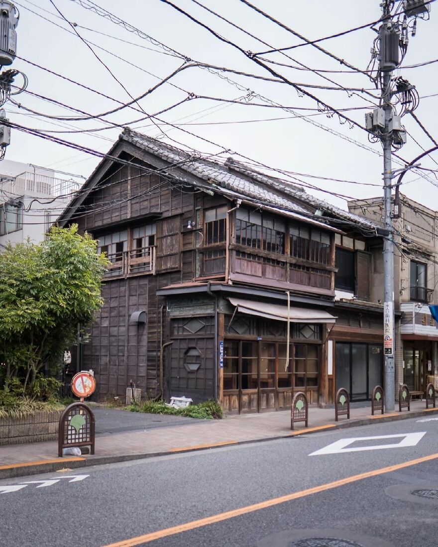
“This shophouse was built in 1918 as a hardware store. At a later point it housed a bar and restaurant but has sat vacant for the past few years.”
japanpropertycentral Report
“There’s something about living in a constantly evolving city like Tokyo that is very energizing and motivating. There’s always something to see or somewhere to visit. It’s also a very safe and clean place to live, and it is incredibly easy to get around by train with no need for a car. Some of the architects and building designs are among the best in the world. My favorite ones are the weird and unusual homes often built on tiny plots of land in the middle of the city. You have to be very creative to come up with some of the designs, especially when the land itself might be just 50 square meters in size.”
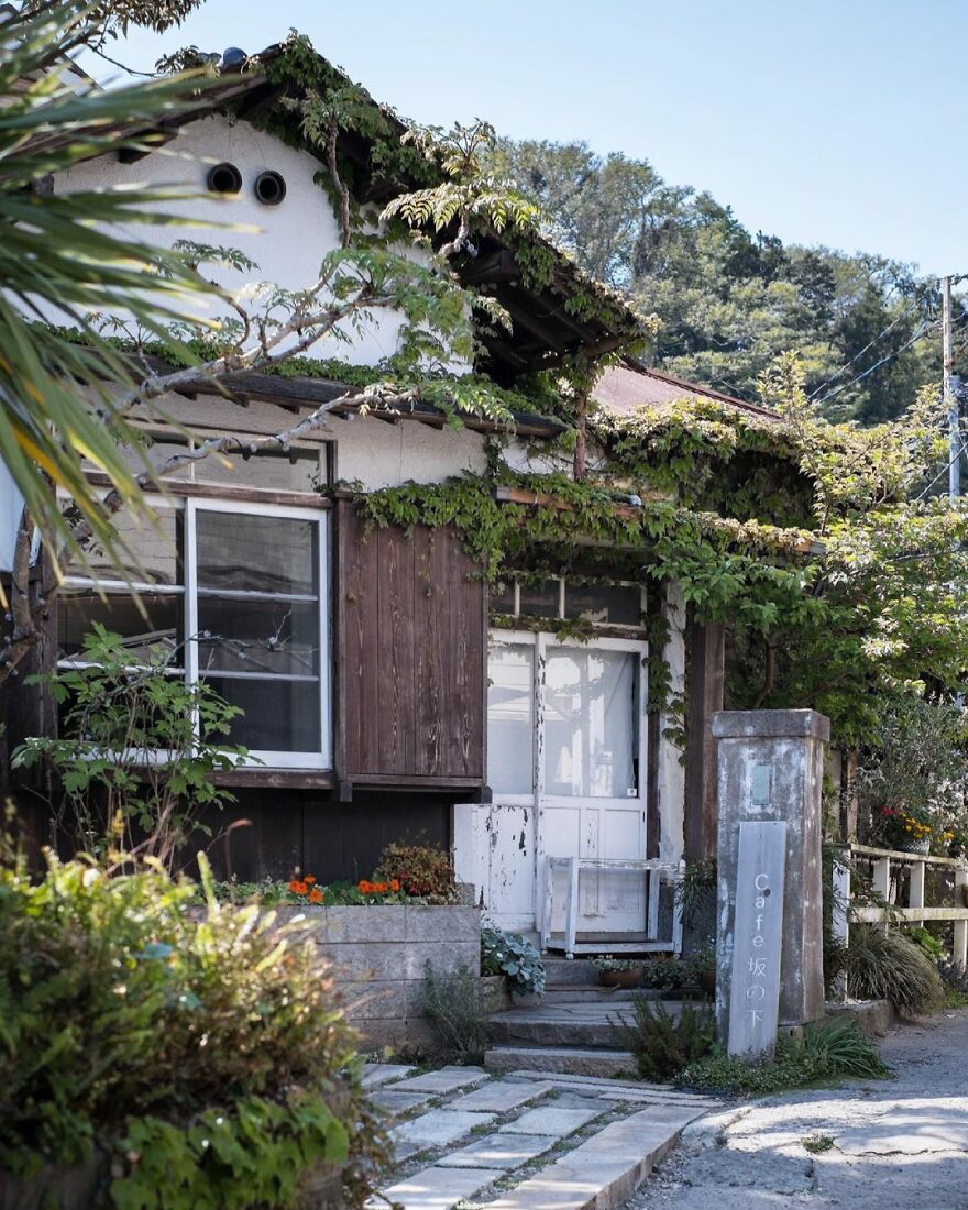
“Café Sakanoshita – a charming place inside a 90-year old renovated kominka house. Closed on Mondays. Unfortunate timing!”
japanpropertycentral Report
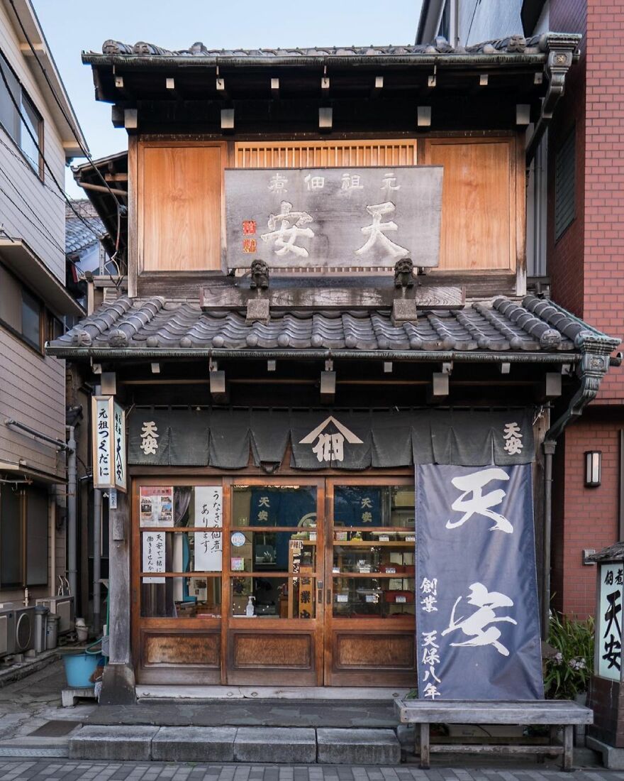
“Tenyasu Tsukudani, a store selling simmered and preserved food since 1838. This shophouse was built in the 1920s. The streets would have once been lined with buildings like this.
This part of Tsukuda has a history going back 400 years, and is where the traditional tsukudani preserved food originated.”
japanpropertycentral Report
Here is what inspires Zoe: “Being able to continue to connect with all kinds of wonderful people who are also into Japanese architecture, new and old, and who like to explore different neighborhoods. The most unexpected and fun part is seeing sketch artists in other countries create amazing artwork from photos I posted.”
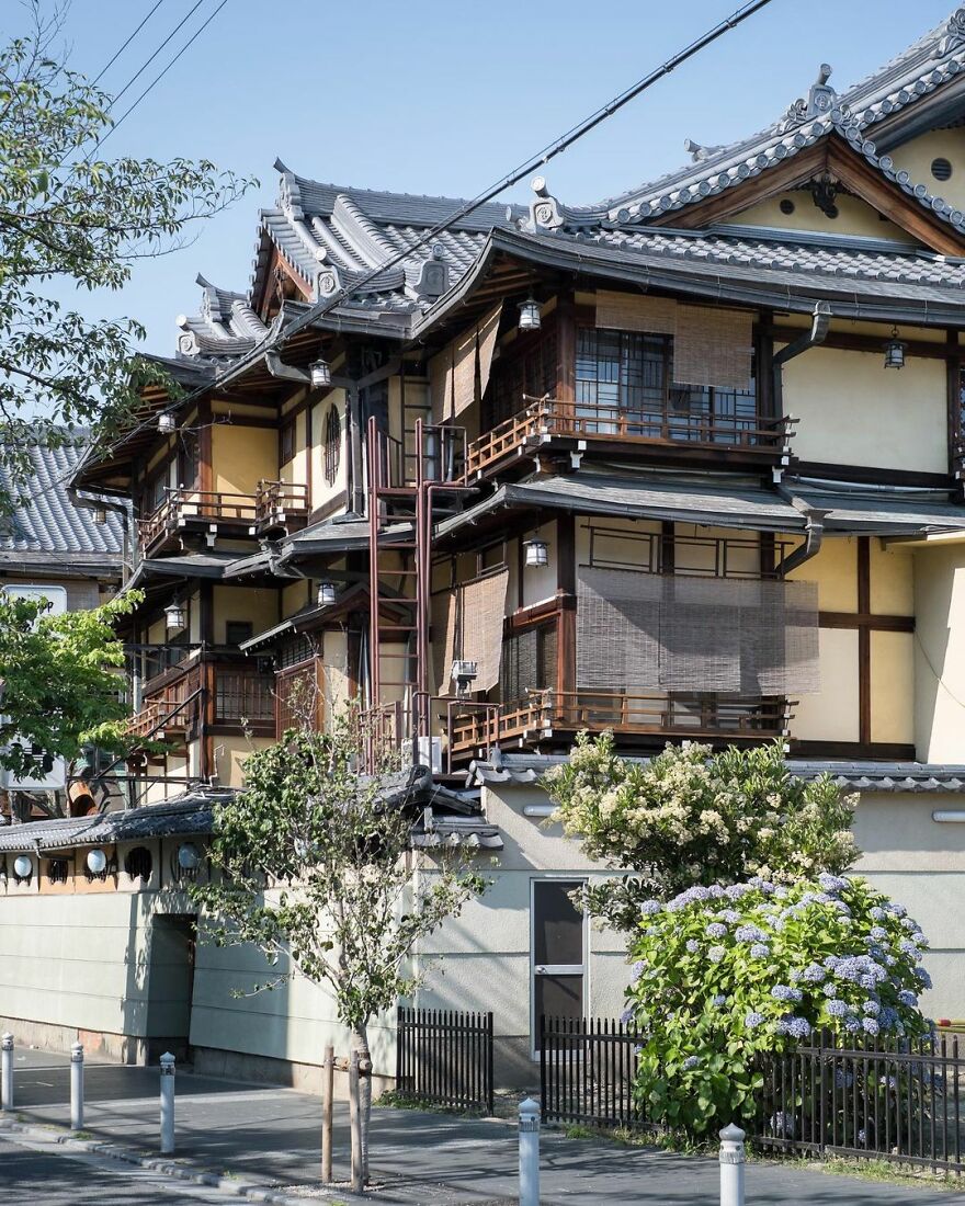
“Tsuruse traditional inn and kaiseki restaurant. Built from Hinoki cypress wood in the 1920s~1930s, but the restaurant has been operating even longer. The outdoor terrace dining deck along Kamo River is the largest of its kind in Japan, seating over 200.”
japanpropertycentral Report
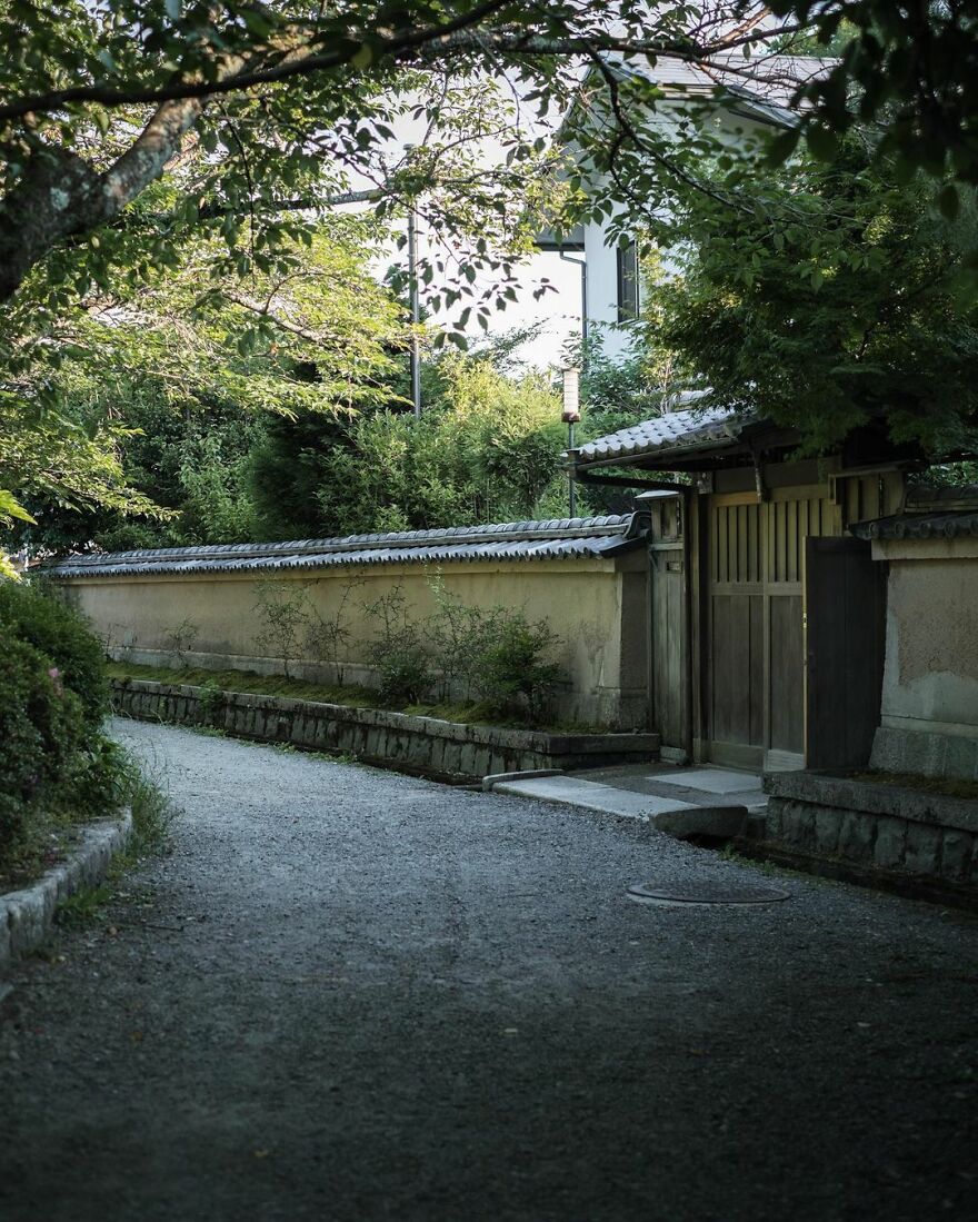
“The Philosopher’s Path (or walk). A peaceful path alongside the Biwa Canal. The historic canal was completed in 1890 and the 1.8-kilometer long walking trail was completed in 1968 thanks to efforts by local residents. It was named to honor Nishida Kitarō (1870-1945), said to be Japan’s most influential and significant philosopher of the 20th century. He would walk along this path each day on his way to teach at Kyoto University. He later moved to Kamakura, and his home there has been preserved to this day.”
japanpropertycentral Report
Zoe gives some advice to photographers and artists out there in the world: “It’s okay if you don’t know what you are doing or don’t have a particular goal with what you are currently doing. Do what makes you happy and gives you the most joy creating. Maybe it will lead you somewhere?”
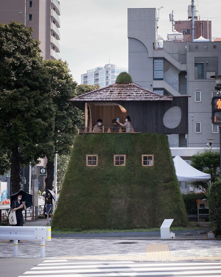
“Tea House ‘Go-an’ by Terunobu Fujimori. Part of the Pavilion Tokyo 2021 / Tokyo Tokyo FESTIVAL being held in connection with the 2020 Olympics. Fujimori is known for his creative and often elevated tea house designs that are far from traditional. This one resembles a ‘yagura’ watchtower with a grass-covered base (the same turf used on race tracks) and burnt cedar walls. The ceiling is decorated with crushed cedar pieces. To enter, you must crawl through a small circular door at the rear and climb a ladder to the tea room upstairs. The tea house is a temporary structure and will be disassembled when the exhibit ends on September 5, 2021. Viewing the interior requires advance bookings.”
japanpropertycentral Report
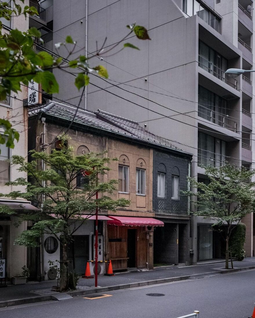
“This group of three shophouses in Nihonbashi was listed for sale a little over a month ago for ¥149 million (US$1.35 million), and appears to have already sold, if the removal of all of the online listings is any indication. That means demolition is likely looming.
The terraces date from the 1920s or 1930s and are on Chuo City’s list of early 20th century modern architecture. Sadly being on that list, or having any type of official heritage recognition, doesn’t provide any legal protection to prevent these historic buildings from being demolished. A few from the list have been torn down in recent years, and more will follow. They are a wonderful example of kanban-kenchiku (#看板建築), or billboard style architecture.
The terraces sit on 92 sqm of commercially zoned land, and some suggested redevelopment plans for a 13-story block of 17 units with a potential gross yield of 8% have been provided. That’s a hugely impressive yield and a very low price for land like this. There’s a good reason, too – the land is leasehold. It’s the old, and almost perpetually renewable leasehold type, and the landowner is a major real estate company, so there is some stability with that type of landlord.
The majority of land in Tokyo and across Japan is freehold, but occasionally you might encounter a leasehold property. It’s really important that you fully understand the costs, pros and cons, and legal entitlements and obligations that come with leasehold properties, as they can easily be a source of disputes and troubles for the inexperienced.”
japanpropertycentral Report
The author tells us more about herself and her journey: “I first moved here about 15 years ago, after growing up in a rural part of Australia. I first got involved in the real estate industry in Japan in 2008 and opened my own real estate brokerage company in 2014. I did not speak any Japanese when I first moved here but studied for a long time after I arrived. You need to be fluent to work in real estate here as all of the sellers and agents will only speak Japanese, and all of the documentation and legal explanations are also in the Japanese language only.”
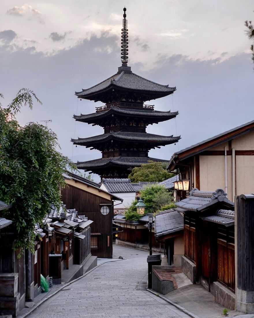
“The Yasaka Pagoda in Hōkan-ji Temple, Kyoto. First built in 592. It was destroyed in a fire in 1191 that broke out after a dispute between Kiyomizu Temple and Yasaka Shrine and had to be rebuilt. In 1291 it was struck by lightning and rebuilt in 1309. It was lost again to a fire in 1436. The current pagoda dates from 1440, making it 581 years old. The foundation stone for the central pillar of the pagoda is said to be the original one from over 1,400 years ago.”
japanpropertycentral Report
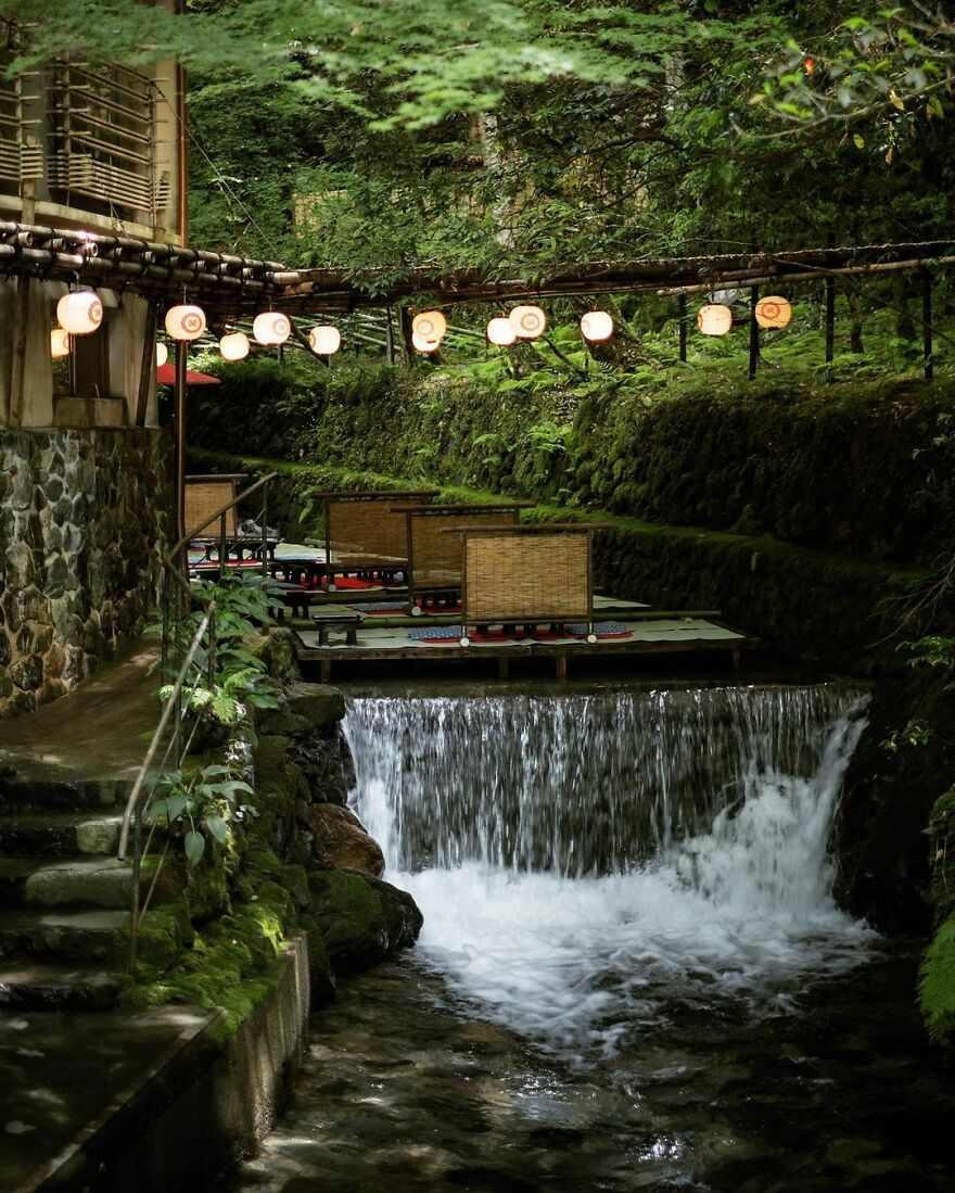
“Fujiya Ryokan and its ‘kawadoko’ river floor dining set up for the hot summer months. These floating floors first appeared over the Kibune River in the 1910s~1920s and have become a summer tradition ever since. Several restaurants and ryokans along this section of the river set up these tatami dining areas each year.
Fujiya Ryokan has one of the longest histories in the area, having been founded in the 1830s~1840s. ”
japanpropertycentral Report
“If you do get the chance to visit Japan in the future, don’t be afraid to skip some of the over-touristy areas and explore some of the more local neighborhoods. Instead of Shibuya Crossing, for example, I would go for a wander to try all of the coffee shops around Yoyogi-Koen, a 15-minute walk north, or head a few stations over to Shimokitazawa for some vintage clothing. If you are into old architecture, there is the Edo-Tokyo Open-Air Architectural Museum in Tokyo and the Meiji-mura museum in Nagoya (highly recommended!). Otherwise, you can still see a few old buildings around Tokyo’s former merchant districts like Tsukiji and Nihonbashi.”
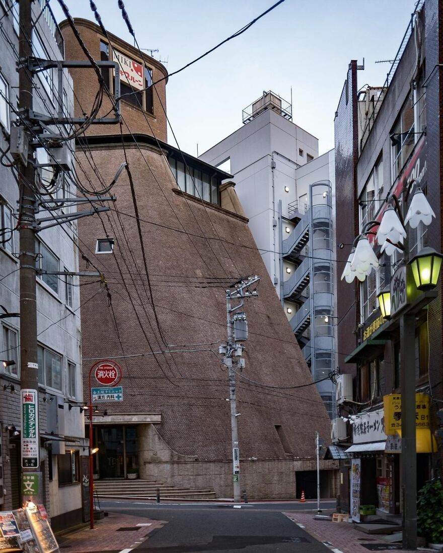
“The offices of a prune company near Shibuya Station. Designed by Yuzo Nagata on behalf of Takenaka Corporation and built in 1985. The facade is clad in small granite tiles. Nagata founded his own architectural practice that same year. His works are often statement pieces with detailed tiled facades. Several of his designs are large private residences, including one in Omotesando.”
japanpropertycentral Report
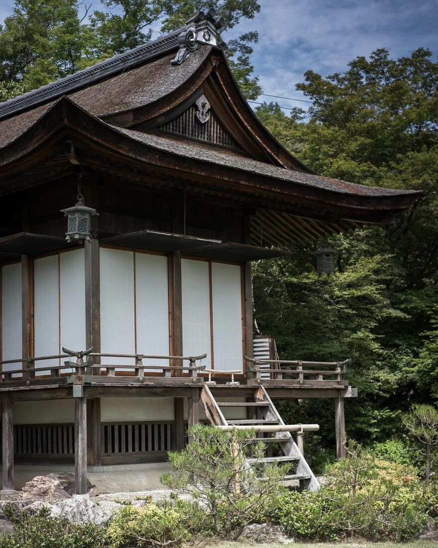
“The former home of actor Denjiro Okochi, famous for starring in many samurai-themed movies. His two-hectare estate sits on the hillside just above the Arashiyama bamboo path and has sweeping views over Kyoto City. His main residence pictured above is called Daijokaku. It was built by Sukiya-zukuri master Kaichiro Usui and was completed in 1941.
The grounds are open to the public as the Okochi Sanso Garden, with an admission fee of ¥1,000 per person.”
japanpropertycentral Report
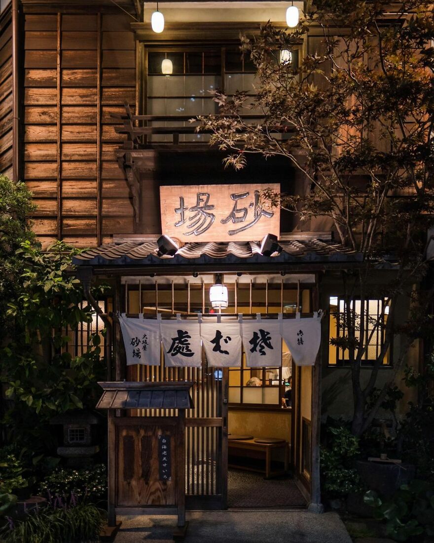
“The Toranomon Osaka-ya Sunaba Soba Restaurant. The current building was completed just before the 1923 Kanto Earthquake, although the restaurant itself has been operating since 1872. It was registered as a Tangible Cultural Property in 2011.”
japanpropertycentral Report
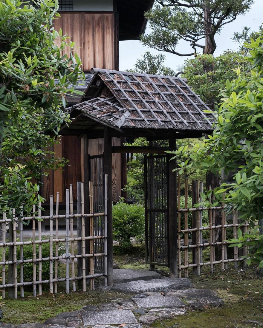
“The entrance to the Ro-an Teahouse in Shōsei-en Garden. The gate leads to a tea garden and represents the delineation of the serenity of the tea ceremony and the chaos of the world outside. This tea house was rebuilt in 1957. The garden and its structures were destroyed twice by fires, once in 1858 and again in the 1864 riot.”
japanpropertycentral Report
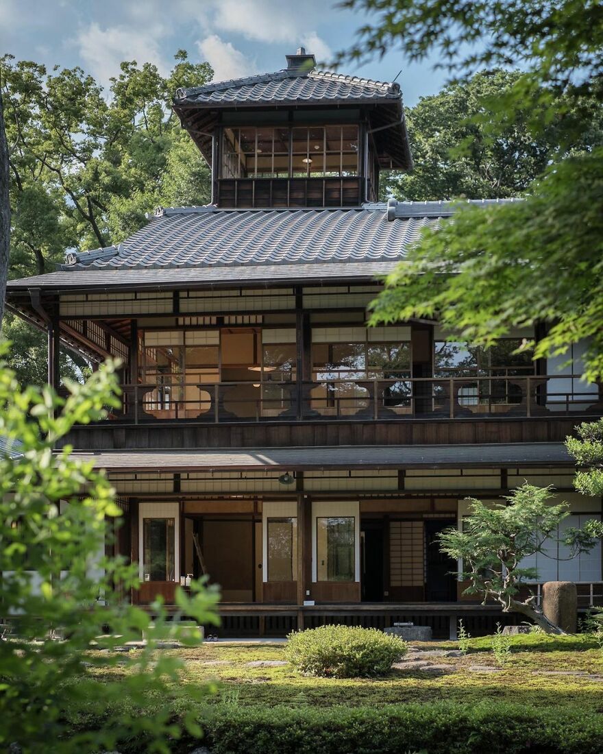
“The former Mitsui Family Shimogamo Villa. Built in 1925, although part of the home dates from the 1880s, having been detached and relocated here from their other, larger villa near Sanjo Street (since demolished). The European-influenced part of the house was the newer portion built in 1925. Despite the grandeur, this home was built as a rest-stop for when they visited their ancestral shrine nearby. The property was transferred to the national government in 1949, and from 1951 to 2007 it was used as the official residence of the president of the Kyoto Family Court.”
japanpropertycentral Report
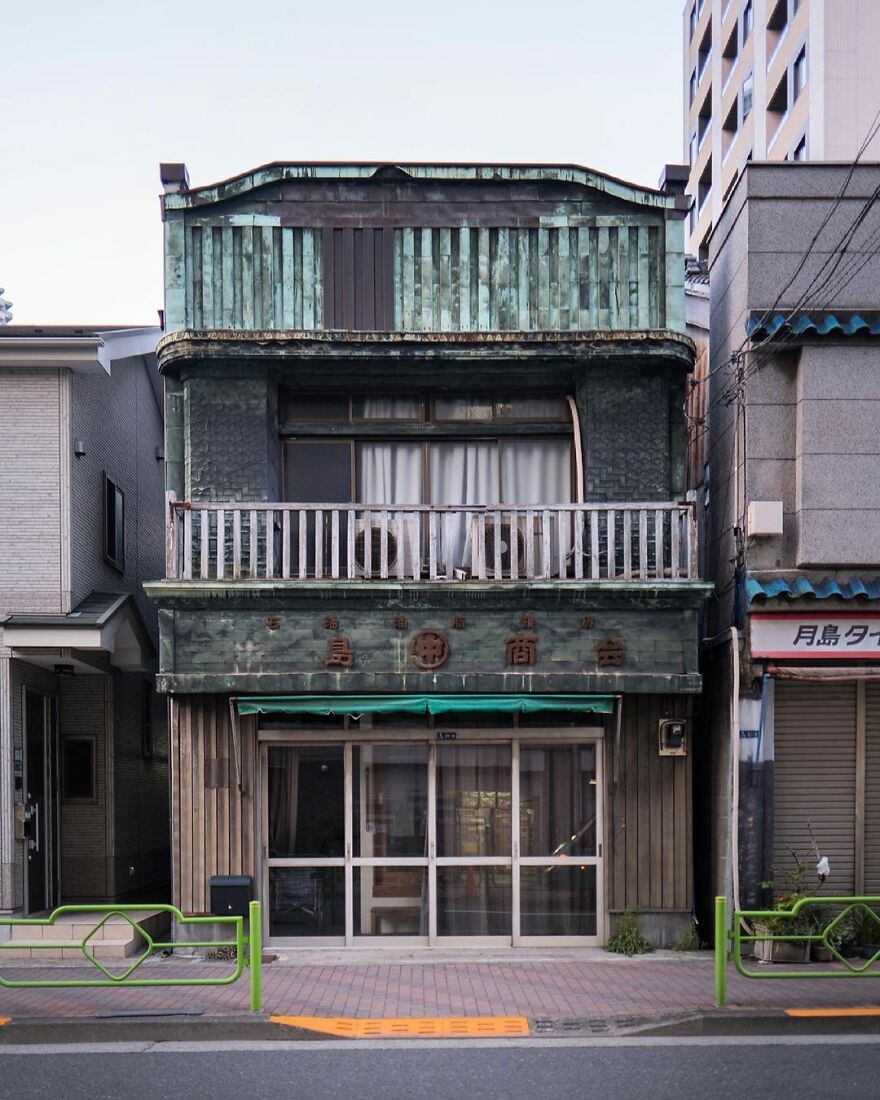
“The merchant house of Nakashima Shokai. Built in 1928. The decorative sheet copper facade is a wonderful example of billboard architecture (kanban-kenchiku).”
japanpropertycentral Report
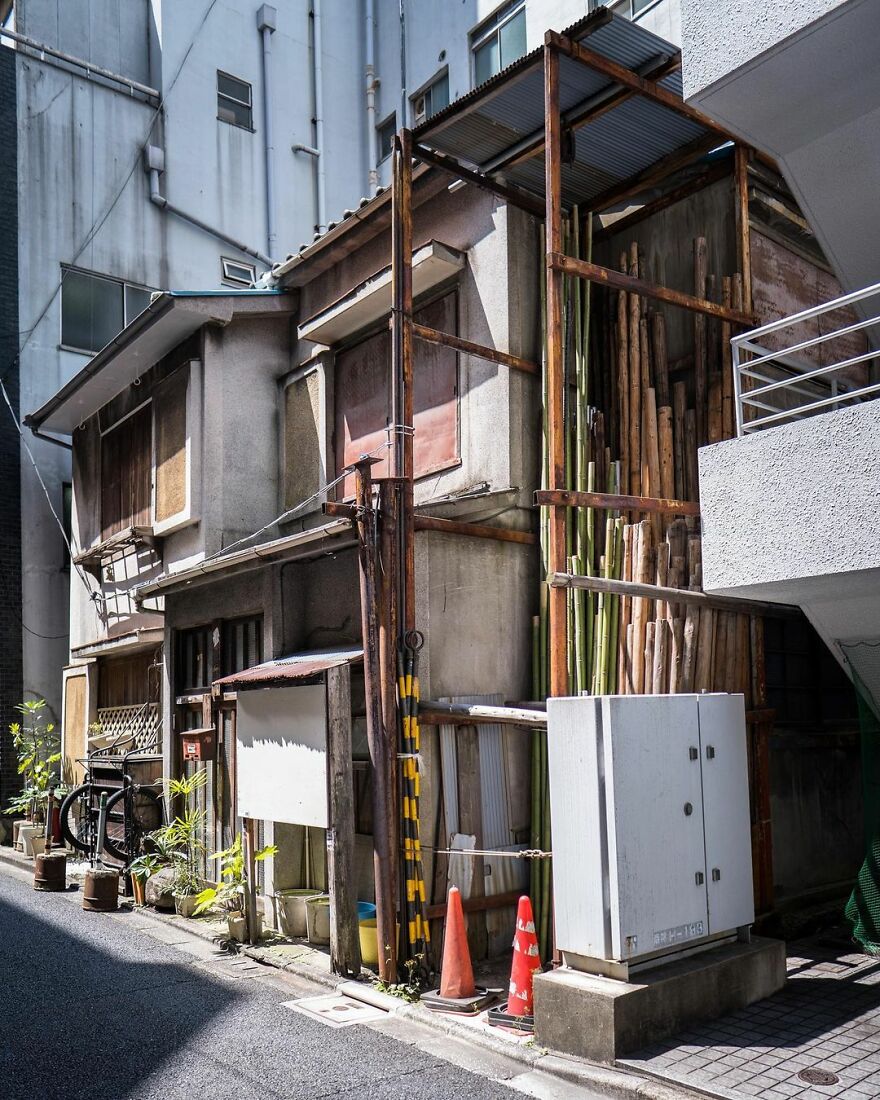
“A traditional setting in Tokyo’s Kanda district. An early postwar house now swamped by office buildings. Miraculously the sun is still able to shine down on the narrow laneway.”
japanpropertycentral Report
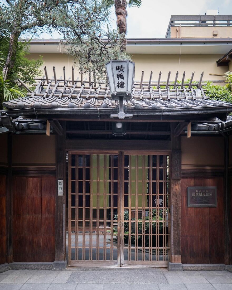
“Seikoro Ryokan, Kyoto. Established in 1831 as a traditional inn. The current buildings date from 1901 and 1921.”
japanpropertycentral Report
Note: this post originally had 100 images. It’s been shortened to the top 30 images based on user votes.
Old Architecture Looks Like In Japan (30 Pics)
- Published in abandon, abandoned, adventure, Architecture, Art, balance, build, buildings, creative, Creepy, culture, decades, eerie, exploration, explore, forgotten, full-page, furniture, harmony, History, home, Homepage featured, idea, International, japan, Japan Property Central, japanpropertycentral, live, memories, mess, modern, old, pass, past, People, period, Photography, photos, project, real estate company, remember, repurposed, reuse, sad, scary, space, stories, story, time, time period, Tokyo, travel, vintage
Designers Visualize The Same American House In 10 Different Styles From The Last Five Centuries
Have you ever watched a Hollywood movie or TV series and caught yourself paying attention to the beautiful architectural styles of the characters’ houses rather than the plot? I have. Which is why I was so happy to find out that American Home Shield has decided to look back at the evolution of the American house for their 50th anniversary.
Turns out, many elements of American home design have stayed the same over the last 450 years. Talk about long-standing traditions, right? In the images below, you can see renders that American Home Shield has created to document the history of the American home.
More info: ahs.com | Facebook | twitter.com | youtube.com
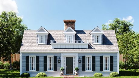
Cape Cod Style (1600s–1950s)
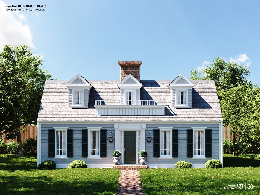
Image credits: American Home Shield
“The first Cape Cod style homes were built by Puritan colonists who came to America in the late 17th century. They modeled their homes after the half-timbered houses of their English homeland, but adapted the style to the stormy New England weather. Over a few generations, a modest, one- to one-and-a-half-story house with wooden shutters emerged. Reverend Timothy Dwight, a president of Yale University in Connecticut, recognized these houses as he traveled throughout the Massachusetts coastline, where Cape Cod juts out into the Atlantic Ocean. In an 1800 book describing his travels, Dwight is credited with coining the term “Cape Cod” to describe this prolific class or type of colonial architecture.” (source)
“Although Victorian styles eclipsed the plain Cape, these houses came back, in greater numbers than ever, during the Colonial Revival of the 1930s, often larger than the originals and with different framing methods, interior plans, staircases, and details. Owing to the romantic associations of 18th century models and the ubiquity of 20th century Capes, this is arguably the most recognized house style in America.” (source)
Georgian Colonial House Style (1690s–1830)
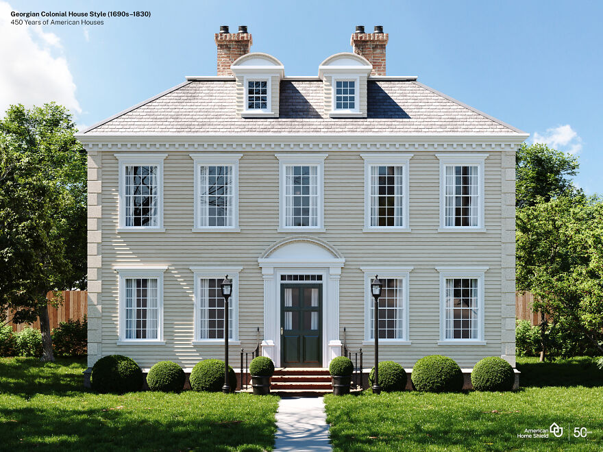
Image credits: American Home Shield
“The Georgian style arrived in America via British architectural building manuals called pattern books around 1700. While the Georgian style was popular in England in the 17th and 18th centuries, it is based on the classical forms of the earlier Italian Renaissance period. English master architects Inigo Jones, Christopher Wren and James Gibbs, inspired by the classicism of the Italian Renaissance developed the Georgian style in England. (source)
The first high-style examples are in the South, built usually by affluent tobacco planters. Grand examples—of wood rather than brick as in Virginia—became more common in the North only after 1750.” (source)
Federal Style (1780–1840)
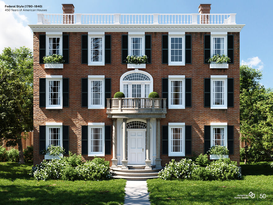
Image credits: American Home Shield
“After the Revolution, Americans wanted cultural as well as political independence, and they began to change the style of their buildings to reflect their change of allegiance. While the houses were not radically different—and still drew upon British sources—the high-style buildings of the new era bore a new and American name.
The Federalist party which, ironically, tended to favor British interests in foreign affairs, was the party of the merchants and landowners. These were the people with the means to build important houses—houses that came to be known as having been built in the Federal Style. The name “Federal” is a catch-all for buildings that date from the close of the Revolution (1783) until the first great machine-age style, the Greek Revival, became popular in the 1820s and 1830s. Other terms used for buildings of the Federal decades are Adamesque and Neo-Classical.” (source)
Greek Revival House Style (1825–1860)
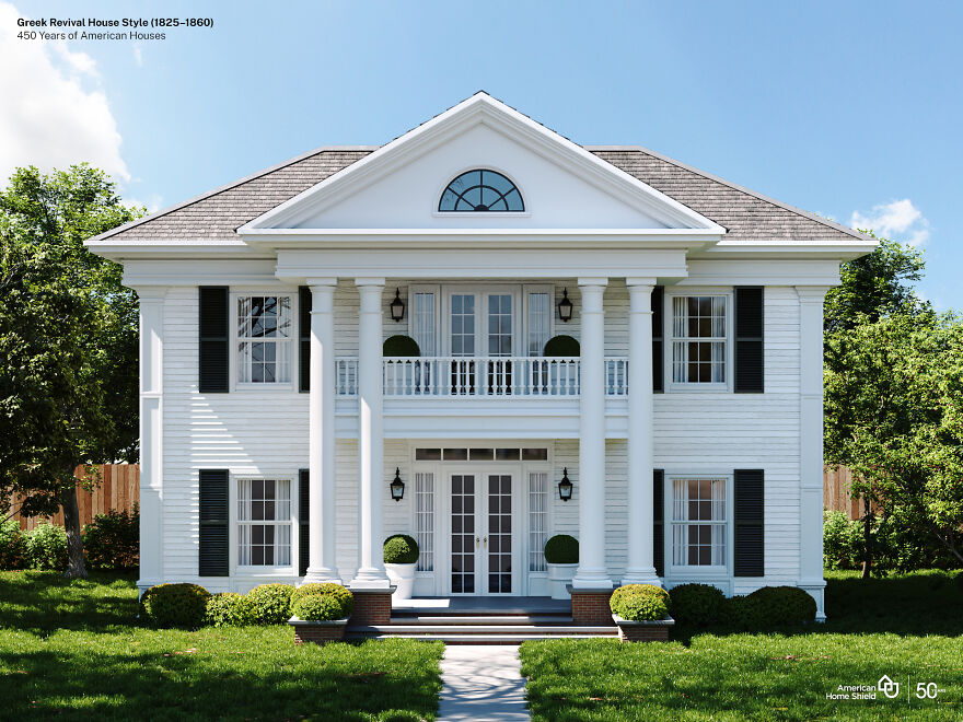
Image credits: American Home Shield
“British architect James “Athenian” Stuart is said to have been the first to introduce Greek Revival to Britain, but it was in America that Greek Revival would fully bloom. As a new democracy, 19th-century Americans were inspired by the birthplace of democracy and by Greek culture, art, and philosophy and all of the symbolism and meaning that it held for a nation in the midst of defining itself. Americans began to reject the Federal style with its British influences and sought an American style with bona fide democratic roots. The Greek War of Independence (1821-1832) was another galvanizing force encouraging Americans to embrace the values of a country that had created democracy and was fighting for its independence from the Ottoman Empire.” (source)
“In Greece, temples were built of marble painted in primary colors. But by the time they were discovered by Europeans in the eighteenth century, the paint was long gone, leaving the white marble. And to this day, people associate the Greek Revival with the color white – the white columned look.” (source)
Italianate House (1840–1885)
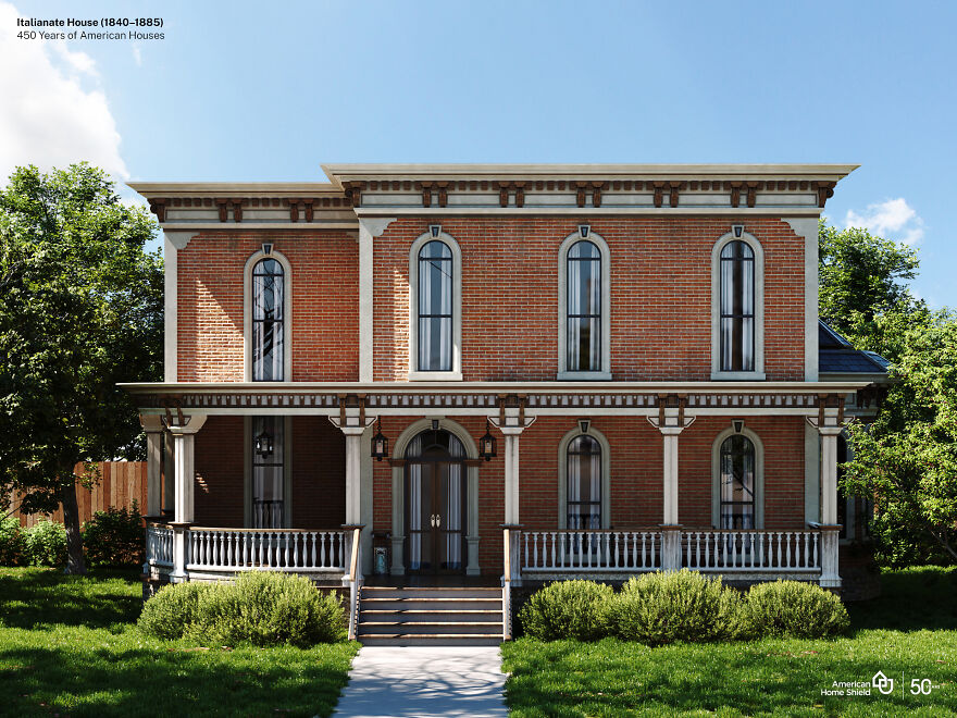
Image credits: American Home Shield
“The style derived from Italy’s rambling farmhouses, usually built of masonry, with their characteristic square towers and informal detailing. By the 1830s, Italianate had spread to the United States, where architects began to transform it into something truly American with only hints of its Italian origin. Thus, working in this style, architects had a higher degree of artistic freedom than they had in earlier, more rigid styles.” (source)
“The Italianate style was popularized in the United States by Alexander Jackson Davis in the 1840s as an alternative to Gothic or Greek Revival styles. Davis’ design for Blandwood is the oldest surviving example of Italianate architecture in the United States, constructed in 1844 as the residence of North Carolina Governor John Motley Morehead.” (source)
Queen Anne Style (1880–1910)
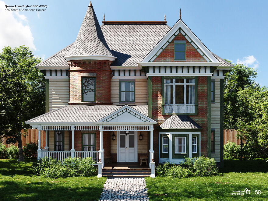
Image credits: American Home Shield
“The Queen Anne style represented the culmination of the picturesque, or romantic movement of the 19th century. Based on a premise of “decorative excess” and variety, there was little attempt to stay true to any one particular style or historical detailing. Rather, the style displayed a combination of various forms and stylistic features borrowed from the earlier parts of the Victorian and Romantic eras. “Queen Anne” is somewhat misleading given her much earlier reign (1702-1714) during times when Renaissance-inspired architecture was the norm.
The last two decades of the nineteenth century saw Queen Anne become the most dominant residential style in the U.S., heavily favored by the Victorian elite who had become wealthy from industrial growth. Middle- and working-class families often enjoyed their own versions, however, in the form of smaller, L-shaped cottages or other “folk” variants decorated with some of the style’s typical trim or siding varieties.” (source)
Arts and Crafts (Craftsman) (1905–1930)
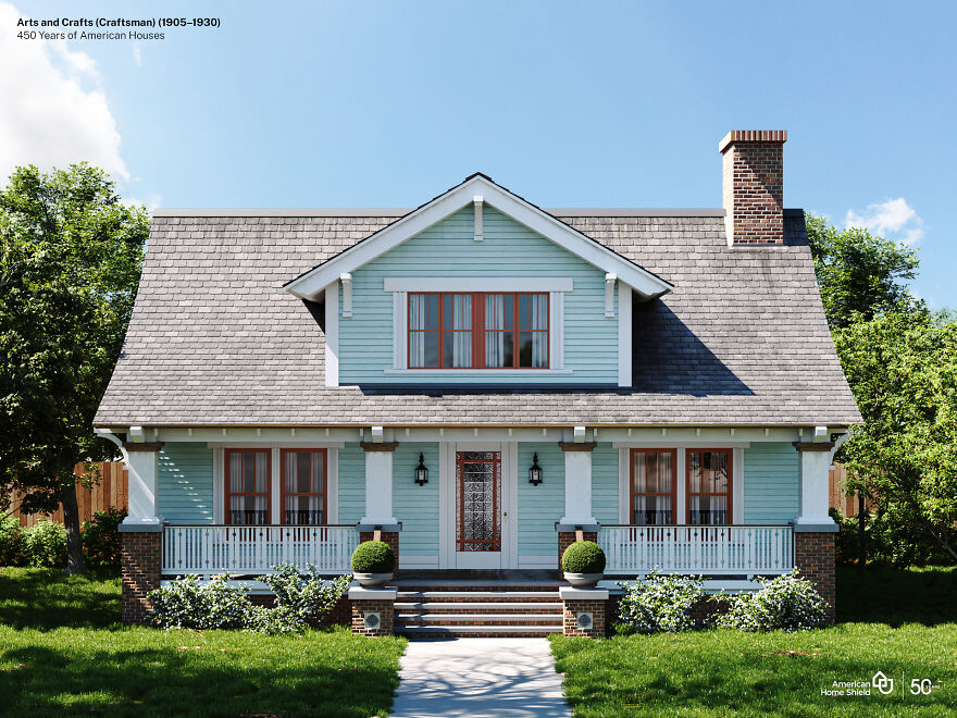
Image credits: American Home Shield
“As a reaction to the manufactured and ornate styles of the Victorian age, Arts and Crafts-style homes embraced handcrafted design and approachable materials. The style originated in Great Britain in the mid-19th century and came to America around the beginning of the 20th century. The term “Arts and Crafts” refers to a broader social movement that encompasses not just architecture, but also interior design, textiles, fine art, and more.
The design movement began as a revolt against the opulence of the Industrial Revolution, where design could be needlessly overdone. Arts and Crafts instead focused on the opposite–instead of mass-produced and uninspired, the movement was all about being handcrafted and personal. The idea was that if quality could replace quantity, good design and good taste would prevail.
The Arts and Crafts movement was directly tied to the rise of Craftsman and Bungalow-style homes, architecture that played off of the same mentality of simple but thoughtful structures. Bungalows were intended to give working-class families the ability to own a well-designed home that was easy to maintain and manage.” (source)
Art Deco + Art Moderne House Style (1920–1945)
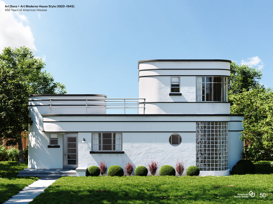
Image credits: American Home Shield
“Art Deco was the first widely popular style in U.S. to break with revivalist tradition represented by Beaux-Arts and period houses. Art Deco uses a style of decoration that was applied to jewelry, clothing, furniture, handicrafts, and – in this case – buildings. Industrial designers used art deco motifs to decorate streamlined cars, trains, kitchen appliances, and many other machine-age innovations. Art Deco takes its name from the Exposition Internationale des Arts Decoratifs and Industriels Modernes, held in Paris 1925.” (source)
“The Art Deco style first gained public attention in 1922 in a design competition for the Chicago Tribune Headquarters. Finnish architect Eliel Saarinen submitted an Art Deco design that was not chosen, but was widely publicized and embraced as an exciting new architectural style.” (source)
Ranch Style (1945–1980)
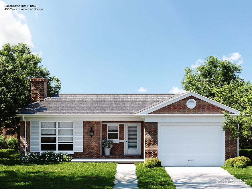
Image credits: American Home Shield
“True ranch-style homes first made their appearance in the 1920s. Originally, they were based on Spanish colonial architecture used in the American Southwest. Efforts to combine that style with modern architectural touches created the California ranch-style home. That led to a boom in the building of these homes from the 1940s through the 1970s. Their livability, flexibility in floor plans and uncomplicated design were perfect for the post-World War II growth of American suburbs.” (source)
“A small number of architects working in California and the Southwest during the 1920s and ’30s designed the first suburban ranch-style houses. These were based on the simple, one-story houses built by ranchers who lived in the harsh climate of the plains and mountains of the West. For young architects seeking forms that were defined by their function and not layers of Victorian bric-a-brac or the Colonial-style treatments popular in the East, the ranchers’ houses had particular appeal.” (source)
Prefabricated Homes (1945-present)
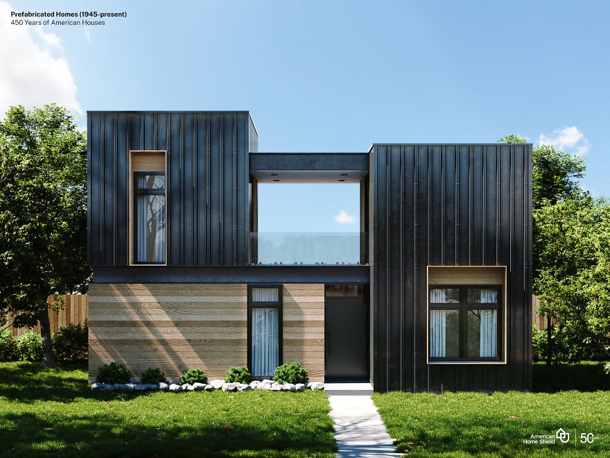
Image credits: American Home Shield
“Prefabrication is a method of producing standardised components off-site in a factory or workshop, that can be fitted together on-site. The components can be shipped flat packed or partially assembled and are not subject to fluctuating weather conditions when they are manufactured. Prefabrication was a solution where there were no suitable local materials, for example in the former colonies, where buildings had to be erected quickly or where there were skills and materials shortages.” (source)
“After the development of the assembly line by Henry Ford in 1913, it became even easier to manufacture modular homes at a price that was affordable to many more consumers. And after World War II, when the US faced a housing crisis as soldiers returned home and started families, modular construction offered quick, low-cost housing options to house a new generation of Americans. From the beginning, modular buildings have provided innovative and affordable solutions.” (source)
Designers Visualize The Same American House In 10 Different Styles From The Last Five Centuries
- Published in #architecture, #style, American, American Home Shield, Architecture, art deco, arts and crafts, cape cod, Design, federal, full-page, georgian colonial, greek revival, Hidreley, History, home, Homepage featured, houses, italianate, queen anne, ranch, USA
This Is How Garden Design Evolved Over 4,000 Years All Over The World, Provided By Household Quotes
Household Quotes, Civilizations around the world have been creating gardens for thousands of years. Since then, garden designs have continued to evolve, influenced by trends and changing priorities.
To show how much garden designs have changed over the years, Household Quotes.co.uk identified 10 key eras in the evolution of garden design and visualized them as a series of detailed 3D renders.
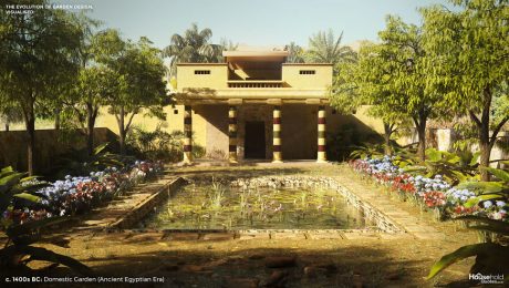
c. 1400s BCE: Domestic Garden (Ancient Egyptian Era)
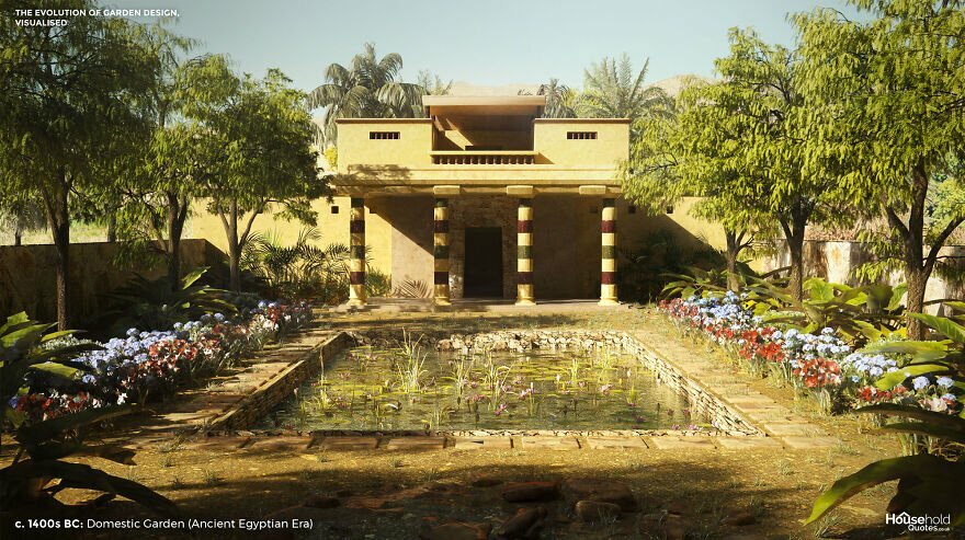
Image credits: HouseholdQuotes
Our Ancient Egyptian garden is inspired by the world’s oldest known garden plan. The design exists today as a 19th-century copy of a painting from a nobleman’s walls in the era of Pharaoh Amenhotep II. However, the plan is so sophisticated that it is likely a style that had developed over years or centuries before this example was designed.
The Egyptian garden was an oasis. It provided shade and carefully ordered natural beauty in an arid land. But the garden was also a spiritual haven, dotted with symbolic patterns and trees, including frankincense and sycamore fig.
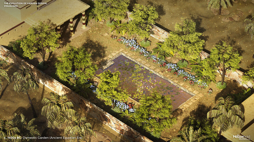
Image credits: HouseholdQuotes
The bold geometry of the Egyptian garden had as much to do with practicality as aesthetics. In addition to pleasure, gardens were cultivated for the raw ingredients of everyday life – from herbs and spices to papyrus and palm trees that offered both shade and fruit. Water features were positioned to aid irrigation (worth thinking about if you don’t want to trek to the far end of your garden every night of a hot summer).
400 BCE to 550 CE: Graeco-Roman Courtyard (Classical Era)
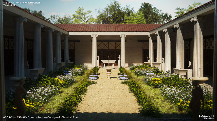
Image credits: HouseholdQuotes
The walled cities of Ancient Greece and Rome left little space for gardens. Only the rich had room for a small courtyard in the centre of their home. The roofed portico around the edge of the garden below is called a peristyle and offers shelter among finely painted walls. The Ionic columns that form the colonnade are inspired by those in Pompeii’s House of the Coloured Capitals.
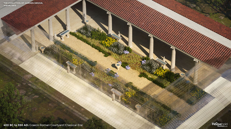
Image credits: HouseholdQuotes
Greek and Roman architects designed these urban gardens for escapism as well as to entertain. They would specify dining areas and impress with the inclusion of sophisticated statues and fountains. High walls offered privacy and regulated the climate for all-year use.
It wasn’t all stone and water. Herb and flower beds boasted roses, violets, saffron, thyme, marigolds, and narcissi, offering fresh scents and colour – although these areas, too, would be augmented with statues and water features. Box hedging zoned larger courtyards, while Cyprus and mulberry trees put greenery on the vertical plane.
c500s BCE to c1700s CE: Chahar Bagh/Pleasure Garden (Indo-Persian Era)
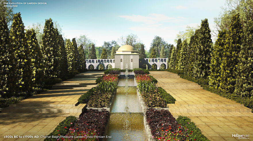
Image credits: HouseholdQuotes
“The chahar bagh was more than a pleasure garden,” said Aga Khan IV in a 2003 speech. “In the discipline and order of its landscaped geometry, its octagonal or rectangular pools, its selection of favourite plants and trees, it was an attempt to create transcendent perfection – a glimpse of paradise on earth.”
According to the Qur’an, paradise will be a place of flowing, incorruptible waters, flowers, and fruit trees. On Earth, the Chahar Bagh garden celebrated natural beauty while acknowledging the imperfections of life as lived. Still, designers would often divide the garden’s four quadrants with running water to represent the four rivers of paradise.
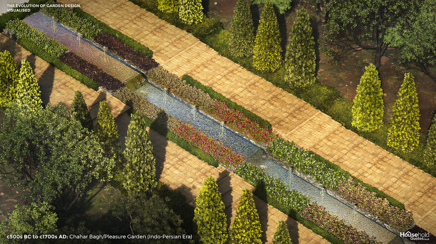
Image credits: HouseholdQuotes
A sloping underground tunnel called a Qanat was used to irrigate gardens in arid regions. Rugs embroidered with flora enhanced areas where nothing would grow. In verdant areas, roses were prominent, supported by bulb flowers, violets, poppies, and flowering shrubs. The pavilion on the central axis emphasises the symmetry and craft of the garden. The influence of Persian garden design is still felt today, through Islamic traditions and then via Greece, thanks to the impressions made on Alexander the Great as he invaded and conquered the region.
1000 to 1450: Town or City Garden (Medieval Era)
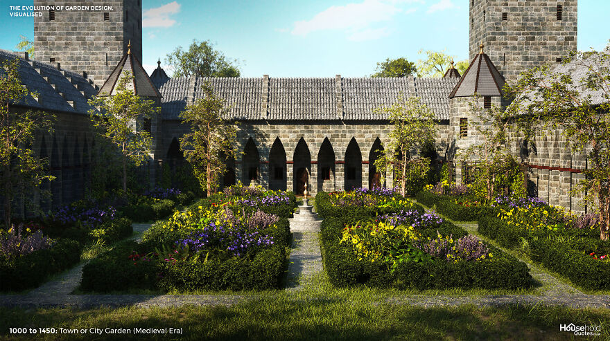
Image credits: HouseholdQuotes
As the medieval city developed, there was still space for town dwellers to cultivate a garden. Ongoing food insecurity made home ‘kitchen gardens’ commonplace. Meanwhile, physicians prescribed the scent of flowers to ward off the plague and recommended garden walks for mental health. Therefore, ornamental gardens flourished in hospitals and wealthy homes, while commentators snorted that smaller garden owners should stick to vegetables.
Another key difference between regular city gardens and those of the wealthy was the enclosure. While poorer gardens were often street-side, wealthier gardens were securely enclosed – following the lead of the monastery and castle gardens from which they took their cue. Further inspired by the renaissance in Italy, European gardens were designed with greater regularity of form, adopting rows and symmetrical quadrants.
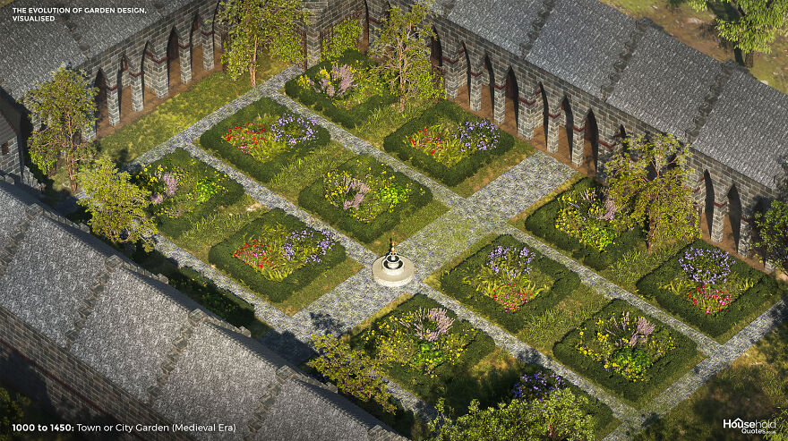
Image credits: HouseholdQuotes
The garden as a status symbol flourished, and so did one-upmanship among horticulturalists seeking finer and rarer flowers for their ornamental gardens. Roses, lilies, and violets became commonplace. When the tulip arrived in Europe, speculation on the value of bulbs led to ‘tulip mania’ and – perhaps – the “first great financial bubble.” One Dutch gardener even designed a network of carefully positioned mirrors to give the impression of a larger collection (and thus, greater wealth).
Early 1600s: Knot Garden (Tudor Era)
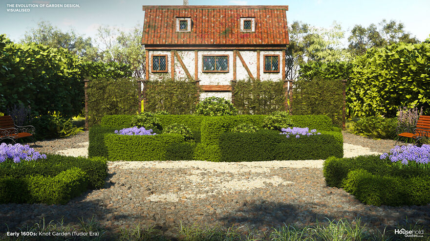
Image credits: HouseholdQuotes
Tudor designers wove medieval and Renaissance-Italy influences into impressively complex gardens. The knot garden had begun in medieval times as a practical way to partition kitchen gardens with intertwining patterns of herbs. Under Henry VIII and, later, Elizabeth I, the knotted hedge became an ornamental feature to be admired in its own right.
The knotted hedges of ornamental gardens often dipped at the ‘joins’ to give the impression that they actually threaded through. This may be hard work to achieve but, once established, such hedges are relatively low-maintenance. Gardeners can fill the hollows between knots with fancy herbs and flowers: gillyflowers, carnations, violets, marigolds, and roses were popular in Tudor times.
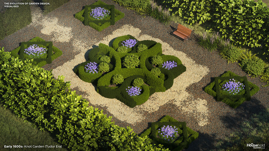
Image credits: HouseholdQuotes
Tudor gardens could be grand attractions. A knot garden might have been just one feature of a network of walled garden types, including labyrinths and fish ponds. A knot garden works best when visitors can get an overhead view. Elizabethan designers favoured a snail mount, consisting of a sloping path that spiralled up to a pavilion or sitting place.
1600s: Jardin à la Française/French Formal Garden
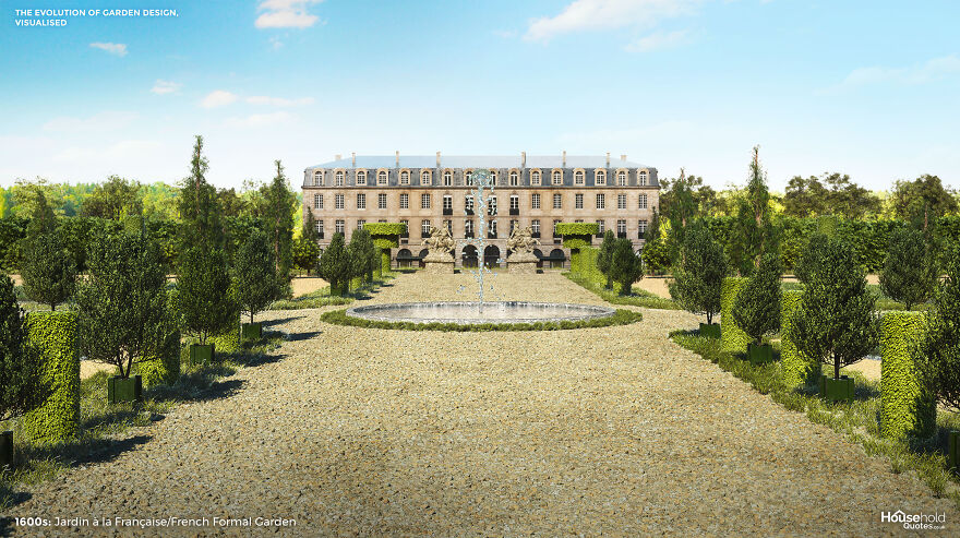
Image credits: HouseholdQuotes
The Gardens of Versaille are one of the few ‘international celebrities’ in the gardening world. And they exemplify the French formal garden type, whose enormous influence across 17th-century Europe continues to reverberate today. Versaille and its contemporaries were cutting-edge horticultural achievements requiring an enormous effort of labour. Versaille itself continues to need replanting once every century.
But all of this does not put the style out of reach of the average 21st-century gardener. Versailles is an expansion of the garden unit known as the parterre: a formal garden divided into patterns by gravel, hedging, and flower beds. Those with the time and imagination can scale the style down and replace elements with less maintenance-intensive features. As well as richly scented plants including lavender and rosemary, the French formal garden may feature trees such as beech, chestnut, and Linden.
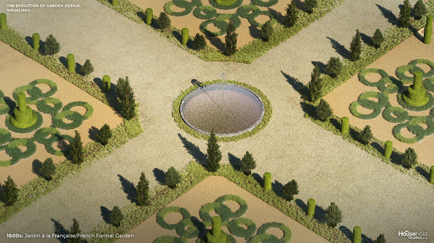
Image credits: HouseholdQuotes
The English variation on the Jardin à la Française, like the knot garden above, was inspired by the patterns of embroidery. This parterre à l’anglaise transplanted the patterns of the French formal garden to a grass lawn, softening the effect and delivering a spectrum of floral colour. Water features and statues are popular in all variations.
Early 1800s: Gardenesque Style (Late Georgian)
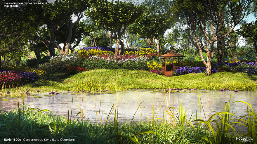
Image credits: HouseholdQuotes
Celebrated garden designer John Claudius Loudon conceived the gardenesque style as high art, which, all the same, removed design responsibility from architects and passed it to gardeners. Loudon proclaimed that “any creation, to be recognised as a work of art, must be such as can never be mistaken for a work of nature” – and yet his gardening philosophy called for plants to be allowed to express their natural uniqueness.
The trees of a gardenesque landscape should be segregated by type, but the arrangement should not be geometric or repetitious. And the flora should be displayed for pleasure and education, without being “picturesque” (or kitsch, as we might put it today). All in all, the gardenesque style is wracked with contradictions.
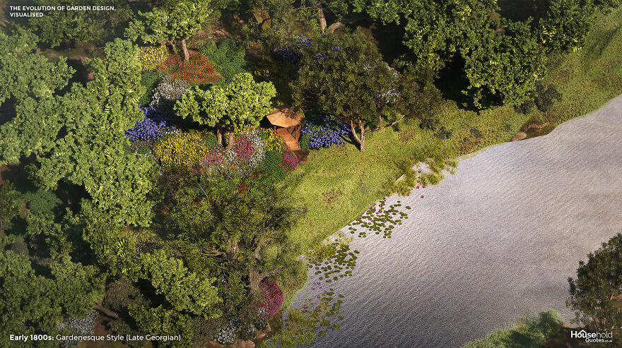
Image credits: HouseholdQuotes
Loudon’s solution to these contradictions? Firstly, to import exotic blooms which fully celebrate nature while being quite unnatural (and therefore artistic) in an English garden. And second, to plan the gardenesque design on a ‘hidden’ structure of irregular geometric shapes of grouped species. The result was an immersive, dramatic garden. Unfortunately, gardenesque principles are difficult to replicate since they involve swapping out even local grasses for exotic ones and making lakes and large rocks seem artificial by substituting the surrounding vegetation wholesal
1800s: Early American Period – Pioneer Kitchen Garden
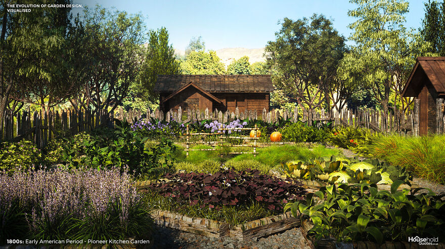
Image credits: HouseholdQuotes
Aesthetics were the last thing on the mind of pioneer kitchen gardeners. As invaders of a strange land, the kitchen garden was a vital source of sustenance. The garden was laid out with an eye for efficiency: close to the door for access and security, with perimeter paths for harvesting rather than admiring the beds. Border hedges or fencing kept scavengers out.
But there was beauty in this economy of design. Sweet-smelling herbs were planted nearer the house, with onions and cabbages grown at a distance. Patterns emerged where seasonal vegetables grew close to each other to prevent the disturbance of perennials that could be left alone. Taking a tip from the Native American tradition, settlers would plant corn, pole beans, and squash together. These three crops provided trellis support, nitrogen for healthy growth, and light and temperature regulation, respectively.
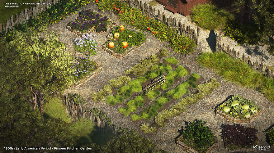
Image credits: HouseholdQuotes
Fruit trees, cotton, and medicinal plants were also cultivated, but flowers were not a priority. The settlers learned lessons that prevail today: listen to the land and find beauty and structure in the functioning of nature.
1870s to 1920s: Arts & Crafts Garden (Victorian & Modernist Eras)
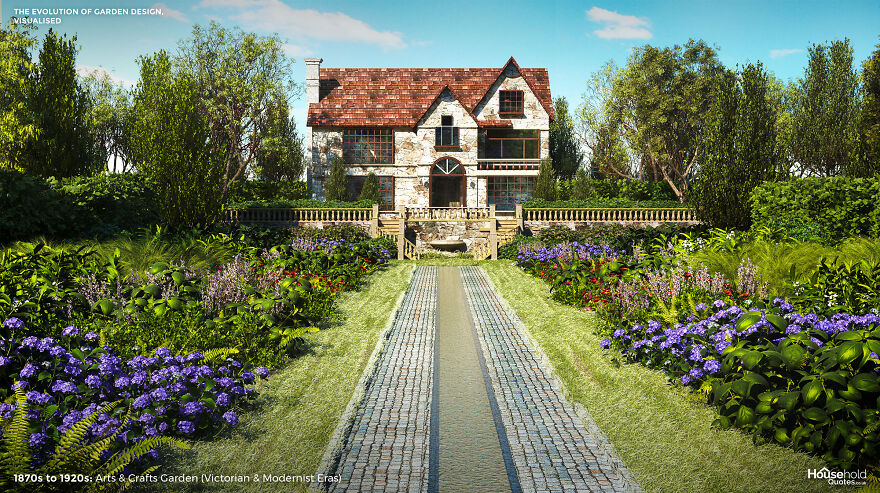
Image credits: HouseholdQuotes
The Arts and Crafts movement valued authenticity and a hands-on approach. Its manifestation in the garden was no different. Like the gardenesque style before it, the arts and crafts garden railed against kitsch ornamentation – but now, faithfulness to the site was paramount. From region to region, this meant the use of indigenous plants and materials. From home to next-door home, it meant celebrating nuances between the architectural and environmental features of neighbouring properties.
The arts and crafts garden should express the personality of its owners. It begins as an extension of the home and then blends into the landscape beyond the owner’s plot, segueing into woodland or the countryside. The natural textures and colours of materials used in built elements of the garden should be exposed, and the crafter’s hand might be visible in the uneven stones of drywall or crooked trellis.
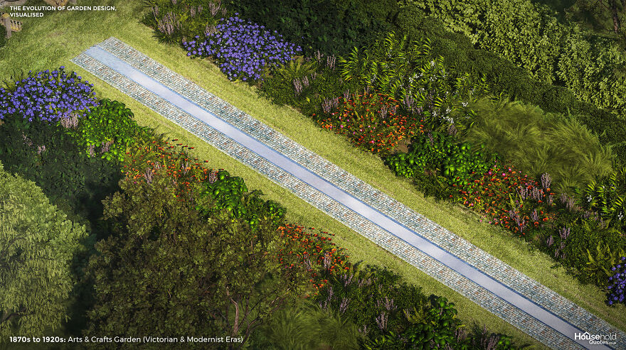
Image credits: HouseholdQuotes
The look can be approximated and modernised today with fashionable materials such as rattan and slate and the use of vines and fruit trees. But to truly approach a ‘modern’ arts and crafts garden, begin by stripping back your garden’s features and looking into the local ecology and history for artistic inspiration.
1900s to Today: American Suburban Front Lawn (Contemporary Era)
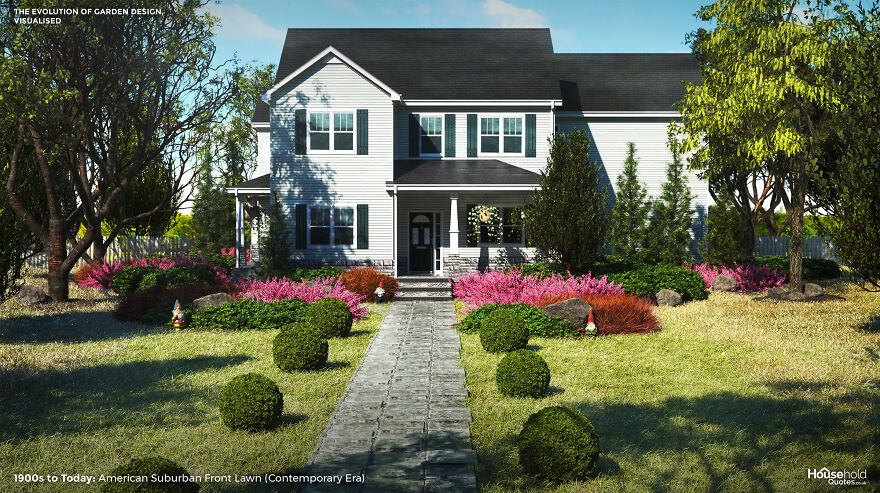
Image credits: HouseholdQuotes
It’s a modern classic: the American lawn, veteran of Fitzgerald’s novels and David Lynch’s movies. The lawn is the simplest of gardens but a complex status symbol representing colonisation or middle-class attainment, depending on your perspective.
At first, grass was a matter of survival: settlers sent for non-indigenous grass seeds to replenish the land after their livestock ate their way through what they found. But after the American Revolution, as food security improved, settlers embraced European influences. The lawn was conceived as a country estate in miniature – an enclosed and manicured landscape with room to roam.
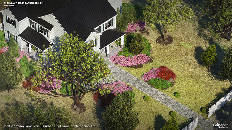
Image credits: HouseholdQuotes
Lawn maintenance aside, the art of the American front garden is found in its practical elements: a winding path that delivers varying views of the home and surrounding landscape, that white picket border fence and shady tree. Choosing a dogwood, magnolia, or sugar maple tree adds narrative to the front of your home, changing with the seasons.
Today, the sprinkler system and the hired gardener of the American front lawn operate along the same lines as the ornamental hermits mentioned in the introduction – they are garden furniture in themselves, indicating the unruly scale of the land and the wealth of the owner. But with thousands of years of garden design inspiration from which to draw, you are sure to invent more unique ways to bring out the best in your home.
This Is How Garden Design Evolved Over 4,000 Years All Over The World, Provided By Household Quotes
My Trip To Explore The Lost Kingdom (8 Pics)
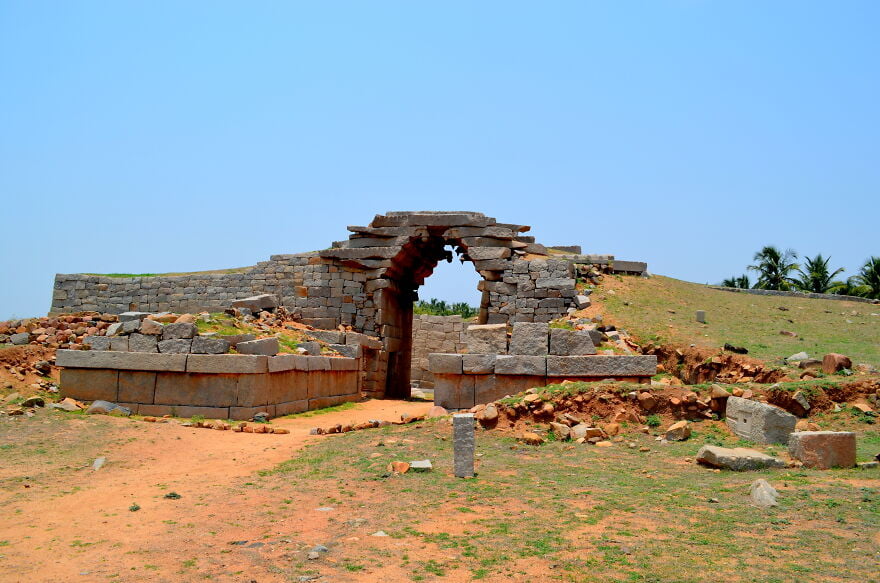
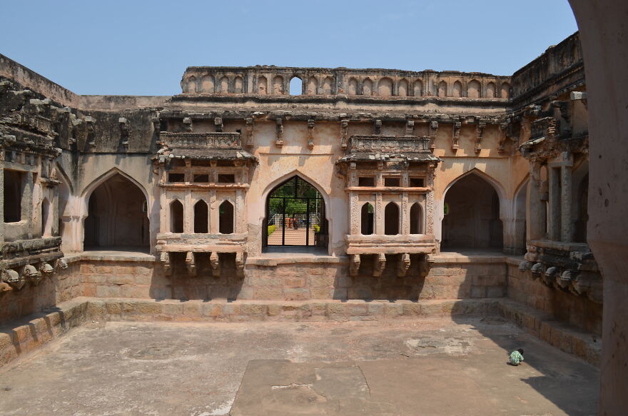
I traveled 300 kilometers to Hampi, India to explore the lost and forgotten kingdom of the Vijayanagara Dynasty at Hampi. Hampi was perhaps the second largest city in the world at the time. It was a flourishing kingdom in the 13th century. It is now a UNESCO World Heritage Site.
Hampi ruins
Queen’s Bath
Lotus Mahal
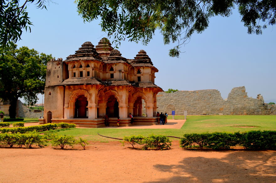
Lotus Mahal compound

Lotus Mahal
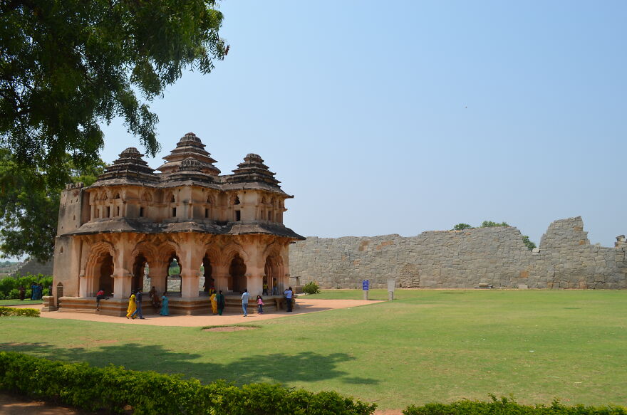
Virupaksha Temple

Stone Chariot

Virupaksha Temple
Pa
Stay tuned to Feeta Blog to learn more about Pakistan Real estate.
My Trip To Explore The Lost Kingdom (8 Pics)
- Published in #architecture, #travel, adventure, Ajay Sharda, ancient, Architecture, Category featured, dinasty, forgotten kingdom, full-page, Hampi, History, India, journey, karnataka, lost kingdom, old, Pics, ruins, travel, trip, unesco, vijayanagara, World Heritage
Pictures Inside Worcester’s Bancroft Tower (7 Pics)
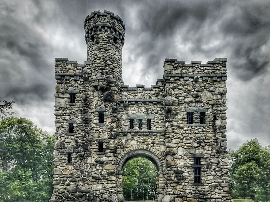
Once a year they open the tower to the public. I was lucky enough to get a private tour to see the inside of this historic structure.
Bancroft Tower is a 56-foot-tall natural stone and granite tower that looks like a miniature feudal castle. It is located in Salisbury Park, in the city of Worcester, Massachusetts. It was established in 1900, in memory of Worcester native politician, historian, and statesman George Bancroft. The tower was designed by Worcester architects Earle and Fisher.
The cost of construction was approximately $ 15,000. Bancroft Tower is listed on the National Register of Historic Places.
Bancroft Tower
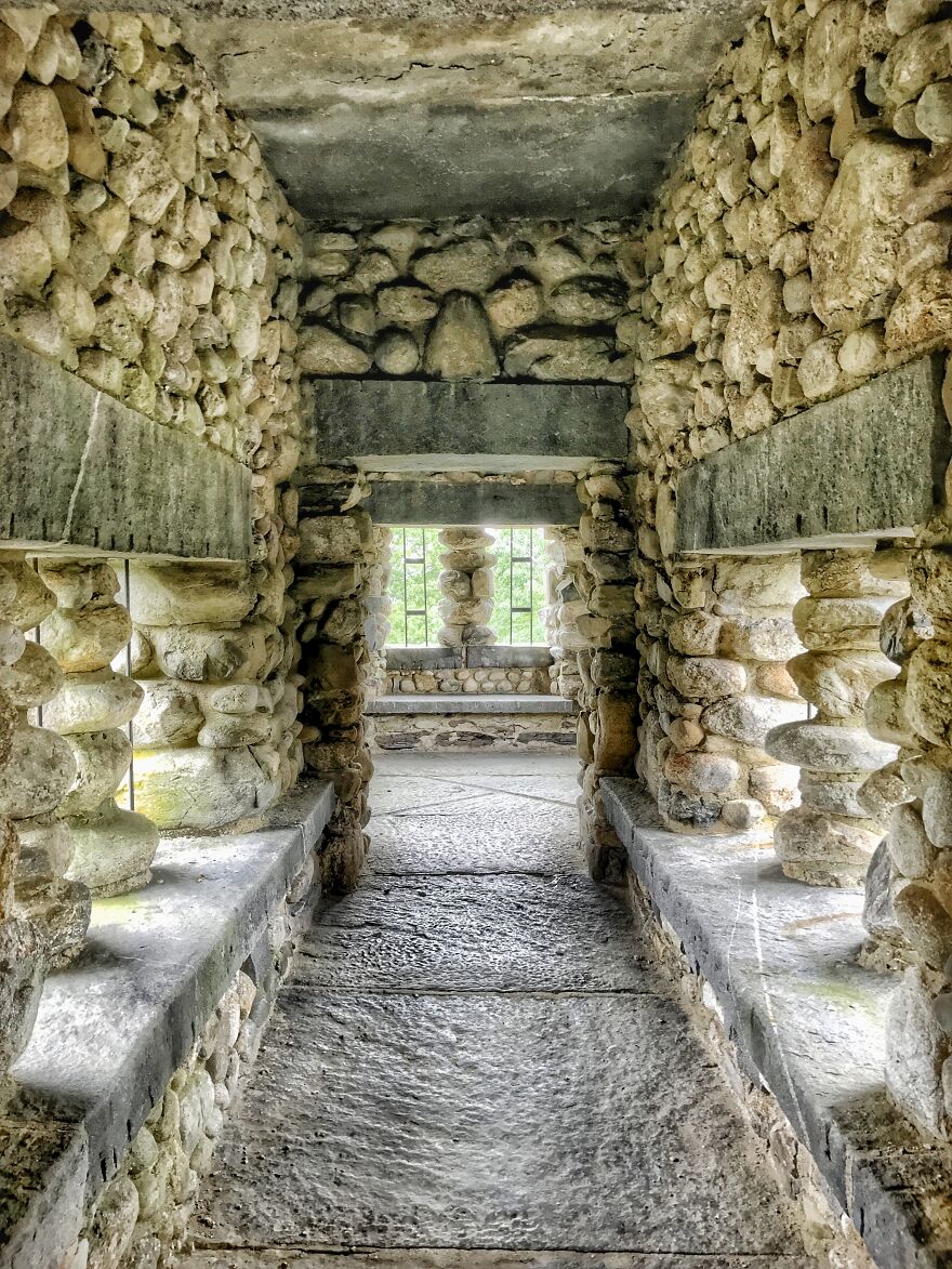
A corridor in a tower
Top of tower
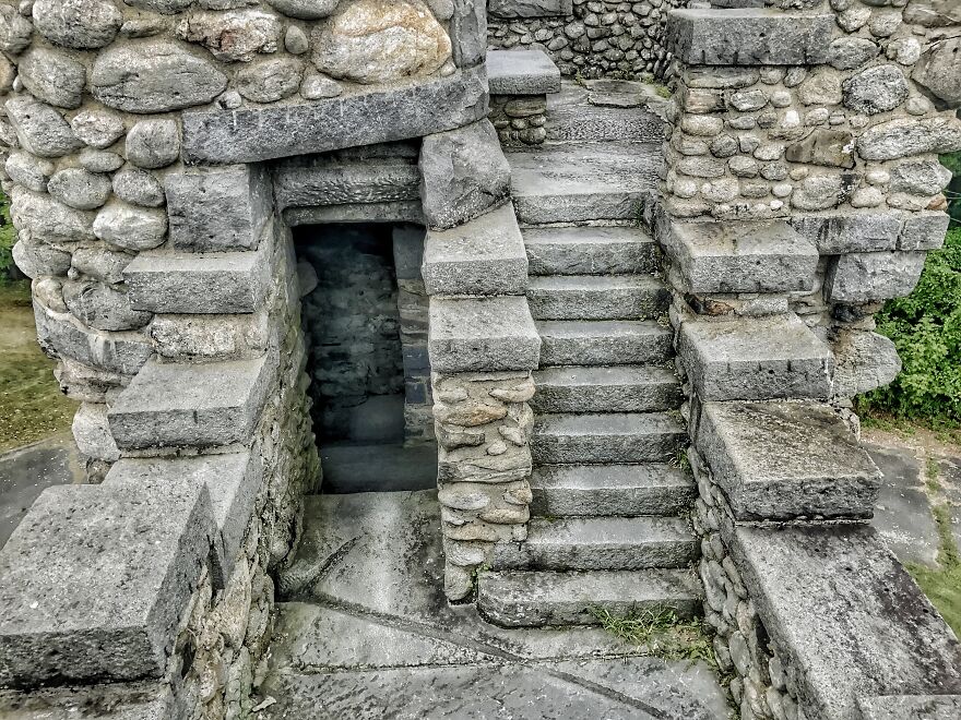
Stairs in a tower
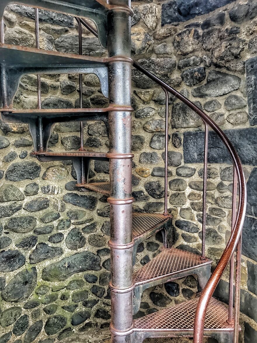
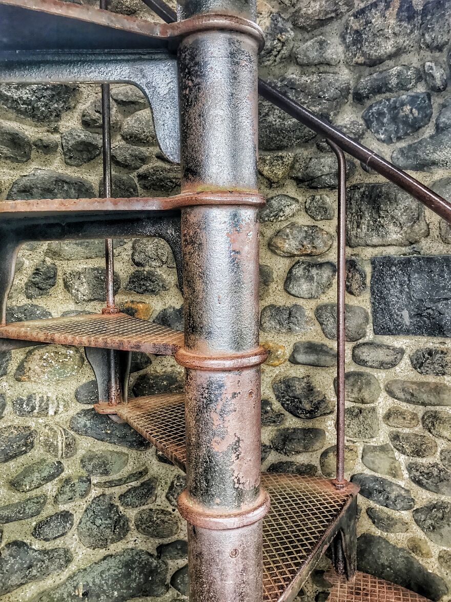
Close-up photo of an iron spiral staircase
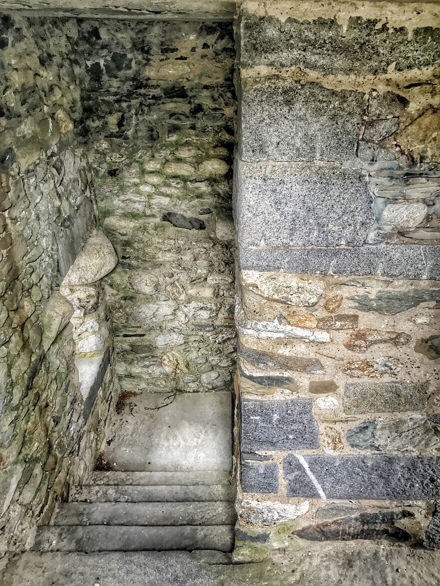
Stairs
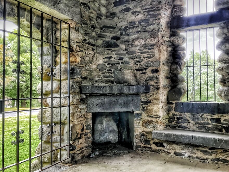
Fireplace
Meanwhile, if you want to read more such exciting lifestyle guides and informative property updates, stay tuned to Feeta Blog — Pakistan’s best real estate blog.
Pictures Inside Worcester’s Bancroft Tower (7 Pics)
- Published in Architecture, Category featured, full-page, History, Jason Baker, Photography
Exploring Shanghai’s Art Deco Past Through 11 Captivating Pictures
As I searched around the city for a photo shoot, I was slowly fascinated by pre-war 1925-style buildings and explored their historical past. So here are some inspirations for my fellow pandas!
# 1 Majestic Theater (1941)

Street Details # 2 Huaihai Rd
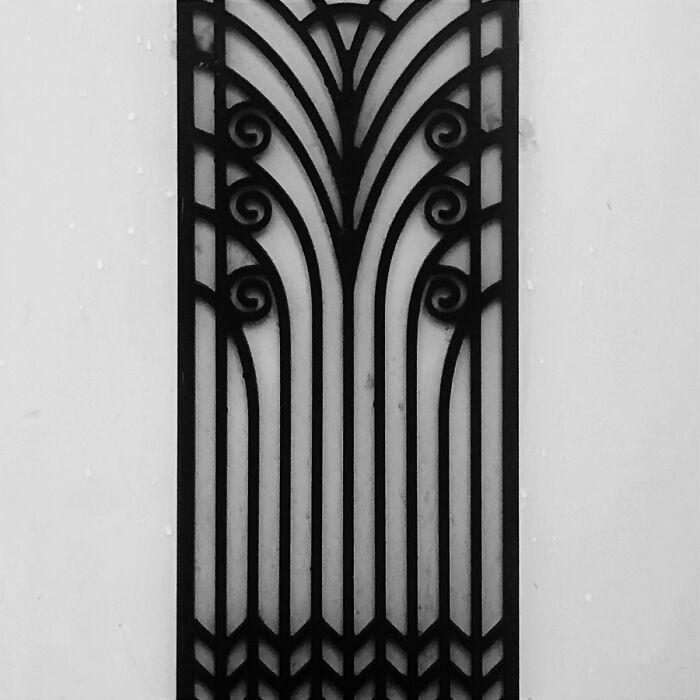
# 3 Sassoon House (1932)

# 4 Nanyang Rd – Plasterwork – Hamilton House (1932)
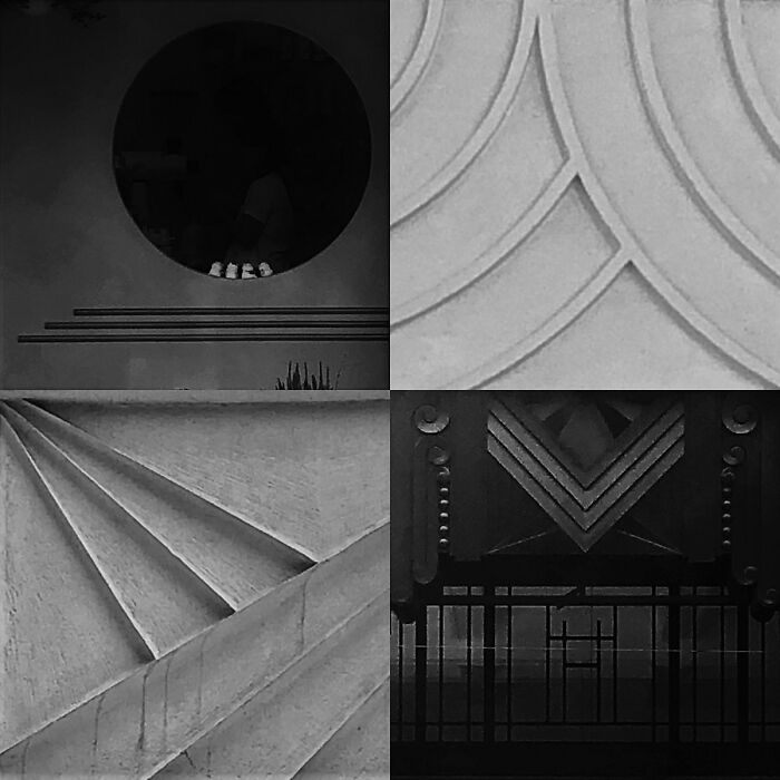
# 5 Continental Bank (1933)
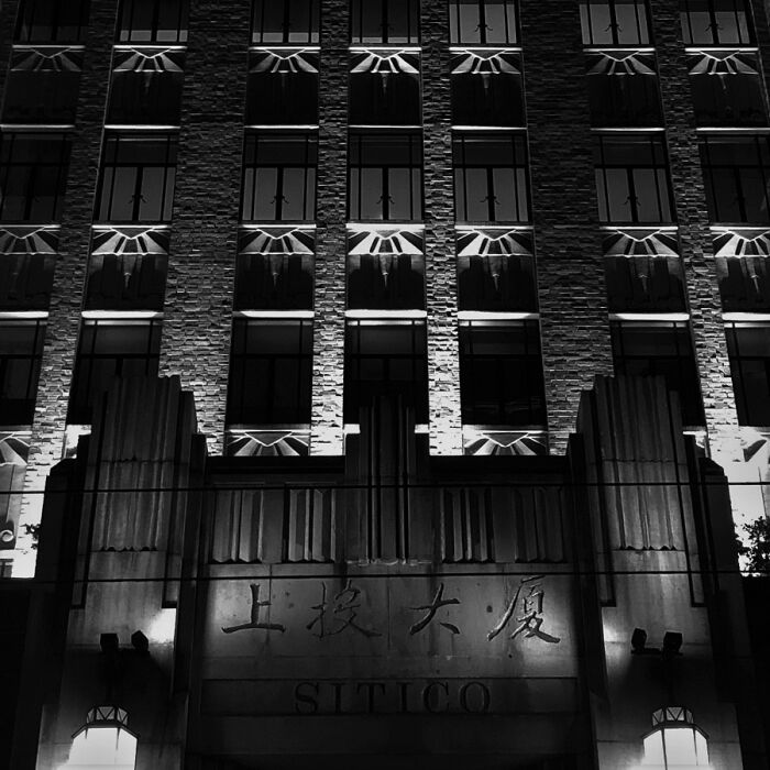
# 6 Metal Fences Details
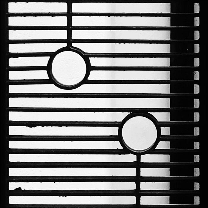
# 7 Major Ballroom (1934)

# 8 Foncim Houses (1932)

# 9 Residences On Guangyan Rd

# 10 Hamilton House (1934)

# 11 Metropole Hotel (1934)

Watch this space for more information on that. Stay tuned to Feeta Blog for the latest updates about Architrcture, Lifestyle and Interior Design.
Exploring Shanghai’s Art Deco Past Through 11 Captivating Pictures
- Published in #photography #, #travel, 1930s, Architecture, art deco, beauty, black and white, buildings, Category featured, eerie, Effy, full-page, History, Majestic, paramount, past, photograph, Photography, photos, Pics, Sassoon, Shanghai
Designers Show How The White House Could Have Looked Different If These 5 Plans Weren’t Rejected
We are all accustomed to the look of the White House, and most of us appreciate its modest neoclassical design. In 1792, the first president of the United States George Washington held a contest for the design of the White House, which an Irishman James Hoban won. But the seat of the world’s most powerful nation might look different. Many architects offered their own versions of the White House, including polyhistorical president Thomas Jefferson, who lived in the same White House nearly 10 years after the contest. But as with all competitions, the winner is long remembered, and the ideas of the losers are almost always forgotten. These rejected plans remained obscure until HouseFresh decided to revive them in digital form and show us what the White House could be like. So look!
Jefferson’s plan for the White House
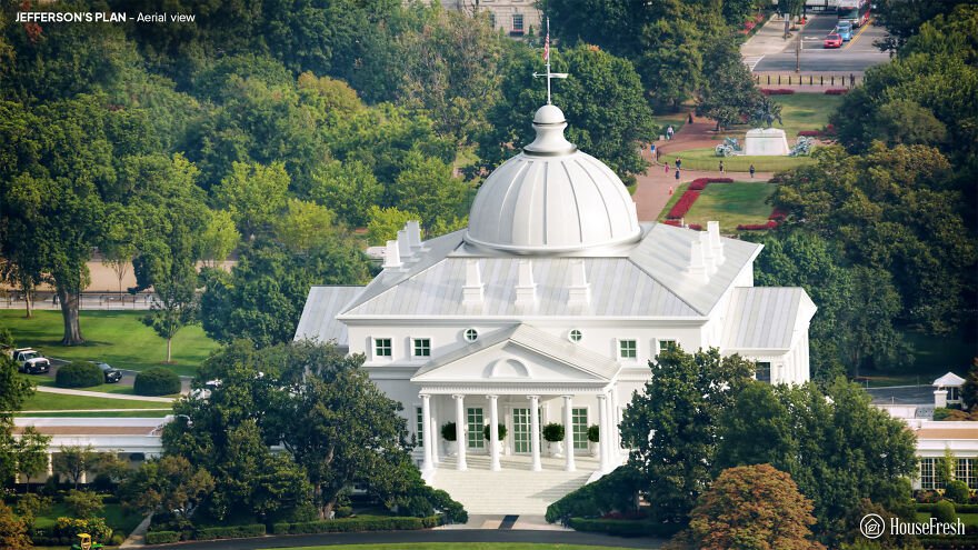
Thomas Jefferson was Secretary of State at the time, and was closely involved with the management of the competition. But he was also an architect and an enthusiast of classical European design. Experts attribute a losing entry with the name “Abraham Faws” to Jefferson. The “real” Faws sent their own, amateur entry, and Jefferson’s anonymous project was later attributed to Faws due to a clerical error.

Jefferson would move to the White House as president in 1801, describing the mansion as “large enough for two emperors, one pope and the great lama.” However, he couldn’t help but expand it, adding an arcade and other features to form the White House as it looks now.
Philip Hart’s plan for the White House

The competition to design the White House was part of a broader challenge to suggest an architecture for Washington’s powerful headquarters. Phillip Hart was an amateur architect – more likely a professional builder – who submitted proposals for both the president’s house and the Capitol.

Hart’s White House repeats its vaguely absurd capital sketches. The abbreviated upper floor and faux-Renaissance style lacks the style and complexity that Washington wanted from a building that should, “in terms of size, shape and elegance … look beyond the present.”
Andrew Mayfield’s plan
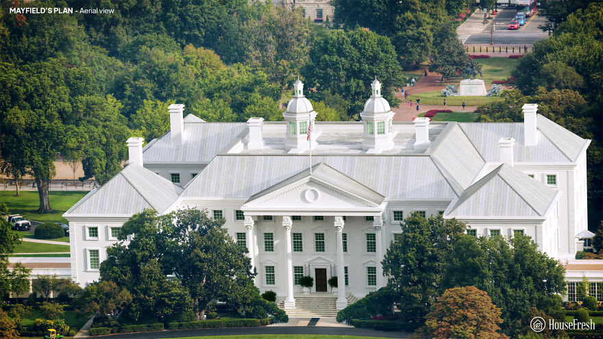
Andrew Mayfield Carshores was a linguist and former British soldier and teacher. Its simple design reflects the pre-revolutionary military architecture, characterized by the colonial period of American buildings Georgian, and English.

Carshore’s steep roofs border a lead footpath, with a rainwater reservoir on the roof of the main block. But the judges lacked a vital spark to his work. According to architectural historian Hugh Howard, Carshore was an ‘amateur gentleman’ and his rejected entrance may be the only building he has ever designed.
Jacob Small’s plan
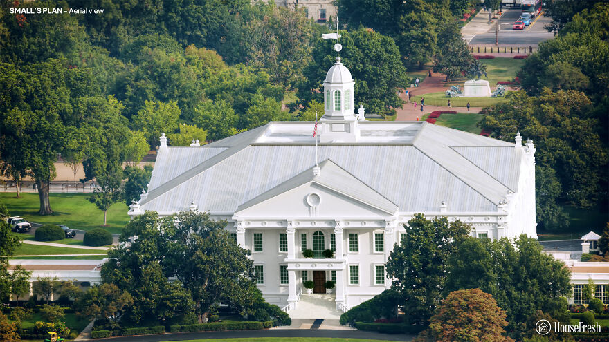
Jacob Small submitted four entries to the 1792 contest. Author Patrick Phillips-Shrock points out that the designs of the Small White House were inspired by two iconic buildings of that time: Mount Vernon, George Washington’s plantation mansion, and the Maryland State House in Annapolis.
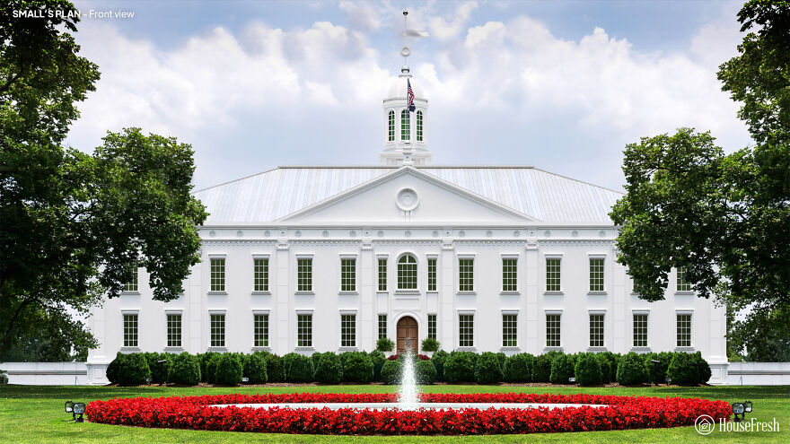
A small one connects the stable and kitchen blocks to the main house with arcades. But its labyrinthine interior of corridors and mysterious stairs would be unpleasant for the president. Interestingly, Little envisioned oval-shaped rooms for the White House – but he failed to integrate them into his broader design in any significant way.
James Diamond’s plan
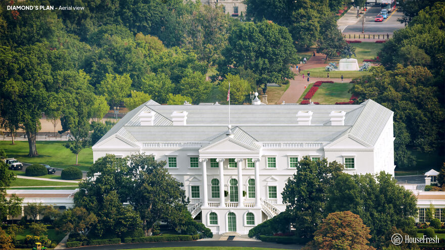
Originally from Ireland, James Diamond was an architect and builder. The White Diamond House stands around a rectangular courtyard. However, Diamond notes in his project that “the Open Court can be changed to a Picture Gallery and Illuminated from the Top, which would have a great Effect.”

Diamond’s design incorporates complex design elements such as Ionic columns and window frames covered with pediments. But the stairs are located awkwardly away from the entrance, and the overall size is supposed to be too ornate for George Washington’s tastes.
This is what it looked like. Aerial view

An actual white house, front view

Also, if you want to read more informative content about construction and real estate, keep following Feeta Blog, the best property blog in Pakistan.
Designers Show How The White House Could Have Looked Different If These 5 Plans Weren’t Rejected
- Published in Architecture, buildings, competition, Different, five, full-page, Homepage featured, house fresh, housefresh, jefferson, rejected designs, rejected ideas, Washington, What if, White House
Stress-Relief Cabin: Compact, Global Assembly in 183 Sq Ft
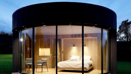
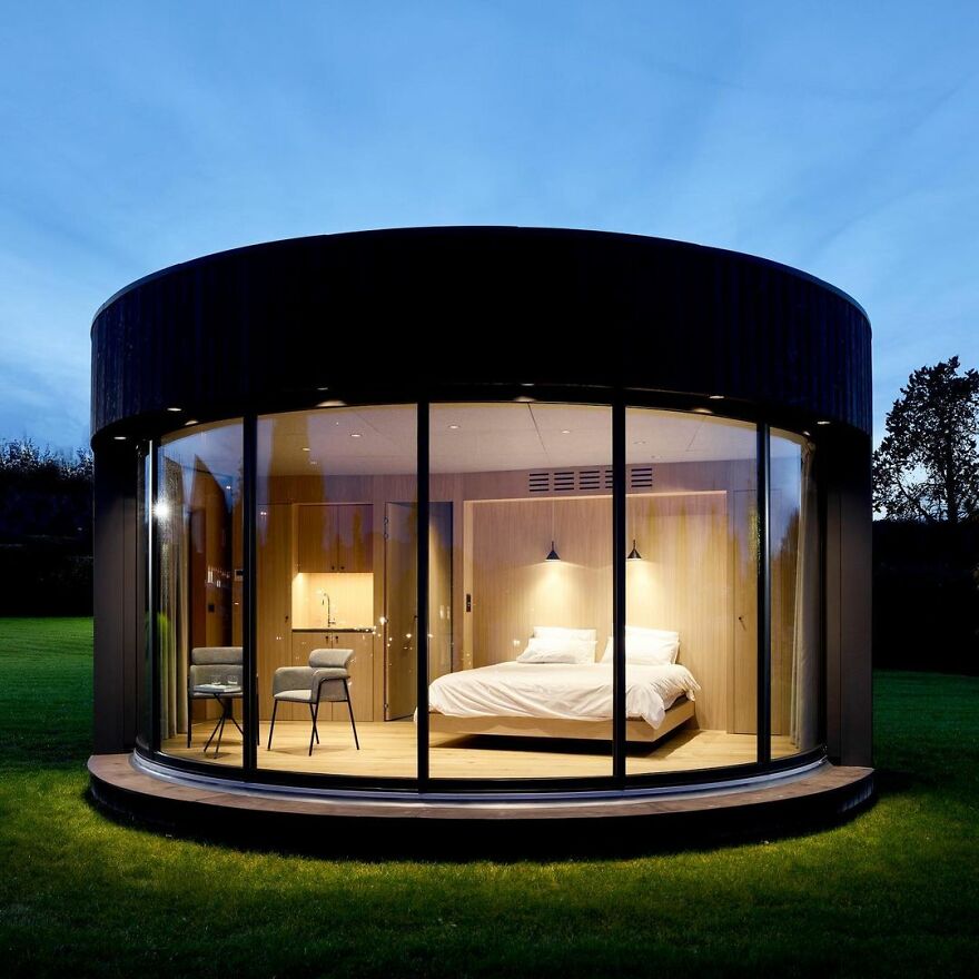
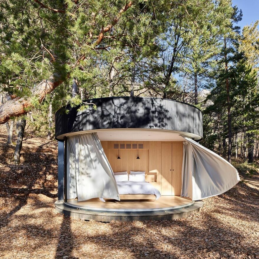
We are pretty sure that most of us enjoy a relaxing getaway in nature, whether camping, renting a cabin in the middle of the forest or just spending a day by the lake. Well, it seems that getting closer to nature has become even easier – and more comfortable – thanks to these ready-made, round huts with sliding glass walls that can be put together almost anywhere in the world!
The aforementioned huts are called LumiPods, and are only 183 square feet. The compound cabin contains a simple bedroom and bathroom.
They have charred wood cladding and a glass facade that slides open to give a seamless connection between the interior and exterior spaces and were created for stressed city residents who may be looking for a weekend getaway.
Would you like to try this yourself, Pandas? Let us know in the comments!
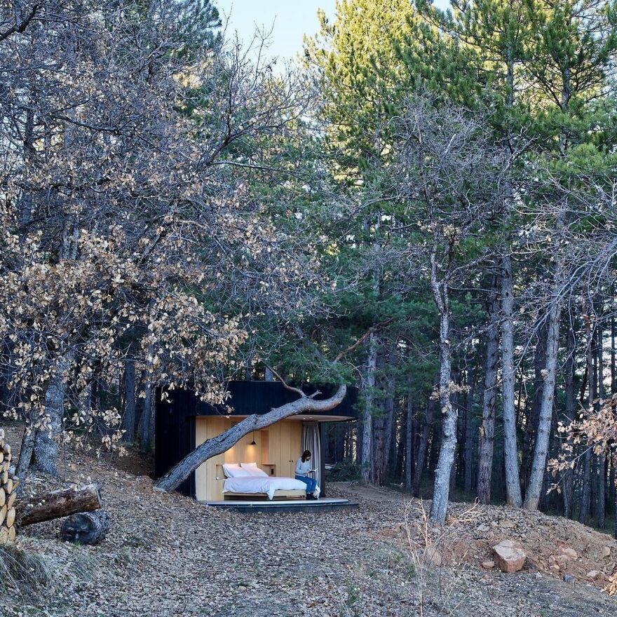
The new tiny cabins are called LumiPods and measure just 183 square feet. They contain a simple bedroom and a bathroom.
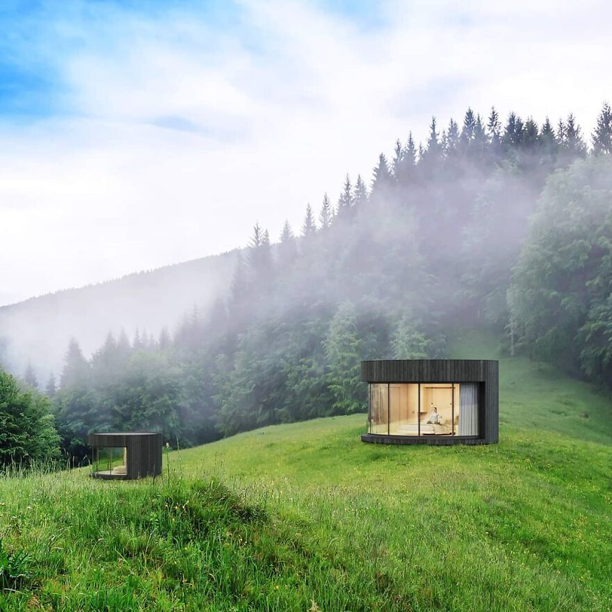
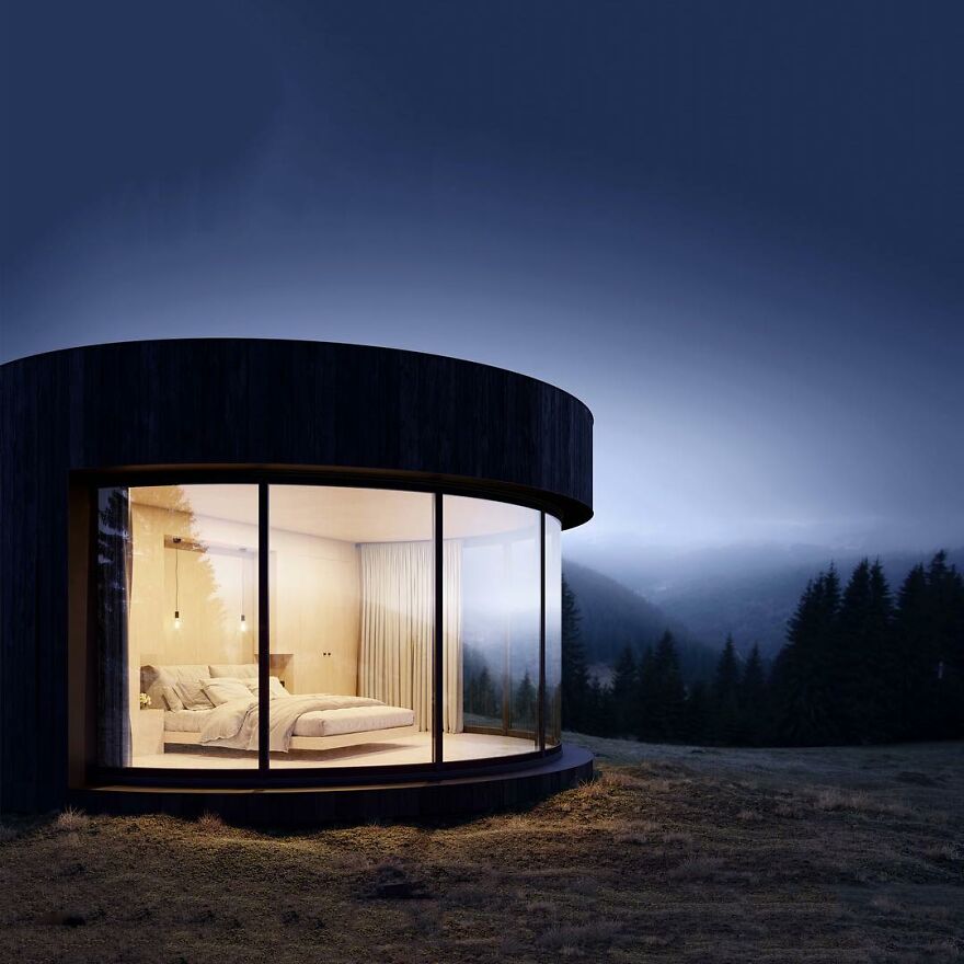
The LumiPod was designed by French company Lumicene, which says it envisions the capsules as “simple cocoons”
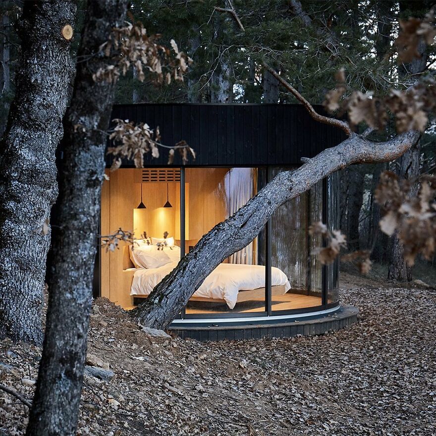

The mini-cabin offers unobstructed views – from almost any position inside
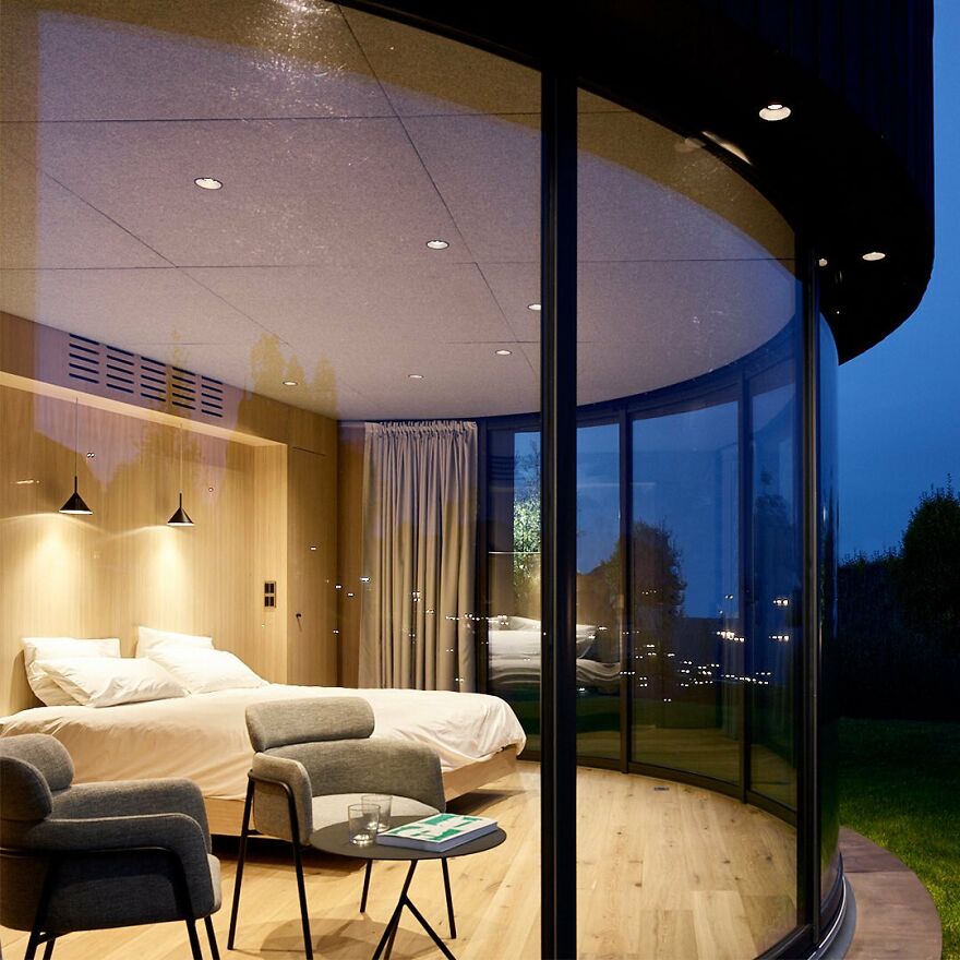
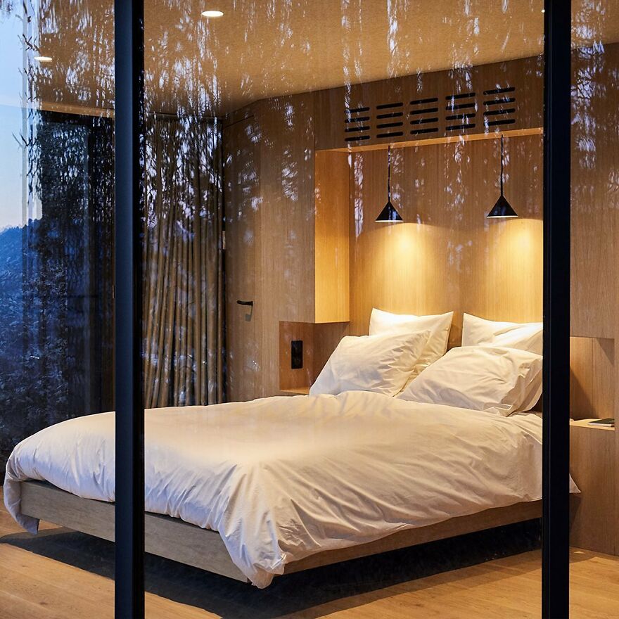
The prefabricated capsules consist of two modules that stand gently on four screw piles
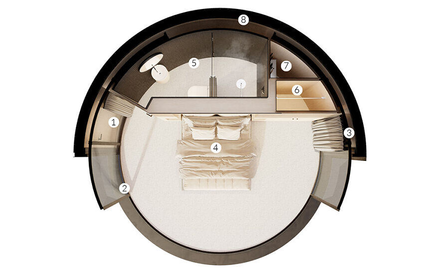
LUMIPOD components:
1 – Curved Entrance Door
2 – LUMICENE curved reversible window
3 – Curtains
4 – 150 square feet (14 square meters) bedroom with panoramic view
5 – Bathroom and toilet
6 – Cabinet
7 – Service cabinet
8 – Curved timber frame walls
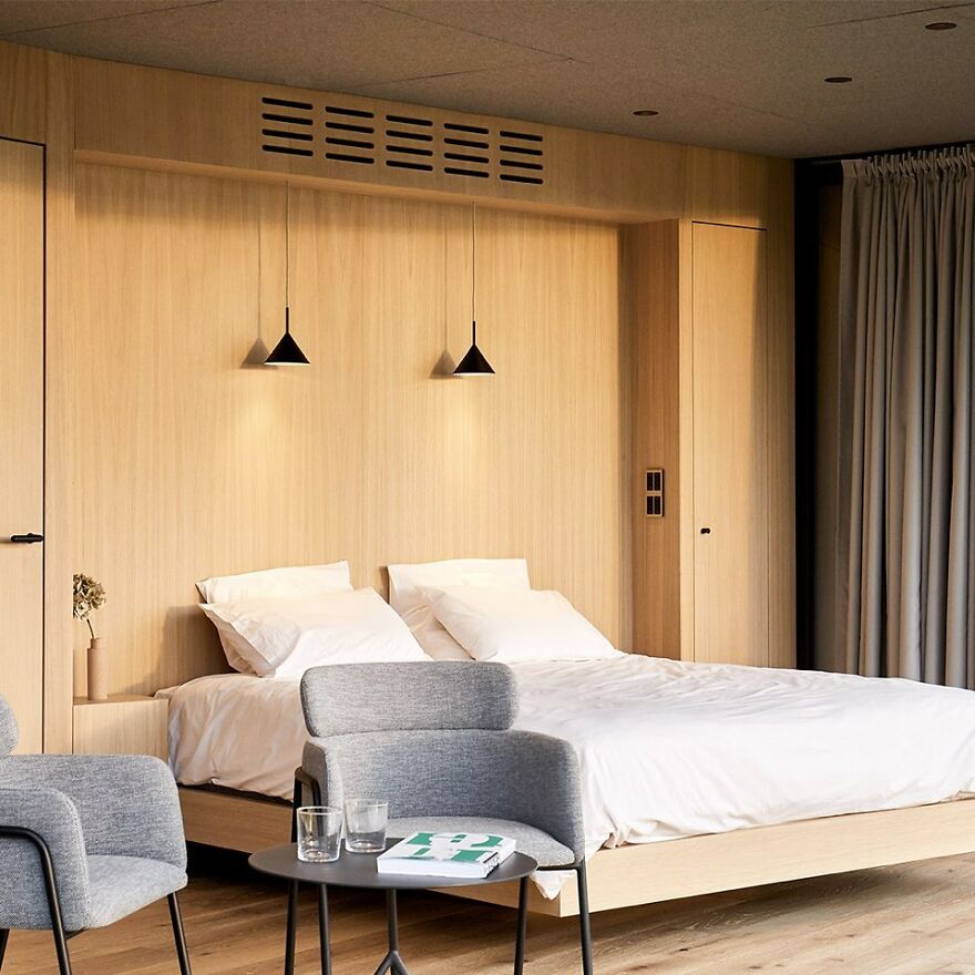
A simple bathroom inside the LumiPod. They can be shipped anywhere in the world and assembled within two days
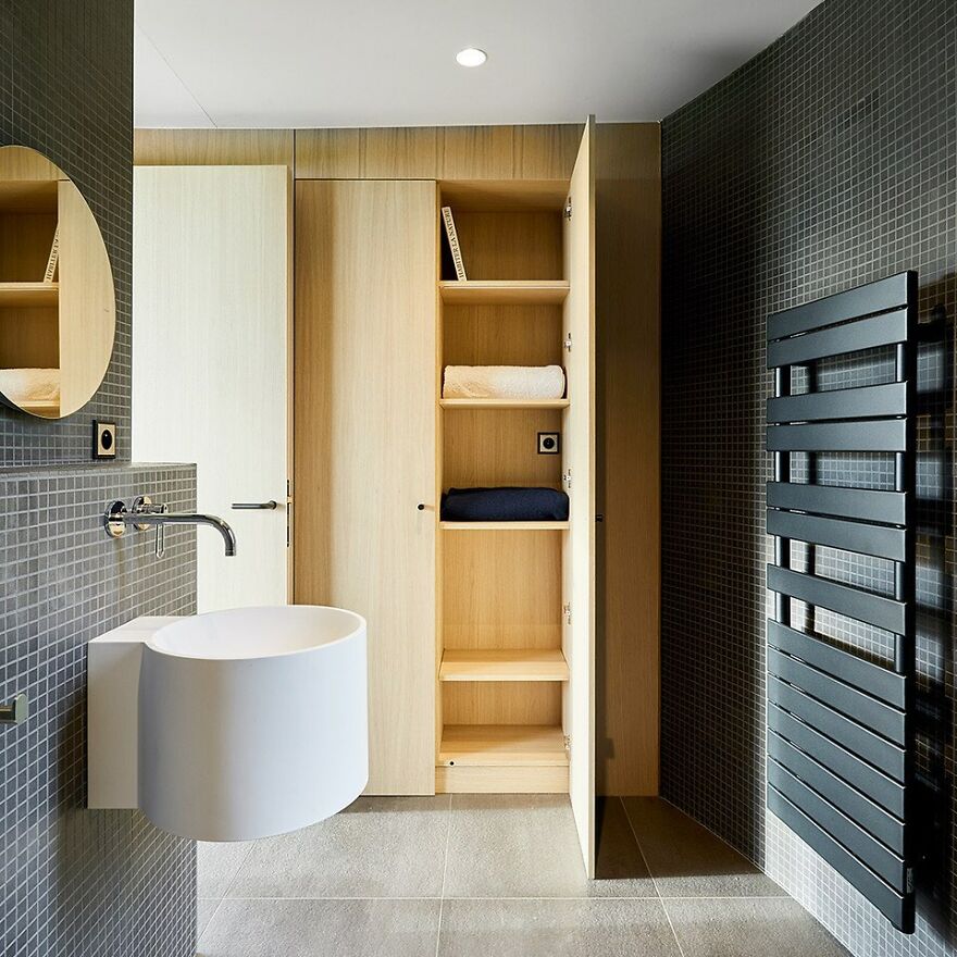
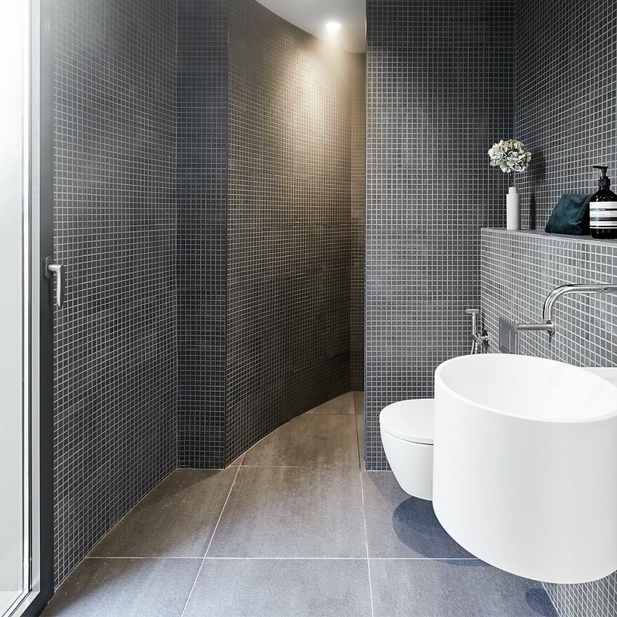
The capsules are strong enough to withstand most climates and the inside of the capsules is well insulated.
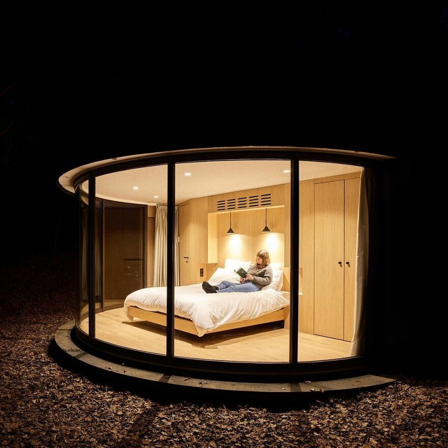
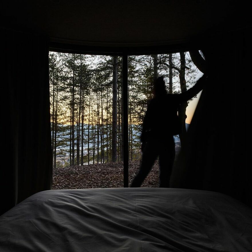
LumiPods must be connected to electricity, water and sewage networks. But the company is currently exploring new technology to offer a completely offline version later in the future
Watch this space for more information on that. Stay tuned to Feeta Blog for the latest updates about Architrcture, Lifestyle and Interior Design.
Stress-Relief Cabin: Compact, Global Assembly in 183 Sq Ft
We Built Our Own Camper From Scratch Out In The Desert
We are no strangers to camping. In fact, we have been living almost exclusively on the road, frequenting BLM and national forest lands, since 2018, and have gone through four campsites at that time. After a special work that planted us in one place for three months, we set off (mostly indifferent to the horizon) just as the effects of the pandemic hit the nation and the world: March 2020.
But we wanted something better than the cheaply built, often problematic RVs we were used to. We wanted something with hard sides (for safety) but not too heavy and bulky, as that would be a burden to transport along the way and limit where we could go.
A generous pile of 2 × 2 wood – we end up buying quite a bit more

Having a truck already, we worked with what we had. One of the bigger lessons I’ve learned over the years on the road is not to focus on what you don’t have, but to work to the limits and “do what you can, with what you have, where you is. ”(This is a quote from varlet Bill Widener, often attributed to Theodore Roosevelt.)
Framing it
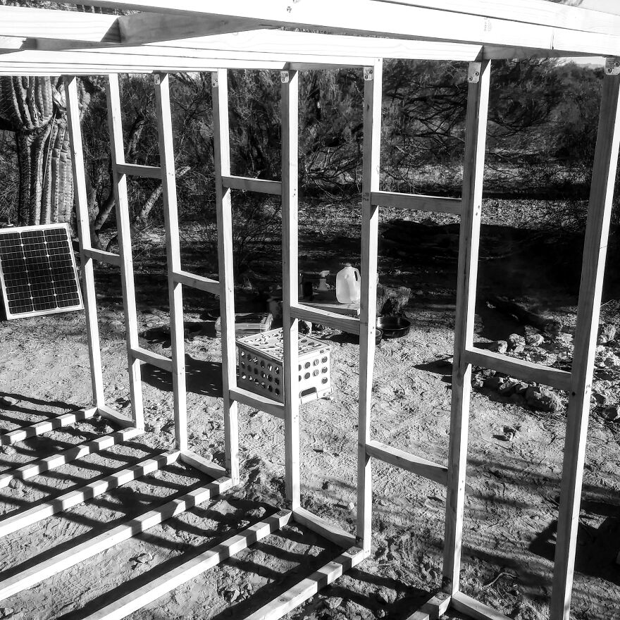
We recently sold our latest “camper van,” which was a basic fiberglass truck capsule designed for contractors and converted by us for camping. It was low profile and big enough for a bed and some storage.
Now is the time for something more suitable for us.
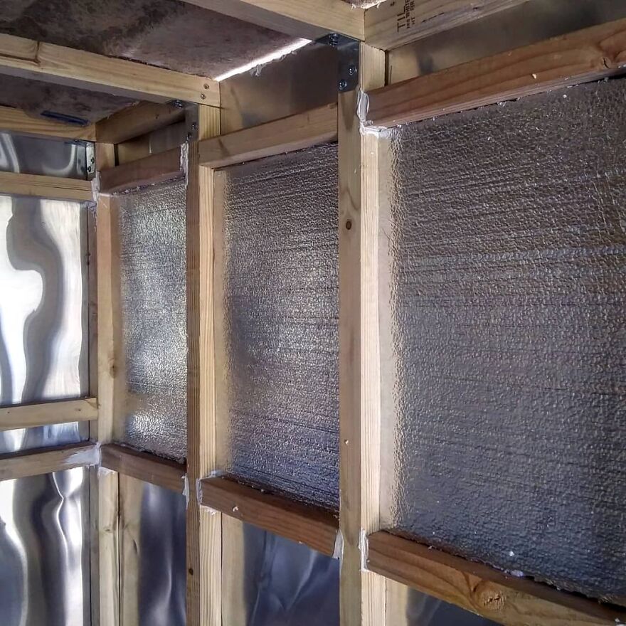
We wrapped the studs with aluminum flashing, a total of five rolls
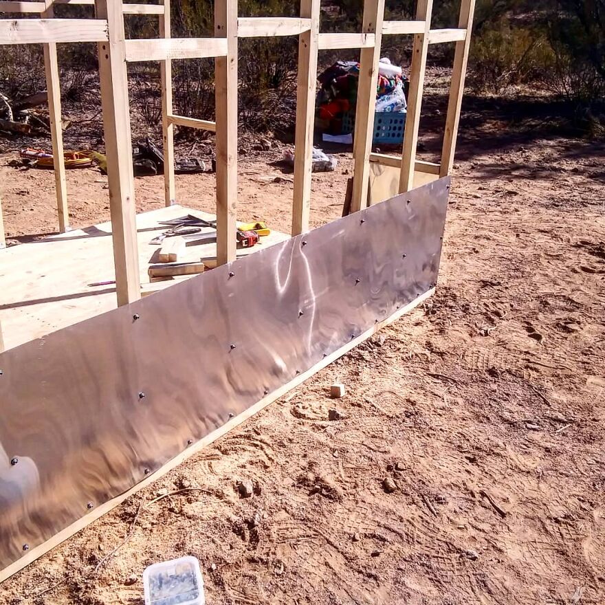
The seams were taped with aluminum waterproof tape

What we have done is not perfect. We have not experienced builders. But my wife and I combined our knowledge of construction learned in part during our younger years by helping our parents with various home remodeling projects and building something we hoped we could make happy.
The circumstances in which we built our truck were not ideal … at least. We had no flat terrain.
Lightweight foam insulation was inserted and glued between each 2 × 2
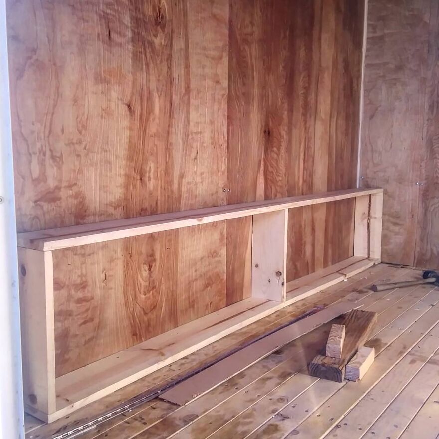
Adding the bookcase; by that time, we had moved to a friend’s house to continue the work
It was north of Tucson, a BLM site with nothing but pale green, shrubbery, some well-chopped saguaros, and all dust. Military aircraft flew daily, along with some private gliders, which circled silently above; even the occasional parachute trainers fell at high altitude somewhere across Interstate 10, barely visible in the midday sun.
Here is the framework for our bench storage
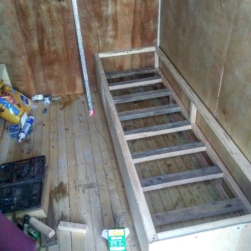
The fifty watts of solar energy we got in wasn’t enough to power tools beyond filling up any 12V batteries for my drill that were old, tired, and barely charged. Naturally, all woodcuts were made by hand.
The 2 × 2 wood at Home Depot was curved, knotted and prone to splitting.
Our budget was very limited due to difficulties I was able to fill a book discussion.
We got this cool vintage door and I framed it to fit using stained wood from an old bed frame
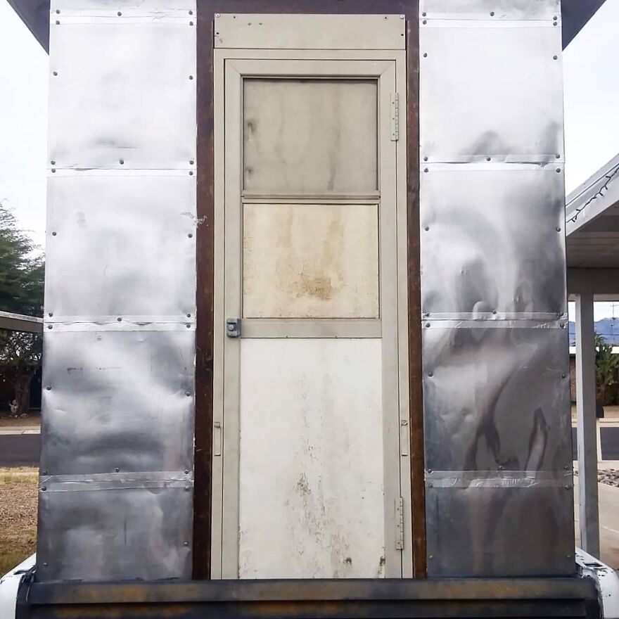
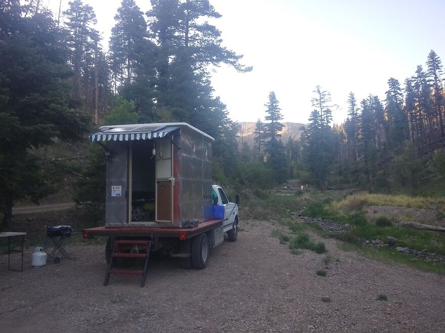
But in the end, we got framed in the camper and had a proper shell. At the time it was light enough to get into the back of our old Ford truck.
Over time, people with materials and various aids (you know who you are, and we always appreciate your help).
A beautiful sunset captured during the construction
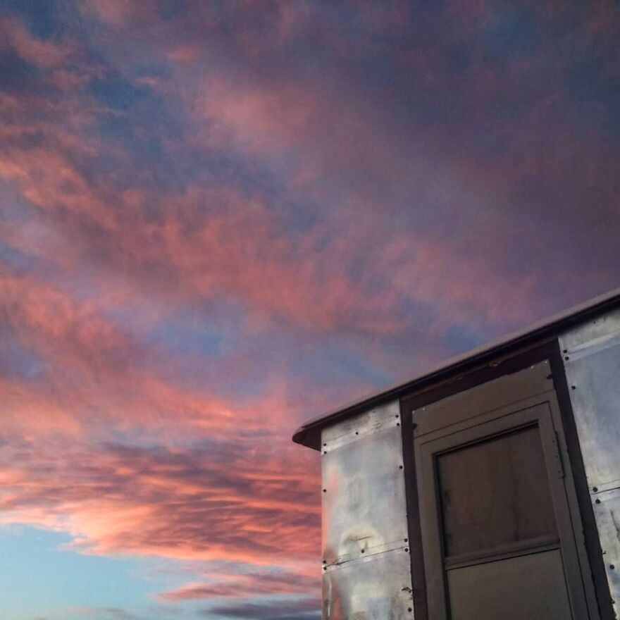
100 watts of sunscreen tied to our signature blue awning, made of metal futon, which we bought for $ 20

Finally, the pieces came together and we had something workable. We recycled a lot of material and took advantage of our limited resources, forcing ourselves to work almost exclusively with what we had at our disposal, only by buying things considered absolutely essential.
What you see in the video (link at the end) is a tour of where we are right now. We have plans for more, but the project has reached a point where we are happy to share it with those looking for ways to live simply and cheaply and build their own platforms with a very limited budget.
It’s always good to see free electricity coming in!

Eventually, the camper becomes more domestic; the left “wall” is the bottom of the folding bed
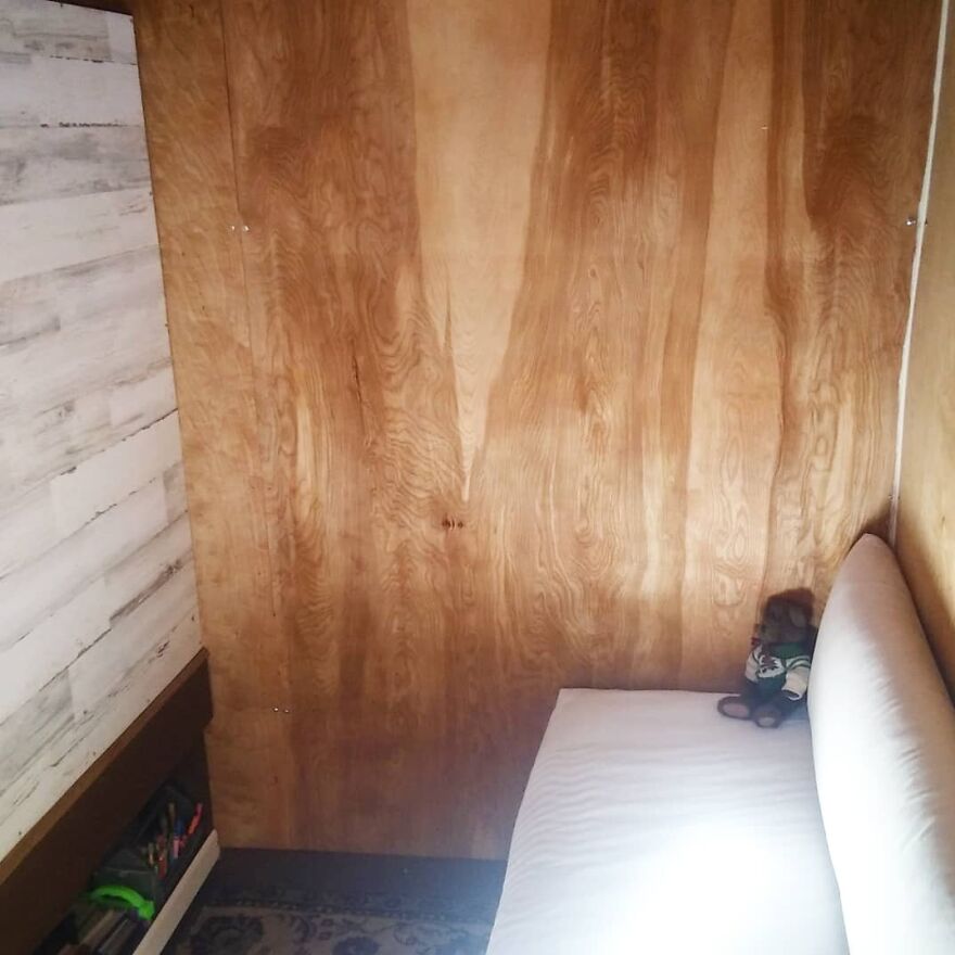
The sofa and roof
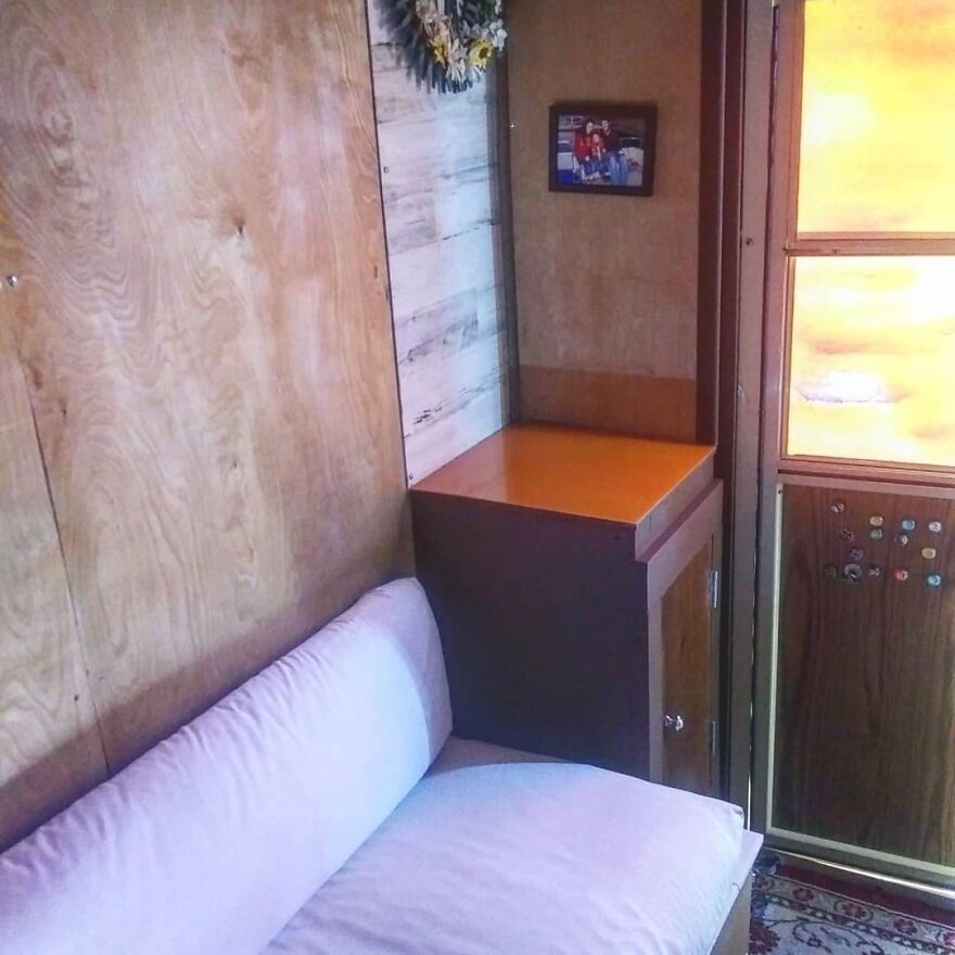
We then added two windows to light and ventilate

The “New” truck with a freshly painted wooden flat bed

Then we added some steps
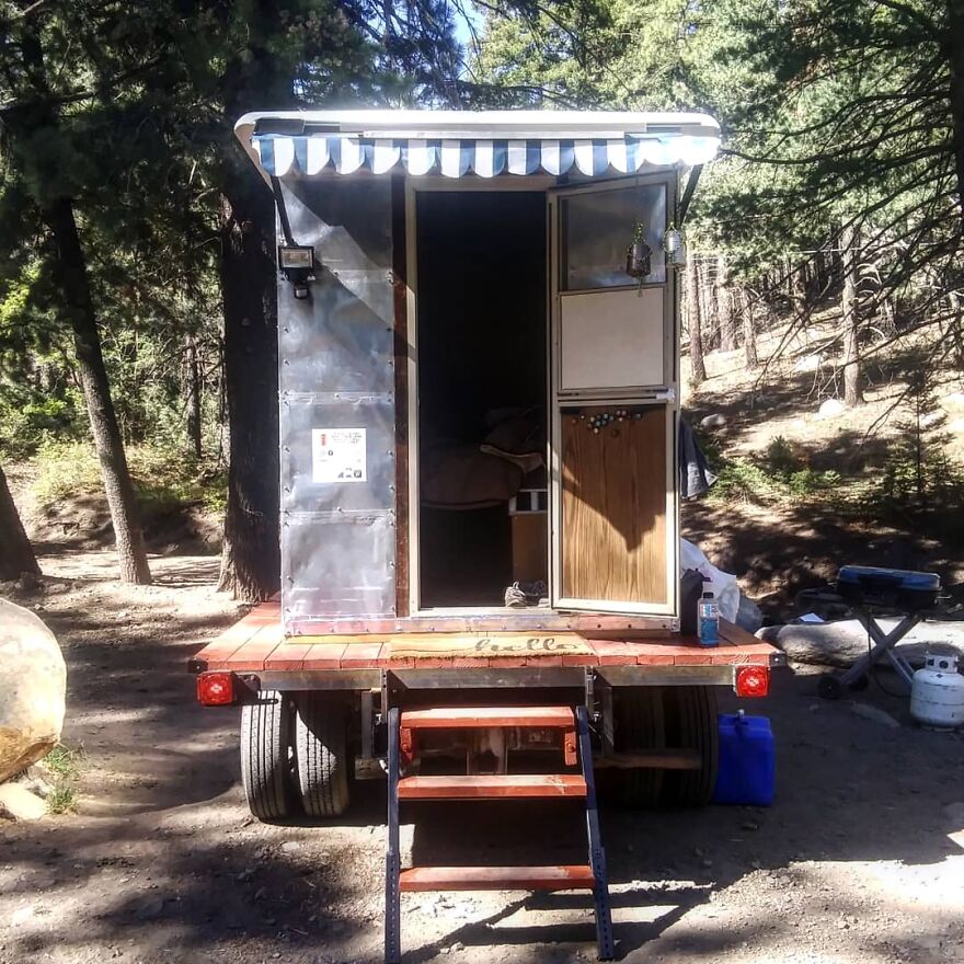
We hope you can gather some ideas for your own built-in project, as doing it yourself will ultimately save you a lot of money, give you the personal nuances, and hopefully give you the longevity you probably won’t get from most anything on the RV market.
Wild horses visiting our back door

Camping in the mountains at a new favorite place
Another of the greatest lessons I have learned and paid attention to: the most worthy things are also the most difficult; realizing something good can and will destroy you until the desire to stop completely. I have felt that many times. But you go on, it’s over, and you’re glad (and probably amazed) that you did it. Make no mistake: living on the road is NOT easy. Behindus behind all the good sunshine, beach campfires, spotless RV interiors and bright Instagram smiles are perhaps a near-train wreck. Vehicles break down, curtains stain, finances run out, plans fail, people fail, the weather prevents everything (although these are things that happen in any life scenario). But van life, bus life and truck life can be a much simpler and cheaper way to live. And if nothing else, you can’t surpass the ability to change your backyard (and your neighbors) whenever you want.
Some perspective … a little life in a big world

Bored Panda works best if you switch to ours Android program
Stay tuned to Feeta Blog to learn more about architecture, Lifestyle and Interior Design.
We Built Our Own Camper From Scratch Out In The Desert
Graphic Designers Show What 6 Asian Castles Looked Like Before Falling Into Ruins
You definitely want to travel before this point, so the best we can do is offer you a way to discover something new and exciting without leaving your home. This time it is the largest and most populous continent, Asia, with its 45 million square kilometers of deserts, mountains, plateaus, plains and jungles that carry the history of ancient civilizations. Budget Direct has decided to digitally rebuild 6 castles that have become ruins over the years across five countries in Asia. The architectural wonders of Asia restore their former glory right before our eyes.
This is the newest project in the series of reconstructions by Budget Direct: the team has previously revived European castles, Ancient Wonders and UNESCO-protected heritage sites.
“In 2020, millions of people around the world will be stuck at home, and even in 2021, there are many travel restrictions still in place. To support those looking for inspiration on a travel chair, Budget Direct has decided to bring back some of the most awesome castles from all over Asia. The team started by making a long list of castles in Asia and then limited these to those that had resources available for us to digitally readjust.
They then chose the castles with the most architectural marvel from across the continent to rebuild. The team has been working with researchers, architects and digital designers to bring these ancient castles into the 21st century. ”
So sit back, relax, and start the virtual journey! And hopefully, you’ll find out something new along the way today.
Alamut Castle, Alamut Valley, Iran

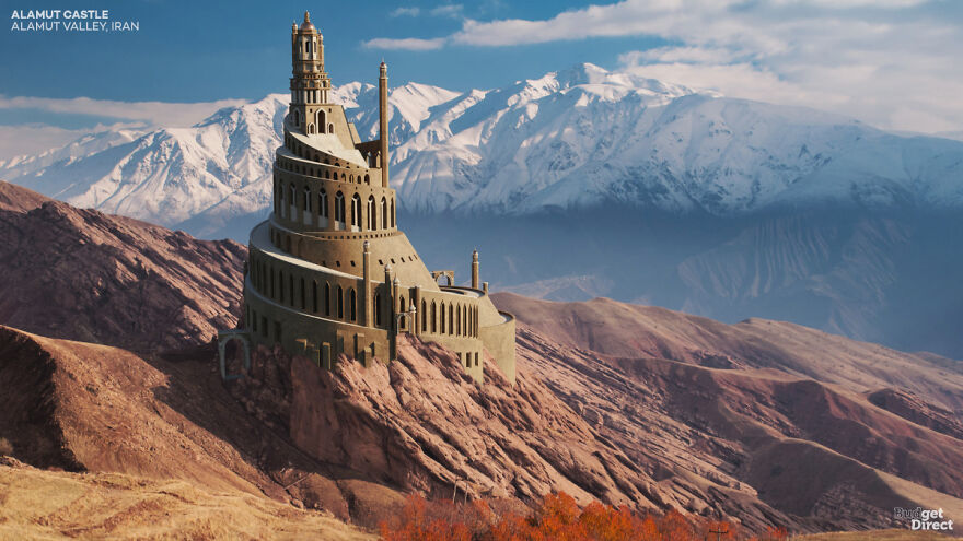
In 1090, Imam Hassan-i Sabbāh allegedly conquered the castle without shedding a drop of blood. The new state secured its power through targeted attacks on enemy leaders. Those who carried out these attacks were contemptuously called “Hashashin” (“tumultuous grass”), thus giving birth to the word “Assassin”. Ironically, Alamut’s fame caused its demise; its various conquerors demolished the castle while searching for a legendary assassin.
Alamut Rock is a popular day trek that offers a lookup view of the surrounding country. However, not much remains of Alamut Castle itself; its few surviving stone clouds are covered in scaffolding while the Iranian government tries to partially restore it for tourists.

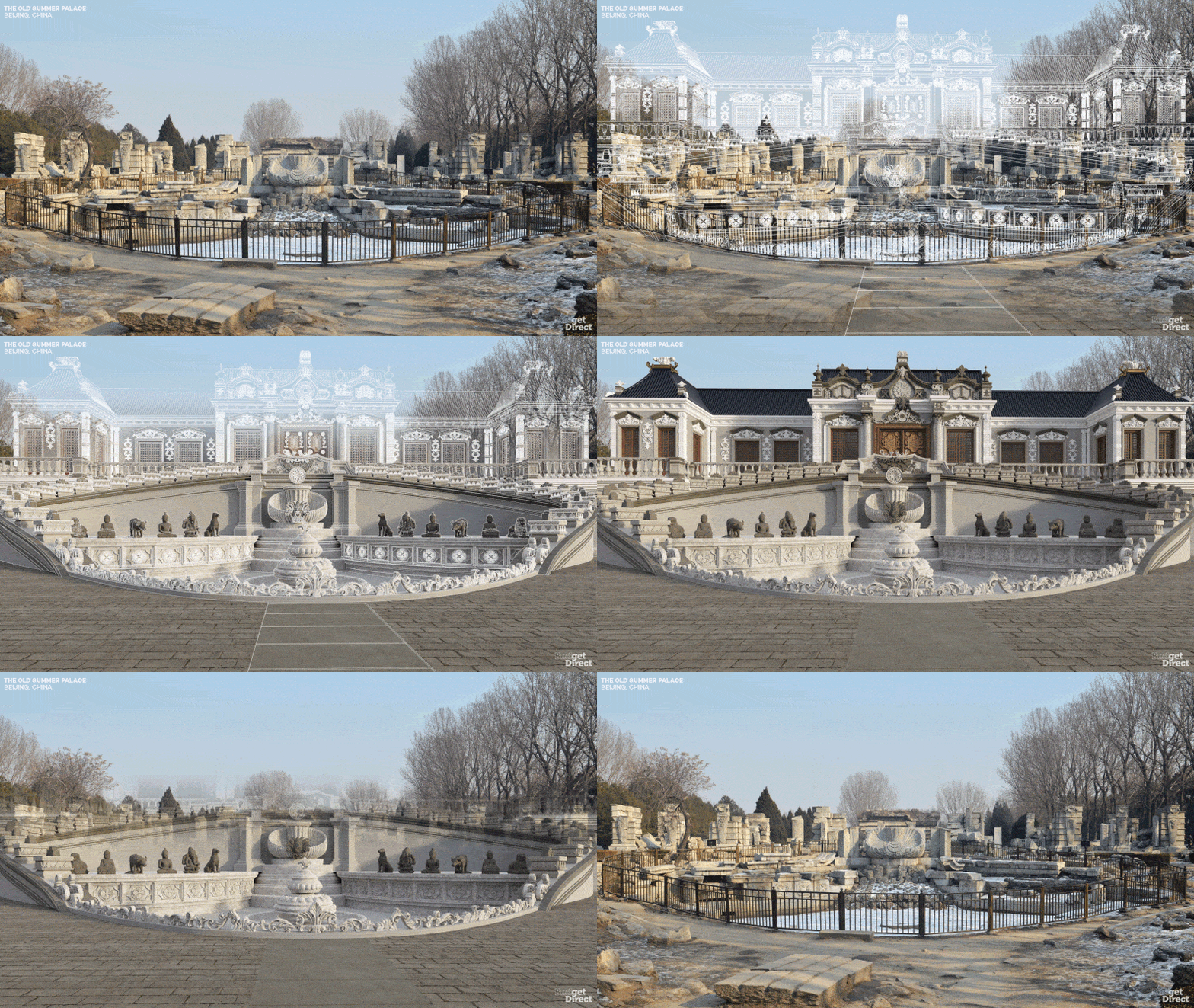
The Old Summer Palace, Beijing, China
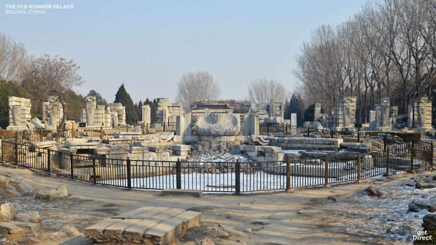
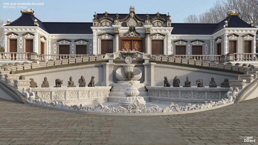
Yuanming Yuan – known in the Western World as the Old Summer Palace – was not a single building but a 3.5 square kilometer complex of palaces, lakes, gardens, towers and sculptures. The pride of the Qing dynasty, Yuanming Yuan, was largely destroyed by British and French troops in retaliation for the death of a British envoy during the Second Opium War. Further destruction occurred during the Boxer Rebellion and the Cultural Revolution.
We chose here to rebuild Haiyantang from the Yuanming Yuan (The Palace of Calm Seas). In front of a two-story Western-style palace, a water clock surrounded the 12 animals of the Chinese Zodiac. Today, the Martian ornament of the fountain sits within the contour of its former depression, backed by a spaced view of fallen palace columns.
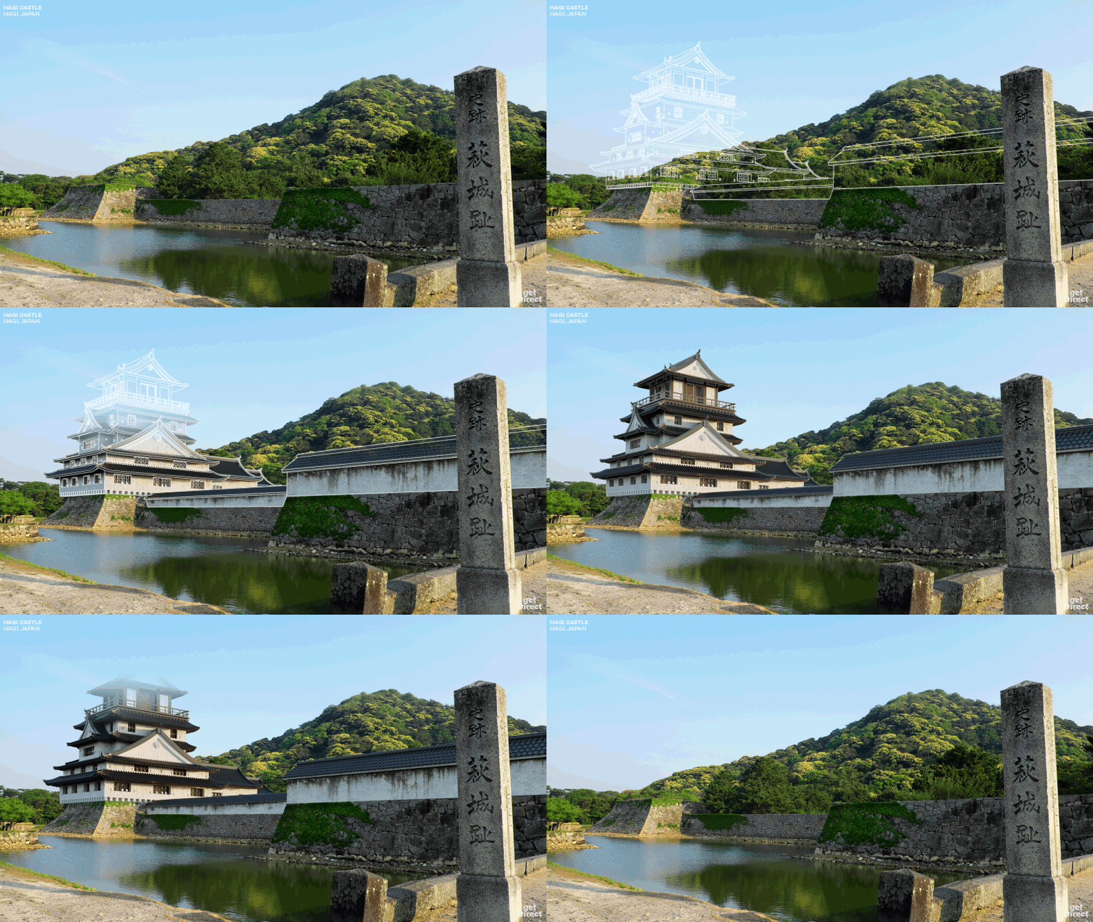
Hagi Castle, Hagi, Japan
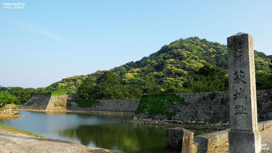
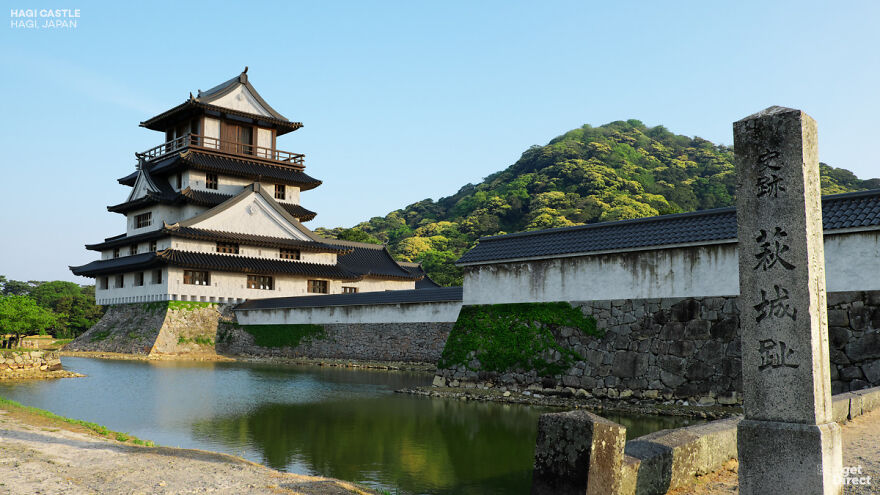
The Mōri Samurai clan lost to Tokugawa in the Battle of Sekigahara, and as a result, had to rebuild their capital in the small seaside town of Hagi. The Mōri got their revenge, however. The castle became the capital of the Chōshū Domain, which was instrumental in the final overthrow of the Tokugawa Shogunate. Ironically, the castle was dismantled by the new government in 1874 as part of a policy of centralization and modernization.
Hagi was very awesome at the time. Multiple galleries and walls protect the surrounding land, many of which are still visible. The main wooden fort has been dismantled, but its stone base and part of its moat stand. Higher up the mountain, the remains of a reserve fort can be found.
Ghazni Citadel, Ghazni, Afghanistan
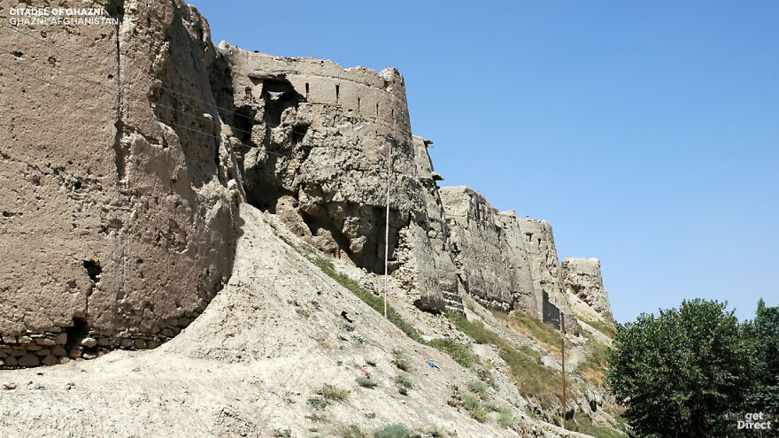
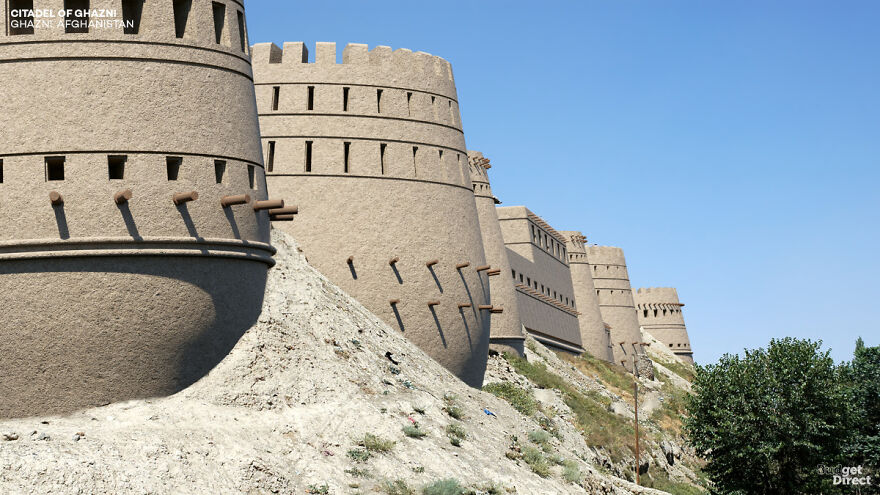
The former slave Sebüktigin received the governorship of Ghazni in 977, but he promptly rebelled against his ruling Iranian rulers to found the Ghazni Empire. Ghazni became the war point of Afghanistan, sought after by the VIP conquerors from the history of Timur (Tamerlane) to the Mongols. When the citadel was famously conquered by the British in 1839, Afghan leadership had to flee Kabul. It was also used as a U.S. military base after 2001.
The remains of the citadel rest on a central hill above the walled city. However, neglect, war and weather severely damaged Ghazni. 14 of its original 32 towers have collapsed, one recently as 2019. Today, Ghazni’s walls, towers and citadel are in danger of being lost permanently to the weather winds.

Raigad Fort, Raigad, Maharashtra, India

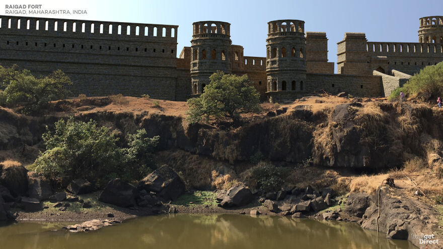
Although parts of the structure date from 1030 AD, the already imposing fortifications of Raigad were expanded by Shivaji Maharaj. Shivaji was crowned Chhatrapati (“Umbrella Lord”) here in 1674, establishing the Marathan Confederacy as opposed to the Mughal Empire. The Confederacy ruled Raigad until its destruction by the British East India Company in 1818.
The main entrance to the castle is 820 meters above sea level – a climb of 1737 steps. (Luckily now there is an aerial tramway.) Visitors can still look at the remains of two of the three watchtowers, several reservoirs, stone trading booths and a famous wall called Hirakani Buruj.

Takeda Castle, Asago, Hyogo, Japan
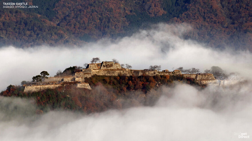
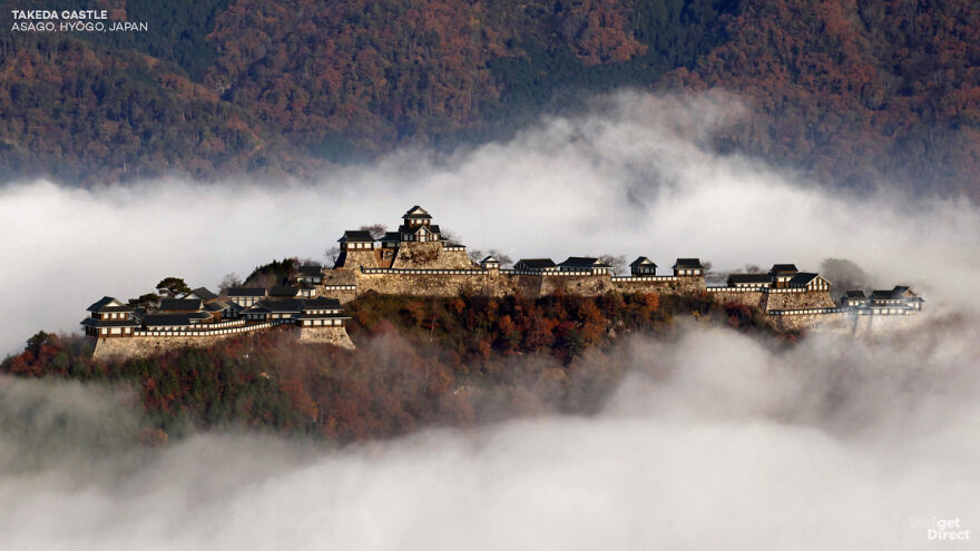
Takeda was built in the 15th century by “the Red Monaco” – a man partly responsible for plunging Japan into the century of chaos known as the Sengoku period. The fort was later conquered by Toyotomi Hideyoshi during a reunion. After Hideyoshi’s death, the new shogun Tokugawa Ieyasu accused the final lord of the castle of arson during a pivotal battle. From here Takeda decayed.
Today the ruins of the castle sit 353 meters above sea level. Although no buildings remain standing on the mountain itself, a row of temples has survived at the base. The stone foundations of the castle are well preserved, having undergone minor restorations in the late twentieth century. Due to a seasonal fog that fills the valley, some mornings Takeda seems to float above the clouds.

Watch this space for more information on that. Stay tuned to Feeta Blog for the latest updates about Architrcture, Lifestyle and Interior Design.
Graphic Designers Show What 6 Asian Castles Looked Like Before Falling Into Ruins
- Published in Architectural Heritage, architectural wonders, Architecture, Asia, asian castles, asian history, Budget Direct, castles in asia, castles reconstructed, culture, digital art, full-page, Graphic Design, heritage, History, Homepage featured, ruined castles rebuilt, ruined castles restored, ruined catles, travel, travel destinations, travel destinations in asia

