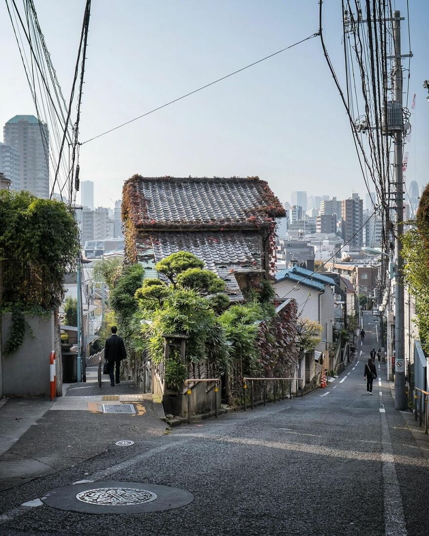
“Hinashizaka Slope on the left, and Fujimizaka Slope on the right. Apparently you could see Mt Fuji from here on the early 1900s. Likely blocked nowadays.”
Old Architecture Looks Like In Japan (30 Pics)
History, although not always correct, is very important to our society. Without it, there would be no traditions to follow today, culture to appreciate, or memories of our ancestors that we can learn so much from.
Instagram account Japan Property Central shares a really important part of history—architecture. Their photographers travel around Japan, capturing the oldest buildings and how they look. How they’re being used today. Many of them have been repurposed to be something else, like hotels, shops, or even homes.
The buildings are really beautiful and unique. The way they harmonize with the modern world around them is an amazing sight to see. These buildings are like monuments of history, a portal which transports you to old times.
More info: Instagram | japanpropertycentral.com
We got an interview with Zoe. She told us the main goal behind these photos: “To share the interesting buildings and homes in Tokyo and other parts of Japan, and the history and stories behind them. The older homes may be at risk of being demolished and redeveloped, so I want to try and document them while they are still standing. Sometimes I am too late.”
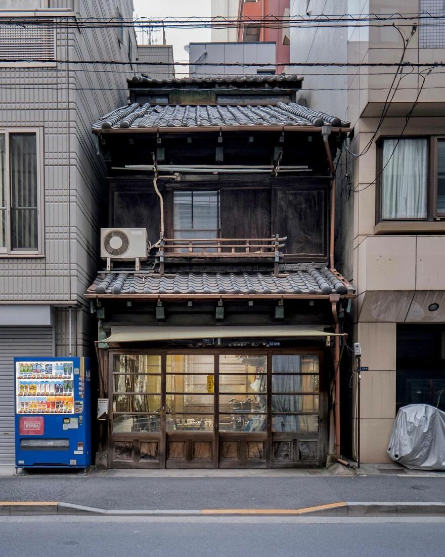
“A tatami shop in Tsukiji, Tokyo. Built sometime in the 1920s or 1930s, and still seems to be operating today. The building is a great surviving example of the pre-war shophouses found in Tsukiji and around Tokyo’s other historic merchant districts. If you look at the roof line you can see a line of windows showing a 3rd floor or attic that may have been added at a later date.”
japanpropertycentral Report
Here’s how Zoe got into photographing these buildings: “Out of necessity. I run a real estate brokerage and the property photos we receive from listing agents do not always show the property in the best possible light. Many times there are no photos at all. Many of our buyers are foreigners and expect high-quality photos before they will decide to inspect a home or apartment, especially if they are flying in from overseas. Often I will have to go and take the photos myself. I am still very much a beginner at photography.”
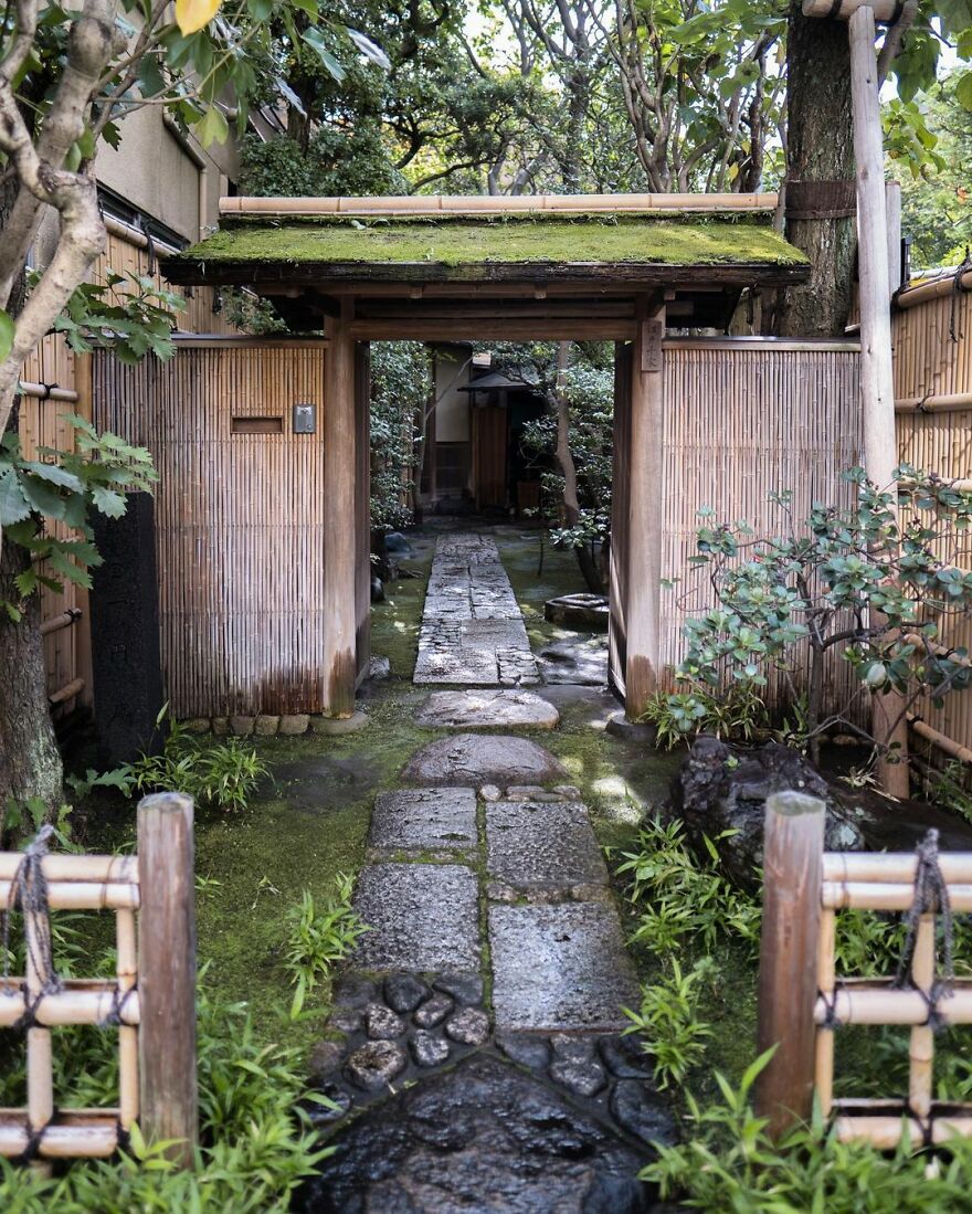
“The entrance to the Edo Senke tea ceremony estate in Ueno, Tokyo. The buildings are historic, having been shifted here from a Daimyo’s mansion in the 1860s. Wooden tea houses are relatively easy to dismantle and relocate, and it wasn’t unusual for old buildings or even parts of them to be moved and reused. It still happens today on occasion. When people talk about Japan’s scrap-and-build approach to buildings, they are not referring to the traditional construction methods that last centuries. Alas, the grounds of this estate are privately owned and not open to the public.”
japanpropertycentral Report
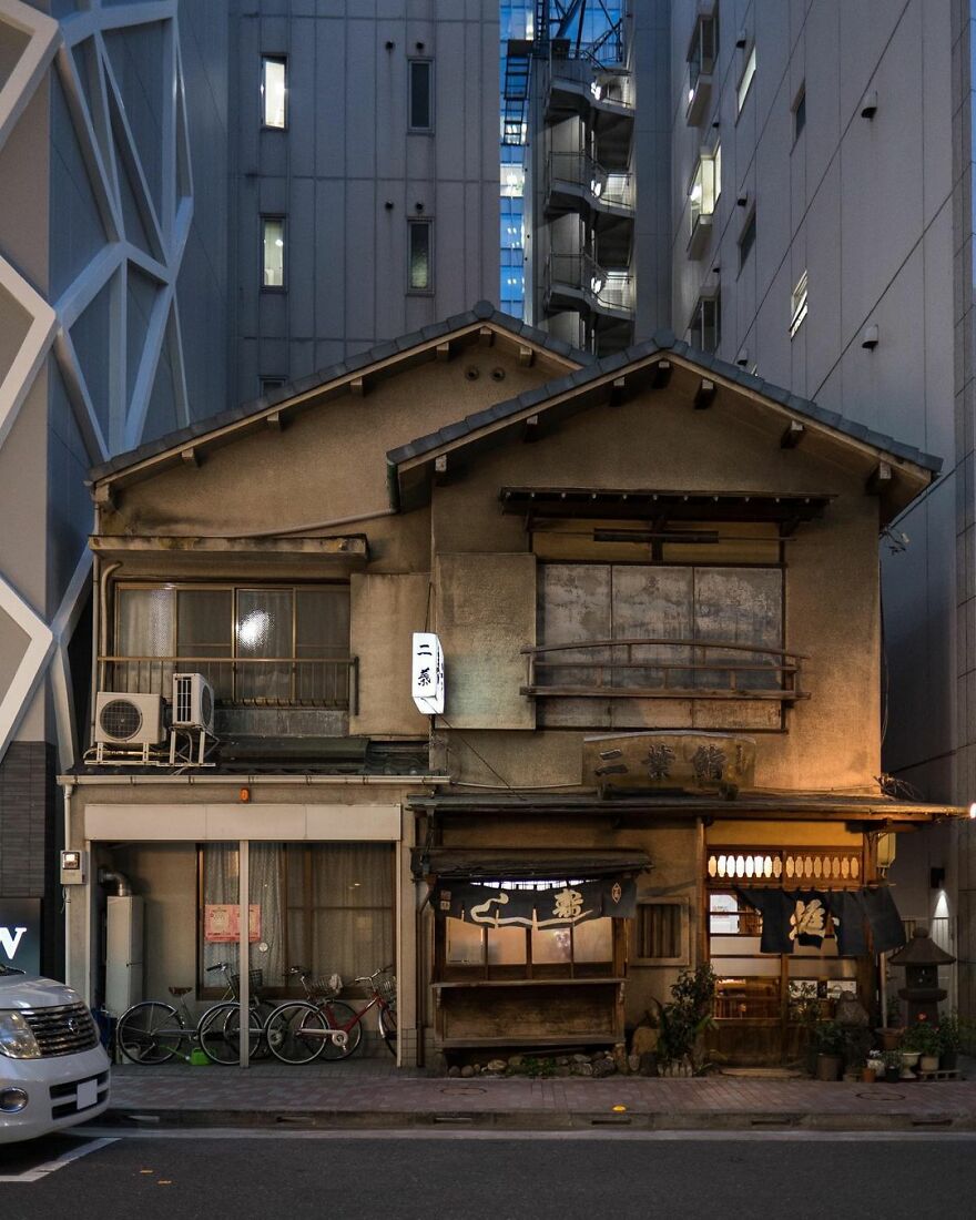
“Futaba Sushi, Ginza. First opened in 1877. The current building dates from the 1950s. Note the sushi ‘yatai’ cart built into the ground floor, right in the center. Sorry, no photography allowed inside the restaurant.”
japanpropertycentral Report
Zoe shares the difficulties she runs into while capturing the photos: “Trying to get a shot without a car or van blocking the building. I usually wait until there are no pedestrians or cars in the frame. It might only be a few minutes, but other times I have to come back later. Another challenge is that the streets are often very narrow (some streets are just 2 meters wide), so you need a wide-angle lens for some locations.”
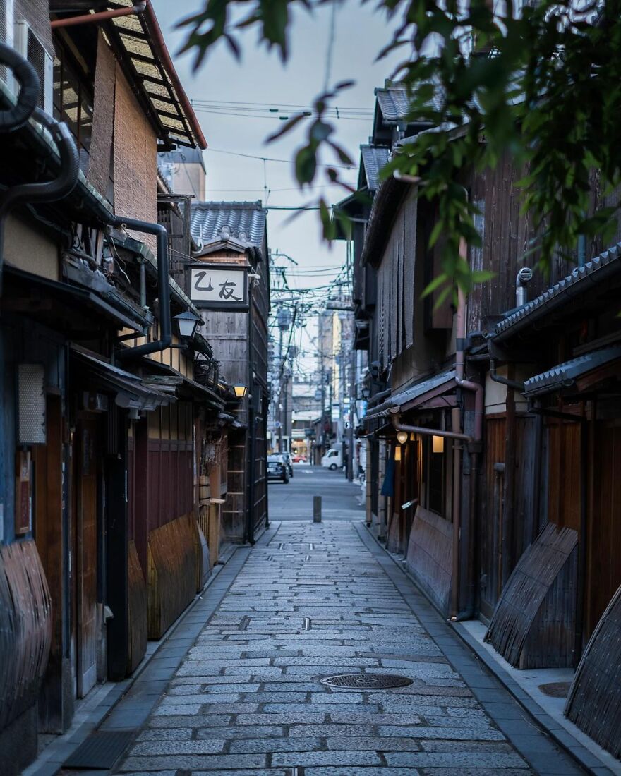
“Gion Shirakawa at dusk. This laneway is a cobblestone shortcut near Shirakawa River. If you follow it you’ll end up at Shijo Street.”
japanpropertycentral Report
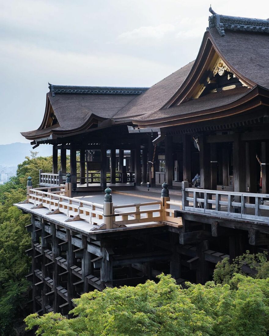
“Kiyomizu-dera Temple and its hinoki wood stage. Founded in 778. I wonder if this is the quietest it has ever been in its 1200 year history. The main hall and stage were built entirely without the use of nails (or screws) in 1633. The wooden foundation pillars below stand 13 meters tall and are made from 400-year old trees.
The main hall was covered in scaffolding for over three years while the roof was redone, and only just removed in February 2020. It had been 50 years since the bark-thatched roof had been replaced.
Many of the buildings within the temple grounds date from the mid-1600s. There were a few fires up until that point that had destroyed the even older structures.”
japanpropertycentral Report
“In my free time, I like to explore different neighborhoods and share some stories about the interesting buildings I find along the way. If I have an afternoon or an evening free, I’ll go for a walk around all the back streets of a neighborhood in search of some interesting buildings. You are almost guaranteed to find a few no matter where you go. Sometimes I will have a particular house in mind, or be in the neighborhood checking out listings for sale and use it as an opportunity to explore a little and take some photos.”
Here is how Zoe describes her style: “Chaotic. The city is just a jumble of power lines, street signs, bicycles, and construction. I would love to take clean and uncluttered photos but I am realizing that it is impossible in Tokyo. I no longer notice all the transformer boxes and power lines anymore.”
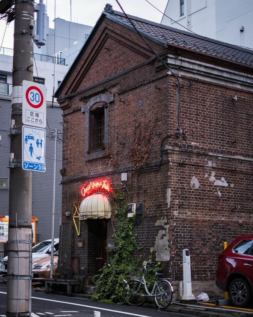
“Once Upon a Time. A bar in a historic brick storehouse in Yushima, Tokyo. Built sometime in the late 1800s. The bar owner has been renting this space since the mid-1970s. Downstairs has a bar counter and tables, while the 2nd floor has an event space.
Not sure how much longer this historic building will remain standing. The property owner wants to demolish it rather than repair it, with news of its potential future demise first reported back in 2013. Last year there were stories that it would close in 2022.”
japanpropertycentral Report
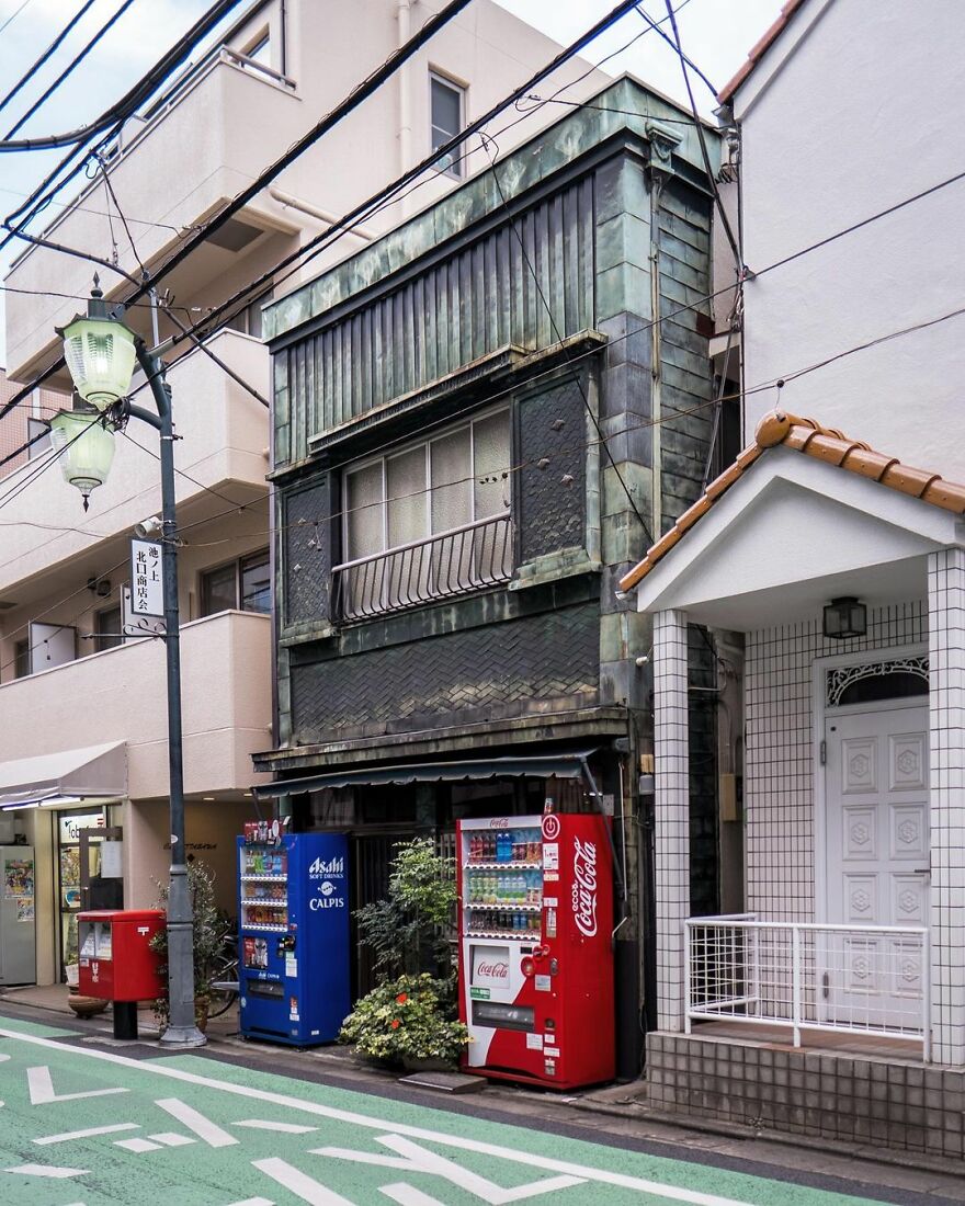
“An old shophouse alongside the Ikenoue Shopping Street in Tokyo. This would have once had a shop on the ground floor, but has been converted into a private residence some time ago.”
japanpropertycentral Report
“It has always been a personal interest. There’s an assumption that Tokyo is a big metropolis of shiny glass buildings and neon lights, but it’s a very old city with lots of more humble, older, and traditional streets that don’t get featured in the tourist guides. Something is charming about them, especially when they have a very worn patina and are lived-in and cared for,” said Zoe about how she came up with the idea to photograph old buildings.”
I started putting more effort into my company’s Instagram account about three years ago. I still have a very long list of places to share and neighborhoods to visit. I don’t think I will be stopping any time soon.”
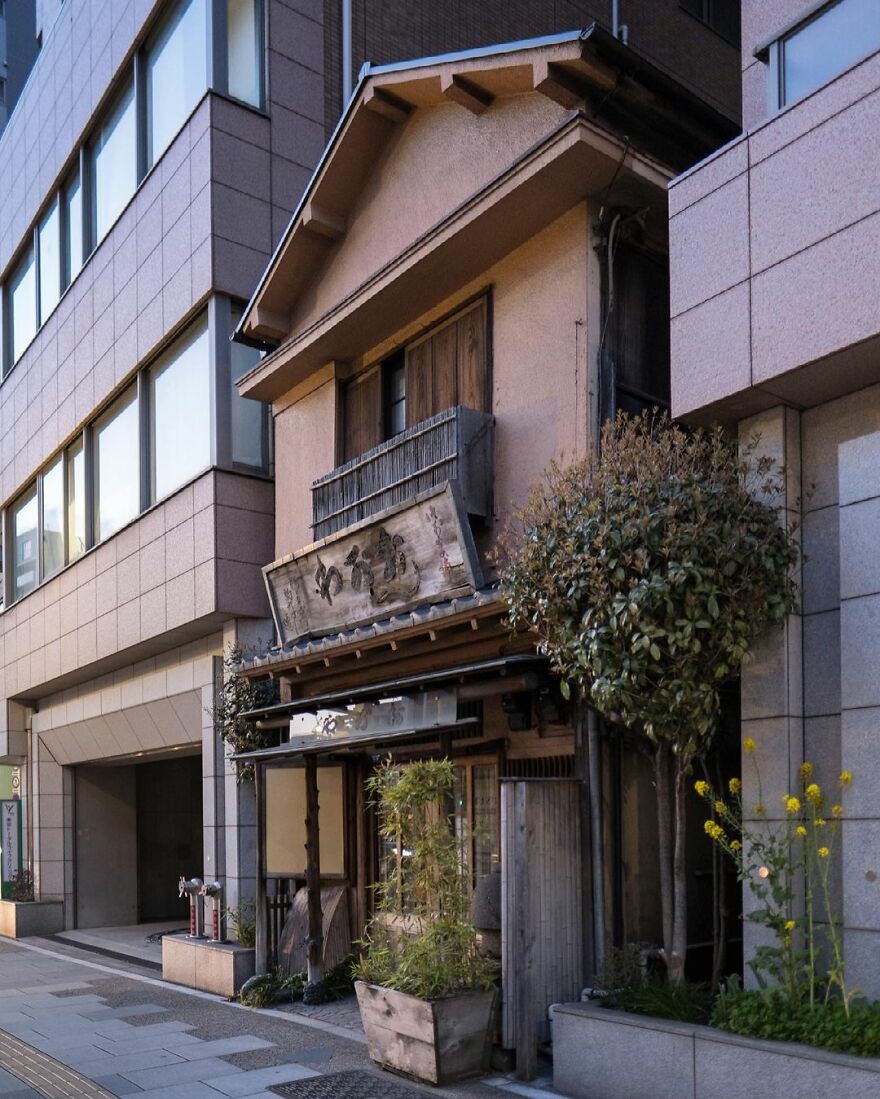
“The Ogawa Dorayaki Store alongside Asakusa-dori Avenue. Dorayaki is made from two pancakes or pikelets with red bean paste filling. This little shop was a hold-out, and is now sandwiched between a 13-story office building on all three sides.”
japanpropertycentral Report
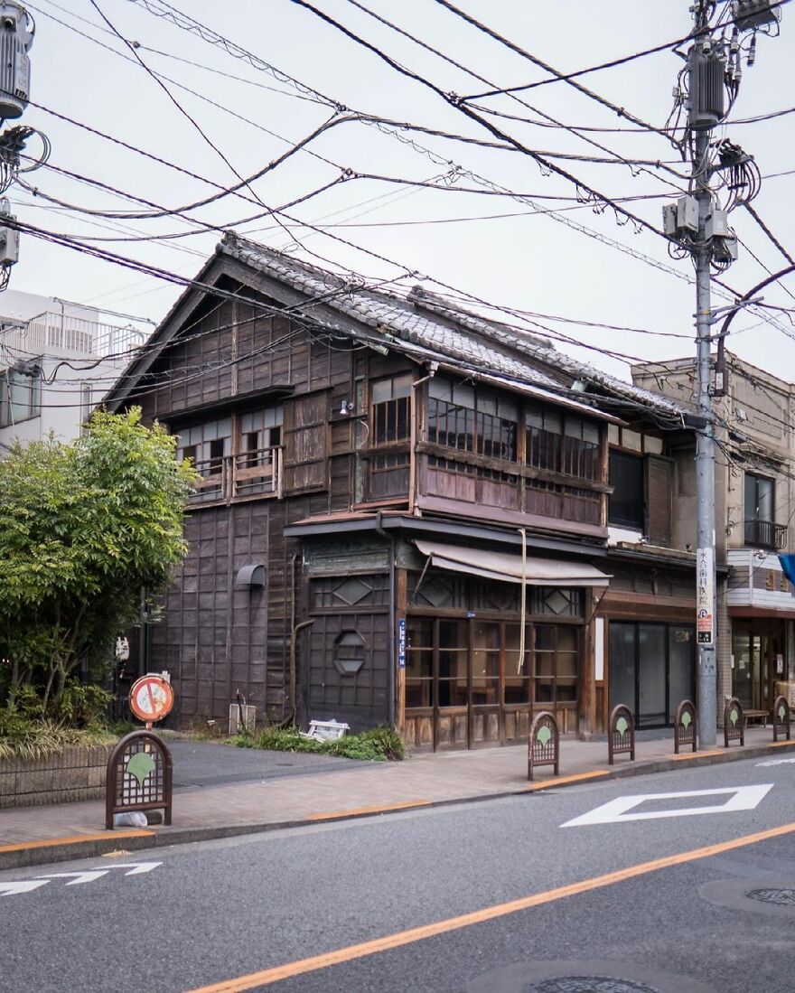
“This shophouse was built in 1918 as a hardware store. At a later point it housed a bar and restaurant but has sat vacant for the past few years.”
japanpropertycentral Report
“There’s something about living in a constantly evolving city like Tokyo that is very energizing and motivating. There’s always something to see or somewhere to visit. It’s also a very safe and clean place to live, and it is incredibly easy to get around by train with no need for a car. Some of the architects and building designs are among the best in the world. My favorite ones are the weird and unusual homes often built on tiny plots of land in the middle of the city. You have to be very creative to come up with some of the designs, especially when the land itself might be just 50 square meters in size.”
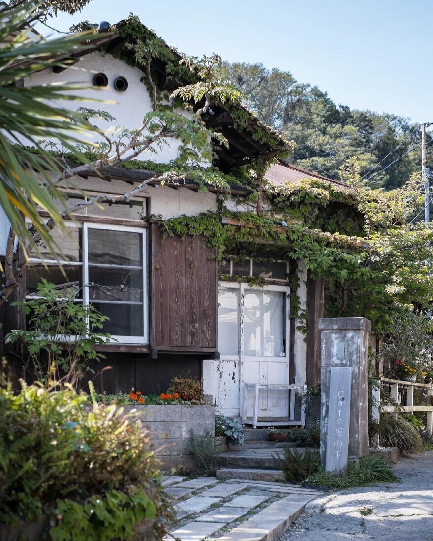
“Café Sakanoshita – a charming place inside a 90-year old renovated kominka house. Closed on Mondays. Unfortunate timing!”
japanpropertycentral Report
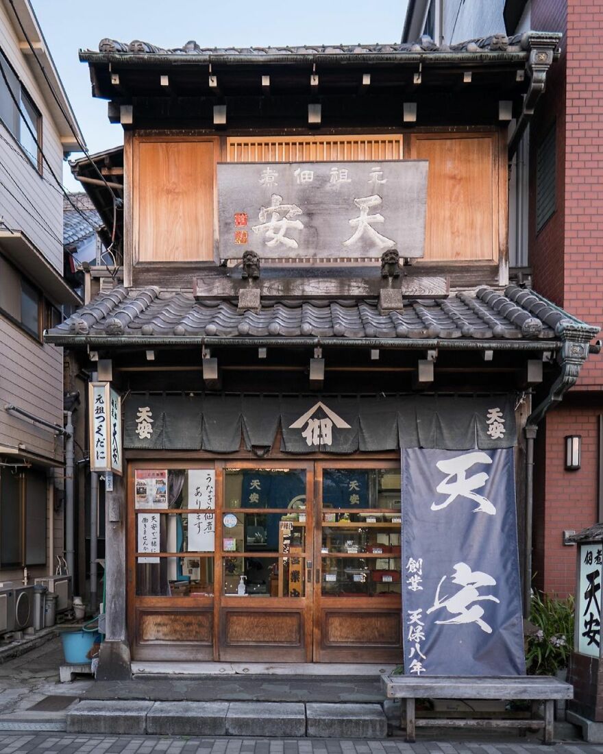
“Tenyasu Tsukudani, a store selling simmered and preserved food since 1838. This shophouse was built in the 1920s. The streets would have once been lined with buildings like this.
This part of Tsukuda has a history going back 400 years, and is where the traditional tsukudani preserved food originated.”
japanpropertycentral Report
Here is what inspires Zoe: “Being able to continue to connect with all kinds of wonderful people who are also into Japanese architecture, new and old, and who like to explore different neighborhoods. The most unexpected and fun part is seeing sketch artists in other countries create amazing artwork from photos I posted.”
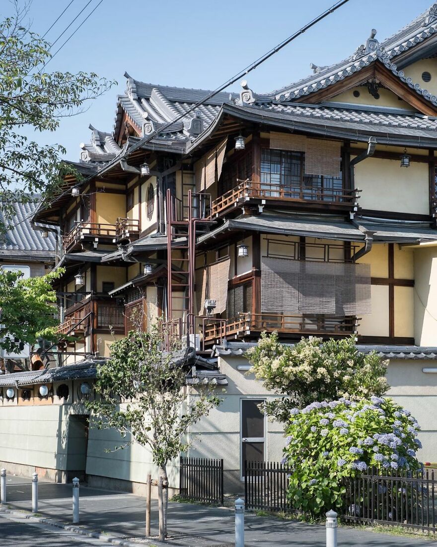
“Tsuruse traditional inn and kaiseki restaurant. Built from Hinoki cypress wood in the 1920s~1930s, but the restaurant has been operating even longer. The outdoor terrace dining deck along Kamo River is the largest of its kind in Japan, seating over 200.”
japanpropertycentral Report
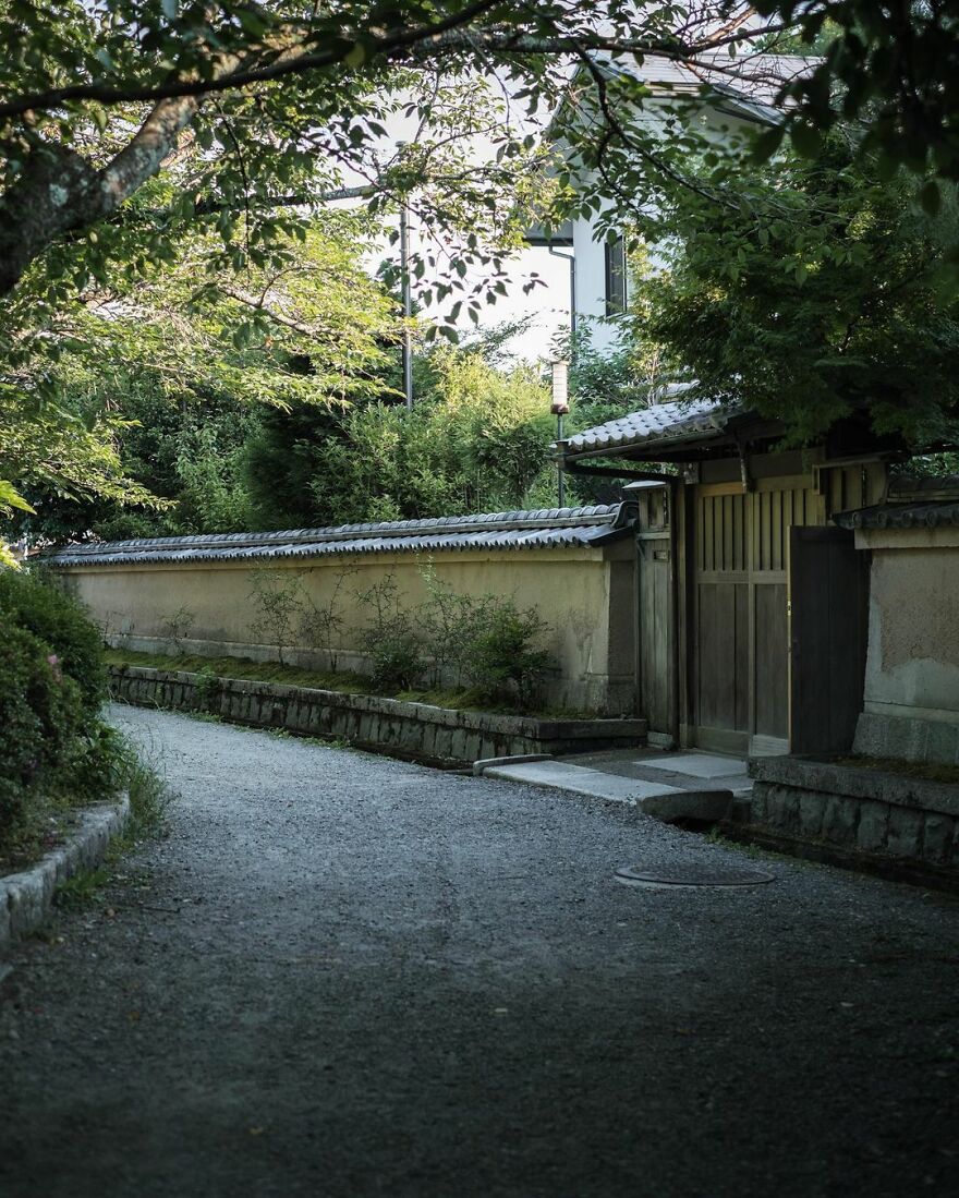
“The Philosopher’s Path (or walk). A peaceful path alongside the Biwa Canal. The historic canal was completed in 1890 and the 1.8-kilometer long walking trail was completed in 1968 thanks to efforts by local residents. It was named to honor Nishida Kitarō (1870-1945), said to be Japan’s most influential and significant philosopher of the 20th century. He would walk along this path each day on his way to teach at Kyoto University. He later moved to Kamakura, and his home there has been preserved to this day.”
japanpropertycentral Report
Zoe gives some advice to photographers and artists out there in the world: “It’s okay if you don’t know what you are doing or don’t have a particular goal with what you are currently doing. Do what makes you happy and gives you the most joy creating. Maybe it will lead you somewhere?”
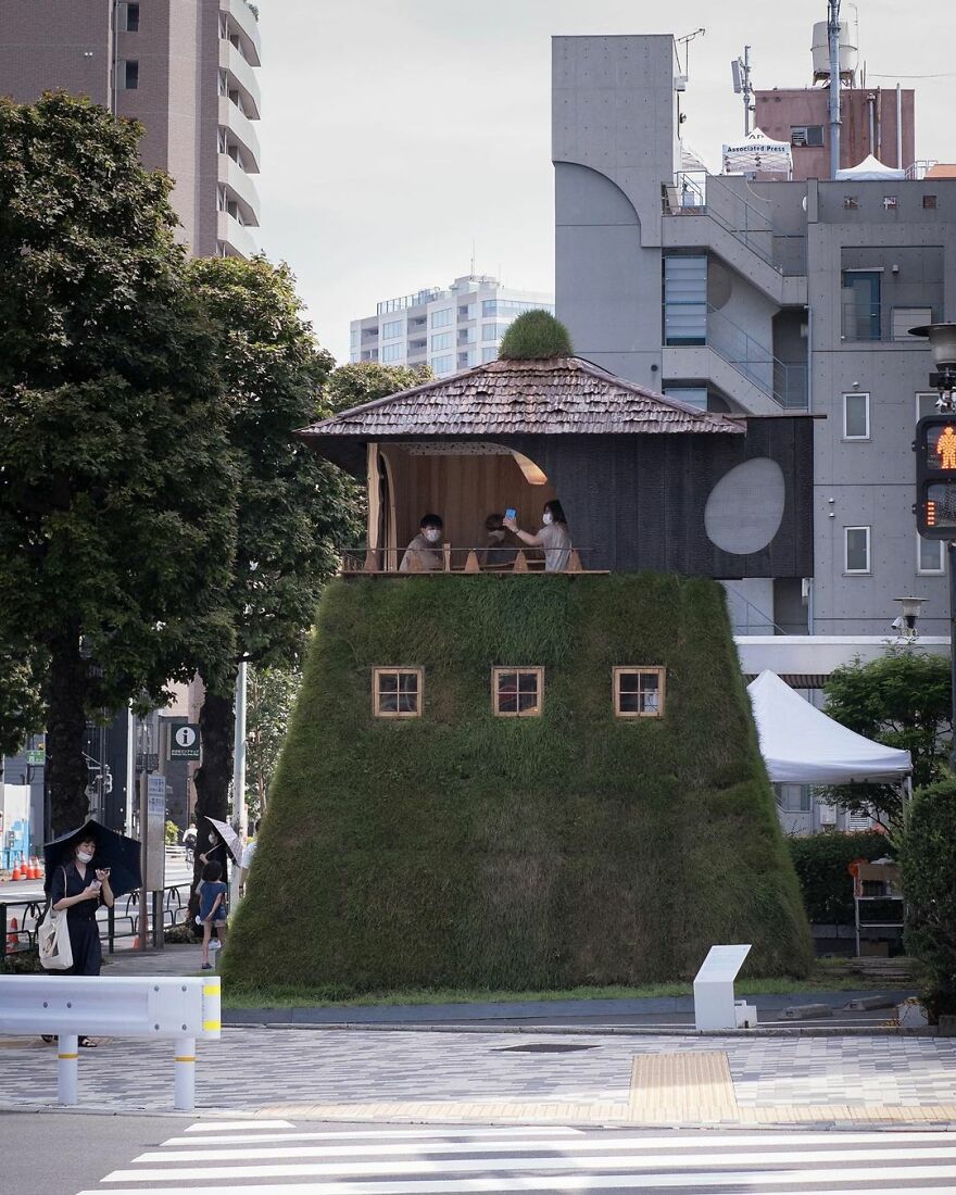
“Tea House ‘Go-an’ by Terunobu Fujimori. Part of the Pavilion Tokyo 2021 / Tokyo Tokyo FESTIVAL being held in connection with the 2020 Olympics. Fujimori is known for his creative and often elevated tea house designs that are far from traditional. This one resembles a ‘yagura’ watchtower with a grass-covered base (the same turf used on race tracks) and burnt cedar walls. The ceiling is decorated with crushed cedar pieces. To enter, you must crawl through a small circular door at the rear and climb a ladder to the tea room upstairs. The tea house is a temporary structure and will be disassembled when the exhibit ends on September 5, 2021. Viewing the interior requires advance bookings.”
japanpropertycentral Report
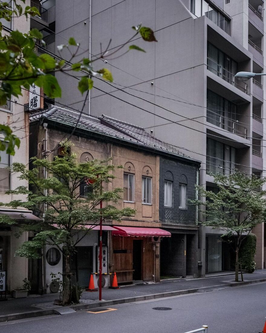
“This group of three shophouses in Nihonbashi was listed for sale a little over a month ago for ¥149 million (US$1.35 million), and appears to have already sold, if the removal of all of the online listings is any indication. That means demolition is likely looming.
The terraces date from the 1920s or 1930s and are on Chuo City’s list of early 20th century modern architecture. Sadly being on that list, or having any type of official heritage recognition, doesn’t provide any legal protection to prevent these historic buildings from being demolished. A few from the list have been torn down in recent years, and more will follow. They are a wonderful example of kanban-kenchiku (#看板建築), or billboard style architecture.
The terraces sit on 92 sqm of commercially zoned land, and some suggested redevelopment plans for a 13-story block of 17 units with a potential gross yield of 8% have been provided. That’s a hugely impressive yield and a very low price for land like this. There’s a good reason, too – the land is leasehold. It’s the old, and almost perpetually renewable leasehold type, and the landowner is a major real estate company, so there is some stability with that type of landlord.
The majority of land in Tokyo and across Japan is freehold, but occasionally you might encounter a leasehold property. It’s really important that you fully understand the costs, pros and cons, and legal entitlements and obligations that come with leasehold properties, as they can easily be a source of disputes and troubles for the inexperienced.”
japanpropertycentral Report
The author tells us more about herself and her journey: “I first moved here about 15 years ago, after growing up in a rural part of Australia. I first got involved in the real estate industry in Japan in 2008 and opened my own real estate brokerage company in 2014. I did not speak any Japanese when I first moved here but studied for a long time after I arrived. You need to be fluent to work in real estate here as all of the sellers and agents will only speak Japanese, and all of the documentation and legal explanations are also in the Japanese language only.”
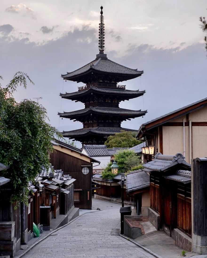
“The Yasaka Pagoda in Hōkan-ji Temple, Kyoto. First built in 592. It was destroyed in a fire in 1191 that broke out after a dispute between Kiyomizu Temple and Yasaka Shrine and had to be rebuilt. In 1291 it was struck by lightning and rebuilt in 1309. It was lost again to a fire in 1436. The current pagoda dates from 1440, making it 581 years old. The foundation stone for the central pillar of the pagoda is said to be the original one from over 1,400 years ago.”
japanpropertycentral Report
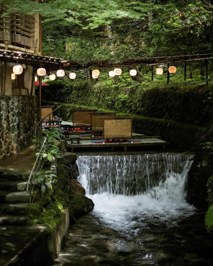
“Fujiya Ryokan and its ‘kawadoko’ river floor dining set up for the hot summer months. These floating floors first appeared over the Kibune River in the 1910s~1920s and have become a summer tradition ever since. Several restaurants and ryokans along this section of the river set up these tatami dining areas each year.
Fujiya Ryokan has one of the longest histories in the area, having been founded in the 1830s~1840s. ”
japanpropertycentral Report
“If you do get the chance to visit Japan in the future, don’t be afraid to skip some of the over-touristy areas and explore some of the more local neighborhoods. Instead of Shibuya Crossing, for example, I would go for a wander to try all of the coffee shops around Yoyogi-Koen, a 15-minute walk north, or head a few stations over to Shimokitazawa for some vintage clothing. If you are into old architecture, there is the Edo-Tokyo Open-Air Architectural Museum in Tokyo and the Meiji-mura museum in Nagoya (highly recommended!). Otherwise, you can still see a few old buildings around Tokyo’s former merchant districts like Tsukiji and Nihonbashi.”
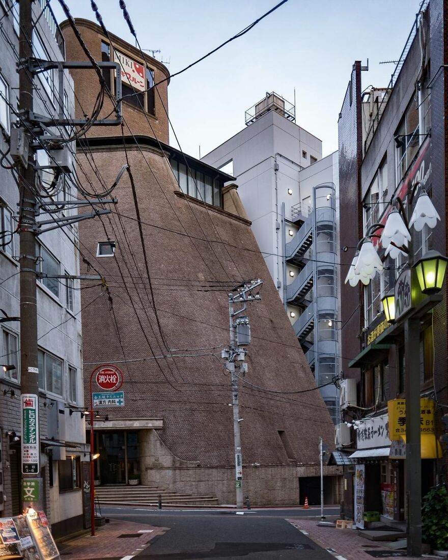
“The offices of a prune company near Shibuya Station. Designed by Yuzo Nagata on behalf of Takenaka Corporation and built in 1985. The facade is clad in small granite tiles. Nagata founded his own architectural practice that same year. His works are often statement pieces with detailed tiled facades. Several of his designs are large private residences, including one in Omotesando.”
japanpropertycentral Report
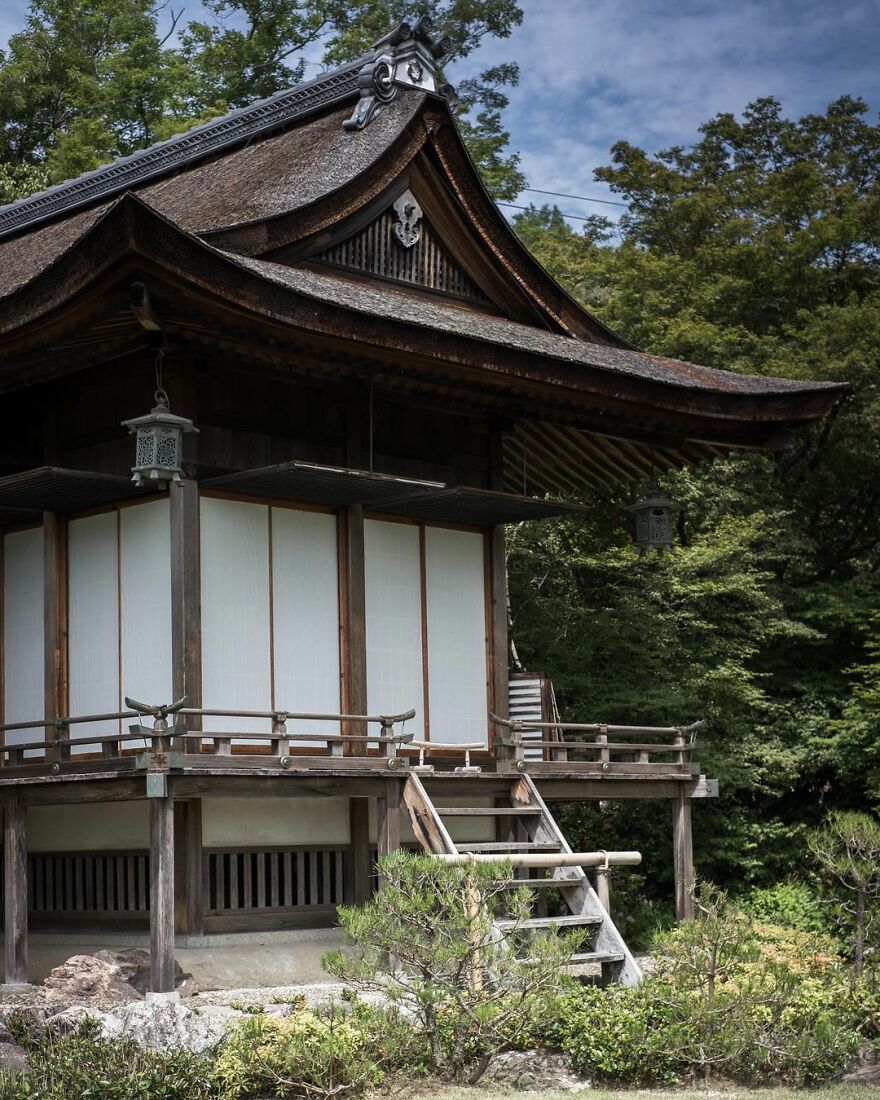
“The former home of actor Denjiro Okochi, famous for starring in many samurai-themed movies. His two-hectare estate sits on the hillside just above the Arashiyama bamboo path and has sweeping views over Kyoto City. His main residence pictured above is called Daijokaku. It was built by Sukiya-zukuri master Kaichiro Usui and was completed in 1941.
The grounds are open to the public as the Okochi Sanso Garden, with an admission fee of ¥1,000 per person.”
japanpropertycentral Report
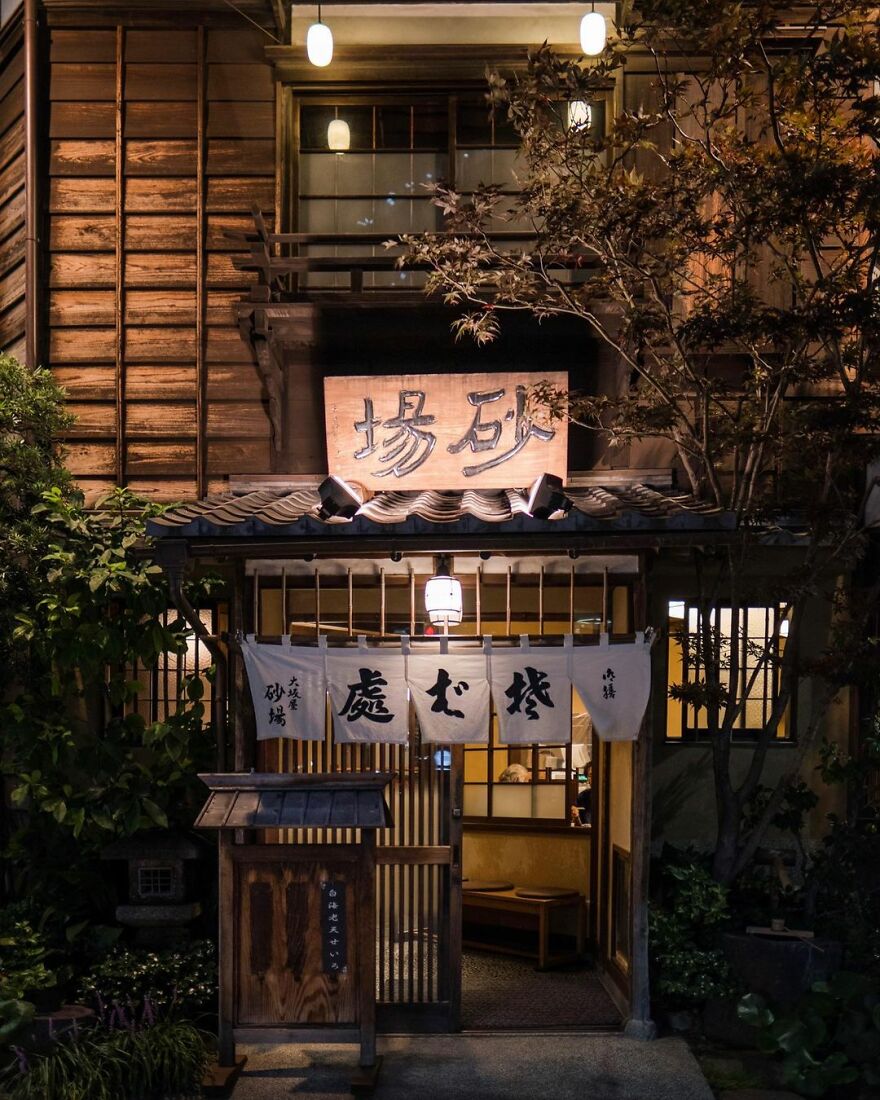
“The Toranomon Osaka-ya Sunaba Soba Restaurant. The current building was completed just before the 1923 Kanto Earthquake, although the restaurant itself has been operating since 1872. It was registered as a Tangible Cultural Property in 2011.”
japanpropertycentral Report
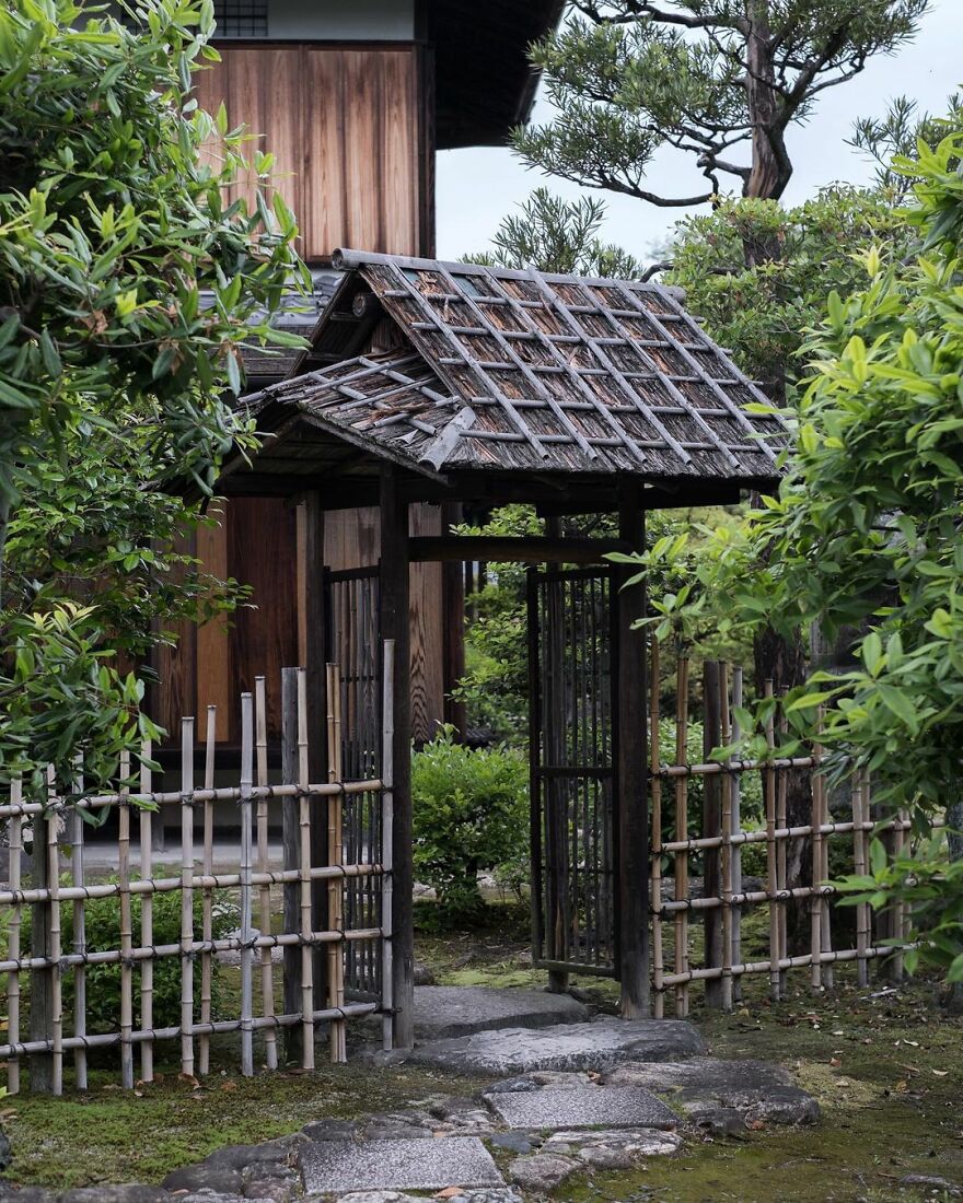
“The entrance to the Ro-an Teahouse in Shōsei-en Garden. The gate leads to a tea garden and represents the delineation of the serenity of the tea ceremony and the chaos of the world outside. This tea house was rebuilt in 1957. The garden and its structures were destroyed twice by fires, once in 1858 and again in the 1864 riot.”
japanpropertycentral Report
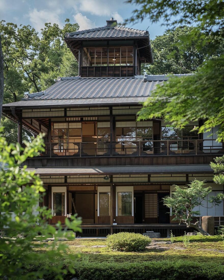
“The former Mitsui Family Shimogamo Villa. Built in 1925, although part of the home dates from the 1880s, having been detached and relocated here from their other, larger villa near Sanjo Street (since demolished). The European-influenced part of the house was the newer portion built in 1925. Despite the grandeur, this home was built as a rest-stop for when they visited their ancestral shrine nearby. The property was transferred to the national government in 1949, and from 1951 to 2007 it was used as the official residence of the president of the Kyoto Family Court.”
japanpropertycentral Report
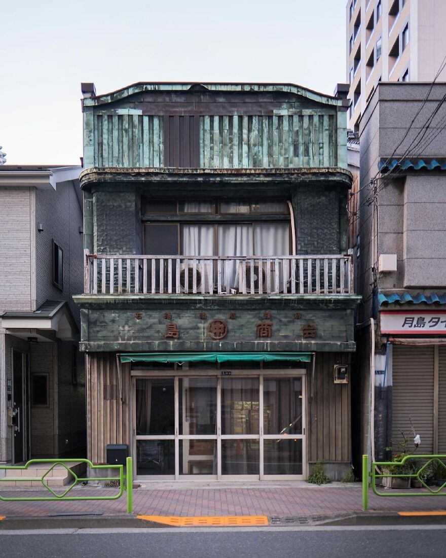
“The merchant house of Nakashima Shokai. Built in 1928. The decorative sheet copper facade is a wonderful example of billboard architecture (kanban-kenchiku).”
japanpropertycentral Report
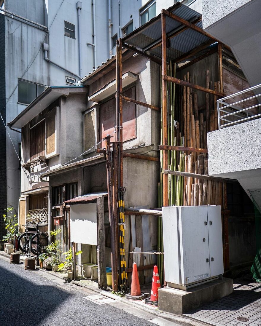
“A traditional setting in Tokyo’s Kanda district. An early postwar house now swamped by office buildings. Miraculously the sun is still able to shine down on the narrow laneway.”
japanpropertycentral Report
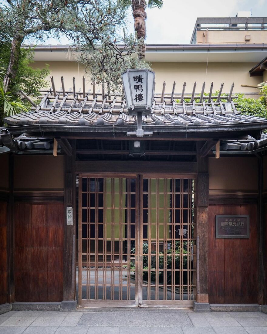
“Seikoro Ryokan, Kyoto. Established in 1831 as a traditional inn. The current buildings date from 1901 and 1921.”
japanpropertycentral Report
Note: this post originally had 100 images. It’s been shortened to the top 30 images based on user votes.
Old Architecture Looks Like In Japan (30 Pics)
- Published in abandon, abandoned, adventure, Architecture, Art, balance, build, buildings, creative, Creepy, culture, decades, eerie, exploration, explore, forgotten, full-page, furniture, harmony, History, home, Homepage featured, idea, International, japan, Japan Property Central, japanpropertycentral, live, memories, mess, modern, old, pass, past, People, period, Photography, photos, project, real estate company, remember, repurposed, reuse, sad, scary, space, stories, story, time, time period, Tokyo, travel, vintage
Modern Home Trends Find Annoying
If you’re decorating a new house and don’t know where to start, you might spend hours browsing Pinterest mood boards. Looking for new ideas and trying to figure out your style and what’s considered in this year can be exhausting. But remember one thing—home design trends come and go. While some of them turn out quite nice, others might be expensive and inefficient.
Reddit user u/wazzel2u raised this question in r/AskReddit: “What is a terrible trend found in new home design?”, and more than 5K people replied. Whether it’s lack of storage space, hollow interior doors or open concept bathrooms, the comment section under their post is full of some of the worst design solutions that you should leave behind.
Bored Panda collected some of the most messed-up decor tendencies shared in this Reddit thread. If you have some insights on the topic, don’t be shy and share them below!
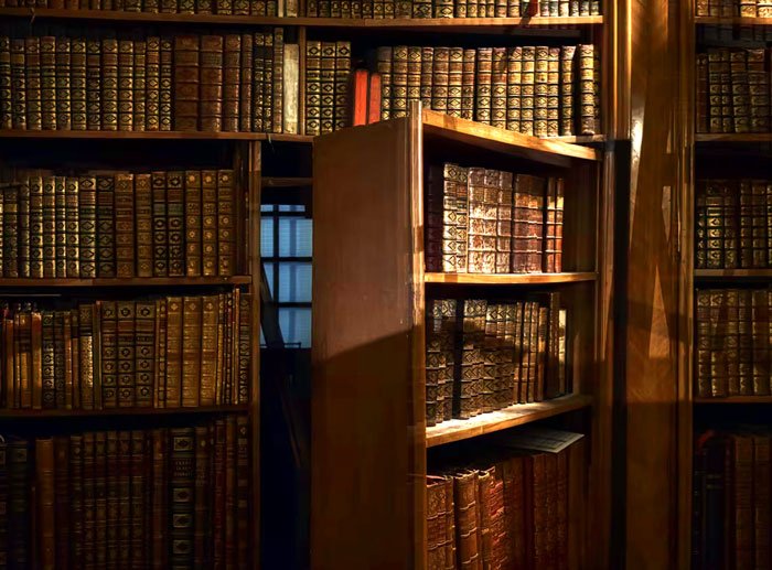 The lack of secret bookshelf doors. I mean, who designs their custom home and does not include a bookshelf secret door? People design houses for a reason, and that reason should be secret doors
foxsable , Stefan Steinbauer Report
According to design guru Nate Berkus, following the trends too closely is actually one of the biggest mistakes homeowners can make. “I think that people are very easily taken with the latest look, the latest feeling,” he said.
The interior designer explained that we get easily tired by these types of trends: “It’s kind of like that black-and-white concrete tile that everybody had. Three, four years ago, it was the thing to use in your powder room floor and on your kitchen backsplash, but do you really want it anymore now that you’ve seen it over and over and over?” he asked. Berkus would rather choose really classic, beautiful materials that stand the test of time.
So instead of copying the latest decor tendencies, Berkus suggests choosing materials that have been around since the 1920s because they are always a safe choice: “Stone or stone-solid surfacing, concrete, stone, or wood floors, classic ceramic tiles, terra-cotta, butcher block—all of that stuff has been around forever, and there’s new innovation within those looks.“
Apartment Therapy says that a good rule of thumb would be to go a little more traditional with major furnishings and to add new trends with textiles and other small items. This way, you can modernize your home without changing the expensive cornerstone pieces and easily swap out the little details in the future.
They advise on a few timeless trends that could save you some money if you’re planning to redecorate at some point. One of them would be choosing white subway tiles in the kitchen: “White is always a bright, clean backdrop for styling objects and art against.” As people say, white never goes out of style, so it is a safe bet since you don’t have to limit yourself when looking for other details.
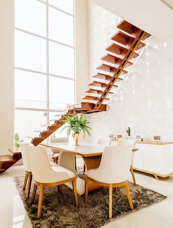 Removing stair banisters for a crisp look. Like your drunk friend Brooks is going to fall of the side and die one day. There are building codes for reasons
ProofBelt5 , Jonathan Borba Report
In their opinion, neutral tones are always a better option than going with the color of the year (unless, of course, it’s neutral). “Neutral tones are timeless and work in any context,” explains designer Becky Shea. “When you go too bold and loud, in the long term, it’s not sustainable.” The same could be applied to furniture and textiles. Choosing natural materials is stylistically versatile, full of texture and warmth, not to mention that it’s sustainable and practical.
 Might be an unpopular opinion but i don’t need my home to be smart…I just need things to happen when they are supposed to happen and not completely shut off when some douche thought it was a good idea to play who can touch the powerline
ptapobane , Mati Mango Report
Then there are the small details. “Live laugh love“ type of decorations or ordering everything in marble might seem great at the time but after some time it can become tasteless. And what about removing stair banisters? Well, it definitely achieves the minimalistic look that’s been trendy for the past few decades but in real life, it’s not only useless but also dangerous.
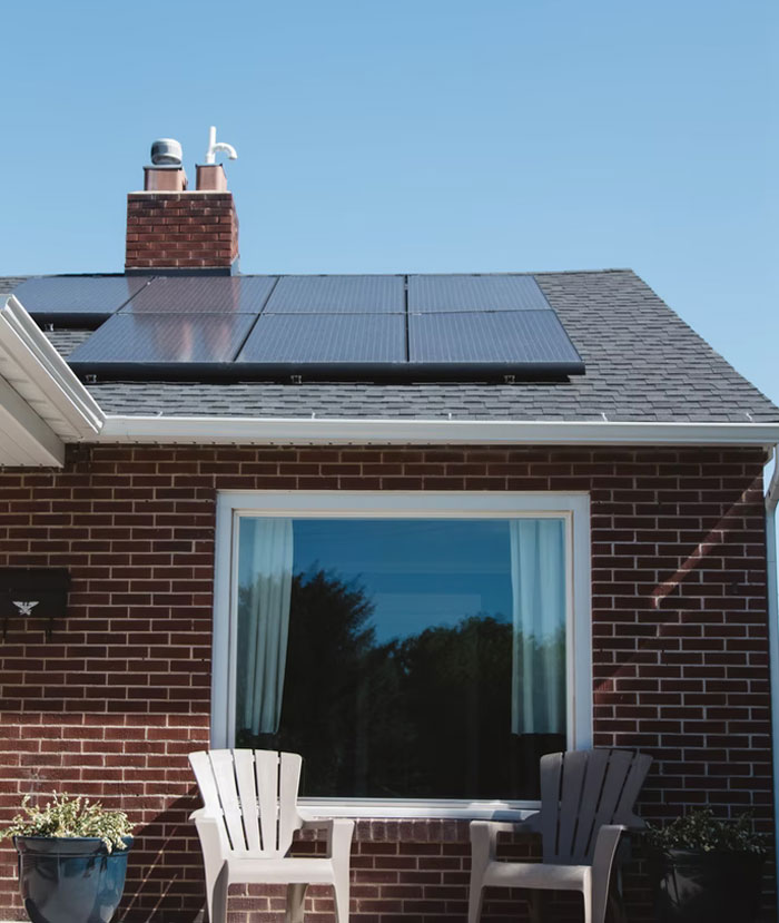 Total lack of solar panels/windmills. I think its criminal that new builds don’t have any form of energy generator built in.
SpudGun312 , Vivint Solar Report
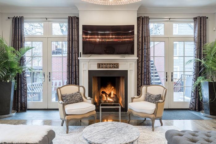 I really don’t like the fireplace design where you are intended to put your TV over it. A TV is way too high when over the fireplace.
0rangePolarBear , Alex Qian Report
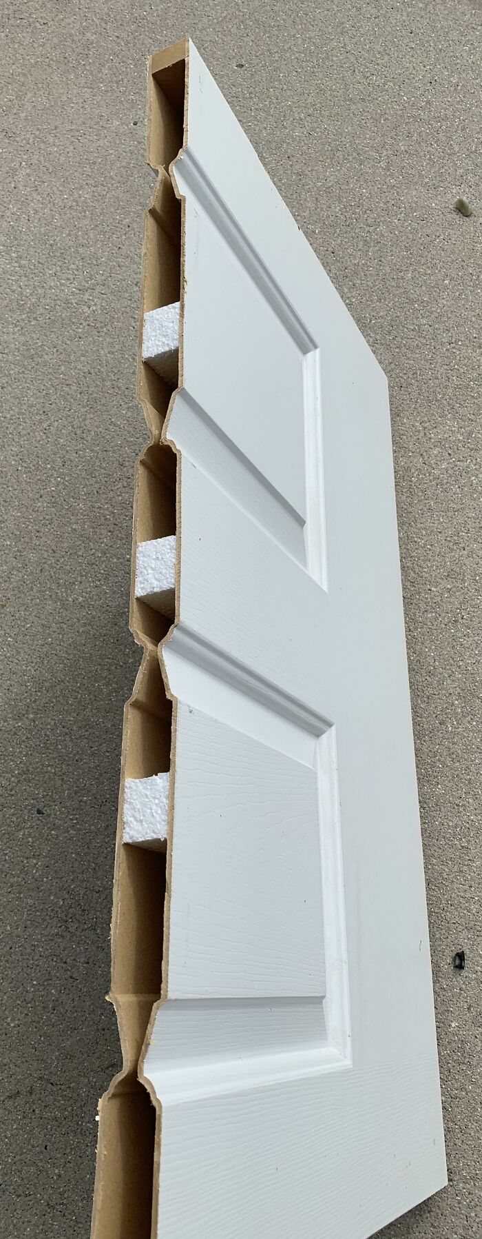 Hollow interior doors that don’t keep sound out from within the house and hallways – especially hollow bedroom doors when you’re trying to sleep.
Lastly, the most important thing to remember is that you are creating a home for yourself. Your place should reflect you as a person, it does not have to be perfect or insta-worthy. It’s all about coziness and familiarity, not aesthetics.
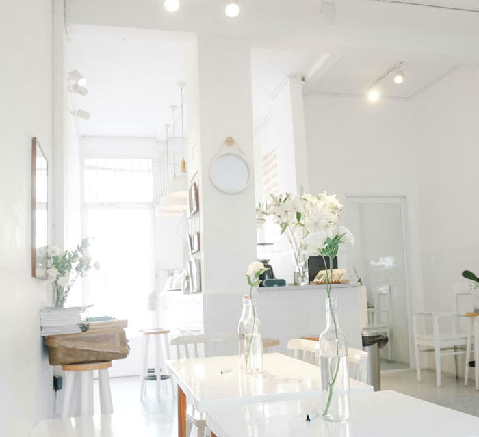 The cold and sterile look. White, black (high polish please so you see every single fingerprint)… why?
Satures , Chang Duong Report
 No broom closets. Where the hell do people put their mops and vacuum cleaners? Or do the people who buy those McMansions just not do any of their own cleaning?
CristabelYYC , Neal E. Johnson Report
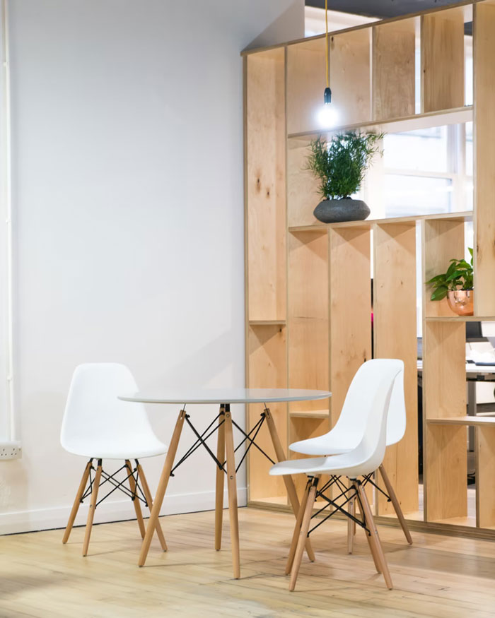 I don’t know if it’s new new, but it drives me crazy when people replace cabinetry with open shelves.
Don’t people understand dust? Bugs ring a bell? Pet hair? Speaking of pets, how do you keep your cats from messing around with that setup?
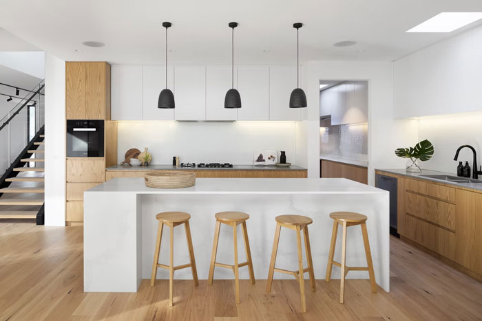 I may die on this hill alone, but I HATE open concept kitchens. Not the ones with a nice bar separating the space, not the ones with a window. I’m talking wide open, no barrier to determine where the kitchen ends. It’s hideous.
wfogle97 , R ARCHITECTURE Report
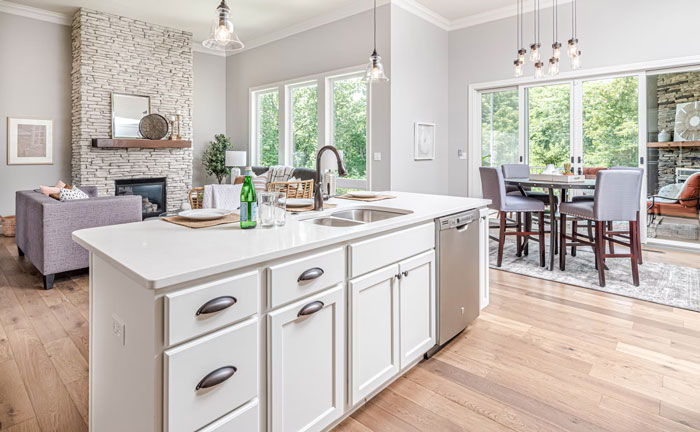 Open concept everything. There is value in being able to separate some rooms of the house. I very much prefer to have a kitchen that is not completely exposed to the area where I am going to be entertaining company.
That way, I can cook dinner and not worry about having to clean up everything in the kitchen so its spotless because the kitchen is basically in the main living room of the house.
This and also the trend of having big a** f**king windows in the front so everyone in the street can see your whole ground floor. Makes your first floor into a f**king fishbowl that I would never be comfortable in. I like to be able to walk around my house without worrying the people across the street can track my every move.
blanketz____ , Mike Gattorna Report
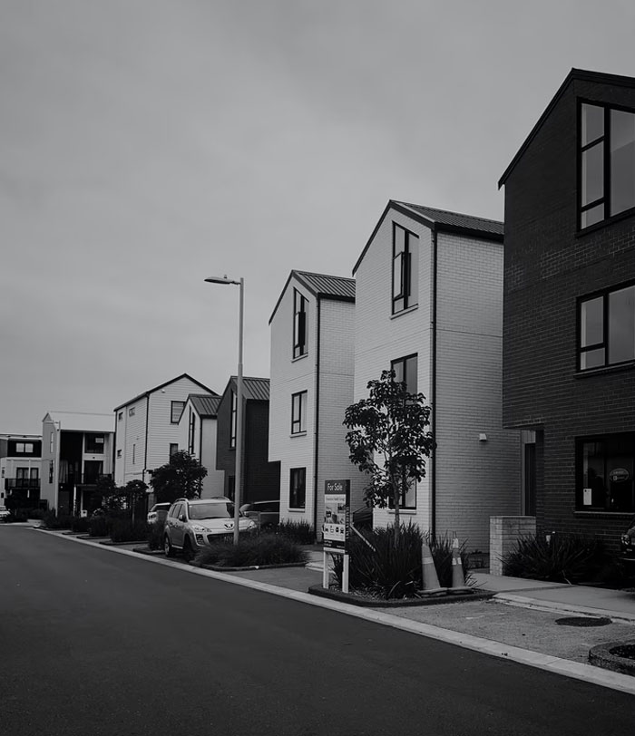 The grotesque housing developments of the same like 4 models and 3 colors with no trees. Not to mention the houses are built like s**t. The terribly inefficient road layout with a million cul de sacs.
Individual-Text-1805 , Paul JS Report
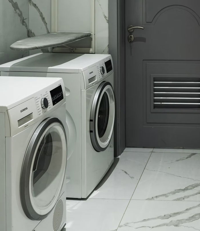 Small laundry rooms, small pantries, no linen closets, but here’s a 20×20 media room to watch TV. My next house will either be laid out by me or made in the 70s/80s when they designed homes to be lived in.
oldbulldog22 , Emmanuel Ikwuegbu Report
 Lack of storage space. Just bought a new home and didn’t realize how little space there was. We have one storage closet upstairs. That’s it.
A_Bit_Off_Kilter , Annie Spratt Report
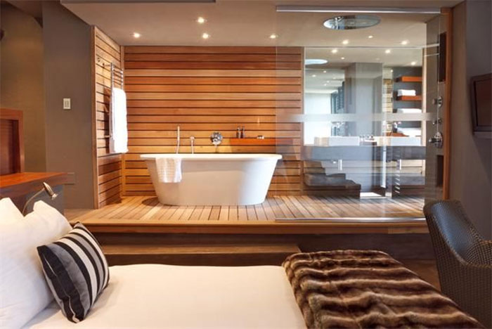
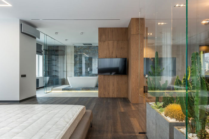 No door between the master bedroom and master bathroom. It’s so annoying.
The last 3 houses I’ve lived in have had this issue. I like to be able to close the door when I take a bath or shower.
oleander4tea , Max Vakhtbovych Report
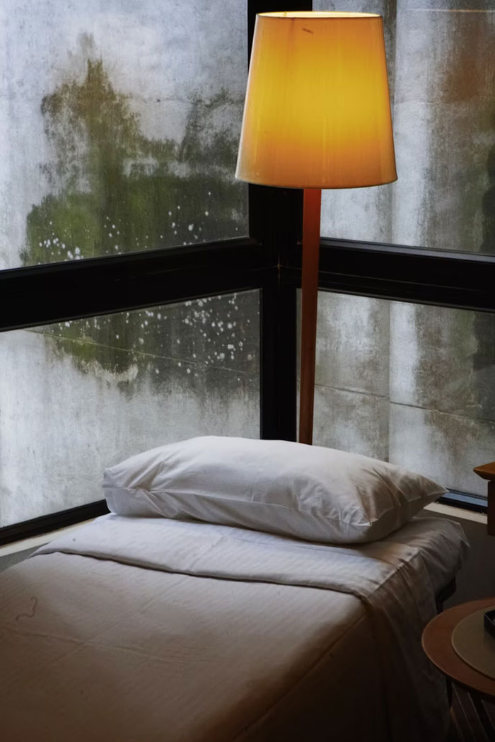 Homes built on the cheap with so many corners cut in their construction that they end up being horrible places to live in, plagued by mold, damp, noise and plumbing issues and more.
Creative_Recover , Siarhei Plashchynski Report
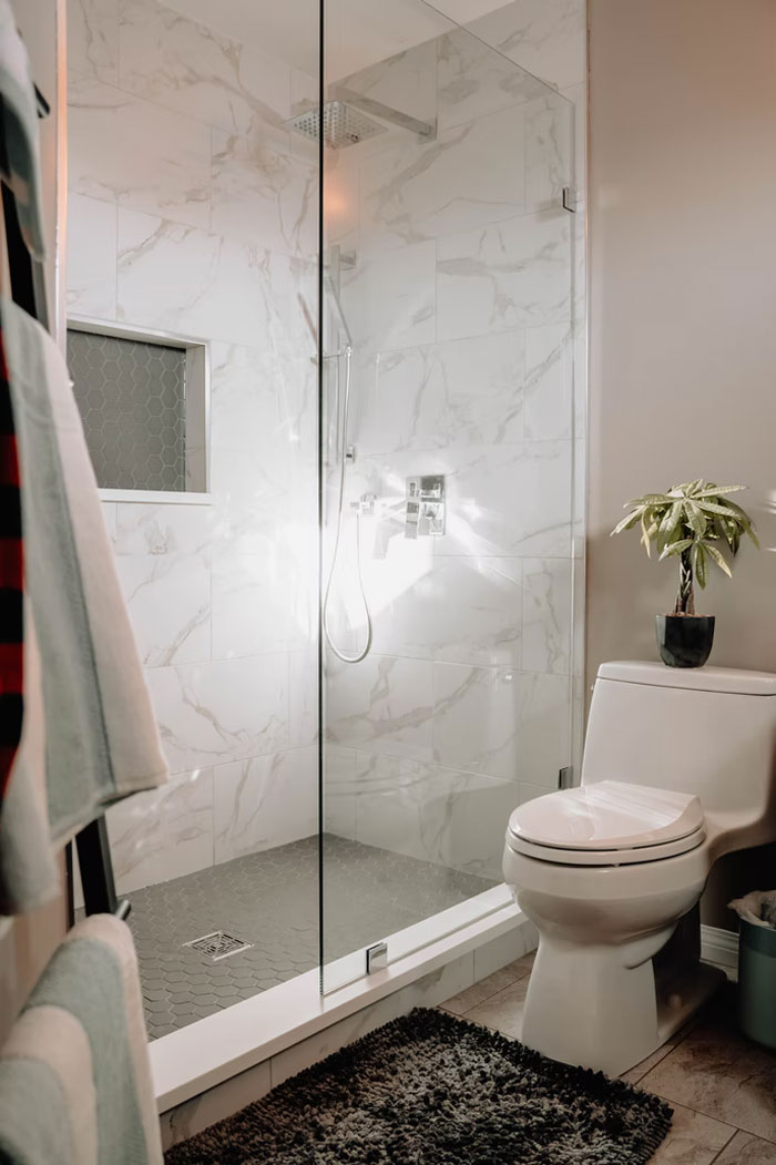 Floor-to-ceiling, clear glass showers. They look great when they are spotlessly clean, which means it looks terrible most of the time in most homes.
 Why is everything so damn bland? Why is white and grey the popular colors? Whatever happened to color? Why can’t we have living rooms wallpapered with big bright flowers, long suede couches in deep fuchsia? And, mile-high blue carpets that you sink into when you walk? Whatever happened to walnut paneling and colored subway tile in the bathroom? Whatever happened to delicate stenciled flowers on the inside of the bowl of the bathroom sink?
When did we lose our personalities? I just want a house that looks like a manic-depressive toddler version of myself was set lose in a JoAnn’s with a limitless credit card.
carmelacorleone , Chang Duong Report
There’s a builder in our area who tears down perfectly good, full-of-character pre-WWII homes and then packs in these grotesque Craftsman-style-hulk-mode houses that take up every available square foot of the lot. They look absolutely ridiculous. The proportions are wrong, they blight the neighborhood. Bleh.
EvidenceLate Report
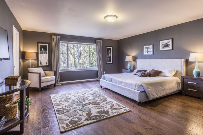 Wasted space. This includes enormous bedrooms with sitting areas, homes with equal number of bed and bathrooms, extravagant foyers that eat half the front of a house, formal living and/dining rooms that never get used. Etc
Sarah-the-Great , Francesca Tosolini Report
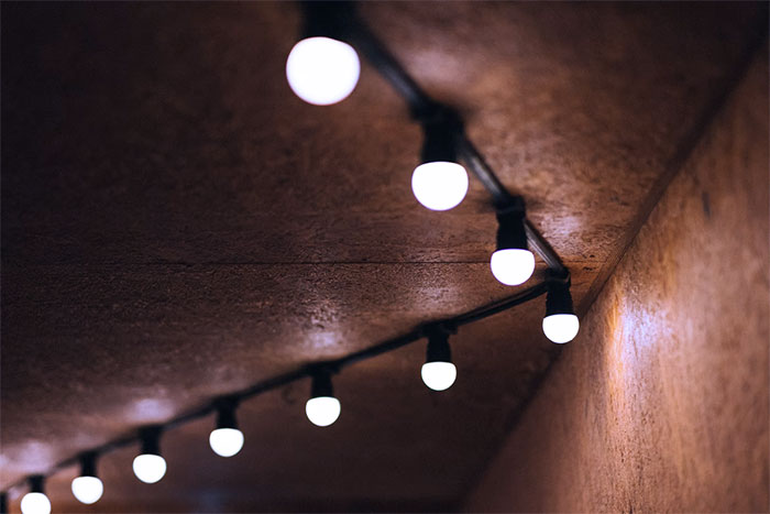 No attention to lighting temperature (kelvins) or even worse, mismatched light temperatures.
Most cheap LED bulbs are way too “cold” looking and lack the natural warmth of old incandescent lighting.
Aim for 2700kelvin or lower for that warm cozy atmosphere.
SubSlutDomDad , Ýlona María Rybka Report
S**tty bathtubs. I grew up in a 100 year old house. It had a nice bathtub with a sloping back so you could comfortably lounge in the bath. Modern tubs are pretty nearly straight up on the back so there’s no comfortable way to soak, smoke a joint, and read a book.
dizzyelk Report
Every inch of acreage is used. Houses are really close together, streets are narrow. It’s crowded
SithLordDave Report
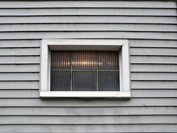 Go to a high end gated community development ($800k – 2M price points in my area) front of the homes is beautiful stone, brick, etc but on the back every house has cheap ugly vinyl siding all the same color as far as the eye can see. I never understood this since you actually spend time in the back yard not the front.
MisterSolid , Katie Wasserman Report
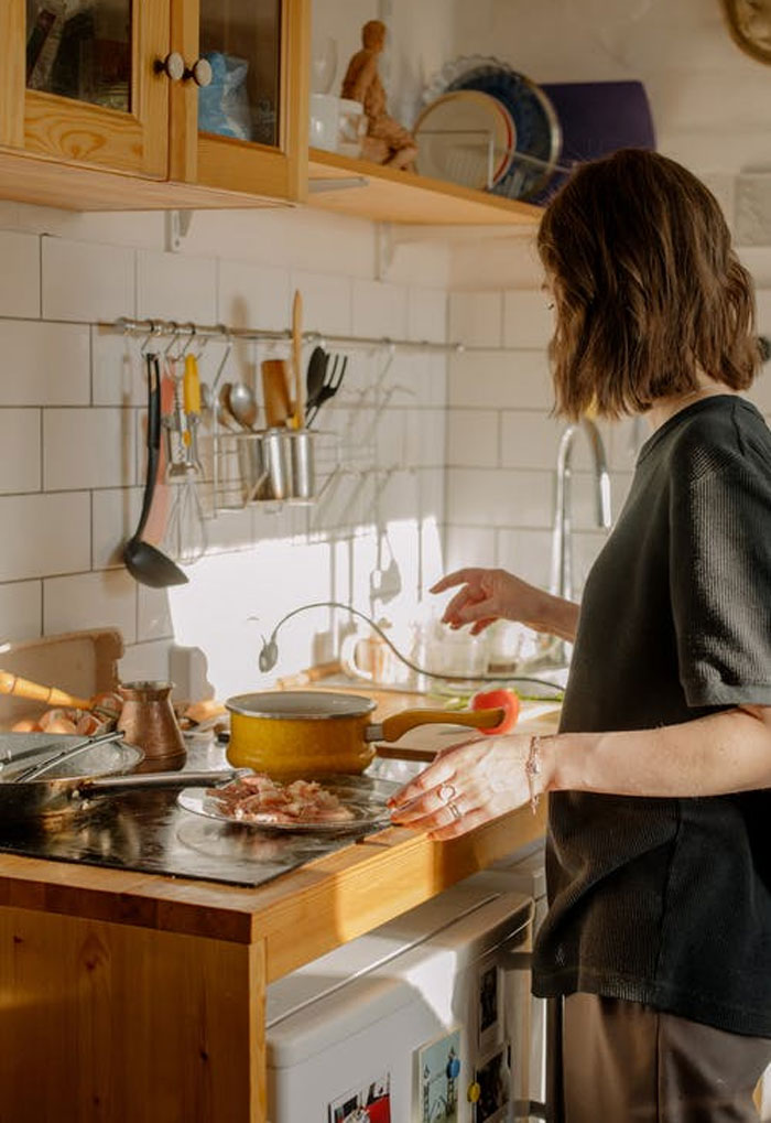 Kitchens that they cram into a narrow rectangle. A lot of apartments and town houses come with these. They are so narrow that if you open the fridge door, nobody can walk past you.
A kitchen should be open, not walled in all sides and shaped like a narrow rectangle. It drives me crazy when I see these.
Effective_James , cottonbro Report
The cookie cutter houses with no personality and no room, where the windows look directly into your neighbor’s bedroom. Ugh!
audania Report
I’ve seen several homes with appliances integrated into the construction of the kitchen itself. Not just in an alcove but actually built into the wall. Sure, it’s convenient that there’s a f**king cappuccino machine built into the wall next to the cabinet over the center island countertop. But what happens when (not if, when) it needs maintenance? Do I have to call a goddamn carpenter as well as a cappuccino machine repairman? Do I have to consider if this is a f**king load bearing wall that contains my broken appliance? And something that’s just a convenience like that is one thing, but they do it with stuff like fridges too.
downvoteallyoulike Report
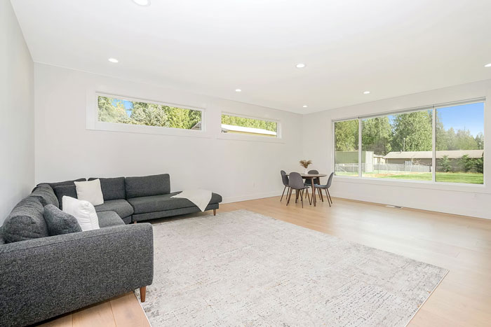 The obsession with space. So many people won’t even consider anything under 2,000sqft. People don’t even think about what it would cost to heat and cool. They just gotta have a McMansion.
User_492006 , Zac Gudakov Report
As an electrician; putting 600 potlights in every room of the house. Sure it makes me money but it looks ridiculous having so many lights every 4 feet of every room.
RichObject5403 Report
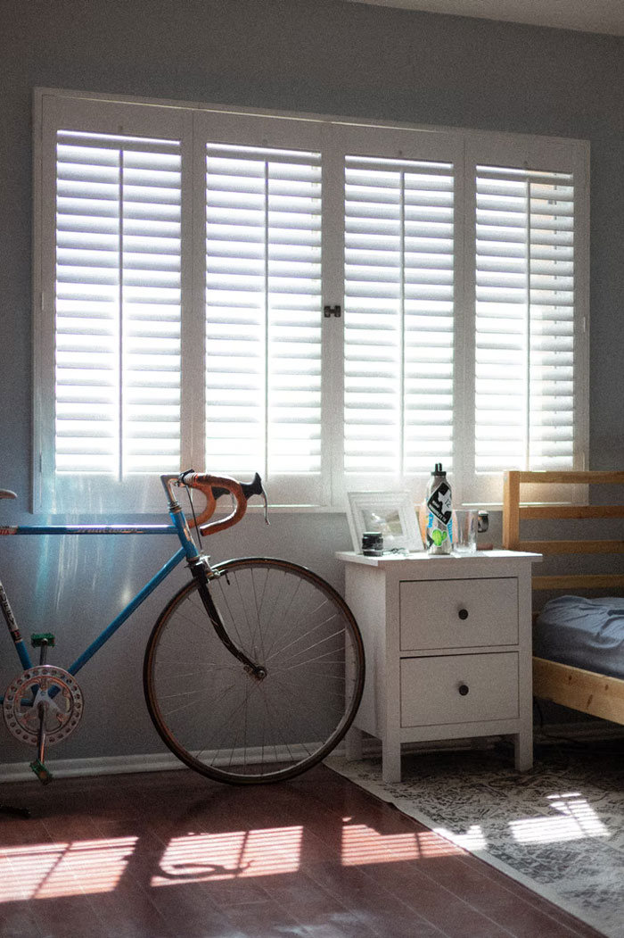 Fake shutters. They dont even look like they would cover the windows on most houses and they just look like garbage. If you love shutters so much, install real ones.
celestian1998 , Phillip Goldsberry Report
Note: this post originally had 76 images. It’s been shortened to the top 40 images based on user votes.
Modern Home Trends Find Annoying
- Published in 700-page, Architecture, askreddit, Design, Furniture Design, Homepage featured, homes, Interior Design, modern, People, reddit, terrible, terrible design, Trends
50 Times Architects Outdid Themselves (New Pics)
Many things can shape a city—its culture, history, social life, or food scene. But perhaps the most distinctive feature would be architecture. Some buildings can completely fascinate you with their astonishing design and pure aesthetics. Through careful urban planning and understanding of the cultural background, the structure of a city can carry you through time while still leaving you in a very particular place.
Need convincing? Let me introduce you to this subreddit page, an online community with more than 923K members. It is dedicated to sharing interesting architecture and some of the most eye-pleasing images of buildings you could find. If you wish to immerse yourself in other customs, traditions and the everyday life of the locals, this is the place to be.
Continue scrolling and upvote your favorite pictures! And if you’re still in the mood for some more, make sure to check out Part 1 of this post.
#1 Sun And Moon Pagodas In Guilin, China
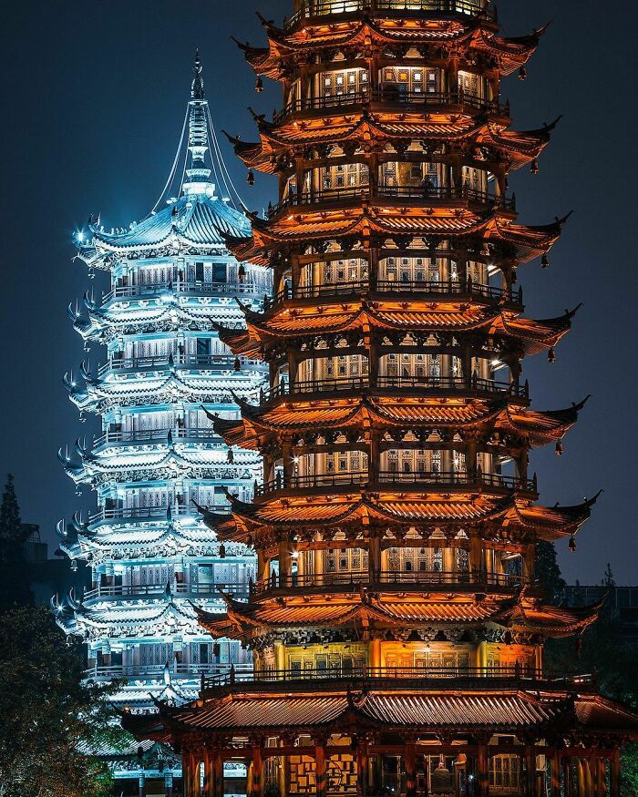
Image credits: oddprophet63
Even if people say that architecture is not about words, sometimes it may seem like buildings can speak to you. One reason for this could be that construction specifics, curves and the whole style of a building tells you its history. What were the prevailing ideas or opinions at the time, the traditions, celebrations—everything’s in the details.
Since its creation in 2011, this Reddit community continues to share pictures of “the beautiful impossibilities that we want to live in”. According to the moderators, “Individual images of buildings are the focus of this subreddit,” and it’s true. The page is full of high-quality pics of architecture that will interest and inspire you.
#2 The Shambles In York, England
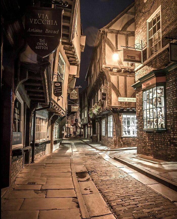
Image credits: Fuckoff555
It’s no secret that beauty is relative. If the structure looks weird to you, it does not actually mean that the creator has poor taste. According to architect, designer and artist Ron Arad, what we consider beautiful architecture is actually all about the “culture, context, personal history, acquired taste and, most importantly, ideas. When an architectural problem is solved by an idea, that idea is always there to be seen in the building – the idea has a visual manifestation that is beautiful.”
Another architect, Sam Jacob, said that aesthetics is actually not an essential consideration in architecture: “Beauty, if it’s anything, is a psycho-cultural phenomenon. After all, it’s an idea (or a sensation) that is not inherent to a thing but a qualitative value thrust upon the object of our gaze.”
The cycle of beauty goes like this: shock, then acceptance, then mainstream before it becomes the one thing to rebel against. “When people use the word beauty in design, they are seeking refuge from all of the difficulties of modern life – all of its doubts, fears and challenges,” he explained.
#3 Mont Saint-Michel, France
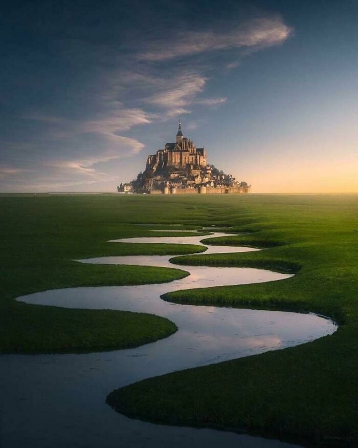
Image credits: j3ffr33d0m
#4 Osaka Castle, Osaka, Japan
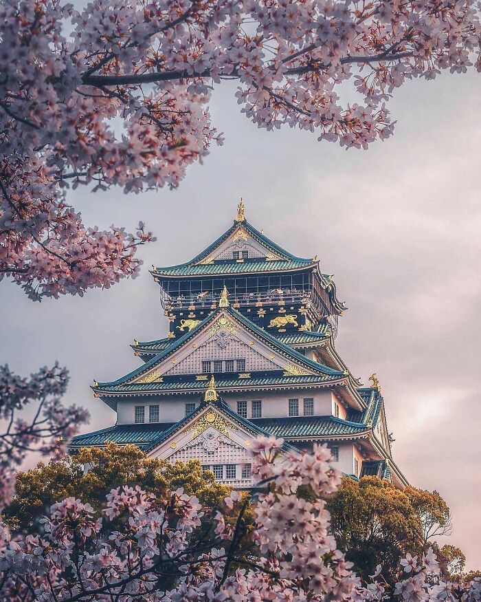
Image credits: Sunkisty
However, being pleasing to the eye is not the only attribute of great architecture. It can also tell a lot about us as human beings. One of the main things they teach you about ancient cultures is in fact the structures they built. Through it, we can get a glimpse of what the builders and other people living there were like. Let’s take ancient Egyptian civilization, we see the pyramids, the temples, the Sphinx and can immediately get a sense of how they viewed their rulers and religion.
#5 Kyoto, Japan
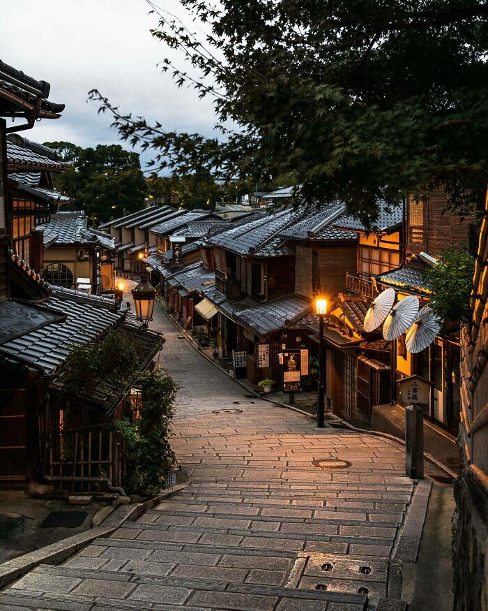
Image credits: Sunkisty
#6 Inner Walls Of Ta Prohm Monastery. Cambodia, Khmer Empire, 12th-13th Century

Image credits: MunakataSennin
Also, big historic events like The Industrial Revolution had an effect on many life aspects. The birth of mass production of iron and steel was a game-changer in construction. It allowed to design bigger and lighter structures and gave a path to Modernism. So one way or the other, all revolutions and historic changes influenced the way we see and think about design, and if we would take more time to observe it, we could clearly see how.
#7 Hungarian Parliament Building, Budapest
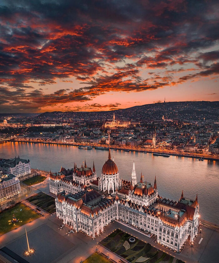
Image credits: KantKay11
#8 Athens
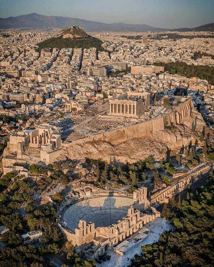
Image credits: forestpunk
#9 Jewel Changi Airport, Singapore
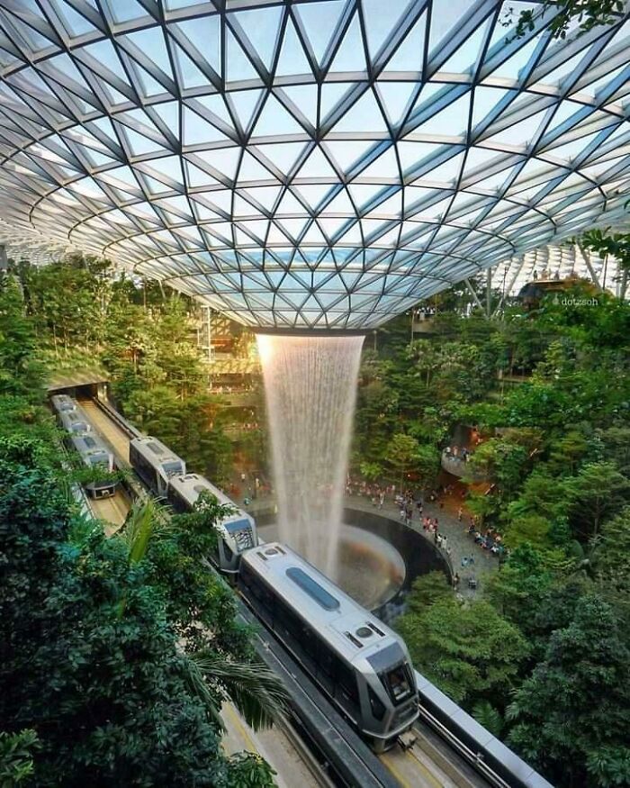
Image credits: Roku80
If design concepts tell so much about our culture and environment, what would they say about our present way of life? One very important topic now is sustainability. The U.S. Energy Information Administration stated that buildings generate nearly 40% of annual global CO2 emissions and that the global building floor area is expected to double by 2060.
#10 Two 17th Century Half-Timbered Houses At Hohe Straße 18 And 19 In Quedlinburg, One Of The Best-Preserved Medieval And Renaissance Towns In Europe That Escaped Major Damage During World War II. Harz, Saxony-Anhalt, Germany
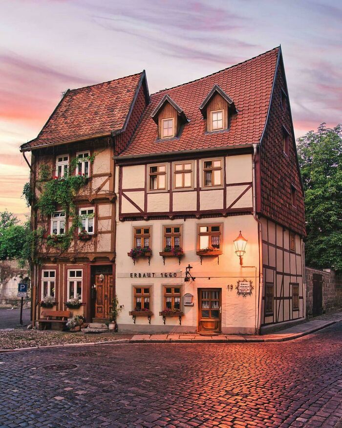
Image credits: ManiaforBeatles
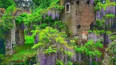
#11 The 24 Year Old ‘Wisteria’ Cottage. This Beautiful Cottage Is Located In Inistioge, Co. Kilkenny, Ireland
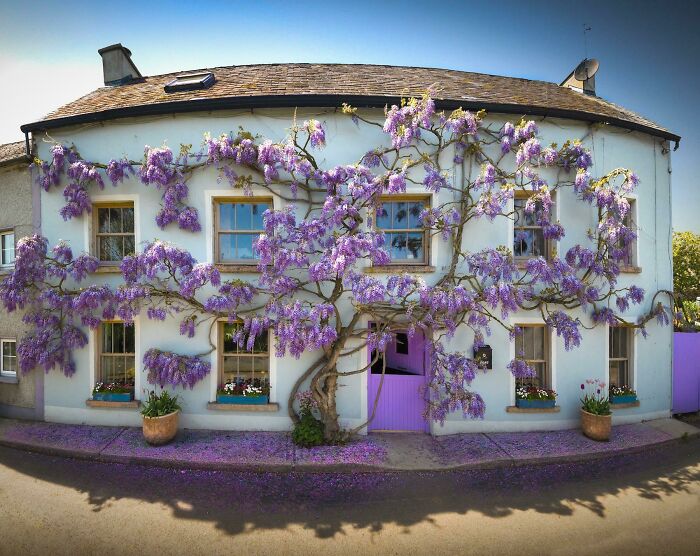
Image credits: TheGuvnor247
#12 This 50-Foot Tall Statue Of A Native American Woman In South Dakota Titled “Dignity”

Image credits: karmagheden
Since the population and sea levels will continue to rise, architects will have to adapt. Architecture Quote is an innovative platform where you can find the right architect for any type of project you have in mind. According to them, “Architecture is the solution to poverty, overcrowding, and land depletion.” They provide a few thoughts on what future trends in construction will look like.
#13 Chefchaouen, Morocco
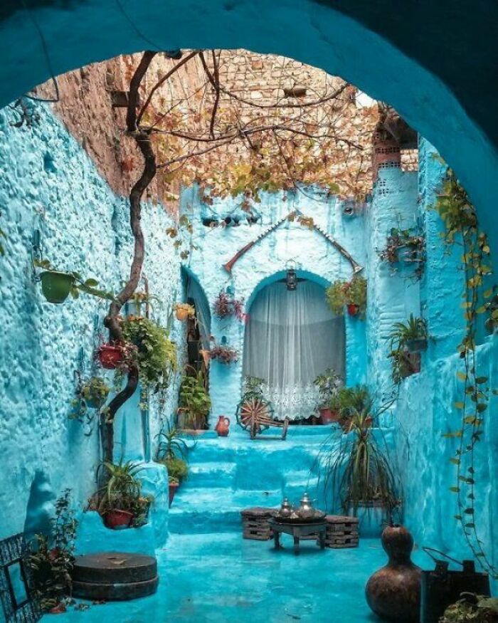
Image credits: bakhtura2403
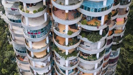
#14 Tree House, Singapore
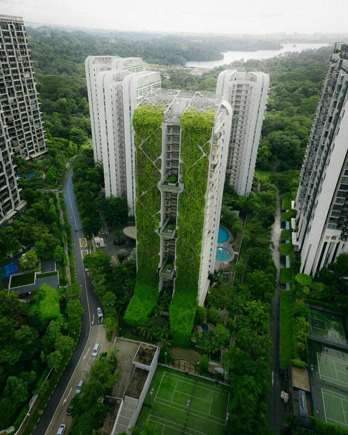
Image credits: tanmaypendse63
#15 The Neuschwanstein Castle In Germany Looks Even More Stunning In Snow

Image credits: SophiaJohnson123
Nowadays, architects are urged to take into account sustainability, carbon footprint, price, and innovations. When it comes to choosing building materials, timber seems to be a trend that’s coming back. It has been used for thousands of years and there still are some buildings that can be dated back to 6000 B.C. “Timber is an inexpensive, light, and easy material to work with during construction,” Architecture Quote explained. “The future of architecture inches closer and closer to more eco-friendly, sustainable solutions each year. Timber actually stores carbon and helps our planet.”
#16 Ruyi Bridge, China
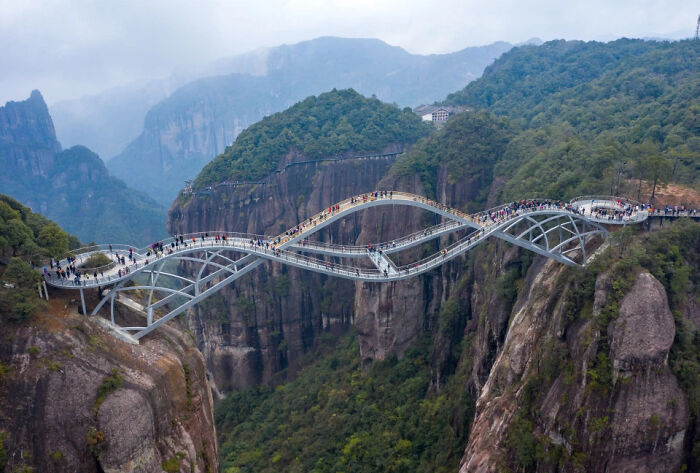
Image credits: Dee_Odj
#17 Concrete Bench, Part Of The Santuario Dell’amore Misericordioso Complex, Todi, Italy (By Architect Julio Lafuente, 1953-1974)
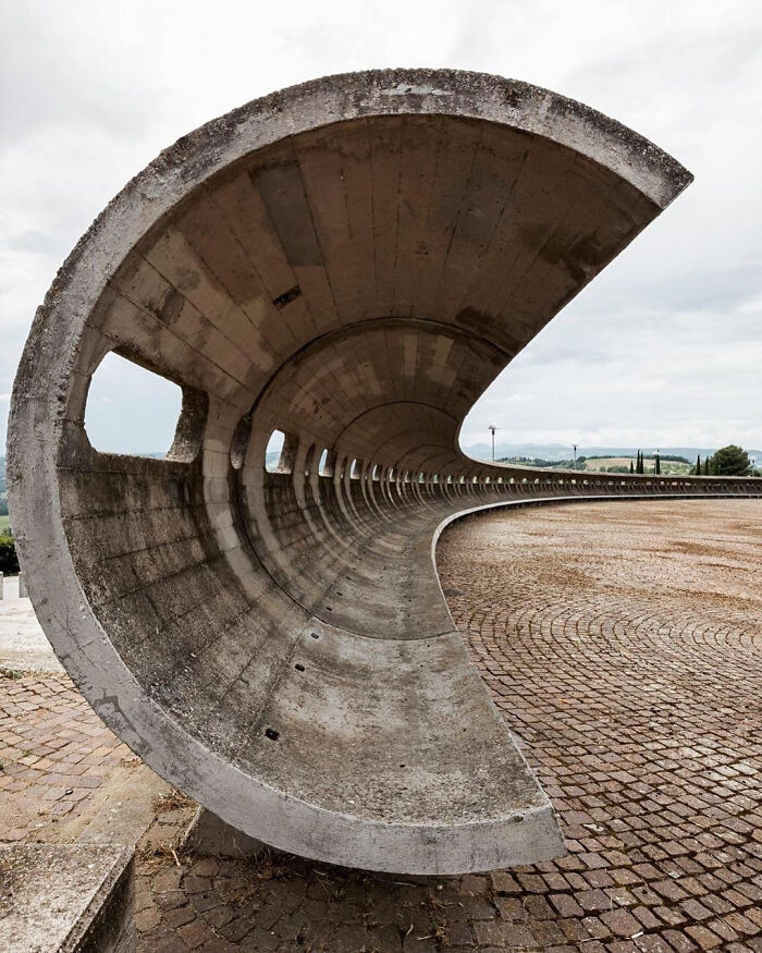
Image credits: tanmaypendse63
#18 English Country Garden Surrounding Asthall Manor, A Gabled Jacobean Cotswold Manor House Originally Built In The 1620s And Later Altered And Enlarged In The 1910s. Asthall, Oxfordshire, England
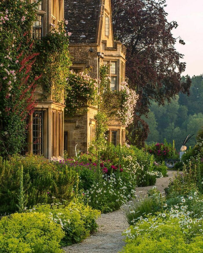
Image credits: ManiaforBeatles
Plywood and newspaper wood are also being used more frequently due to the new look that they give. There’s the growing idea of repurposing materials for a new use, like newspapers. They are especially popular in small living spaces since they give a sense of warmth to the interior.
#19 Casa Batlo, Barcelona, Spain
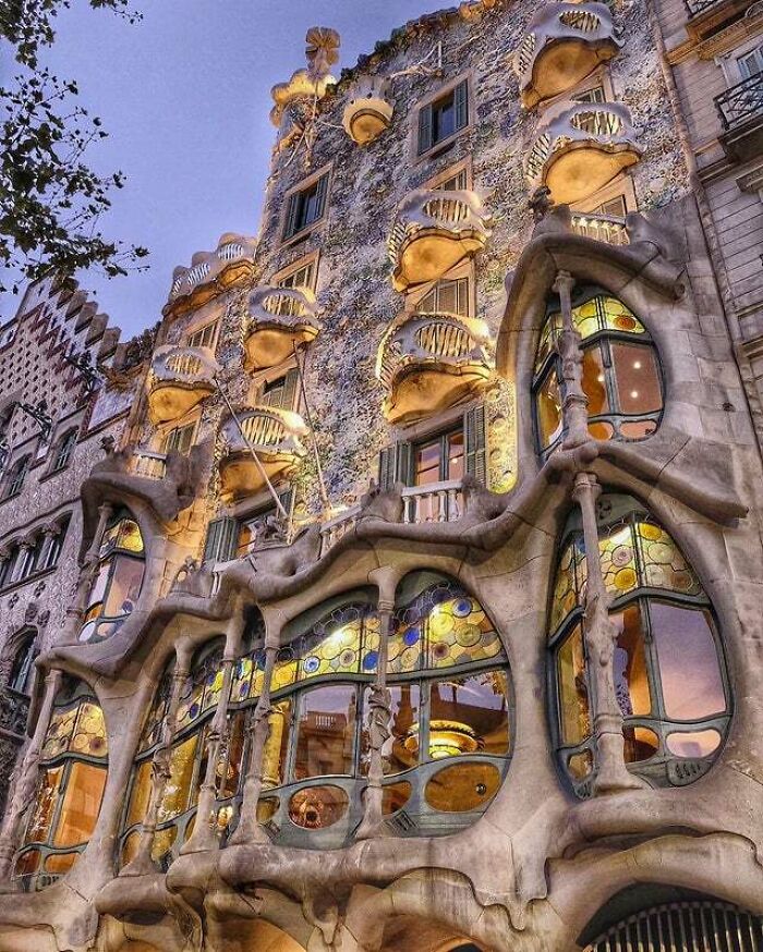
Image credits: Industriosity
#20 My Favorite Castle In Germany
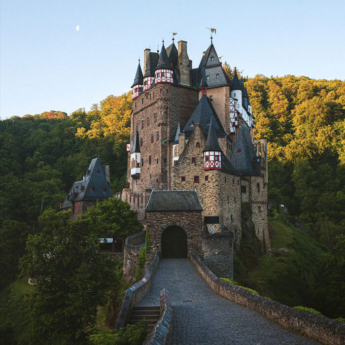
Image credits: nico_shoot
#21 This Is One Of My Favorite Museum’s Stairs (Paris)
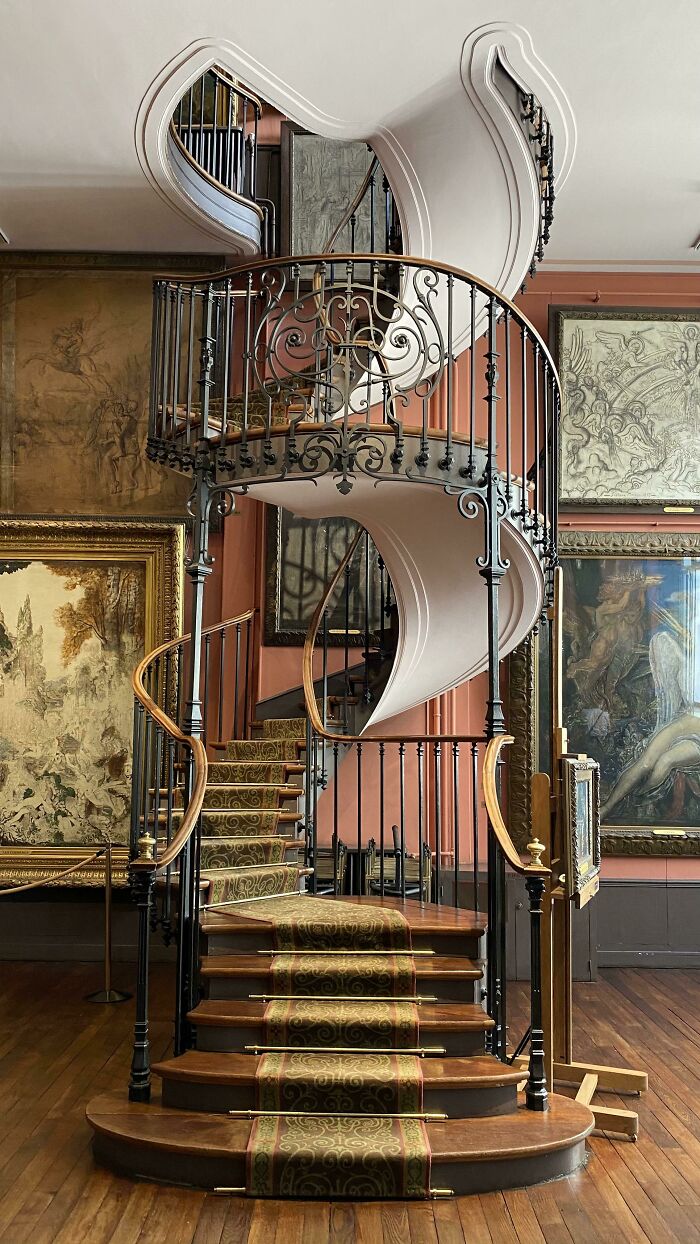
Image credits: redcattino
According to the platform, glass is also considered to become an important material in future housing. There’s a new glass technology that can harness heat from the sun and add to the insulation of the building. “This is particularly exciting for energy efficiency and sustainability in the future,” they said. “Future buildings feature more and more glass as we have learned that it can help with stress, anxiety, productivity, and depression.”
#22 Evening Scene In Bremen, Germany
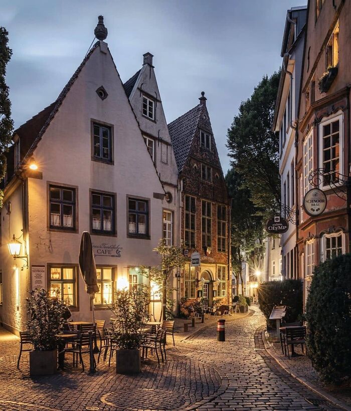
Image credits: granta50
#23 Tolbooth Tavern, Edinburgh / Sir Lewis Bellenden
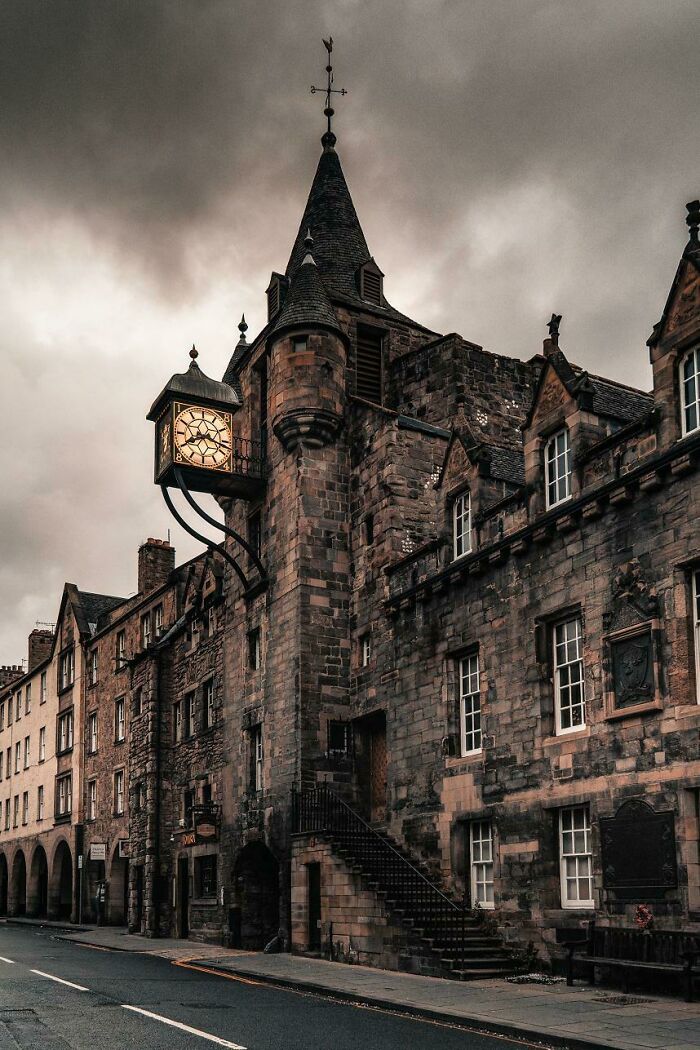
Image credits: langshot
#24 Wooden Houses In Bergen, Norway
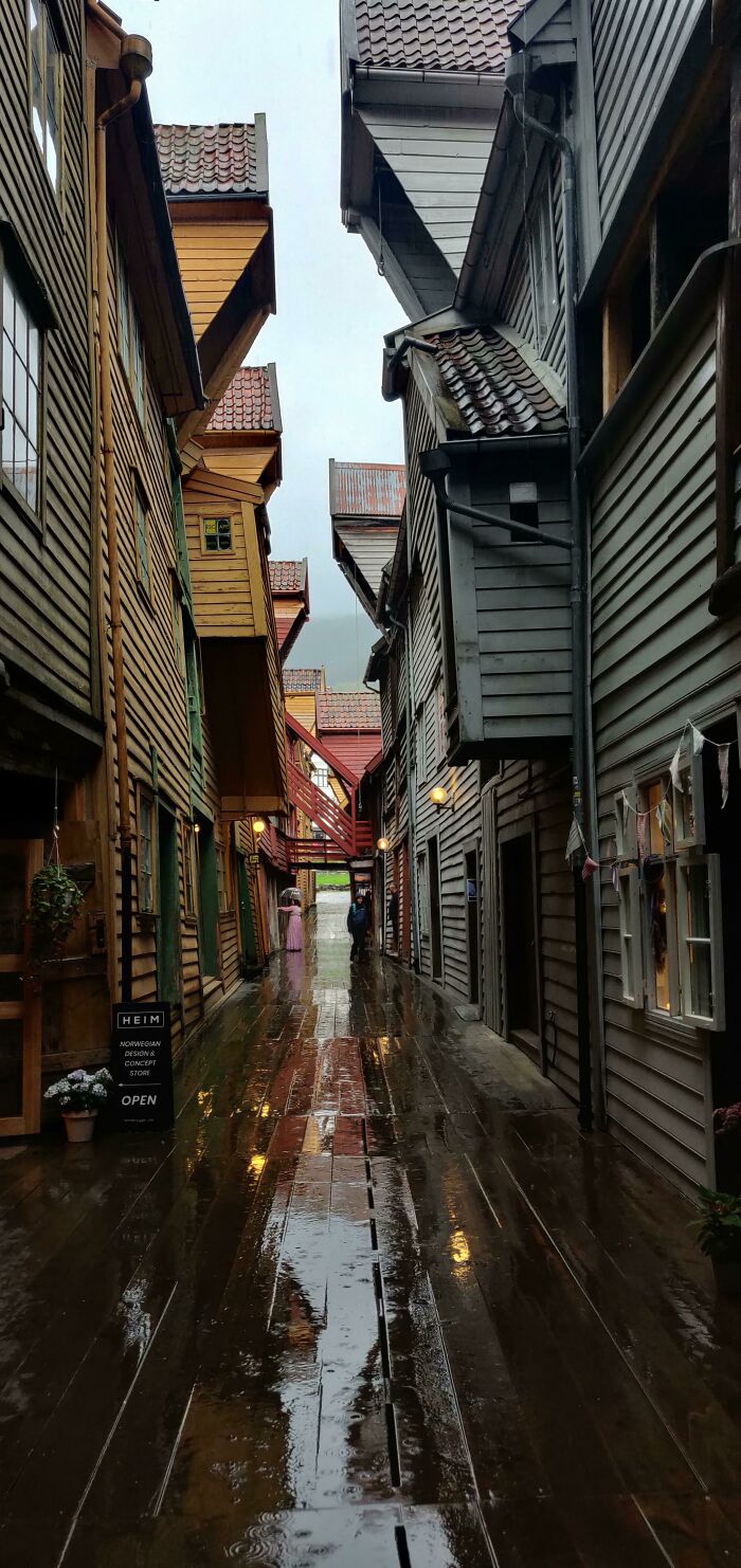
Image credits: MassiveCunt1
Another thing that is considered is earth materials. Even though making walls out of mushrooms might sound crazy, it is possible. And it’s actually better for us to breathe in. “Materials like mud and adobe have been used since the beginning of civilization. The architecture of the future has taken inspiration from the past.” Using the resources that our planet provides us is not only greener but also economically attractive.
#25 Ornate Carvings And Solomonic Columns On The Stone Steps Leading To The Water In Varenna, A Town On The Scenic Shores Of Lake Como, Northern Italy
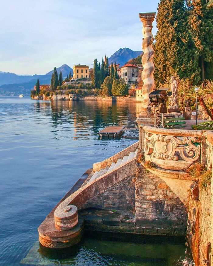
Image credits: ManiaforBeatles
#26 Las Lajas Shrine – Built 1916 -1949 Designed By J. Gualberto Perez & Lucindo Espinosa – Nariño, Colombia
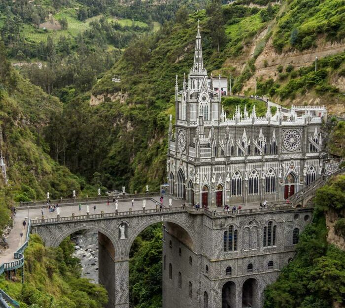
Image credits: 43mysticalSquirrels
#27 Kapaleeswarar Hindu Temple In India

Image credits: Rapama2
Besides, there are new types of buildings that are emerging due to our fast-paced lives. For example, tiny or modular homes. They provide a less environmental impact while saving you time and money. With small homes, you don’t have to stay at exactly one location, you can roll your house anywhere you wish. With modular architecture, houses are built off-site and being delivered already finished to the site.
#28 Old Gatehouse In Northern Ireland
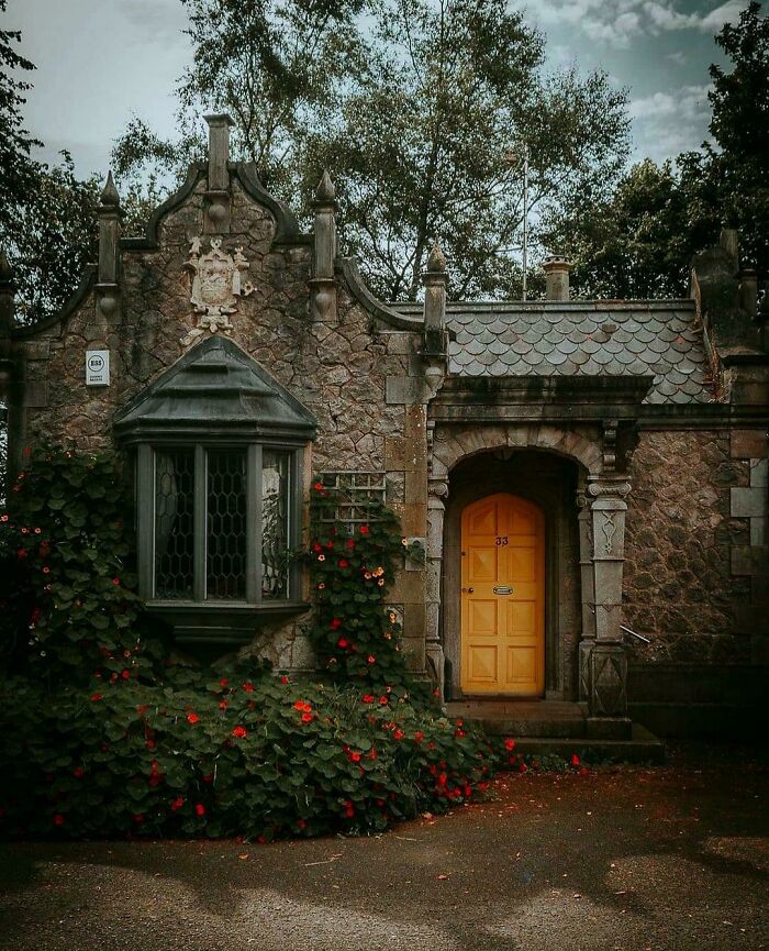
Image credits: I_am_person6969
#29 80 Metre Climbing Wall Built On The Side Of A Power Plant In Copenhagen, Denmark
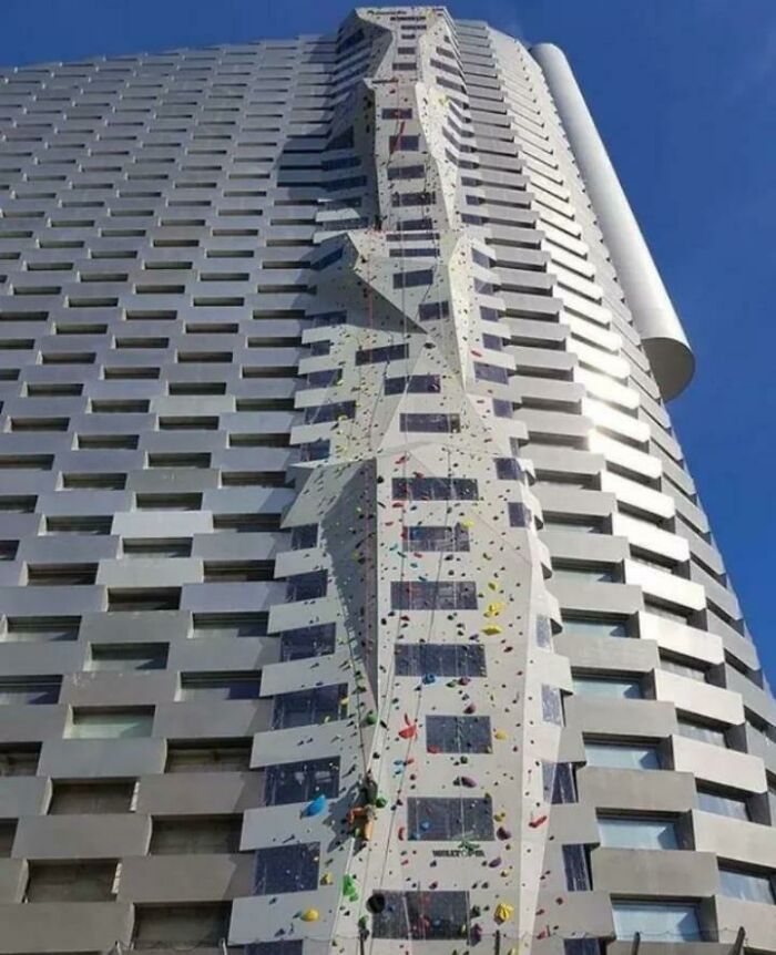
Image credits: 99Blake99
#30 The Frog House In Bielsko-Biała, Poland
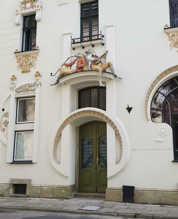
Image credits: Faiiven
“The demand for these small homes is on the rise and we can expect to see many more tiny homes in the future. Architects are building for smaller and smaller spaces as populations rise, whether it is a tiny home or a small apartment. The future is all about small.”
#31 La Casa Pàdua, An Example Of Catalan Modernism Architecture Originally Built As A Single-Family Residence In 1903, Sarrià-Sant Gervasi District Of Barcelona, Spain
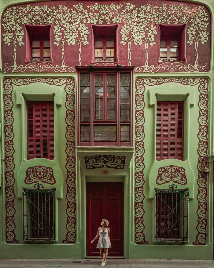
Image credits: ManiaforBeatles
#32 English Garden Of The Coton Manor, A 17th Century Country Manor House That Was Extended In The 1920s, Coton, Northamptonshire, England
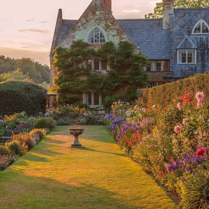
Image credits: ManiaforBeatles
#33 Cathedral Of Saint Mary Of The Flower, Florence
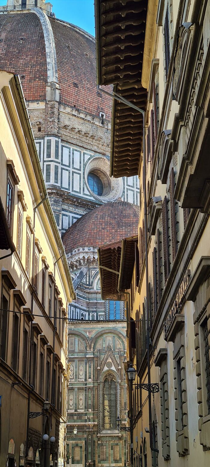
Image credits: Maksele
Lastly, let’s not forget green buildings. According to the World Green Building Council, “A ‘green’ building is a building that, in its design, construction or operation, reduces or eliminates negative impacts, and can create positive impacts, on our climate and natural environment.” So it seems that the hope for the future of architecture is using low-waste and reusable materials, living tighter, greener and more mobile.
#34 Walzin Castle On A Cliff Overlooking The River Lesse, A Castle That Started Construction In The 13th Century And Was Restored Several Times Since, Namur, Wallonia, Belgium
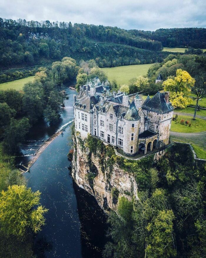
Image credits: ManiaforBeatles
#35 San Carlo Alle Quattro Fontane, Lugano, Switzerland
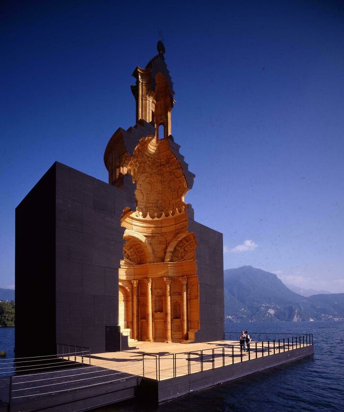
Image credits: Dee_Odj
#36 Architectural Juxtaposition In Clinton Hill Historic District, Which Consists Of 1,063 Largely Residential Buildings Built Between The 1840s And 1930 In Contemporary And Revival Styles Popular At The Time, Clinton Hill, Brooklyn, New York City
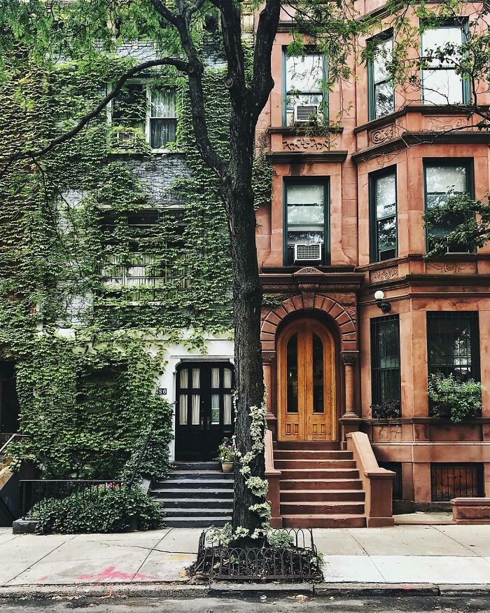
Image credits: ManiaforBeatles
Even though the facts of environmental impact and population rise sound alarming, such architectural trends are giving us hope to be excited about the future of construction. Admire these photos on your screen and try to think about how they reflect our lives. And if that seems like not enough, we have some more stunning architecture right here and here.
#37 Stone House In The Small Village Of Tissington, Derbyshire, England
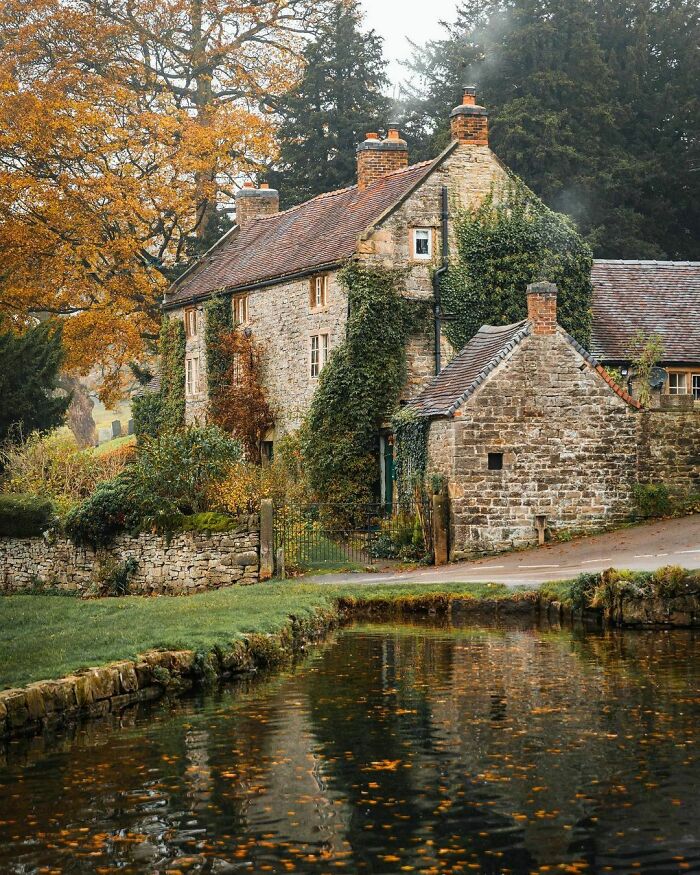
Image credits: ManiaforBeatles
#38 Concrete Turret Of The Félix Potin Building, A 1904 Art Nouveau Department Store With An Exterior Of Moulded Concrete Casts On Rue De Rennes, 6th Arrondissement Of Paris, France
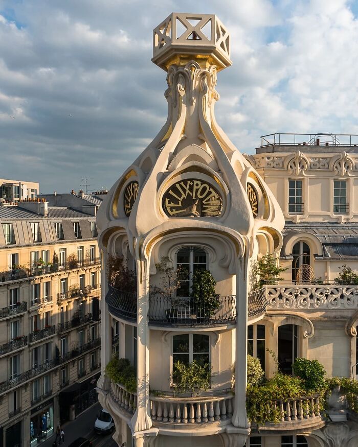
Image credits: ManiaforBeatles
#39 Ghost Sculpture In The Castle Of Vezio, Italy
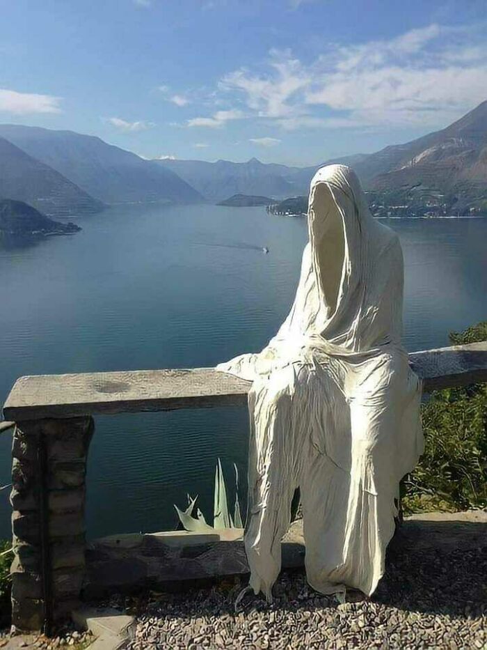
Image credits: karmagheden
#40 Imam Reza Shrine, Mashhad, Iran
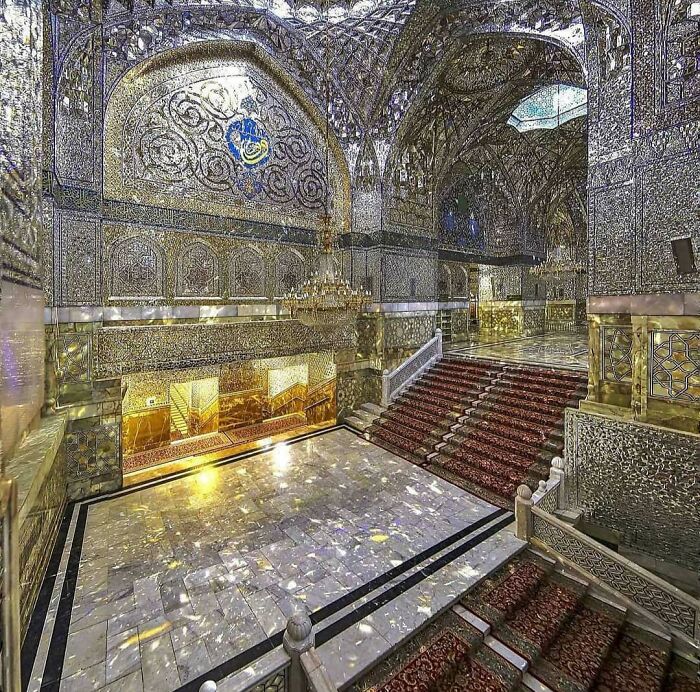
Image credits: BrilliantFamous6570
#41 Grand Central Terminal, NYC, The Sun Can’t Shine Through Like That Now Due To The Surrounding Tall Buildings. 1929
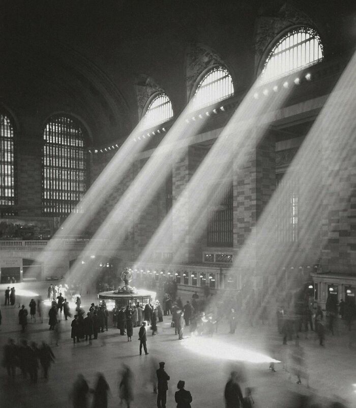
Image credits: SHIVANSH_RTX
#42 Sainte-Chapelle At Paris, France
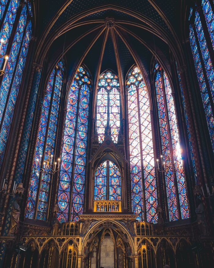
Image credits: chardrizard
#43 Windows Of Paris
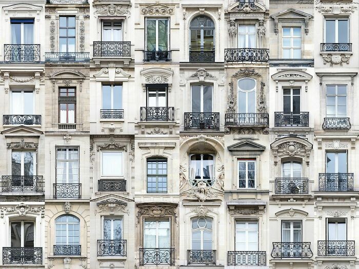
Image credits: TheHammershoi
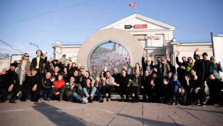
#44 Traditional Old Wooden Houses In Trakai, Lithuania
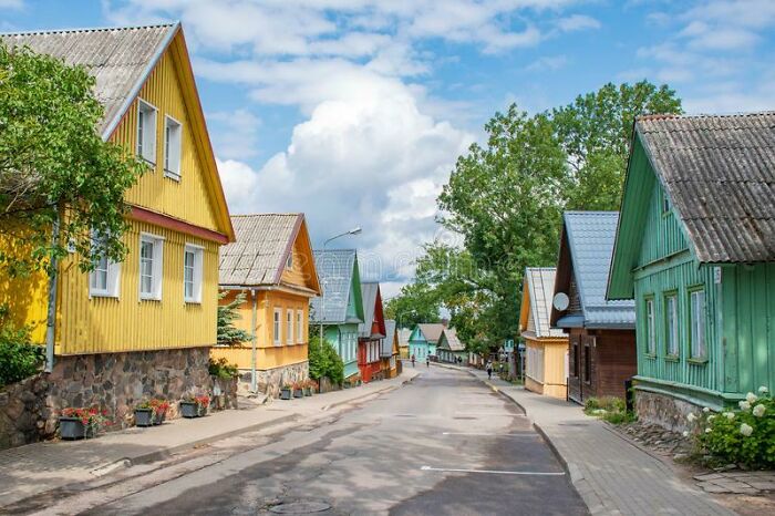
Image credits: 43mysticalSquirrels
#45 Snowy Evening, Oxford University
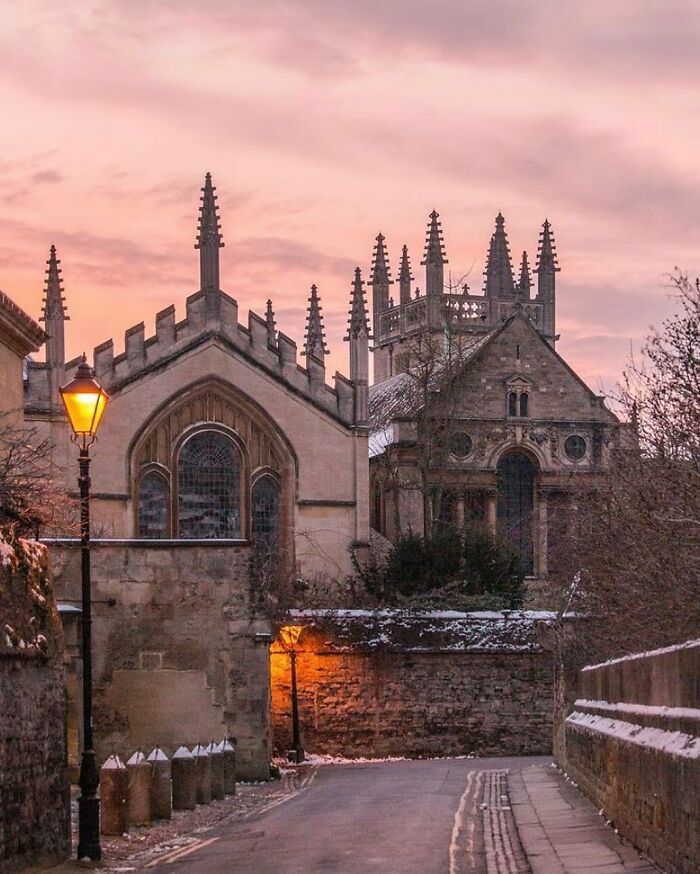
Image credits: granta50
#46 Old Bridge Over A Modern Road. Dublin, Ireland
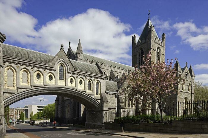
Image credits: trinerr
#47 Top Of Tribune Tower, Chicago Illinois
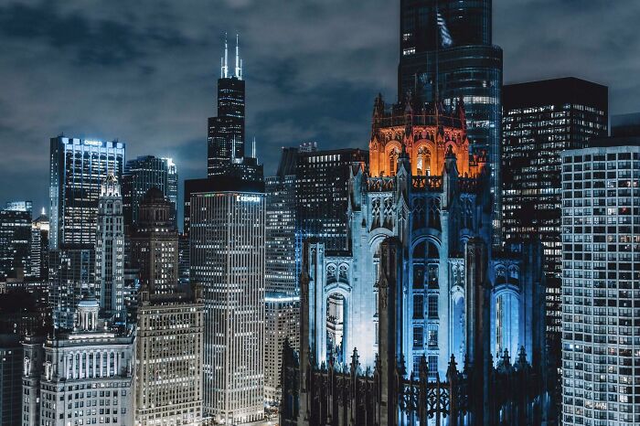
Image credits: MessyGuy01
#48 Cairo, Egypt
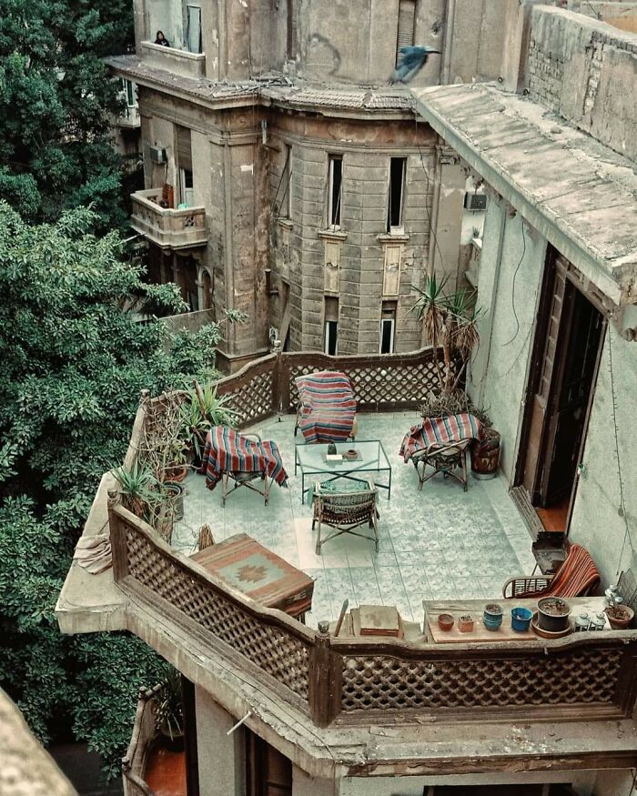
Image credits: manbel13
#49 The Architecture In Some Older Power Plants Were So Unique And Ornate, This One Built In 1925 Was A Neoclassical Design Inspired By Roman Bath Houses. Although It Has Seen Better Days It’s Still Beautiful And Dripping In History
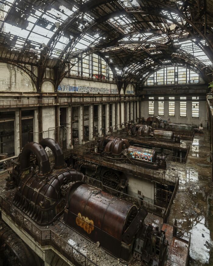
Image credits: st-jawnthebaptist
#50 The First Of The Two Round Houses Constructed In Moscow 9-Storied, 936 Flats, Built In Late 1970s
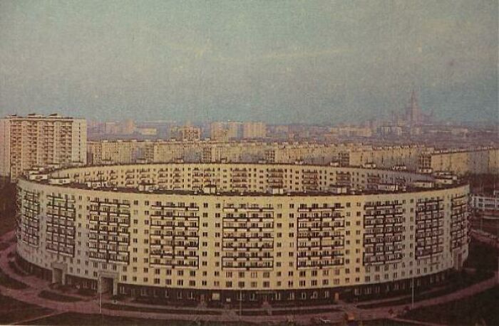
Image credits: ElectronicRhubarb841
50 Times Architects Outdid Themselves (New Pics)
- Published in 700-page, Architecture, buildings, Homepage featured, images, interesting designs, interior, Interior Design, interiors, International, Pics, pictures, reddit, subreddit
Designers Visualize The Same American House In 10 Different Styles From The Last Five Centuries
Have you ever watched a Hollywood movie or TV series and caught yourself paying attention to the beautiful architectural styles of the characters’ houses rather than the plot? I have. Which is why I was so happy to find out that American Home Shield has decided to look back at the evolution of the American house for their 50th anniversary.
Turns out, many elements of American home design have stayed the same over the last 450 years. Talk about long-standing traditions, right? In the images below, you can see renders that American Home Shield has created to document the history of the American home.
More info: ahs.com | Facebook | twitter.com | youtube.com
Cape Cod Style (1600s–1950s)
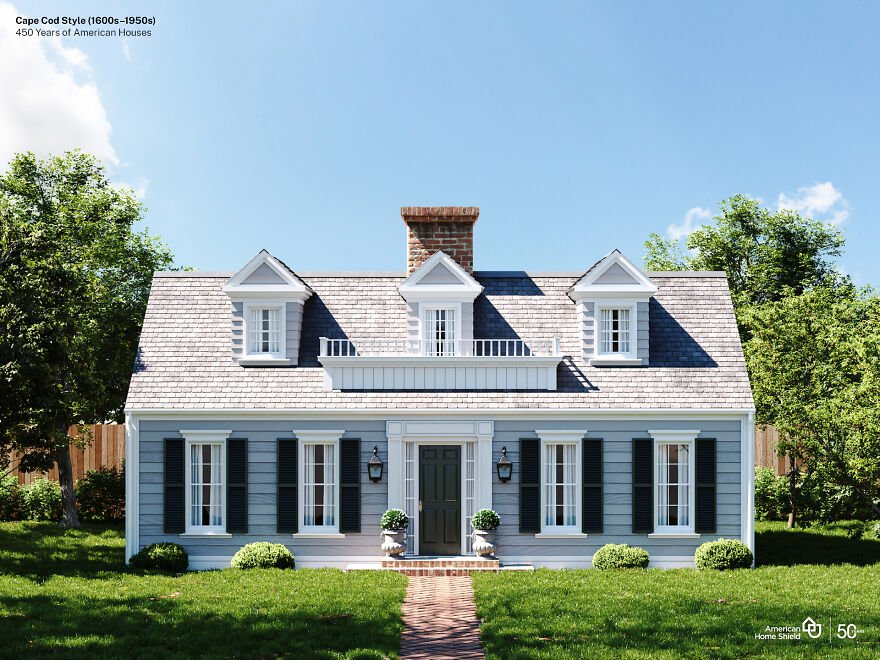
Image credits: American Home Shield
“The first Cape Cod style homes were built by Puritan colonists who came to America in the late 17th century. They modeled their homes after the half-timbered houses of their English homeland, but adapted the style to the stormy New England weather. Over a few generations, a modest, one- to one-and-a-half-story house with wooden shutters emerged. Reverend Timothy Dwight, a president of Yale University in Connecticut, recognized these houses as he traveled throughout the Massachusetts coastline, where Cape Cod juts out into the Atlantic Ocean. In an 1800 book describing his travels, Dwight is credited with coining the term “Cape Cod” to describe this prolific class or type of colonial architecture.” (source)
“Although Victorian styles eclipsed the plain Cape, these houses came back, in greater numbers than ever, during the Colonial Revival of the 1930s, often larger than the originals and with different framing methods, interior plans, staircases, and details. Owing to the romantic associations of 18th century models and the ubiquity of 20th century Capes, this is arguably the most recognized house style in America.” (source)
Georgian Colonial House Style (1690s–1830)
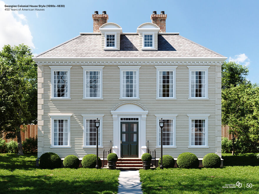
Image credits: American Home Shield
“The Georgian style arrived in America via British architectural building manuals called pattern books around 1700. While the Georgian style was popular in England in the 17th and 18th centuries, it is based on the classical forms of the earlier Italian Renaissance period. English master architects Inigo Jones, Christopher Wren and James Gibbs, inspired by the classicism of the Italian Renaissance developed the Georgian style in England. (source)
The first high-style examples are in the South, built usually by affluent tobacco planters. Grand examples—of wood rather than brick as in Virginia—became more common in the North only after 1750.” (source)
Federal Style (1780–1840)
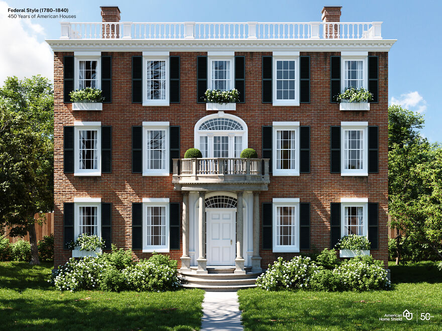
Image credits: American Home Shield
“After the Revolution, Americans wanted cultural as well as political independence, and they began to change the style of their buildings to reflect their change of allegiance. While the houses were not radically different—and still drew upon British sources—the high-style buildings of the new era bore a new and American name.
The Federalist party which, ironically, tended to favor British interests in foreign affairs, was the party of the merchants and landowners. These were the people with the means to build important houses—houses that came to be known as having been built in the Federal Style. The name “Federal” is a catch-all for buildings that date from the close of the Revolution (1783) until the first great machine-age style, the Greek Revival, became popular in the 1820s and 1830s. Other terms used for buildings of the Federal decades are Adamesque and Neo-Classical.” (source)
Greek Revival House Style (1825–1860)
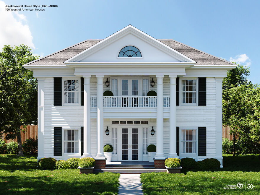
Image credits: American Home Shield
“British architect James “Athenian” Stuart is said to have been the first to introduce Greek Revival to Britain, but it was in America that Greek Revival would fully bloom. As a new democracy, 19th-century Americans were inspired by the birthplace of democracy and by Greek culture, art, and philosophy and all of the symbolism and meaning that it held for a nation in the midst of defining itself. Americans began to reject the Federal style with its British influences and sought an American style with bona fide democratic roots. The Greek War of Independence (1821-1832) was another galvanizing force encouraging Americans to embrace the values of a country that had created democracy and was fighting for its independence from the Ottoman Empire.” (source)
“In Greece, temples were built of marble painted in primary colors. But by the time they were discovered by Europeans in the eighteenth century, the paint was long gone, leaving the white marble. And to this day, people associate the Greek Revival with the color white – the white columned look.” (source)
Italianate House (1840–1885)
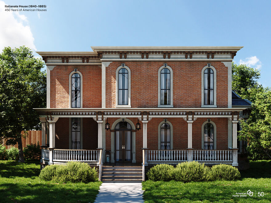
Image credits: American Home Shield
“The style derived from Italy’s rambling farmhouses, usually built of masonry, with their characteristic square towers and informal detailing. By the 1830s, Italianate had spread to the United States, where architects began to transform it into something truly American with only hints of its Italian origin. Thus, working in this style, architects had a higher degree of artistic freedom than they had in earlier, more rigid styles.” (source)
“The Italianate style was popularized in the United States by Alexander Jackson Davis in the 1840s as an alternative to Gothic or Greek Revival styles. Davis’ design for Blandwood is the oldest surviving example of Italianate architecture in the United States, constructed in 1844 as the residence of North Carolina Governor John Motley Morehead.” (source)
Queen Anne Style (1880–1910)
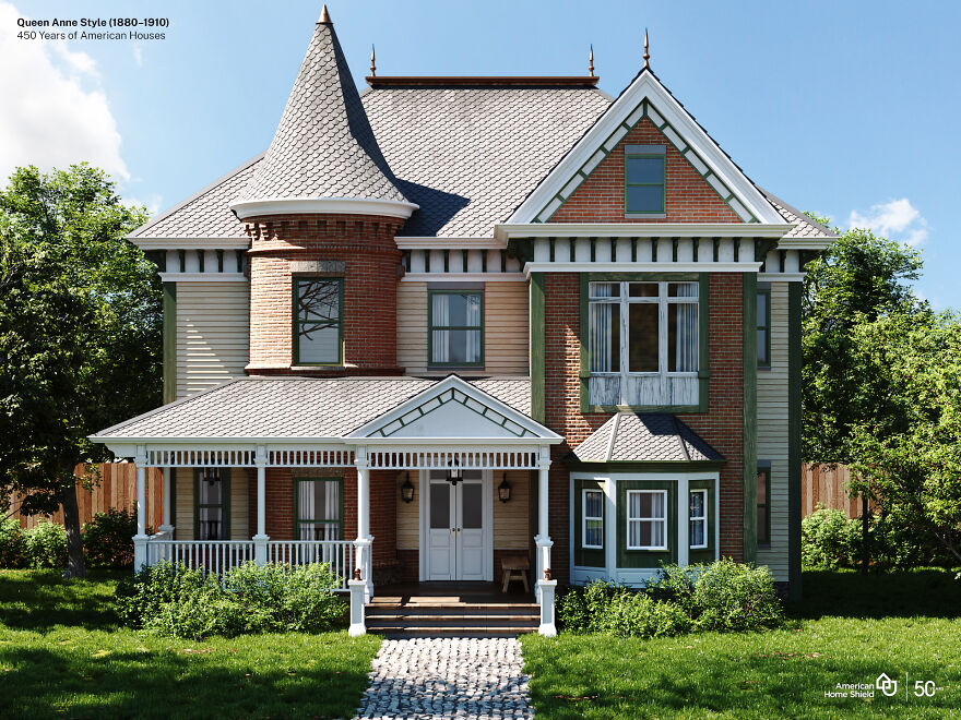
Image credits: American Home Shield
“The Queen Anne style represented the culmination of the picturesque, or romantic movement of the 19th century. Based on a premise of “decorative excess” and variety, there was little attempt to stay true to any one particular style or historical detailing. Rather, the style displayed a combination of various forms and stylistic features borrowed from the earlier parts of the Victorian and Romantic eras. “Queen Anne” is somewhat misleading given her much earlier reign (1702-1714) during times when Renaissance-inspired architecture was the norm.
The last two decades of the nineteenth century saw Queen Anne become the most dominant residential style in the U.S., heavily favored by the Victorian elite who had become wealthy from industrial growth. Middle- and working-class families often enjoyed their own versions, however, in the form of smaller, L-shaped cottages or other “folk” variants decorated with some of the style’s typical trim or siding varieties.” (source)
Arts and Crafts (Craftsman) (1905–1930)
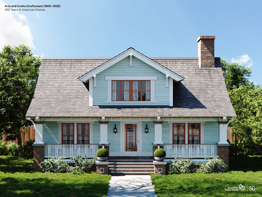
Image credits: American Home Shield
“As a reaction to the manufactured and ornate styles of the Victorian age, Arts and Crafts-style homes embraced handcrafted design and approachable materials. The style originated in Great Britain in the mid-19th century and came to America around the beginning of the 20th century. The term “Arts and Crafts” refers to a broader social movement that encompasses not just architecture, but also interior design, textiles, fine art, and more.
The design movement began as a revolt against the opulence of the Industrial Revolution, where design could be needlessly overdone. Arts and Crafts instead focused on the opposite–instead of mass-produced and uninspired, the movement was all about being handcrafted and personal. The idea was that if quality could replace quantity, good design and good taste would prevail.
The Arts and Crafts movement was directly tied to the rise of Craftsman and Bungalow-style homes, architecture that played off of the same mentality of simple but thoughtful structures. Bungalows were intended to give working-class families the ability to own a well-designed home that was easy to maintain and manage.” (source)
Art Deco + Art Moderne House Style (1920–1945)
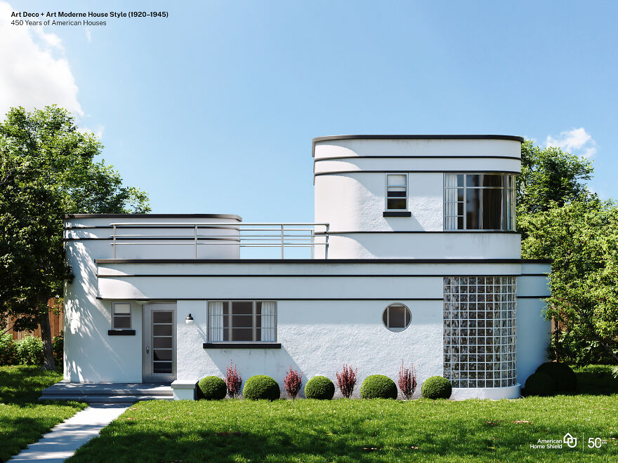
Image credits: American Home Shield
“Art Deco was the first widely popular style in U.S. to break with revivalist tradition represented by Beaux-Arts and period houses. Art Deco uses a style of decoration that was applied to jewelry, clothing, furniture, handicrafts, and – in this case – buildings. Industrial designers used art deco motifs to decorate streamlined cars, trains, kitchen appliances, and many other machine-age innovations. Art Deco takes its name from the Exposition Internationale des Arts Decoratifs and Industriels Modernes, held in Paris 1925.” (source)
“The Art Deco style first gained public attention in 1922 in a design competition for the Chicago Tribune Headquarters. Finnish architect Eliel Saarinen submitted an Art Deco design that was not chosen, but was widely publicized and embraced as an exciting new architectural style.” (source)
Ranch Style (1945–1980)
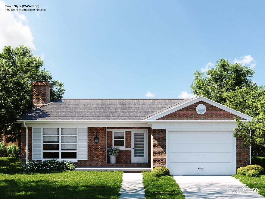
Image credits: American Home Shield
“True ranch-style homes first made their appearance in the 1920s. Originally, they were based on Spanish colonial architecture used in the American Southwest. Efforts to combine that style with modern architectural touches created the California ranch-style home. That led to a boom in the building of these homes from the 1940s through the 1970s. Their livability, flexibility in floor plans and uncomplicated design were perfect for the post-World War II growth of American suburbs.” (source)
“A small number of architects working in California and the Southwest during the 1920s and ’30s designed the first suburban ranch-style houses. These were based on the simple, one-story houses built by ranchers who lived in the harsh climate of the plains and mountains of the West. For young architects seeking forms that were defined by their function and not layers of Victorian bric-a-brac or the Colonial-style treatments popular in the East, the ranchers’ houses had particular appeal.” (source)
Prefabricated Homes (1945-present)
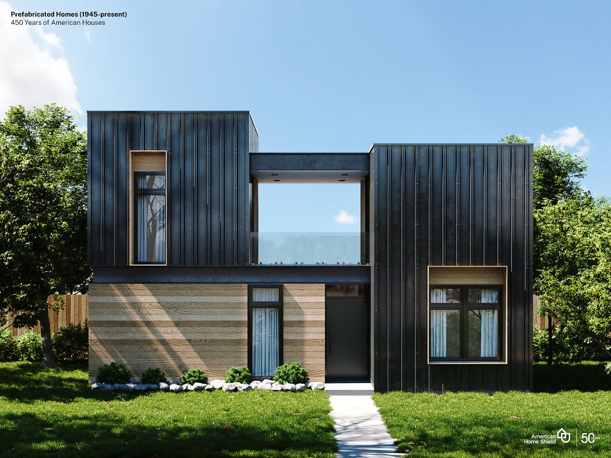
Image credits: American Home Shield
“Prefabrication is a method of producing standardised components off-site in a factory or workshop, that can be fitted together on-site. The components can be shipped flat packed or partially assembled and are not subject to fluctuating weather conditions when they are manufactured. Prefabrication was a solution where there were no suitable local materials, for example in the former colonies, where buildings had to be erected quickly or where there were skills and materials shortages.” (source)
“After the development of the assembly line by Henry Ford in 1913, it became even easier to manufacture modular homes at a price that was affordable to many more consumers. And after World War II, when the US faced a housing crisis as soldiers returned home and started families, modular construction offered quick, low-cost housing options to house a new generation of Americans. From the beginning, modular buildings have provided innovative and affordable solutions.” (source)
Designers Visualize The Same American House In 10 Different Styles From The Last Five Centuries
- Published in #architecture, #style, American, American Home Shield, Architecture, art deco, arts and crafts, cape cod, Design, federal, full-page, georgian colonial, greek revival, Hidreley, History, home, Homepage featured, houses, italianate, queen anne, ranch, USA
Woman On Twitter Shows Major Interior Design Flaws Of This Castle That Costs $60M
Various movies, books and cartoons romanticized living in a castle and that would be many kids’ dream to live in one. Some adults may think so too because they also know about what kind of lifestyle is associated with it. However, the reality of living in a castle is very different as many of them are really old, need renovations and modernization.
That is why some people who have enough money build their own dream castles with all the commodities that modern times offer and with even more features that the old ones don’t have, like a cinema room or a golf field.
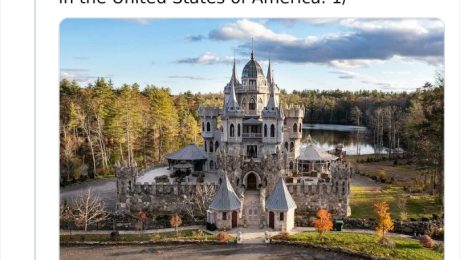
If you go to look through the listings of houses, you might not find a castle that easily, but they are definitely there. Twitter user Rebecca Makkai actually came across one and its interior and exterior are so unusual, the owner’s story is so crazy, and it can be rented for unusual events, so it caught her eye.
Twitter user Rebecca Makkai shared an unusual property listing she found and it was an actual castle
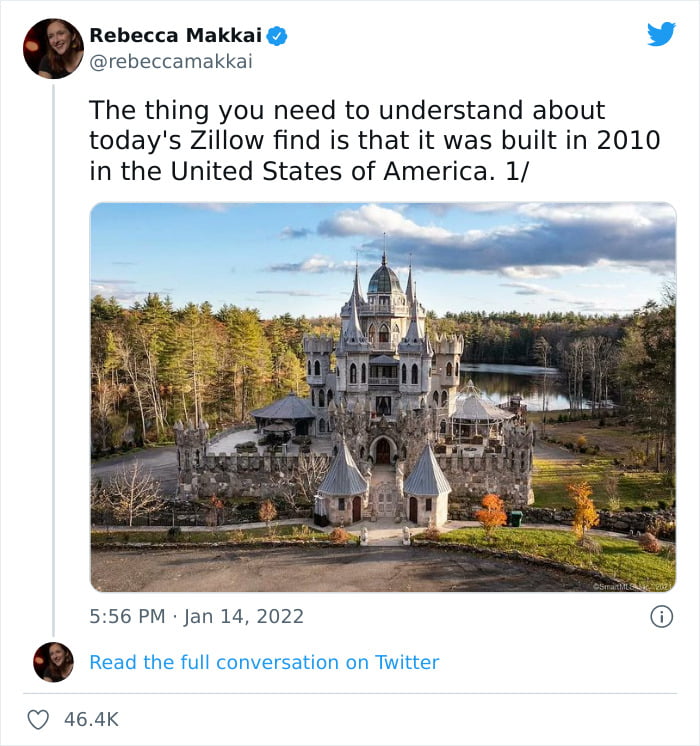
Image credits: rebeccamakkai
Rebecca Makkai is a writer from Chicago and on her Twitter, she shared a long thread of pictures of Christopher Mark’s castle with a moat surrounding it with some interesting facts about the place and the owner taking advantage of her talent to make it an interesting read.
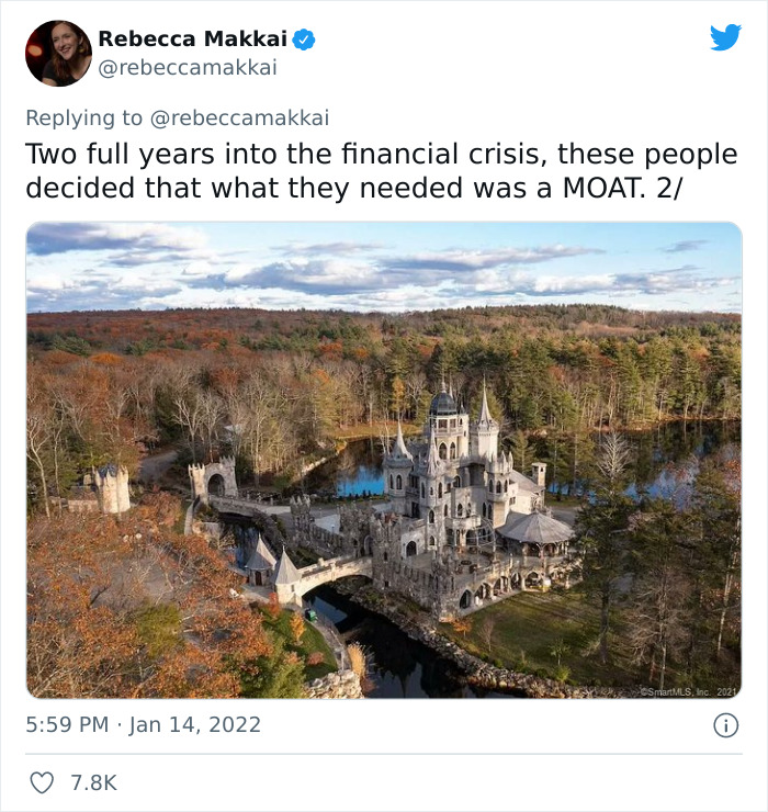
Image credits: rebeccamakkai
It is a modern-day castle, built in 2010 and it resembles a Disney one but a little bit more creepy and less magical
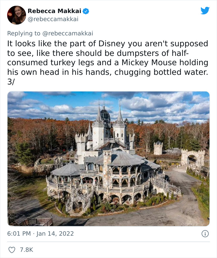
Image credits: rebeccamakkai
The castle was built in 2010 by Christopher Mark, the grandson of Chicago steel tycoon Clayton Mark who was one of the pioneer makers of steel pipe in the US. It is located in Connecticut, around 40 miles from Hartford.
It looks quite fairy tale-like, something similar to what can be seen in Disney movies about princesses and it’s not a coincidence as Christopher Mark dedicated this castle to his daughters who liked to dress up as if they were part of a royal family.
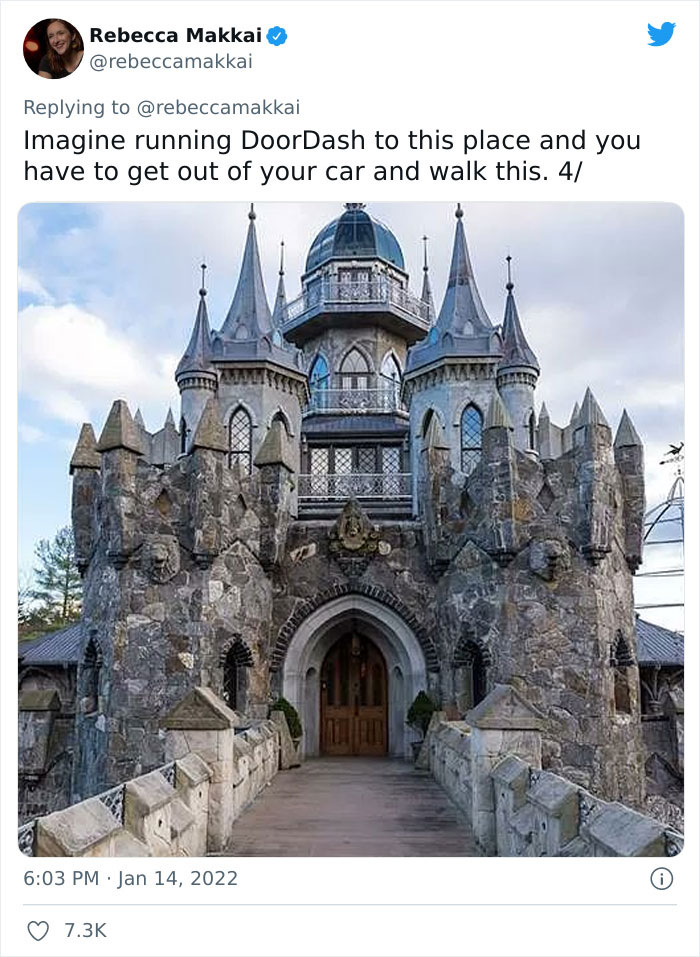
Image credits: rebeccamakkai
The castle is currently owned by Christopher Mark, who had it built for his daughters and he is now selling it for $60M
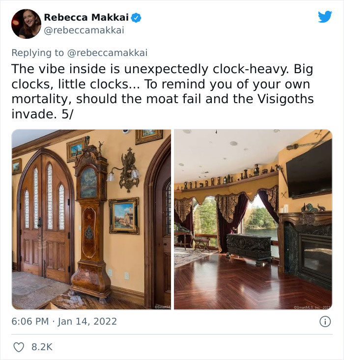
Image credits: rebeccamakkai
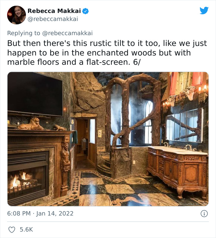
Image credits: rebeccamakkai
The property with the land surrounding the castle covers 75 acres and the castle has 18,777 square feet (1744 square meters) of living space with 9 bedrooms, 10 bathrooms, 12 fireplaces, an underground garage, seven floors and an elevator. There are secret passageways, a dungeon and a moat. The castle is surrounded by a pond, so why not take advantage of it and dig a ditch? On the ground floor, there is a home theatre and complete performing arts stage.
The construction on the castle began back in 2003 and cost $4,100,000. It was a long project and more than 100 artisans from all over the world got involved in it. The wooden doors you see in the pictures were actually hand-carved by a local Connecticut boat builder. Although the style may not be everyone’s favorite, but the construction and the designing of the castle required a lot of effort and time.
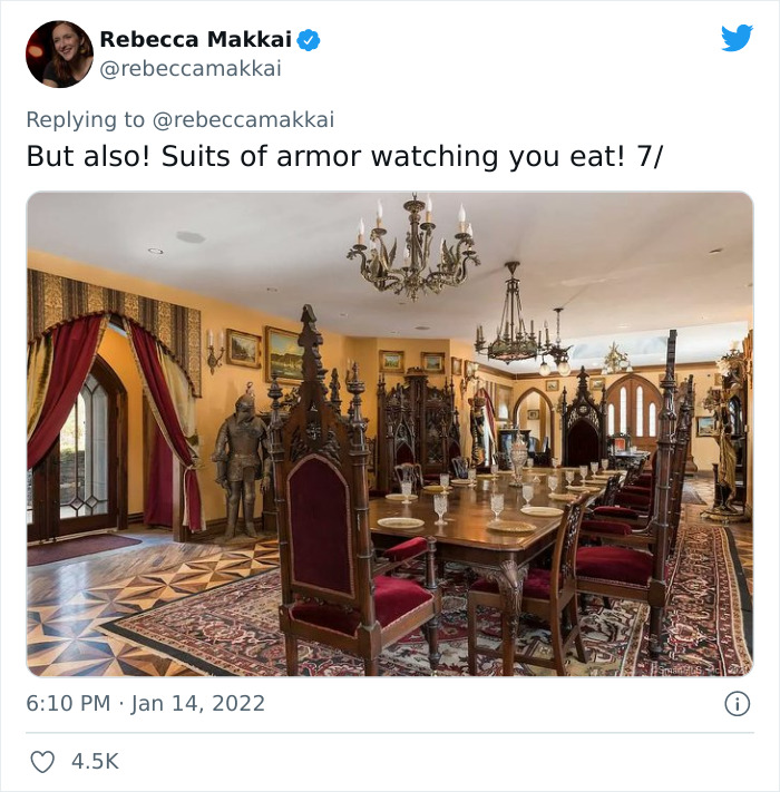
Image credits: rebeccamakkai
It has 10 bedrooms, 9 bathrooms, 12 fireplaces, 7 floors, an elevator, a performance stage and many other crazy features
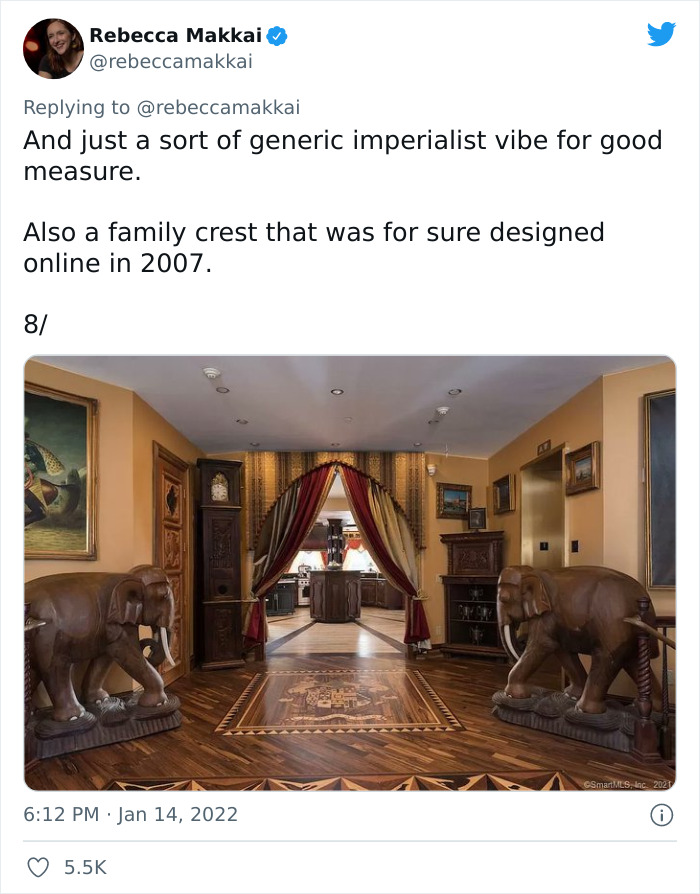
Image credits: rebeccamakkai
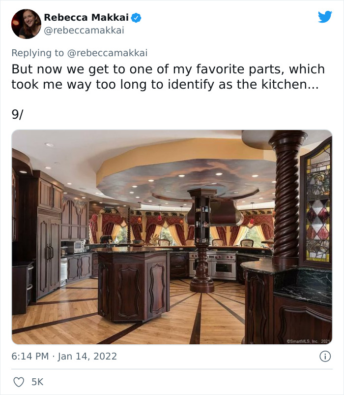
Image credits: rebeccamakkai
It was first listed for sale in 2014 for $45,000,000 and the price changed a couple of times but nobody bought the castle and in 2016 the listing was removed. In June of last year, it reappeared again and the price was $35,000,000, which is $3,000,000 more than before removing the advertisement. Interestingly, a few days ago, on 23 of January, the price had a drastic jump to $60,000,000.
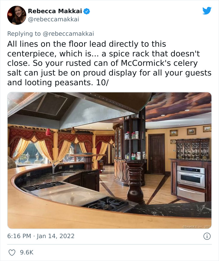
Image credits: rebeccamakkai
Even though the style is not Rebecca’s cup of tea, there was a lot of effort put into the construction and design of the castle as over 100 artisans worked on it

Image credits: rebeccamakkai
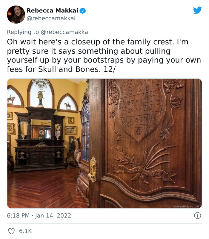
Image credits: rebeccamakkai
Both the exterior and interior of the castle are really eccentric, extravagant and just over the top, so the buyer must have a specific taste, but they must also have some spare millions in their bank account. It’s definitely not a traditional family house.
Rebecca, who posted the thread, seems to not be very fond of the decisions that were made to pull everything together. She points out that there are quite a lot of clocks inside that may be there to remind people that time is what is killing us, unless the moat will be useless and the Visigoths will do that first.
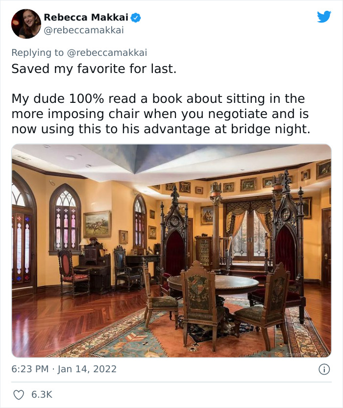
Image credits: rebeccamakkai
Not only did Rebecca talk about the arrangement of the rooms, she gave some interesting facts about the owner’s life

Image credits: rebeccamakkai
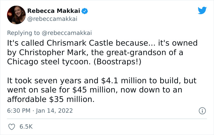
Image credits: rebeccamakkai
She draws our attention to a room that you could say is eclectic as it features some branches that might allude to an enchanted forest from the above-mentioned fairy tales about princesses right by the flat-screen TV and above the marble floors.
The dining room is, for some reason, guarded by suits of armor and the nearby room is decorated with two elephant statues looking down to a family crest integrated in the wooden floor.
Christopher Mark is the great-grandson of Clayton Mark who started using steel for pipes

Image credits: rebeccamakkai

Image credits: rebeccamakkai
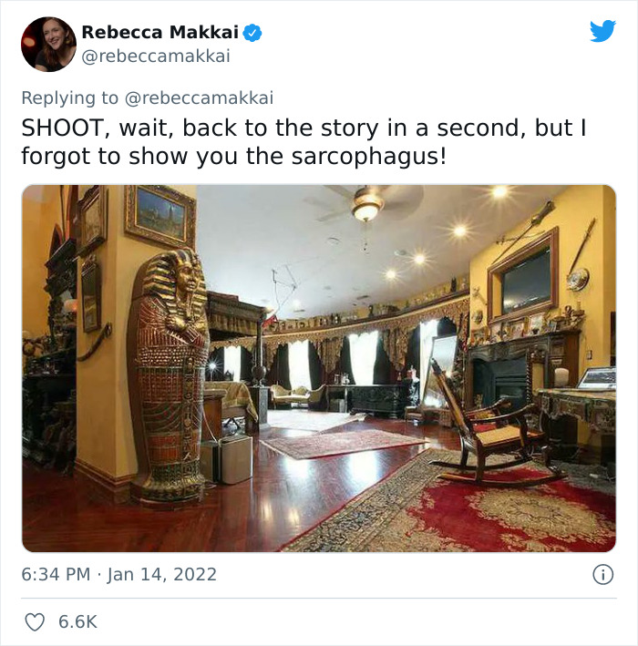
Image credits: rebeccamakkai
Christopher didn’t live in the castle with his family for too long as his wife filed for divorce
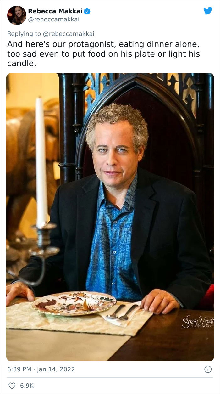
Image credits: rebeccamakkai
Another weirdly arranged part of the house is the kitchen, which is round and has a column in the middle of it with storage space for spices.
Rebbeca’s favorite part is what seems to be an office space where the different-sized chairs just make sense.
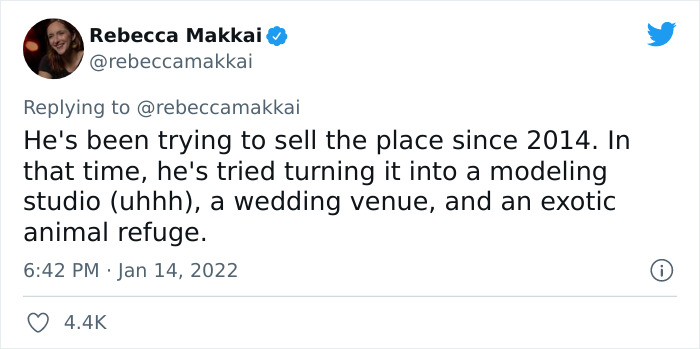
Image credits: rebeccamakkai
He then invited his girlfriend to live with him but when she gave birth to their child, Christopher broke up with her over text

Image credits: rebeccamakkai
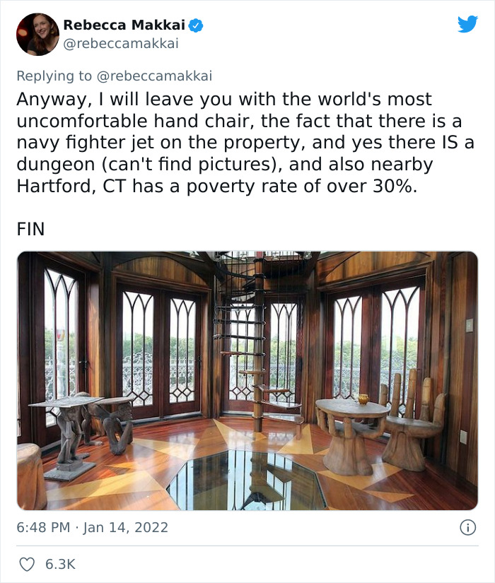
Image credits: rebeccamakkai

Image credits: rebeccamakkai
The writer continues her engaging story to talk about what happened to the castle after it was built. Turns out, Christopher Mark lived there with his wife Mary Galt and two daughters, but she filed for divorce and left.
Then he invited his now ex-girlfriend Marina Isakova to the castle, who left her husband and took her daughter with her to live with him. After she gave birth to Christopher’s daughter, she was reportedly banned from the castle. What is more, Christopher refused to pay more than a required minimum for the child support, so Marina had to live off food stamps.

Image credits: rebeccamakkai
What is more, he refused to pay more than the minimum required childcare and he was allegedly involved in the starving of a camel

Image credits: rebeccamakkai

Image credits: rebeccamakkai

Image credits: rebeccamakkai
Another scandal surrounding the castle was a dead camel. So the castle had a zoo and it was called Wilderness Kingdom, Inc. Besides the camel, the zoo once housed an emu and a zebra. During the divorce litigations between Chrostopher and his wife, Mary, they both accused one another of starving the camel to death.
Despite the family drama attached to the castle, even though it hasn’t been sold yet, it hasn’t stayed empty all that time. It has held events like music performances and weddings and it was involved in the making of the 2020 Hallmark movie One Royal Holiday.
As nobody has purchased the castle, it was repurposed for various events and a movie was filmed in it

Image credits: rebeccamakkai
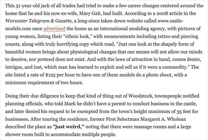
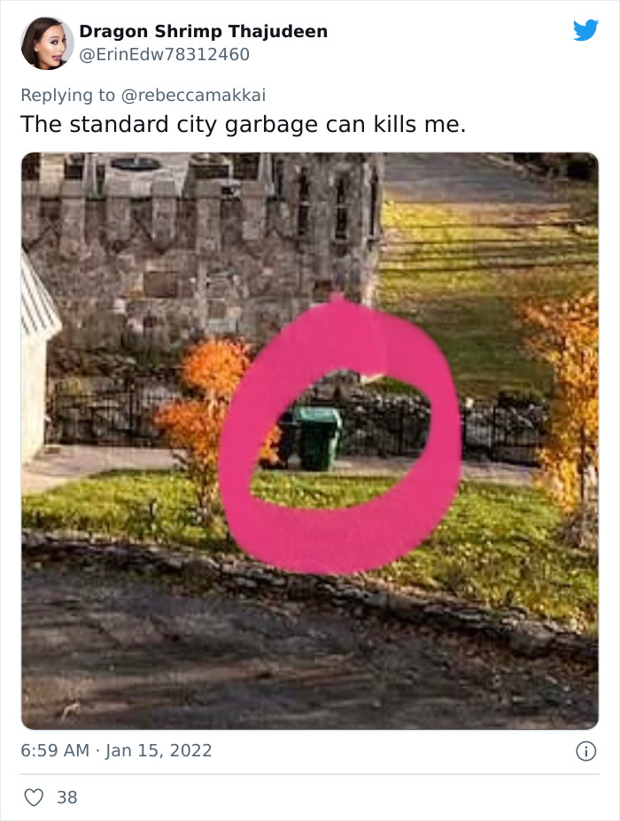
Image credits: ErinEdw78312460
The castle leaves quite an impression; it is for you to decide if it is a good or a bad one. We would like to hear if you would live there if you had the money. What is your favorite and least favorite part of it and why do you think it is still on the market?
Woman On Twitter Shows Major Interior Design Flaws Of This Castle That Costs $60M
30 Construction Workers Share What Creepy Secret Rooms They Were Asked To Build
For Secret Rooms, Your home is your castle. So if you want to install a huge window in your street-facing toilet, by all means, go for it.
Just keep in mind that not only your neighbors, but the entire internet might shame your decision. Plus, selling a property with, let’s call them, extravagant features can be tricky.

To learn more about people’s architectural whims, Reddit user OuterSpacewaysInc made a post on the platform, asking construction workers to share stories about all the secret rooms and other strange compartments they had to build for the owners. Turns out, plenty of folks have secrets they want to keep to themselves.
Residential contractor here. A client once asked that I add a 4×6 room next to the master that would be “just big enough to allow someone to ‘calm down’ if they were being ‘bad'”. Specs had no windows. Brick walls. Double thick door, etc. He gave off that creepy as hell vibe, but you know, money.
Anyway, the job was going fine until we ran out of red bricks and started using those blue and yellow ones. He lost his s**t! Canceled the contract and never looked back.
tldr: My son’s standards for Lego houses are so high that Jesus himself couldn’t reach them.
OptimusPrimEvil Report
Just moved into a house that was built in the 70s. The previous owners custom built it, and the architect was the man’s old frat buddy. Custom stuff everywhere (trash chute straight from the kitchen into the garage wheelie bin!).
When we first looked at the house, we really loved it, but there was no office space that my husband could use for his music stuff. It was the only disappointing thing about the house, but since everything else was so perfect, we went ahead and put in the offer.
When we were doing another walkthrough with our parents, we showed them the walk up attic, which is pretty cool too. When I turned around to leave, I noticed a wall of insulation that looked….different. if you push the insulation to one side, a doorknob appears. And behind it is the secret office.
Coolest house ever.
Cultooolo Report
My dad is a doctor and does a lot of construction at home in his free time. This one time he was moving a wall, making one room smaller and another bigger. He was putting an entire-wall-bookshelf kind of thing in the smaller room, and just to f**k with future homeowners he snatched one of those plastic skeletons from his job and hid it in the space between the bookshelf and the wall
I expect headlines sometime in the future
mangster83 Report
In the 1970s, a group of Edinburgh students living in a flat in Niddry Street, in the city’s Old Town, knocked on a wall and heard a hollow sound.
Curious, and probably drunk, they knocked a hole through it, where they exposed an old labyrinth of corridors and rooms underneath North Bridge, nearly half a mile in length. People had lived and died in these rooms, underneath the city’s bridge. There had been bars and brothels, and doss houses for the poor.
People in Victorian times had closed it off and subsequent generations had forgotten where the entrances were.
tomtell Report
Never built one, but I did find one in a house I was doing some plumbing work in once. This was an expensive condo, and they had a secret office that had a secret one-way mirror looking into the GUEST SHOWER. Creepy as f**k, man.
I_AM_POOPING_NOW_AMA Report
Wife and I had a secret, soundproof “sex dungeon” type room built adjacent to our bedroom. The reason for the room is that we have various devices in there that are impractical to disassemble and put away when we have friends over (or the day we have kids and still want to enjoy our fun discreetly).
We had some devices installed when we built the room, such as a large metal cage and other restraining devices. The people who built the room probably asked us a hundred times if we were sure we didn’t plan to abduct people. The architect nearly dropped the project when I jokingly asked him to make sure there’d be an electric outlet to plug a chainsaw.
1234fckoutthedoor Report
Was a draughtsman for a while. Two super wealthy Chinese parents were building all three of their children houses on their massive property. I was asked to design the ironing room for the eldest daughter. She…genuinely liked doing ironing? And laundry? I ended up designing this massive room with bay windows overlooking the lake with all sorts of storage compartments and a variety of ironing stations. She loved it, I got a healthy bonus, and I’m still confused to this day.
NipponNiGajin Report
I had a client once who wanted a safe room. Full concrete, ballistic glass, rated to withstand explosions, reinforced doors, separate power, and HVAC systems. Dedicated phone and tele/data as well with direct alarms to security and the police.
The thing that was unusual was that they wanted it handled entirely separately. A different building permit, with a different crew, all work being done at night. If anyone was ever able to find blueprints or permits to plan a Hollywood-style caper, they wouldn’t know about the safe room. (This was a public building, not a private residence.)
ivegot2legs Report
During the finishing stages of doing a basement, the customer decided she wanted a wall with dead space behind it. Gave no reasoning, only details how big she wanted it. I had joked multiple times it would end up being a tiny grow room for Marijuana.
It ended up becoming a small grow room for Marijuana.
billmofomurray Report
This one to me is the coolest. We have a family friend who is a builder and built his own house (obviously). I haven’t been over to his house in a while, but last time I was there, they were still finishing it (they’ve been finishing it for several years, and you’ll see why soon). Their house is 7 stories tall (4 above, 3 basement levels), has elevators, a full-size basketball court (indoors), several kitchens and living rooms, a huge theater room, an apartment that is attached with its own kitchen, living room, dining room, and 4 bedrooms, and the main house has countless bedrooms and other multipurpose rooms. The house is enormous.
BUT the coolest part is the house has those McDonald’s slides in it. There are 2 in it (maybe more now) of these slides. One goes from the top floor to the bottom, and one goes from the top floor to ground level. In the biggest one however, there is a secret passage, thats kind of hard to get to. When the slide gets to its steepest point, you have to brace yourself against the walls so you stop. If you can, the slide actually has a tunnel to the side that you can take. When you go through that secret tunnel, it takes you to a secret balcony in their in-home theater, with a fridge and chairs and stuff. It’s a pain in the butt to get to, but it’s really cool.
They do have a few other hidden rooms, but unfortunately, the guy who owned the house wouldn’t tell us, he said we had to find them on our own. Every time I was there spent the entire time knocking on walls, inspecting bookshelves, etc
TheAmishMan Report
I am not a construction worker. I. attended a private boarding school when I was younger the school itself was 200+ years old and the castle it was built around was much older. Upon exploring I and a few other friends found an entrance to a system of tunnels that ran beneath the school. The tunnels were used as maintenance tunnels for the old heating system that was once run from a gas boiler system. Originally we thought that was why they were built. We began trying to map out the tunnels and used to spend hours underneath the school during study time/ night roaming around with a measuring tape drawing it to scale. We never completed the map due to the systems enormity.
As we got further and further into the tunnels we learnt that these were much older than just the gas boiler. A new, cement tunnel seemed to extend about a kilometer in radius. Past a kilometer the tunnels got older and more dangerous. We found that they extended all the way out to a pavilion in our school. These passages were also in cement but were very clearly much older. Most of my time as a 14-year-old was spent roaming around them. It gave us passages into locked rooms, the castle (banned grounds), to the forests, etc. We decorated a lot of the walls down there in shoe polish and stolen art paints. We would even smoke down there a mere few feet below the headmaster’s office.
tiroky Report
Had a request to build a hidden room which was to my belief be used as a sex dungeon. He requested low-hanging support beams, a sunken in part for “storage” we painted it in red and black colours. The floor was tiled in one portion for a drain.
scottsuplol Report
Electrician here. Have done a few. The coolest was a secret passageway and attached room in a very nice house. It was hidden by a movable bookshelf on both ends. The guy said he didn’t have a specific reason for building it, he just always thought it would be cool to have a secret passageway in his house.
The other one that stands out was an underground survival bunker accessed through a hidden door in the back of a garage. It had an additional exit by means of an underground tunnel that lead almost 100 feet in the bordering forest. The strangest thing about it was that it was a survival bunker where he had our wire with outlets and lights, despite there not being any type of backup/off-the-grid power. Makes me think that he actually had an alternative purpose for the shelter.
Barley_Hops_Water Report
Electrician here. The customer wanted a sliding bookcase that hid 2 fire poles that slid down into the basement. Just like the old Batman TV show. He even had the bust on his desk that had a button under the flip-up head. The customer told me the bust was from the original show.
The house also had a couple of hidden doors and a panic room hidden behind a Tardis. It really was bigger on the inside.
electriczap Report
There’s this one house we did where there was a concealed stairway from the master bedroom to the dining room, just so the parents could get booze and snacks without walking past the kid’s rooms. Concealed because at the top of the stair was a massive safe.
DavidSlain Report
Plenty of times. There was one I never saw the finished stages of that was basically an entire apartment accessible only by a small hatch in a closet. Either the homeowner was planning to harbor criminals, or a mistress, a man in an iron mask, or just really wanted to be able to get away from his family. Hope it wasn’t like an HH Holmes thing.
Did a lot of mansions and this wasn’t insanely common but far more than I expected. There was one builder that did a lot of these houses who managed to find a retired electric chair that he kept in a hidden room. He ‘joked’ that when his kids were bad he would make them sit in it for a few hours. It didn’t have power running to it but still.
reddit Report
I was a custom interior carpenter and I did two. One was a bookcase that opened up into a large storage area.
The other was a hidden room behind their wine cellar. We installed a custom wine rack on a piano hinge, with a latch in the space behind one of the bottles. In the room, they installed a safe and a gun safe. All of the electronics for the house lived down there, as well as a panel that opened up into the main living room, in case you wanted to shoot an intruder from the safe room.
Booze, guns, and safety all in one place. I guess what I’m saying is that I know where I’m going when the zombies come.
scrappyjack Report
I built a Narnia closet for someone. Their daughter had one request for the new house: she had a built-in armoire, white and modern looking with nice shelving units on the right side and a bigger opening on the left. However, when you pushed the back of the left, closet side, it opened up into an actual closet that was about 5×10 feet on the inside, not too shabby at all. Was a pretty fun build, albeit somewhat challenging. Edit: spelling/words.
shadowatmidnight104 Report
I used to work construction over the summers in high school and within just a few miles of where I grew up there are 20,000sq+ foot homes…anyways this one client (who was pretty well known for being a CEO of a large corporation) requested a secret self-contained smoking room. Complete with a secret entrance, a bathroom, cedar paneling, self-contained heat and A/c, and an industrial-sized smoke-eater. Along with hideaway shelving that would store an endless amount of mason jars full of pot. Also has some crazy vaporizer as well. He would have meetings upstairs in his underwear and robe whole being high as f**k
Kraus247 Report
I’ve been painting houses since I was 15 and I’ve done two. One was a room behind a bookcase for the kid’s playroom. The second was in a millionaire’s summer home. On the fourth floor of the house, there was a closet on the same wall as the elevator. A section of drywall came away and lead to behind the elevator. There was a wooden ladder that went up and down the entire house, at the very top was a trap door that lead to a small room that was about 6 by 6 feet. It had windows and vents that could be opened or sealed completely. Pretty sure it was for their son to hotbox.
ceigetank Report
I convinced my brother to add a secret door from one closet to the other closer between his daughters rooms when we were building his house.
baderd Report
Kinda not secret. In my old flat, I had a room that was locked with a big yale lock. Whenever we’d have people round, they would always want to know what was in there, but I never let on.
It was my hobby room, so to speak. I used to fix up vintage guitar amps in there and the lock was there simply as I couldn’t trust my drunk friends to not go in there to mess with stuff. Amps have lethal voltages even when they haven’t been used in a while.
But, I liked the mystique and intrigue whenever people were around. The women were the worst and their hypotheses were always centered around a secret dodgy sex life.
raceAround126 Report
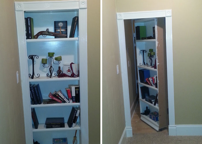 My house has two secret rooms, one of them is the obligatory bookshelf. A real shelving unit with real books, that also…. (clicks a secret button)
jackjack44 Report
When the local FBI office in the city I live in was being built an owner change order came in to make all the finishes in these two rooms in the basement rated for pressure washing. These two rooms were immediately nicked named the murder rooms by the construction workers.
Throwawaysallthetime Report
I work for a contractor. We once built a house for a family with three kids. Each bedroom had a high bed, accessible by a ladder, built into the room itself. And each bed had a little door in it that led to a tunnel connecting all the rooms together. Pretty cool!
supernewf Report
Yes, we worked on what was supposedly going to be a hidden/secret walk-in safe in the basement. This room was heavily reinforced.
Normally, walls around doors are framed using wood. This door frame was solid reinforced concrete. The room was a square attached to the outside of the basement, so all four walls were concrete. We poured concrete above it, so the ceiling was concrete. (Very unusual!) We also poured the floor.
So, it was six sides made of concrete. Since it was attached to the outside, there was no sign that it existed from the inside. No ventilation. No wiring from what I saw.
I never saw the finished product, but the owner was keeping it a secret, and wouldn’t explain much about it. So another contractor finished it off.
reddit Report
A friend of the family works as a custom cabinet maker. Most of his jobs involve him making secret compartments for rich clients. Mainly desks with a secret place that can hide guns, keys, ledgers, and swords (oddly enough a lot of people request that), but also that stuff in bookshelves, picture frames, etc. He also gets your typical movable bookshelves.
reddit Report
Yep. All the time. People that can afford it pay a lot for panic rooms and hidden armories. Swinging bookcases, doors in wall paneling, you name it. People with that much money usually have something to protect.
DavidSlain Report
I used to do some construction work on schools during the summer. The principal wanted, in his closet, a door to slide up where he could keep safe for special school records, and a mini-fridge. Although it wasn’t very big or that cool. It was the coolest work I ever was involved in that summer. Plus, who wouldn’t want a mini-fridge hidden in their wall?
nomore_mrniceguy Report
Note: this post originally had 76 images. It’s been shortened to the top 30 images based on user votes.
30 Construction Workers Share What Creepy Secret Rooms They Were Asked To Build
- Published in #interior design, 700-page, Architecture, Construction, construction workers, Creepy, find, funny., Homepage featured, houses, Other, People, renovation, sahre, secret, secret room, secret room ideas, secret room project, secret rooms, stories, surprise, Weird, workers
Facebook Group: 50 Home Ruining Examples
We’re pretty sure of one thing — no one was born an architect. It takes years of study and practice to become an expert on the art, history, and engineering of the built world. However, some people think that designing a house from the bottom up is something they can do on their own.
Even if we agree that architecture is subjective, sometimes one cannot deny the flaws that people do. In fact, some home designs turned out to be so wrong that they went into the You Should Have Hired an Architect A Facebook group that shows why not hire a professional is a mistake.
From weird roofs to open concept toilets, take a look at some of the pictures we’ve collected from the group, and be sure to vote for the most bizarre ones!
Also, scroll down for our interview with Allison Beer McKenzie, the manager of this Facebook group, where we talk about the mistakes people make while designing a home themselves and the benefits of hiring an expert.
In just a few months, the group has attracted more than 31.2K members, who share some of the strangest design failures on a daily basis. According to the group’s description, much of the built environment in the United States is not designed by architects.
“This group is dedicated to examples of why this is a bad idea with occasional examples of why buildings designed by architects may be superior for variety.”
Bored panda contacted the manager, Allison Beer McKenzie, who is an architect and the director of sustainability at SHP Leading Design in Cincinnati, Ohio. She explained that there are mainly two reasons why many people choose to give up hiring an architect.
“One thing is for sure they are cost conscious or think they can’t afford an architect. The other thing, I think, is that they don’t know or appreciate the value that an architect can bring to their house design, ”she explained.
McKenzie continued: “This value can certainly include a beautiful design, but it can also include things like a house that perfectly fits the site on which it is and is ideally designed for the climate on which it is built.”
Whether it’s creating a bad design, exceeding the budget, or not meeting current codes and standards, there are many ways people can make mistakes without an expert.
The architect thinks that many of the mistakes people make when designing homes themselves “come from the fact that most people have trouble thinking in three dimensions without training on how to do it. This often leads to houses with strange proportions or clumsy connections between materials and elements. ”
McKenzie admits that some houses that are designed without the help of architects perform well. “However, building a house is probably the biggest investment you will ever make and will require you to make hundreds of decisions in a condensed amount of time,” she said.
“Having an architect by your side to guide you through decisions ranging from where the house sits on the ground, to room size and location, to what color you want for your bathroom floor can help ensure you end up with a result you love. . and keep your sanity! ”
According to architect Bill Whittaker, hiring a professional might seem like an unnecessary expense for your construction project. However, an expert can bring quality, professional design and project management to “help you complete a beautiful building according to budget and schedule.”
He provides several reasons why you should hire an architect instead of dealing with challenges on your own. First of all, when it comes to design, they help your home to have a consistent flow and comfort.
“An architect provides a professional design that takes into account the client’s preferences, along with building codes and good design practices to create the best possible space for your project.”
Then, experts can effectively manage a construction site and “ensure that everything is completed according to current codes and standards.” The same goes for the budget. It’s easy to get distracted and spend extra for things you don’t actually need, or to hide the mistakes you’ve made.
“Architects help keep communication clear and can direct the project in the right direction to keep costs where they were originally designed,” Whittaker explained.
However, if you are really determined to design your own home, you should consider starting small. Plan and build a tree house or shed, or perhaps a puppet house for the children. And if you notice that there are some mistakes you make along the way, you should probably contact an architect for your larger future projects.
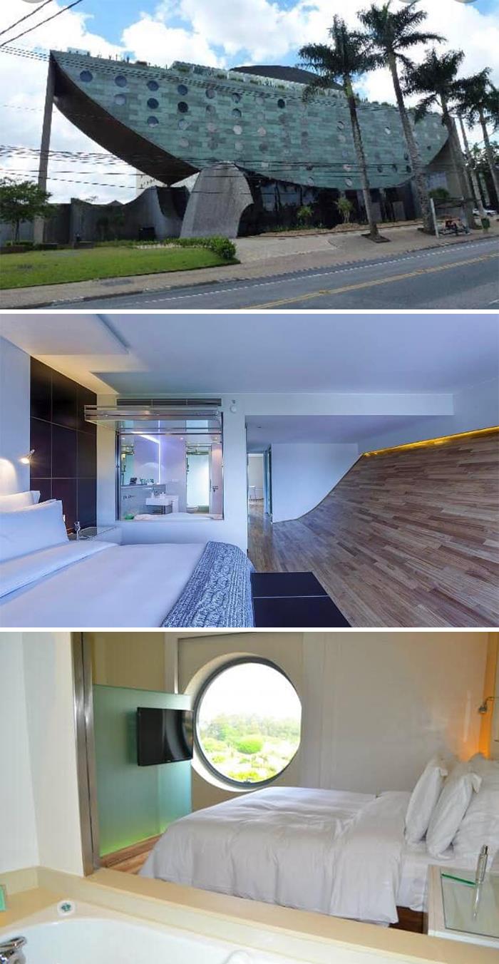
When it was built, everyone was like “ooooh, what a WONDERFUL architecture !!!!”. It is supposed to look like a ship, but all I can see is a rotten slice of watermelon. Then a boyfriend who was an architect called me crazy because it’s ugly. Am I It’s called Hotel Unique if you want to look up and see how strange the rooms look. They have a window between the bed and the bathroom. As for me, I can only see pictures, because it is insanely expensive
Mariana Marinovic Report
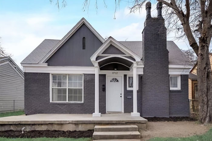
I don’t mind the painted brick (it’s very common in charming old houses in northern Germany – although they tend to be bright white, rather than purple) but the chimney doesn’t please the eye. Maybe they wanted to distract from the curved porch? They certainly succeeded in that!
Nini Stefanie Report
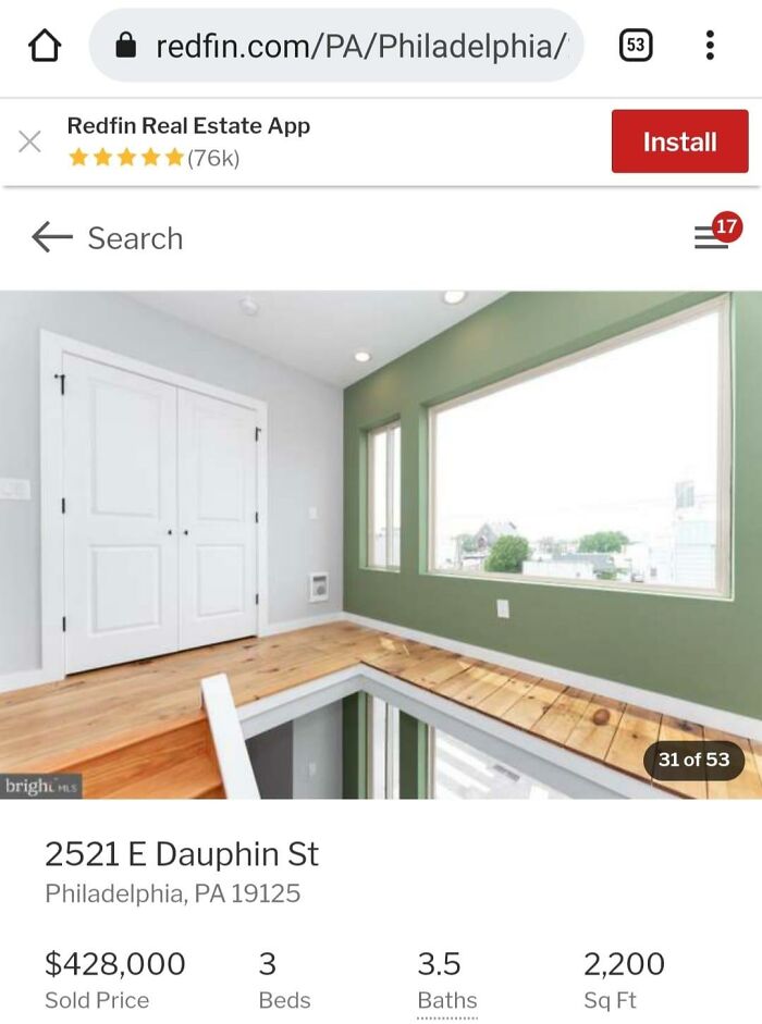
Van Whit Report
Note: This post originally had 93 images. It has been shortened to the top 50 images by user votes.
Meanwhile, if you want to read more such exciting lifestyle guides and informative property updates, stay tuned to Feeta Blog — Pakistan’s best real estate blog.
Facebook Group: 50 Home Ruining Examples
- Published in 700-page, architect, Architecture, bizarre, Design, engineering, errors, expert, facebook group, Fails, Funny, Furniture Design, hilarious, hire, home design, Homepage featured, house design, Interior Design, mistakes, Pics, professional, Weird
50 Of The Most Breathtaking Forgotten Places
There are not too many opportunities to feel like an adventurer in modern times. However, exploring abandoned places and finding unexpected treasures can give you that deep excitement. You may not bring anything physical to show for your endeavors, but the photos you take and the first-hand experiences make for even better souvenirs.
La “Abandoned Beauties” A Facebook page is dedicated to urban exploration (aka Urbex or UE) and shows beautiful images of abandoned places and objects. Both past and present. We have a nice selection of photos of them to share with you today, Pandas, so go ahead and scroll down into the mysterious, unexplored wilderness of Urbex. Vote for your favorite photos and, if you’ve ever researched that yourself, tell us all about it in the comments.
Very strong warning, dear Pandas: your safety is paramount. If you are planning to explore some abandoned places, you need to take the necessary precautions and be extremely careful. I know you are all very capable, but you cannot venture without the proper preparations if you want to stay safe. More on this below.
I held out my hand to photographer Dominic Sberna for some tips on how to keep our camera safe while exploring new areas, how to get the right light for photos in dark settings and understanding how essential camera angles are.
Dominic said Bored panda that camera angles are important when it comes to showing the size of a large building. “A lower angle will enhance the view, just as a high point of view would. The point of view really matters as well. Depending on what you’re aiming for in your shot, you’ll want to have a nice showcase of the scene in front of you when exploring some abandoned property,” he explained. the photographer. You will find the full interview below.
“A wide-angle lens is always a great option for any confined space, but again this depends on the look you’re aiming for and absolutely depends on the scene in front of you. If you’re in a massive industrial warehouse, you could lose some impact. to your image if you have a wide-angle lens, ” photographer Dominic said Bored Panda
“At the end of the day, just like any genre of photography and anything in life, practice is perfect. But don’t beat yourself up if your pictures aren’t ‘perfect.’ You should always try to take them for yourself. If others like them, that’s an added bonus and you’ll stay true to your creative self knowing you’ve done things for yourself, ”the photographer suggested we focus on what makes us happy instead. of trying to please absolutely everyone else.
“The best way to keep your camera safe is to always keep it attached to you. That could mean different things to different people. Generally having your camera strap around your neck is a good thing. But, if you feel more comfortable holding it, so be it. if something unexpected happens, you can move as needed, ”said Dominic.
When it comes to lighting, the built-in flash of your camera may not be enough. He said he would “always recommend” a tripod and long exposure when shooting in dark environments.
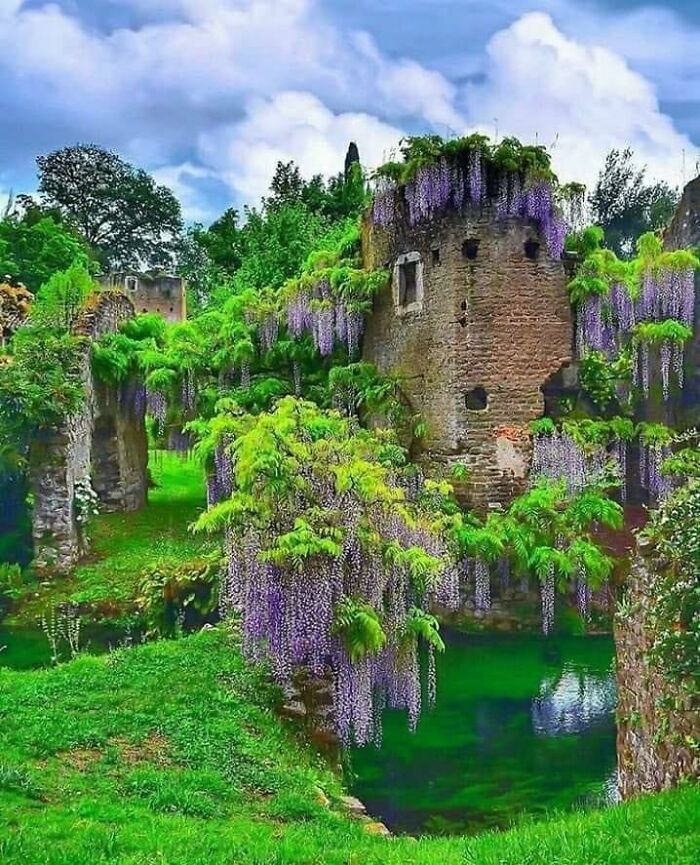
The garden includes the ruins of the ancient settlement Nymph, whose name seems to come from a classical era water lily, a temple dedicated to nymphs, located on an island in the small lake.
Robyrabs Report
“If you want a shot in the dark or a more illuminated subject, I would recommend using external lightning or using external light at all,” Dominic suggested. “Depending on how you go, it will depend on your favorite light source.”
He noticed that the lightning on a camera has a fairly harsh and direct light. “You will cause a lot of severe shadows and as a general rule, I would recommend staying away from the camera flash unless you definitely have to use it,” the photographer told Bored Panda.
The project “Abandoned Beauties” has enough membership on Facebook. Large 435.8k people follow the page. It’s easy to see why.
The photos are amazing and evoke a sense of mystery, adventure and the discovery of lost secrets. The photos are also covered in a heavy dose of fear, which makes us uncomfortable enough to keep an eye on.
The founder of the “Abandoned Beauties” project realizes that they credit all photographers for their work. If you notice a beautiful photo without credits, it means that the image is either part of the creative commons license or the page could not find the original photographer.
If you have questions about all of this and want to follow the photographers, but apparently can’t find the original source, try asking the page moderator or the community itself. You never know, you might find someone who knows!
One thing to remember is that, overwhelmingly, the authors of the photos do not add details about the exact locations. This is done very deliberately, to protect the places and objects from vandalism.
Keeping the secret of the place is a very practical approach. While a handful of city explorers visiting an abandoned ship (which is dangerous in itself) may not do much damage (especially if they don’t remove anything like souvenirs), the same can’t be said about dozens, hundreds, or maybe even. thousands of visitors.
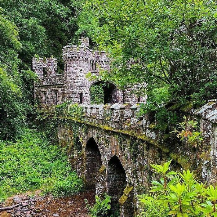
They are located on the former Ballysaggartmore Demesne about 2.5 miles from the town of Lismore in County Waterford, Ireland. The structures were built for an Anglo-Irish landlord, Arthur Keily-Ussher no later than 1834.
michaela.able photography Report
Imagine if a huge flood of urban explorers ended up going to a single place. Some of them could be veterans who know how to treat the place carefully, however, others could be amateurs who damage the place willingly or accidentally.
More foot traffic means more wear and tear and that means the risk of injury increases. Someone might have weakened the floorboards in an abandoned shack or someone else may have vandalized the railing, causing a nasty fall.
There are few reminders of the power of nature as beautiful and harsh as the scenes at the abandoned village of Houtouwan, on the Shengsi archipelago right next to the Chinese mainland.
This small fishing village was only uninhabited in the early 1990s, but since then almost every building has been surrounded by some of the densest greenery you’ll ever see.
w.n__t Report
Part of being an urban explorer means keeping a lot of information secret, just sharing it with a small handful of reliable ones. community members. Posting photos is fine; shouting about where you took them is not.
The quarry closed in 1969 due to an industry downturn and after 170 years of work the site re-emerged in rubble peaks sliding into the main pit operation.
petro.hundido Report
Preparation is everything when it comes to Urbex. That means getting yourself a good pair of gloves, a pair of thick shoes, and wearing a quality dust mask. When you go out, you should wear heavy clothes and maybe even some kind of helmet protect your body from any rubbish or in the case of a fall.
Before you go out do some research about the area and the specific location. Contact any local Urbex communities or any friends you know to explore after school or work. Whenever possible, consider starting your adventure with a partner or two by your side. That way, if one of you gets hurt, the other can help! And that means you’re all safely back home, ready to share your amazing photos with everyone on the internet.
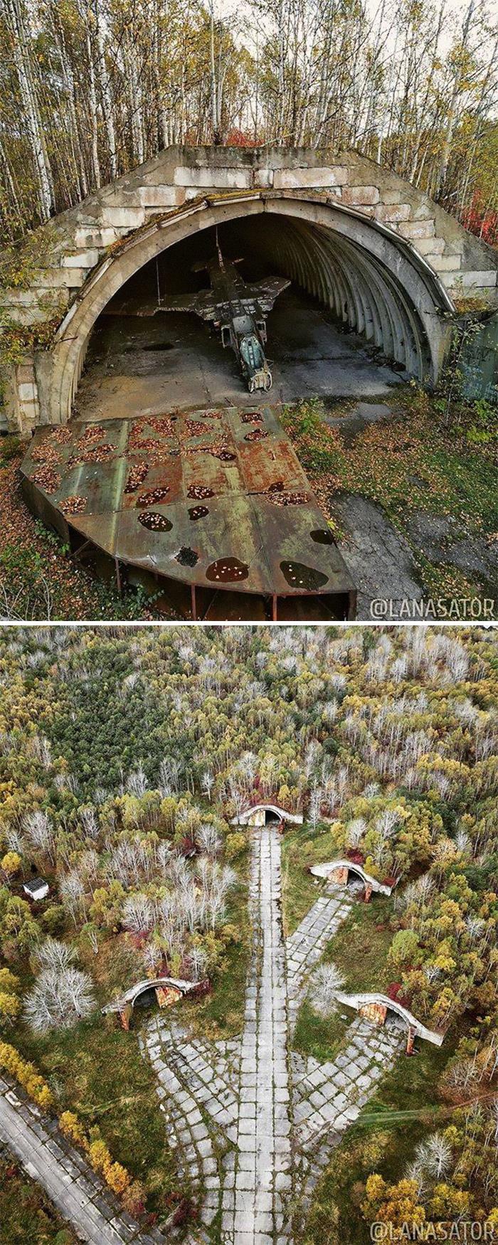
Originally, the airport on that site was built in the early 20th century for the Japanese Imperial Army and was named Keton. It consisted of a 1200 m long concrete runway, gravel taxiways and about 20 equipped aircraft parking lots.
⠀
After the Soviet Union regained control of Sakhalin in 1945, Smirnykh Airport (both the village and airport were renamed in 1946 after the battalion commander who died in the battles for the liberation of the island in that area) became home to the 528th. Fighter Aviation Regiment, which performed the tasks of air defense of Sakhalin Island and its maritime zone.
⠀
In 1966, the airport was rebuilt. A new runway with a length of 2,000 m was built, which was later extended to 2,500 m, as well as reinforced concrete shelters for aircraft with a vent to taxiways.
⠀
In 1994 the combat aircraft regiment was disbanded. The aircraft was moved to Komsomolsk-on-Amur, where a stock base was equipped, but later all of them were removed. But two MiG-23s, one fighter jet and one fighter trainer, were left in hangars at the Smirnykh, where they remain to this day …
Watch this space for more information on that. Stay tuned to Feeta Blog for the latest updates about Architrcture, Lifestyle and Interior Design.
50 Of The Most Breathtaking Forgotten Places
- Published in 700-page, Abandoned Beauties, abandoned buildings, abandoned objects, Architecture, beautiful abandoned places, beautiful pics, bp-exclusive, Design, History, Homepage featured, locations from the past, Nature, photographer Dominic Sberna, Photography, Pics, real-life adventure, travel, urban exploration, urban exploration safety, urbex, urbex photography, vintage
Designers Show How The White House Could Have Looked Different If These 5 Plans Weren’t Rejected
We are all accustomed to the look of the White House, and most of us appreciate its modest neoclassical design. In 1792, the first president of the United States George Washington held a contest for the design of the White House, which an Irishman James Hoban won. But the seat of the world’s most powerful nation might look different. Many architects offered their own versions of the White House, including polyhistorical president Thomas Jefferson, who lived in the same White House nearly 10 years after the contest. But as with all competitions, the winner is long remembered, and the ideas of the losers are almost always forgotten. These rejected plans remained obscure until HouseFresh decided to revive them in digital form and show us what the White House could be like. So look!
Jefferson’s plan for the White House
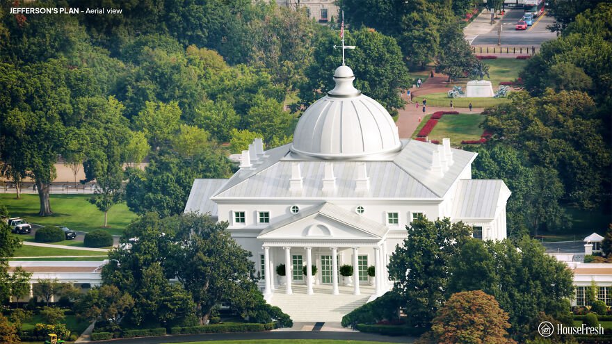
Thomas Jefferson was Secretary of State at the time, and was closely involved with the management of the competition. But he was also an architect and an enthusiast of classical European design. Experts attribute a losing entry with the name “Abraham Faws” to Jefferson. The “real” Faws sent their own, amateur entry, and Jefferson’s anonymous project was later attributed to Faws due to a clerical error.
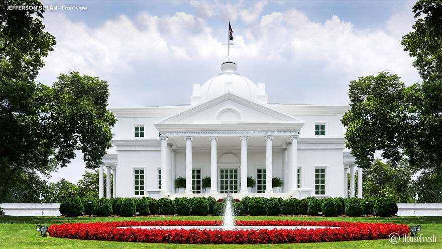
Jefferson would move to the White House as president in 1801, describing the mansion as “large enough for two emperors, one pope and the great lama.” However, he couldn’t help but expand it, adding an arcade and other features to form the White House as it looks now.
Philip Hart’s plan for the White House

The competition to design the White House was part of a broader challenge to suggest an architecture for Washington’s powerful headquarters. Phillip Hart was an amateur architect – more likely a professional builder – who submitted proposals for both the president’s house and the Capitol.

Hart’s White House repeats its vaguely absurd capital sketches. The abbreviated upper floor and faux-Renaissance style lacks the style and complexity that Washington wanted from a building that should, “in terms of size, shape and elegance … look beyond the present.”
Andrew Mayfield’s plan
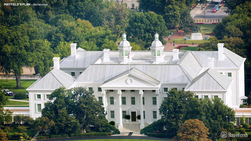
Andrew Mayfield Carshores was a linguist and former British soldier and teacher. Its simple design reflects the pre-revolutionary military architecture, characterized by the colonial period of American buildings Georgian, and English.

Carshore’s steep roofs border a lead footpath, with a rainwater reservoir on the roof of the main block. But the judges lacked a vital spark to his work. According to architectural historian Hugh Howard, Carshore was an ‘amateur gentleman’ and his rejected entrance may be the only building he has ever designed.
Jacob Small’s plan
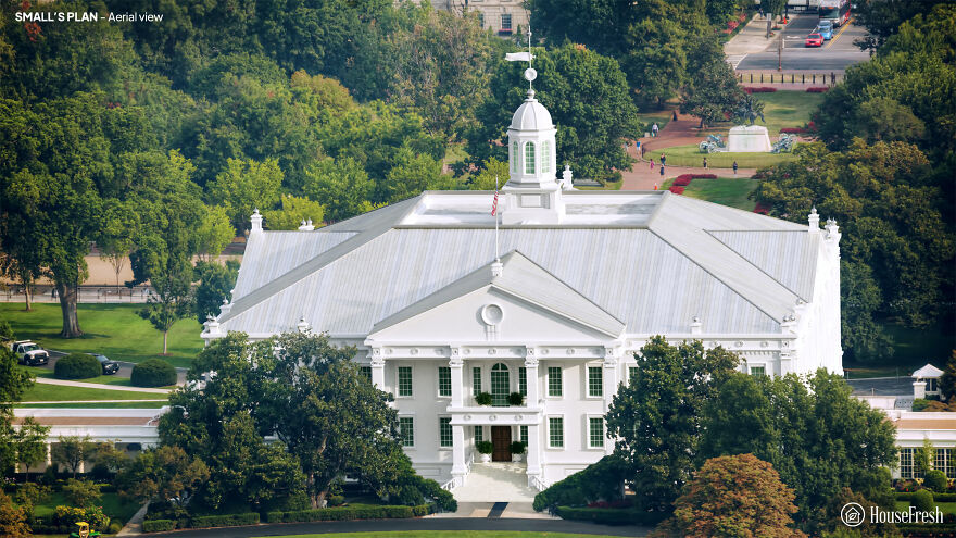
Jacob Small submitted four entries to the 1792 contest. Author Patrick Phillips-Shrock points out that the designs of the Small White House were inspired by two iconic buildings of that time: Mount Vernon, George Washington’s plantation mansion, and the Maryland State House in Annapolis.
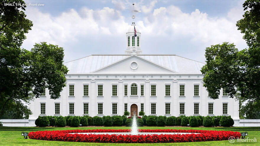
A small one connects the stable and kitchen blocks to the main house with arcades. But its labyrinthine interior of corridors and mysterious stairs would be unpleasant for the president. Interestingly, Little envisioned oval-shaped rooms for the White House – but he failed to integrate them into his broader design in any significant way.
James Diamond’s plan
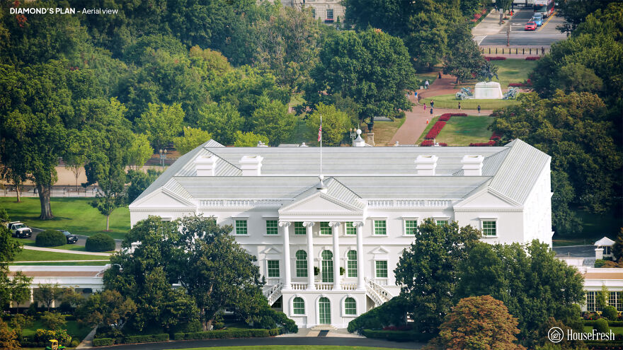
Originally from Ireland, James Diamond was an architect and builder. The White Diamond House stands around a rectangular courtyard. However, Diamond notes in his project that “the Open Court can be changed to a Picture Gallery and Illuminated from the Top, which would have a great Effect.”

Diamond’s design incorporates complex design elements such as Ionic columns and window frames covered with pediments. But the stairs are located awkwardly away from the entrance, and the overall size is supposed to be too ornate for George Washington’s tastes.
This is what it looked like. Aerial view

An actual white house, front view

Also, if you want to read more informative content about construction and real estate, keep following Feeta Blog, the best property blog in Pakistan.
Designers Show How The White House Could Have Looked Different If These 5 Plans Weren’t Rejected
- Published in Architecture, buildings, competition, Different, five, full-page, Homepage featured, house fresh, housefresh, jefferson, rejected designs, rejected ideas, Washington, What if, White House
People In This Online Group Share The 30 Most Unpleasant-Looking Cities In America They’ve Ever Visited
From state armholes to middle fingers of the country – some cities in the United States are known for being the least attractive urban settlements. Of course, beauty is in the eye of the beholder, so not everyone finds NYC or New Orleans pleasurable, and perhaps some negative experiences would influence one’s preferences. But there are certainly a few cities that have no chance of not being called ugly and we hope you don’t live there.

Vega. Although I wouldn’t call it much of a city; it looked more like a set of buildings, neon, and wasted lives all sewn together in the middle of a bumf *** nowhere.
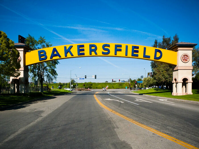
Bakersfield, California – Never in my life have I seen such an acid sight. Oil wells along the eye see that it almost looks heard of motionless ants hunching over the ground.
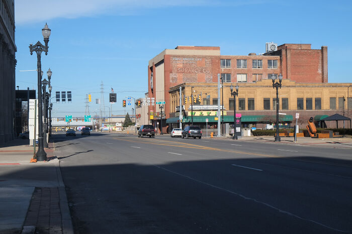
Gary, Indiana. The whole town was gray. No color. I thought I turned color blind until I got to Chicago.
After visiting Aberdeen, Washington, I felt I understood Kurt Cobain better. The natural surroundings are amazingly beautiful, but in the middle of it is this gray, dark, depressing city built on a swamp that feels like it’s sucking the life out of you. If a city could have feelings, this one would be completely hopelessly depressed.
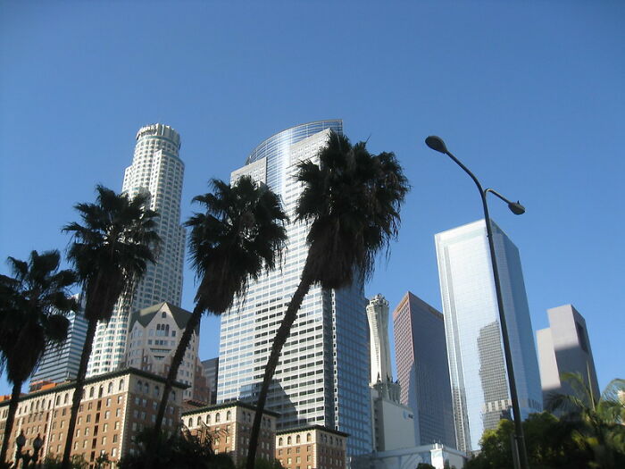
LA. a depressing concrete hole and I’m glad I visited more beautiful cities in the United States. everyone was so angry/sad there.
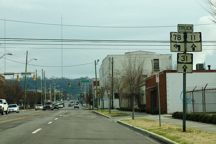
Birmingham, Alabama. Half of the city is just banal brown brick buildings from the 80s, and the other half is basically abandoned ruins of banal brown brick buildings from the 80s.
Johnstown, Pennsylvania … You can almost feel the city dying slowly, worryingly dying …
Albuquerque, NM. Let me paint a picture. In a rental car after 14 hours of driving I drive about halfway into the city. And badly need gasoline. I drive to a pretty empty gas station. Only Some oily cardboard sheets are spread out here and there. Trees almost cover 3 / 4s of the sides of the building itself. I am ready to insert my card into the reader when 6 people start to come out of the cover of the trees. Three guys are sitting or lying on the scattered cardboard and three women/girls are in questionable age somewhere between 16 and 40 years old. My stadium approaches my car and tries to mow and chop and cough to get my attention. I withdraw my card, say “aww s ***, reject. F ***.” Get back in my car and hurry away. In my retrospect I see more people coming out of the trees. They did not look satisfied.
Independence, MO. – methamphetamine capital of the United States. Even the buildings look like they smoke stones.
Gary Indiana is the best reason to ever remove fast limits from highways. So you can get in and out of Gary in the shortest amount of time.
You know a city is bad when the local government brags that there have been less than a dozen murders and less than 20 dead babies this month!
Things are looking for Gary, Indiana!
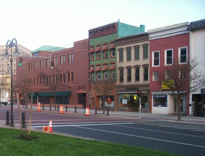
No one mentioned Watertown NY, so I guess I’ll defend it. I grew up in the Watertown area. Since then he has traveled extensively throughout the United States. I’ve seen some really awesome places, but I’ve still seen a place that captures the same kind of energy that Watertown does.
Watertown is unique in that it has the perfect combination of a depressed economy, dilapidated infrastructure and bad weather. It is positively hammered with snow in winter due to its proximity to Lake Ontario and often sets records for snowfall and low temperatures. The winters are brutal and sometimes start as early as October and can last until May. It exists in what was once the bottom of an ancient glacial lake so the low altitude means a constant cloud cover that makes it gray and gloomy during the summer time.
On top of that, almost any art or music is written about the place is about how bad it is. Frank Sinatra’s Watertown album is depressing. Harry Chapin wrote the song “A Better Place To Be” while he was in Watertown. There are also more examples. It’s so depressing that it inspires people to write about how depressed it is.
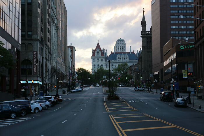
Albany, NY just feels like a really big Greyhound bus station. In summer it gets a little dirty, but in winter it is a muddy gray spike. Whenever I was there, I felt like I needed to escape from it – probably in an old school bus with a razor wire laced around it with sharp broomsticks sticking out of the windows.

Laurel, MS. The attempt to accomplish it on the HGTV show, but it’s shit. Upgraded to the most violent city in Mississippi last year, if I’m not mistaken.
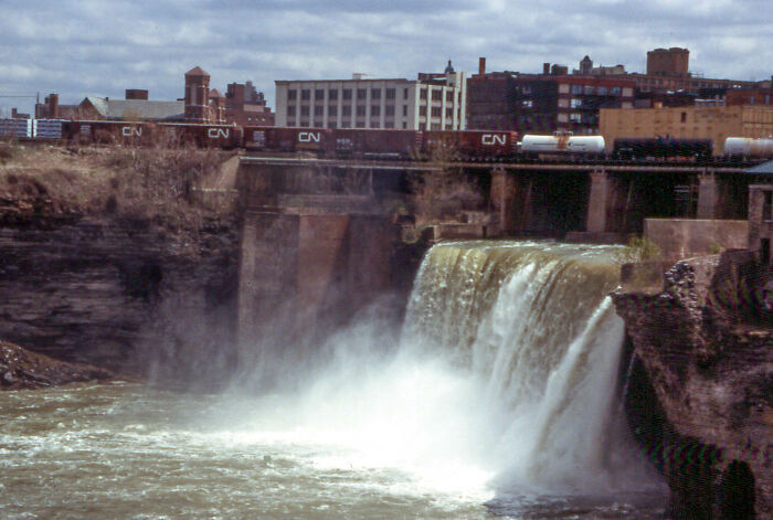
I can’t believe no one mentioned Rochester NY, Anything Beyond Culver Road. The worst parts are near Lyell and Monroe Ave. Place is sh * t hole.

Spokane, WA. It seems to have been in the late ’80s, when Seattle became a major destination with no vigor or anything appealing about the city in general. Just sets of residential areas with a few luxury eateries to keep it just outside the last place.
Watch this space for more information on that. Stay tuned to Feeta Blog for the latest updates about Architrcture, Lifestyle and Interior Design.
People In This Online Group Share The 30 Most Unpleasant-Looking Cities In America They’ve Ever Visited
- Published in 700-page, albuquerque, Architecture, Bakersfield, CA, california, El Paso, Homepage featured, Indiana, Johnstown, NM, Ohio, pennsylvania, reddit, Social Issues, Texas, travel, ugly city, USA
72 Weirdest Building Designs
If you ever feel that some architects live in their own fantasy land, you are not the only one. The buildings they create can range from majestic to magical, and they are sure to captivate your buttresses, stoic columns, angelic balconies and formidable facades. However, you may sometimes get the idea that some of these art innovators haven’t fully considered some things – like the fact that people actually have to live and work in the built-up buildings.
We have some dreamy and confusing buildings to show you today, dear pandas, so take off your opera glasses, get yourself some popcorn, and let’s go through the cream of the crop of the ‘Bizarre Buildings’ subreddit. Take a look at some of the most beautiful buildings people may have a hard time living in, vote for the ones you enjoyed the most, and let us know which one you would choose as your home in the comments section.
I chatted nicely about architecture with Dr. June Commissioner of Ryerson University. Dr. Komisar, who is a specialist in architectural design, the history and theory of architecture, and design for urban agriculture, told Bored Panda for professionals to seek inspiration from the “wise” ancient Roman writer Vitruvius. “What he said about balancing goods (suitability of the building too needs), firmness (structural integrity) and joy (the aesthetics of the building and its relationship to site and context) still holds true.”
# 1 This Building In Guizhou, China
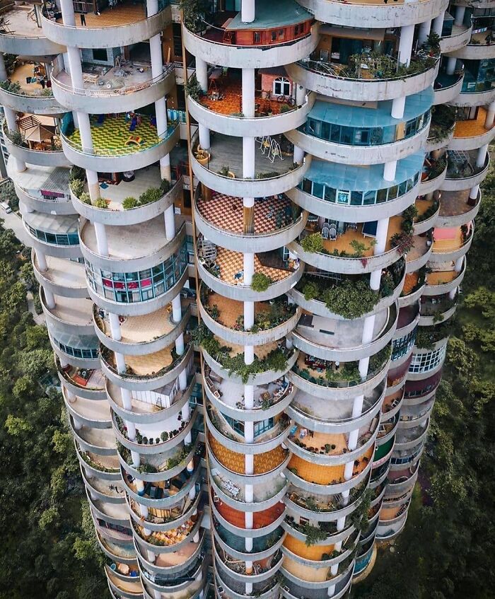
# 2 The Interlace – Singapore
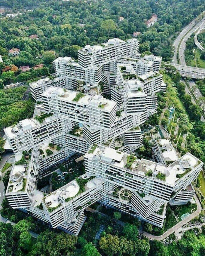
# 3 Cat Shaped Kindergarten, Germany
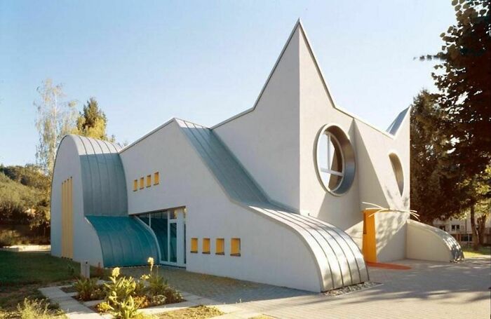
Dr. Komisar has shown Bored Panda that no matter how good an architect is, they will not be able to be prepared for all possible problems and contingencies. “But understanding the local conditions and evaluating other buildings using the same construction techniques and materials can help avoid problems,” she said.
I was also interested to find out how architects can innovate and create originality when sometimes it seems like every idea has already been made. According to Dr. Komisar, the changes do not have to be something profound. Start small.
# 4 The Evolution Of This Building Can Be Seen In Its Masonry
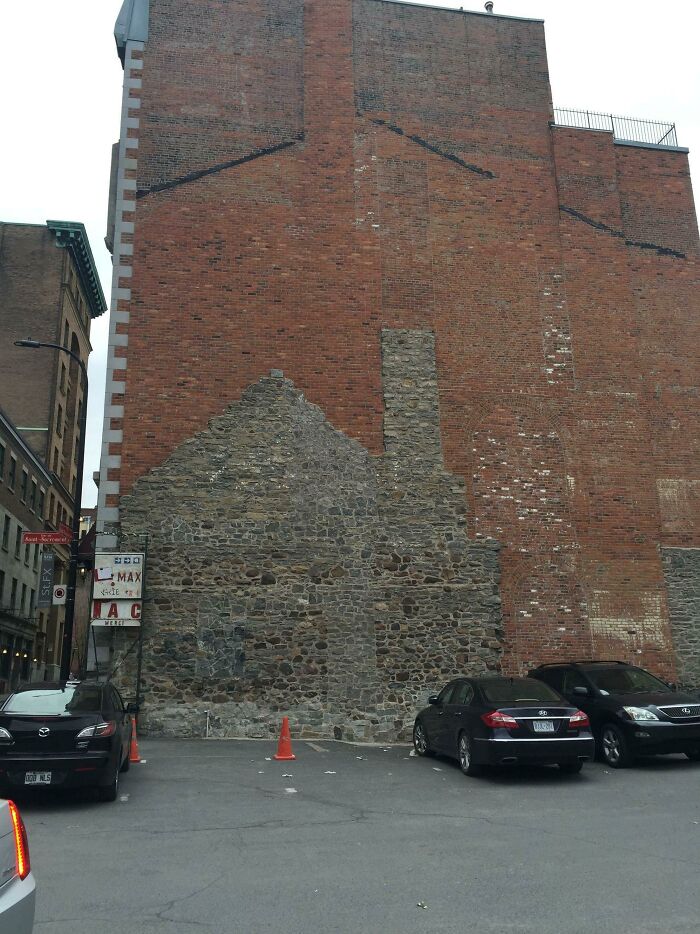
# 5 Pavilion Of Enlightenment, Thailand
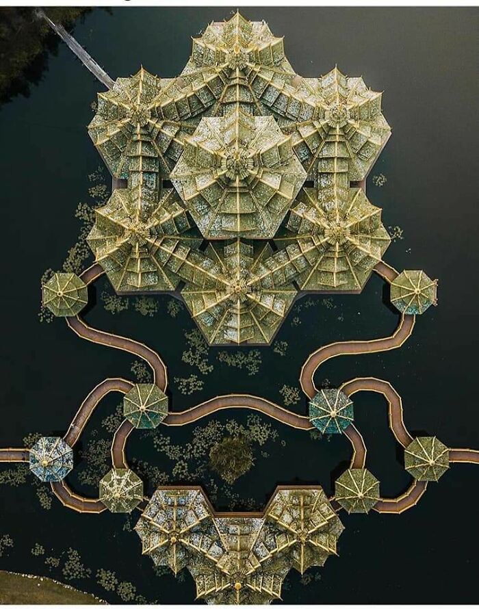
# 6 The National Carpet Museum In Baku, Azerbaijan
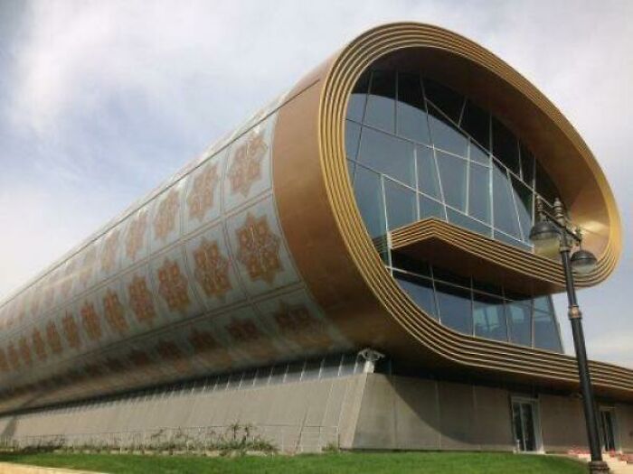
“Innovation does not have to be radical, but can be an incremental change that will benefit users and society at large. Today we have a huge opportunity to build sustainable buildings that approach or achieve ‘net zero energy cost. Using local and/or sustainable materials, designing for passive and/or active solar and wind energy, designed for very low energy, and renovating and adapting existing buildings, we can help mitigate climate change. ”
Dr. Komisar continued: “Dealing with this environmental crisis is not only an issue we need to address, but it is also a tremendous opportunity for project innovation. Addressing these concerns will undoubtedly introduce a variety of creative solutions.”
# 7 The Department of Fisheries In Hyderabad, India

# 8 Tower “Arbre Blanc” by Sou Fujimoto in Montpellier, France
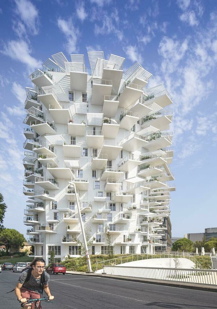
# 9 Giant 16th Century “Colossal” Sculpture In Florence, Italy Has All Rooms Hidden Inside
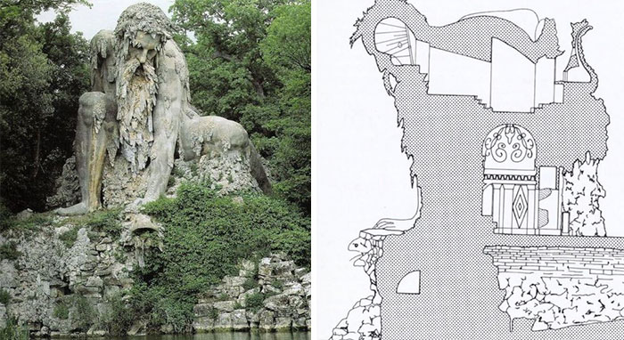
Architecture is a hard crack. On the one hand, it is a very functional and rational field of action that literally projects the spaces in which we live, work and sleep. On the other hand, it is an artistic expression form on the same level of importance as function. After all, if you intend to build something (anything), why not make it amazing?
So of course it’s up to the architect to solve an engineer’s constant riddle: how do you innovate and create something iconic, while also making sure your building doesn’t cause a stir and denounce it in the news?
# 10 Turtle Building
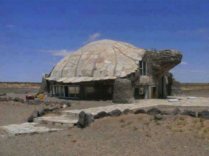
# 11 600-year-old Clock Located In Prague Is The World’s Oldest Astrological Clock Still Working!
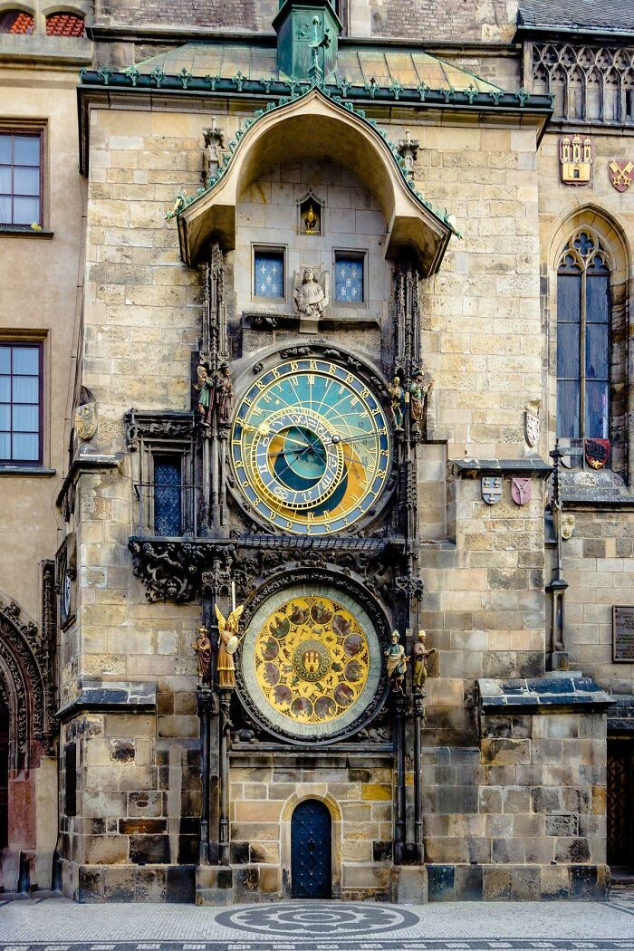
# 12 Original 1930s Shell Gas Station
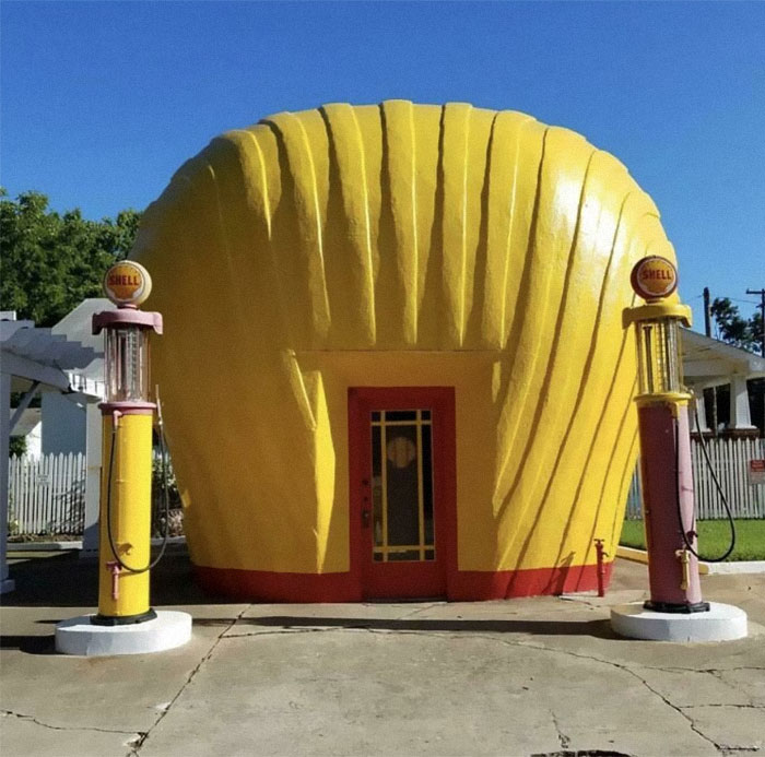
No 99 Designs draw attention that buildings should be pioneering, showy, and come out of their surroundings. And that means bending the rules and capturing (at least some) conventions.
Paradoxically, however, the architect is also very aware of the surroundings of the building, using them as a complementary background. You can still have your modern masterpiece if you pay homage to the more traditional surroundings of the building with the details, colors, etc.
And it is in relation to the surroundings that your choice of materials and the way you shape your project comes in – they are deeply expressive decisions that you should consider as soon as you start outlining your ideas for your project.
And always always remember that even though you are creating a work of art, it must be practical. Otherwise, what is meant by architecture, when sculpture would give you the full freedom to express yourself?
# 13 Wonderful Building In Chile
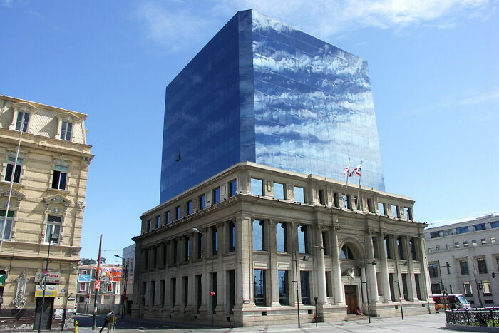
# 14 Austria
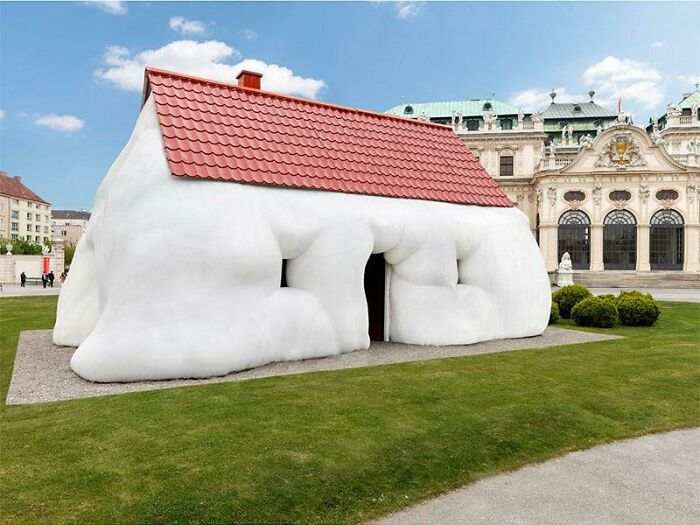
# 15 When You Are An Architect Whose Brother-in-Law Owns A Struggling Window Shop
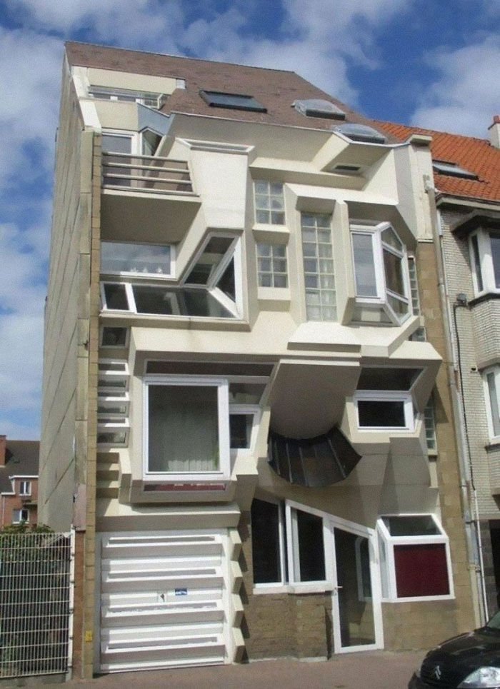
The community r / bizarre buildings celebrated its 5th birthday just a few months ago, in March, and it’s strong. Currently, the subreddit has over 131k members and we can see that number growing in the future.
Be sure to visit the community if you enjoyed the photos on this list. Come in for a quick ‘hello, how are you?’ or consider also posting a strange-looking yet utterly amazing building.
“If it’s a bizarre building, it belongs here. No, not pictures of buildings with a bizarre Christmas [look]. We want unique Unicope buildings! “The moderators of ‘Bizarre Buildings’ shared what their online group is all about.
You heard it here, folks – your regular holiday decor bizarre just won’t cut it. You have to go for bizarre. Start the weirdness until eleven, so even Alice thinks she’s still in Wonderland. Just remember that when you innovate, you also have the ability to make a good climate too!
# 16 Walden 7 in Barcelona, Spain
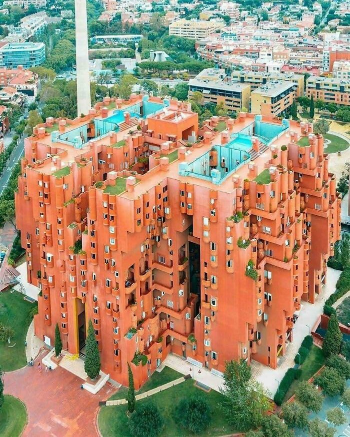
# 17 When You Have the Money But Not the Earth (Batié, Cameroon)
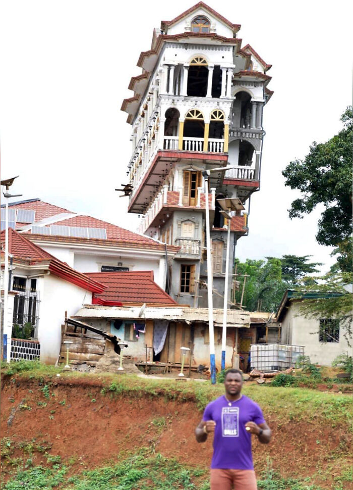
# 18 Treehouse (Demolished), Okinawa
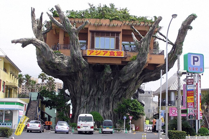
# 19 Content House In The Desert
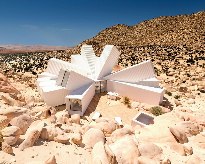
# 20 The Sheep Building (Tirau, Waikato, New Zealand)

# 21 Japanese Moka Railway Station In The Shape Of A Locomotive
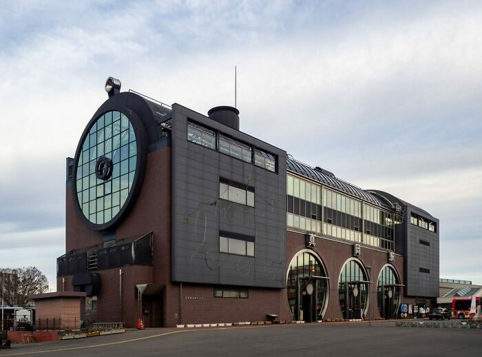
# 22 Tianzi Hotel, China

# 23 The Stockholm Telephone Tower With About 5,500 Telephone Lines, 1890
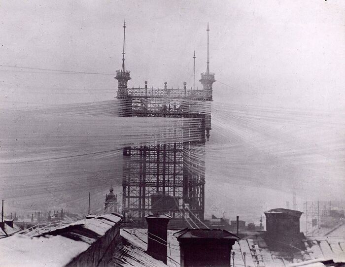
# 24 Unique Residence In The Netherlands
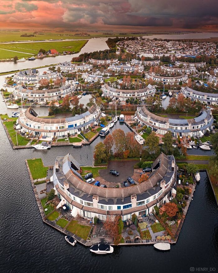
# 25 When Your Growing Family Needs An Upgrade But You Love That Comfortable Cottage
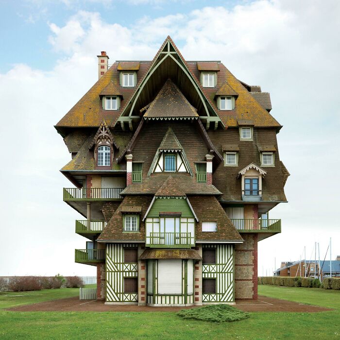
# 26 Here Is The Proposed Crescent Tower For Dubai
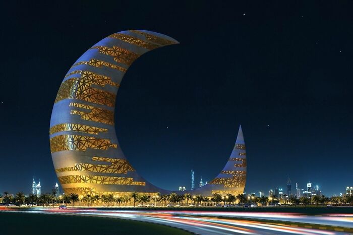
# 27 “My Home Is Off the Highway”
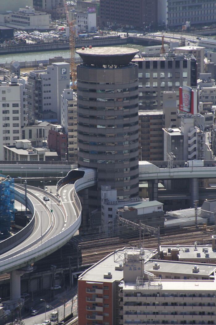
# 28 This Is What Happens When The Owner Of Half Of City Hall Refuses To Sell
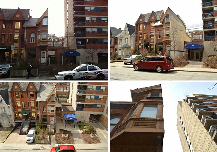
# 29 Technical University University Building Sydney (UTS)
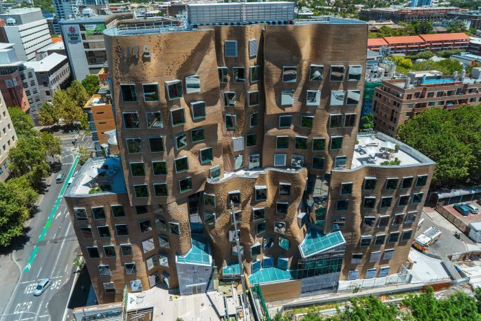
# 30 Abandoned Potato Sorting Station In Ukraine
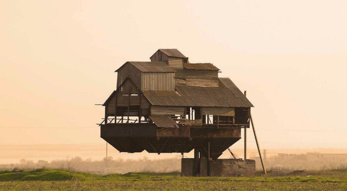
# 31 This Single Pixelated Facade On The Mahanakhon Tower In Bangkok, Thailand

# 32 Living Like a Caverner With Modern Pleasures
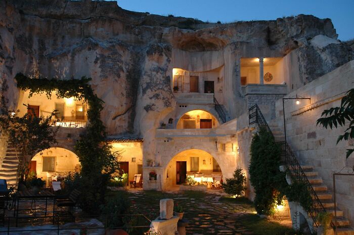
# 33 This Little House
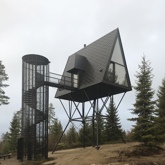
# 34 Chestnut Tower Sun By Fundamental Architects
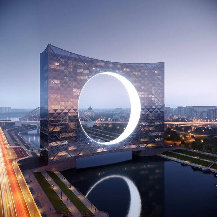
# 35 Bizarre Chicken
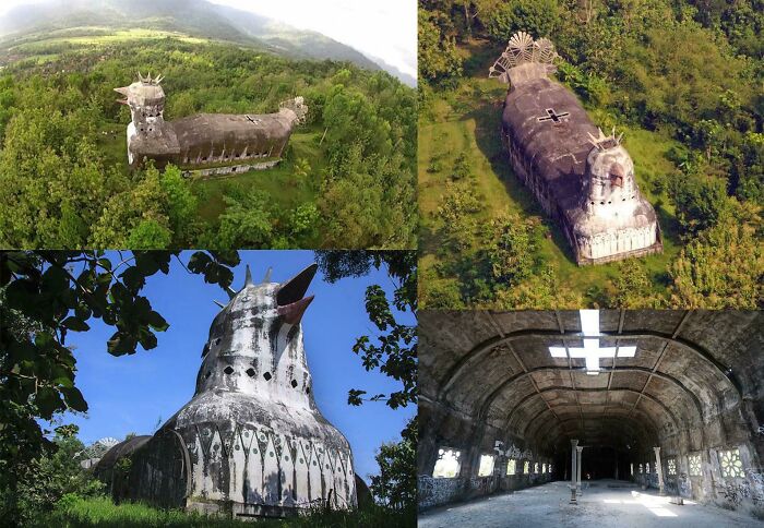
# 36 The Largest Hotel In The World, With A Scanning 10,000 Rooms Currently Under Construction In Saudi Arabia
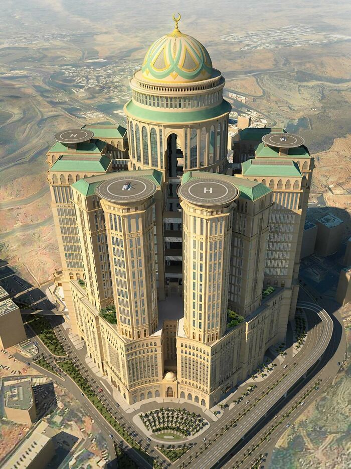
# 37 The New Louis Vuitton Store In Tokyo
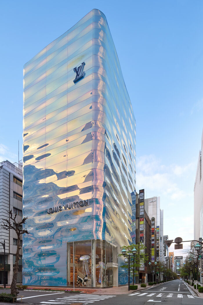
# 38 “Local Man In Altus, Eight Arrested After Shooting From Trebuchet To A Group Of Girl Scouts. His wife was quoted as saying ‘I wish I hadn’t yielded to him begging that devilish castle tower when we built the house, he’s mentally fixed in the Middle Ages since 1981 ‘”
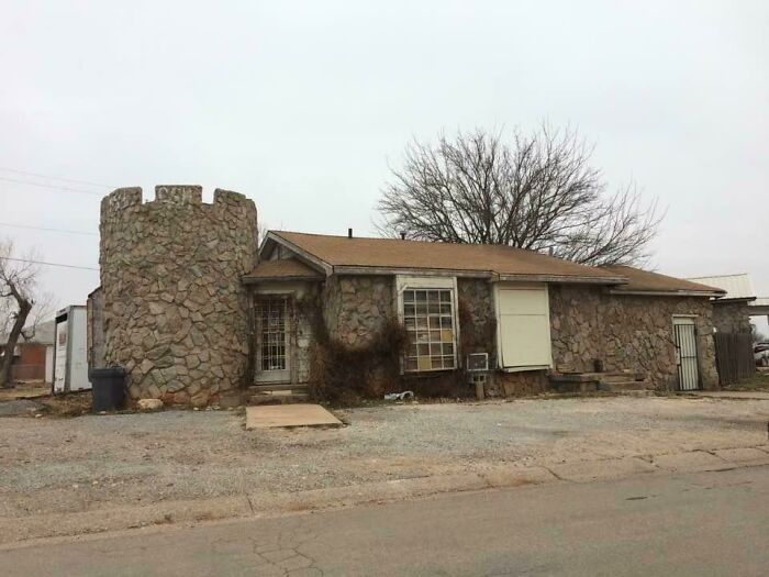
# 39 Plot # 1282, Residential House In Beirut Designed By Bernard Khoury
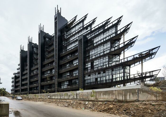
# 40 Inverted Pyramid House In Spain
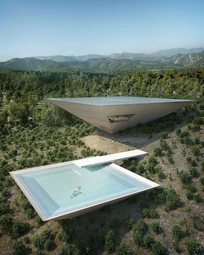
# 41 Shop Front In Kyoto

# 42 The Frame In Dubai – Lift Up Along, Walk Across Glass Floor, Lift Down
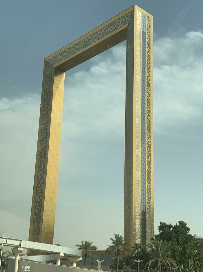
# 43 Shenzhen International Airport Looks like a Giant Airplane

# 44 Spiral House, Ramat Gan
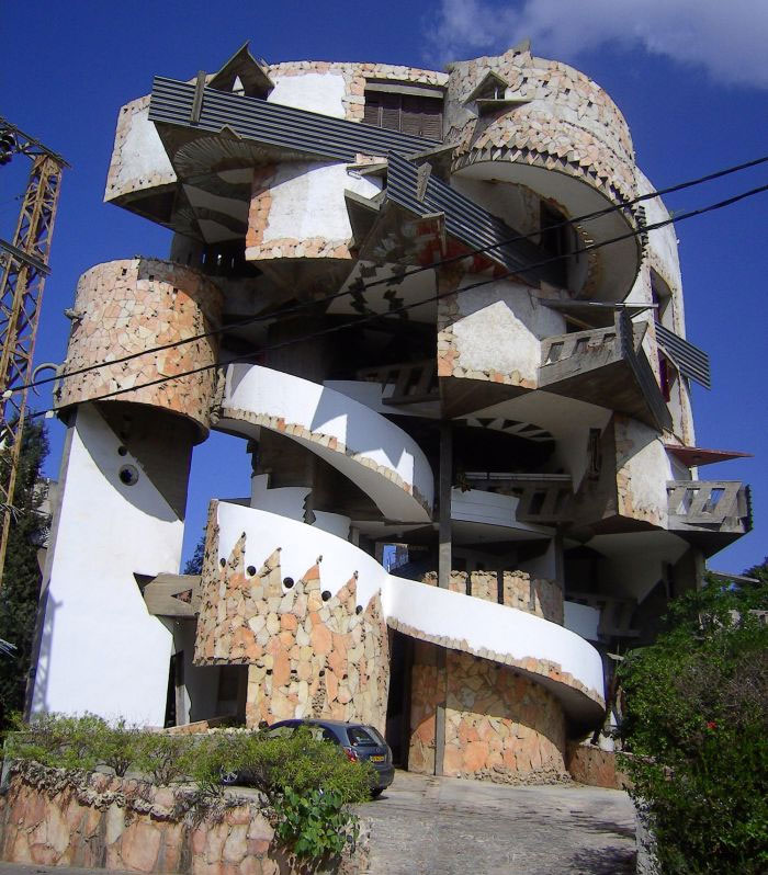
# 45 Spanish Embassy In Brazil
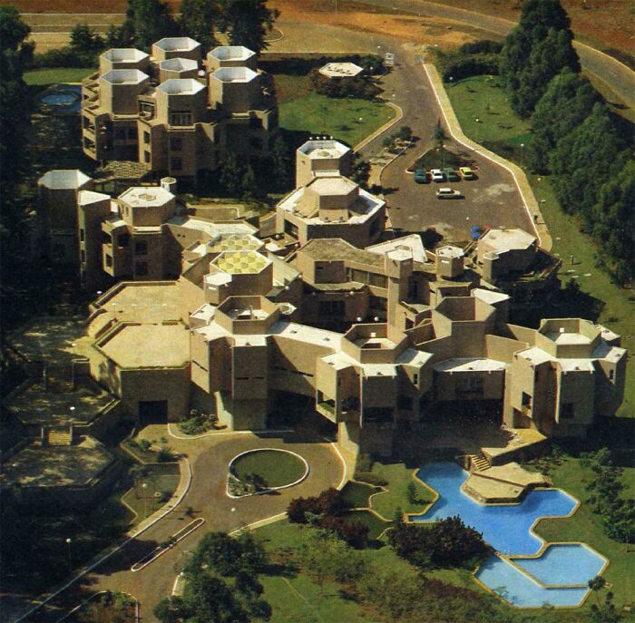
# 46 700 Sq Ft House In My ‘Hood Soldus Sold For $ 1 Million
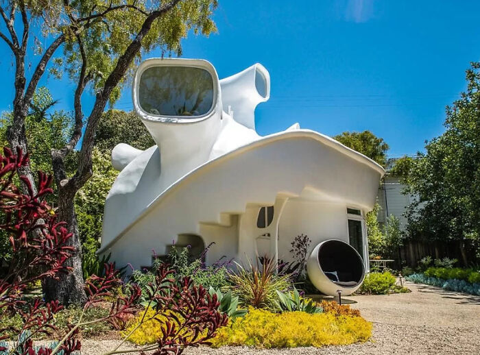
# 47 Modernist Home In Venice, California
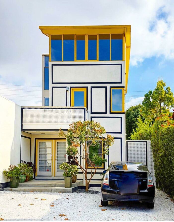
# 48 Saemoonan Church In Seoul, Korea
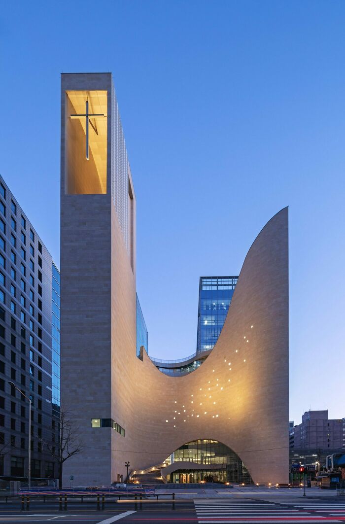
# 49 Seafood Restaurant? An Institute for Marine Biology? Or Headquarters For Crab People Hiding In A Flat View?
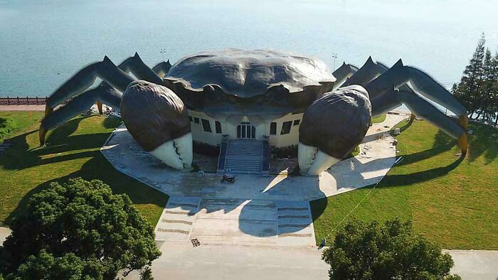
# 50 Hyatt Regency San Francisco De John Portman (1974)
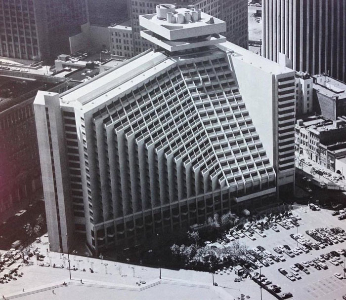
# 51 People Living Near Helicoid Street In Chongqing
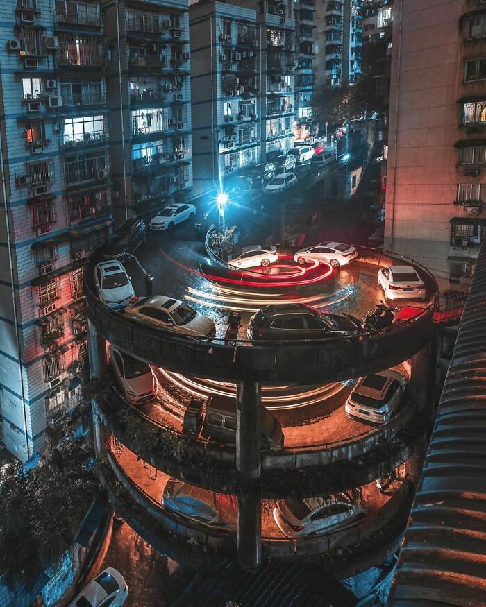
# 52 The Peachoid, A 135 Feet (41 M) High Water Tower In Gaffney, South Carolina

# 53 I Don’t Know About You, But I For One Always Wanted To Live In A Black, Characteristic Monolith
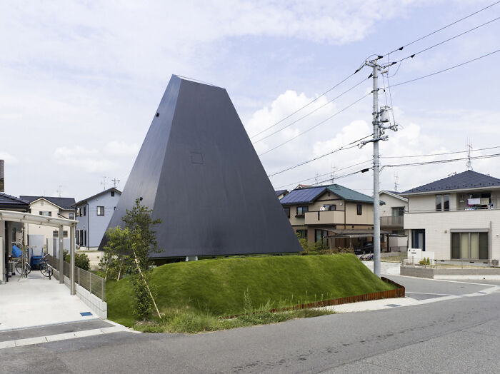
# 54 House in Katayama, Japan
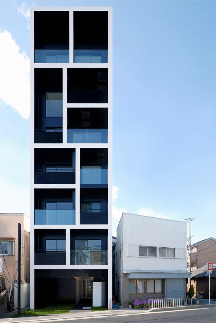
# 55 This House In Sochi, Russia
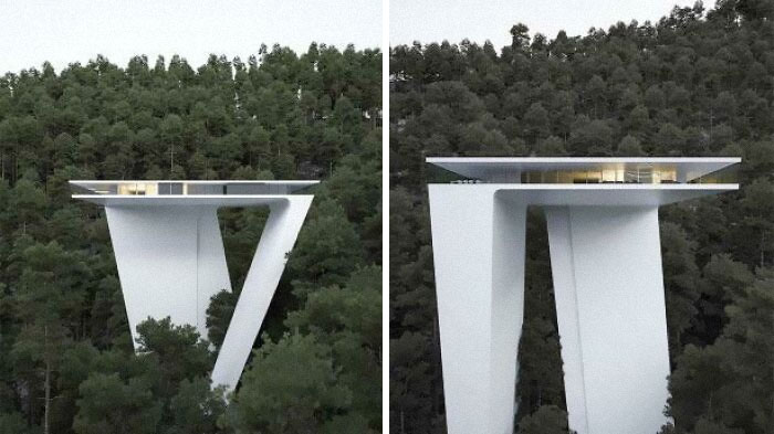
# 56 Residential House In Egypt
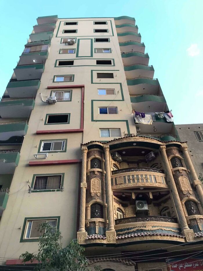
# 57 Cleveland Clinic- Lou Ruvo Center For Brain Health In Las Vegas, Nevada
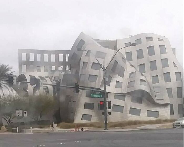
# 58 Rare Vision Of Two Wild Buildings Interacting
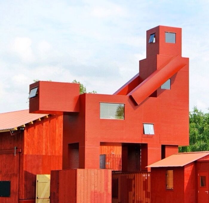
# 59 Is A Huge Open Market In The Netherlands With Housing Inside
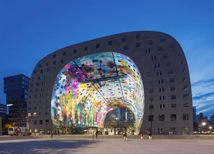
# 60 Often Called “The Great Wall Of Russia” Or “The Lying Skyscraper”, This Is One Of The Longest Buildings In The World
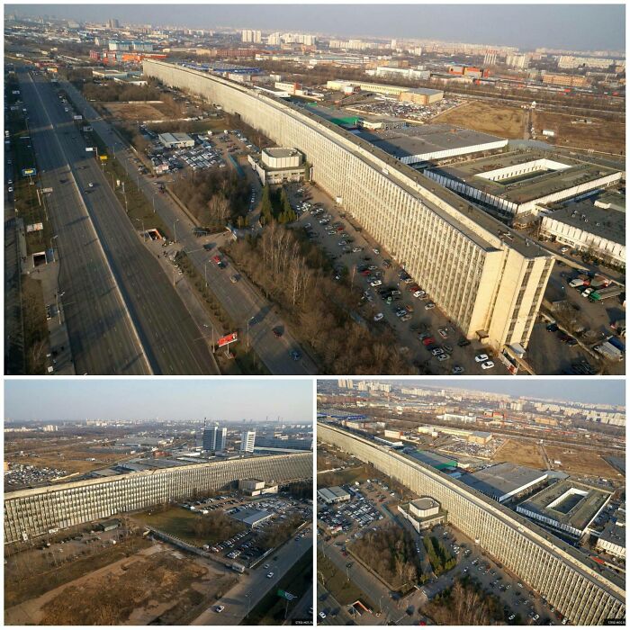
# 61 Side House
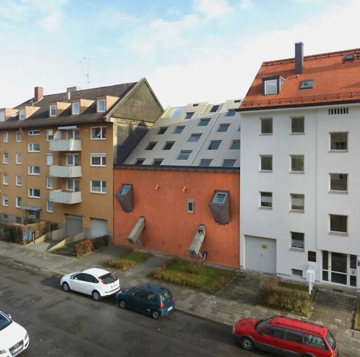
# 62 Basketball / Soccer Patio On The Roof Of Some Houses Next To Old City Walls In Dubrovnik
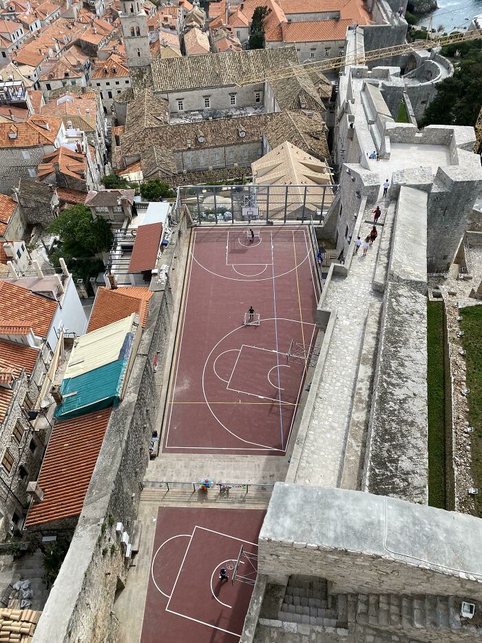
# 63 Grand Castle Apartments, Grand Rapids, Michigan
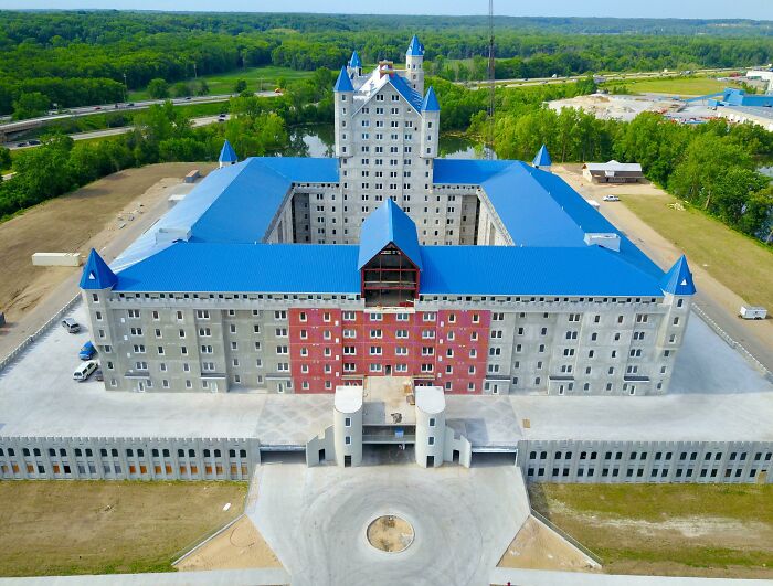
# 64 The Tallest Leisure Building In The World, The North Korean Hotel Ryugyong
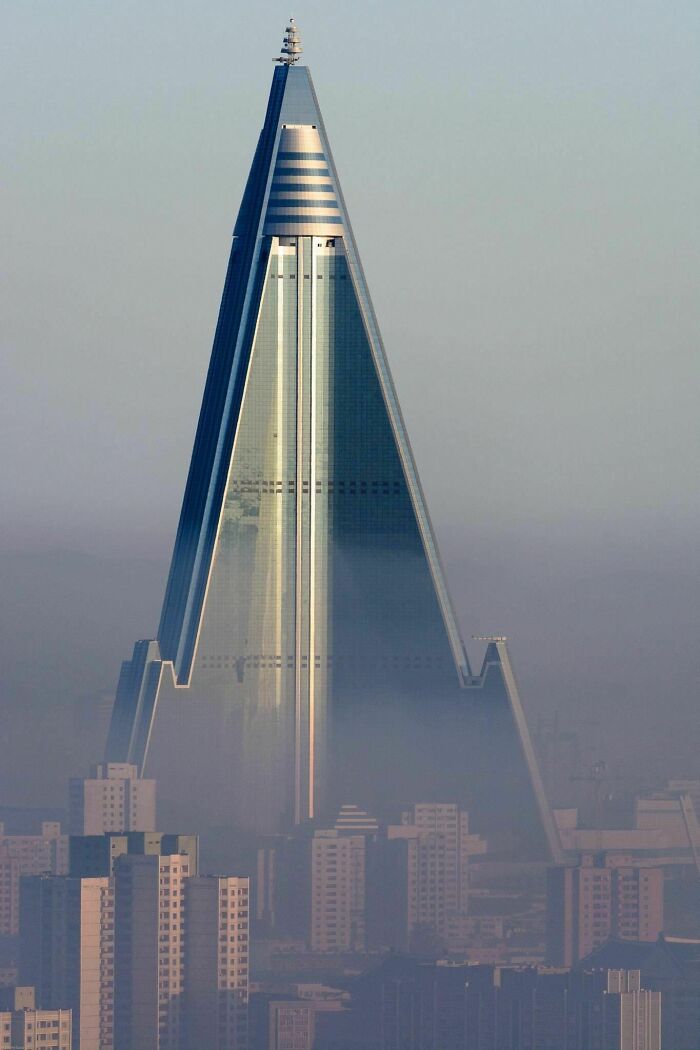
# 65 House From The Beach View, Laguna Beach
# 66 House On Pole, Japan
# 67 Postmodern Garbage In Kahramanmaraş, Turkey
# 68 Ie In Chongqing
# 69 St.Joseph’s Hospital, Tacoma, United States
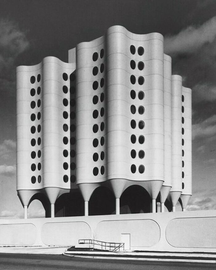
# 70 Unique Window Design On This Building
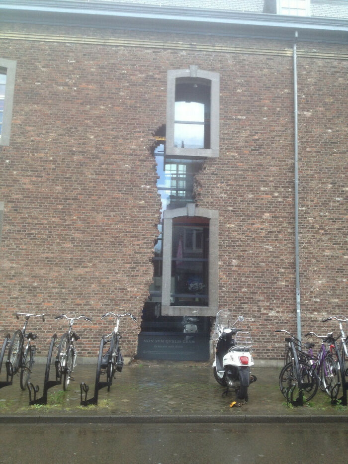
# 71 Basf Tower In Berlin, Germany
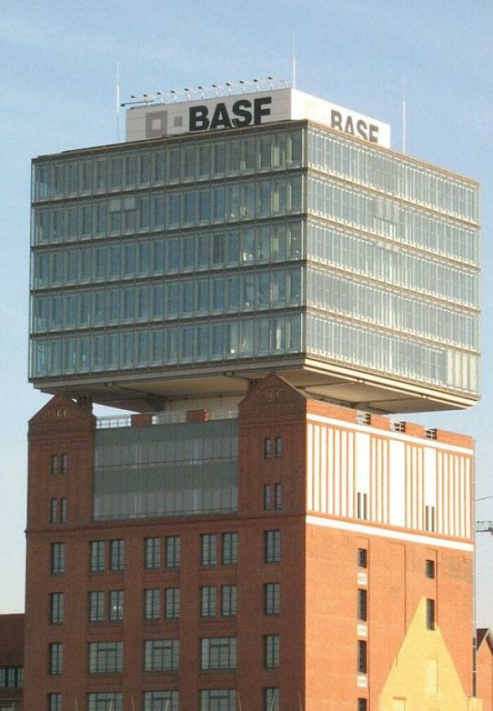
# 72 The Interlace, Singapore
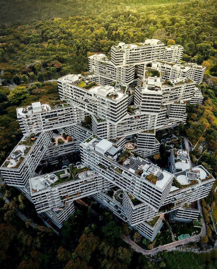
For more information on the real estate sector of the country, keep reading Feeta Blog.
72 Weirdest Building Designs
Homeless Man Gets To Live In A 3D-Printed Tiny Home
70-year-old Tim Shea has progressed a lot since his time as a homeless heroin addict. In what looks like a 180-life transformation, in September, he moved to the outskirts of Austin to live in a 400-square-foot home built by a 3D printer from the company’s Icon.
“I could never have imagined where I came from that I would ever have this beautiful apartment,” Tim told the press recently and called his new home a “miracle”. Before living to live in the Community First! A village, a 51-acre site that houses 500 homes for the chronically homeless, Tim lived in a camper van.
Icon 3D homes printed with a Vulcan II printer have one bedroom, one bathroom, a full kitchen, a living room and a large porch, and give hope to many people with no place to call home. The company’s CEO Jason Ballard said their mission was to “make decent housing accessible to everyone, everywhere” and with Tim being the first proud resident of the 3D house, the future looks brighter than ever.
Formerly homeless man 70-year-old Tim Shea transformed his life when he became the first resident of a 3D printed house in a community in Austin, Texas, in September
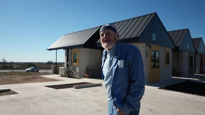
Prior to this new permanent 3D home, Tim lived in the community in an RV. Previously, he struggled with drug addiction and like many seniors in the United States, was unable to maintain affordable housing.
Tim’s 400-square-foot 3D house was built with a Vulcan II 3D printer by the company ICON, which specializes in advanced construction technologies.
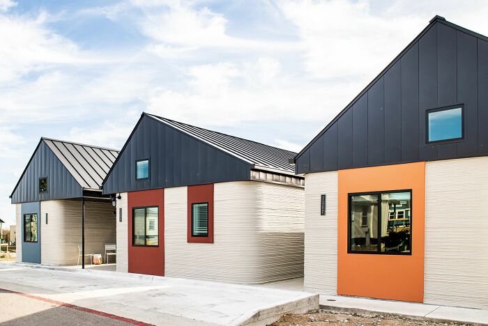
In an interview with NY Poster, Tim said his previous lifestyle made him hide from the world. “I think from my personal experience of my previous way of life that I developed a shell. I didn’t feel safe, and whenever I had the chance, I would hide or isolate myself. I never really wanted to interact with people. “
Tim is said to be the first occupant of one of the 3D printed house
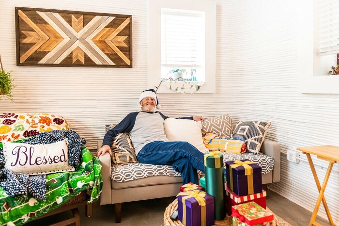
But after moving into her new home in September, at the Community First! In the village, he had his life completely changed. “Everything I do is quite the opposite, and I have a lot of activities every day with others,” he said.
The house is located at Community First! A village is known for its high-level vision of homeless housing
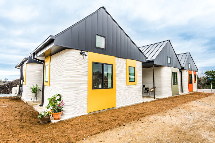
At first, Tim couldn’t believe he would be the first person living in a 3D printed house like this. “When I found out I was going to be the first person in the United States to move to a 3D-printed home, I thought it was pretty awesome. The people I used to run away from, I run. If you’ve been on both sides of the fence, you know some people just need a little bit of encouragement and support, ”he said. NY Poster.
After moving to a beautiful 3D house, Tim’s life changed drastically
Tim’s 3D house is located in the Community First! A village that helped homeless people with shelter, community and support. Alan Graham, a real estate developer and founder of the village as well as the project called Mobile Phones & Fish, is helping others find a place to call home over the past two decades.
ICON has so far developed six different 3D homes, all with different layouts
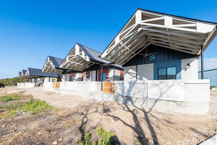
According to Graham, “Home is essentially a place of connection and of life-giving and basic relationships.” His goal is to “make everyone feel at home, ultimately inviting those who live along the edge of society, into your heart.”
Tim says “it’s just a miracle to me that I live there in such a beautiful house”

Tim’s 3D printed home isn’t the only one in town. ICON has built 6 3D homes, all with different layouts for different needs to shelter the homeless on the site. Tim chose an open floor layout because he has arthritis.
His 3D house has one bedroom, one bathroom, full kitchen, living room and porch
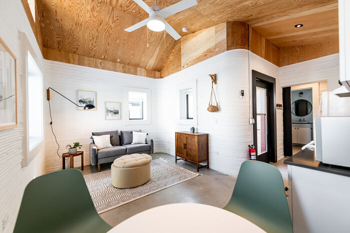
The project was made possible by an ongoing partnership between ICON, the construction technology company, and Austin’s nonprofit Mobile Loaves & Fishes.
Alan Graham, the founder and CEO of Mobile Loaves & Fishes, commented on the project: “Vulnerable populations like the homeless are never among the first to access new things, but now here in Austin, Texas, they are among the first in line, who will live in some of the most unique homes ever built – and we think that’s a beautiful thing. “
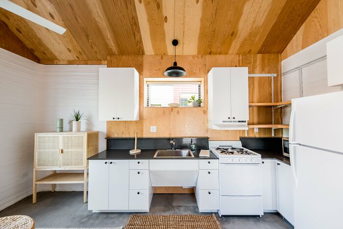
To find out more about this amazing project, Bored Panda contacted Brooke Bauguess, vice president of Communications and Public Affairs at ICON. ICON is an Austin-based construction technology company using 3D robotics, programs and advanced materials to change the paradigm of home building.
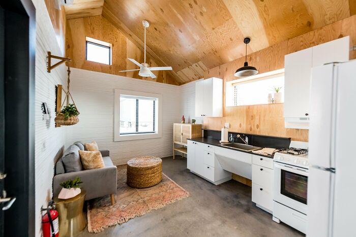
ICON believes that “3D printing will be the preferred method of homebuilding in the future and tends to be a pioneer of the technology that has the potential to end homelessness,” Brooke told us.
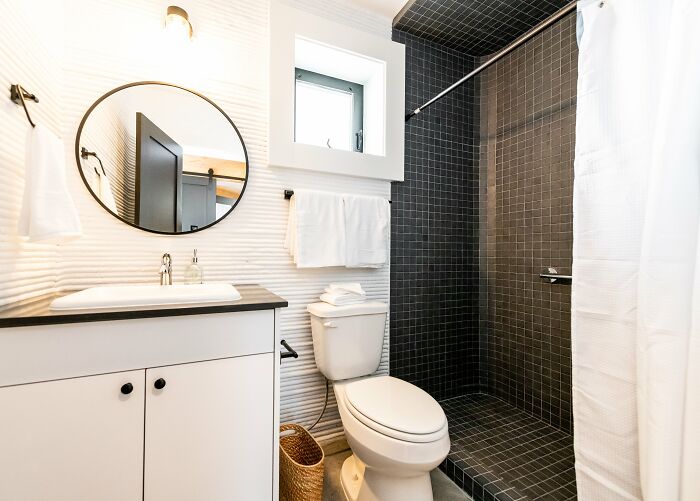
“The United States needs 3.3 million homes a year and is currently building 1.3 million. 3D printing construction can help deliver robust, sustainable, decent housing across the United States and the world. “
Tim, who overcame drug addiction, chose an open floor plan because of arthritis
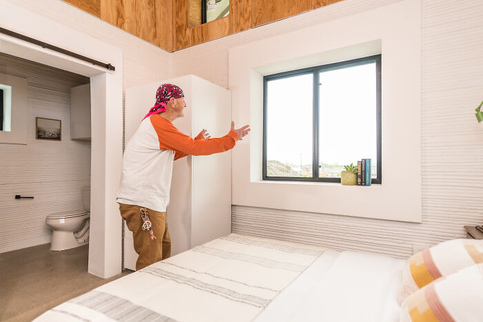
ICON has delivered two dozen 3D-printed homes across Mexico and the United States, including social housing projects with nonprofit organizations, major housing developments with developers and more.
The ICON printer is controlled by a tablet remotely and takes a crew of four to six people to build a house
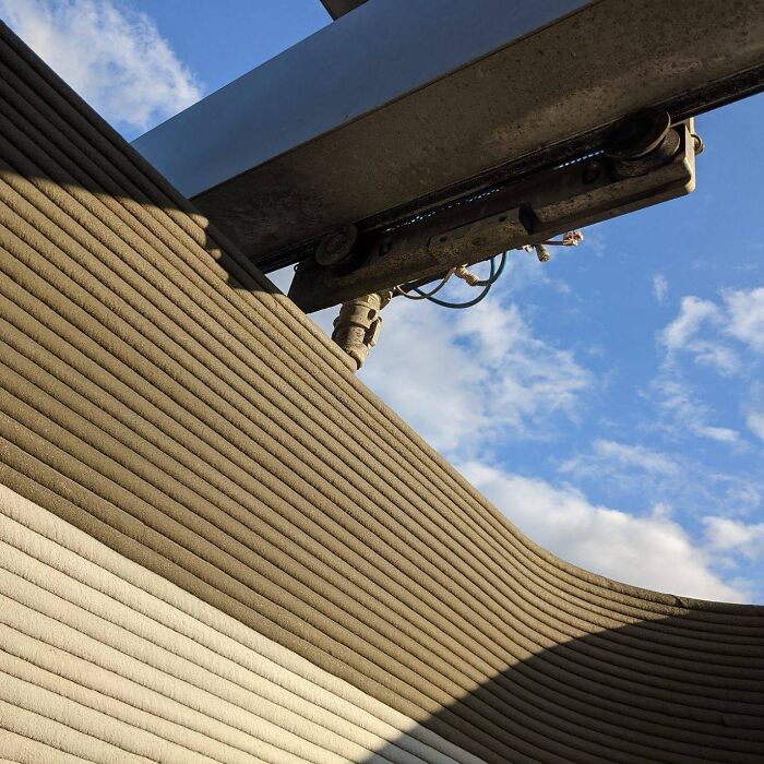
“We appreciate the opportunity to see our technology deliver homes for those in need in Mexico and serve those who have experienced homelessness in central Texas,” Brooke said and continued, “Tim Shea in particular is the first person to ever live in an ICON 3D printed home. We worked closely to design and select furniture in this project in particular and are thrilled to see him thrive in his new home. “
A special concrete formula was used for the project and applied by a 3D printer, which is basically just a concrete nozzle at the end of a giant robot arm.
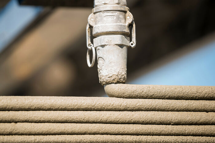
“ICON at its heart is an innovation for a better future,” said Jason Ballard, co-founder and CEO of ICON. We will have to risk some if we want a better world for ourselves, and the team at Mobile Loaves & Fishes shares a similar vision in their efforts to empower the community around them in a lifestyle of service to the homeless. We need a radical rethinking of the way we approach solving troubling problems in our society such as homelessness. Ultimately, this is about people and about human dignity. “
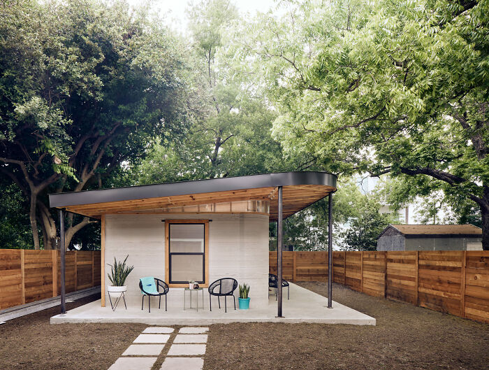
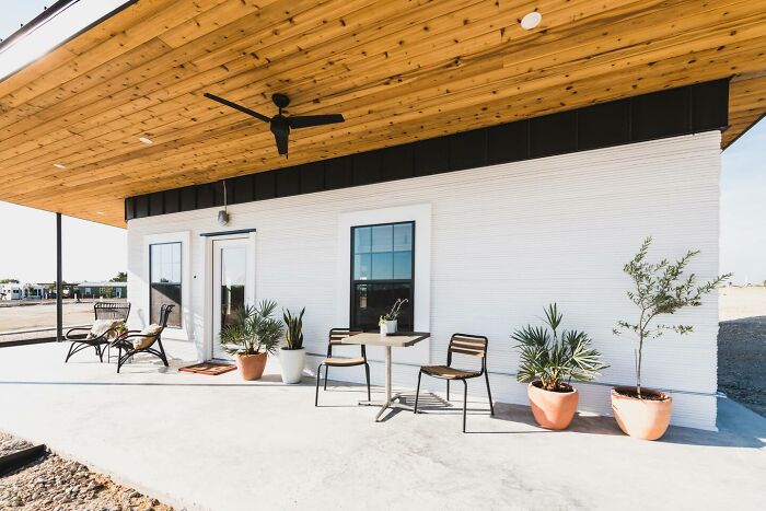
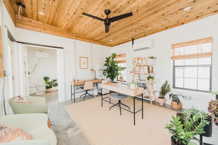
Many people praised the project and its ability to help those in need.
Watch this space for more information on that. Stay tuned to Feeta Blog for the latest updates about Architrcture, Lifestyle and Interior Design.
Homeless Man Gets To Live In A 3D-Printed Tiny Home
- Published in 3d printed houses, 3d printers, 700-page, Architecture, Austin, Community First Village for the homeless, Homepage featured, homes constructed with 3D printer, icon, Icon's 3D Printer, People, Technology, Texas, the first homeless man to live in a 3D printed house, the future of housing, Tim Shea
Lithuania And Poland Built A ‘Portal’ Connecting Two Of Their Cities And People Are Loving It
Society is evolving and we have gone a long way from slavery and women not being able to vote. But we still have room for improvement: stop discriminating against different people, accepting people who think, dress, speak differently than we do.
Separation between people is a problem as old as the world, but it needs modern solutions. The internet is now everywhere in a “portal” open in two European cities, Vilnius and Lublin, which was built just to shorten the distance between us and them. Not only is the meaning behind this project amazing, but it also looks so cool and futuristic.
The city of Vilnius in Lithuania and the city of Lublin in Poland are now linked by a portal in which they can see each other.
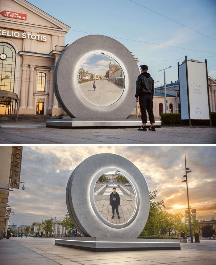
The portal has a circular shape that symbolizes the wheel of time, and in science fiction, it represents space and time that link back to the circle as a portal. This virtual bridge between the capital of Lithuania, Vilnius, and one of the oldest Polish cities, Lublin, is the first of its kind. In Vilnius, the portal can be found next to Vilnius railway station. Meanwhile, in Lublin, he resides on Plac Litewski.
These 2 cities have a historical connection, as the Lublin Union was signed on 1 July 1569 between Poland and Lithuania in that same city. This union created a single state, the Polish-Lithuanian Commonwealth, one of the largest countries in Europe at the time. Bored Panda contacted the PORTAL team and asked if this was planned. Apparently, it was an unexpected coincidence. They contacted various cities abroad that would collaborate for this project and the circumstances lead to that city being Lublin. It is truly symbolic that these two cities are spreading the message behind the project, which must be unified and not separated.
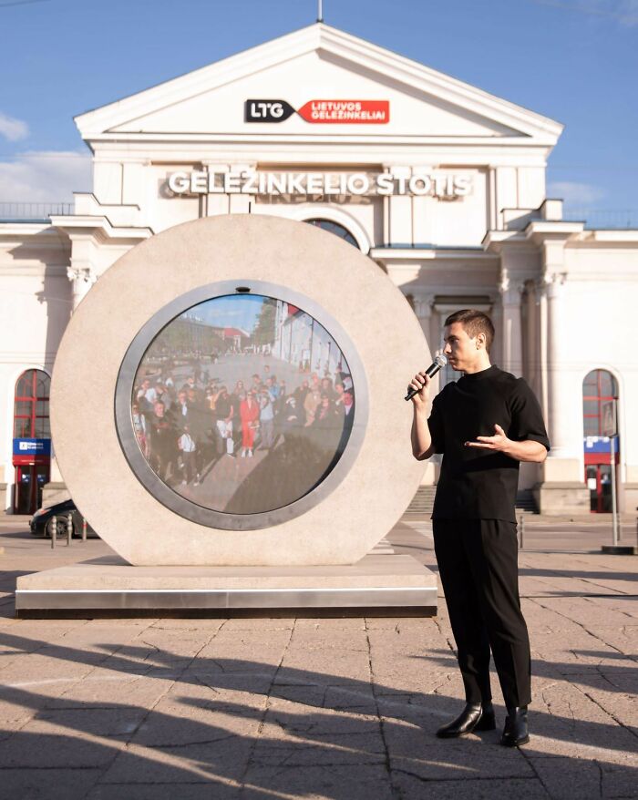
This circle with a screen that looks like a portal to another dimension actually allows you to see people in the other city and wave at them
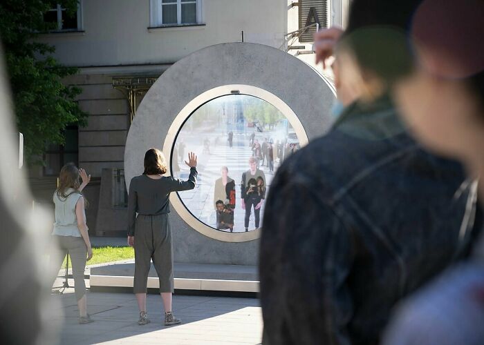
The ‘portals’ both have screens and cameras to broadcast the other city live. The view you see on the screen is similar to what astronauts see looking at the world below.
It’s called a “surveillance effect” and astronauts experience it when they see Earth in space, so little, so delicately in this big world.
Hazzaa Ali Almansoori, the first person from the United Arab Emirates in space, said “It’s amazing how space brings everyone together. No matter what country you come from, no matter what your religion or background, it unites everyone … Our goal is one: it is for humanity. ”
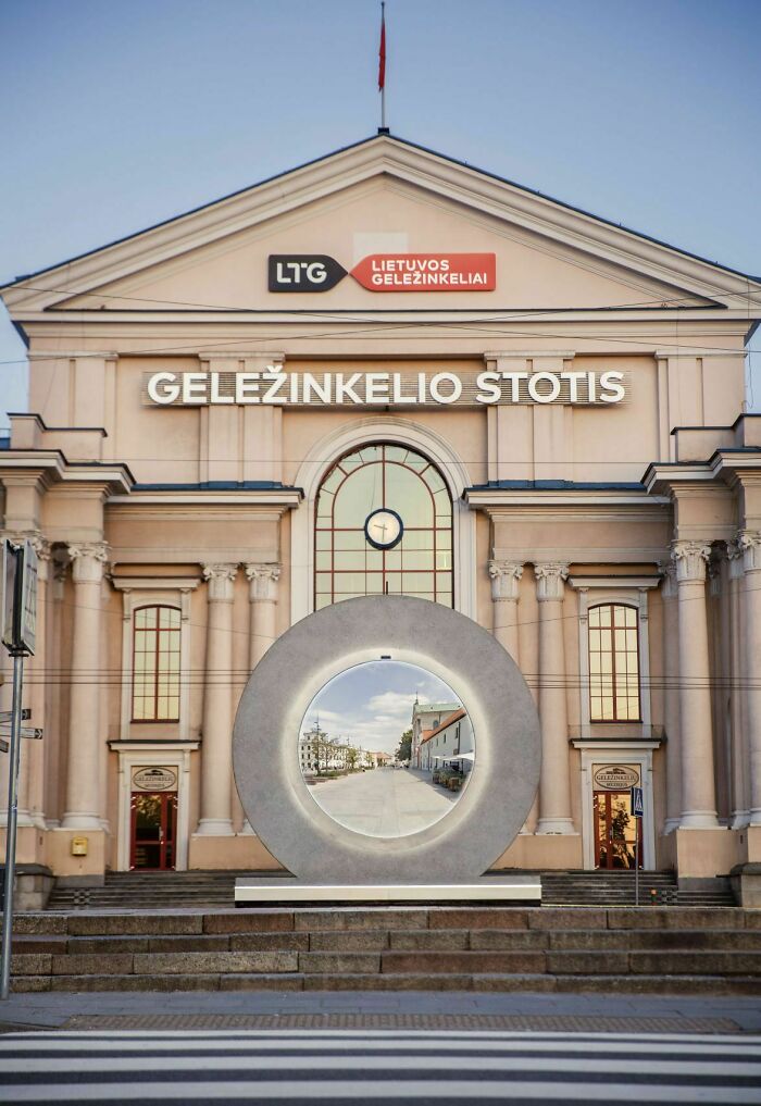
The portal is now silent as it would be technically difficult to have a sound 24/7, however, it is possible and for special events, it will be done.
Despite this, the creators of the project believe that people will find a way to communicate. They’ve noticed people waving, sending kisses or doing push-ups, so they’re still involved.
The team told us that “it seems that with physical measures like the PORTAL the internal psychological barriers disappear and people enthusiastically participate in the activity in front of the portal and are friendly to each other. Most of them do not need encouragement and access the portal with curiosity or maybe they just crave a human relationship during this pandemic. ”They think that starting a conversation with complete strangers only on the street would present difficulties and it seems that the portal makes people more relaxed.
The message behind the PORTAL project is to make people forget about the separation between us and them and just see our planet united
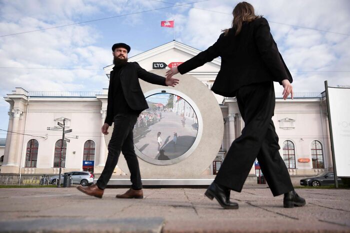
The main goal of the project is to connect people. On the official website, they say “Surrounding ourselves only with those who are close and speak the same language gives us comfort and a sense of stability. It also limits the worldview to our narrow inner circle. Slowly it becomes a perfect space for awakening insecurities to outsiders and a perfect excuse to be careless about the world that belongs to them. Every day there is less room for dialogue, empathy and compassion to feel and be united in our home – a tiny spaceship Earth rapidly decaying because of too many of them and too few of us. It’s so easy to believe we’re all a wave and forget we’re an ocean too. Let’s transcend this sense of separation and be pioneers of unity. ”
It almost seems like we welcome aliens to Earth, but sometimes we treat humans as if they’re not from this planet and don’t deserve to be here. The person behind the idea, Benedict Gylys, says many of the potentially deadly challenges humanity faces, such as polarization and climate change, have been caused by a lack of understanding of others and of the world at large. So the PORTER must unite people and it is an invitation to rise above the illusion of division that we ourselves have created.
This cool idea was shared on Reddit and the post received 140k likes in less than 24 hours

Although it is not a portal that we see in movies or read in books, it is nevertheless the closest to teleportation and it is so cool that you can only communicate with random people on the street who are hundreds of miles away.
It caught the attention of Redditors like the post about it got 140k votes in less than a day. People joked about Stargate and that if you go through it, you will end up in Poland. It seems that people liked this idea, but others shared that something similar happened where they live, but it didn’t last long as people started abusing the portal.
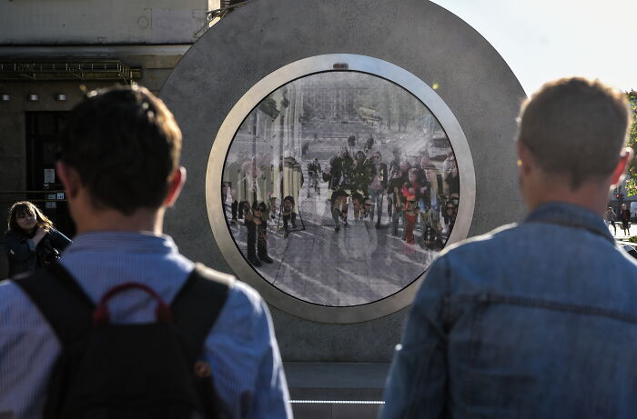
The project had its challenges, “First, it was a challenge to draft a project for the PORTFOLIO, which is minimal and simple, but able to fit all the complex electronics inside and prevent vandalism and negative environmental impact.” Then the project had to be carried out and after many tests, it was chosen to use “concrete, stainless steel and tempered glass to build these 11 tons wide two meters by two meters.”
It all came true because the people at Vilnius Gediminas Technical University Creative and Innovation Center “LinkMenų manufactures” were crazy enough to believe in the idea and were able to realize it.
The brain behind the project is Benedict Gylys and it took 5 years to realize the idea
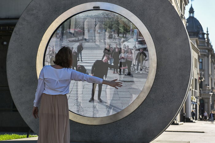
The project was completed during a pandemic, when travel within the borders may have restrictions, so travel to other countries is hardly disputed. The creators of Vilnius Technique have been working on the portal for 5 years and now was the best time to introduce it publicly when everyone is so isolated and eager to taste something new a bit.
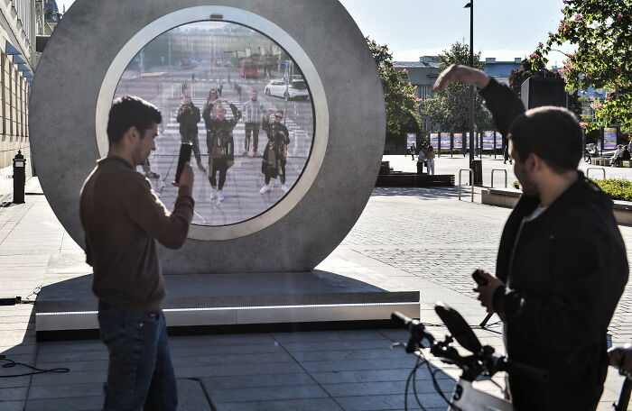
There are plans to open more of these portals in various cities in the world and connect even more people
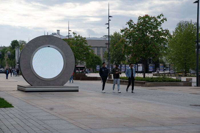
The portal between Vilnius and Lublin was the first in the world, but it will not be the last. The creators of the project hope to connect dozens of cities around the world and two new ones are expected to open soon: one in Reykjavik, Iceland and another in London, United Kingdom.
The team revealed that Reykjavik was chosen because of the very important historical story that links it to Lithuania: Iceland was the first to recognize Lithuania’s independence in 1991 and Lithuanians appreciate it and want to continue the partnership between the countries. Also, Reykjavik contrasts perfectly with Vilnius.
London is important to them as they begin a friendship with another international initiative.
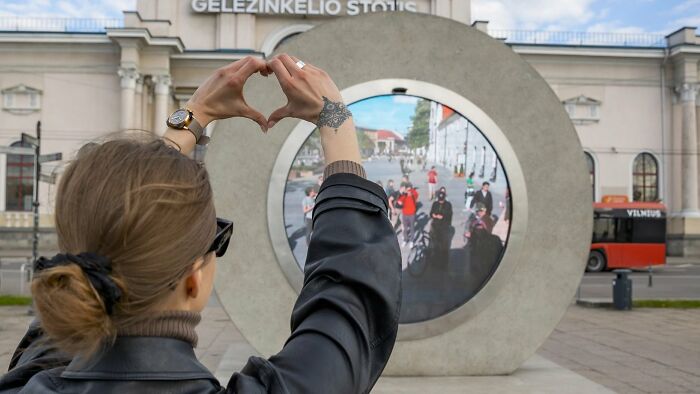
Image credits: Benedict Gylys Foundation
Now Vilnius is linked to Lublin and will last until August. Then it will move to another city. The project creators think that maybe in the future the portals will change cities every 10 minutes more or less because they are open to anyone who would like to join.
Although the cities will have a limited connection time, the project has no time limit, “the project will continue until the destruction of the planet or the end of the problems that cause the separation between people.”
What do you think of this idea? Would you like to see such a ‘portal’ in your city? Let us know your thoughts on this project in the comments.
More than 2k people shared their reactions to this “portal” on Reddit and most of them thought it was a cool idea.
Meanwhile, if you want to read more such exciting lifestyle guides and informative property updates, stay tuned to Feeta Blog — Pakistan’s best real estate blog.
Lithuania And Poland Built A ‘Portal’ Connecting Two Of Their Cities And People Are Loving It
- Published in 700-page, Architecture, Art, Benediktas Gylys, Design, Homepage featured, Lithuania, lublin, News, News & Updates, News and Update, People, Poland, portal, portal between cities, project portal, reddit, stargate, Technology, vilnius, virtual bridge
40 Architecture Examples That Look So Bad, People Just Had To Shame Them
Some buildings will absolutely captivate you with their amazing projects, ingenious architectural decisions and the power of their aesthetics. This article, however, is not about such buildings. No! See, not all buildings are the same, and the “bad guys” should be publicly embarrassed so that others don’t copy their projects. So we will focus exclusively on simple terrifying architectural decisions.
Remember to vote for your favorite photos you love to hate and be sure to follow the arrogant Facebook group if you like their stuff. They are a growing community with awesome content.
Bored Panda talked about what separates good and bad design, the need to democratize access to strange projects on private property, and also the roles that architecture plays with an expert in Sweden’s field that has a background in urban planning. You will find our full interview with her below.
1. I Dunno, Slim Doesn’t Seem To Be Digging This Situation
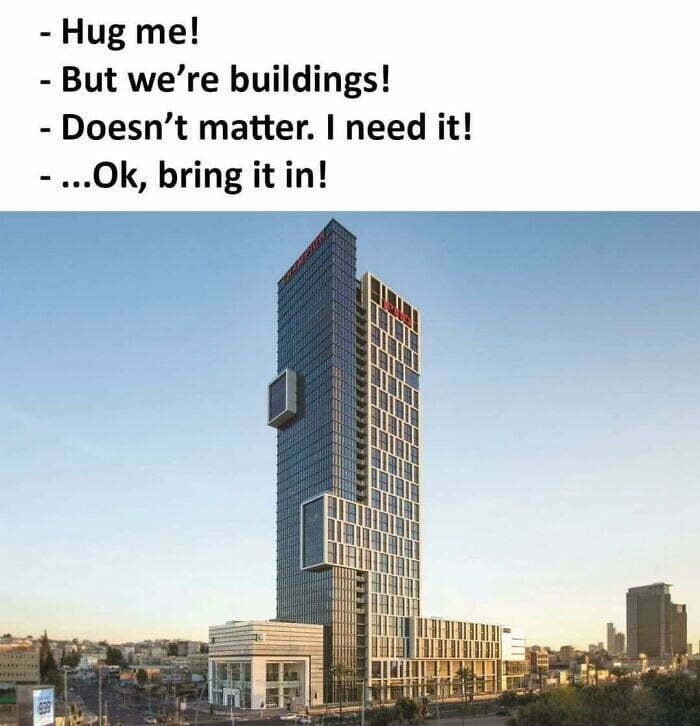
2. This Pillar Was Straight Last Week. This Is The First Floor Of A Seven-Floor Building
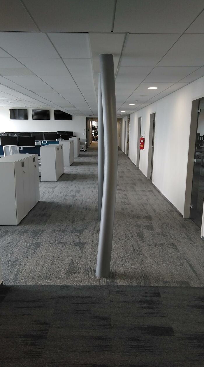
3. I Do Not Give A Damn How Well It’s Cantilevered Or How Strong The Struts Are. I Do Not Have The Kind Of Luck It Would Take To Set Foot In This House
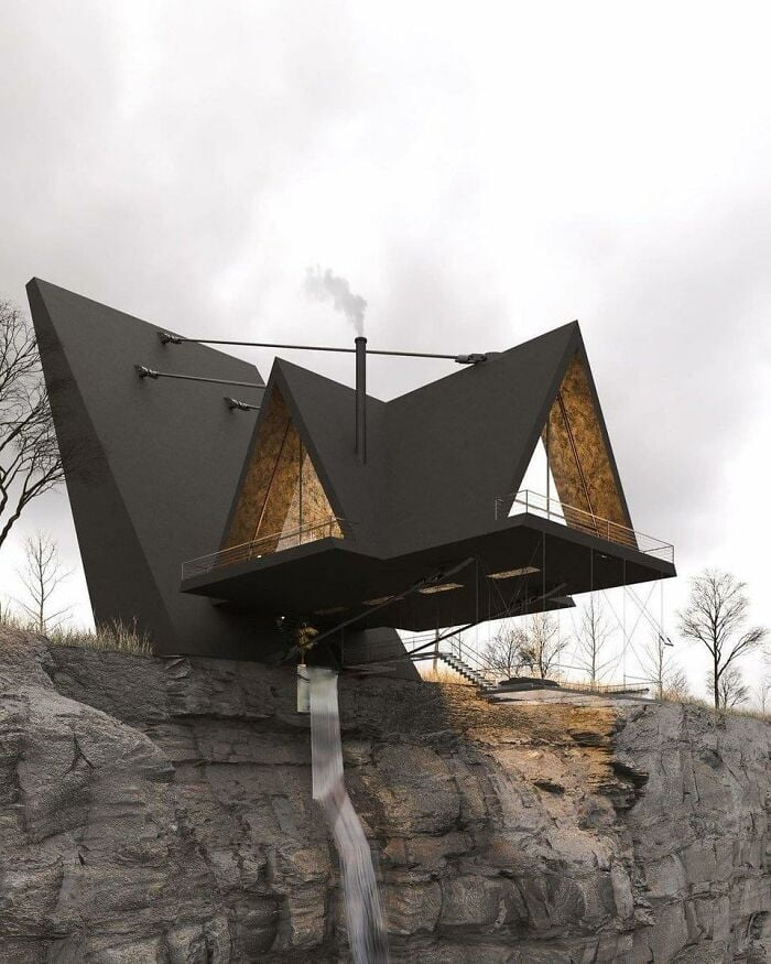
The Swedish planning expert with Bored Panda explained to Bored Panda that while public spaces must meet safety and accessibility standards, aesthetic standards can be much more fluid for buildings. The expert spoke to Bored Panda on the condition that she remain anonymous. (Remember, just because you’re an expert at something and want to help doesn’t mean you always like fame … as opposed to a weird architecture that just asks you to look at it!)
“Most often the elements of the built environment must be in harmony with each other and with the environment. However, sometimes something more daring and ready can form an attractive contrast, “she said. However, the urban planning expert shared with Bored Panda that, in her personal opinion, our built environments should engage us, as well as stimulate our minds and senses. In fact, she believes that the ability of architecture to make us think is one of its most powerful aspects.
4. The Cactus Is *chef’s Kiss
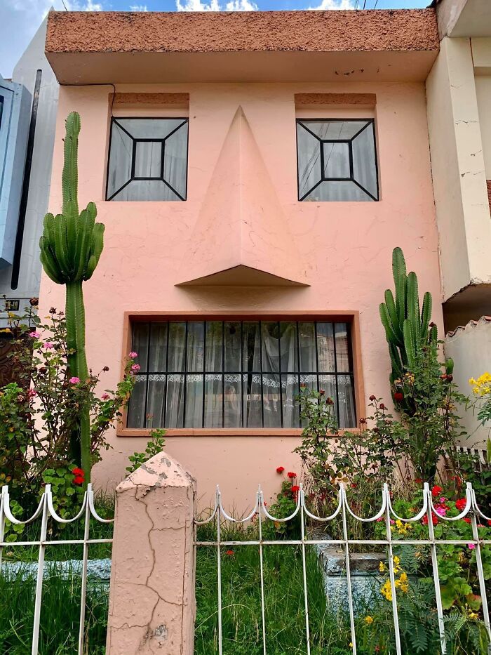
5 . This Is Not Photoshopped
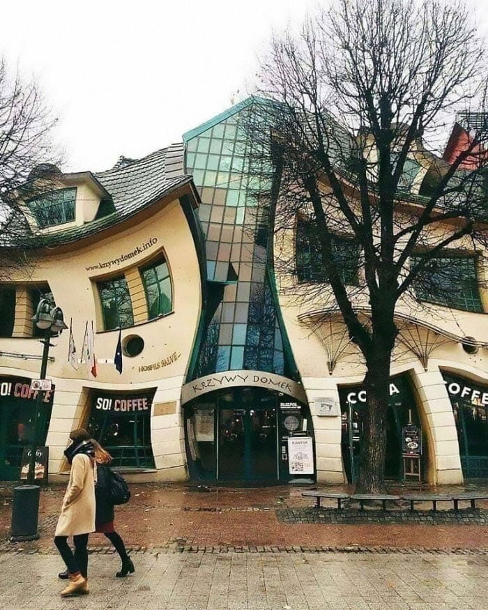
6. That Gives Me Anxiety
“There are circumstances when architecture has to create a sense of calm and security, yet there are cases where it’s not bad if the architecture provokes us and makes us think, ‘Why don’t I like the look of this building?’ ”
The city planner said we need to give people the freedom to express themselves the way they want when it comes to designing their private property. As long as they have the resources, almost anything is allowed, in her opinion.
7 . Opera And Ballet Theatre Of Cheboksary (Russia)

8. A Friend Of Mine Cross-Posted This And It Made Me Think Of Y’all
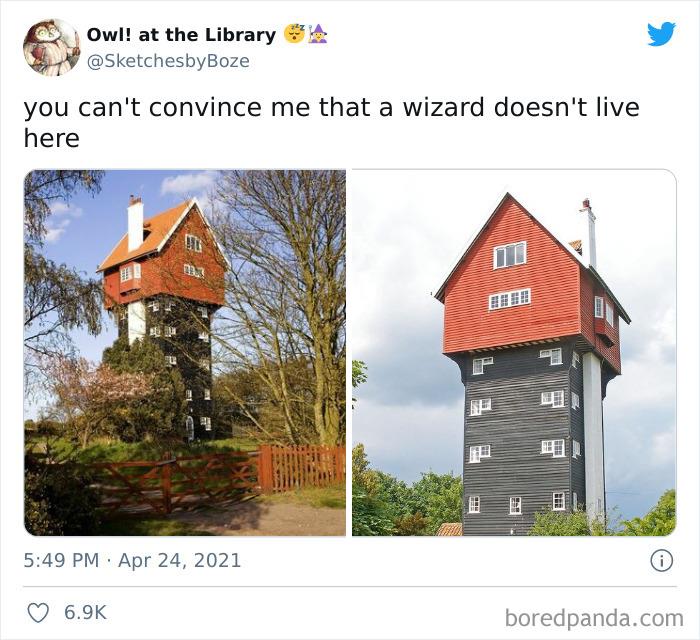
9. I Might Like This If Those Were Slides
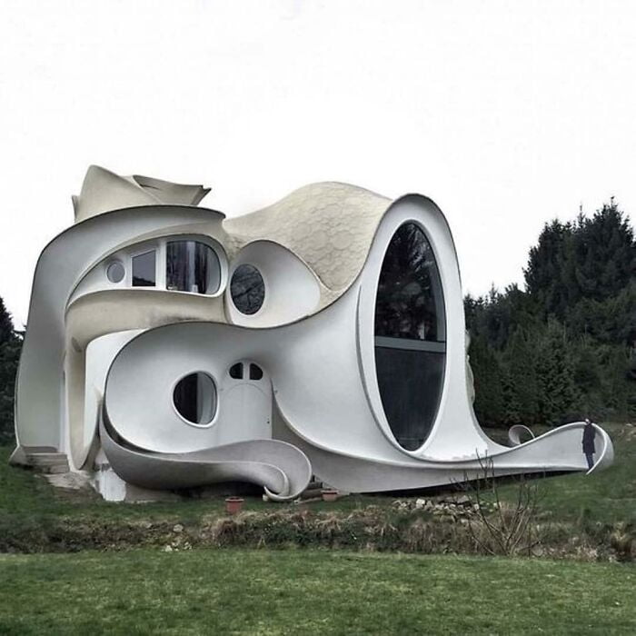
“Strange architecture comes from our innate desire to prove our uniqueness. However, not everyone who has the resources has a medium taste for aesthetics. However, if it’s for the people who live or use their private space, I mean why not? “she told Bored Panda that as long as you don’t actively harm anyone, no matter how bad your projects are, you have to be as unique as you want to be. Even if it lacks objective aesthetic standards.
10. Who Remembers Those Gerbil Enclosures That Look Like This?
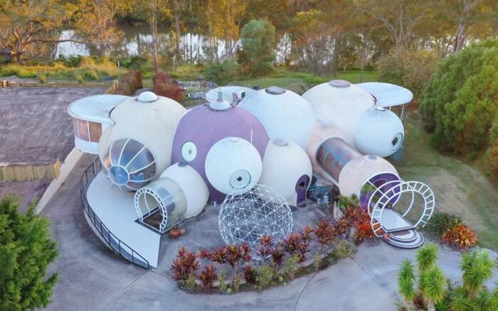
11. This Looks Like A Place A Villain Would Live
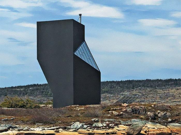
12. I’ll Meet Your Brutalism, And Raise You This
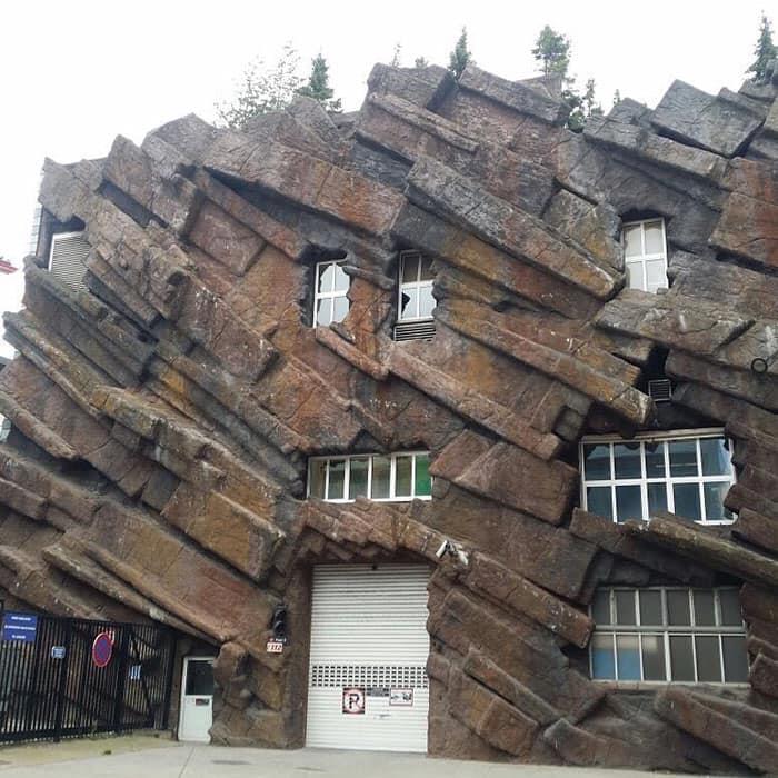
However, the expert acknowledged that others in the industry may not see things the way she sees. Others, she said, believe private property should harmonize with the surroundings.
“But I don’t think we should cross that thin line where architecture becomes reserved only for the rich and for those with good taste ’(whoever decides that). I’m only talking about the private property here. When it comes to public space, there has to be a consensus between public and professional on the design, ”she said, as the rules for the private and public spheres are very different.
13. Um… What Is This?
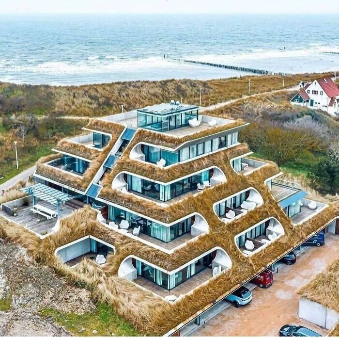
14. Art Nouveau On Psychedelics
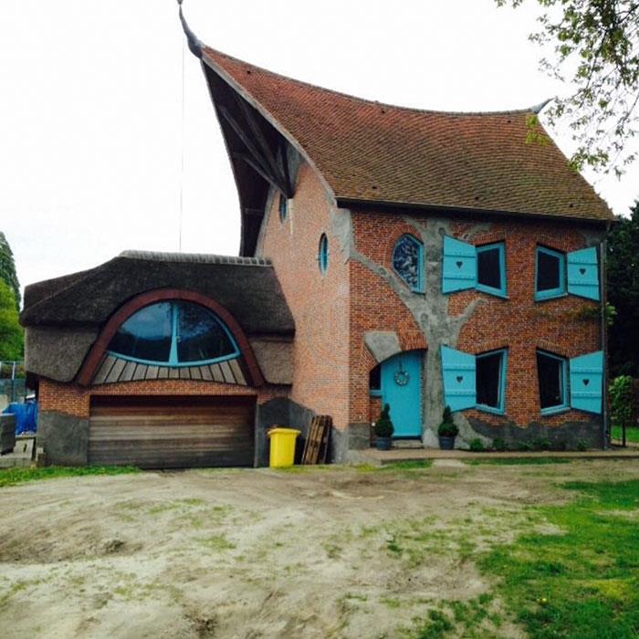
15. I Wonder Who Thought This Would Be A Good Idea
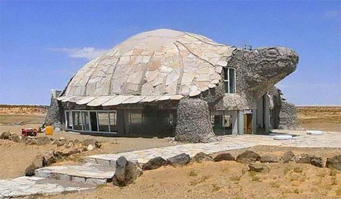
The town planning expert also had some design tips. “First, although I often advocate for unconventional-looking buildings, I do not purposely encourage provocative architecture. The building must be designed with the intention of housing and protecting society. It should create a sense of security but not be boring, ”she told Bored Panda that we need to balance uniqueness and service, expression and community.
16. “Sharkitecture”
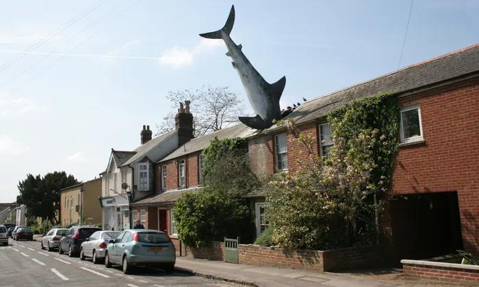
17. Can We All Just Take A Moment And Acknowledge That Prince Produced Some Great Music, But He Lived In A Water Treatment Station
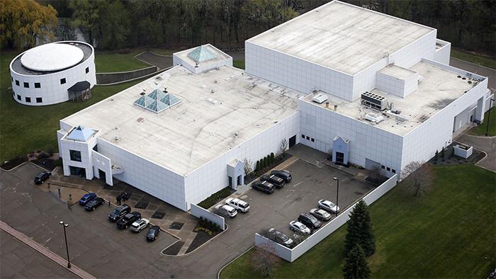
18. The “Snail House” In Bulgaria Actually Does Look Like A Snail
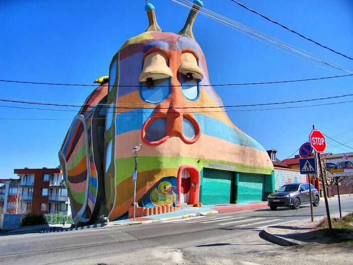
In addition, the expert from Sweden pointed out that accessibility, inclusiveness and empowerment should also be key features of any architectural project. “I also prefer somewhat complex but systematic projects. Minimalist and box floor plans are good in some cases when easy access is needed (e.g. hospitals) however they can be completely untrue while more complex floor plan plans are more stimulating (e.g., good for schools, in my opinion). ”
19. Toilet-Shaped House (Named Haewoojae), Built By Sim Jae-Duck, The Chairman Of The Organizing Committee Of The Inaugural General Assembly Of The World Toilet Association
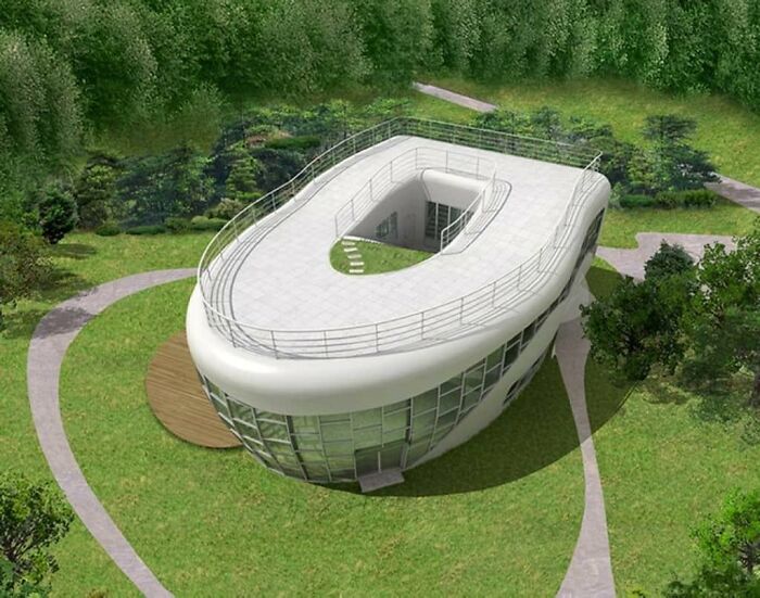
20. Interesting Concept
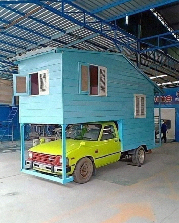
21. A House I Used To Drive Past In A Little Iowa Town. All I Ever Heard From Locals Was That This Place Had A Terrible Leaking Problem When It Rained
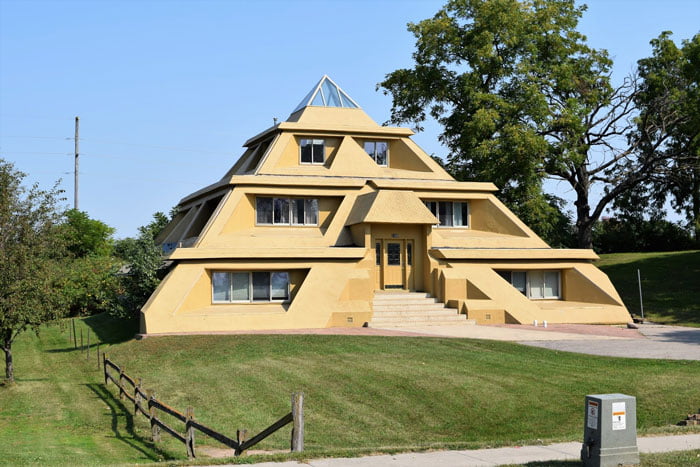
At the time of writing, the ‘Here It Is, I Shaming Architecture’ community had 64.1k members. However, it is growing so fast that when you read this, dear Pandas, that number could be much, much higher. In the last week alone, the group has grown by more than 7.3 thousand members. And they have created more than a thousand posts in the last month.
22. They Drew The Line At A Fountain In The Kitchen
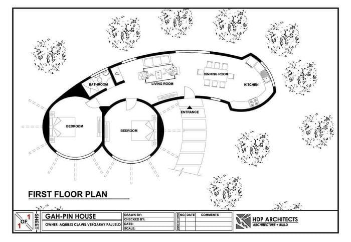
23. You Too Can Have Your Own White Castle
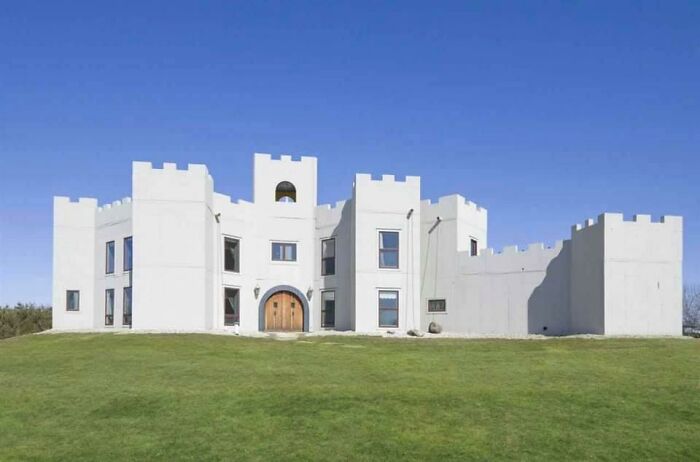
24. I Will Haunt Your Dreams! Residential Building In Belgium
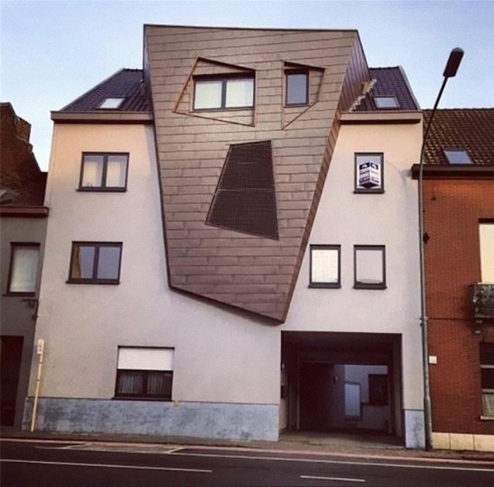
Because of this rapid growth and the problems with it, the manager of the “Architecture Shaming” group, Oregon-based Matthew Brühn, addressed the community and the changes that took place in April. Basically, the rules are now much more structured.
25. I Think Syndrome From The Incredibles Lived Here
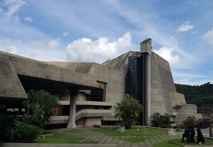
26. Bangkok’s Elephant Building. The Tusks Are A Bowling Alley In My Imagination
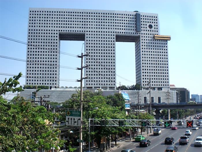
27. Why?
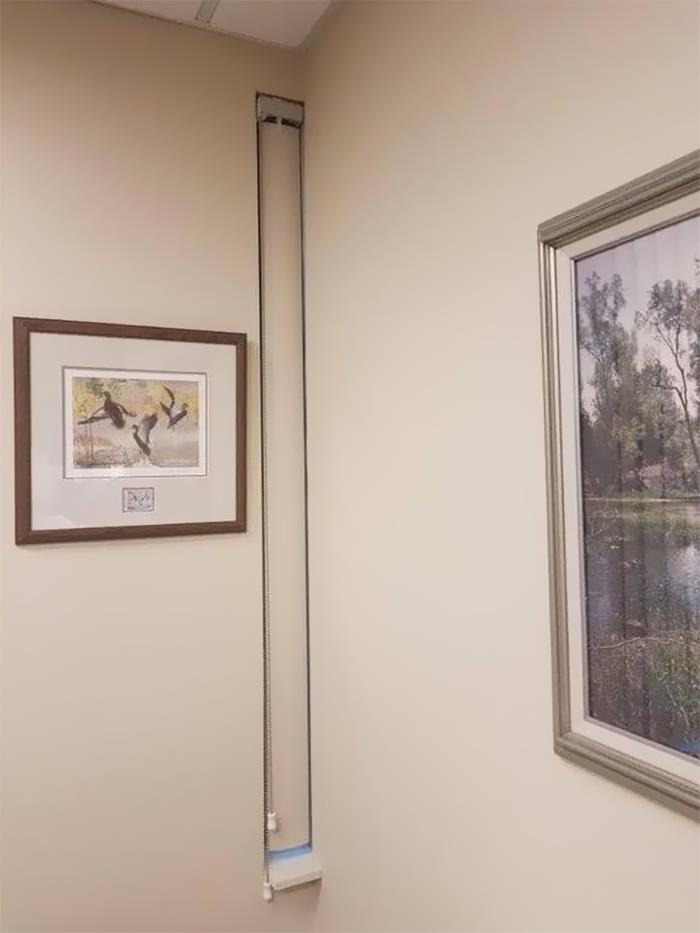
Matthew pointed out that the administrators were tired of the “massive influx of negativity,” which came with more and more members joining the community. While the manager expressed his admiration for how amazing many members are, he also noted that the group will start filtering out too aggressive posts.
28. Saw This On A Walk Today. A Table Lamp, In A Glass Box, Hanging From The Roof Of A Carport
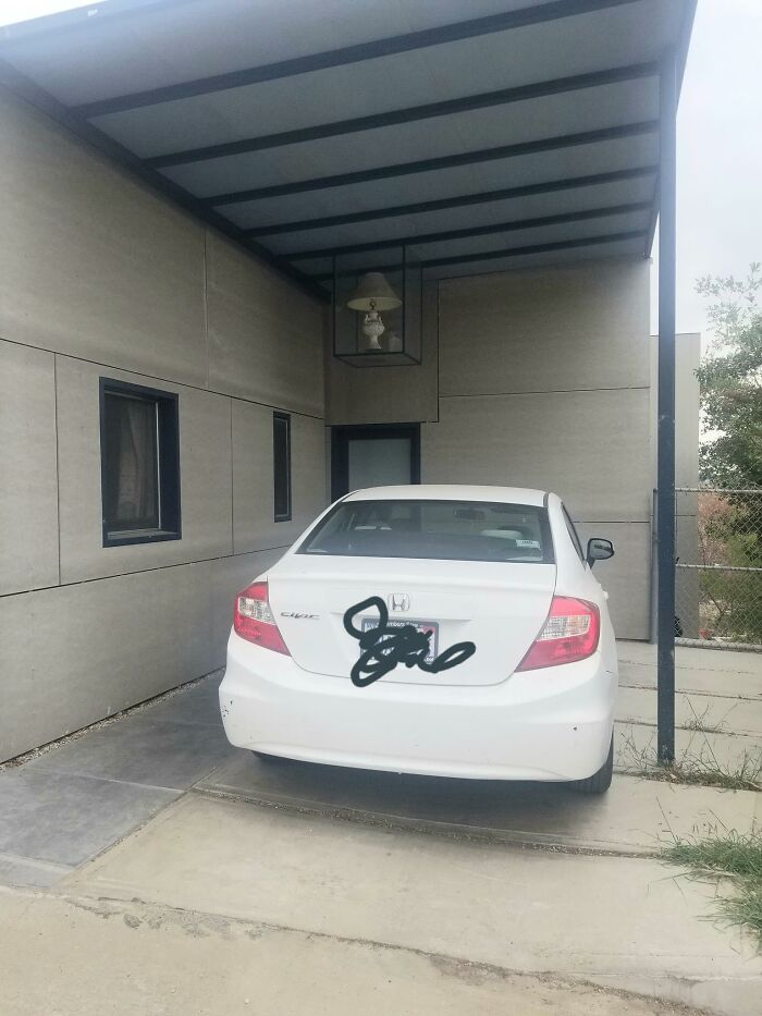
29. This Is Plane Awesome
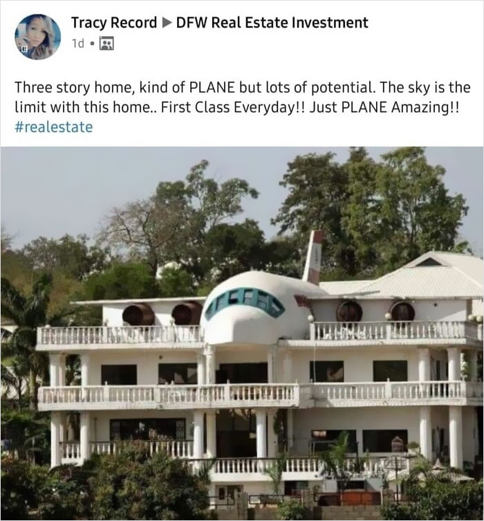
30. Spotted This Gem In Tel Aviv
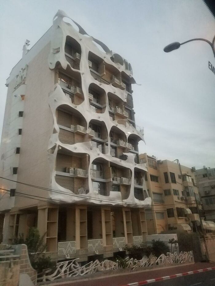
“Don’t take it personally; we’re just trying to create an atmosphere where we can all have fun and be kind. Now is the equivalent of a small town of us all here now, so that will be harder, “Matthew pointed out. He added that mentions of politics and religion will be removed, while all potential new members will have to answer some questions before entering. at the end of the day leads to a friendlier and happier community that, we are sure, abound of you pandas will want to join.
31. Kind Of Reminds Me Of A Church (Granted, A Strange One) But It’s Actually A House With A 6,000 Sq. Ft. Garage… And Its Own Car Wash
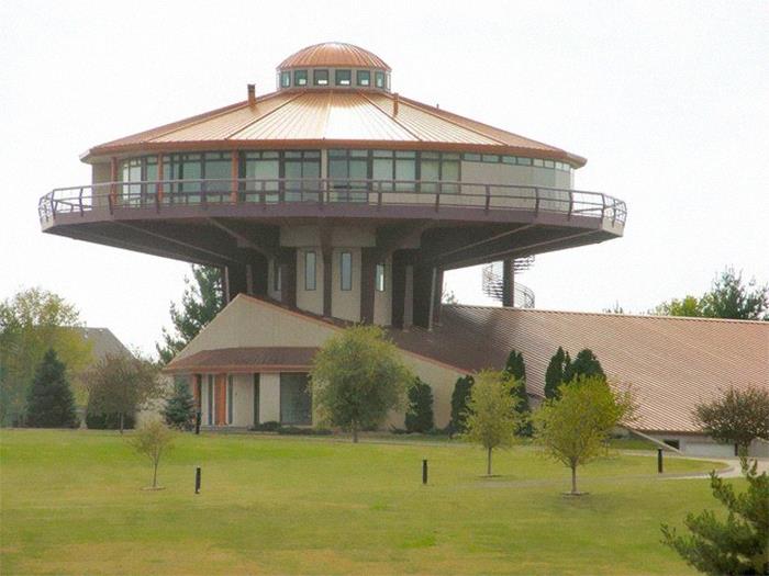
32. Surrealist Neighborhood
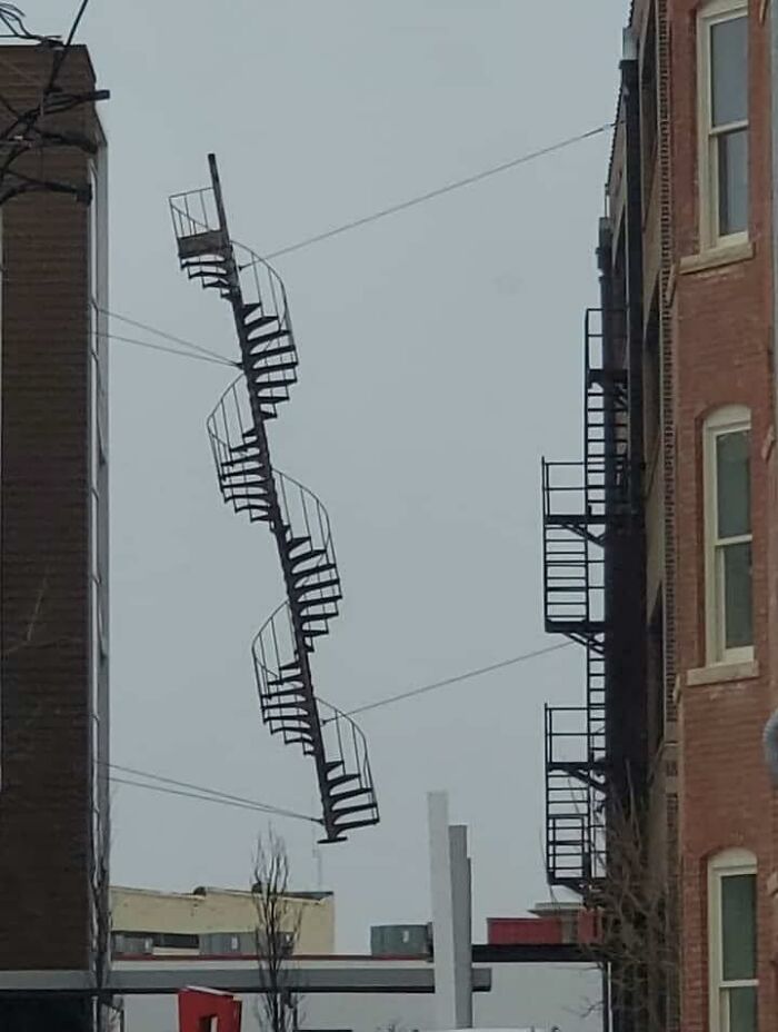
33. Forbidden Waffle In Santiago
34. This Building Has My City In A Uproar
35. Please Don’t Take It Too Seriously, Just A Surprised House
36. This Place Is All Curb Appeal
37. The Glorious Flower Of Communist Brutalism That Is The Former Central Post Office In Skopje, Macedonia. Some People Want It Preserved
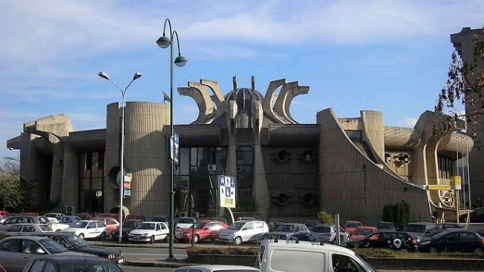
38. Just
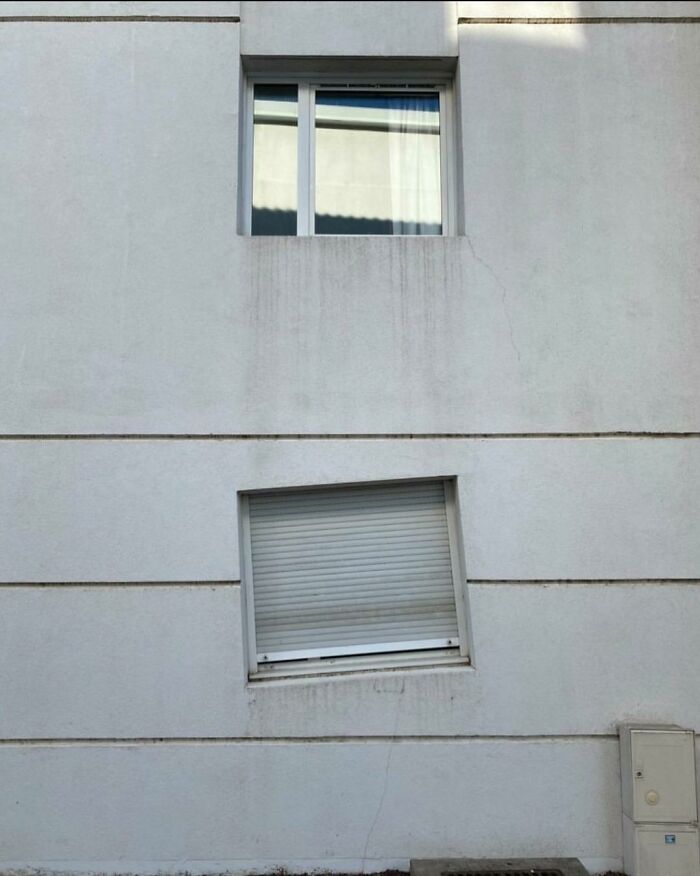
39. I’ve Been Looking At Homes Trying To Get Ideas For When We Move In A Few Years And I Came Across A House That Was Perfect In Every Way Except One
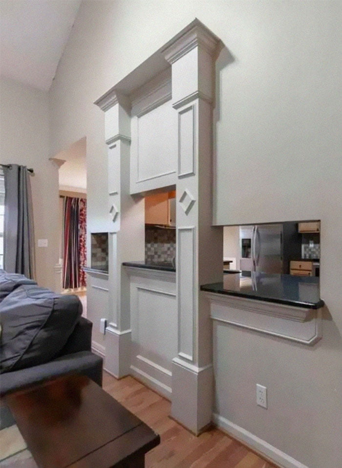
What’s in the ever-living fudge – one step is, eh, but this one has three different levels plus the added detriment of the world’s worst architectural details around it. Please have someone else tell me that you hate this as much as I do. I know it’s probably more interior design, but it’s so ugly.
40. Car Dealership Trying For More Of A Classy Look!
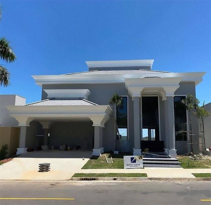
Watch this space for more information on that. Stay tuned to Feeta Blog for the latest updates about Architrcture, Lifestyle and Interior Design.
40 Architecture Examples That Look So Bad, People Just Had To Shame Them
- Published in 700-page, Architecture, bad architecture, bad design, blueprints, bp-exclusive, building plan, Design, design fails, designs that stand out for all the wrong reasons, Fails, Funny, good and bad design, Homepage featured, Pics, quirky architecture, shaming architecture, That's It I'm Architecture Shaming, weird buildings
Graphic Designers Show What 6 Asian Castles Looked Like Before Falling Into Ruins
You definitely want to travel before this point, so the best we can do is offer you a way to discover something new and exciting without leaving your home. This time it is the largest and most populous continent, Asia, with its 45 million square kilometers of deserts, mountains, plateaus, plains and jungles that carry the history of ancient civilizations. Budget Direct has decided to digitally rebuild 6 castles that have become ruins over the years across five countries in Asia. The architectural wonders of Asia restore their former glory right before our eyes.
This is the newest project in the series of reconstructions by Budget Direct: the team has previously revived European castles, Ancient Wonders and UNESCO-protected heritage sites.
“In 2020, millions of people around the world will be stuck at home, and even in 2021, there are many travel restrictions still in place. To support those looking for inspiration on a travel chair, Budget Direct has decided to bring back some of the most awesome castles from all over Asia. The team started by making a long list of castles in Asia and then limited these to those that had resources available for us to digitally readjust.
They then chose the castles with the most architectural marvel from across the continent to rebuild. The team has been working with researchers, architects and digital designers to bring these ancient castles into the 21st century. ”
So sit back, relax, and start the virtual journey! And hopefully, you’ll find out something new along the way today.
Alamut Castle, Alamut Valley, Iran


In 1090, Imam Hassan-i Sabbāh allegedly conquered the castle without shedding a drop of blood. The new state secured its power through targeted attacks on enemy leaders. Those who carried out these attacks were contemptuously called “Hashashin” (“tumultuous grass”), thus giving birth to the word “Assassin”. Ironically, Alamut’s fame caused its demise; its various conquerors demolished the castle while searching for a legendary assassin.
Alamut Rock is a popular day trek that offers a lookup view of the surrounding country. However, not much remains of Alamut Castle itself; its few surviving stone clouds are covered in scaffolding while the Iranian government tries to partially restore it for tourists.

The Old Summer Palace, Beijing, China
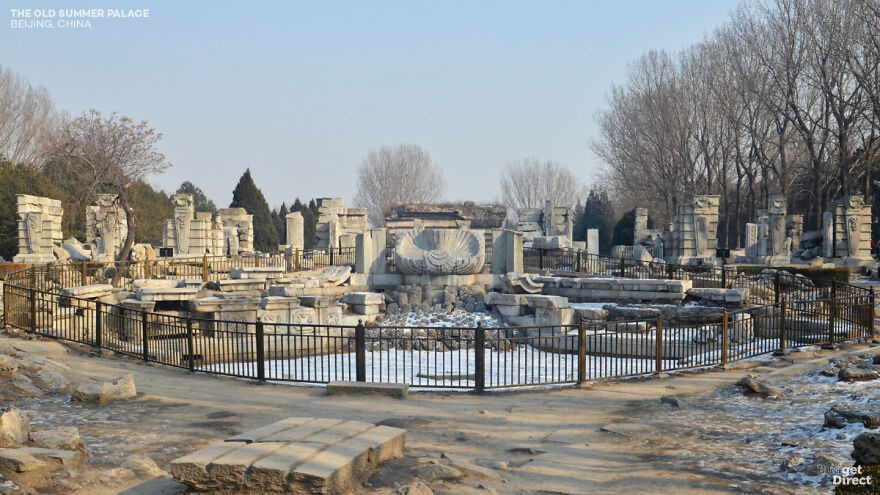
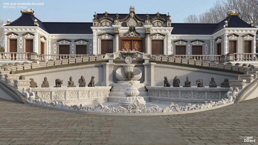
Yuanming Yuan – known in the Western World as the Old Summer Palace – was not a single building but a 3.5 square kilometer complex of palaces, lakes, gardens, towers and sculptures. The pride of the Qing dynasty, Yuanming Yuan, was largely destroyed by British and French troops in retaliation for the death of a British envoy during the Second Opium War. Further destruction occurred during the Boxer Rebellion and the Cultural Revolution.
We chose here to rebuild Haiyantang from the Yuanming Yuan (The Palace of Calm Seas). In front of a two-story Western-style palace, a water clock surrounded the 12 animals of the Chinese Zodiac. Today, the Martian ornament of the fountain sits within the contour of its former depression, backed by a spaced view of fallen palace columns.
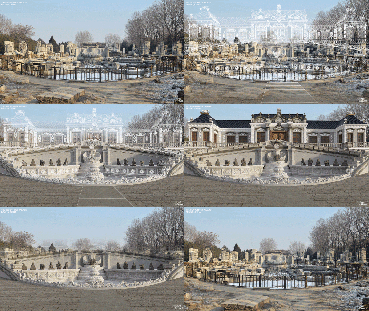
Hagi Castle, Hagi, Japan
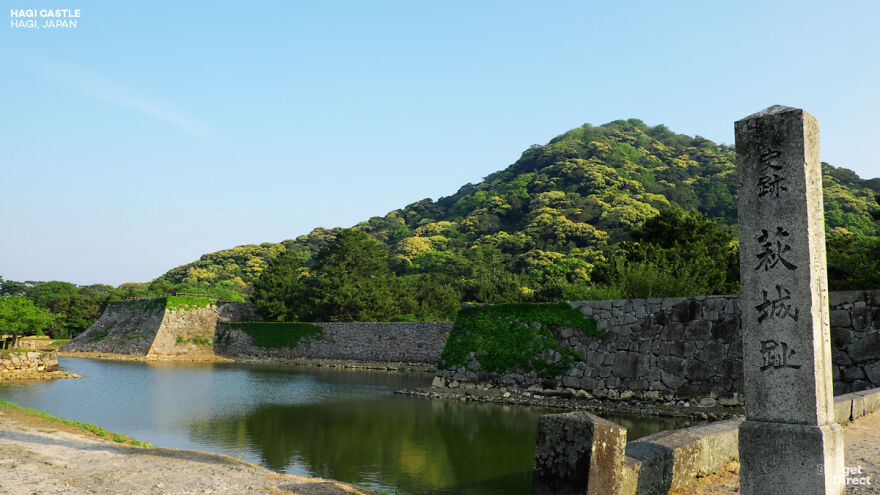
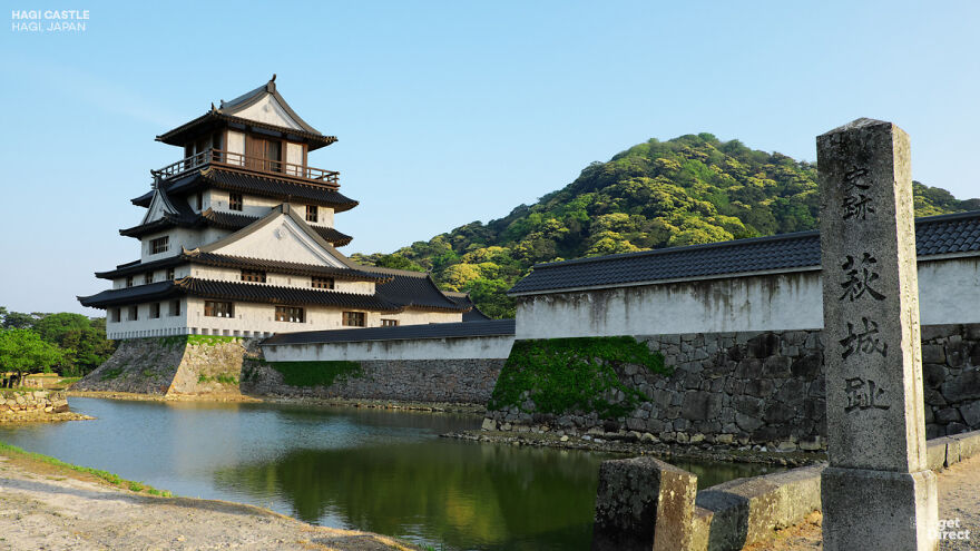
The Mōri Samurai clan lost to Tokugawa in the Battle of Sekigahara, and as a result, had to rebuild their capital in the small seaside town of Hagi. The Mōri got their revenge, however. The castle became the capital of the Chōshū Domain, which was instrumental in the final overthrow of the Tokugawa Shogunate. Ironically, the castle was dismantled by the new government in 1874 as part of a policy of centralization and modernization.
Hagi was very awesome at the time. Multiple galleries and walls protect the surrounding land, many of which are still visible. The main wooden fort has been dismantled, but its stone base and part of its moat stand. Higher up the mountain, the remains of a reserve fort can be found.
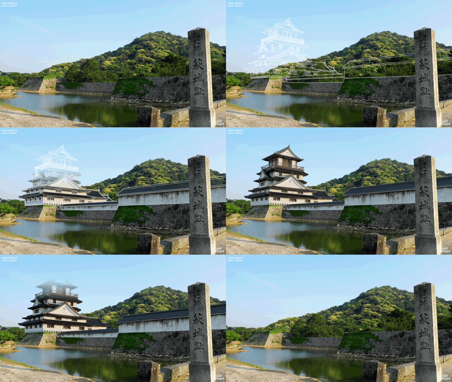
Ghazni Citadel, Ghazni, Afghanistan
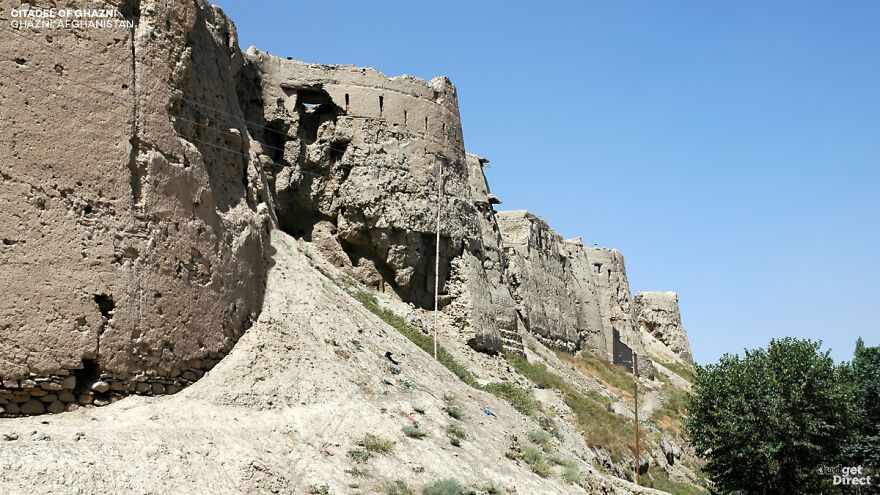
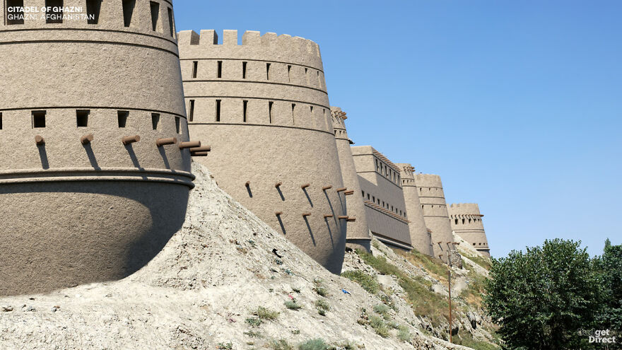
The former slave Sebüktigin received the governorship of Ghazni in 977, but he promptly rebelled against his ruling Iranian rulers to found the Ghazni Empire. Ghazni became the war point of Afghanistan, sought after by the VIP conquerors from the history of Timur (Tamerlane) to the Mongols. When the citadel was famously conquered by the British in 1839, Afghan leadership had to flee Kabul. It was also used as a U.S. military base after 2001.
The remains of the citadel rest on a central hill above the walled city. However, neglect, war and weather severely damaged Ghazni. 14 of its original 32 towers have collapsed, one recently as 2019. Today, Ghazni’s walls, towers and citadel are in danger of being lost permanently to the weather winds.

Raigad Fort, Raigad, Maharashtra, India


Although parts of the structure date from 1030 AD, the already imposing fortifications of Raigad were expanded by Shivaji Maharaj. Shivaji was crowned Chhatrapati (“Umbrella Lord”) here in 1674, establishing the Marathan Confederacy as opposed to the Mughal Empire. The Confederacy ruled Raigad until its destruction by the British East India Company in 1818.
The main entrance to the castle is 820 meters above sea level – a climb of 1737 steps. (Luckily now there is an aerial tramway.) Visitors can still look at the remains of two of the three watchtowers, several reservoirs, stone trading booths and a famous wall called Hirakani Buruj.

Takeda Castle, Asago, Hyogo, Japan


Takeda was built in the 15th century by “the Red Monaco” – a man partly responsible for plunging Japan into the century of chaos known as the Sengoku period. The fort was later conquered by Toyotomi Hideyoshi during a reunion. After Hideyoshi’s death, the new shogun Tokugawa Ieyasu accused the final lord of the castle of arson during a pivotal battle. From here Takeda decayed.
Today the ruins of the castle sit 353 meters above sea level. Although no buildings remain standing on the mountain itself, a row of temples has survived at the base. The stone foundations of the castle are well preserved, having undergone minor restorations in the late twentieth century. Due to a seasonal fog that fills the valley, some mornings Takeda seems to float above the clouds.

Watch this space for more information on that. Stay tuned to Feeta Blog for the latest updates about Architrcture, Lifestyle and Interior Design.
Graphic Designers Show What 6 Asian Castles Looked Like Before Falling Into Ruins
- Published in Architectural Heritage, architectural wonders, Architecture, Asia, asian castles, asian history, Budget Direct, castles in asia, castles reconstructed, culture, digital art, full-page, Graphic Design, heritage, History, Homepage featured, ruined castles rebuilt, ruined castles restored, ruined catles, travel, travel destinations, travel destinations in asia

