This Is How Garden Design Evolved Over 4,000 Years All Over The World, Provided By Household Quotes
Household Quotes, Civilizations around the world have been creating gardens for thousands of years. Since then, garden designs have continued to evolve, influenced by trends and changing priorities.
To show how much garden designs have changed over the years, Household Quotes.co.uk identified 10 key eras in the evolution of garden design and visualized them as a series of detailed 3D renders.
c. 1400s BCE: Domestic Garden (Ancient Egyptian Era)
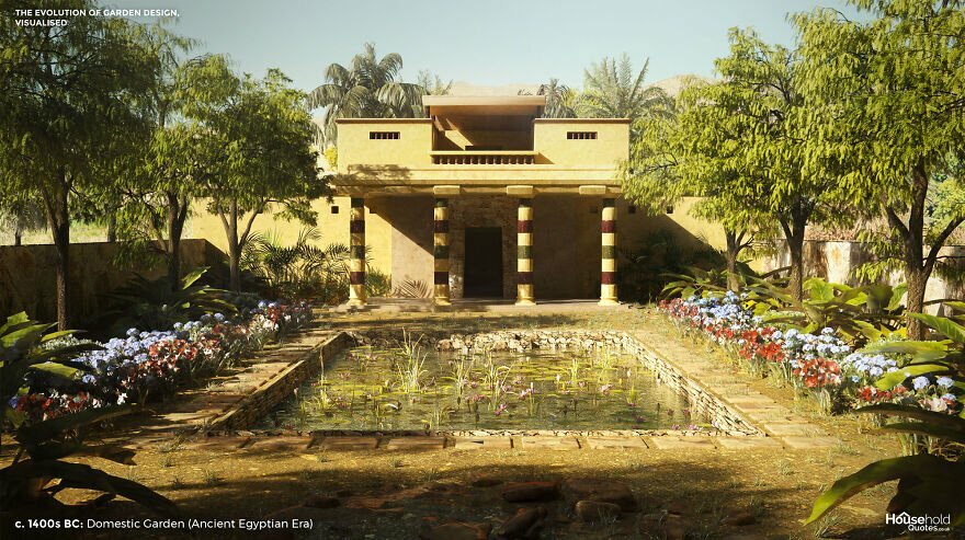
Image credits: HouseholdQuotes
Our Ancient Egyptian garden is inspired by the world’s oldest known garden plan. The design exists today as a 19th-century copy of a painting from a nobleman’s walls in the era of Pharaoh Amenhotep II. However, the plan is so sophisticated that it is likely a style that had developed over years or centuries before this example was designed.
The Egyptian garden was an oasis. It provided shade and carefully ordered natural beauty in an arid land. But the garden was also a spiritual haven, dotted with symbolic patterns and trees, including frankincense and sycamore fig.
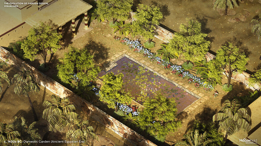
Image credits: HouseholdQuotes
The bold geometry of the Egyptian garden had as much to do with practicality as aesthetics. In addition to pleasure, gardens were cultivated for the raw ingredients of everyday life – from herbs and spices to papyrus and palm trees that offered both shade and fruit. Water features were positioned to aid irrigation (worth thinking about if you don’t want to trek to the far end of your garden every night of a hot summer).
400 BCE to 550 CE: Graeco-Roman Courtyard (Classical Era)
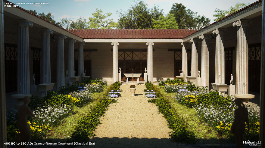
Image credits: HouseholdQuotes
The walled cities of Ancient Greece and Rome left little space for gardens. Only the rich had room for a small courtyard in the centre of their home. The roofed portico around the edge of the garden below is called a peristyle and offers shelter among finely painted walls. The Ionic columns that form the colonnade are inspired by those in Pompeii’s House of the Coloured Capitals.
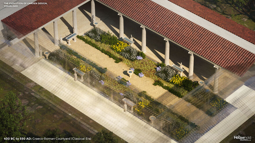
Image credits: HouseholdQuotes
Greek and Roman architects designed these urban gardens for escapism as well as to entertain. They would specify dining areas and impress with the inclusion of sophisticated statues and fountains. High walls offered privacy and regulated the climate for all-year use.
It wasn’t all stone and water. Herb and flower beds boasted roses, violets, saffron, thyme, marigolds, and narcissi, offering fresh scents and colour – although these areas, too, would be augmented with statues and water features. Box hedging zoned larger courtyards, while Cyprus and mulberry trees put greenery on the vertical plane.
c500s BCE to c1700s CE: Chahar Bagh/Pleasure Garden (Indo-Persian Era)
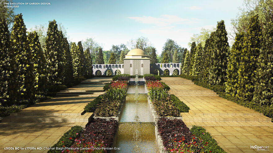
Image credits: HouseholdQuotes
“The chahar bagh was more than a pleasure garden,” said Aga Khan IV in a 2003 speech. “In the discipline and order of its landscaped geometry, its octagonal or rectangular pools, its selection of favourite plants and trees, it was an attempt to create transcendent perfection – a glimpse of paradise on earth.”
According to the Qur’an, paradise will be a place of flowing, incorruptible waters, flowers, and fruit trees. On Earth, the Chahar Bagh garden celebrated natural beauty while acknowledging the imperfections of life as lived. Still, designers would often divide the garden’s four quadrants with running water to represent the four rivers of paradise.

Image credits: HouseholdQuotes
A sloping underground tunnel called a Qanat was used to irrigate gardens in arid regions. Rugs embroidered with flora enhanced areas where nothing would grow. In verdant areas, roses were prominent, supported by bulb flowers, violets, poppies, and flowering shrubs. The pavilion on the central axis emphasises the symmetry and craft of the garden. The influence of Persian garden design is still felt today, through Islamic traditions and then via Greece, thanks to the impressions made on Alexander the Great as he invaded and conquered the region.
1000 to 1450: Town or City Garden (Medieval Era)
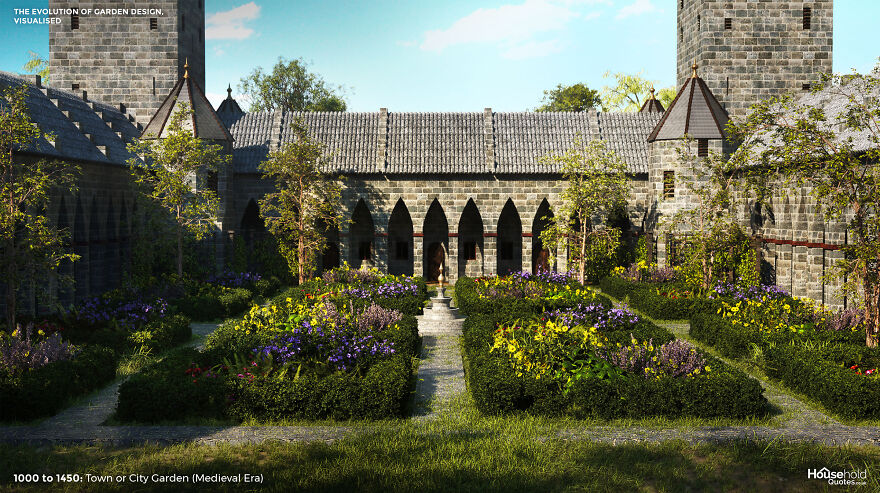
Image credits: HouseholdQuotes
As the medieval city developed, there was still space for town dwellers to cultivate a garden. Ongoing food insecurity made home ‘kitchen gardens’ commonplace. Meanwhile, physicians prescribed the scent of flowers to ward off the plague and recommended garden walks for mental health. Therefore, ornamental gardens flourished in hospitals and wealthy homes, while commentators snorted that smaller garden owners should stick to vegetables.
Another key difference between regular city gardens and those of the wealthy was the enclosure. While poorer gardens were often street-side, wealthier gardens were securely enclosed – following the lead of the monastery and castle gardens from which they took their cue. Further inspired by the renaissance in Italy, European gardens were designed with greater regularity of form, adopting rows and symmetrical quadrants.
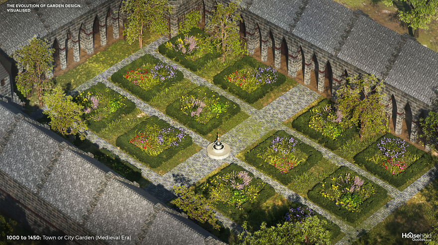
Image credits: HouseholdQuotes
The garden as a status symbol flourished, and so did one-upmanship among horticulturalists seeking finer and rarer flowers for their ornamental gardens. Roses, lilies, and violets became commonplace. When the tulip arrived in Europe, speculation on the value of bulbs led to ‘tulip mania’ and – perhaps – the “first great financial bubble.” One Dutch gardener even designed a network of carefully positioned mirrors to give the impression of a larger collection (and thus, greater wealth).
Early 1600s: Knot Garden (Tudor Era)
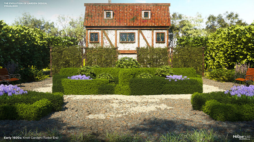
Image credits: HouseholdQuotes
Tudor designers wove medieval and Renaissance-Italy influences into impressively complex gardens. The knot garden had begun in medieval times as a practical way to partition kitchen gardens with intertwining patterns of herbs. Under Henry VIII and, later, Elizabeth I, the knotted hedge became an ornamental feature to be admired in its own right.
The knotted hedges of ornamental gardens often dipped at the ‘joins’ to give the impression that they actually threaded through. This may be hard work to achieve but, once established, such hedges are relatively low-maintenance. Gardeners can fill the hollows between knots with fancy herbs and flowers: gillyflowers, carnations, violets, marigolds, and roses were popular in Tudor times.
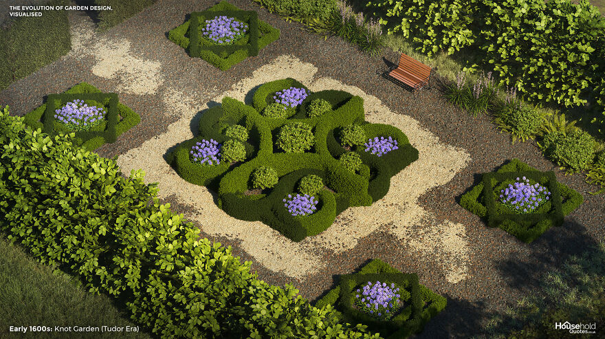
Image credits: HouseholdQuotes
Tudor gardens could be grand attractions. A knot garden might have been just one feature of a network of walled garden types, including labyrinths and fish ponds. A knot garden works best when visitors can get an overhead view. Elizabethan designers favoured a snail mount, consisting of a sloping path that spiralled up to a pavilion or sitting place.
1600s: Jardin à la Française/French Formal Garden
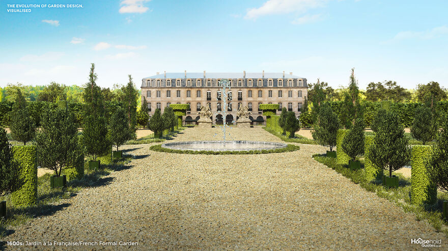
Image credits: HouseholdQuotes
The Gardens of Versaille are one of the few ‘international celebrities’ in the gardening world. And they exemplify the French formal garden type, whose enormous influence across 17th-century Europe continues to reverberate today. Versaille and its contemporaries were cutting-edge horticultural achievements requiring an enormous effort of labour. Versaille itself continues to need replanting once every century.
But all of this does not put the style out of reach of the average 21st-century gardener. Versailles is an expansion of the garden unit known as the parterre: a formal garden divided into patterns by gravel, hedging, and flower beds. Those with the time and imagination can scale the style down and replace elements with less maintenance-intensive features. As well as richly scented plants including lavender and rosemary, the French formal garden may feature trees such as beech, chestnut, and Linden.

Image credits: HouseholdQuotes
The English variation on the Jardin à la Française, like the knot garden above, was inspired by the patterns of embroidery. This parterre à l’anglaise transplanted the patterns of the French formal garden to a grass lawn, softening the effect and delivering a spectrum of floral colour. Water features and statues are popular in all variations.
Early 1800s: Gardenesque Style (Late Georgian)
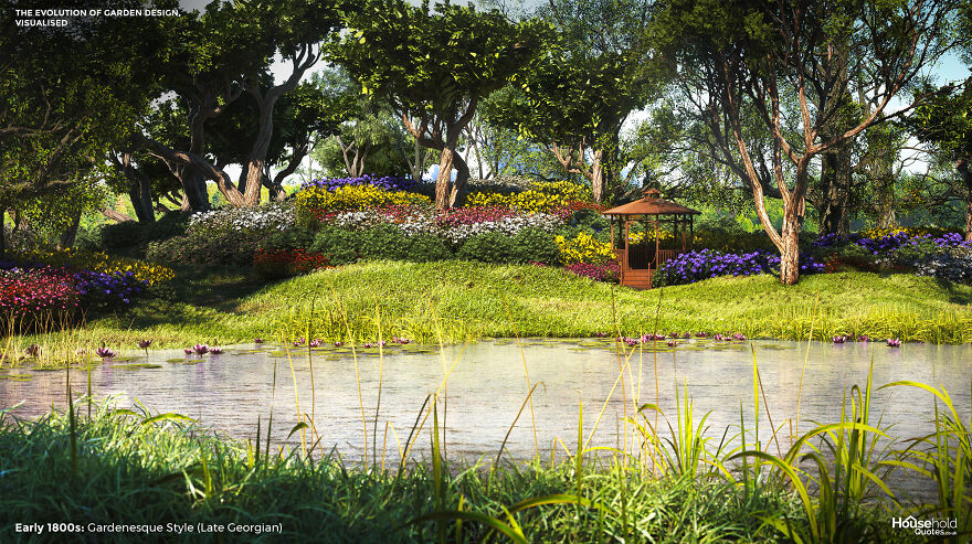
Image credits: HouseholdQuotes
Celebrated garden designer John Claudius Loudon conceived the gardenesque style as high art, which, all the same, removed design responsibility from architects and passed it to gardeners. Loudon proclaimed that “any creation, to be recognised as a work of art, must be such as can never be mistaken for a work of nature” – and yet his gardening philosophy called for plants to be allowed to express their natural uniqueness.
The trees of a gardenesque landscape should be segregated by type, but the arrangement should not be geometric or repetitious. And the flora should be displayed for pleasure and education, without being “picturesque” (or kitsch, as we might put it today). All in all, the gardenesque style is wracked with contradictions.
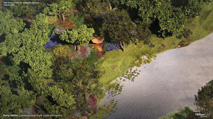
Image credits: HouseholdQuotes
Loudon’s solution to these contradictions? Firstly, to import exotic blooms which fully celebrate nature while being quite unnatural (and therefore artistic) in an English garden. And second, to plan the gardenesque design on a ‘hidden’ structure of irregular geometric shapes of grouped species. The result was an immersive, dramatic garden. Unfortunately, gardenesque principles are difficult to replicate since they involve swapping out even local grasses for exotic ones and making lakes and large rocks seem artificial by substituting the surrounding vegetation wholesal
1800s: Early American Period – Pioneer Kitchen Garden
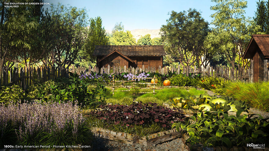
Image credits: HouseholdQuotes
Aesthetics were the last thing on the mind of pioneer kitchen gardeners. As invaders of a strange land, the kitchen garden was a vital source of sustenance. The garden was laid out with an eye for efficiency: close to the door for access and security, with perimeter paths for harvesting rather than admiring the beds. Border hedges or fencing kept scavengers out.
But there was beauty in this economy of design. Sweet-smelling herbs were planted nearer the house, with onions and cabbages grown at a distance. Patterns emerged where seasonal vegetables grew close to each other to prevent the disturbance of perennials that could be left alone. Taking a tip from the Native American tradition, settlers would plant corn, pole beans, and squash together. These three crops provided trellis support, nitrogen for healthy growth, and light and temperature regulation, respectively.
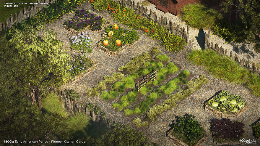
Image credits: HouseholdQuotes
Fruit trees, cotton, and medicinal plants were also cultivated, but flowers were not a priority. The settlers learned lessons that prevail today: listen to the land and find beauty and structure in the functioning of nature.
1870s to 1920s: Arts & Crafts Garden (Victorian & Modernist Eras)
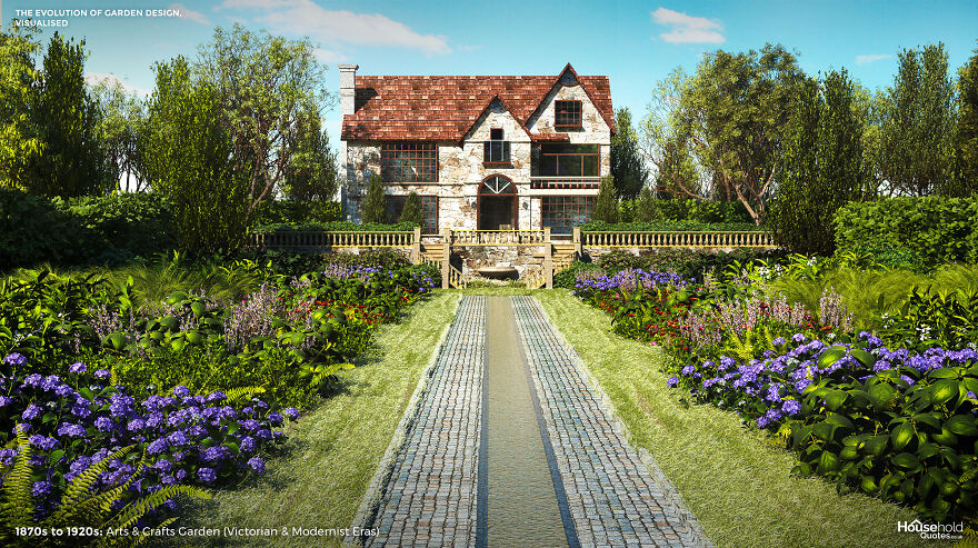
Image credits: HouseholdQuotes
The Arts and Crafts movement valued authenticity and a hands-on approach. Its manifestation in the garden was no different. Like the gardenesque style before it, the arts and crafts garden railed against kitsch ornamentation – but now, faithfulness to the site was paramount. From region to region, this meant the use of indigenous plants and materials. From home to next-door home, it meant celebrating nuances between the architectural and environmental features of neighbouring properties.
The arts and crafts garden should express the personality of its owners. It begins as an extension of the home and then blends into the landscape beyond the owner’s plot, segueing into woodland or the countryside. The natural textures and colours of materials used in built elements of the garden should be exposed, and the crafter’s hand might be visible in the uneven stones of drywall or crooked trellis.

Image credits: HouseholdQuotes
The look can be approximated and modernised today with fashionable materials such as rattan and slate and the use of vines and fruit trees. But to truly approach a ‘modern’ arts and crafts garden, begin by stripping back your garden’s features and looking into the local ecology and history for artistic inspiration.
1900s to Today: American Suburban Front Lawn (Contemporary Era)
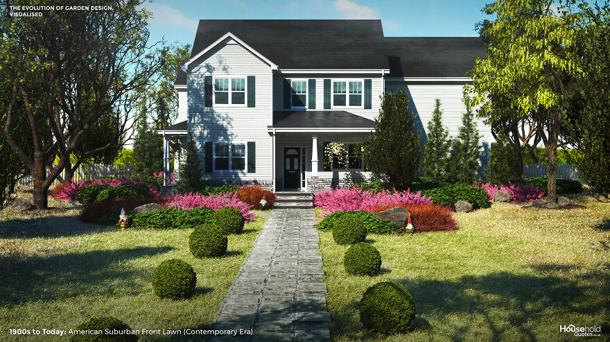
Image credits: HouseholdQuotes
It’s a modern classic: the American lawn, veteran of Fitzgerald’s novels and David Lynch’s movies. The lawn is the simplest of gardens but a complex status symbol representing colonisation or middle-class attainment, depending on your perspective.
At first, grass was a matter of survival: settlers sent for non-indigenous grass seeds to replenish the land after their livestock ate their way through what they found. But after the American Revolution, as food security improved, settlers embraced European influences. The lawn was conceived as a country estate in miniature – an enclosed and manicured landscape with room to roam.
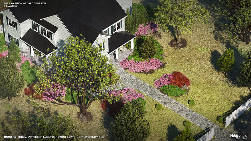
Image credits: HouseholdQuotes
Lawn maintenance aside, the art of the American front garden is found in its practical elements: a winding path that delivers varying views of the home and surrounding landscape, that white picket border fence and shady tree. Choosing a dogwood, magnolia, or sugar maple tree adds narrative to the front of your home, changing with the seasons.
Today, the sprinkler system and the hired gardener of the American front lawn operate along the same lines as the ornamental hermits mentioned in the introduction – they are garden furniture in themselves, indicating the unruly scale of the land and the wealth of the owner. But with thousands of years of garden design inspiration from which to draw, you are sure to invent more unique ways to bring out the best in your home.
This Is How Garden Design Evolved Over 4,000 Years All Over The World, Provided By Household Quotes
Designers’ Vision: Childlike London Landmarks
We have become accustomed to the appearance of the great monuments of the London Landmarks. London is blessed with many great landmarks, Buckingham Palace, Big Ben, the Eye, the Bridge, and many, many more. Have you ever wondered how you can adjust them? Probably not, because it would take a lot of creativity and imagination and even the courage to do so. I mean, they already look perfect …
But such a challenge is a piece of cake for a child. And so, the British housebuilder Barratt Homes asked some children to try to reimagine these famous landmarks according to their taste. And they departed. Later, they asked some digital artists to recreate their drawings in 3D so that the whole world would know what they would look like in reality. See for yourself!
Woods Big Ben
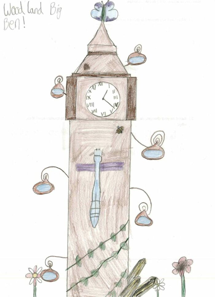
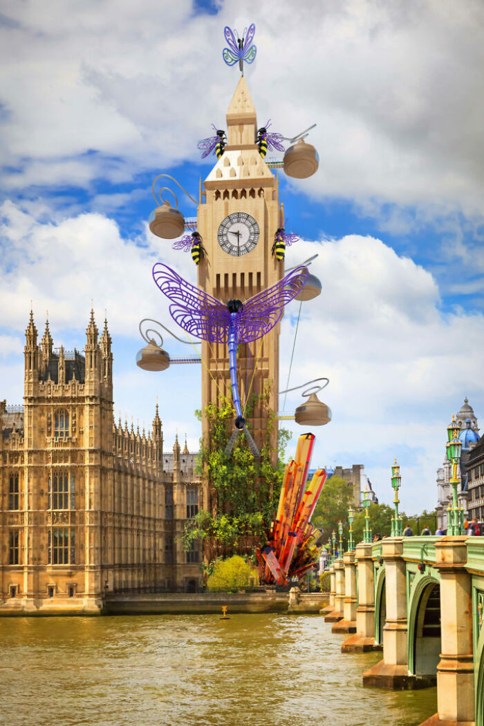
Big Ben was reimagined by Daisy, aged 11, and has a wooden building giving it a naturalistic finish. These hanging baskets, which look very much like beehives, also serve as well-to-do pods where tourists and city workers can sit, relax and watch the sights of London. Daisy also featured an embroidered dragonfly sculpture sitting just below the clock, as well as smaller bee sculptures scattered throughout helping to bring more of the woodland nature feel. The finishing touches around the base include hanging ivy and a few crystals.
Tower Bridge Theme Park
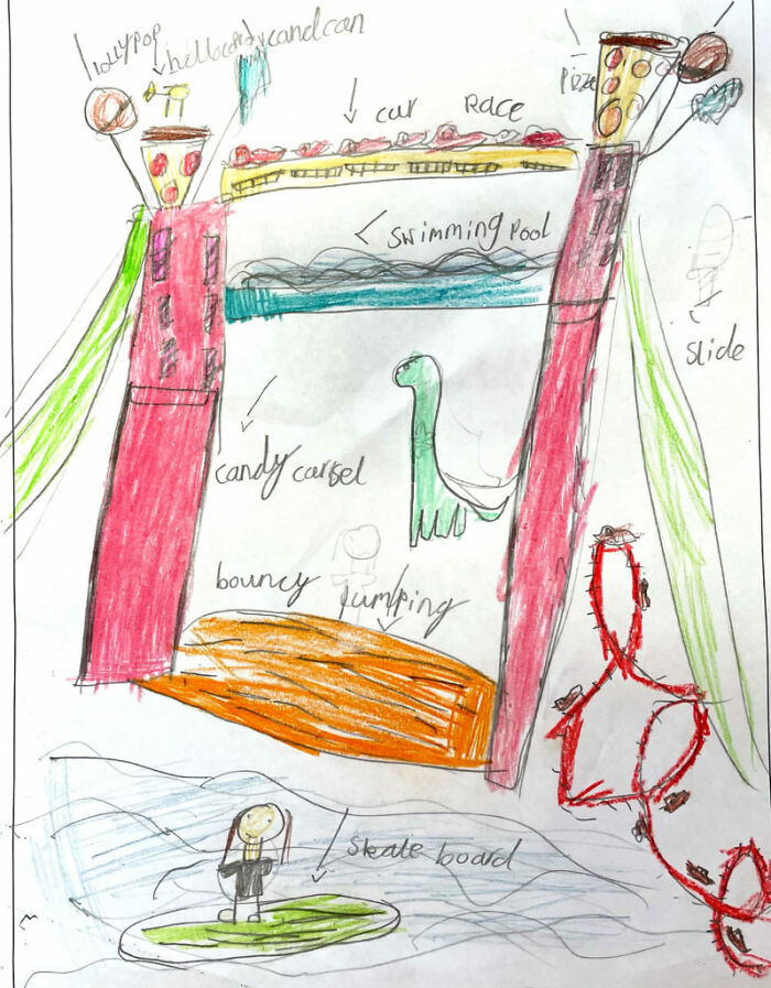

Our next re-imagining of London Landmark was edited by Navneet, a 7-year-old who turned Tower Bridge into a full-fledged amusement park. Excited fans would be glad to know that it now has a roller coaster, water slides, a running track and a giant jumping castle. If quiet swimming sounds more like your street, however, Navneet has also incorporated an endless swimming pool that will surely offer some unique views of the skyline of London. For all the visiting characters, there are also 2 helipads in the shape of pizza slices that sit above each of the towers.
The Star London Eye


Designed by 8-year-old Syeda, this reimagined version of the London Eye gives up the round shape and instead uses a visually striking star. With neon lights everywhere, this new addition to London’s skyline will surely brighten the city all year round, and will certainly be a huge hit during the festive months. And to remember a ride, Syeda’s design also features several traditional square cars where visitors can fly.
The Spooky Breaking Coaster
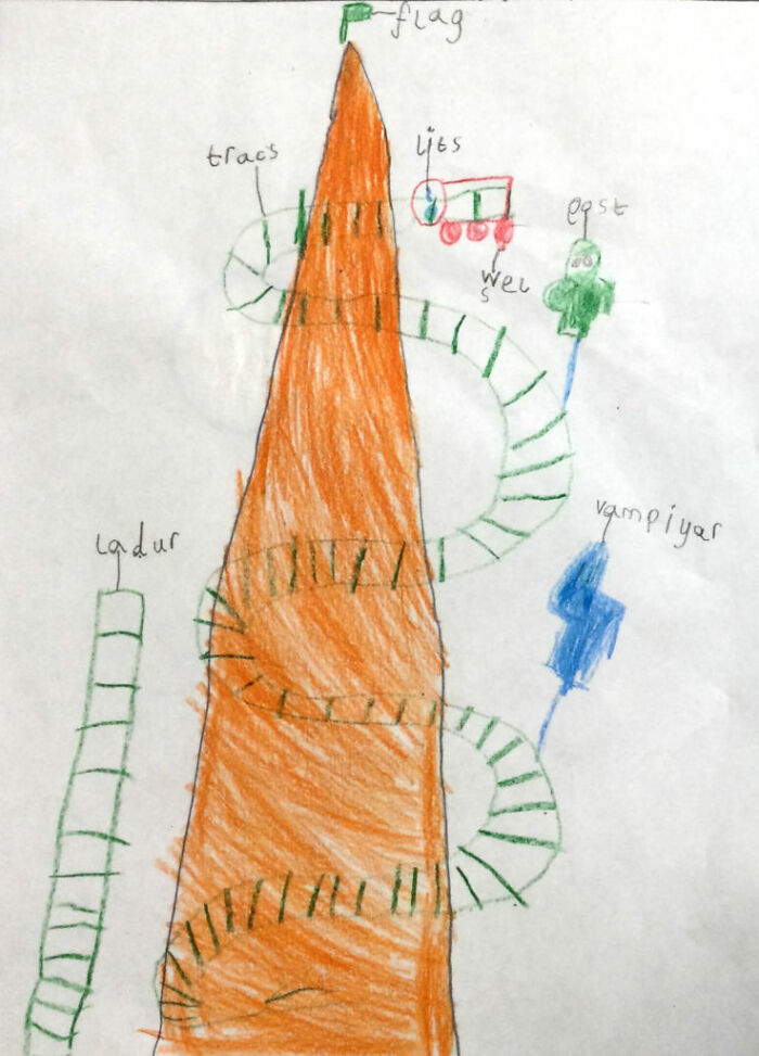

Our last landmark reimagined is from Ayan, 6, who turned The Breach into a haunted roller coaster. Using the height of the building to his advantage, Ayan’s created a white-finish ride that extends the entire length of the building. Ghosts and vampires also patrol the tracks, while the orange and green colors add to the Halloween theme.
Watch this space for more information on that. Stay tuned to Feeta Blog for the latest updates about Real estate.
Designers’ Vision: Childlike London Landmarks
- Published in #architecture, 3d, 700-page, Architecture, Big Ben, children, childrens drawing, digital art, famous, historical, Homepage trending, imagination, kids, Landmark, landscape, London, monuments, popular, recreation, redrawn, reimagine, render
Stress-Relief Cabin: Compact, Global Assembly in 183 Sq Ft
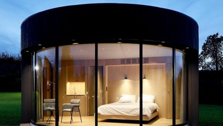
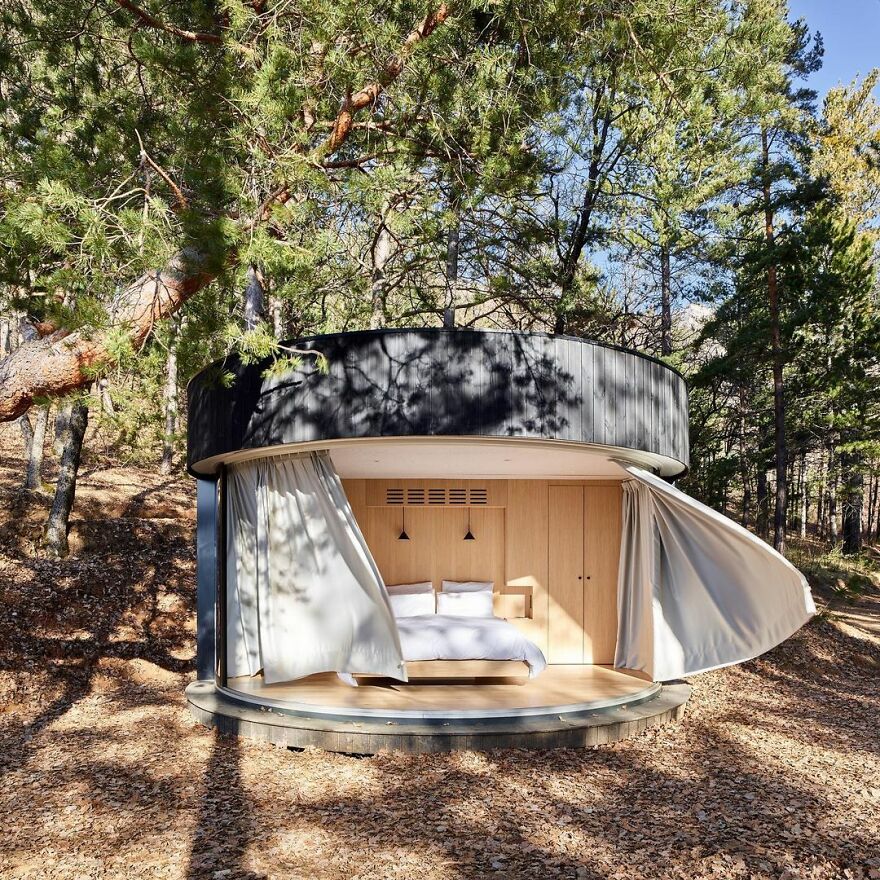
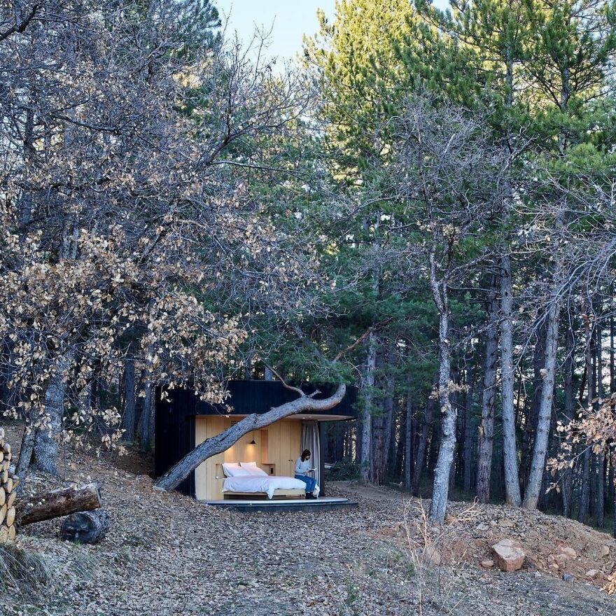
We are pretty sure that most of us enjoy a relaxing getaway in nature, whether camping, renting a cabin in the middle of the forest or just spending a day by the lake. Well, it seems that getting closer to nature has become even easier – and more comfortable – thanks to these ready-made, round huts with sliding glass walls that can be put together almost anywhere in the world!
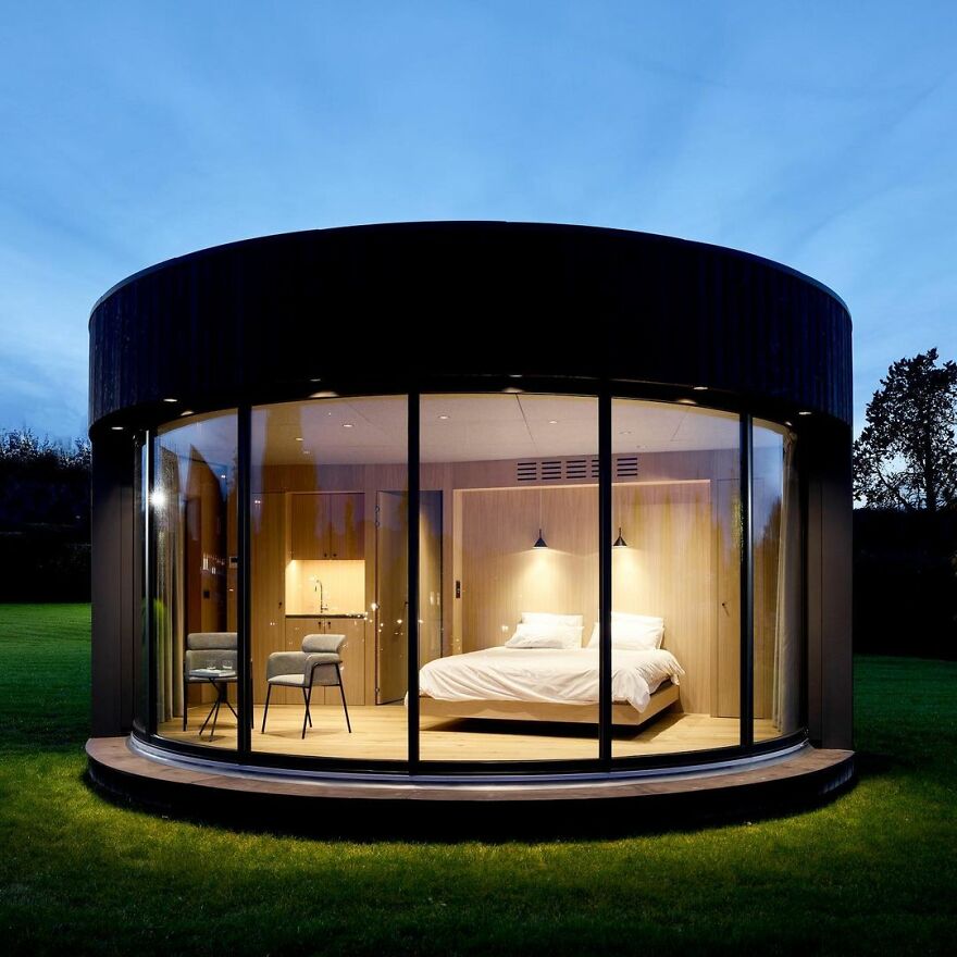
The aforementioned huts are called LumiPods, and are only 183 square feet. The compound cabin contains a simple bedroom and bathroom.
They have charred wood cladding and a glass facade that slides open to give a seamless connection between the interior and exterior spaces and were created for stressed city residents who may be looking for a weekend getaway.
Would you like to try this yourself, Pandas? Let us know in the comments!
The new tiny cabins are called LumiPods and measure just 183 square feet. They contain a simple bedroom and a bathroom.
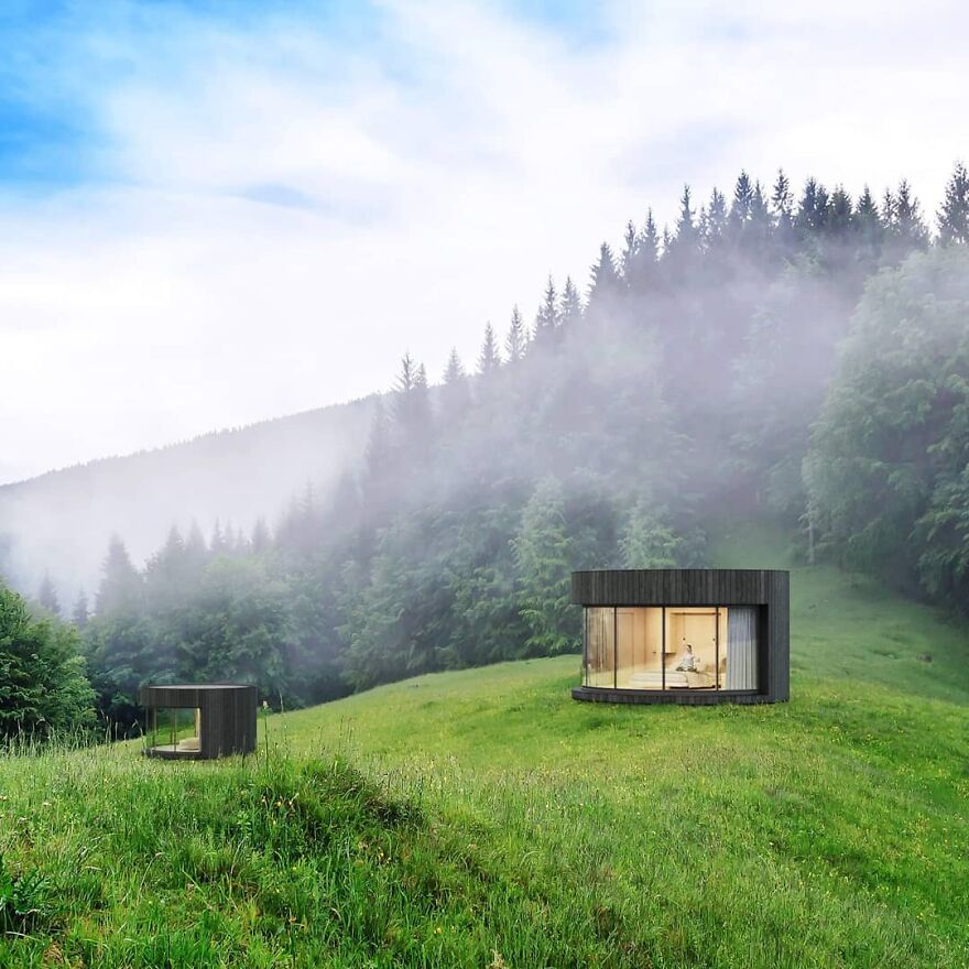
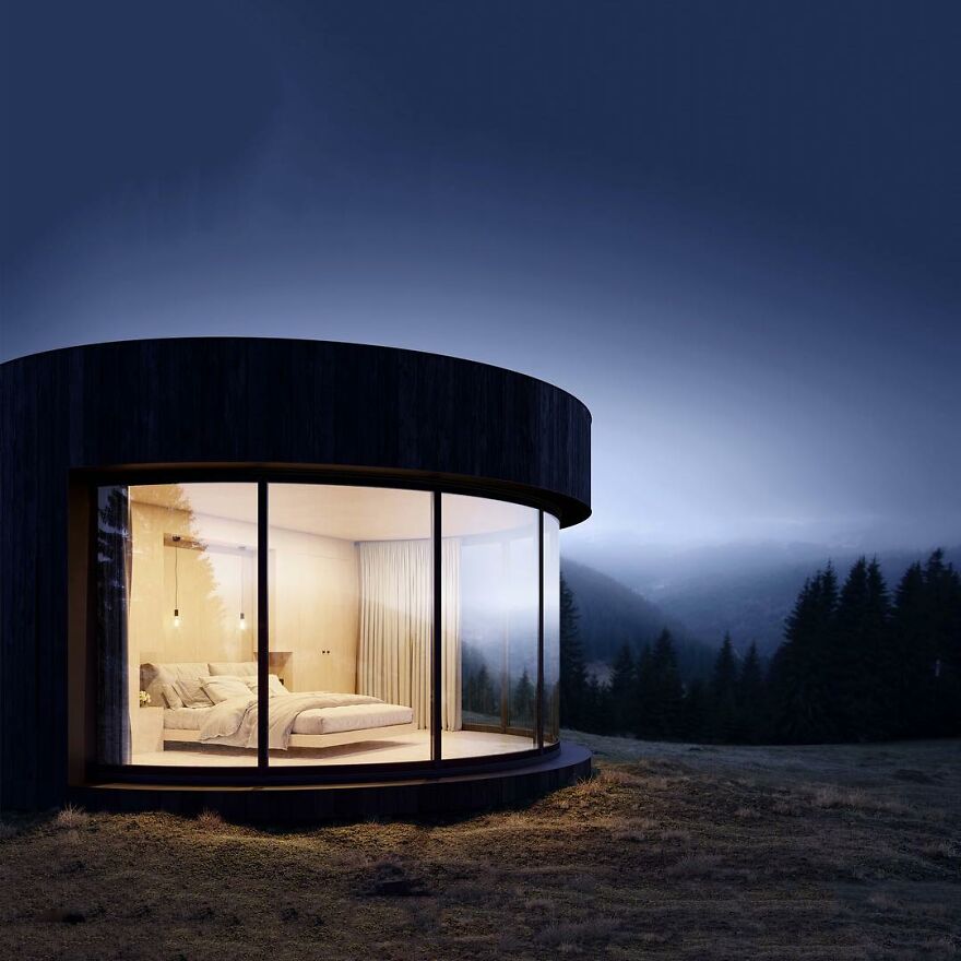
The LumiPod was designed by French company Lumicene, which says it envisions the capsules as “simple cocoons”
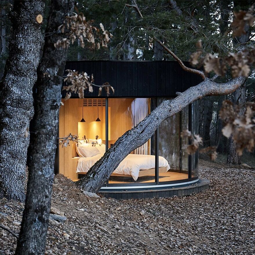

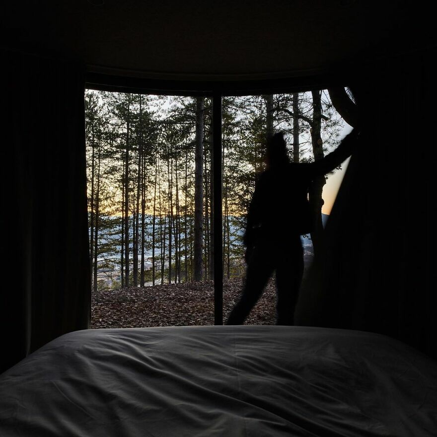
The mini-cabin offers unobstructed views – from almost any position inside
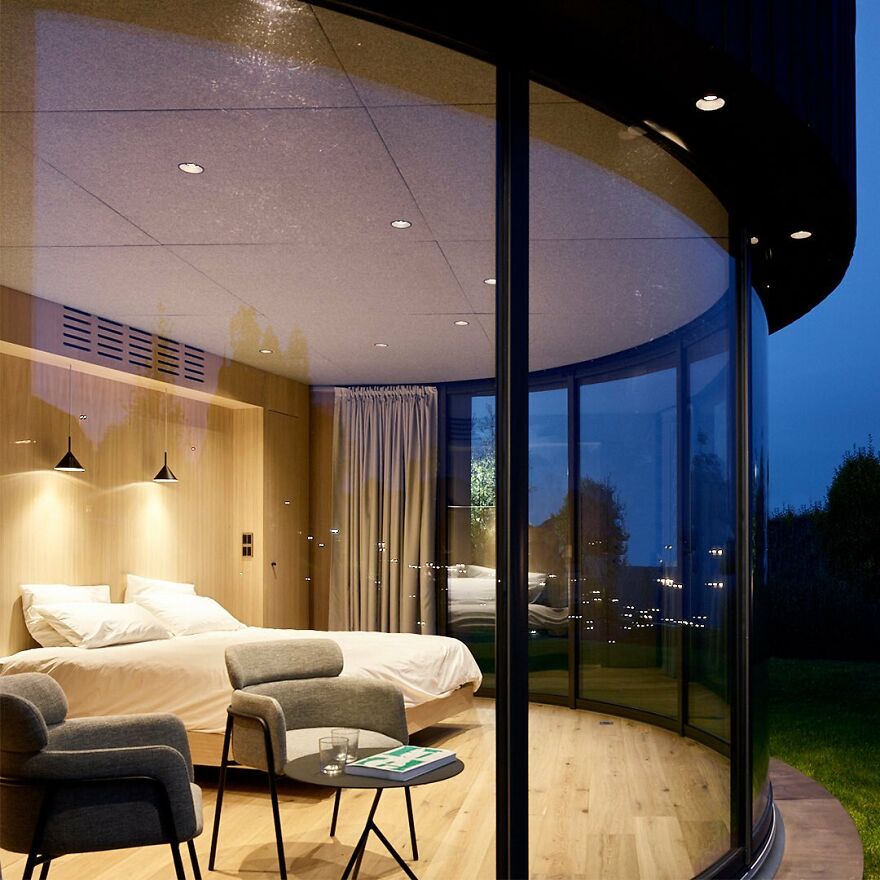
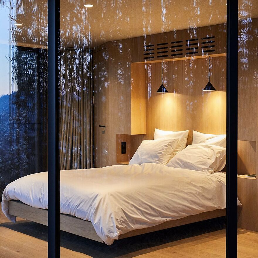
The prefabricated capsules consist of two modules that stand gently on four screw piles
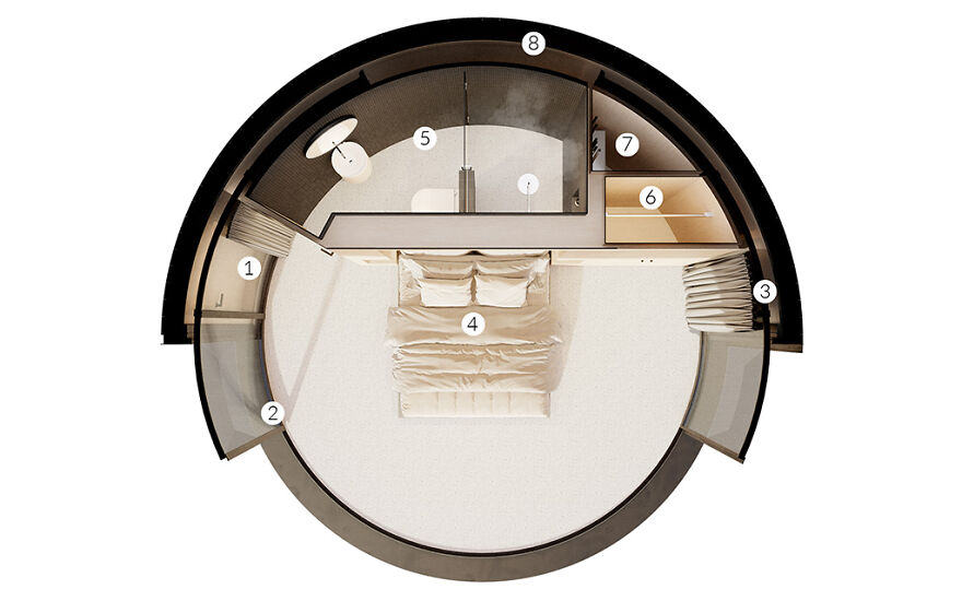
LUMIPOD components:
1 – Curved Entrance Door
2 – LUMICENE curved reversible window
3 – Curtains
4 – 150 square feet (14 square meters) bedroom with panoramic view
5 – Bathroom and toilet
6 – Cabinet
7 – Service cabinet
8 – Curved timber frame walls

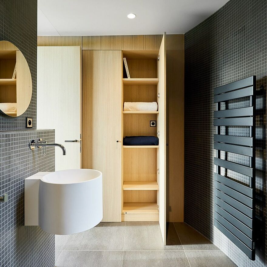
A simple bathroom inside the LumiPod. They can be shipped anywhere in the world and assembled within two days

The capsules are strong enough to withstand most climates and the inside of the capsules is well insulated.
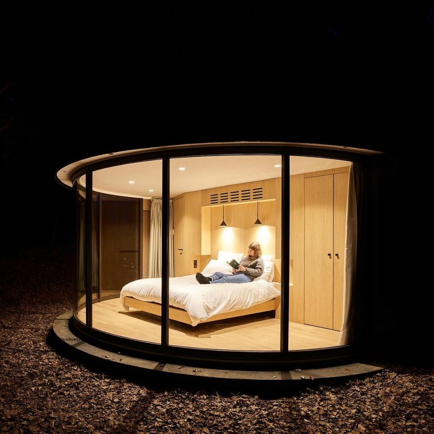
LumiPods must be connected to electricity, water and sewage networks. But the company is currently exploring new technology to offer a completely offline version later in the future
Watch this space for more information on that. Stay tuned to Feeta Blog for the latest updates about Architrcture, Lifestyle and Interior Design.

