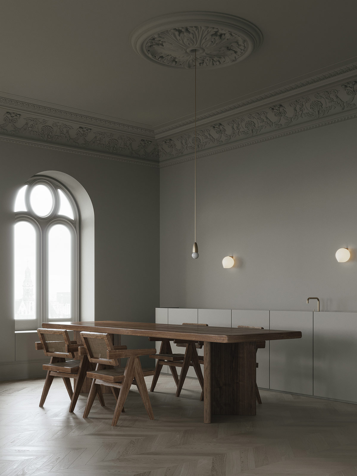
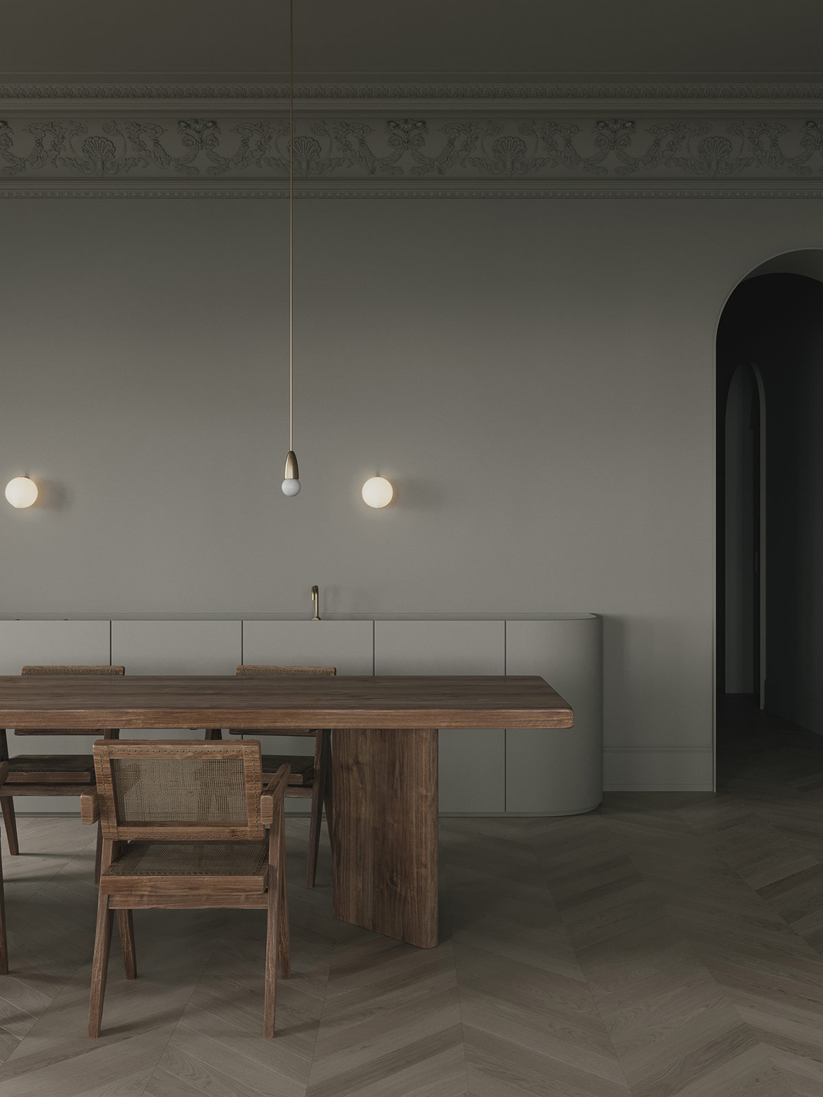
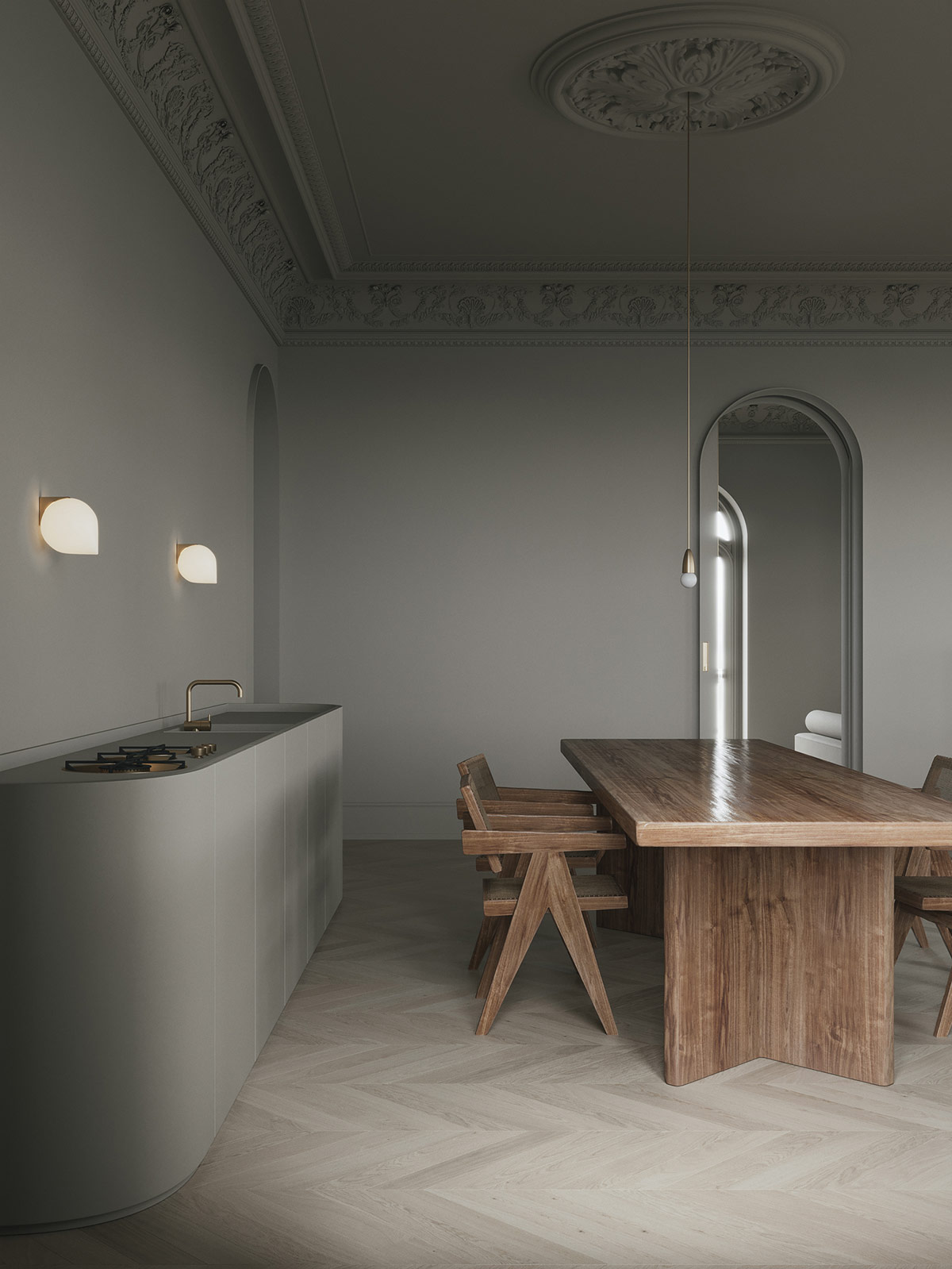
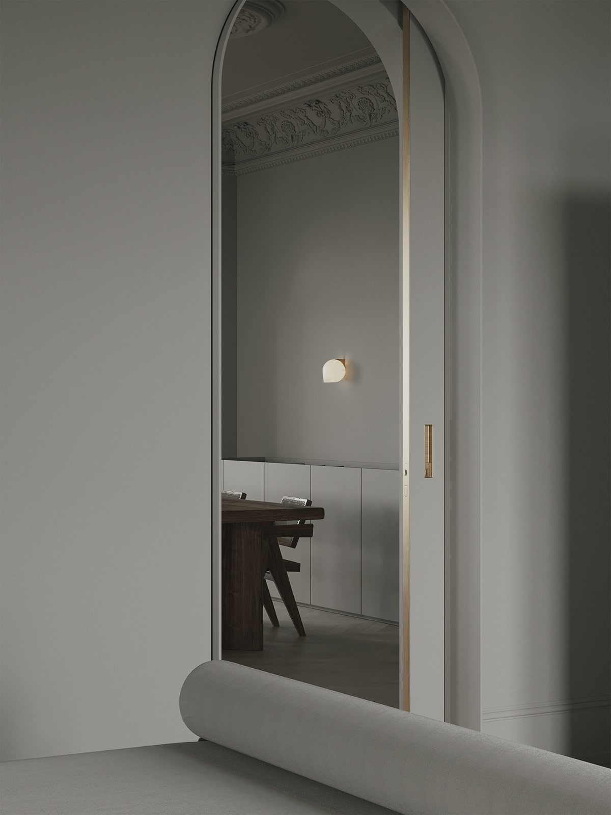
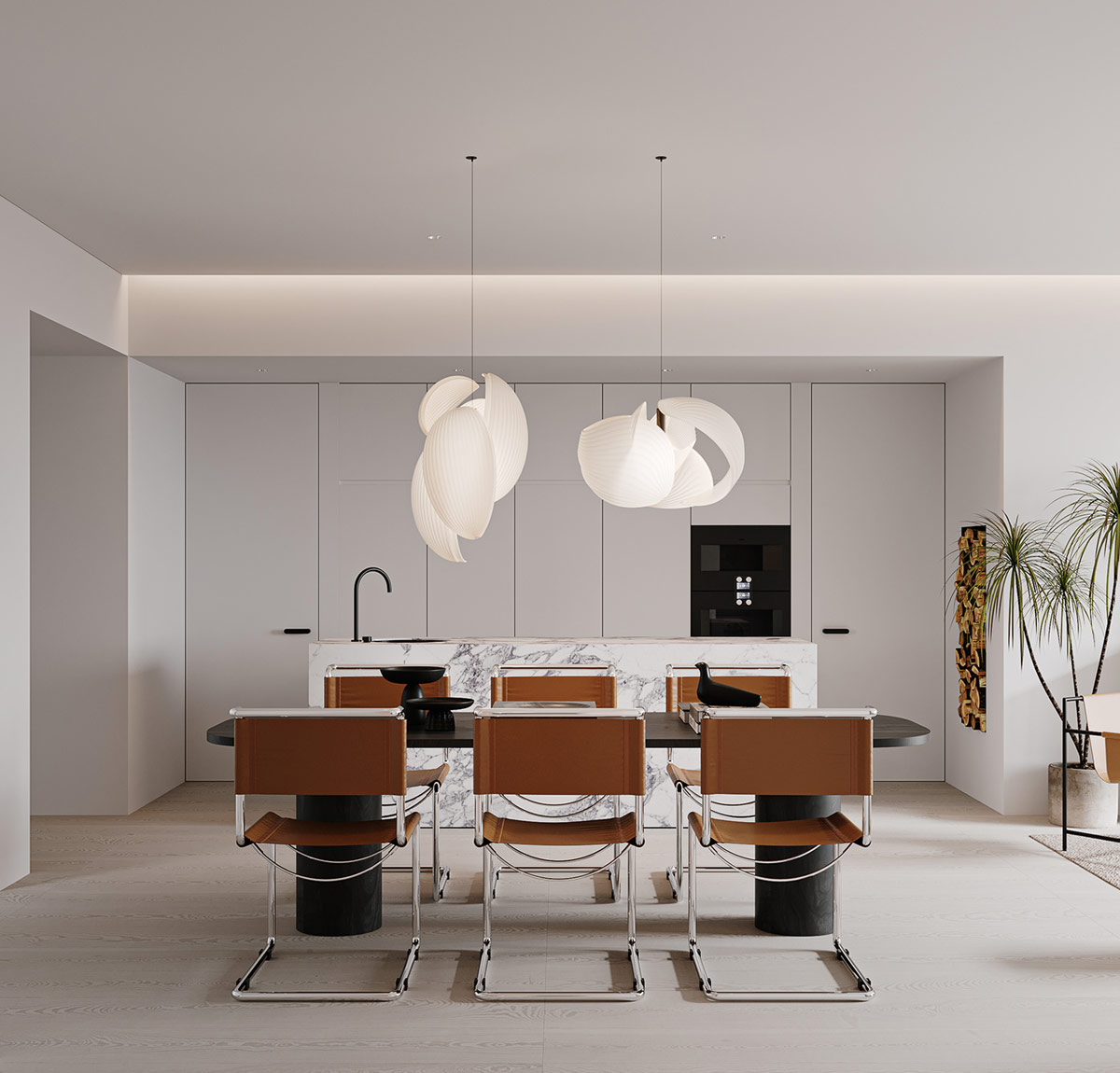
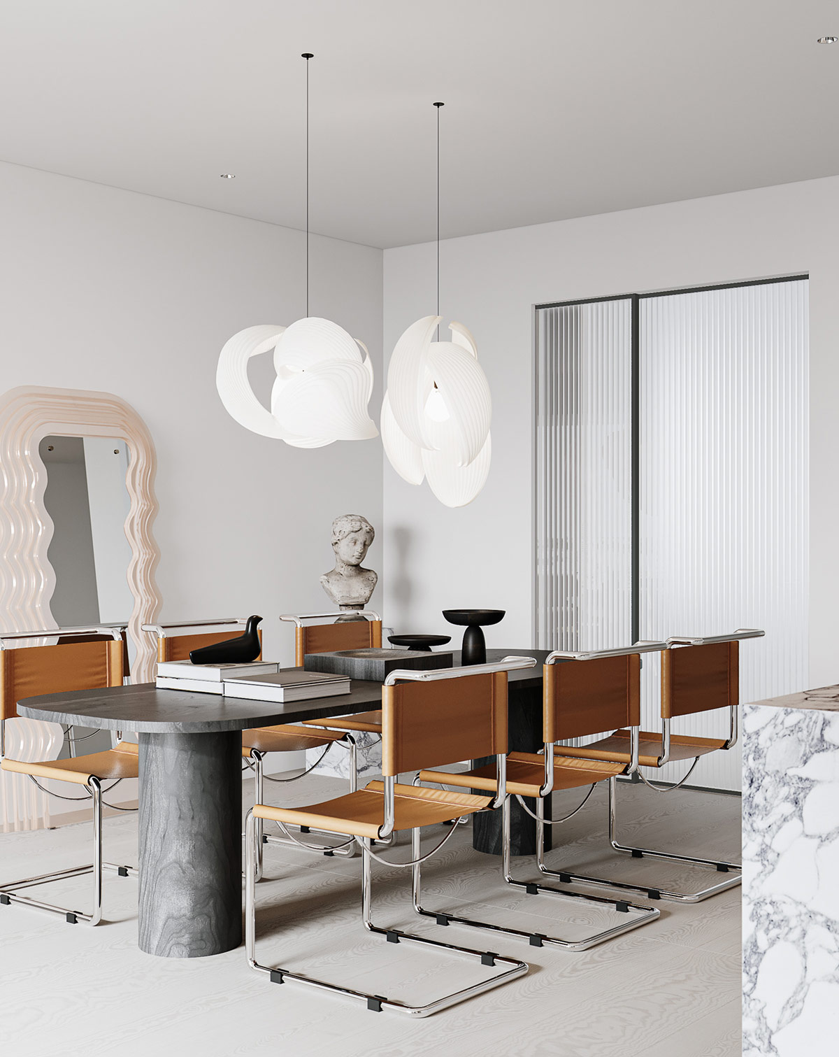
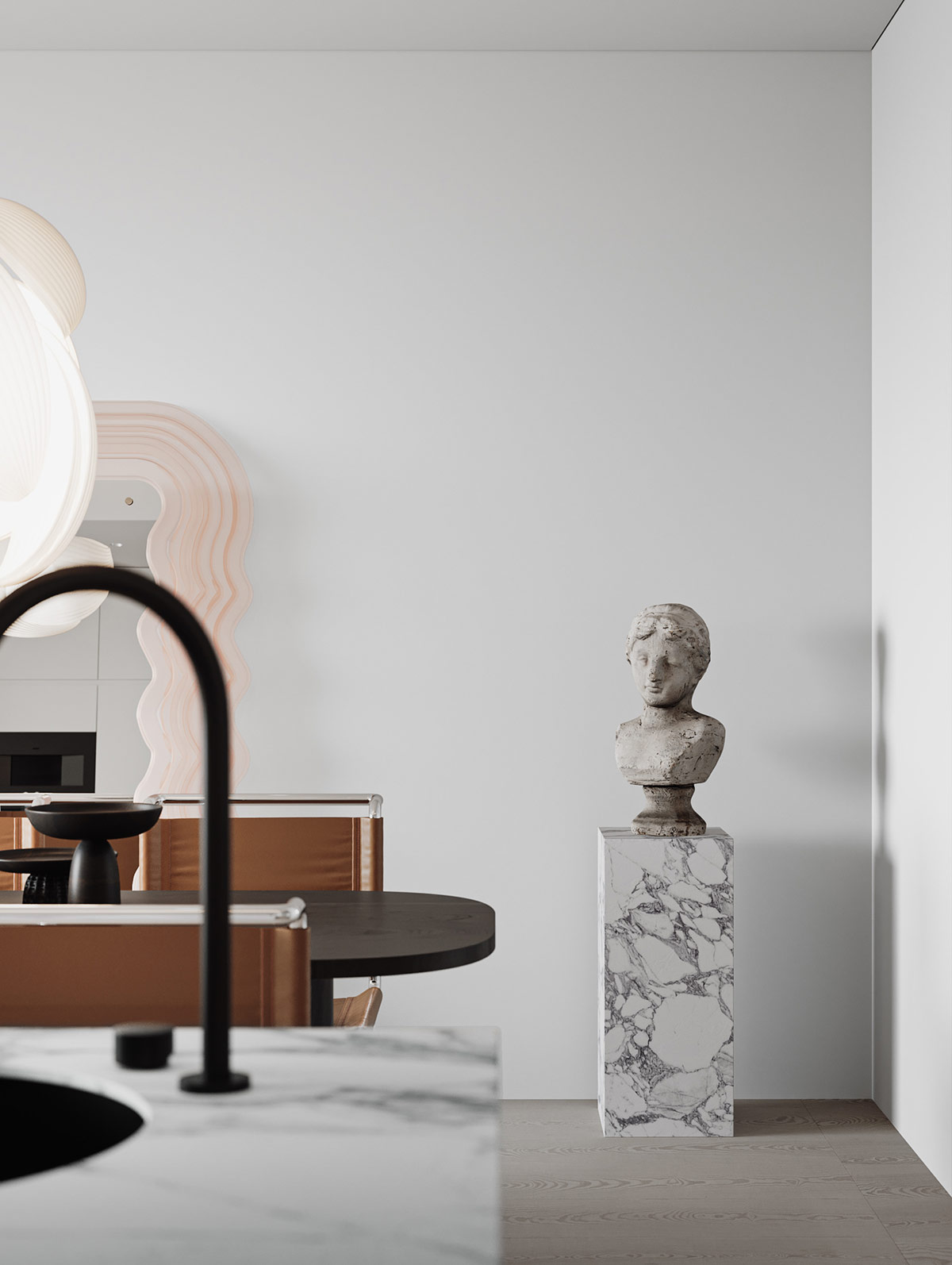
Small Kitchen Design Ideas & Kitchen Cabinet Design Ideas
Kitchen design is one of the most important aspects of any home. Not only does it need to be functional, but it should also be stylish and inviting. In this post, we’re going to share with you some beautiful kitchen design ideas that will help you create a space that you will love. From modern and sleek to traditional and rustic, there are styles to suit every taste. Whether you’re looking to update your kitchen or just want to explore some new design ideas, these are the beautiful kitchen design ideas you need to see.
Best Kitchen Design Ideas For A Modern Home
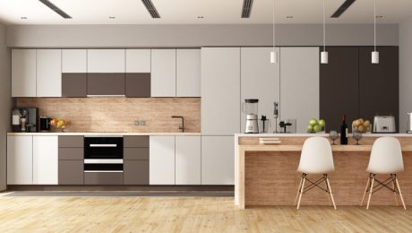
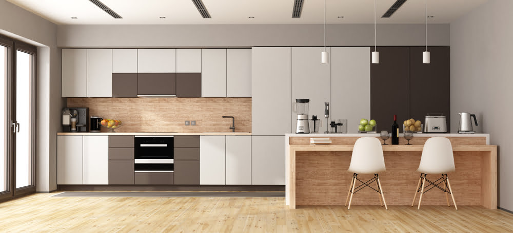
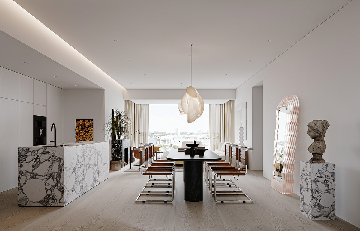
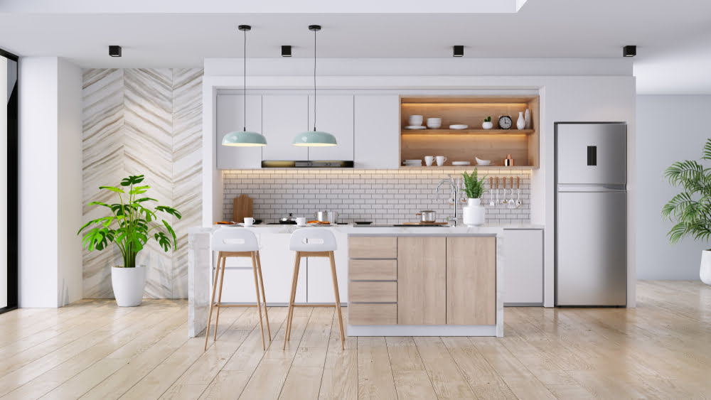
Kitchen design is one of the most important aspects of any home. Not only do you want to make sure the space looks great, but you also want to make sure that the kitchen is functional and meets all of your needs. Below are the best functional kitchen design ideas that will help you create the perfect kitchen for your home. Whether you’re looking for a modern style or a more traditional one, these ideas will be perfect for you.
1. Use natural materials in your kitchen design
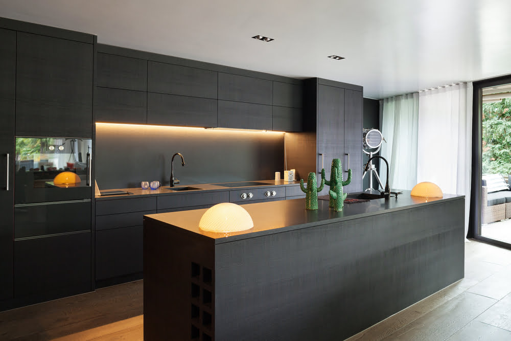
Natural materials such as wood, stone, and glass can create a beautiful and rustic look in your kitchen. They also have the added benefit of being environmentally friendly, which is a big plus in today’s world.
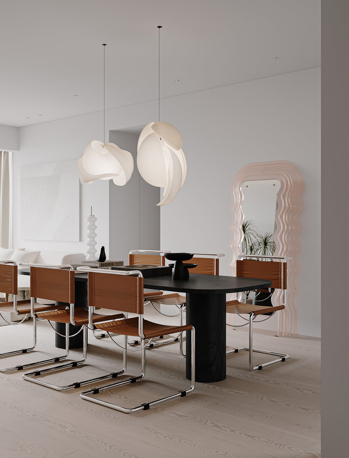
2. Use chrome and stainless steel in your kitchen design.
These materials are both modern and sleek, and they combine well with other materials in your kitchen. They also tend to be very durable, which is perfect for a kitchen that sees a lot of use.
3. Use a mix of styles in your kitchen design.
A kitchen that is all one style or type of style can start to look boring after a while. Mixing different styles will give your kitchen a more interesting look and feel.
4. Think about the layout of your kitchen.
The layout is important in any room in your home, and it’s even more important in a kitchen. Make sure you think about where everything will go and what the best layout will be.
5. Use natural light in your kitchen design.
Lighting is one of the most important aspects of kitchen design. Use natural light to give your kitchen a bright and cheerful look.
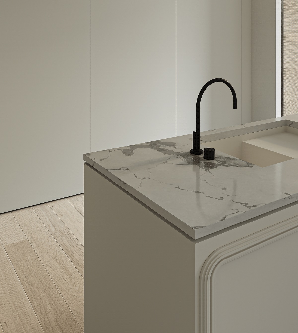
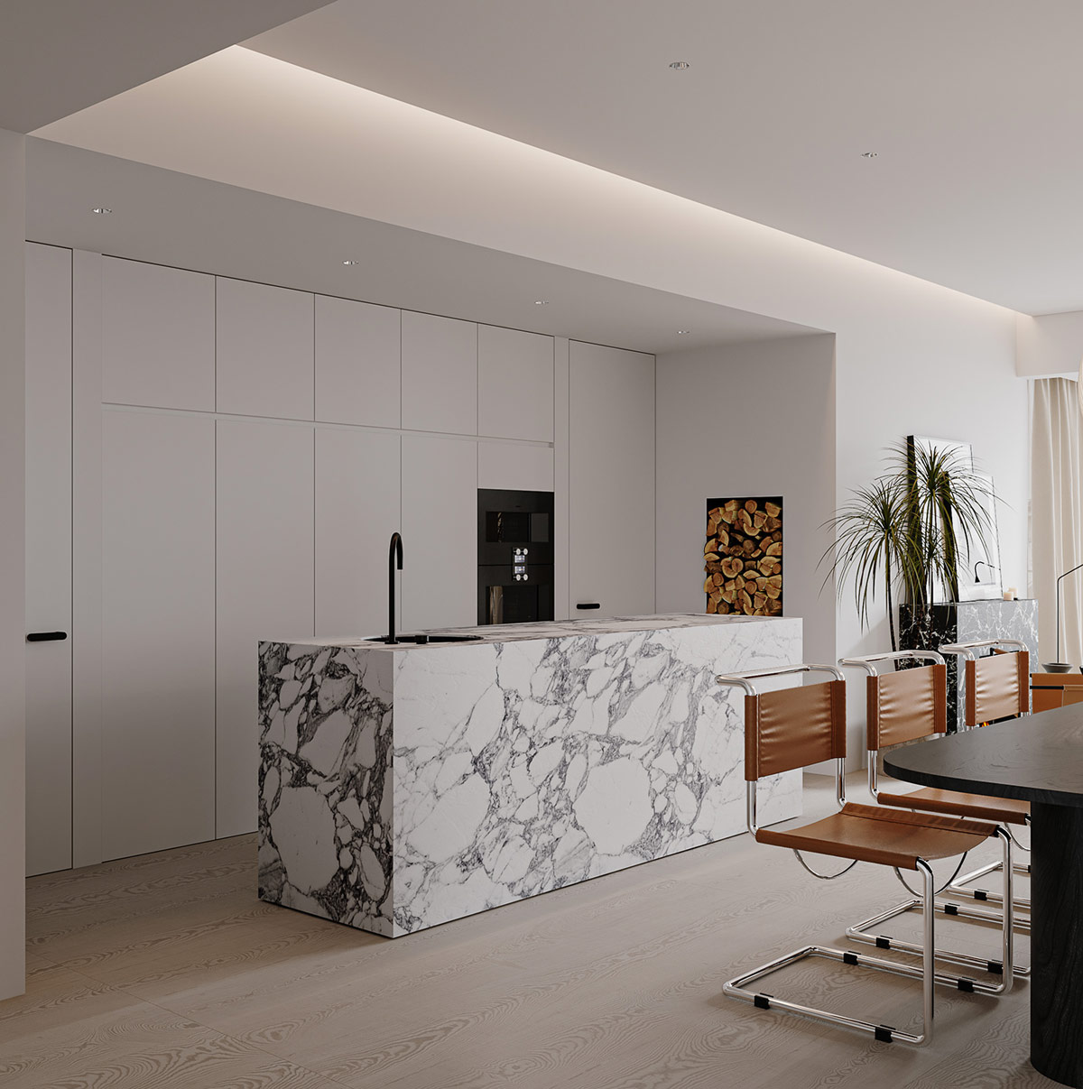
6. Use stone and marble in your kitchen design.
These materials are classic and elegant, and they can create a beautiful and warm feeling in your kitchen.
7. Use a modern style in your kitchen design.
A modern style in your kitchen will look sleek and modern, and it will be perfect for a kitchen that is used often.
8. Use glass in your kitchen design.
Glass is not only beautiful to look at, but it also has a lot of practical uses in a kitchen. It can be used for cabinets, windows, and other kitchen elements.
9. Use natural materials
Stone, wood, and ceramic are all great materials to use in a kitchen, and they will look beautiful and timeless.
10. Go for a contemporary look
A sleek, modern kitchen will go great with any type of décor.
11. Use bright colors
A brightly-colored kitchen will add a pop of color and brightness to any room.
12. Use plants
A kitchen without plants is like a kitchen without life – it’s just not right. Add a few plants to your kitchen and watch them flourish!
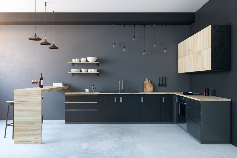
Best Kitchen Cabinet Design Ideas
Kitchen cabinets are one of the most important pieces of furniture in any home. They not only store food and dishes, but they also play an important role in the design and function of your kitchen. When it comes to choosing the right kitchen cabinet design, you have a lot of options. From traditional to modern, these designs will suit a variety of different kitchen styles. So whether you’re looking for a classic look or something a little more contemporary, we’ve got you covered
- The first thing you’ll want to think about is the size of the cabinet. This is important because it will determine the amount of storage you’ll have. If you have a small kitchen, you may want to go with a smaller cabinet. On the other hand, if you have a large kitchen, you may want to go with a larger cabinet. If you want to create a more minimalist kitchen, you can use wall cabinets. Wall cabinets come in a variety of styles and they’re perfect if you want a sleek and modern look in your kitchen.
- Think about the layout of your kitchen cabinet. This will determine where the cabinet will go. For example, if you have a kitchen with a lot of counter space, you may want to put the cabinet on the counter. If you have a kitchen with limited counter space, you may want to put the cabinet in the corner. If you’re looking for a more traditional kitchen cabinet design, you can use drawer units. This type of cabinet is perfect if you want to store dishes and silverware in separate compartments.
- Make sure to choose an impressive style for your kitchen cabinet. This will determine what type of cabinet you’ll want. You can choose to go with a traditional style, a modern style, or a transitional style. A bright kitchen cabinet design will help to brighten up your kitchen and make it more cheerful. You can use any color you like, but be sure to choose a color that will go well with your other kitchen décor.
- And finally, you must think about the materials you’ll use. You can choose to go with a wooden cabinet, a metal cabinet, or a plastic cabinet. The two most popular materials for kitchen cabinets are wood and metal. Wood is the traditional material for kitchen cabinets, and it offers many benefits such as being sturdy, affordable, and easy to work with. If you want to use traditional kitchen cabinet designs, you can use kitchen cabinetry. Kitchen cabinetry is a more expensive option, but it’s also more durable and it can be customized to match your needs.
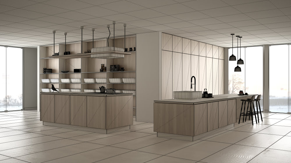
Small Kitchen Design Ideas & Kitchen Cabinet Design Ideas
- Published in #architecture, #homelibrary, #interior design, #librarydesigns, #style, bad design, home, home before and after, House for sale in DHA Lahore, house fresh, house from conteiners, interesting designs, interior, Interior Decoration Ideas, Interior Design, Living Rooms, News, real estate marketing companies in pakistan, Real Estate News
What Happens When The Famous Style Melds With Others
Do you like Architecture and Interior Design? Follow us …
Thank you. You have been subscribed.
![]()
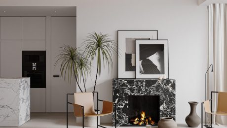
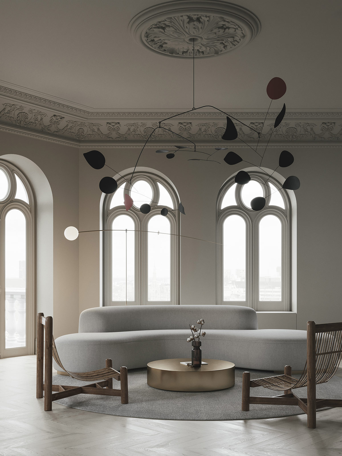
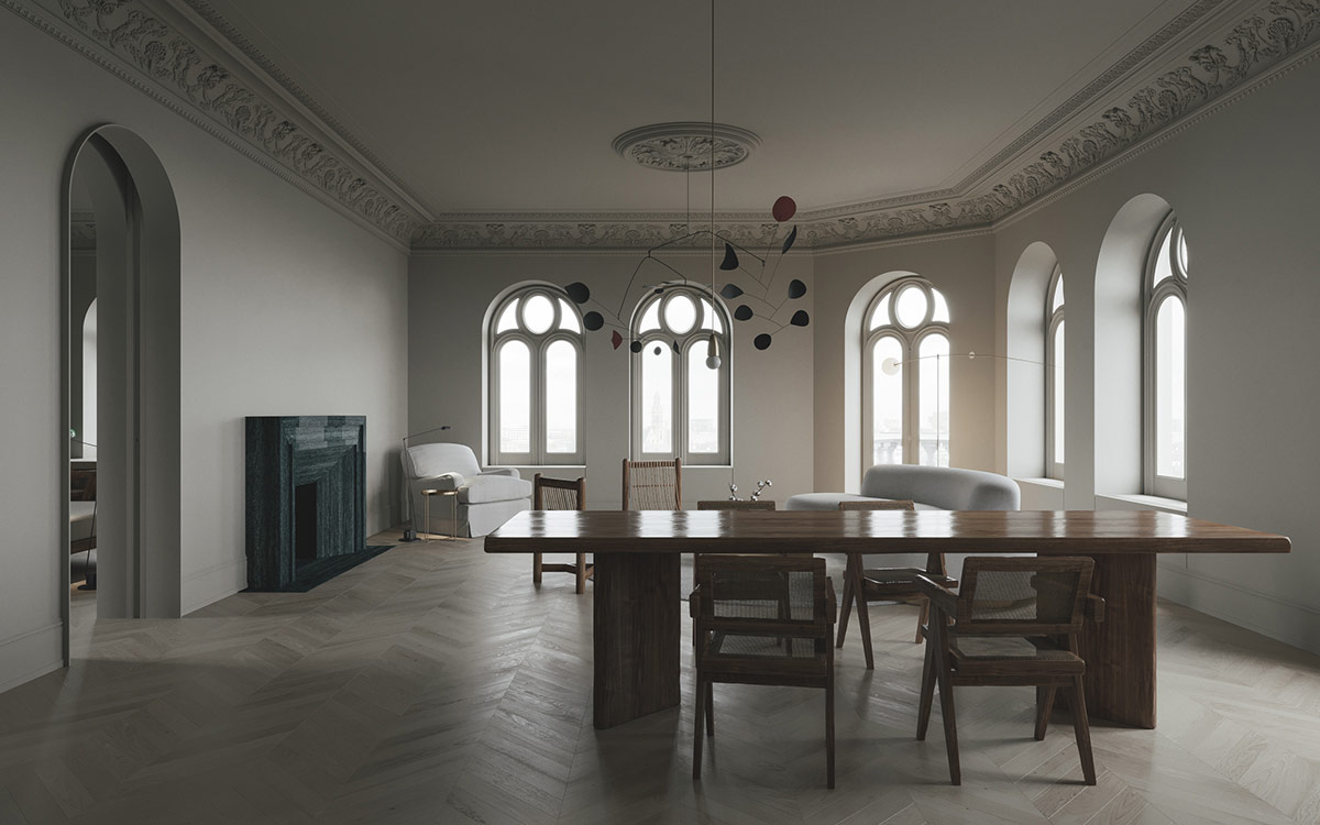
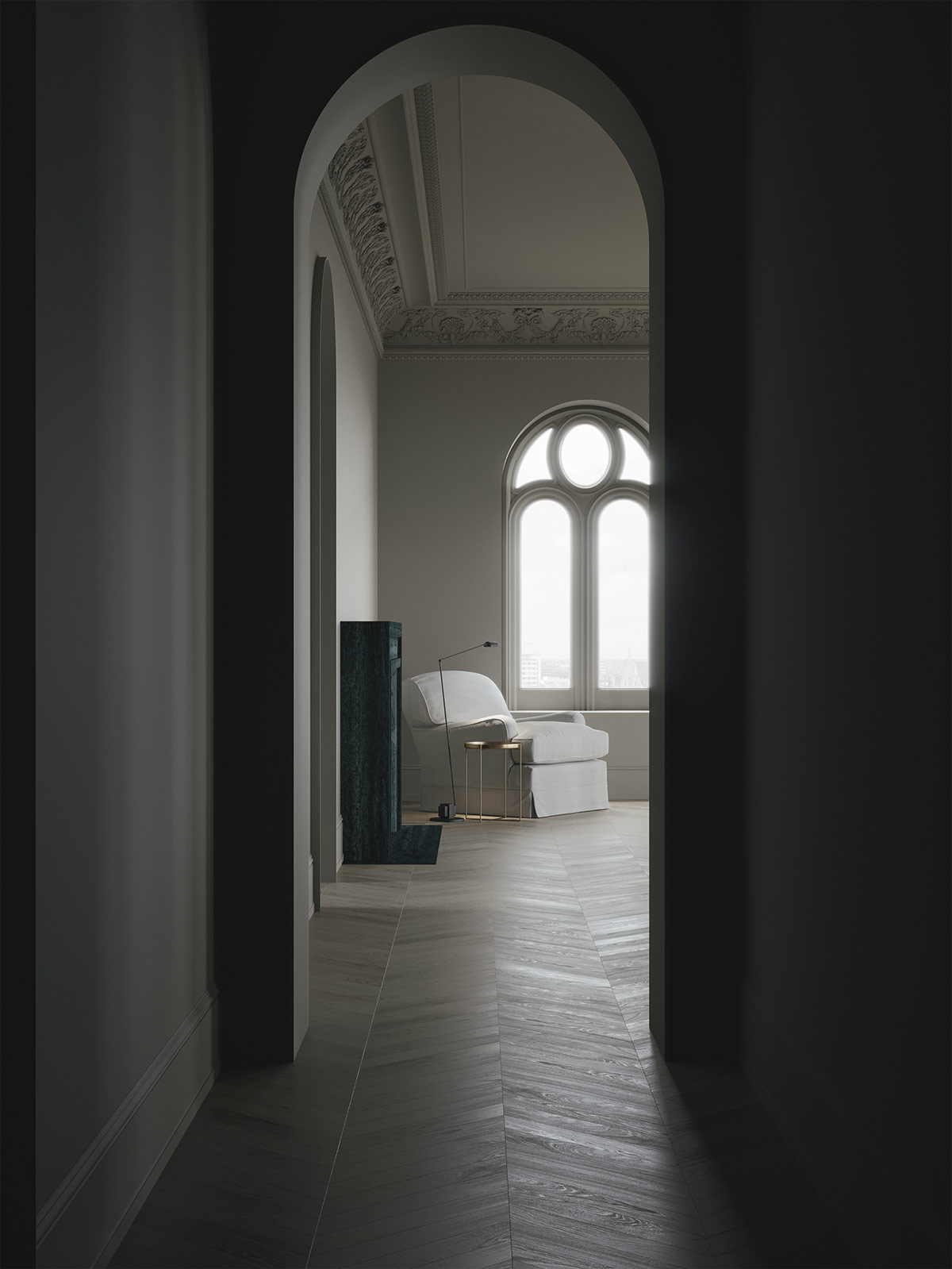
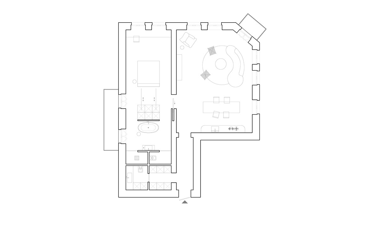
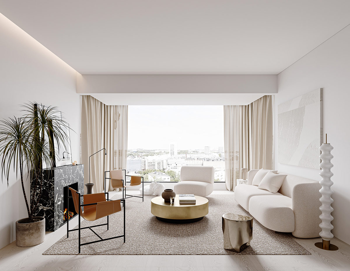
Mid-century modern encounters a crash of contemporary and classic decorating themes in these three home projects. Each exquisite interior takes a sip of many eras and styles to create interesting combinations that excite the eye. We first travel to a lake house that includes an eclectic combination of elements to form a chic and sophisticated home, and classic art pieces absorb culture. Our second tour takes place under ornate ceiling roses and intricate cover, where graceful window arches inspire curved furniture silhouettes juxtaposing sturdy mid-century pieces. Our final featured home has an ethereal white scheme in which modern gold and marble accents are mixed with antique style chairs and traditional sculpture for an attractive result.
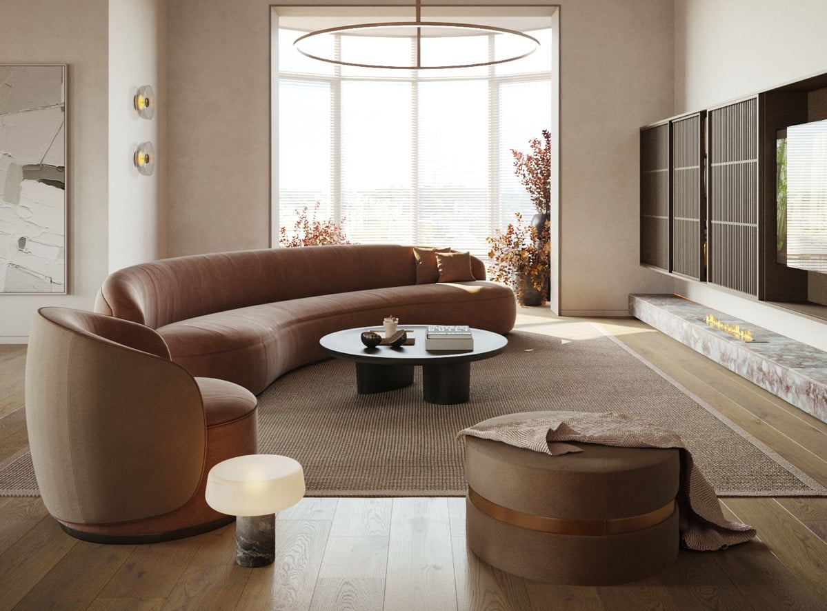
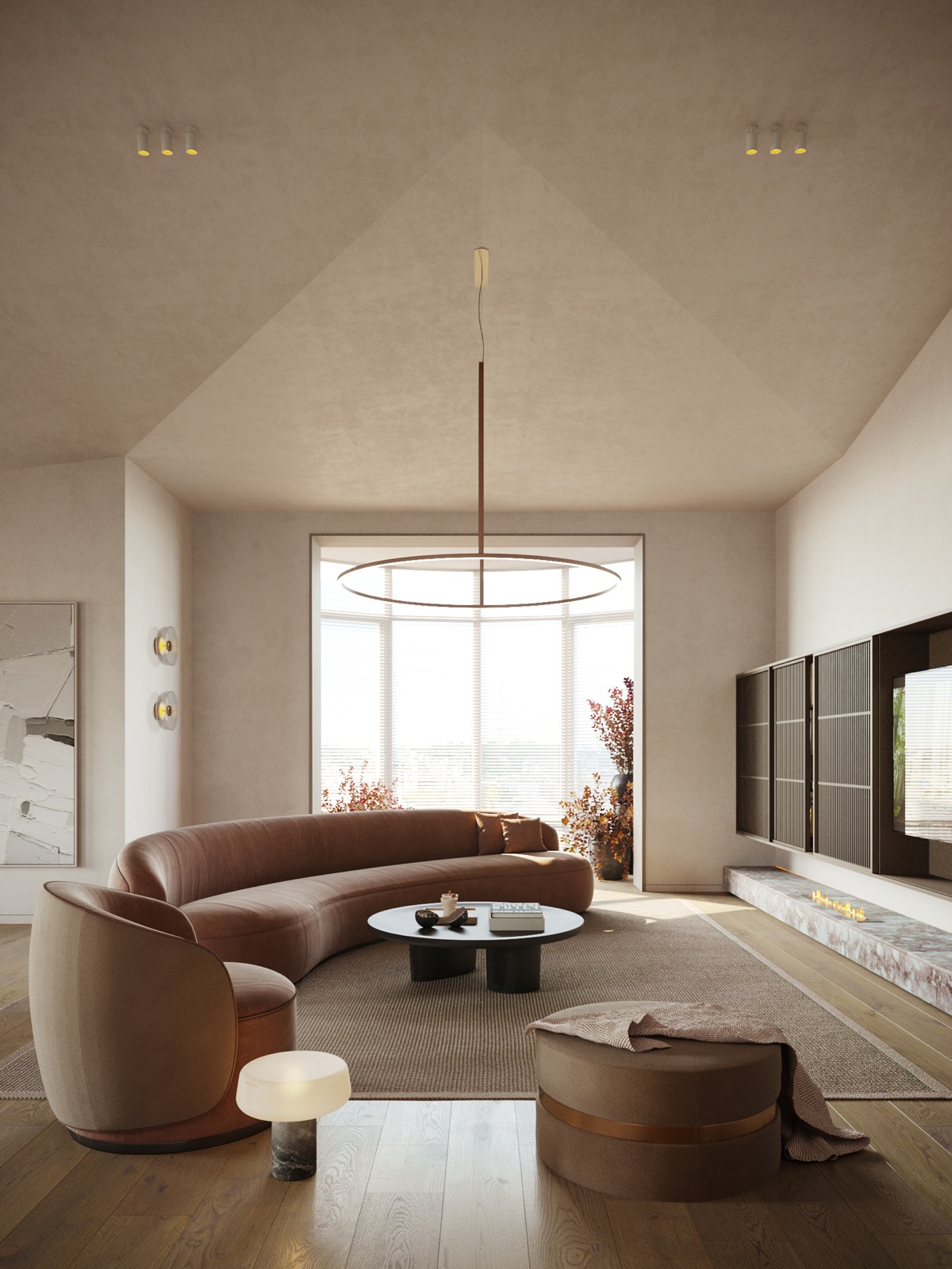
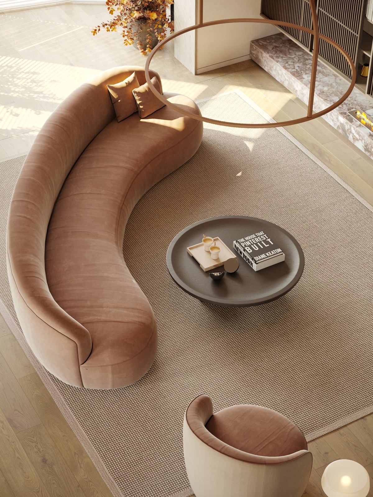
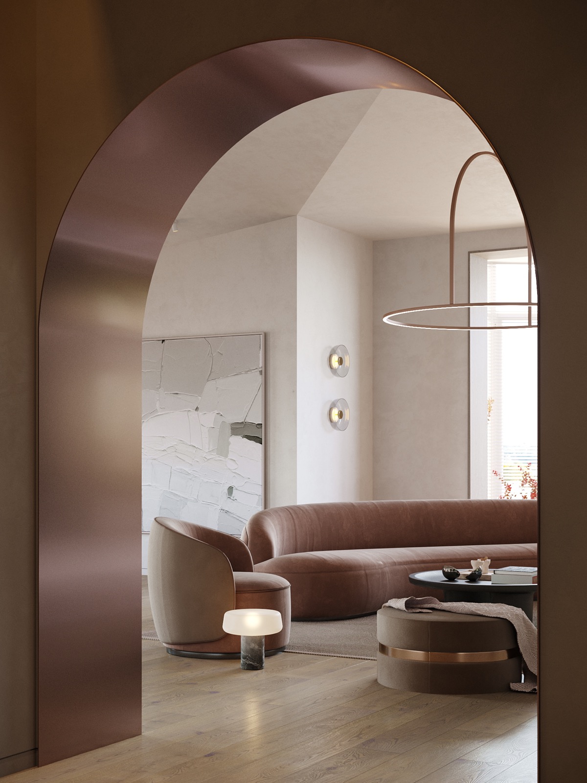
Our next tour takes place in a 106-square-foot home, where ornate ceiling roses and intricate cover crown a room that is bordered by graceful arched windows. The classic architectural arches inspire an interior layout of curved furniture silhouettes, including a curved sofa, a round coffee table and a large round rug.
Did you like this article?
Share it on some of the following social networking channels below to give us your vote. Your feedback helps us improve.
Meanwhile, if you want to read more such exciting lifestyle guides and informative property updates, stay tuned to Feeta Blog — Pakistan’s best real estate blog.
What Happens When The Famous Style Melds With Others
- Published in #architecture, #interior design, accent furniture, architectural wonders, Architecture, Architecture Design, bedroom design, creative home design, decor, Decoration, Design, Design Gallery, Designs by Style, Featured, Furniture Design, Home Decor, house, house decoration, house design, house fresh, interesting designs, interior, Interior Decoration Ideas, Interior Design, interiors, International, mid century, neoclassical
Designers Show How The White House Could Have Looked Different If These 5 Plans Weren’t Rejected
We are all accustomed to the look of the White House, and most of us appreciate its modest neoclassical design. In 1792, the first president of the United States George Washington held a contest for the design of the White House, which an Irishman James Hoban won. But the seat of the world’s most powerful nation might look different. Many architects offered their own versions of the White House, including polyhistorical president Thomas Jefferson, who lived in the same White House nearly 10 years after the contest. But as with all competitions, the winner is long remembered, and the ideas of the losers are almost always forgotten. These rejected plans remained obscure until HouseFresh decided to revive them in digital form and show us what the White House could be like. So look!
Jefferson’s plan for the White House
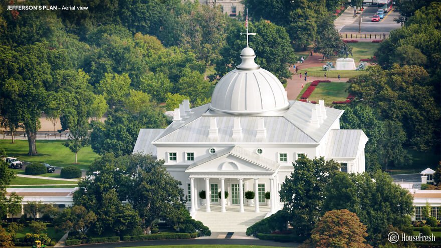
Thomas Jefferson was Secretary of State at the time, and was closely involved with the management of the competition. But he was also an architect and an enthusiast of classical European design. Experts attribute a losing entry with the name “Abraham Faws” to Jefferson. The “real” Faws sent their own, amateur entry, and Jefferson’s anonymous project was later attributed to Faws due to a clerical error.
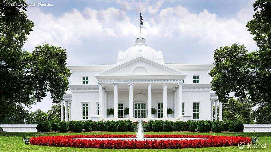
Jefferson would move to the White House as president in 1801, describing the mansion as “large enough for two emperors, one pope and the great lama.” However, he couldn’t help but expand it, adding an arcade and other features to form the White House as it looks now.
Philip Hart’s plan for the White House
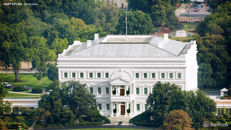
The competition to design the White House was part of a broader challenge to suggest an architecture for Washington’s powerful headquarters. Phillip Hart was an amateur architect – more likely a professional builder – who submitted proposals for both the president’s house and the Capitol.
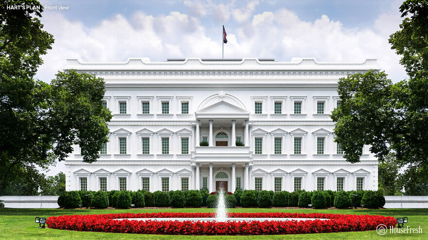
Hart’s White House repeats its vaguely absurd capital sketches. The abbreviated upper floor and faux-Renaissance style lacks the style and complexity that Washington wanted from a building that should, “in terms of size, shape and elegance … look beyond the present.”
Andrew Mayfield’s plan
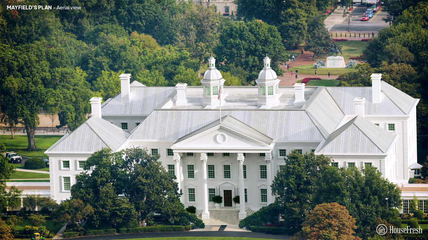
Andrew Mayfield Carshores was a linguist and former British soldier and teacher. Its simple design reflects the pre-revolutionary military architecture, characterized by the colonial period of American buildings Georgian, and English.
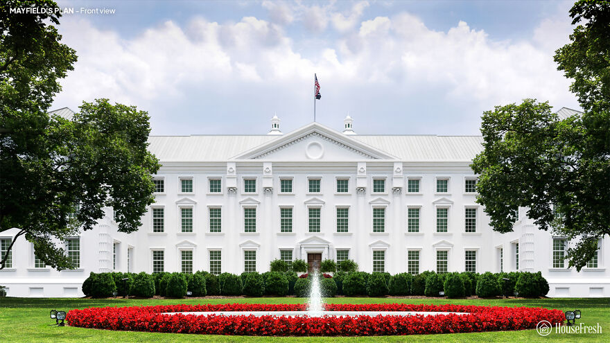
Carshore’s steep roofs border a lead footpath, with a rainwater reservoir on the roof of the main block. But the judges lacked a vital spark to his work. According to architectural historian Hugh Howard, Carshore was an ‘amateur gentleman’ and his rejected entrance may be the only building he has ever designed.
Jacob Small’s plan
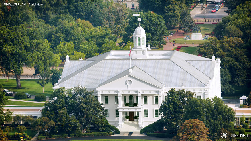
Jacob Small submitted four entries to the 1792 contest. Author Patrick Phillips-Shrock points out that the designs of the Small White House were inspired by two iconic buildings of that time: Mount Vernon, George Washington’s plantation mansion, and the Maryland State House in Annapolis.
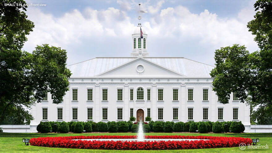
A small one connects the stable and kitchen blocks to the main house with arcades. But its labyrinthine interior of corridors and mysterious stairs would be unpleasant for the president. Interestingly, Little envisioned oval-shaped rooms for the White House – but he failed to integrate them into his broader design in any significant way.
James Diamond’s plan
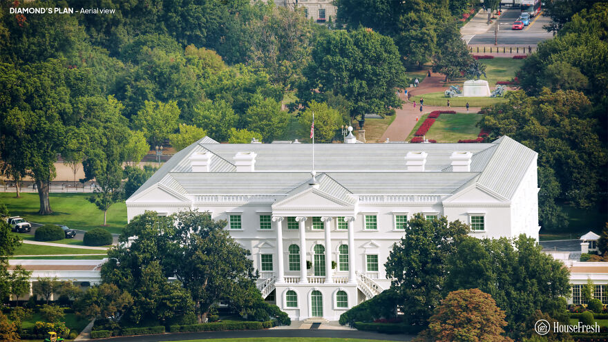
Originally from Ireland, James Diamond was an architect and builder. The White Diamond House stands around a rectangular courtyard. However, Diamond notes in his project that “the Open Court can be changed to a Picture Gallery and Illuminated from the Top, which would have a great Effect.”
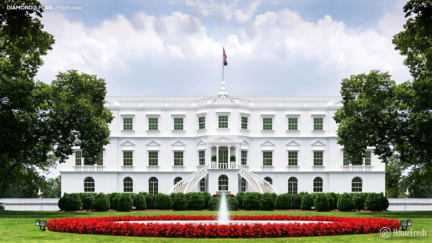
Diamond’s design incorporates complex design elements such as Ionic columns and window frames covered with pediments. But the stairs are located awkwardly away from the entrance, and the overall size is supposed to be too ornate for George Washington’s tastes.
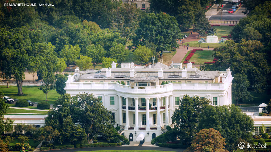
This is what it looked like. Aerial view
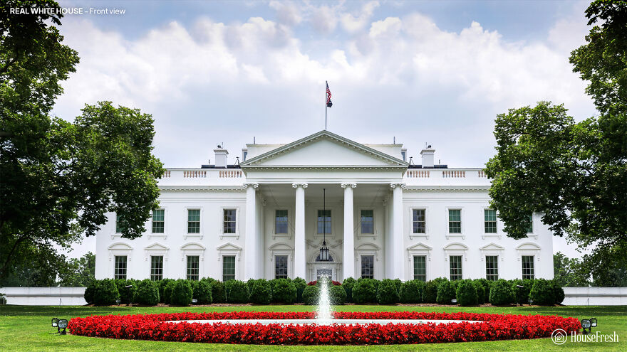
An actual white house, front view
Also, if you want to read more informative content about construction and real estate, keep following Feeta Blog, the best property blog in Pakistan.
Designers Show How The White House Could Have Looked Different If These 5 Plans Weren’t Rejected
- Published in Architecture, buildings, competition, Different, five, full-page, Homepage featured, house fresh, housefresh, jefferson, rejected designs, rejected ideas, Washington, What if, White House
Textural Interior Smoothed By Curves & Classic Arches
Do you like Architecture and Interior Design? Follow us …
Thank you. You have been subscribed.
![]()
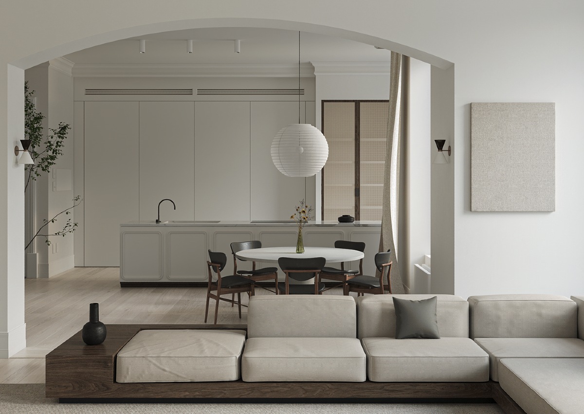
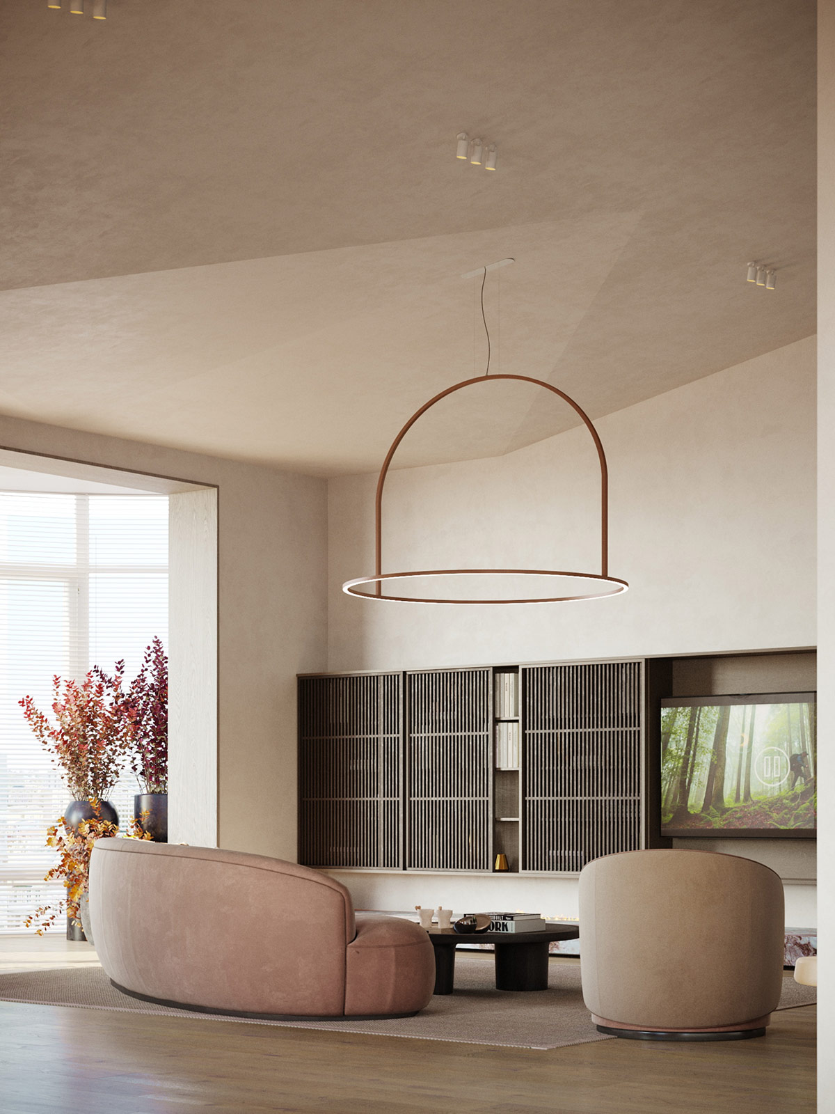
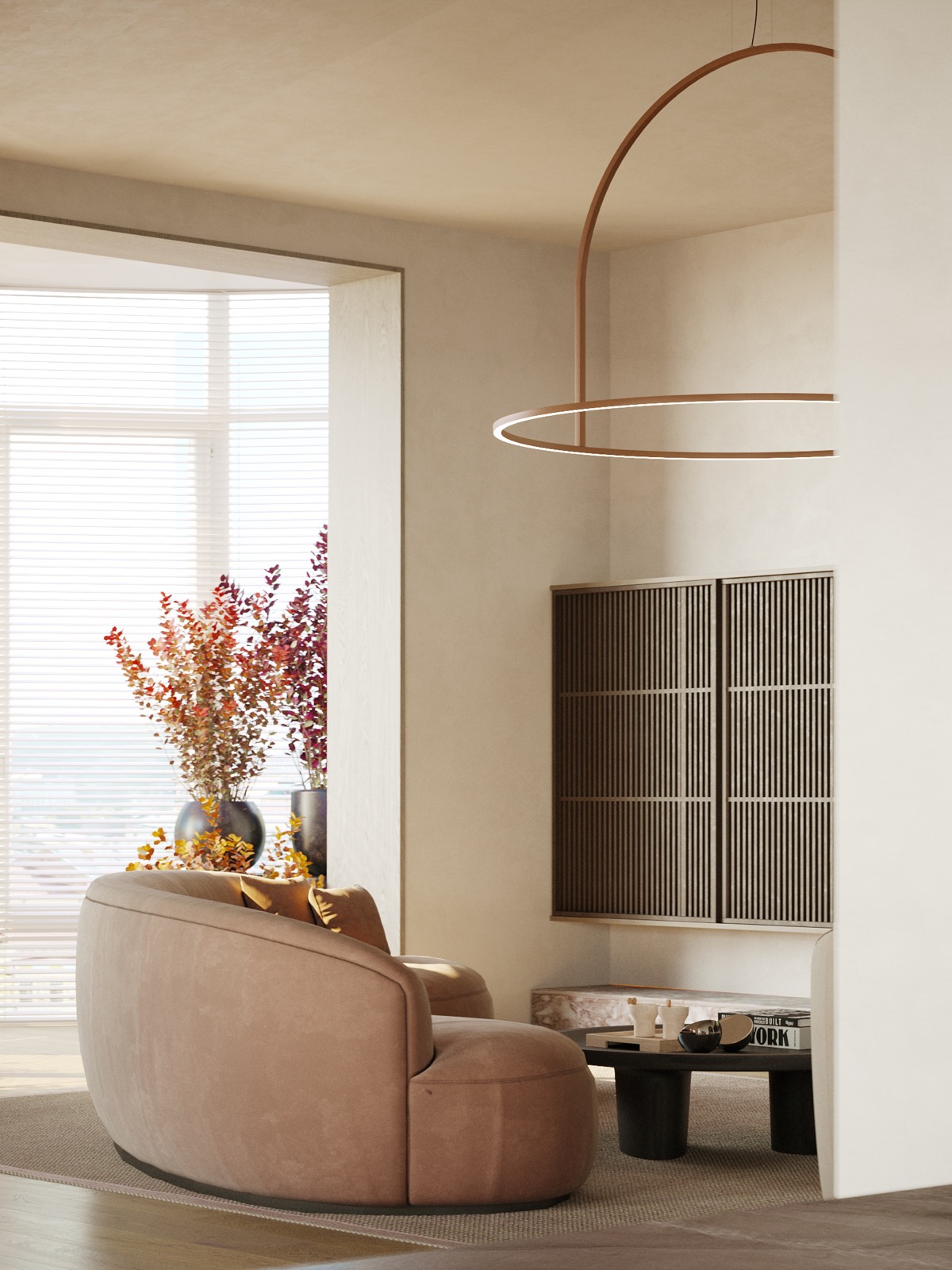
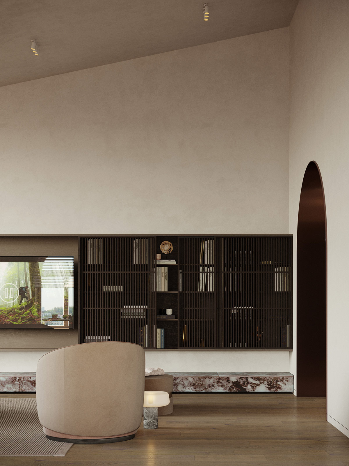
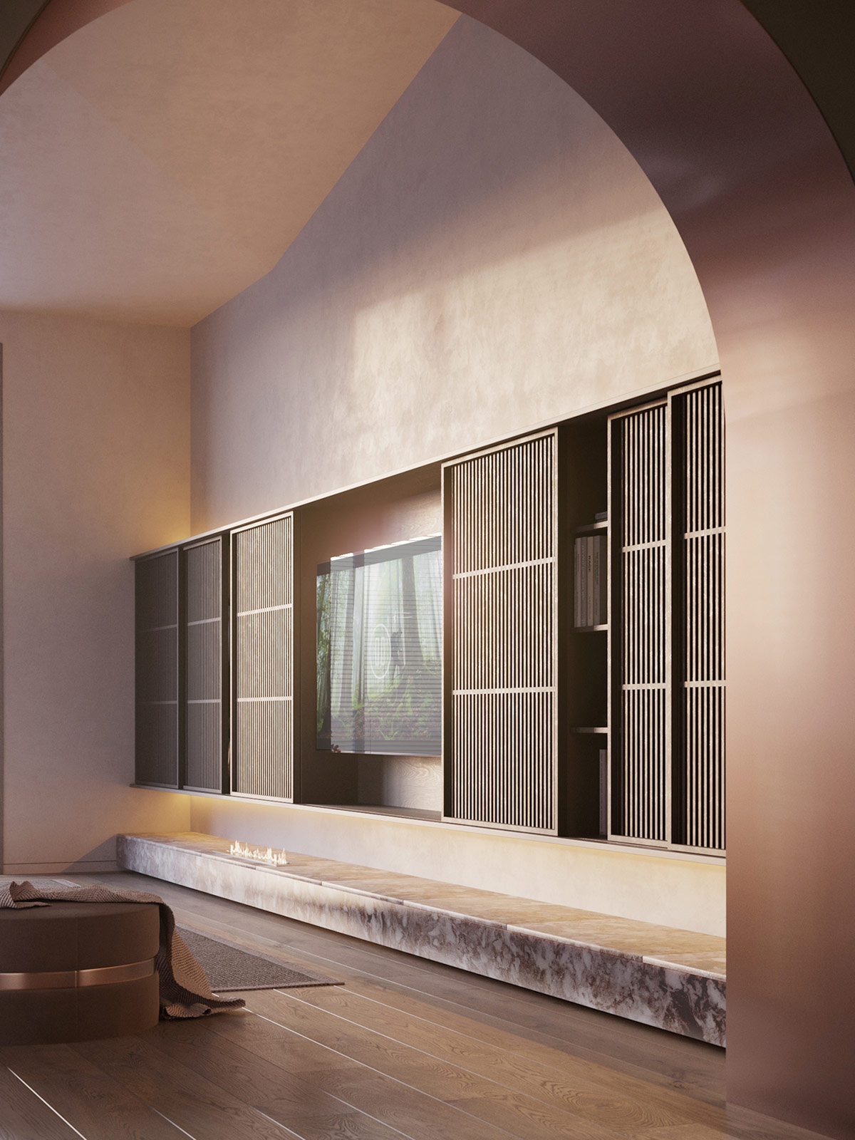
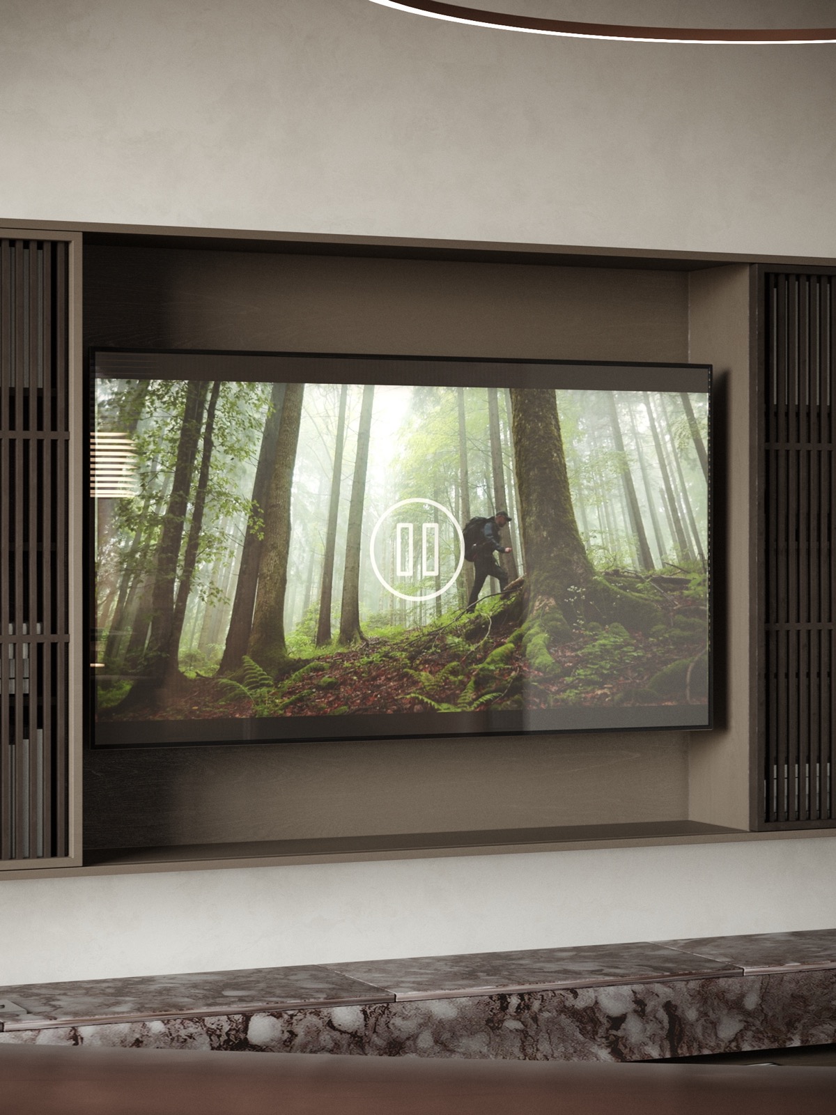
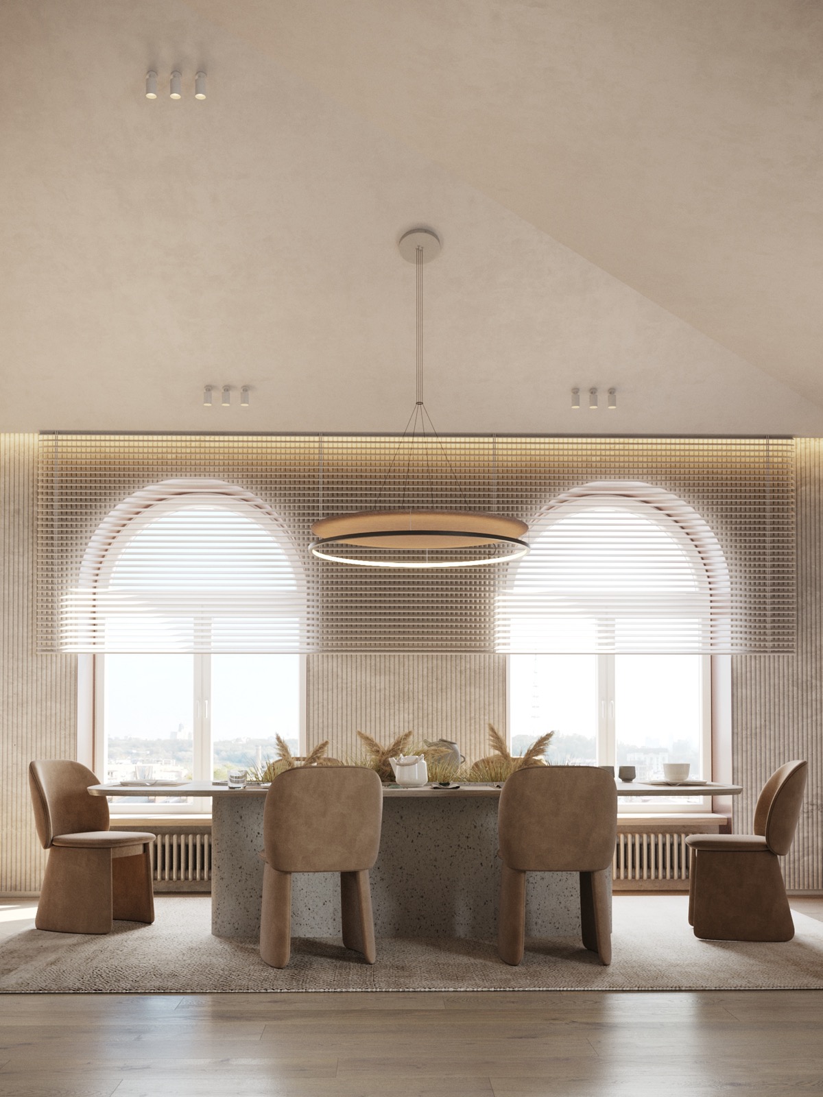
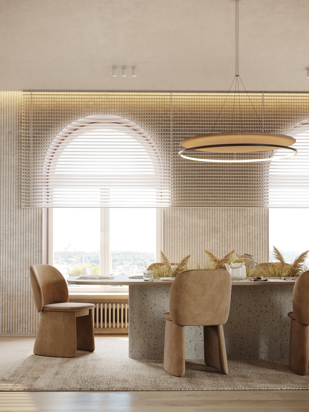
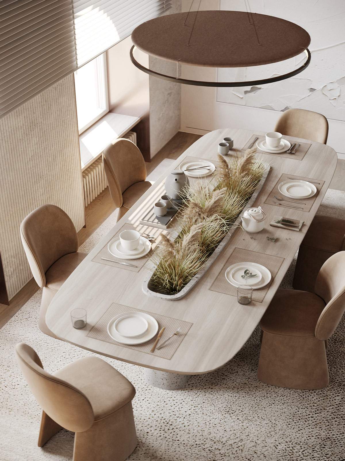
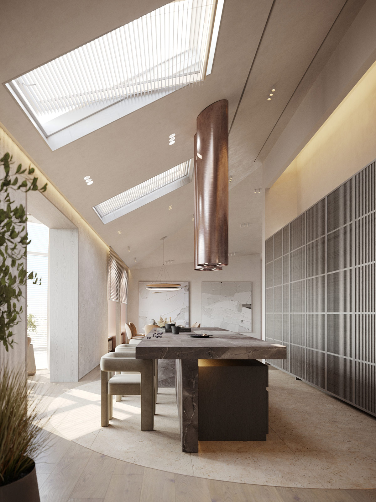
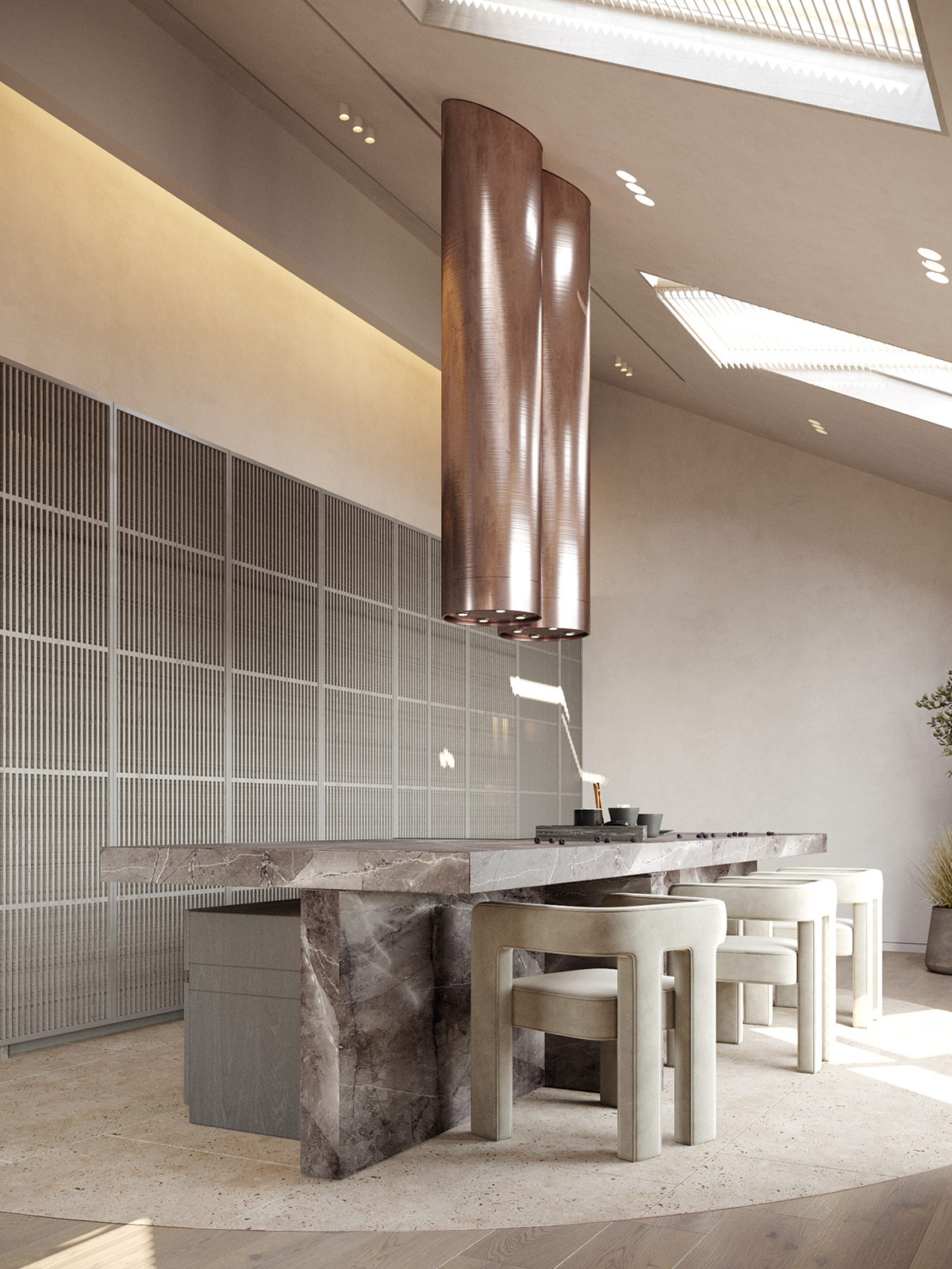
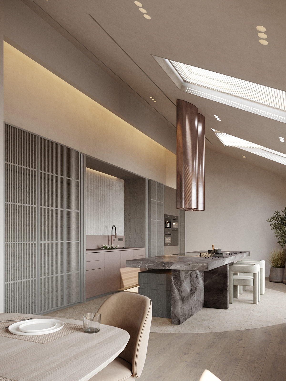
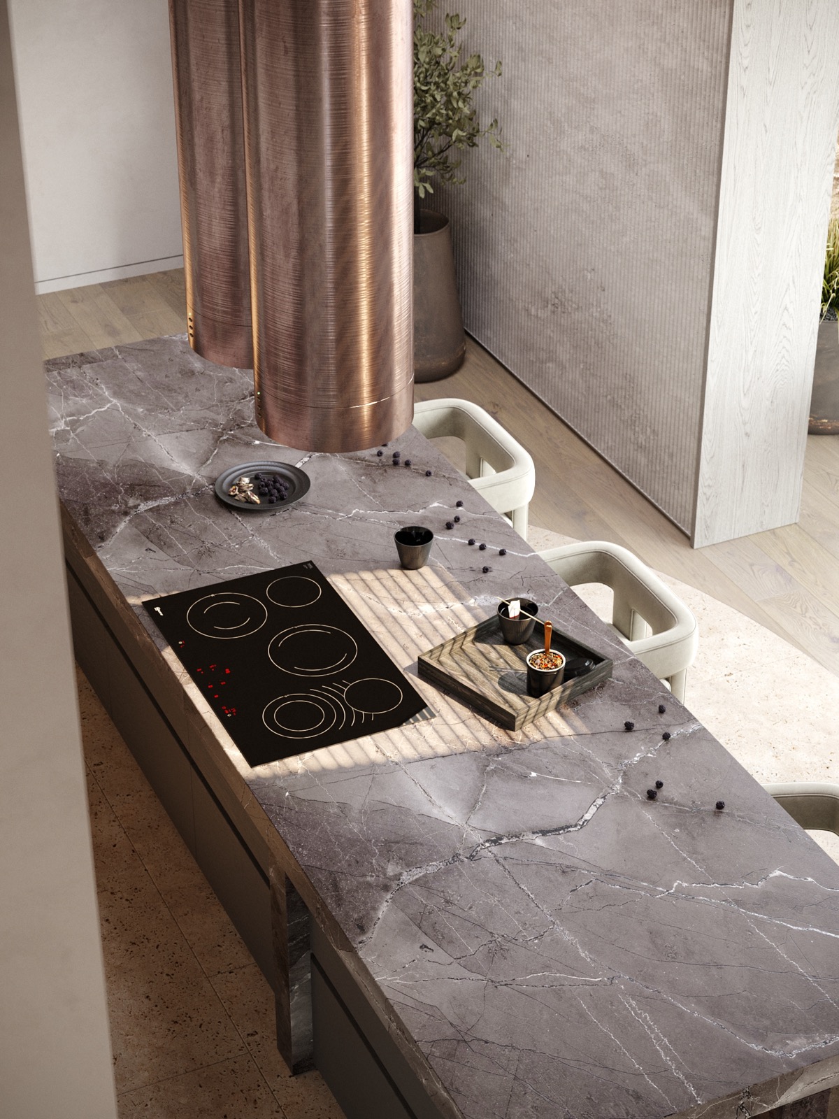
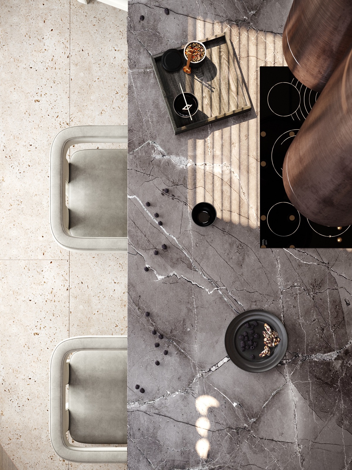
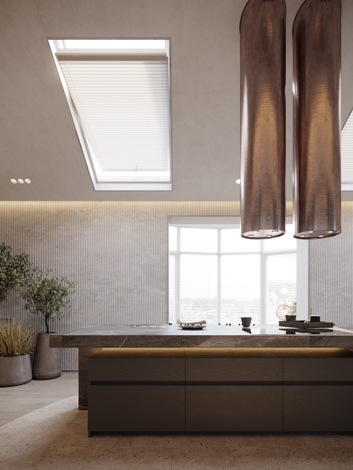
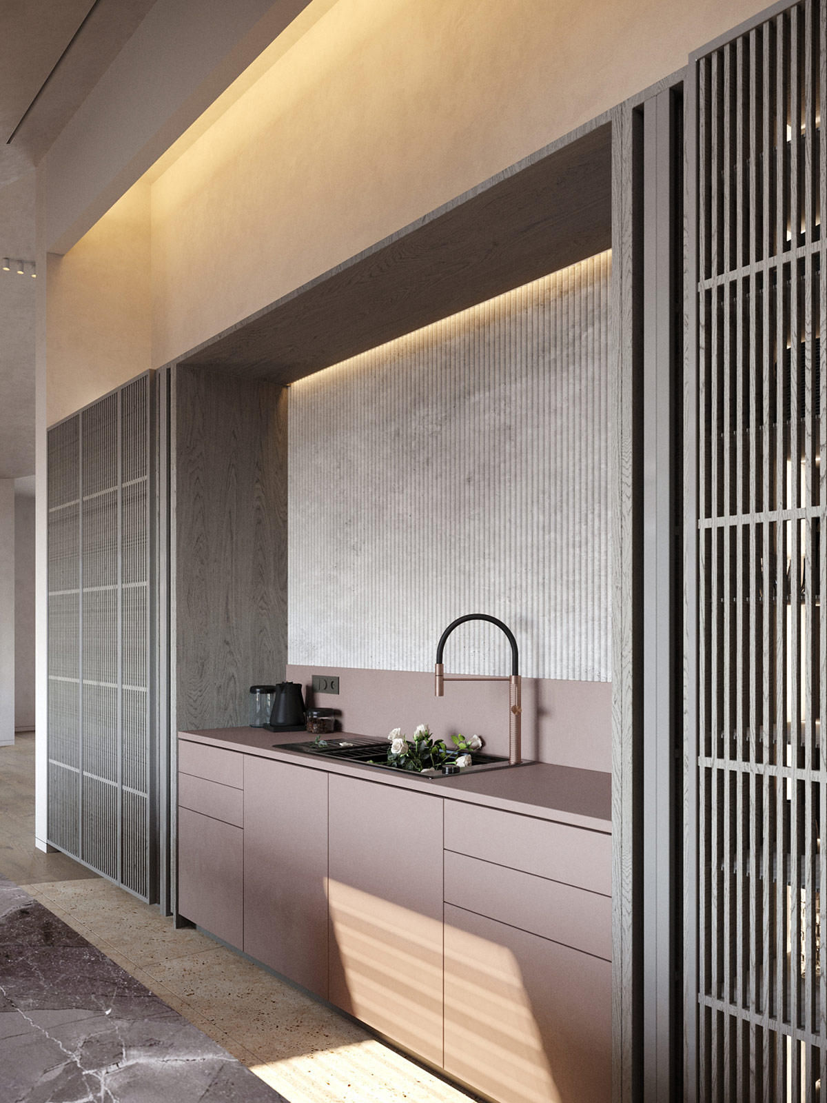
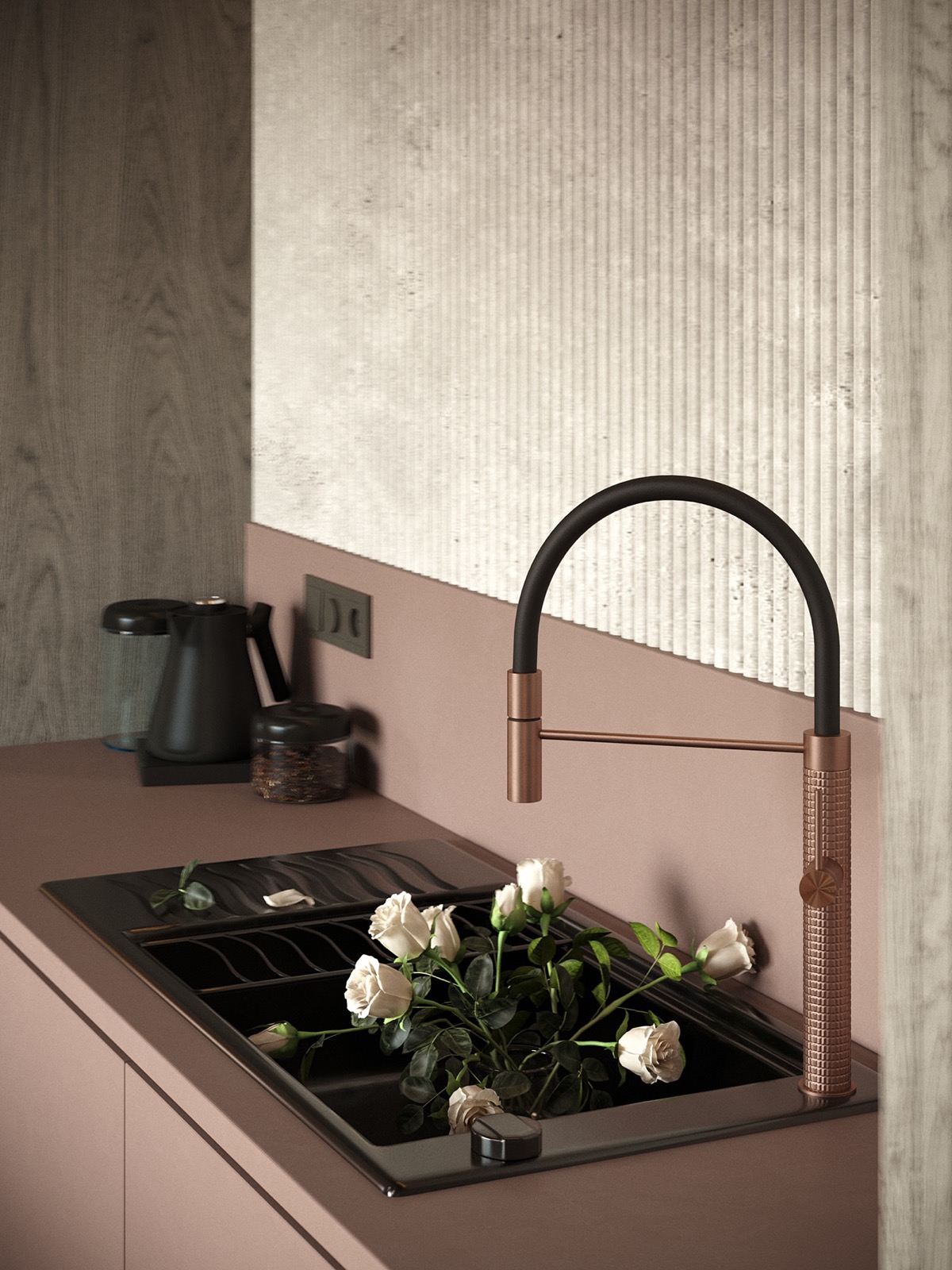
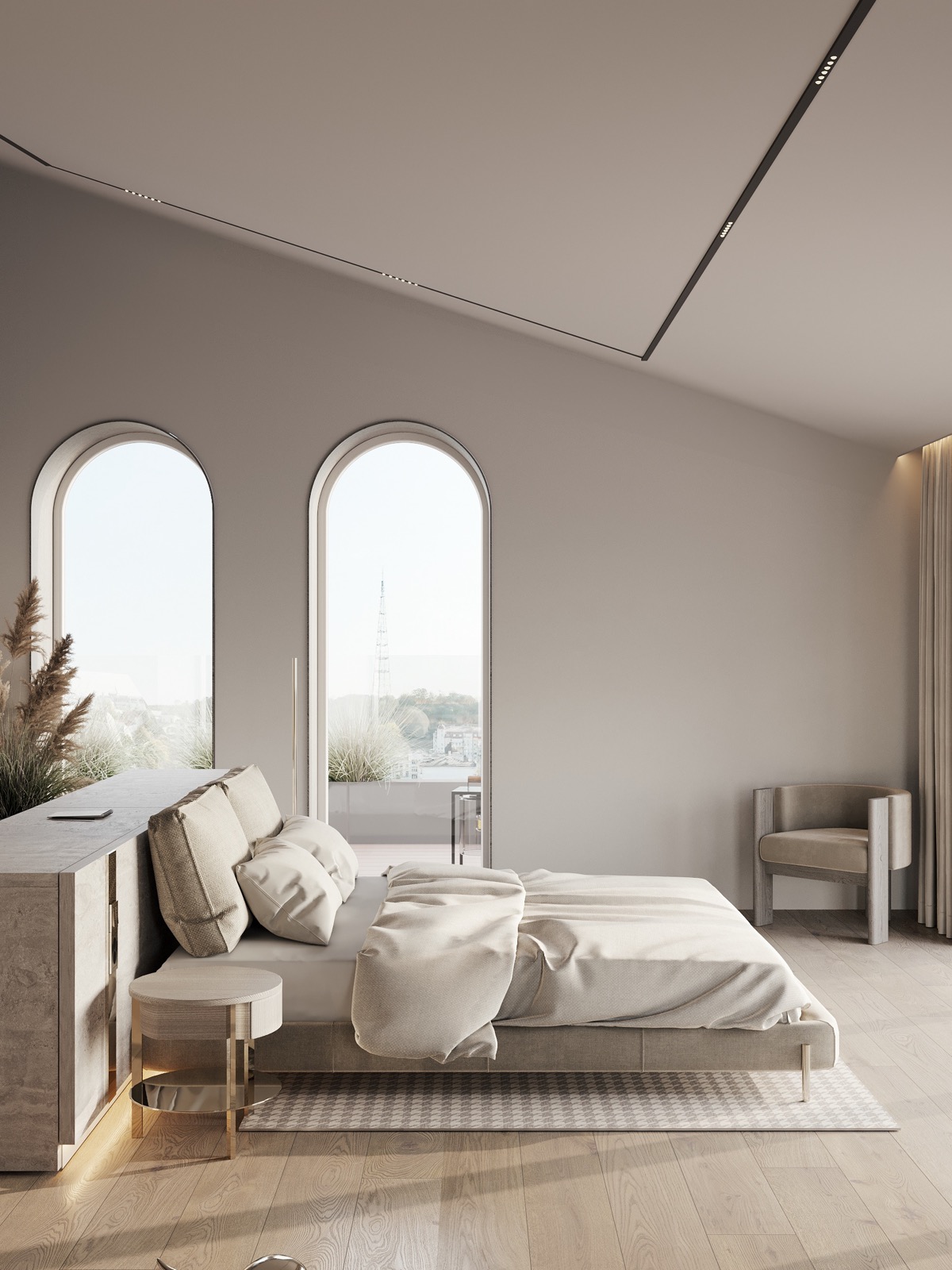
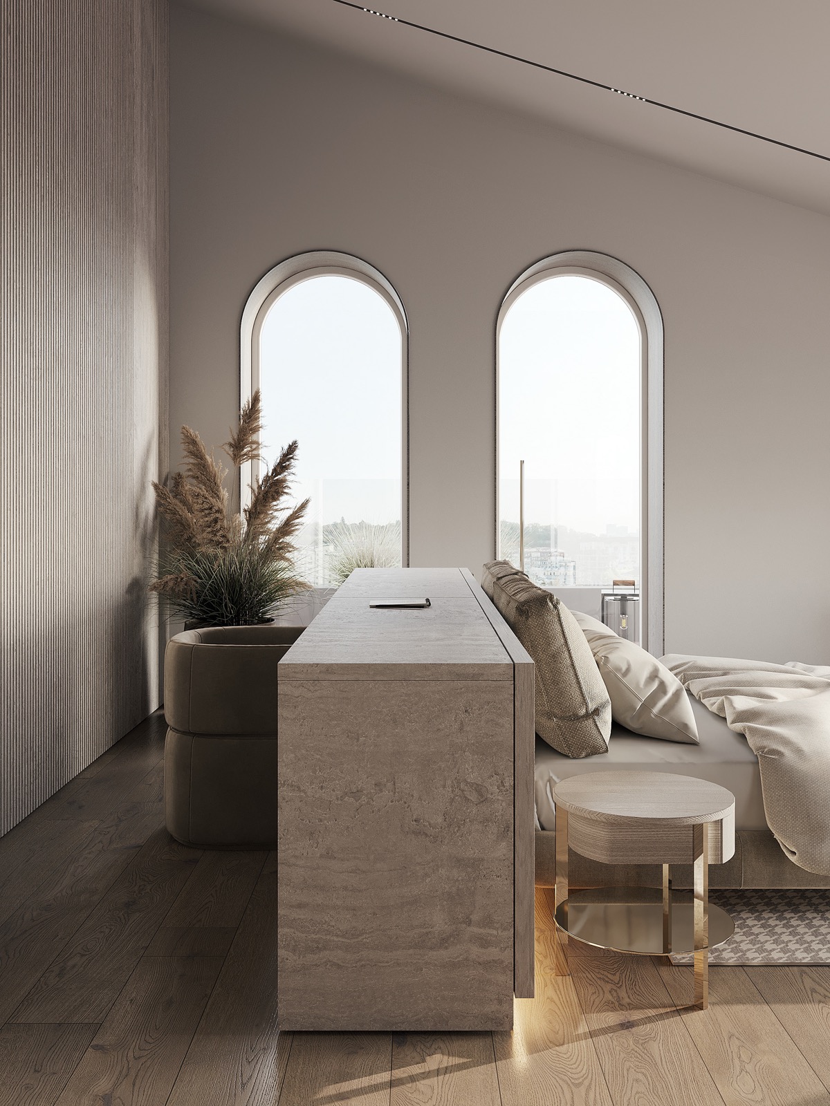
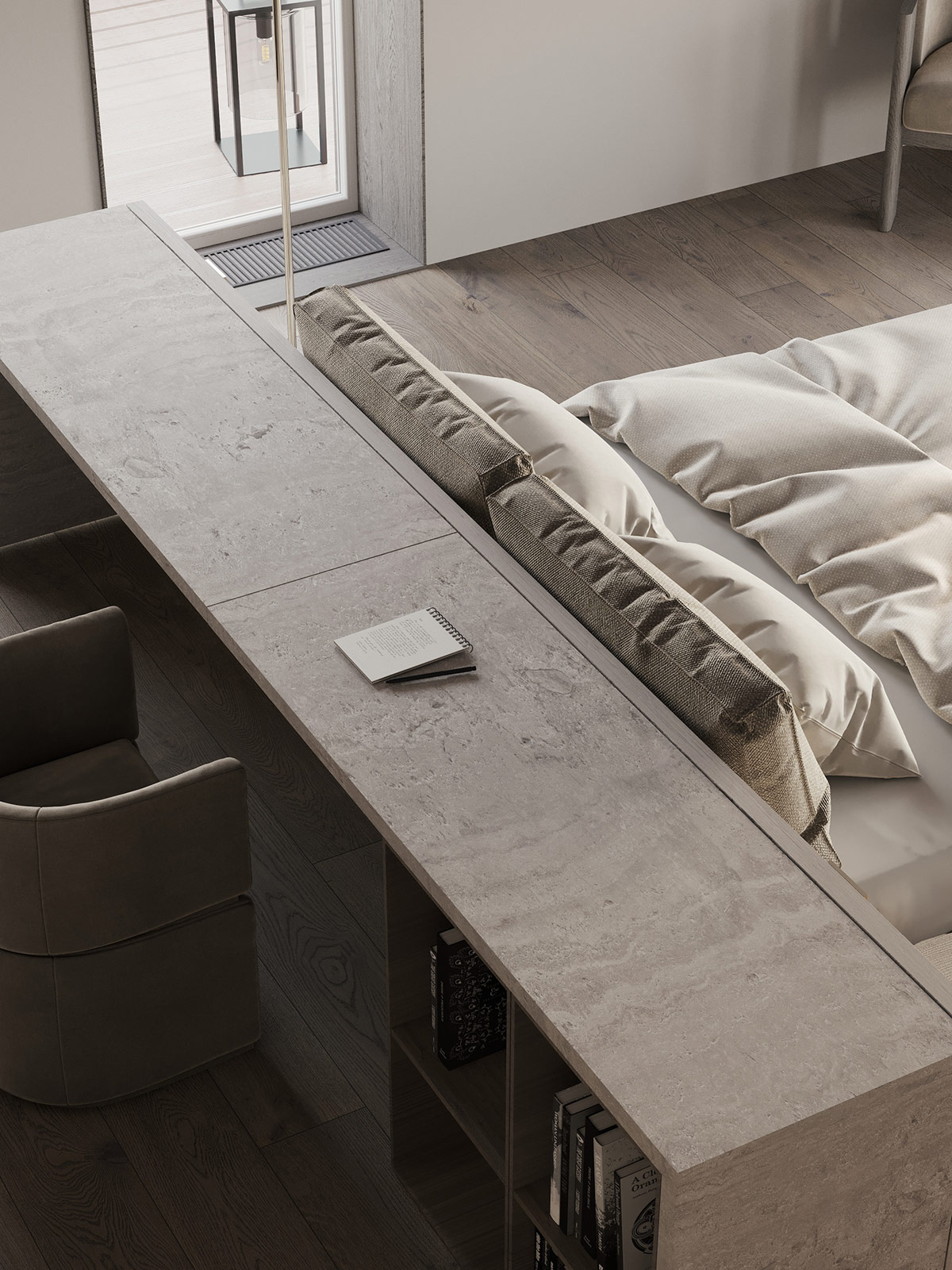
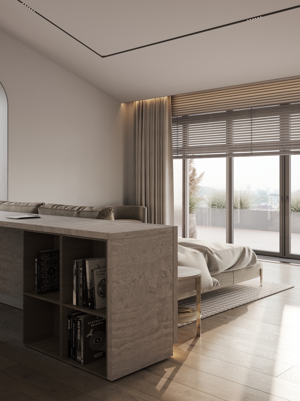
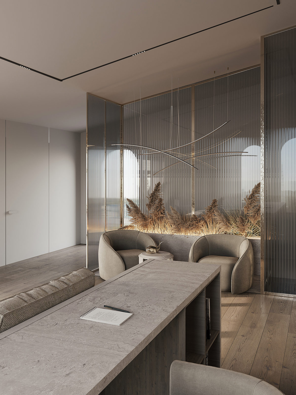
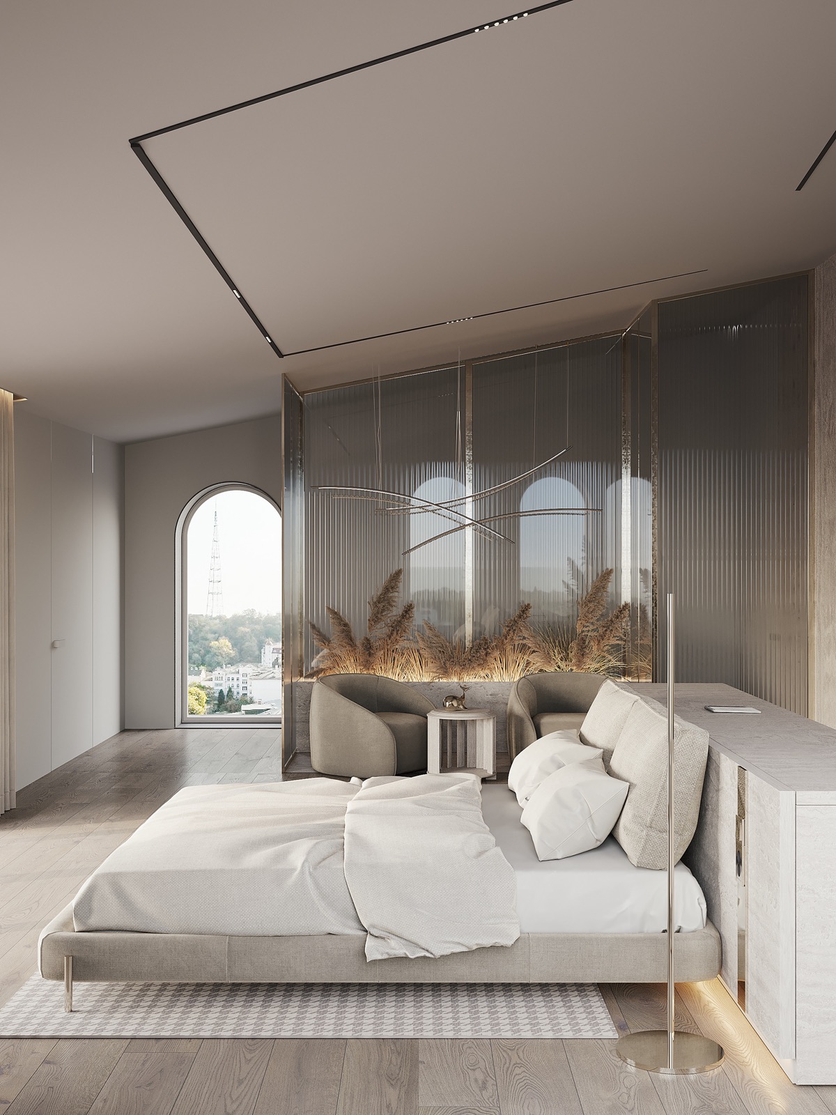
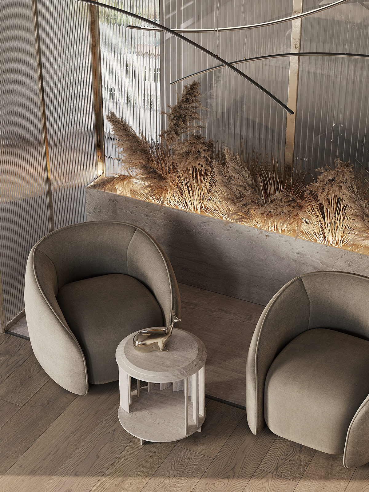
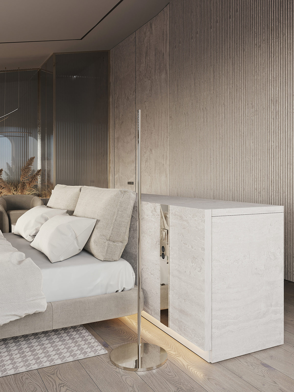
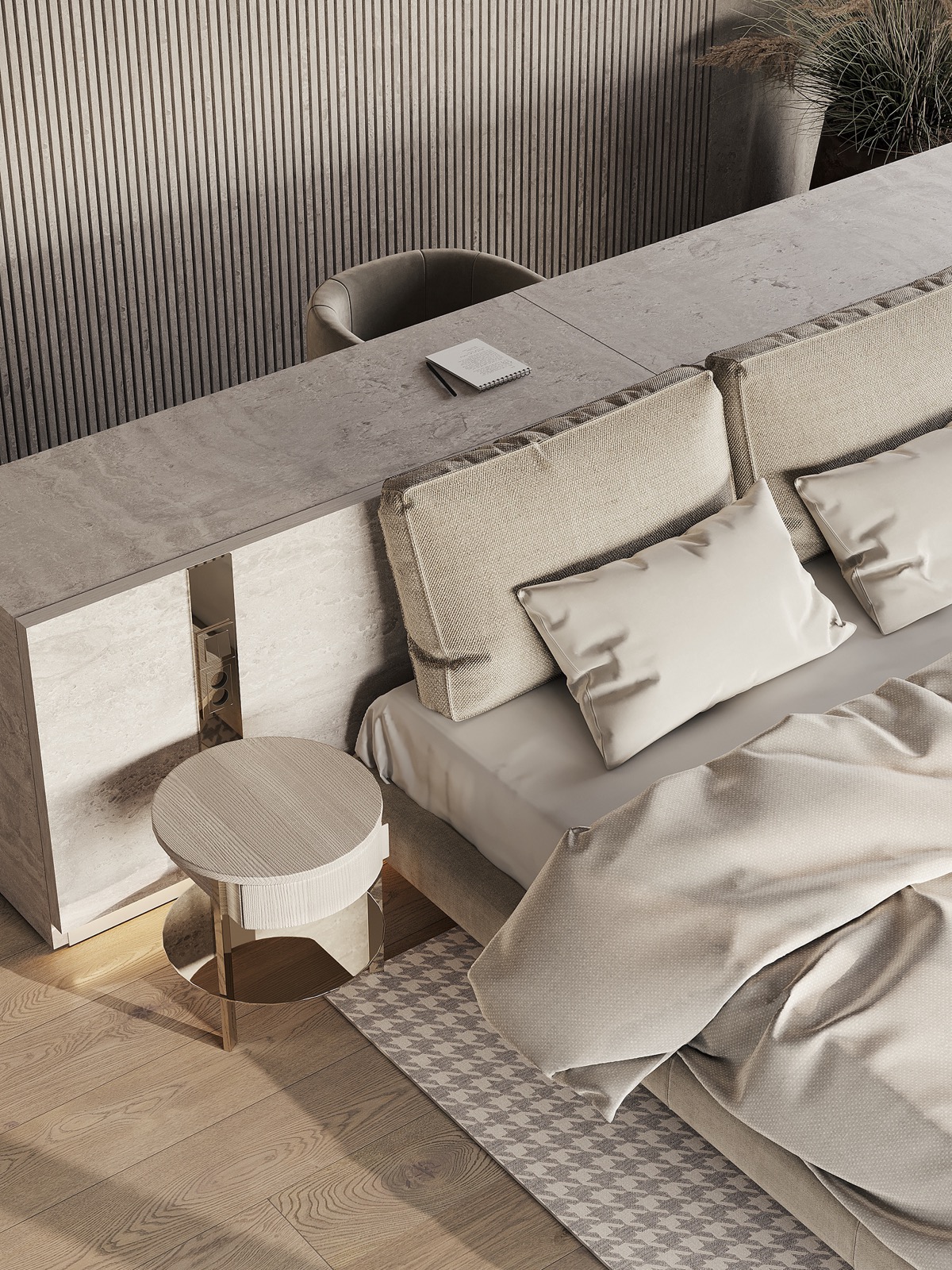
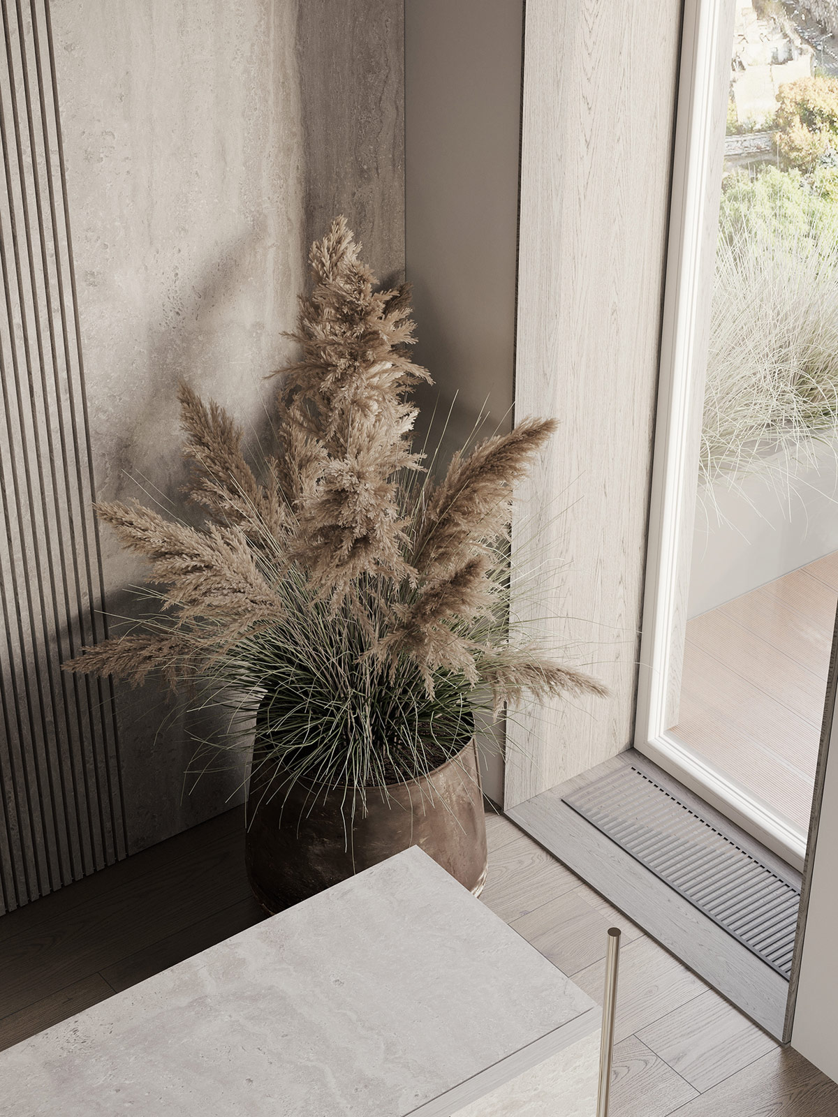
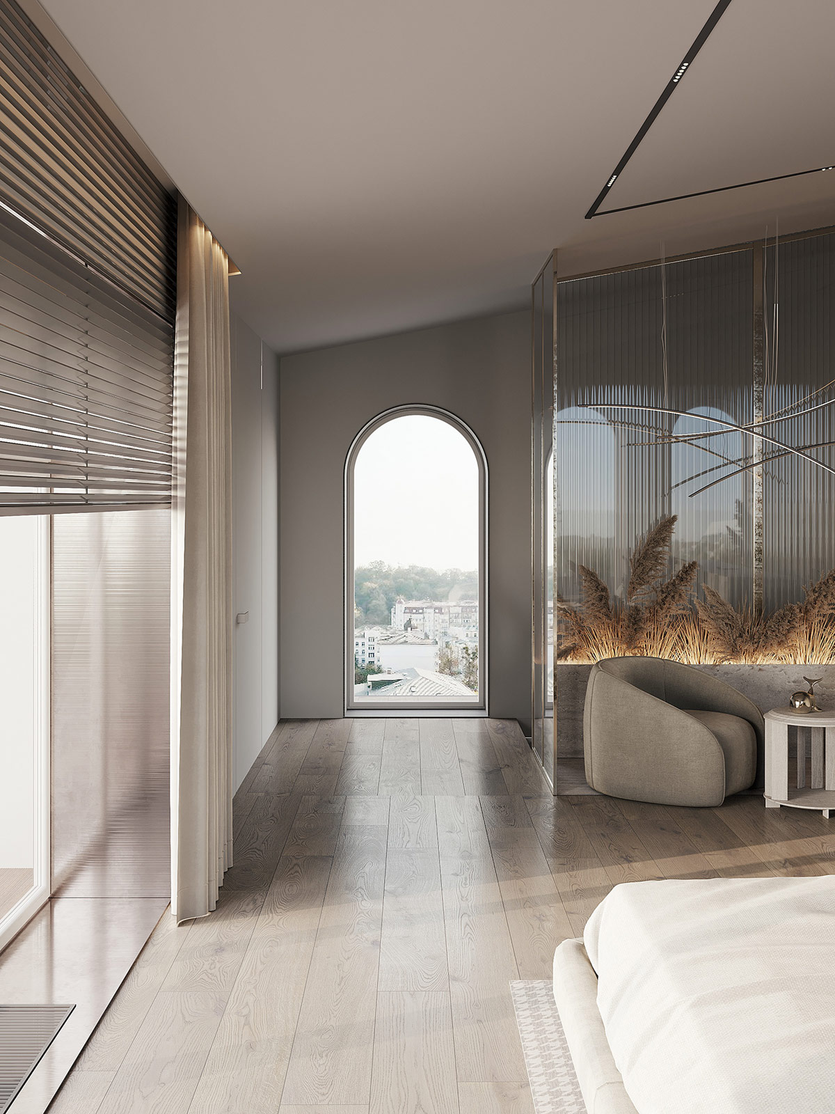
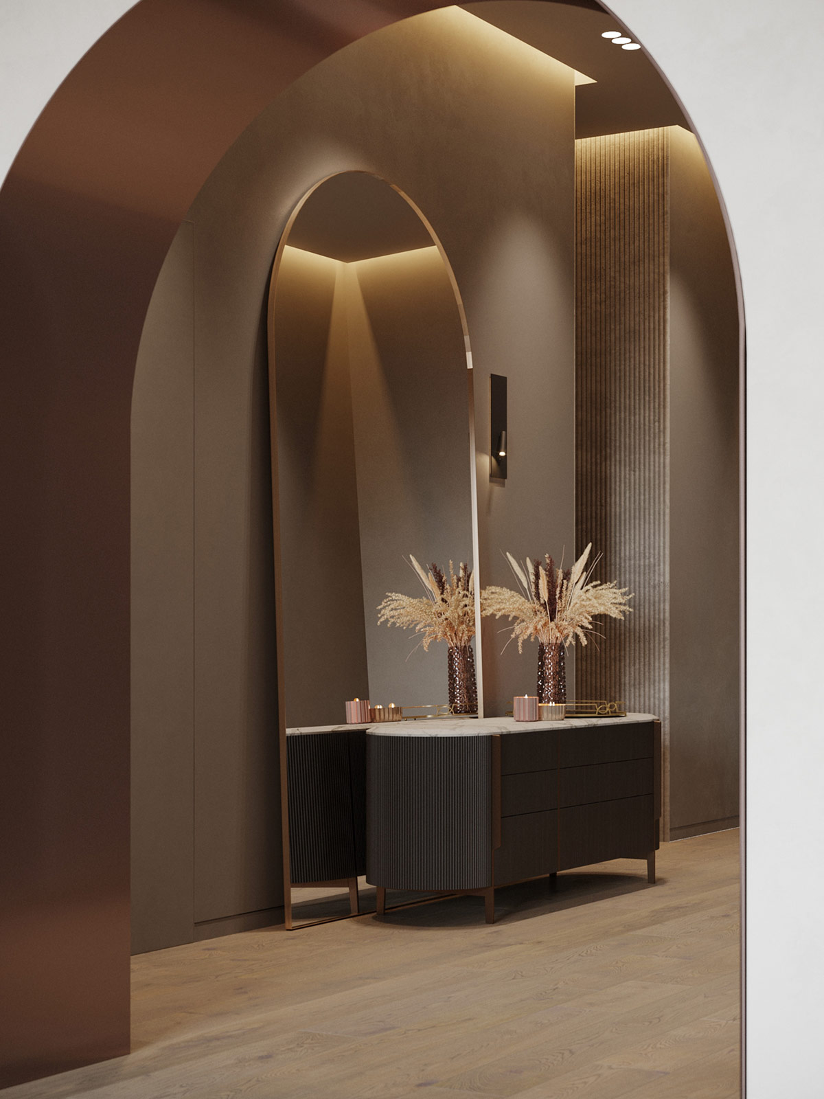
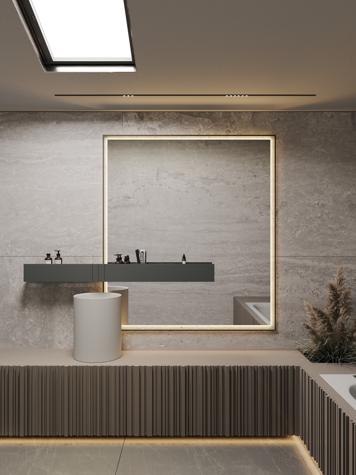
Slatted panels and natural stone bring a deep and luxurious texture to this chic modern home design, pictured by ArtPartner Architects. The text decoration is smoothed with curved furniture lines and graceful classic arches within the high ceiling architecture. Large living spaces radiate elegance under a delicate tonal color palette of warm Belgians and soft browns. Copper accents add a rich and shiny element within the attractive kitchen design, where a stone island sets a solid anchor in front of a kitchen run hidden behind lattic doors. The text theme matches across all, with lined feature walls clearly countering curves at every beautiful turn of the sumptuous residence and an impressive master bedroom.
Did you like this article?
Share it on some of the following social networking channels to give us your vote. Your feedback helps us improve.
For more information on the real estate sector of the country, keep reading Feeta Blog.
Textural Interior Smoothed By Curves & Classic Arches
- Published in #architecture, accent furniture, arches, architectural wonders, Architecture, Architecture Design, Asia, bedroom design, creative, creative home design, decor, Decoration, Design, Design Gallery, design objects, Designs by Style, designs that stand out for all the wrong reasons, furniture, Furniture Design, home, Home Decor, house, house decoration, house design, house fresh, House Tours, interior, Interior Decoration Ideas, Interior Design, interiors, International, texture

