40 Aesthetic Kitchens: Inspiring Culinary Skills
Like Architecture and Interior Design? Follow us …
Thank you. You have been subscribed.
![]()
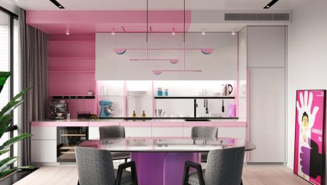
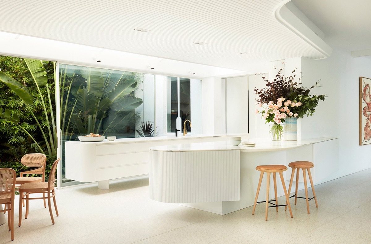
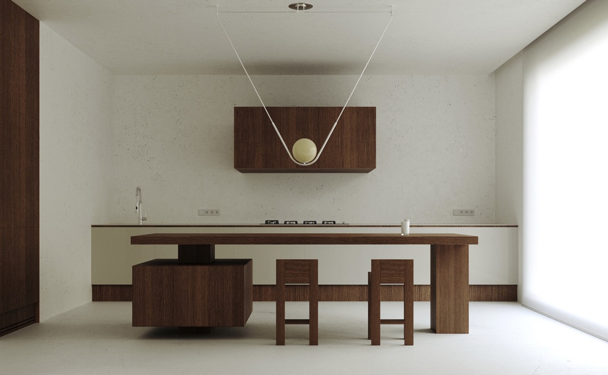
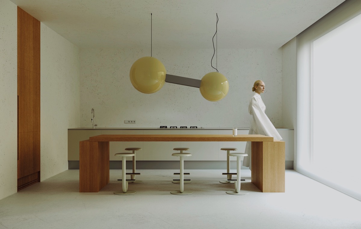
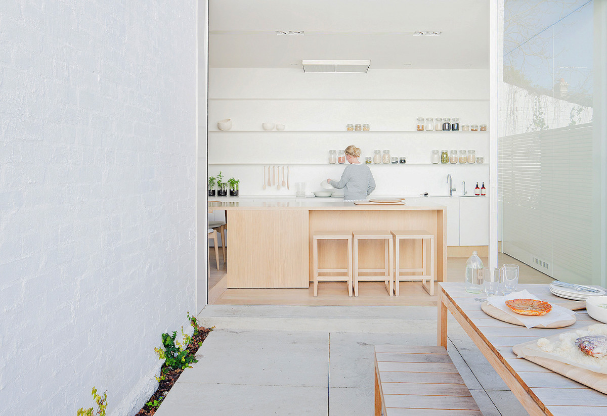
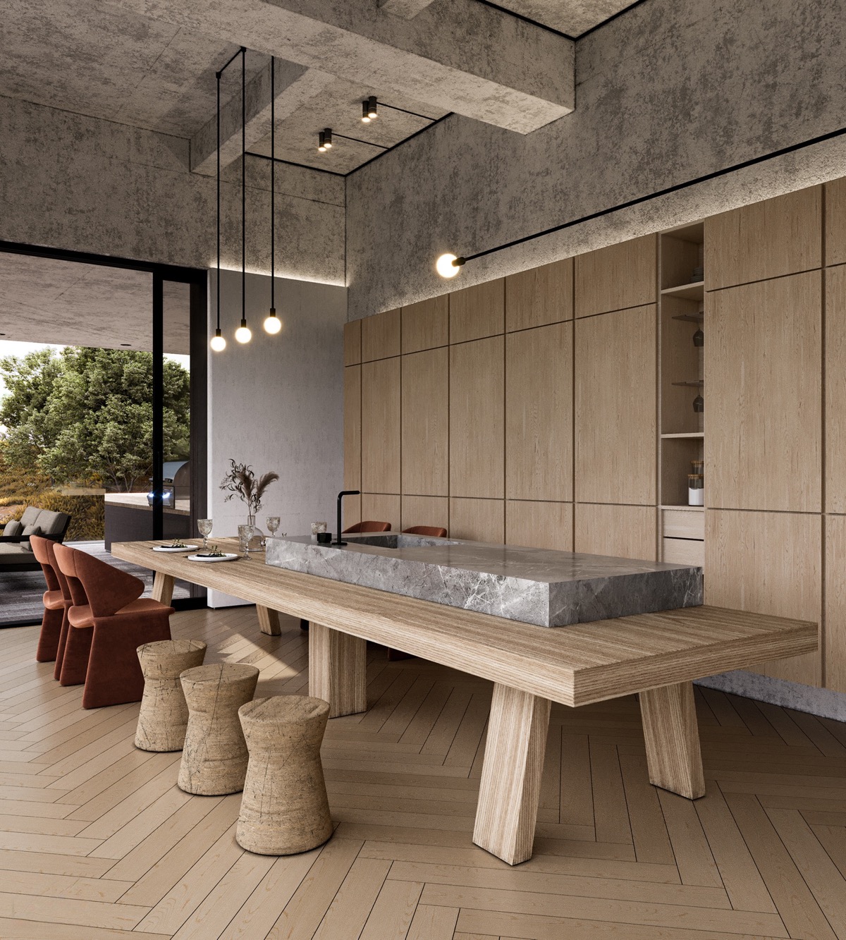
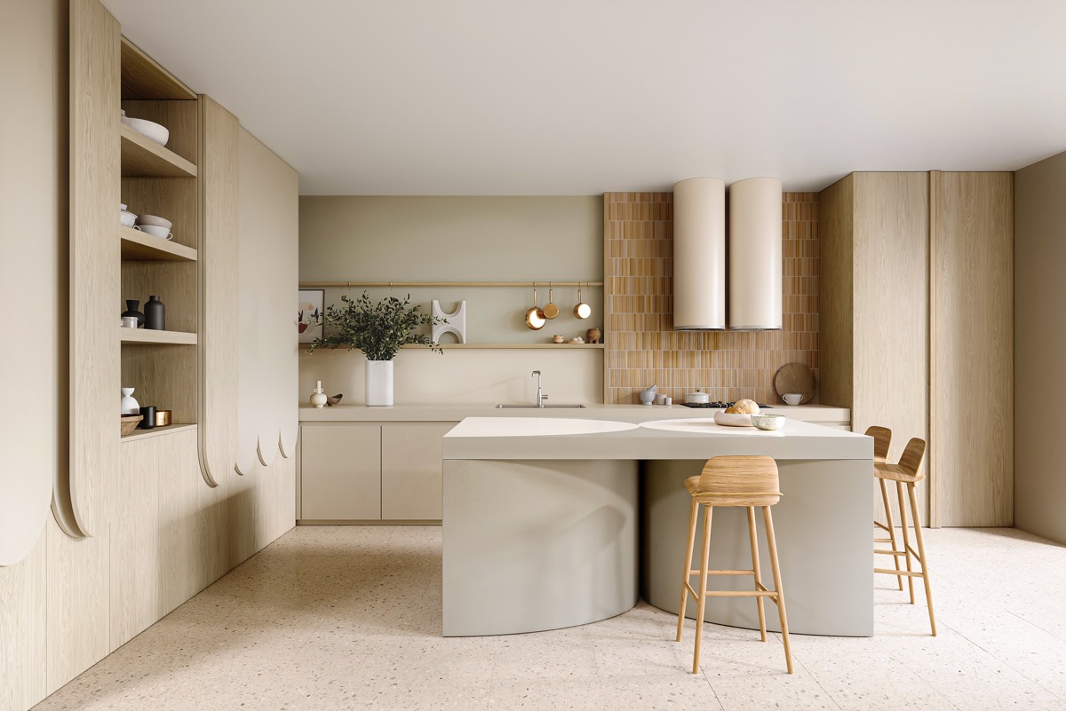
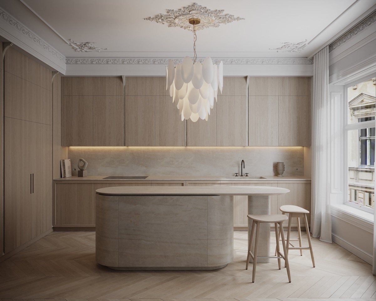
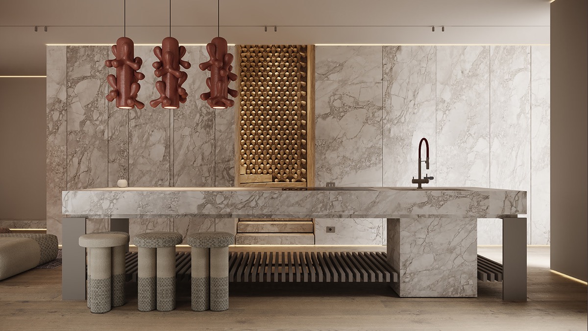
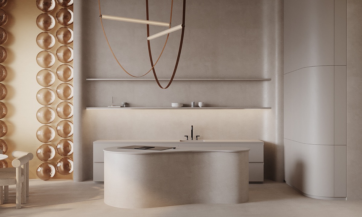
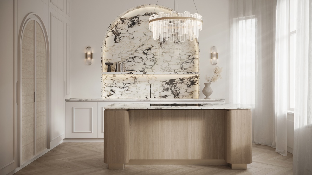
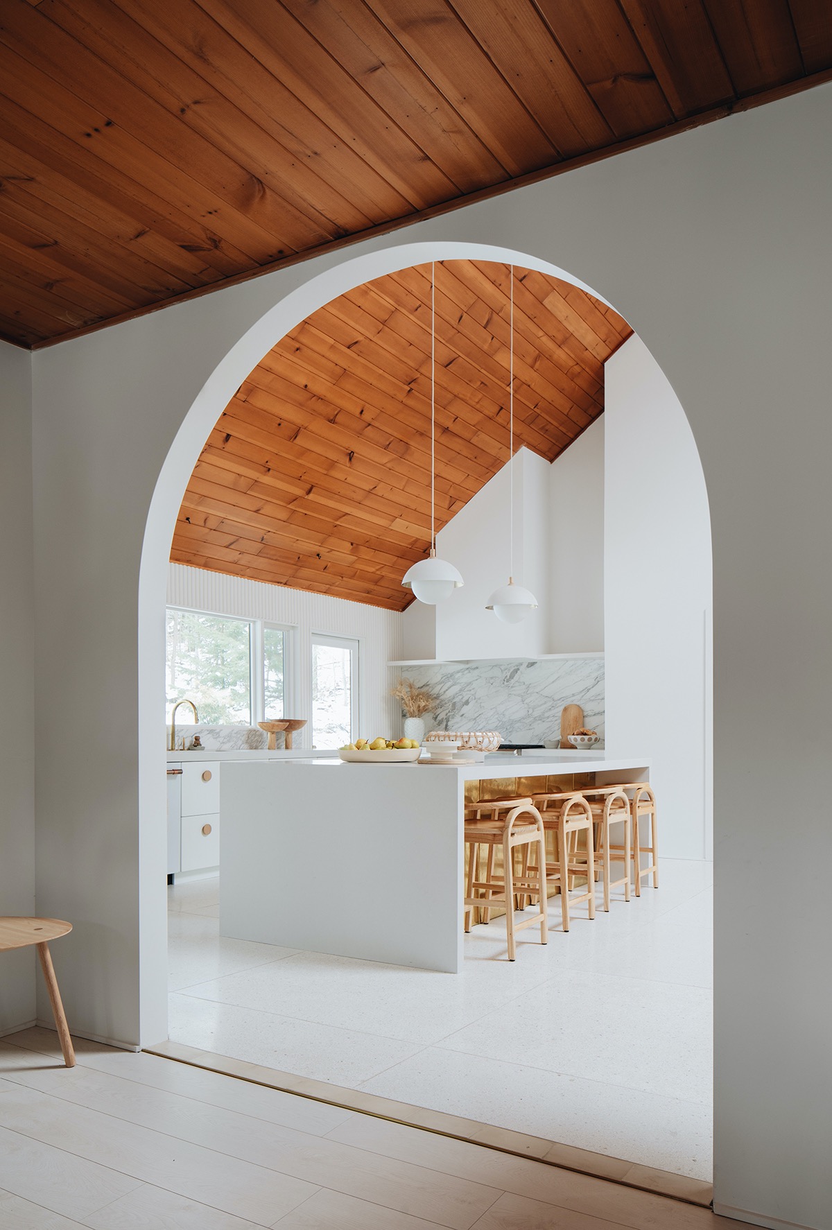
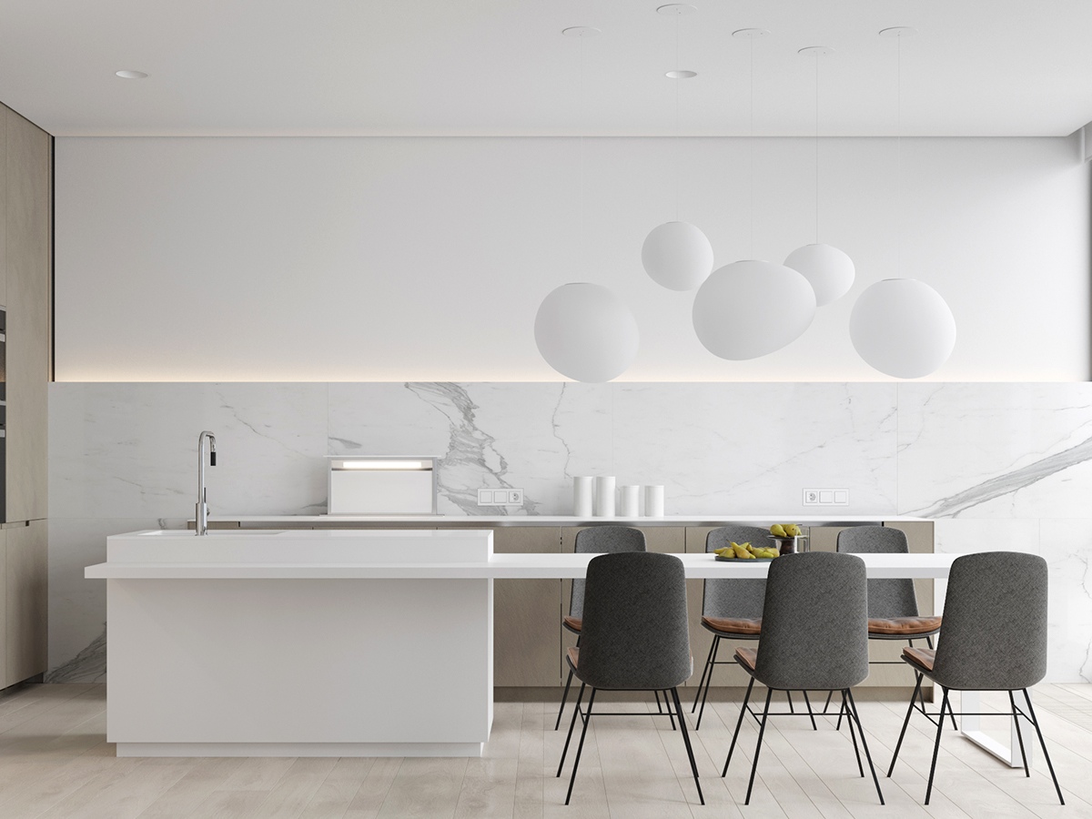
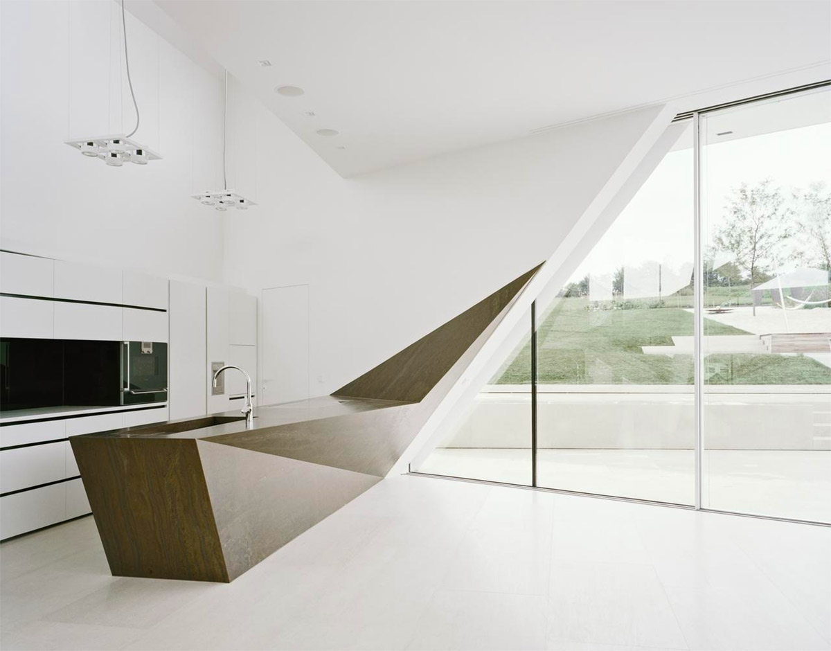
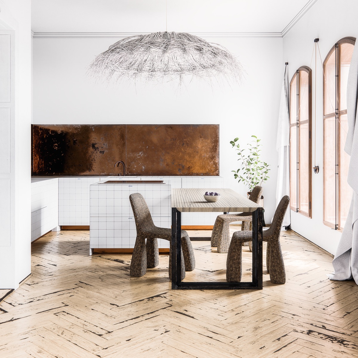
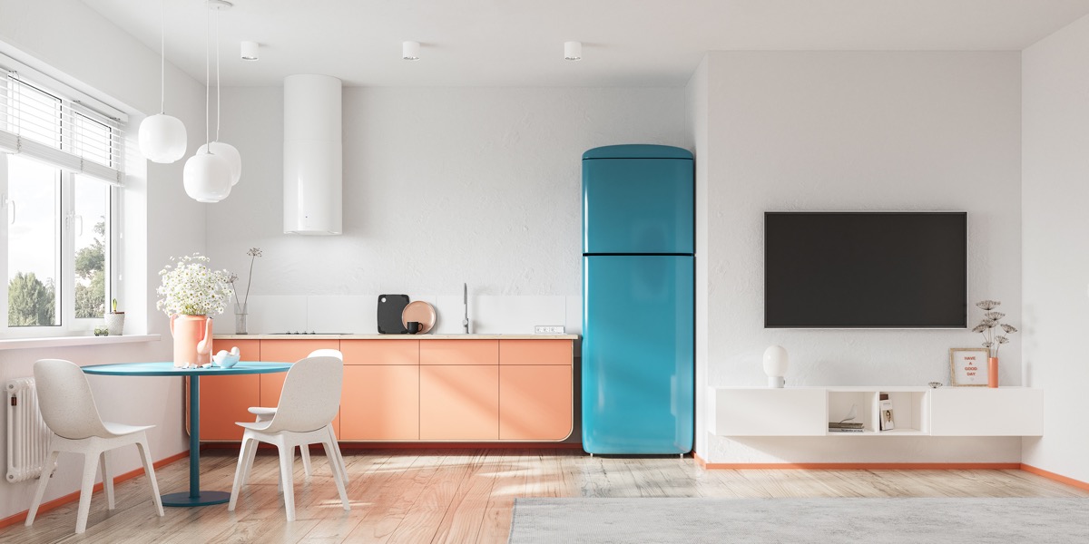
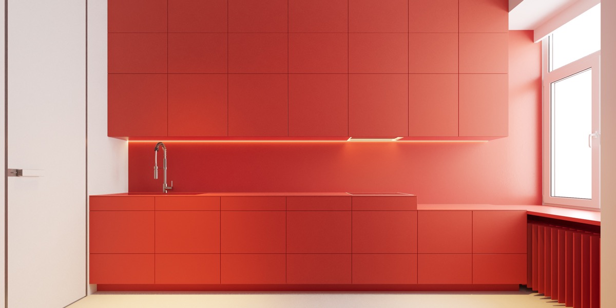
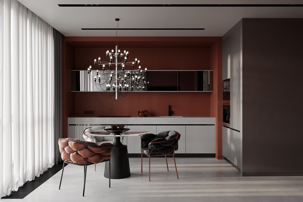
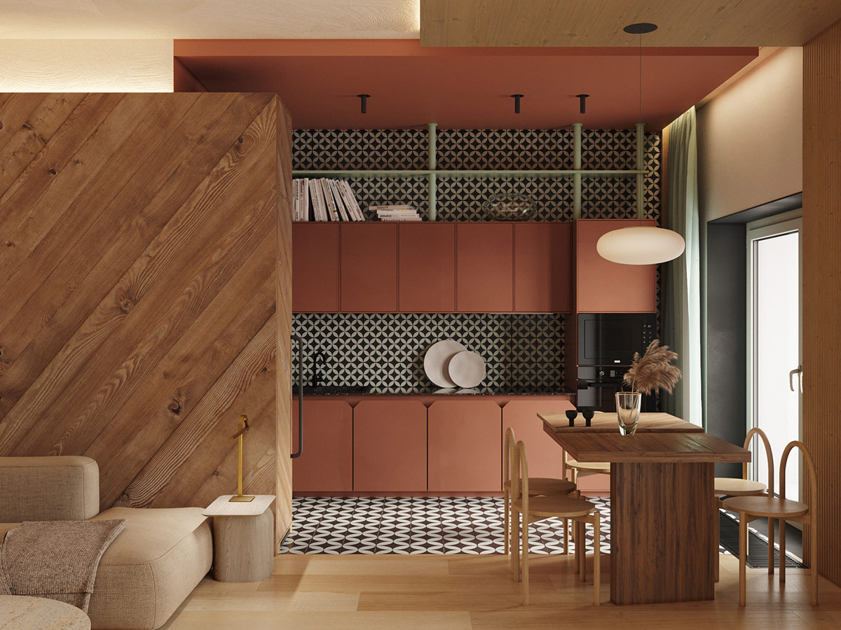
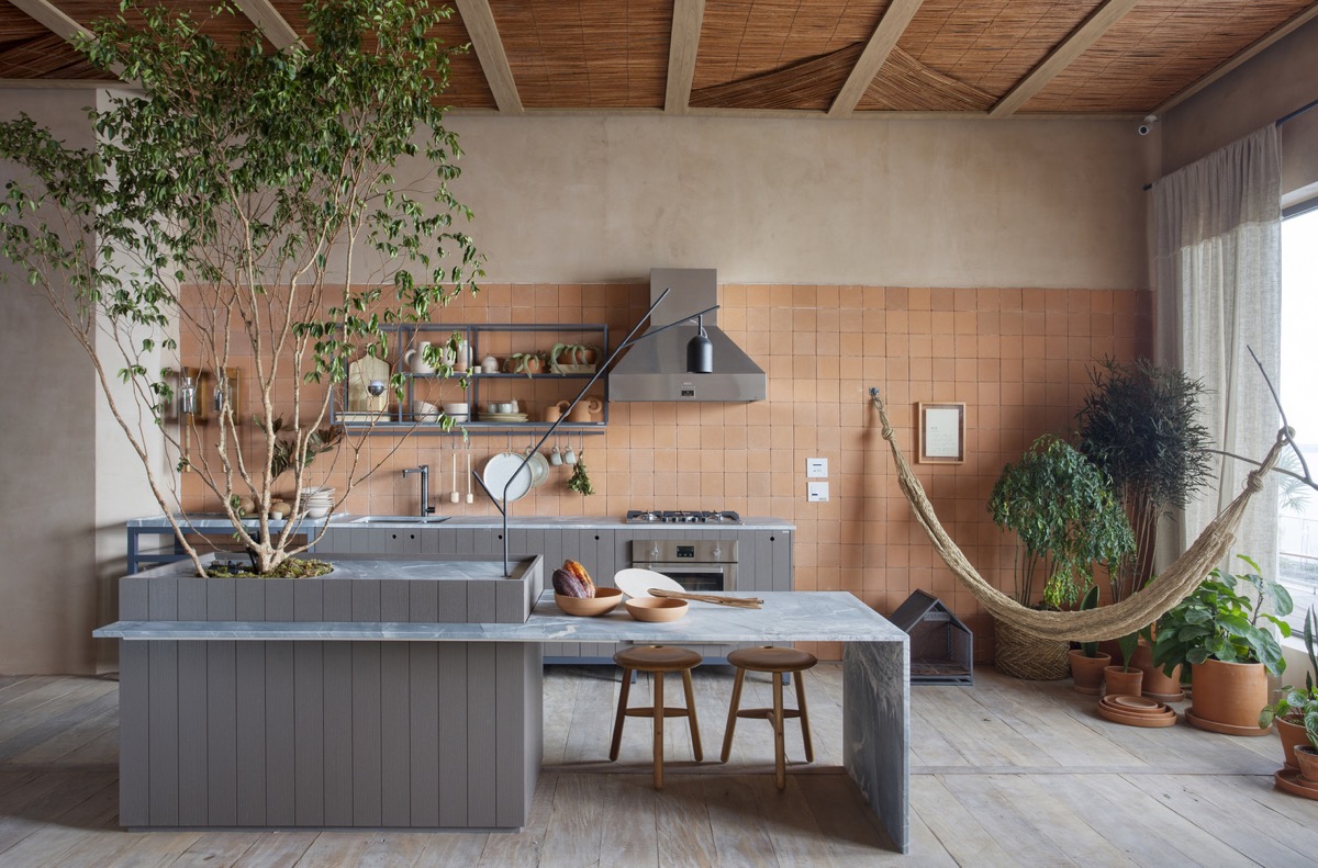
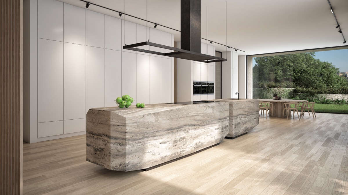
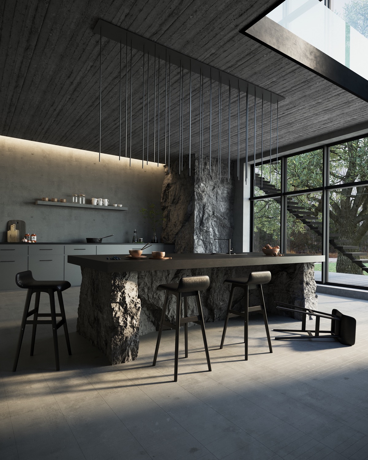
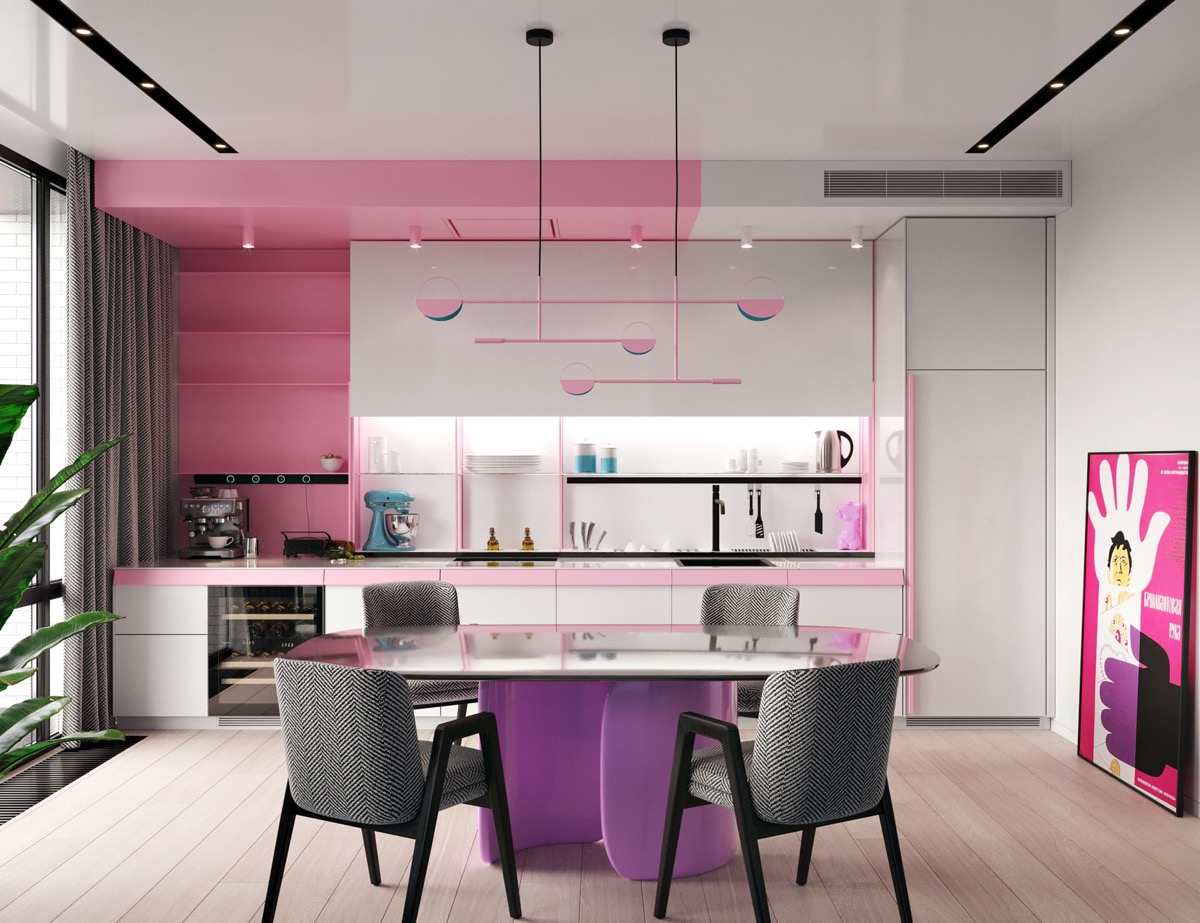
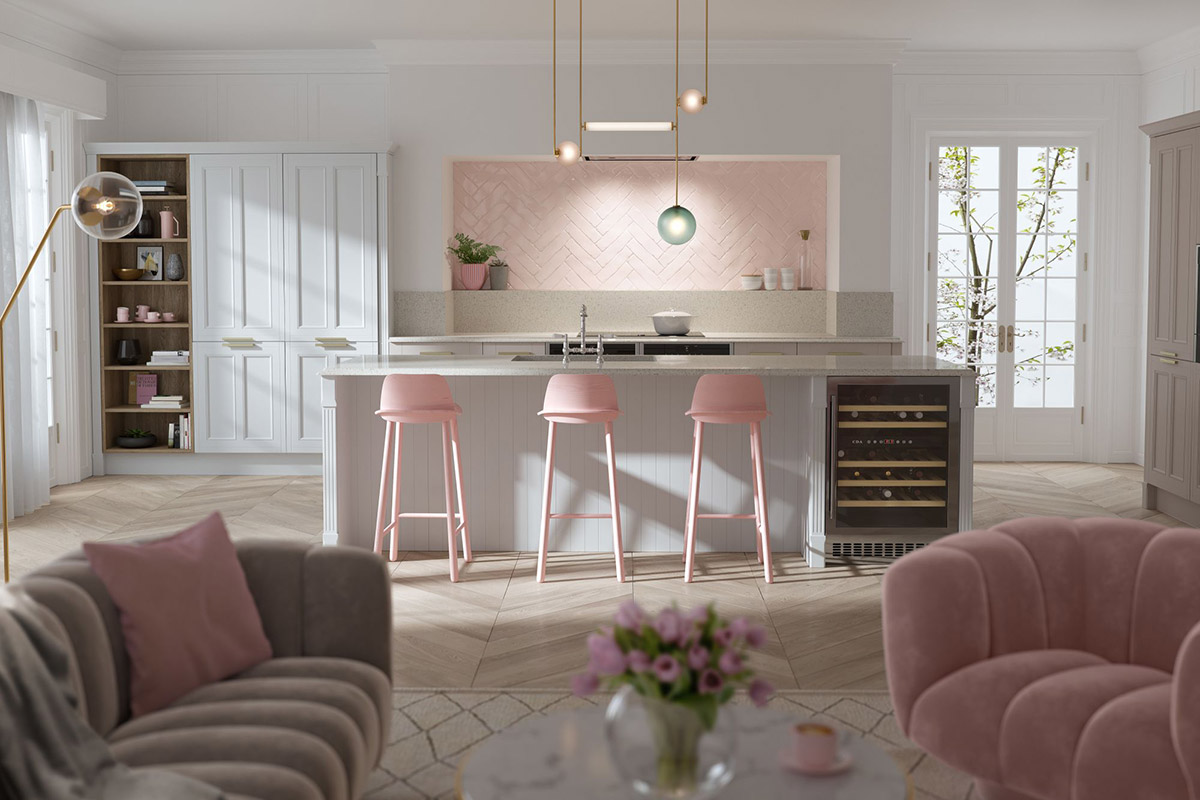
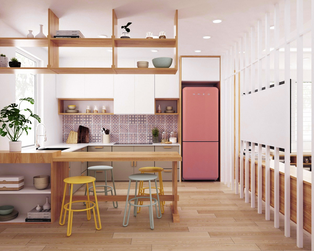
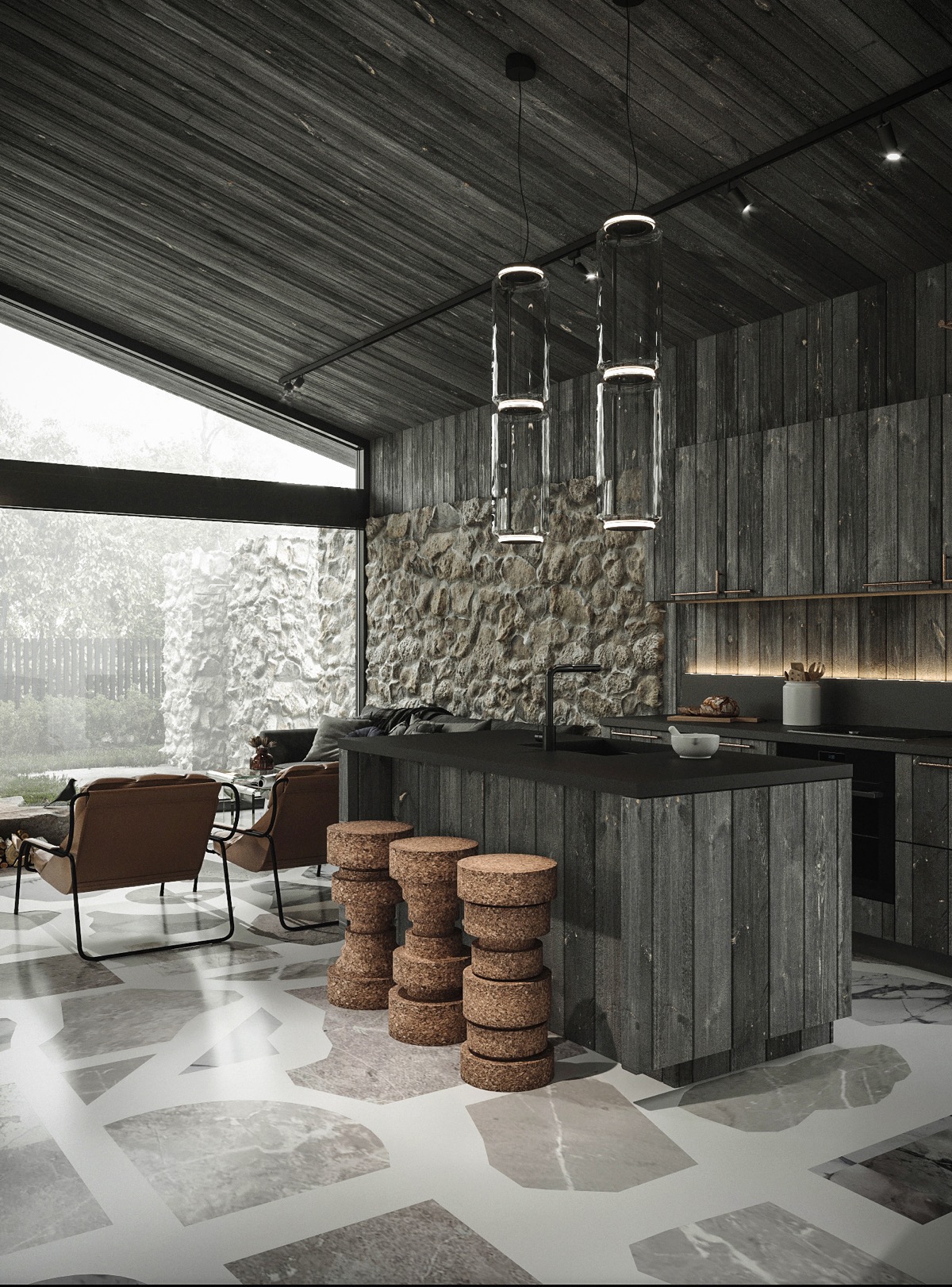
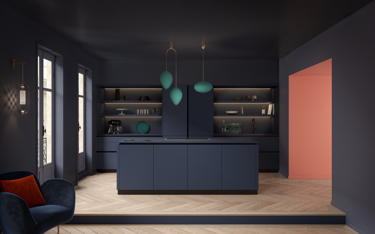
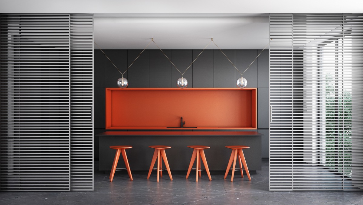
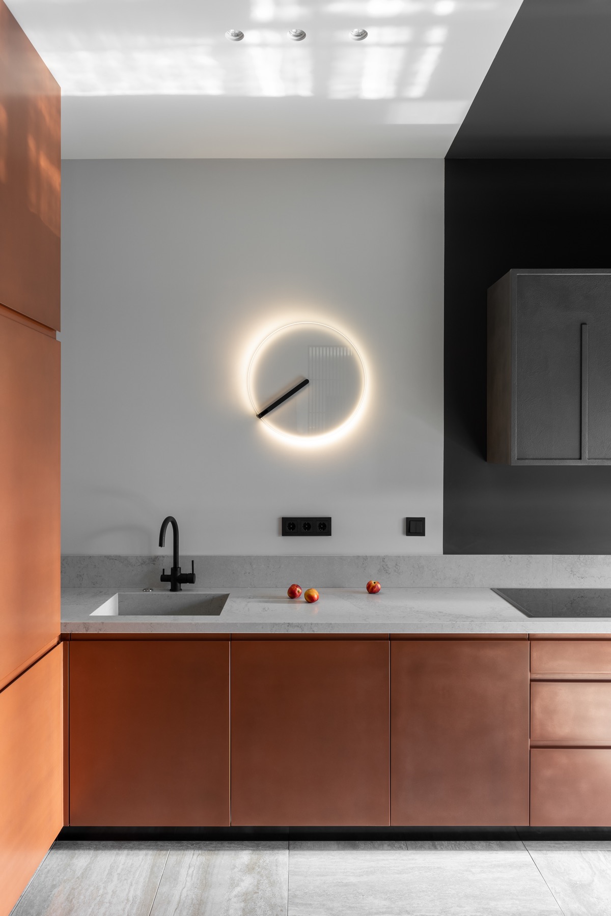
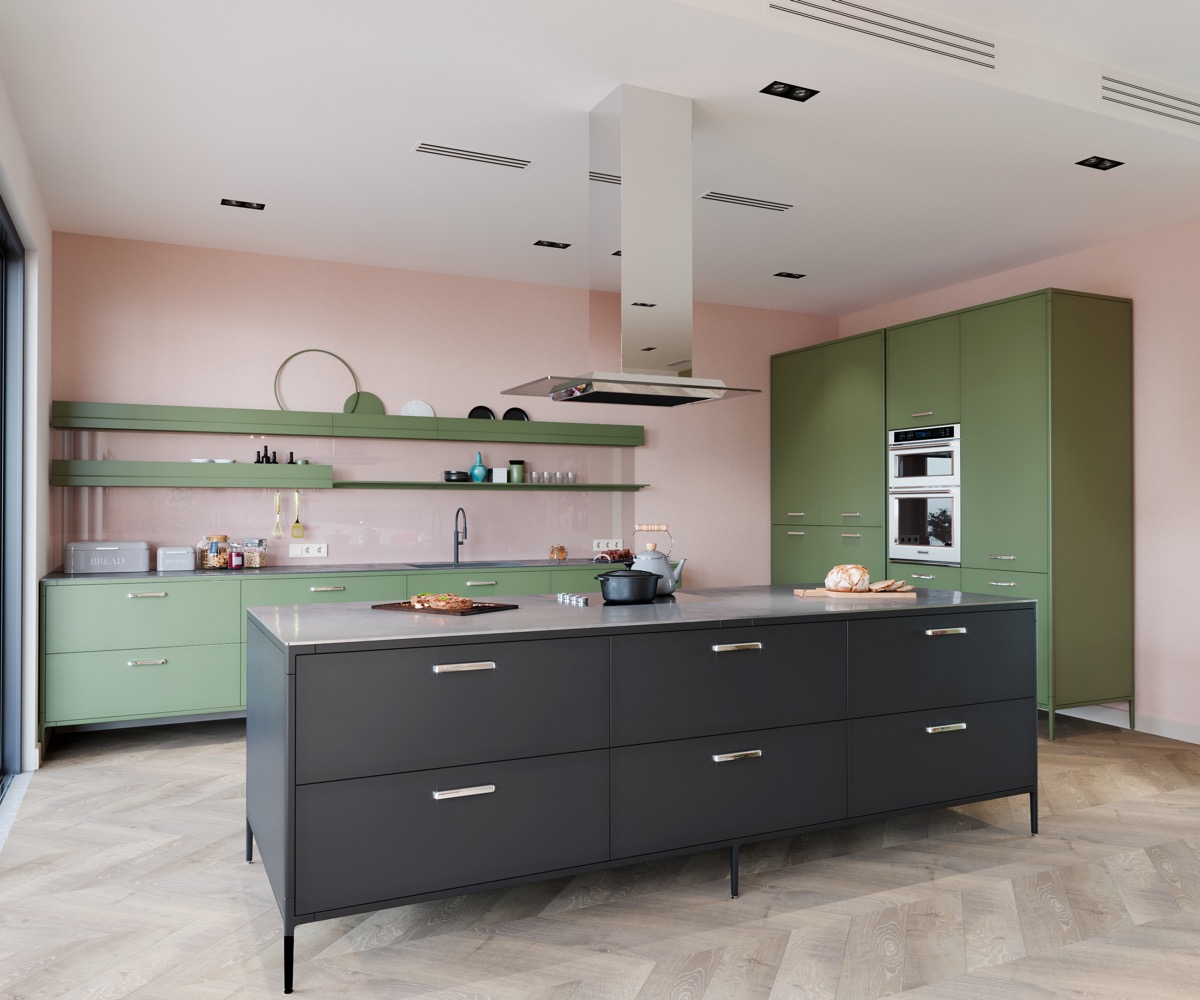
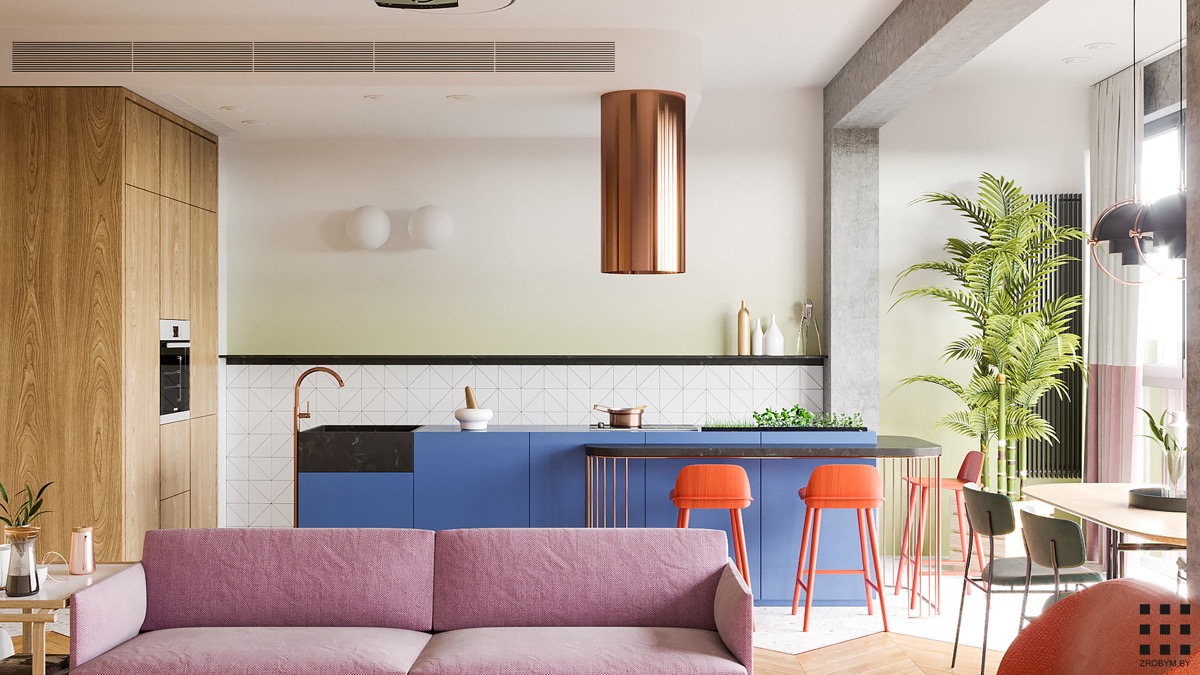
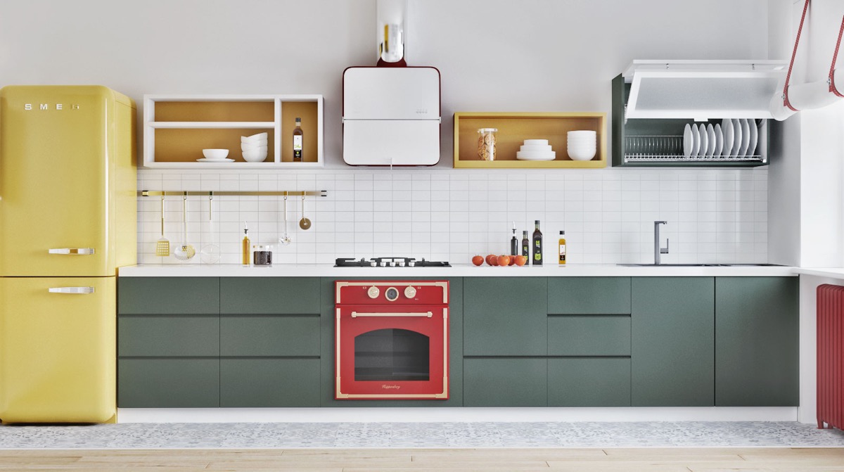
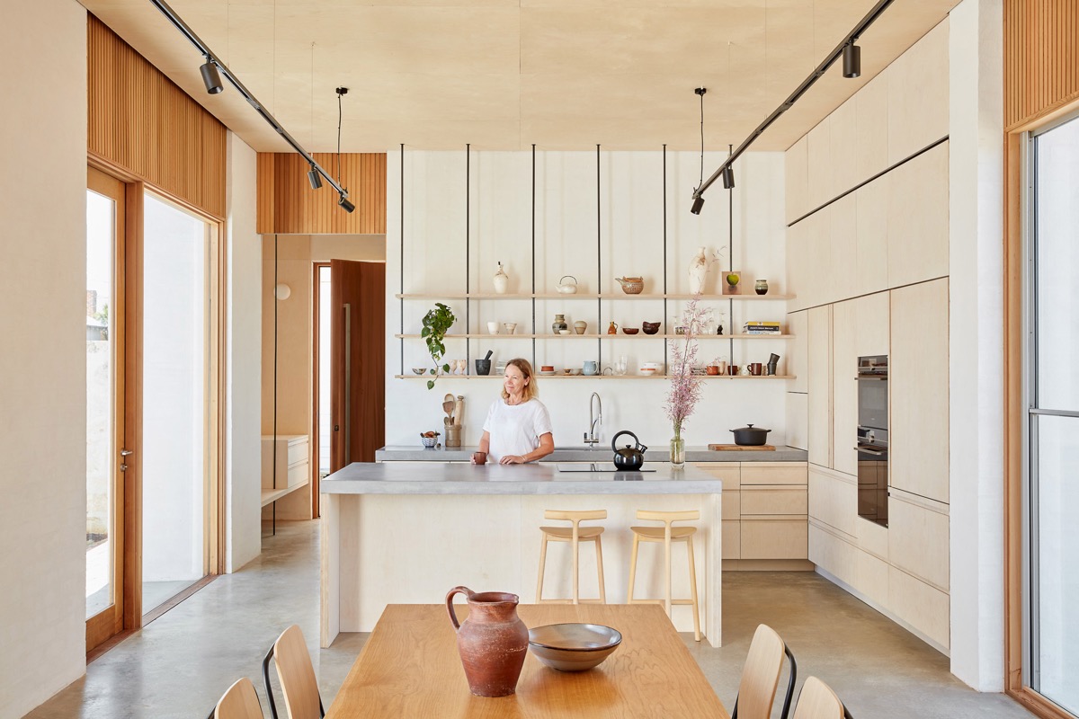
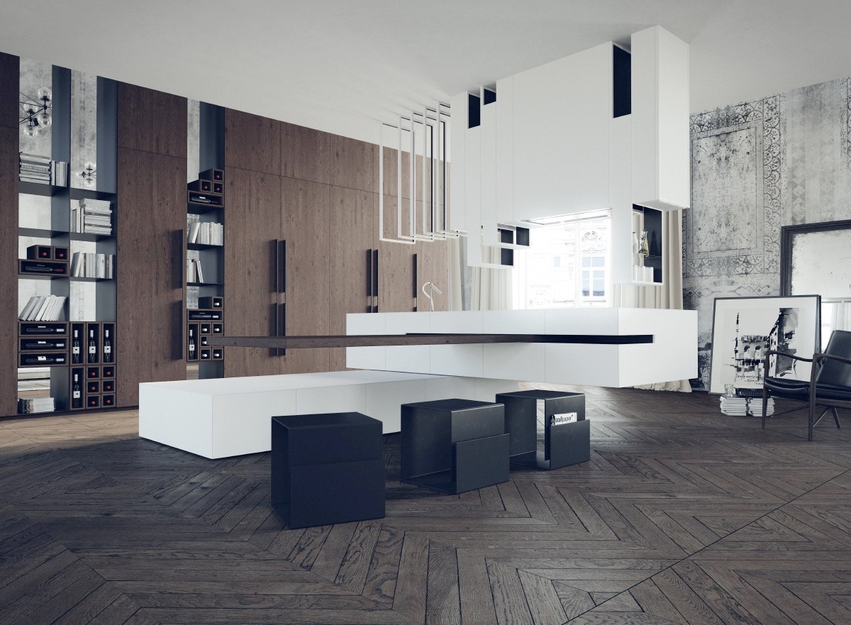
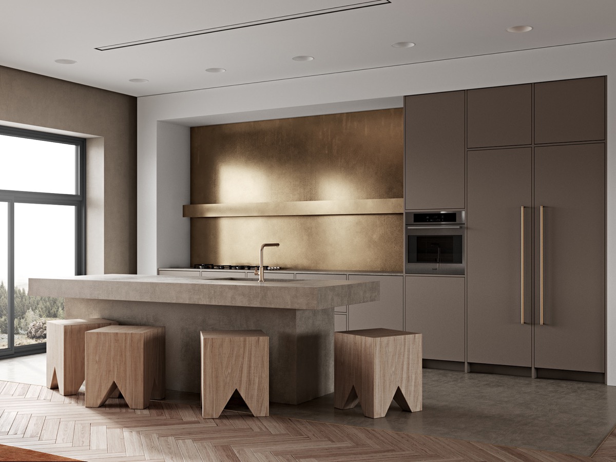
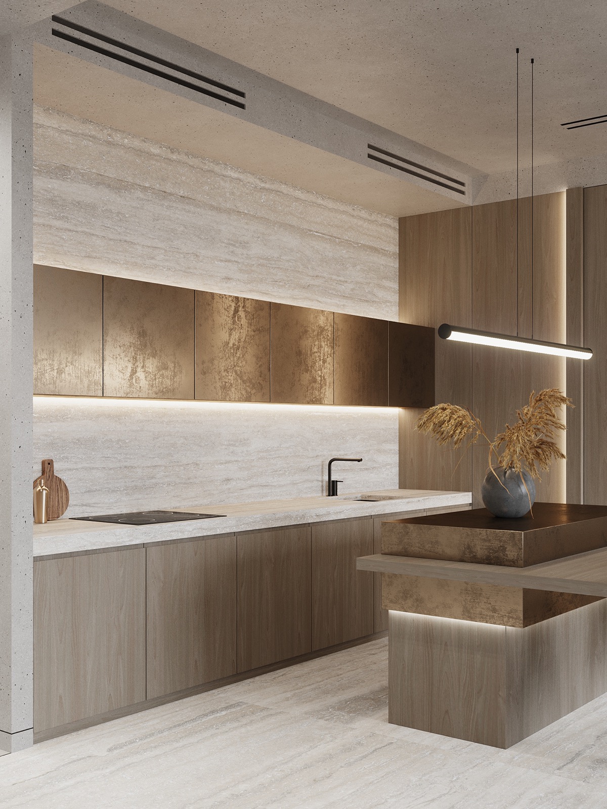
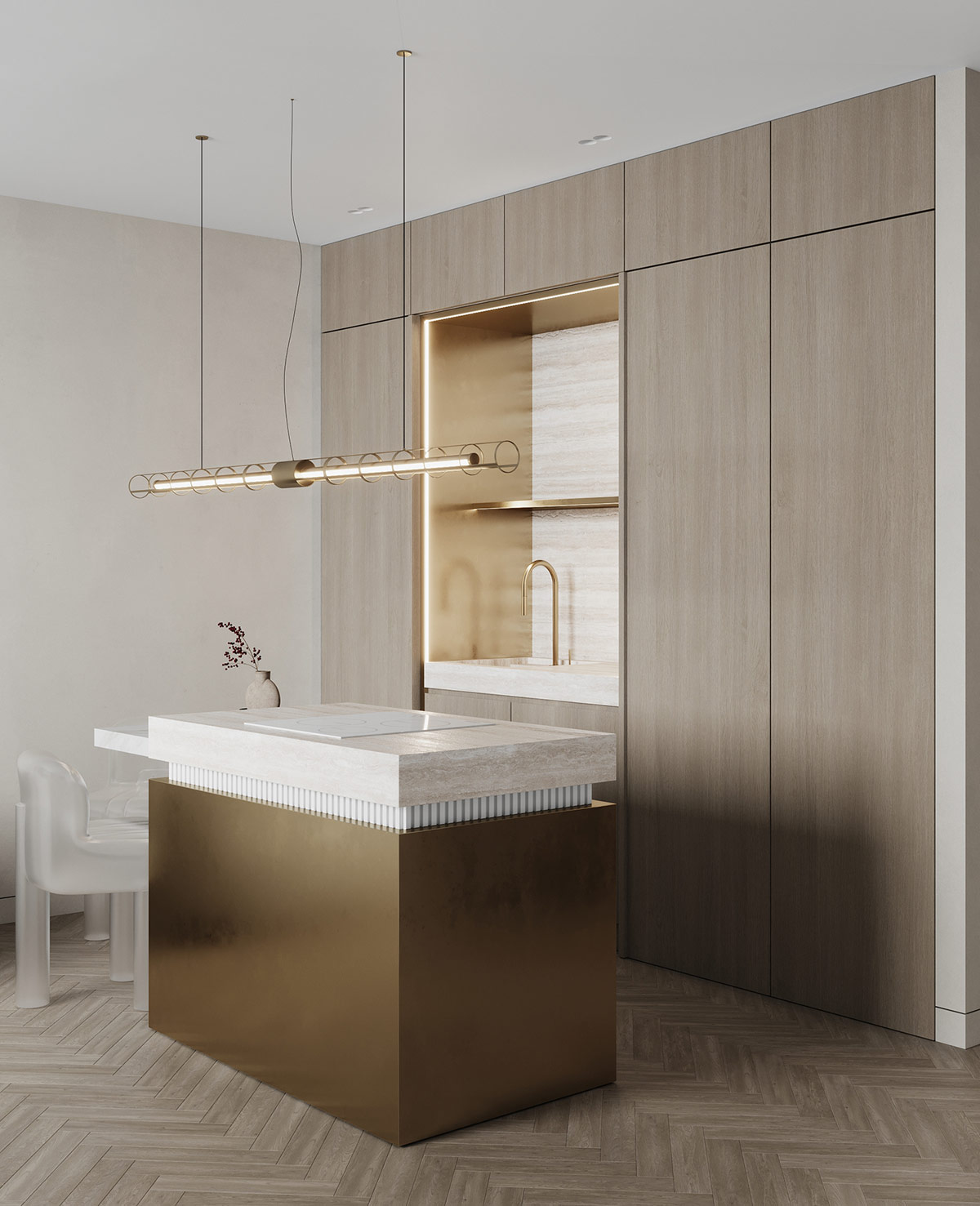
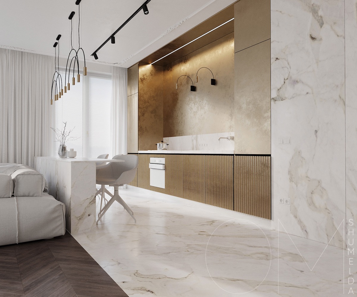
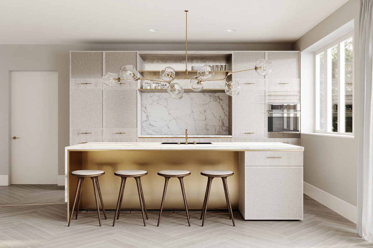
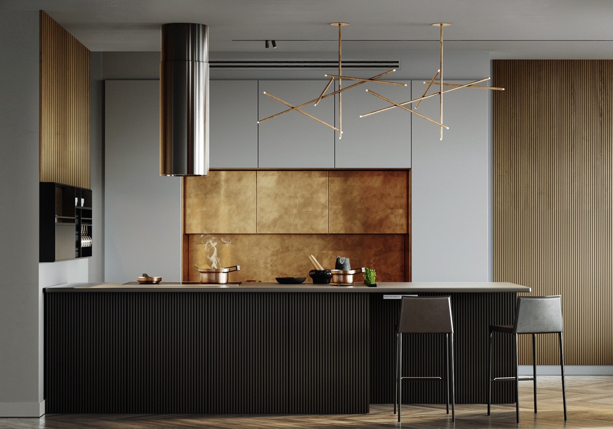
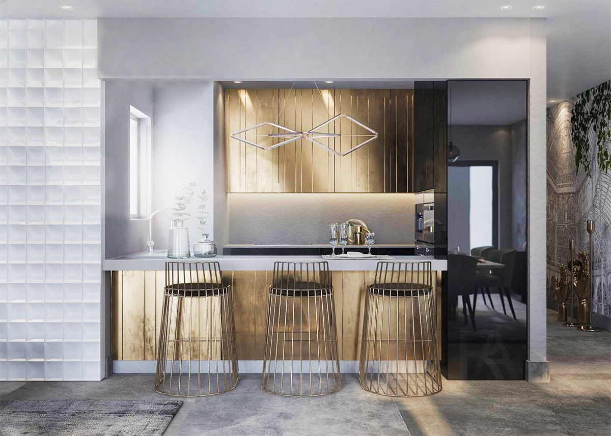
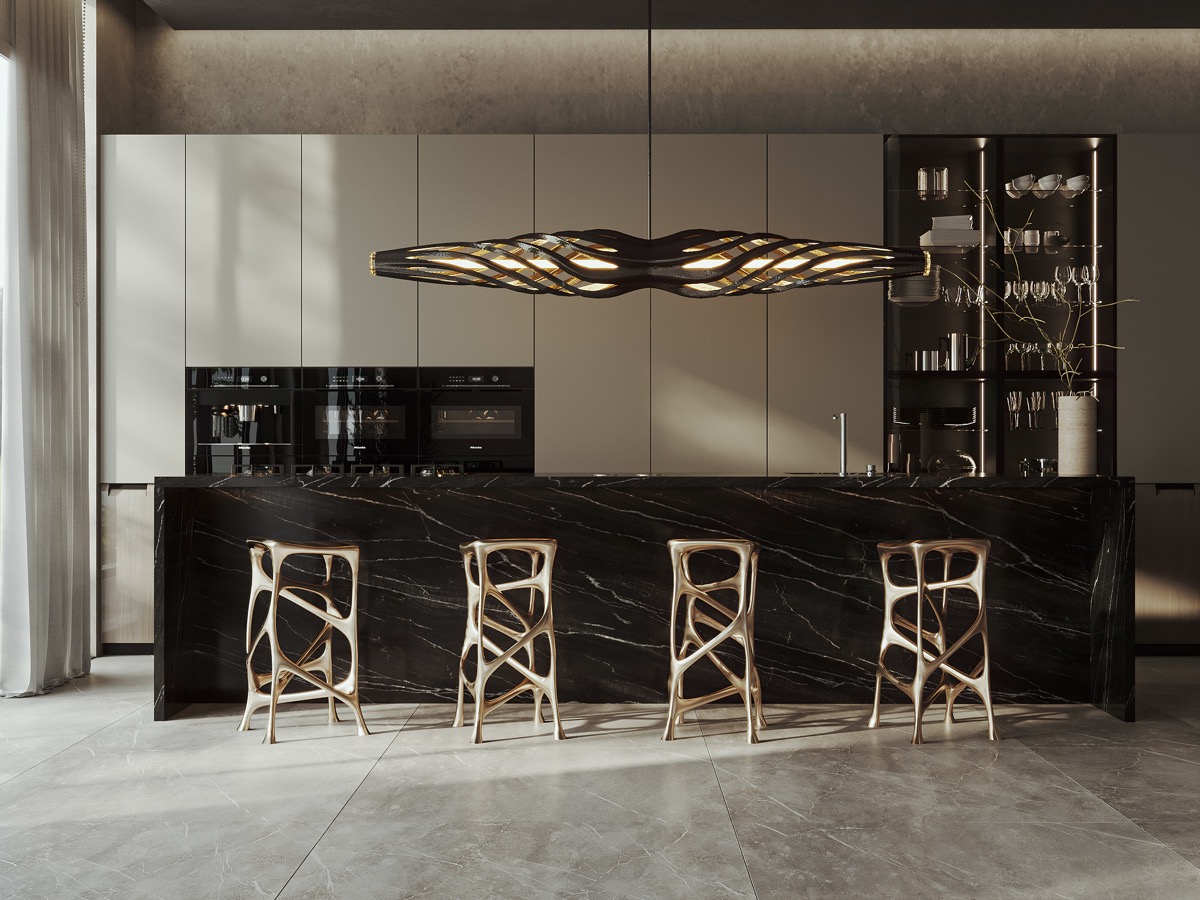
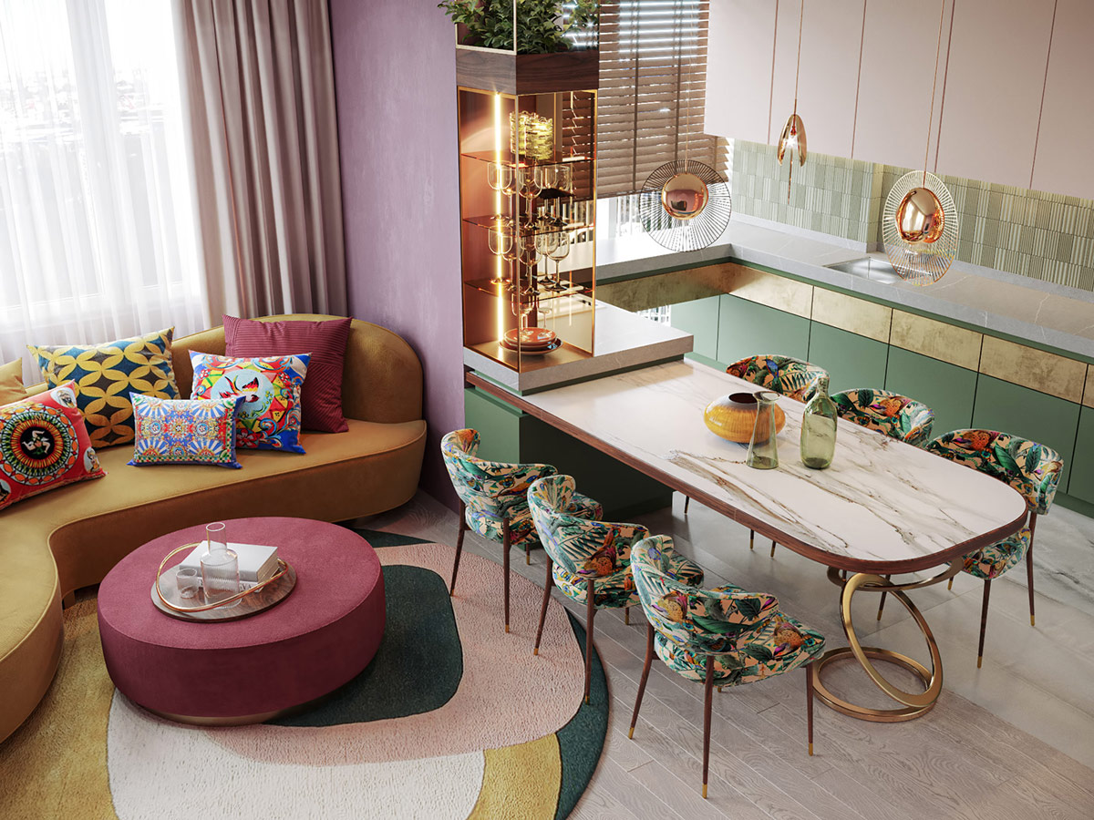
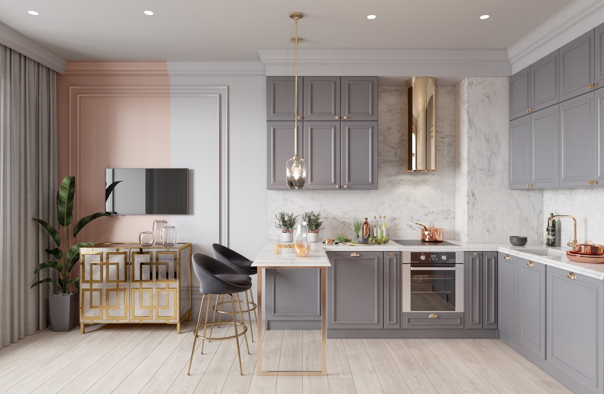
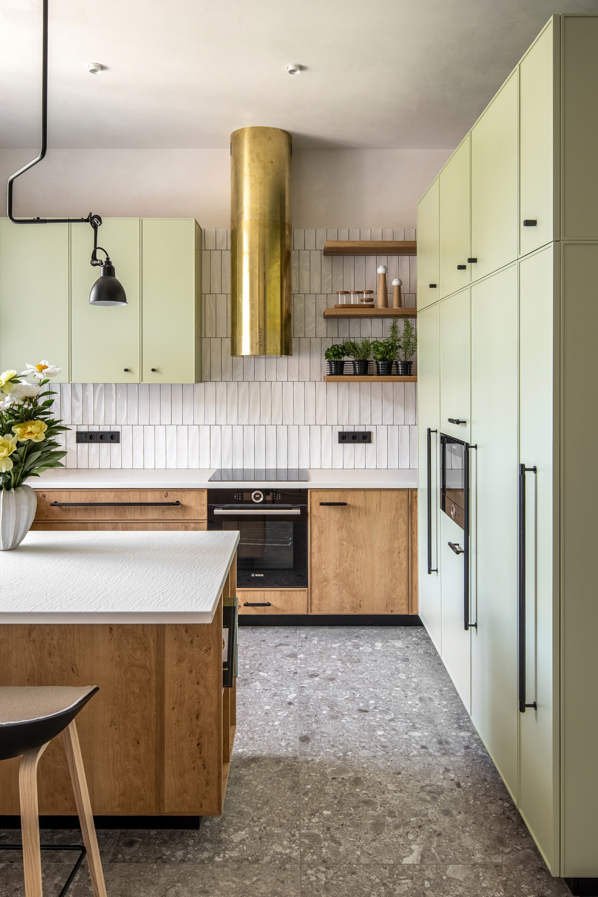
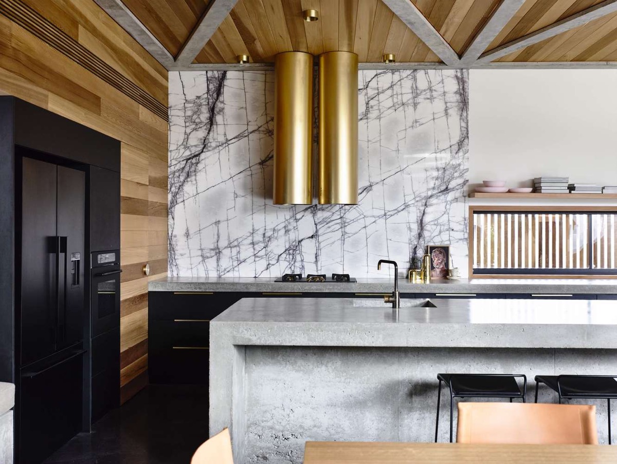
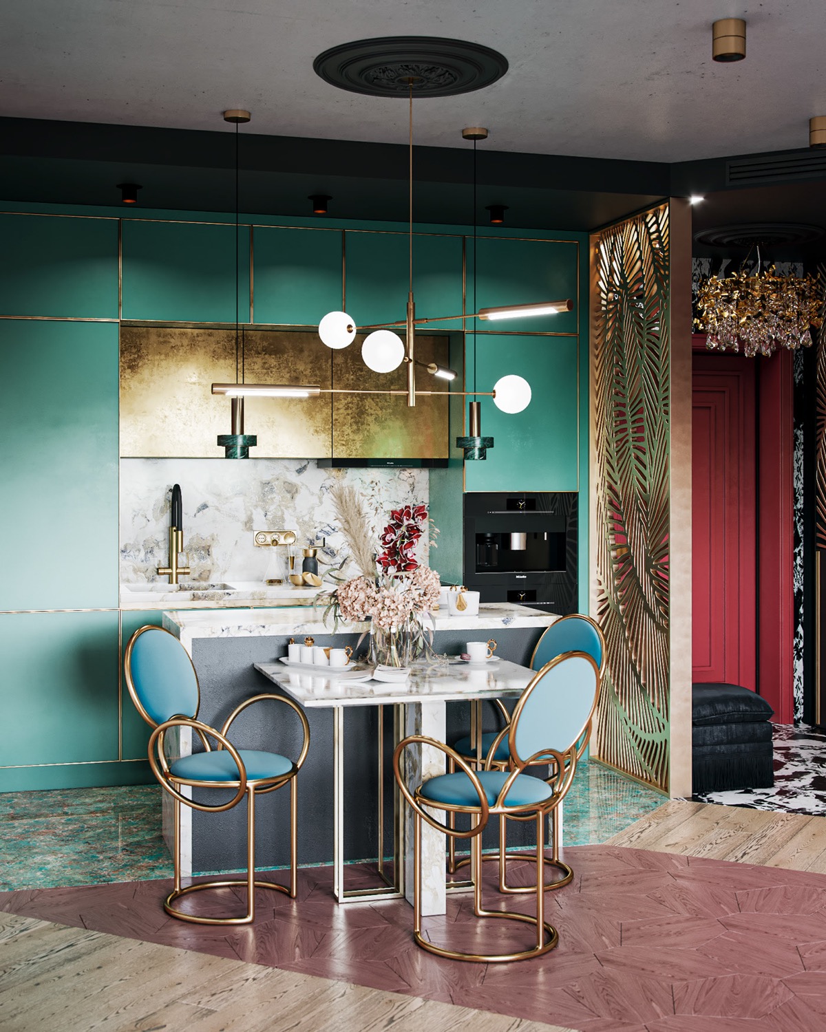
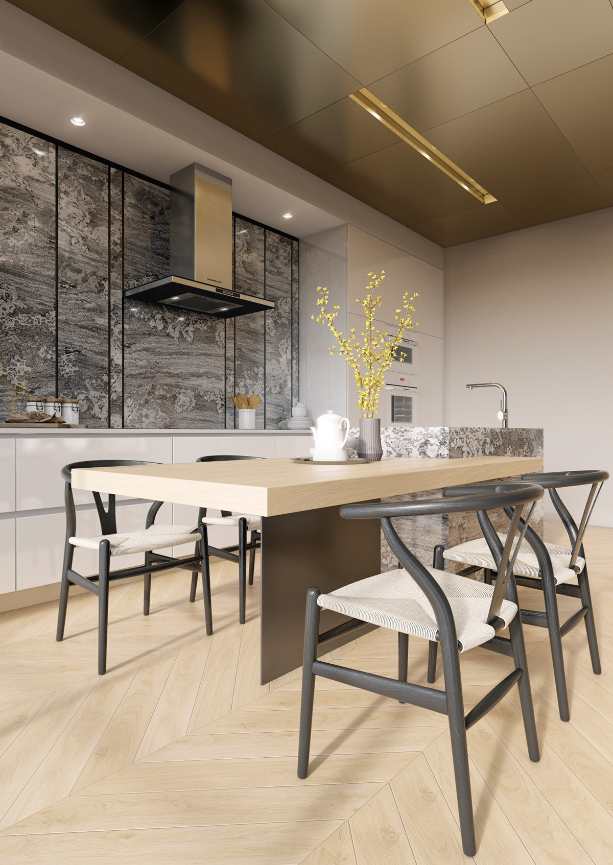
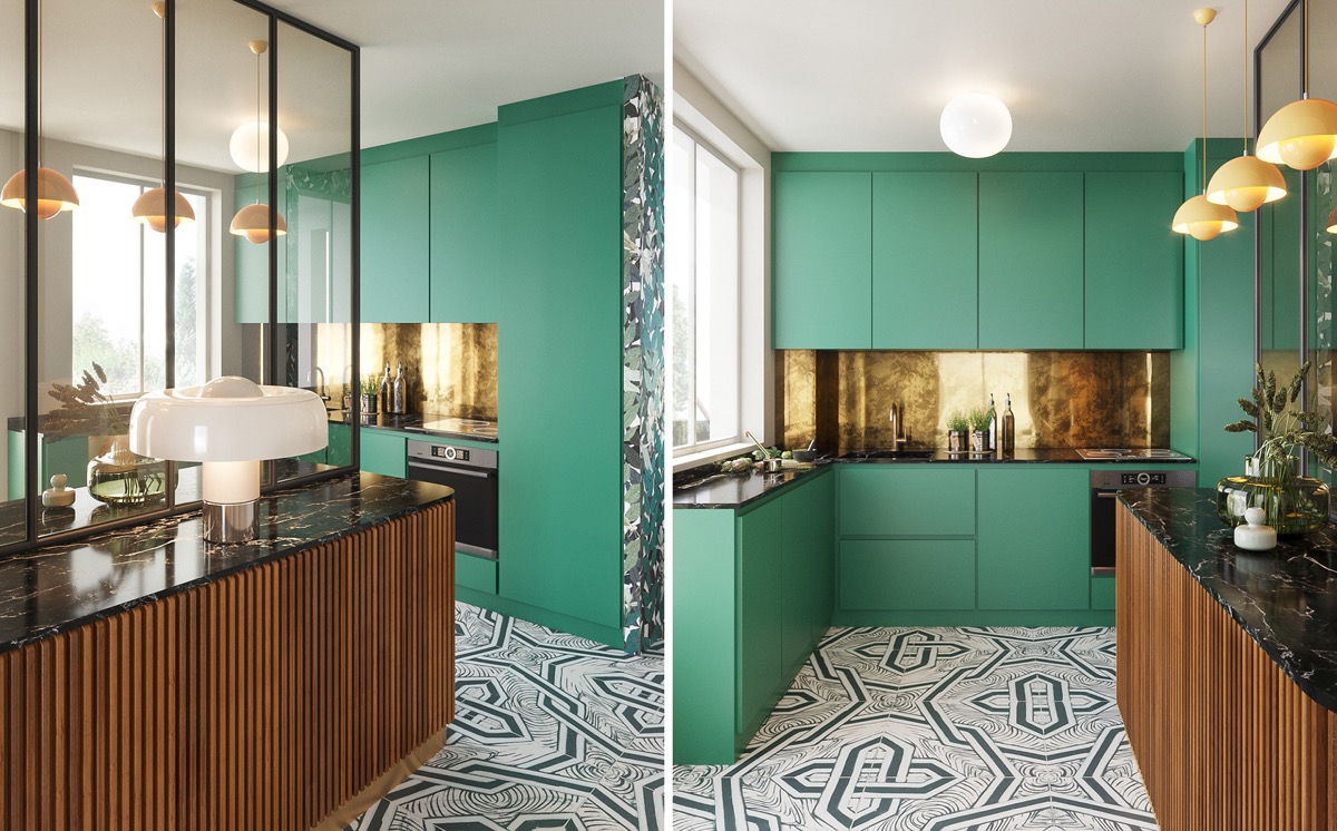
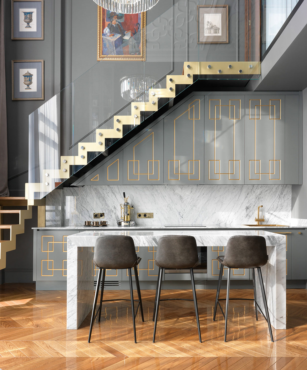
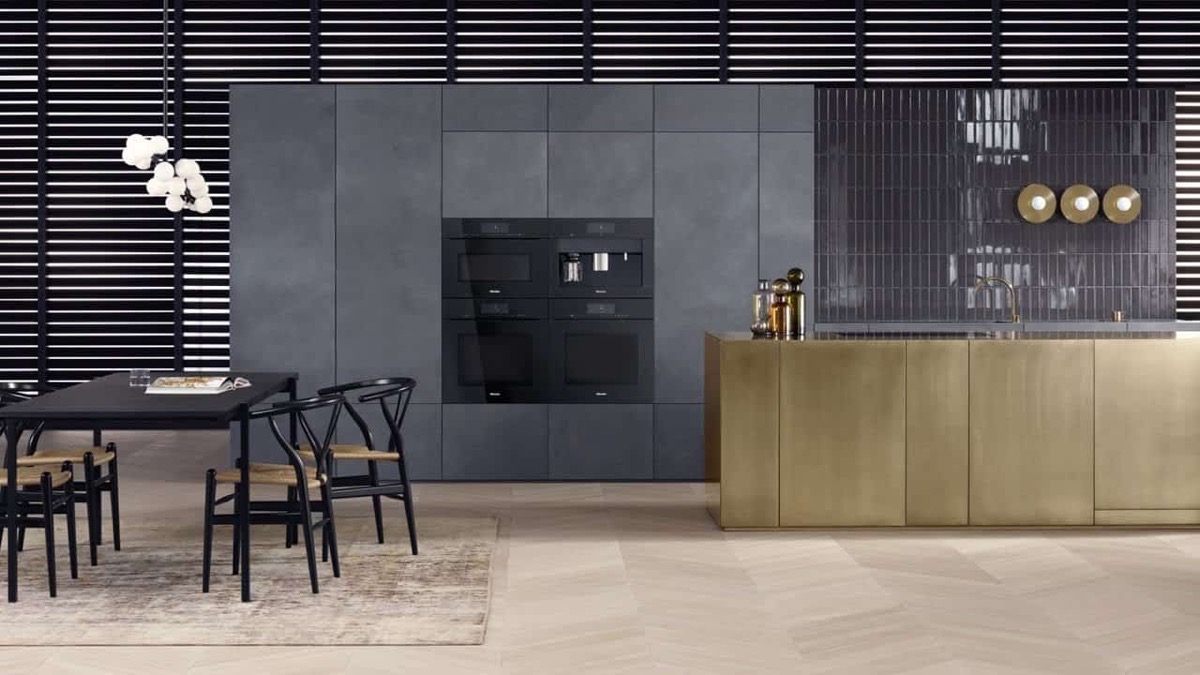
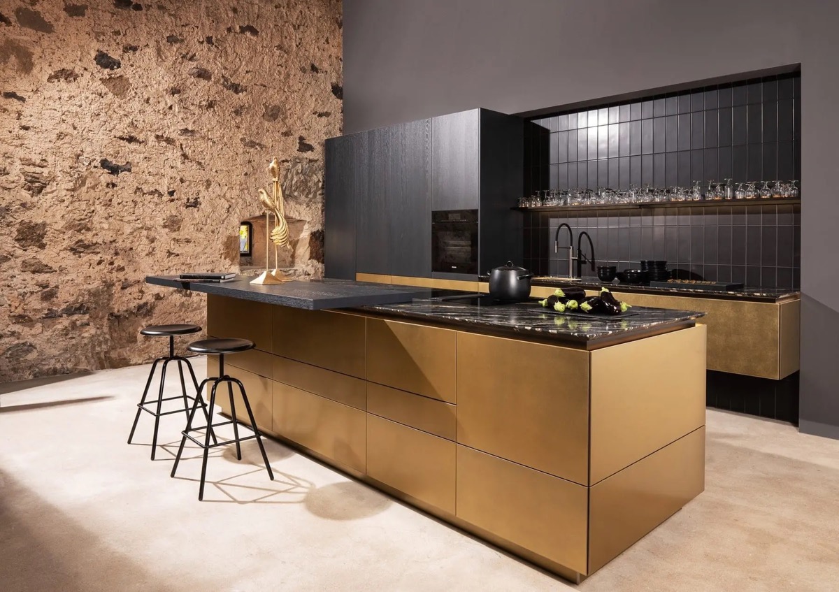
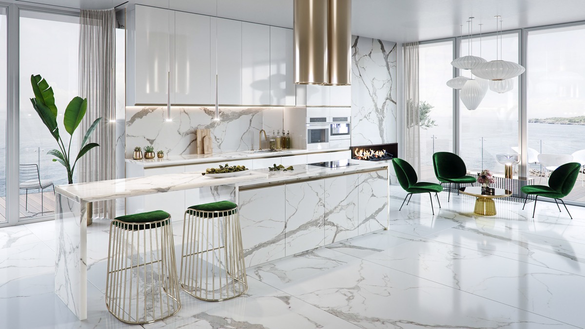
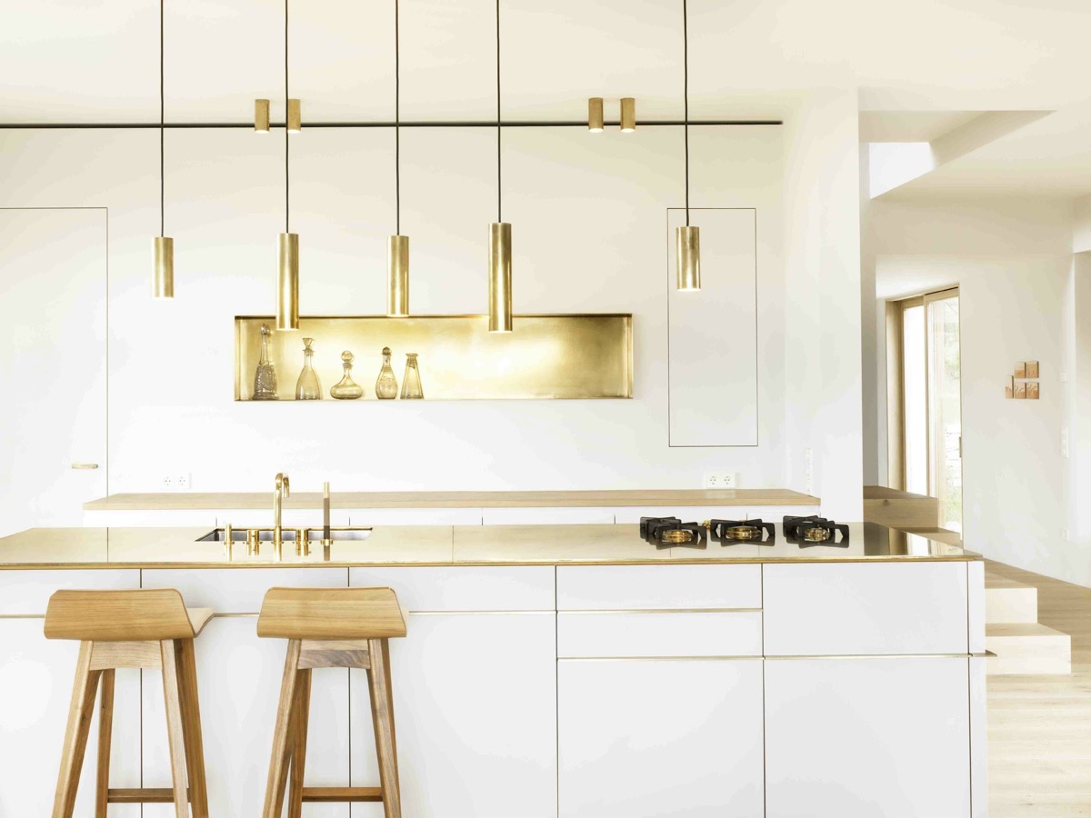
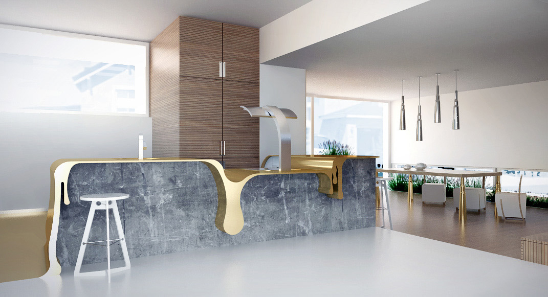
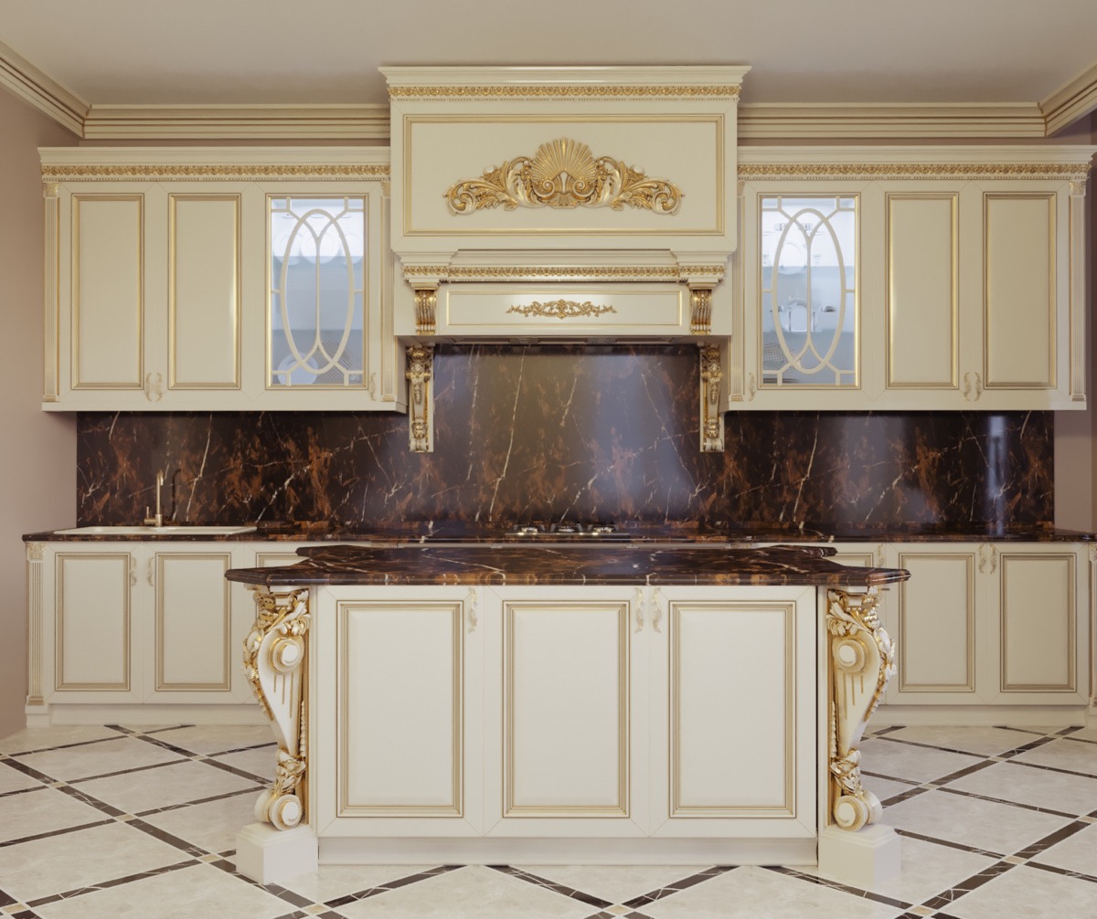
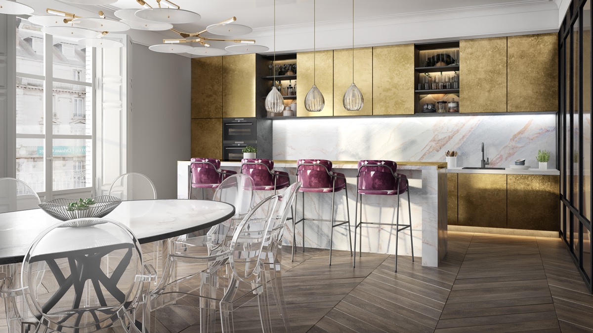
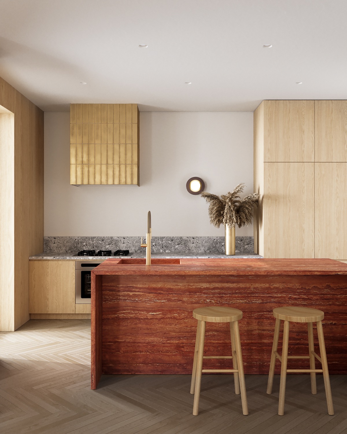
Creating culinary masterpieces may not be your particular strength, but you’d like it to be after you’ve cast your eyes on this special collection of 40 aesthetic kitchen designs. This gallery of avant-garde kitchens covers almost every interior style on the spectrum. We will visit kitchens with a minimal, clean white aesthetic up to joyous spaces that touch color. We will visit abstract modern kitchen designs, rustic interiors, luxurious marble kitchens and decorative schemes with rich metallic gold accents. We will be introduced to futuristic kitchen designs, large kitchen arrangements with curvy islands, kitchen eaters flowing into open plan living quarters, and those that are inspired by nature.
Did you like this article?
Share it on any of the following social media below to give us your voice. Your comments help us improve.
For more information on the real estate sector of the country, keep reading Feeta Blog.
40 Aesthetic Kitchens: Inspiring Culinary Skills
- Published in kitchen, kitchen cabinets, kitchen countertops, Kitchen Designs
51 Gold Kitchens With Tips And Accessories
Like Architecture and Interior Design? Follow us …
Thank you. You have been subscribed.
![]()
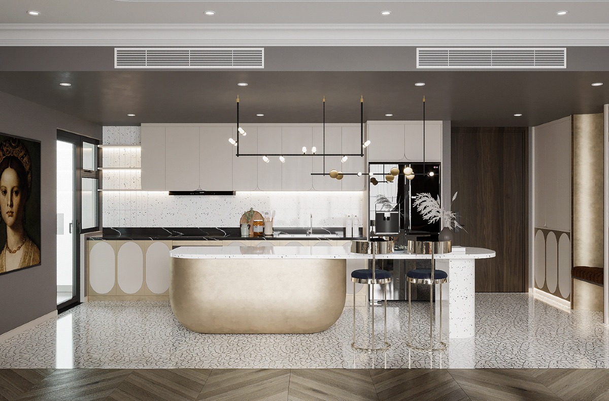
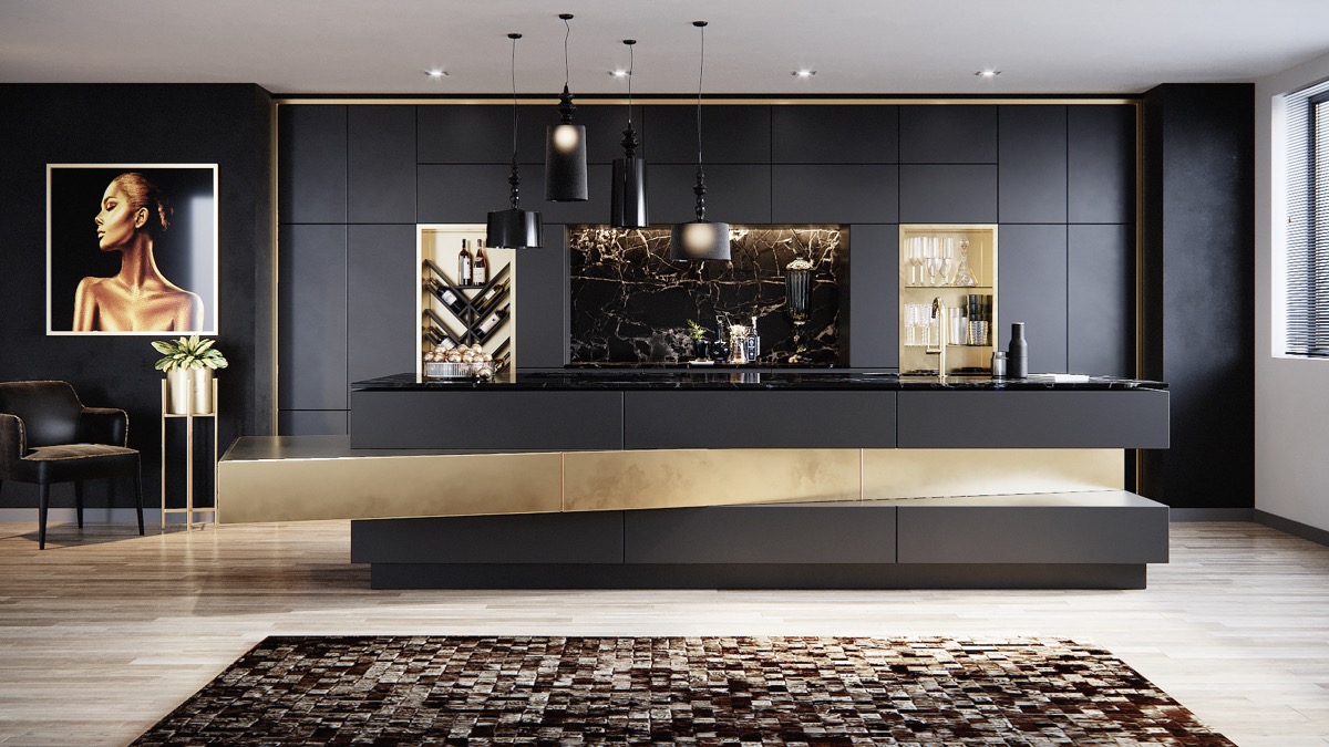
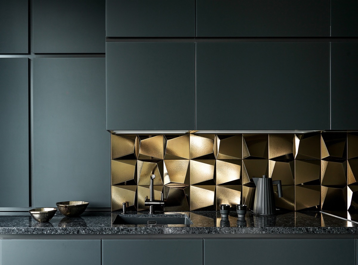
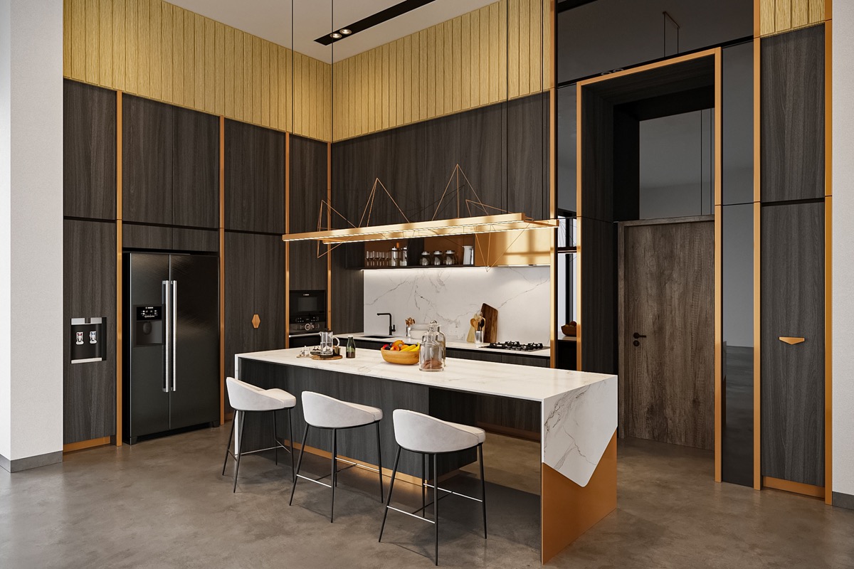
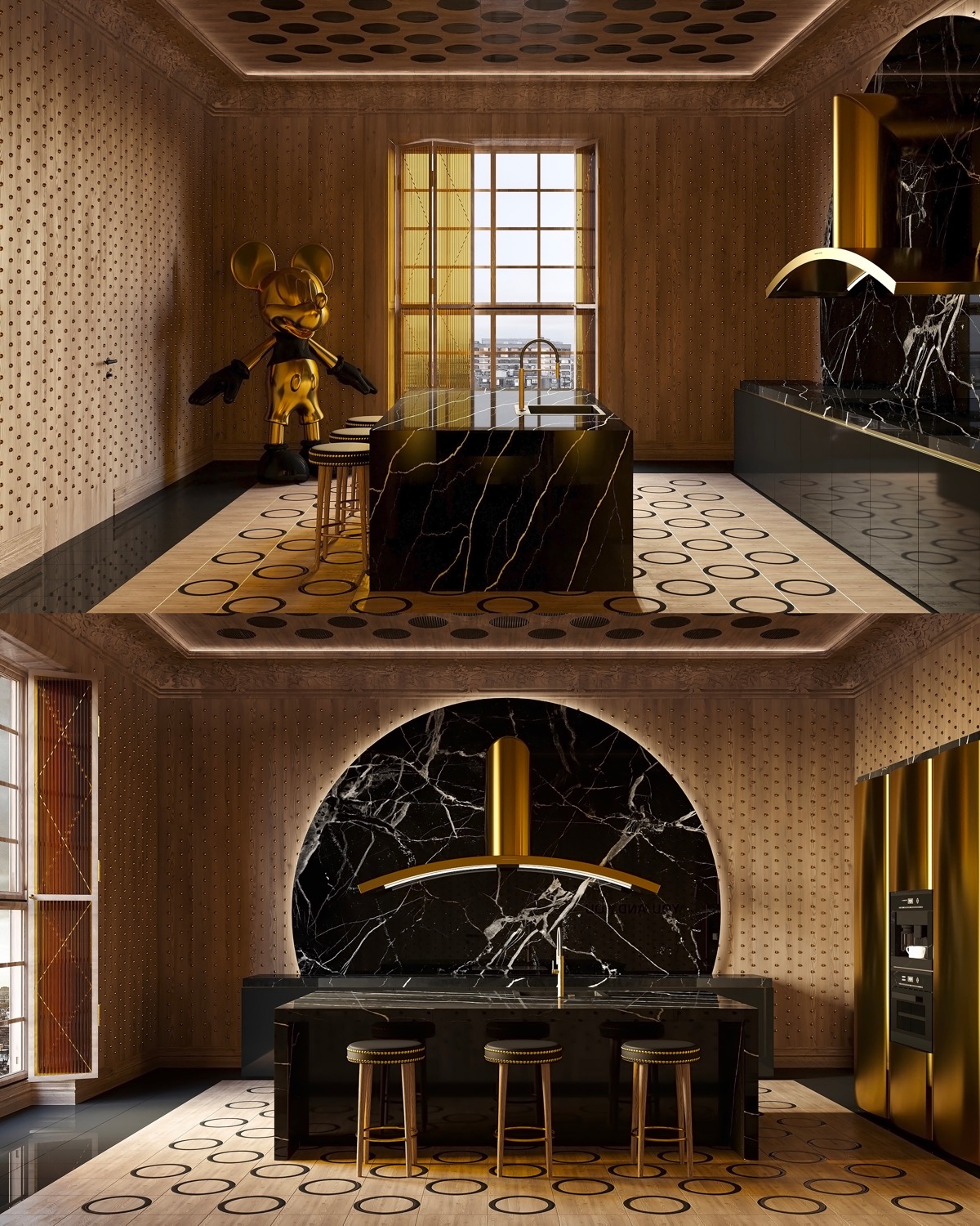
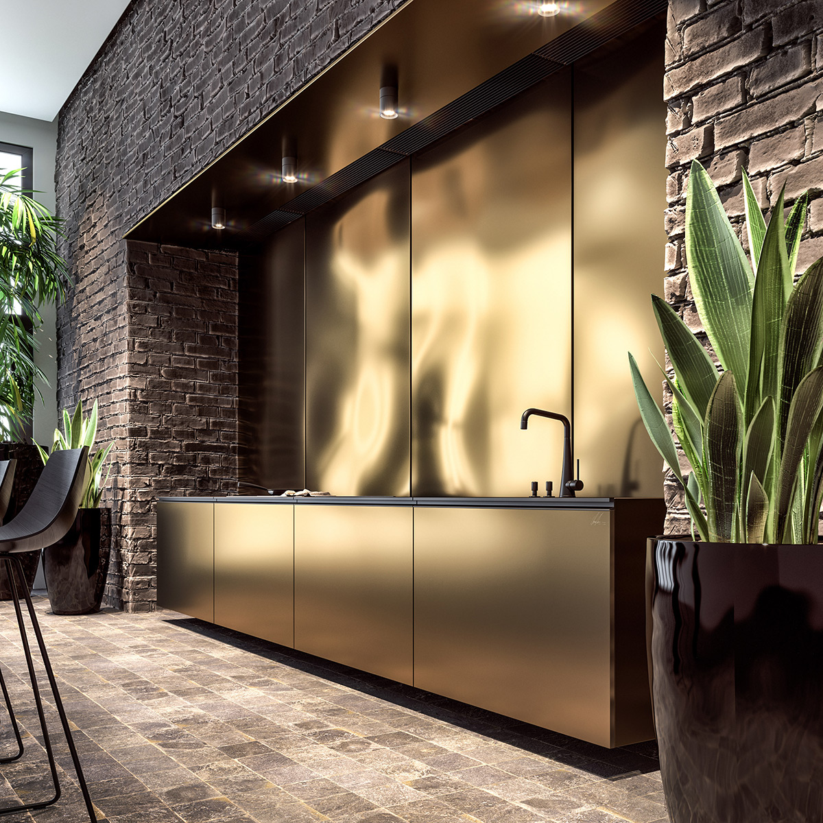
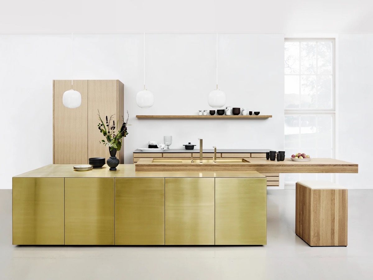
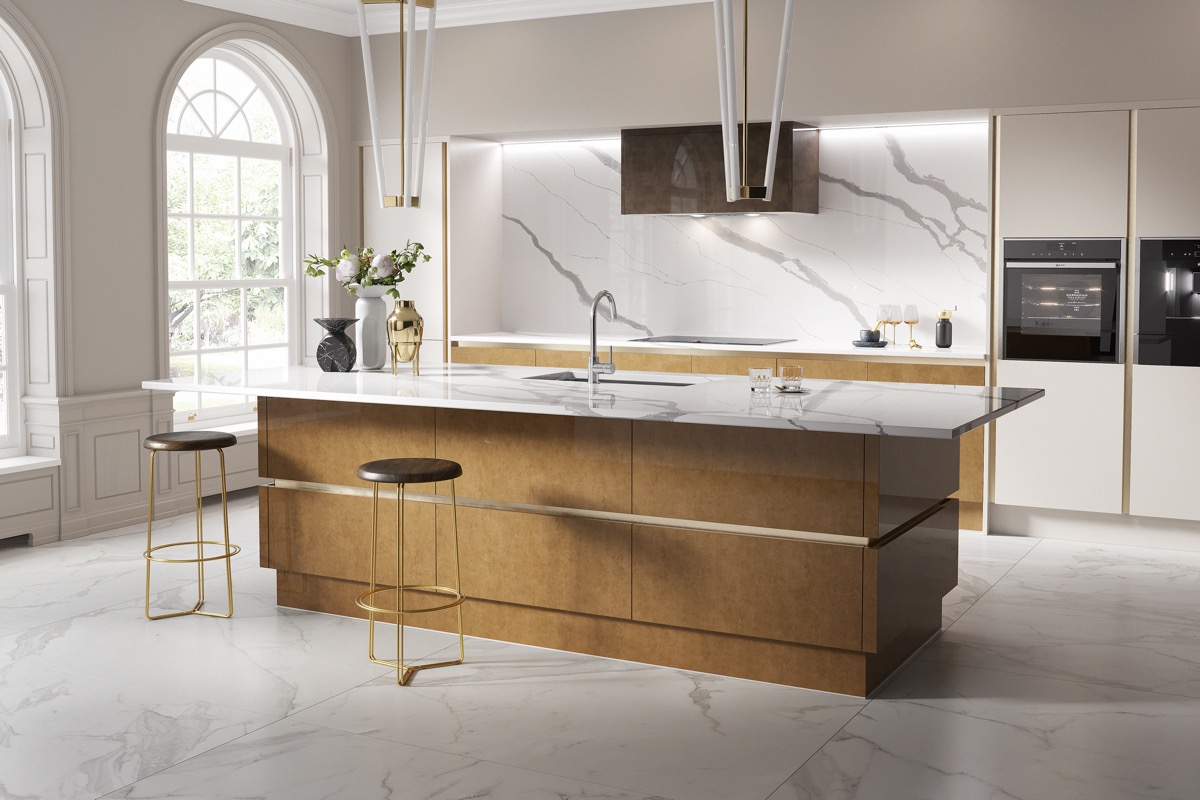
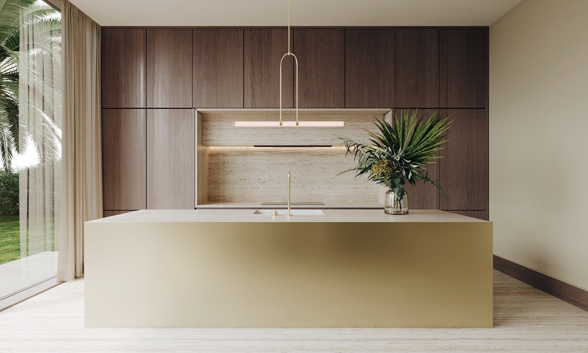
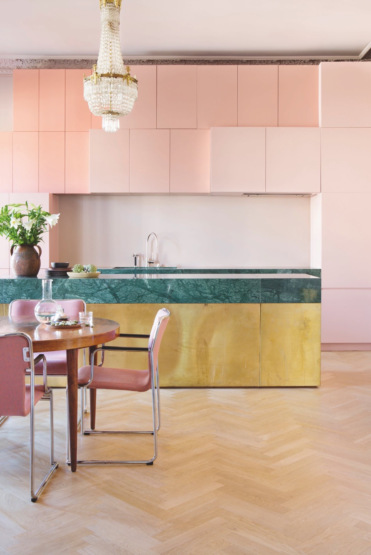
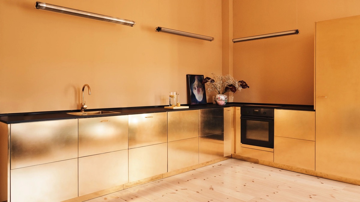
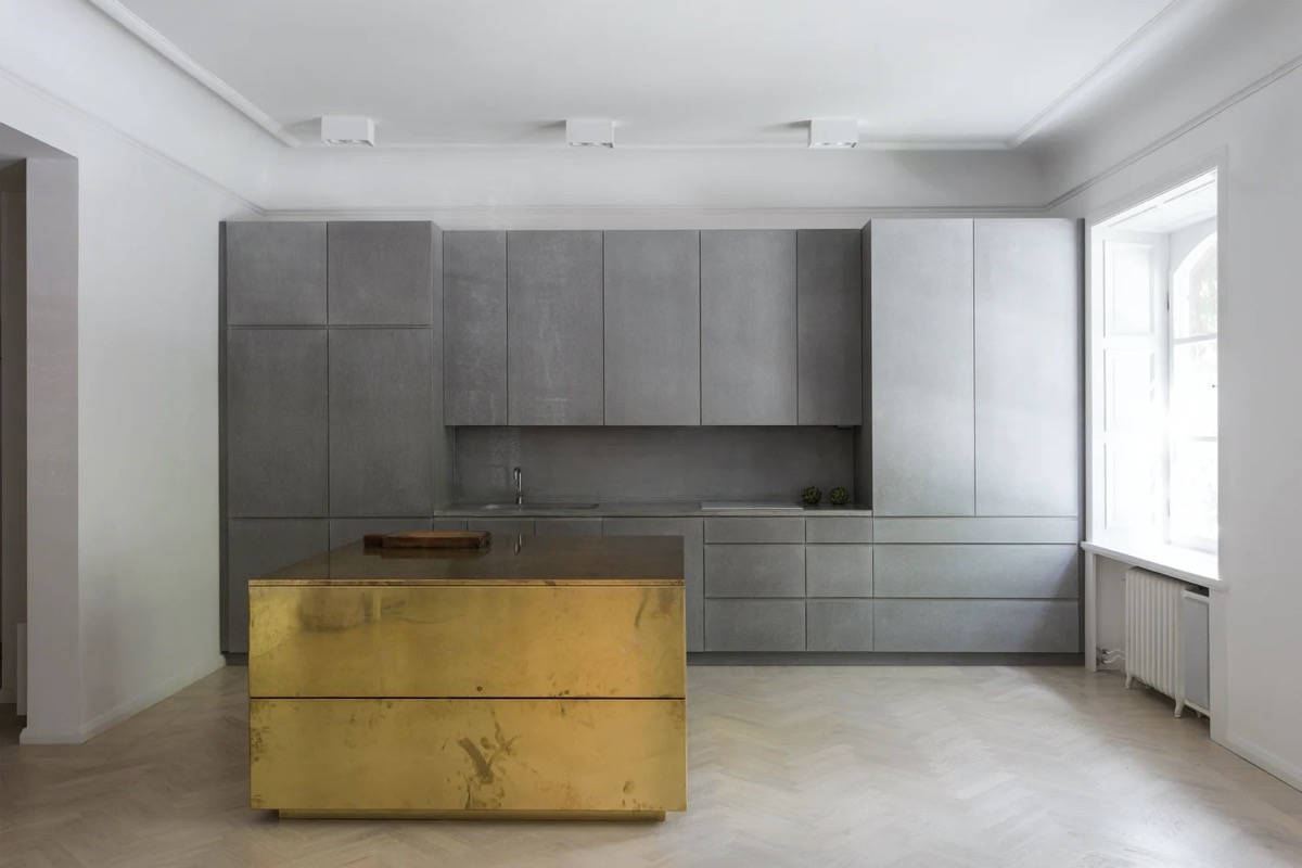
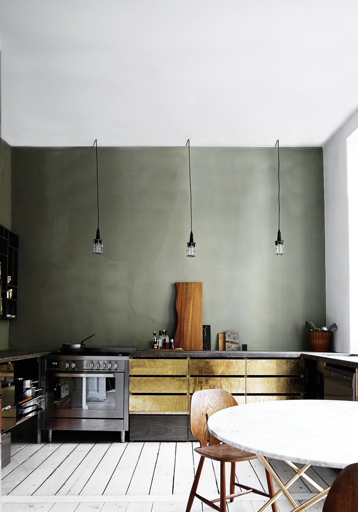
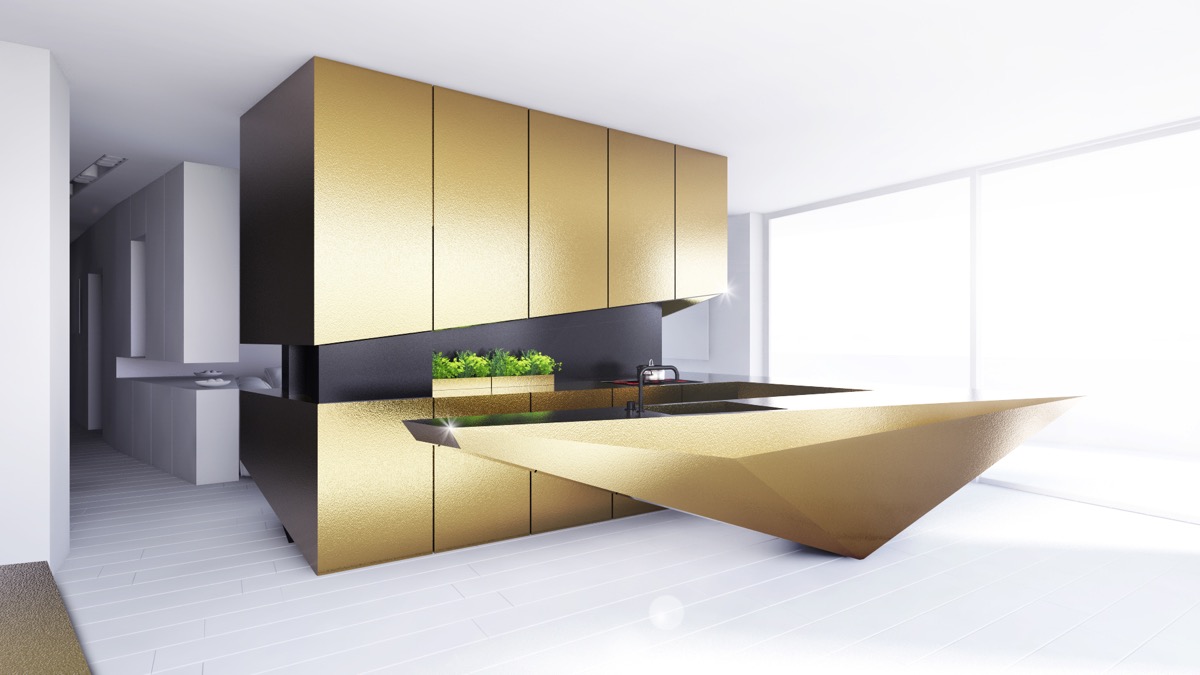
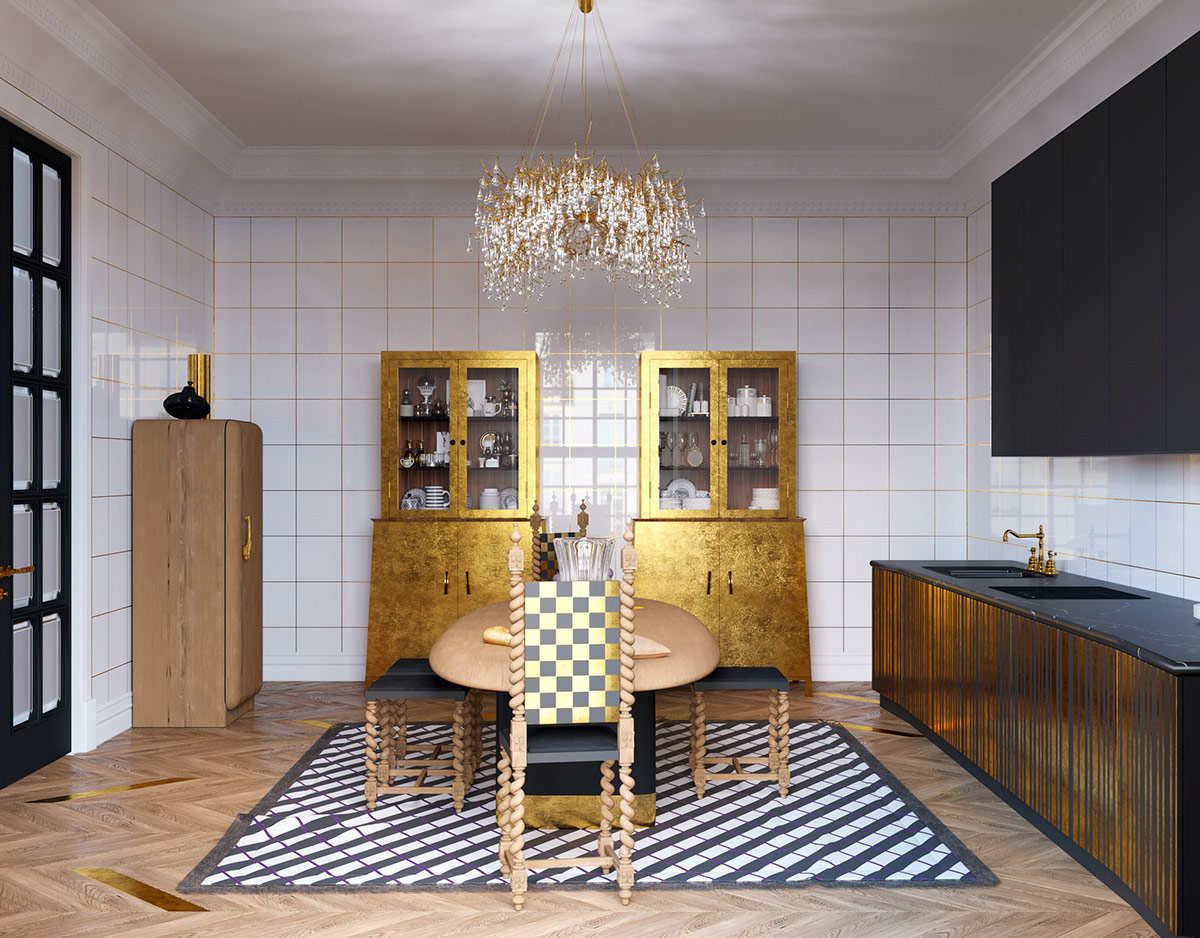
The gold kitchen decorating trend is regularly tamed with small gold kitchen accessories, upgraded hardware, or maybe a gold kitchen appliance or two. However, if you really want this high-end trend to surpass luxury and a bold personality, you have to make it bigger. Gold kitchen cabinets can be used for a full Midas touch, or just a few accent units can achieve the required luxurious fullness of the aesthetic without becoming overwhelming in the space. This collection of 51 golden kitchens, fabulous accessories, hanging lights and bar stools shows just how to achieve the luxurious metal mood of the moment without appearing even a little chic.
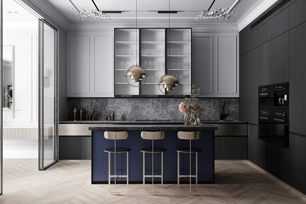
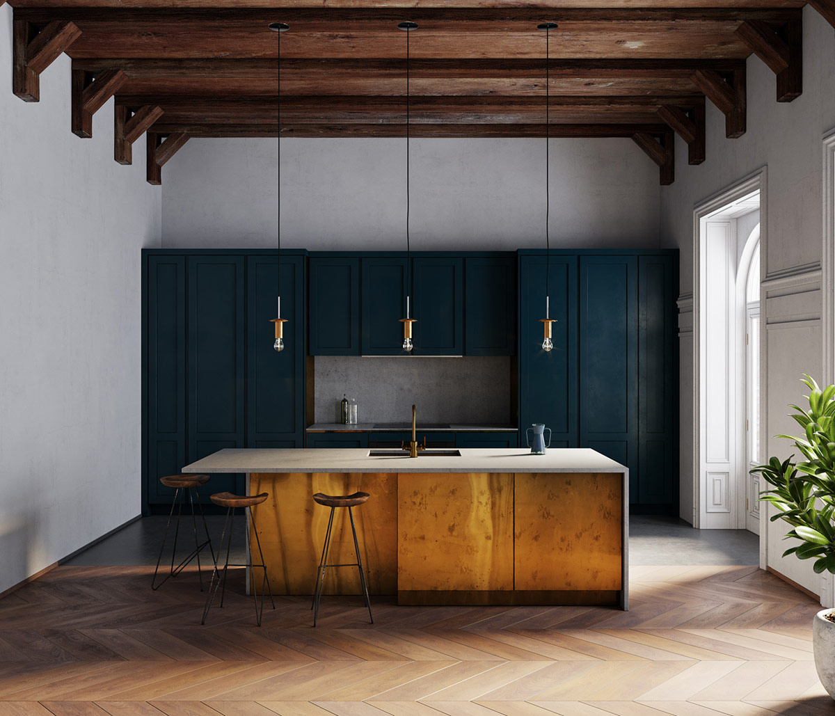
Royal gold meets royal blue. Multi-Lite hangers of Gubi and three golden kitchen stools make a rich union with a solid blue kitchen island in this chic concept.
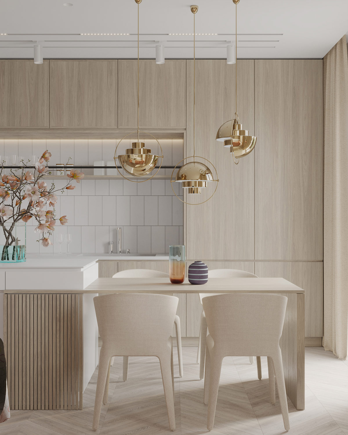
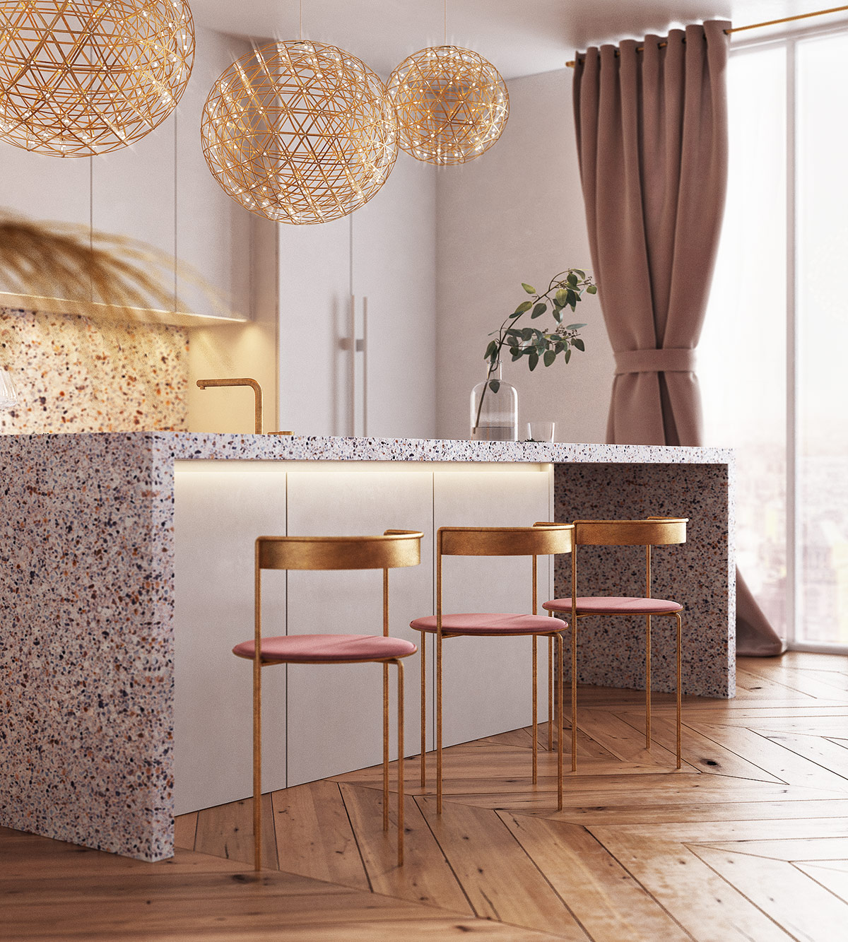
Combine golden kitchen accents with other striking colors without causing a collision. White stripes will create a wide and airy break between bold accents, while natural wood grain brings earthy balance. In this design, a trio of low-hanging kitchen pendant lights delicately combine the contrasting elements.
- 25 |
- Viewer: Karpenko Daria & Vepryk Aleksey
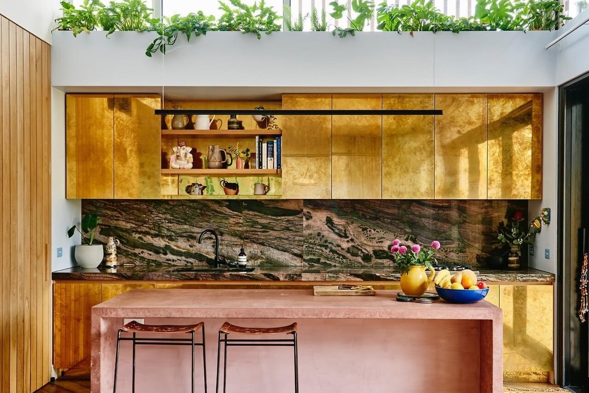
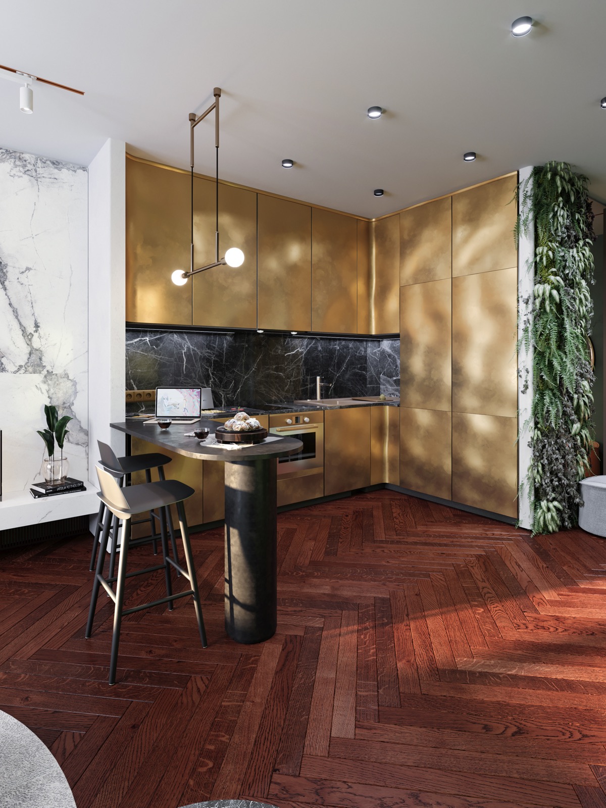
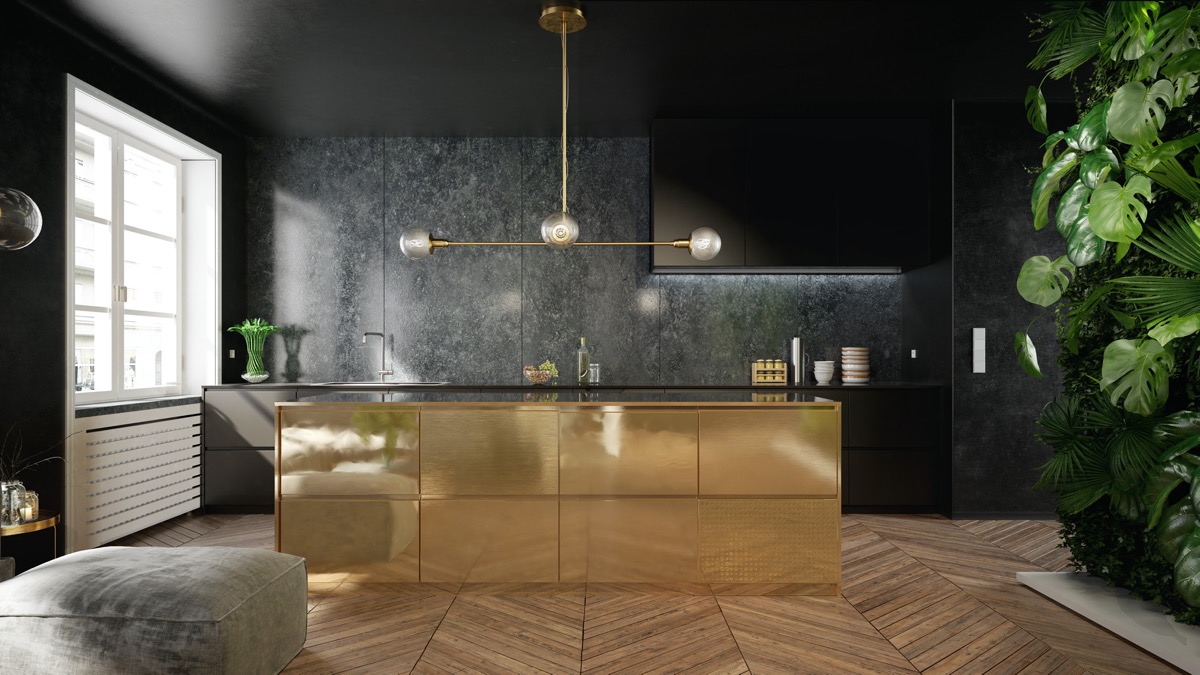
Gold fixtures and vertical garden walls. For uninterrupted gold cooking, integrated gold appliances will help you achieve one solid expanse. Add interest to the end of your kitchen with a narrow vertical garden strip where abundant green leaves will grow invigorating contrast and texture.
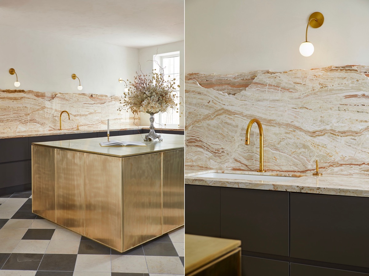
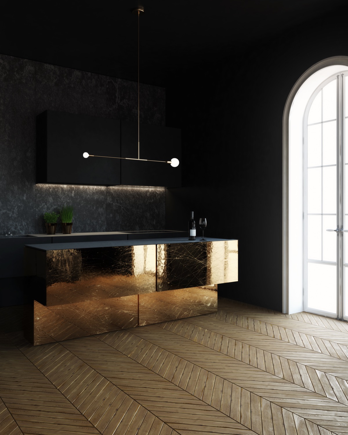
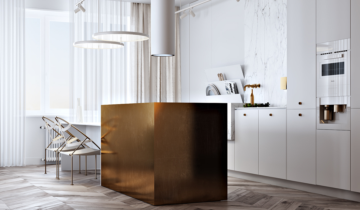
Consider reflections. When working with metals, it is also necessary to consider what will be reflected in the finish. This golden kitchen island beautifully reflects a chevron floor treatment that makes the floor expanse look even bigger. On the other hand, it would be undesirable to duplicate the presence of trash or damage to the floor, so use reflective endings wisely.
Did you like this article?
Share it on any of the following social media below to give us your voice. Your comments help us improve.
Also, if you want to read more informative content about construction and real estate, keep following Feeta Blog, the best property blog in Pakistan.
51 Gold Kitchens With Tips And Accessories
Kitchen with the living room – how to choose accessories?
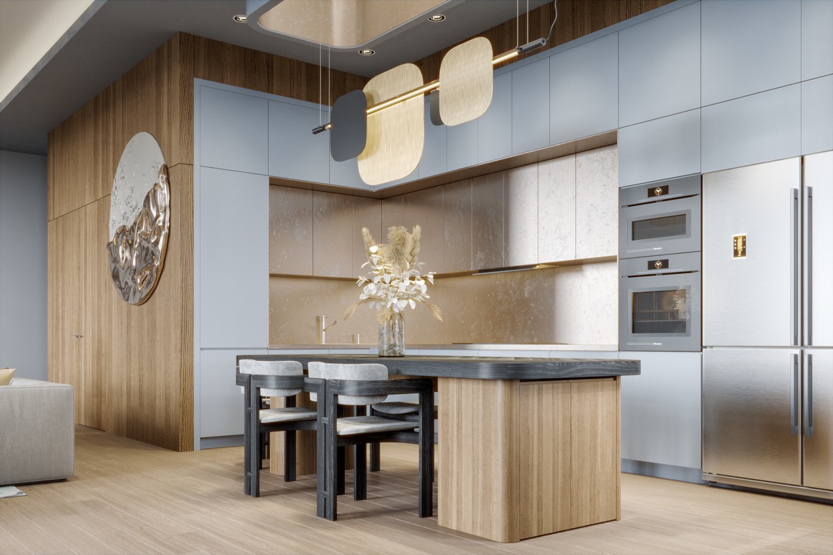
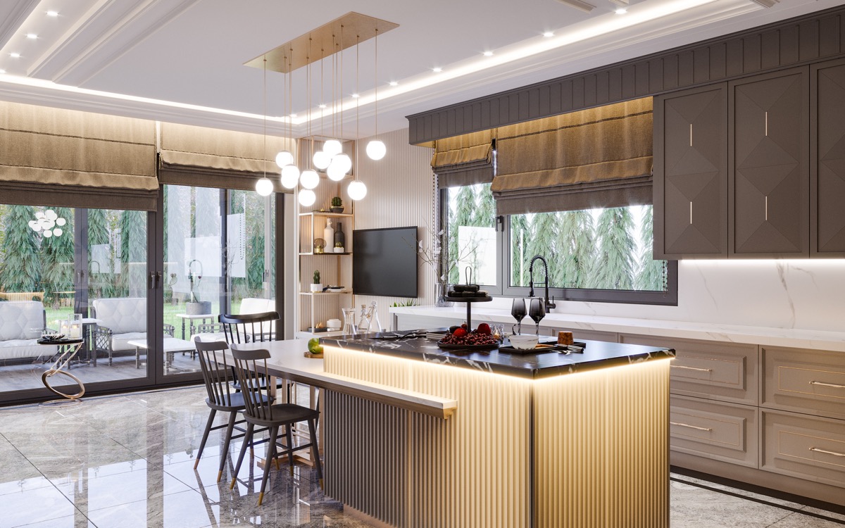
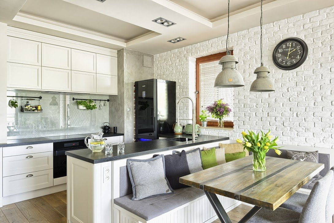
One of the long-lasting trends in interior design is connecting the kitchen with the living room. Designers focus on opening the living space in such a way as to visually enlarge it and give households the impression of space even in small rooms. This solution has its advantages – it brings the household members closer together and makes them stay in the same room more often.
How to arrange a kitchen connected to the living room? It is worth ensuring that the style is consistent so that the dining, kitchen and sitting areas form a unity, rather than look like separate rooms. How to achieve it? By choosing the right colors, accessories and equipment.
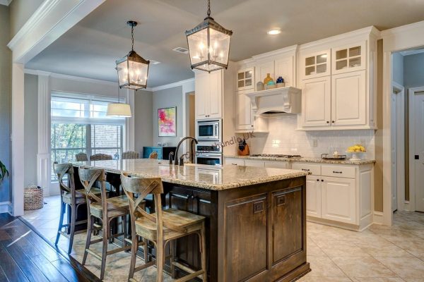
How to choose colors for an open kitchen?
When we decide to open the kitchen to the living room to gain additional space and optically enlarge it, the obvious choice may be white or very bright walls. They give the impression of even greater spaciousness, brightness and lightness. However, such colors can be hardly practical in places where we prepare and eat meals. So let’s use the growing popularity of gray then. Gray walls do not overwhelm the interior and are so versatile that they can be combined with dark and light furniture. They are suitable for both kitchen and leisure spaces and fit many styles. They also come in a rich palette of shades – both warm and cold, so everyone can choose the gray that suits them best.
What about dark and bright colors? You should act a little more carefully here. If the interior obtained from the combination of the living room and kitchen space is still small, then black, red, burgundy, brown or navy blue will overwhelm them and optically reduce. The same will happen when our open kitchen open to the living room is poorly lit. Then the dark colors will make it seem bleak, sad and tight. Dark and expressive shades can, however, be successfully used as a color accent combining spaces with different functionality. In the kitchen zone, such a wall will contrast nicely with bright tiles and furniture, while remaining functional. In the leisure sphere, it will add mood to the place where we sit in the evenings. If the remaining walls are still bright, it will not overwhelm the space, it will only diversify it. It will pay attention and add multidimensionality and character.
And what if we want to apply a dark color on all walls? Then you should opt for bright furniture and as many reflective accessories as possible – metallic, crystal and mirror. They will balance dark wallpapers or paint used on the walls.
Harmony of colors and textures does not have to mean boredom – color accents and patterns
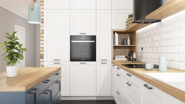
Combining the living room with the kitchen, you need to keep the same style and color in each of the room zones. However, such harmony does not necessarily mean boredom and monotony. The interior can be varied and at the same time mixed if you use:
• strong color accent on the walls and accessories
If you choose one accent color, you don’t have to use identical shades everywhere. Pillows and curtains may differ slightly. A slight difference in shades will give the interior depth and originality. However, it is important to keep the same tones – warm or cold. This will keep the consistency and impression of harmony.
You can also use two different accent colors, both similar to each other (e.g. green and yellow), and contrasting with each other (e.g. blue and red). However, remember that choosing three or more colors can give the impression of disorder and a smaller space (especially in a small room).
When choosing accessories in accent colors, pay attention not only to the seating and dining area but also to the kitchen itself. Here, it is more difficult to diversify the space with colors, because fewer textile accessories are used. However, you can always match the outstanding color of the tiles or good quality handles for kitchen cupboards. It is also worth buying household appliances, e.g. a toaster, electric kettle, and coffee maker in the same accent color that matches the curtains, pillows, and decorations in the seating and dining area. This will connect all the zones of the room with each other and make them form a harmonious whole. The effect will be the most aesthetic if the equipment will come from the same series.

• patterns
If you want to mix space in the kitchen with the living room, you can also apply a variety of designs. Recently, not only Moroccan wallpapers and tiles are popular, but also graphic, floral and leaf motifs. Furniture handles with ceramics are very suitable for such patterns. Ceramics used in ceramic handles that we offer in our store are of the highest quality and some models have floral designs.
Why choose such accents? Patterns can effectively enlarge the space, e.g. horizontal stripes will optically lengthen the wall, and small patterns such as dots and zigzags will visually enlarge the space and deepen the impression of multidimensionality. In turn, floral elements add romance, coziness, and lightness to the room.
• metallic additions and distinctive textures
Connecting different zones in a kitchen open to the living room does not necessarily have to be done using color. You can keep the room monochrome and clean by placing only decorations and accessories that are metallic and with a mirror effect. Such details shine nicely and guarantee the effect of visual enlargement of space and brightening of the interior. More crystal and decorative accessories will work in glamour arrangements. These types of arrangements look great if you use crystal furniture knobs.
In turn, interiors with a raw and metallic appearance can be emphasized by modern bar handles. This type of furniture handles come in a glossy version: gold, copper and chrome, and matte: black and brass. Chrome and shiny elements can also be easily duplicated in the kitchen area itself (e.g. by finishing cabinets and household appliances).
You will also get similar consistency thanks to interesting textures. Not only will they diversify the monotonous colors, but they also give depth and multi-dimensionality to the entire room. Convex diamond-style patterns (consisting of small triangles that reflect light differently at different angles) are currently particularly popular. They look extravagant and modern. They fit both harsh and glamorous interiors. The diamond texture motif can be used, for example, on some kitchen cabinet fronts and duplicated on furniture in the living room or in accessories such as vases, photo frames, and lampshades.
When planning the interior and combining the functions of many rooms, remember to stick to a consistent style and one dominant theme. Try to avoid the impression of clutter and exaggeration. In the kitchen and living room, you spend the most time during the day, so these spaces should please the eye and be completely comfortable for you.

