51 Neoclassical Living Rooms With Tips And Accessories
Like Architecture and Interior Design? Follow us…
Just one more step. Please click the confirmation link sent to you.
![]()
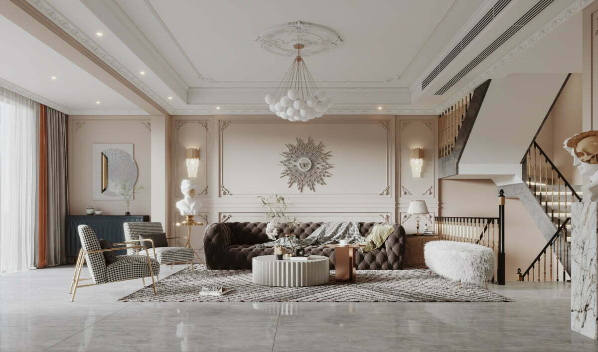
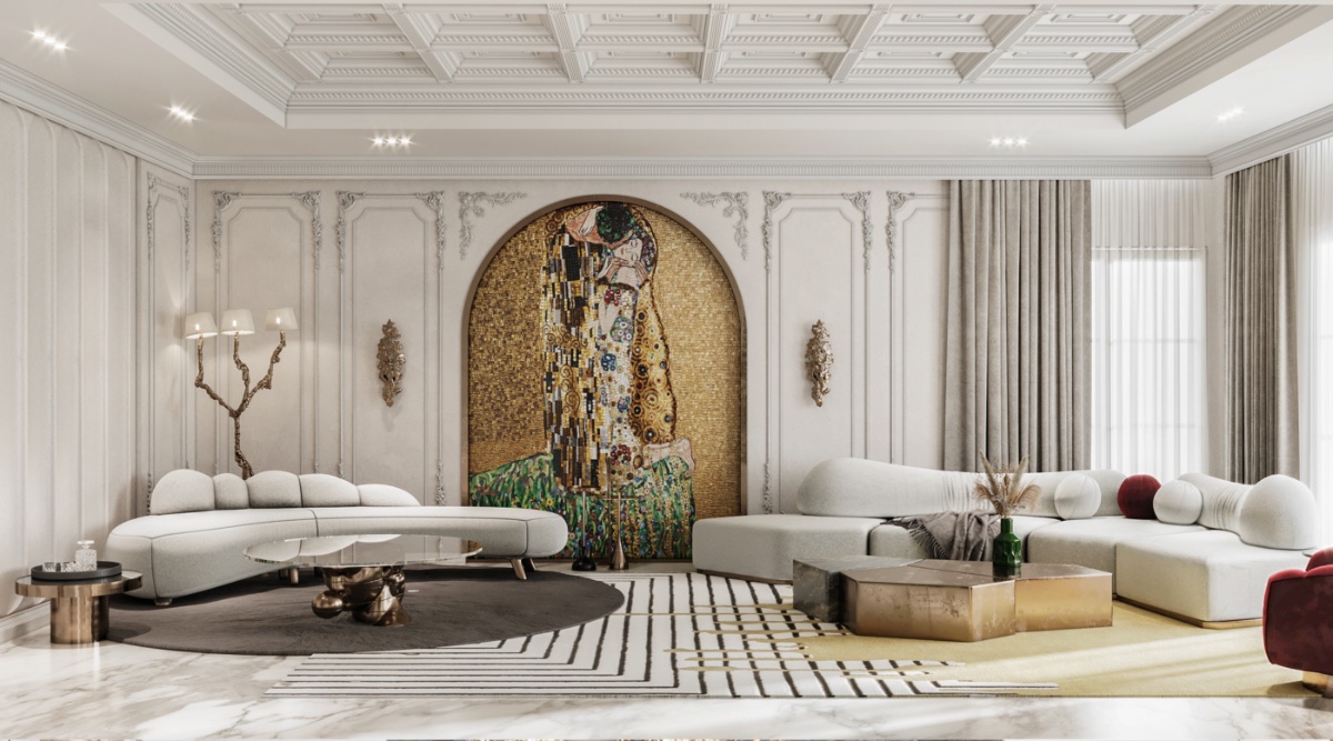
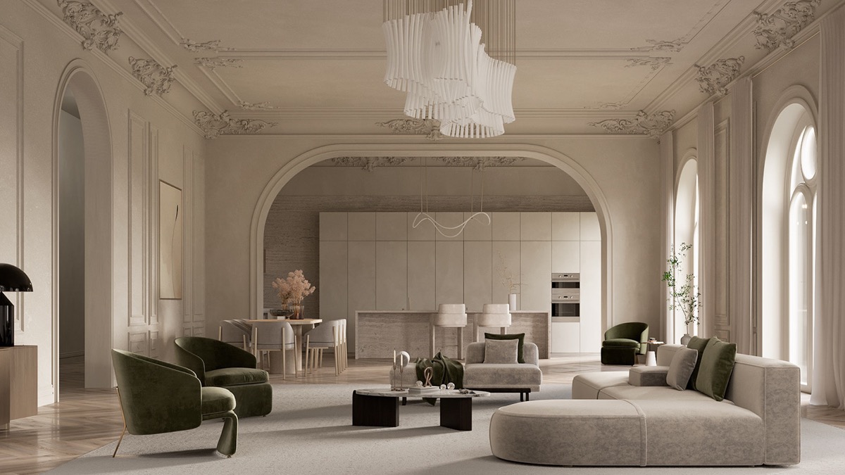
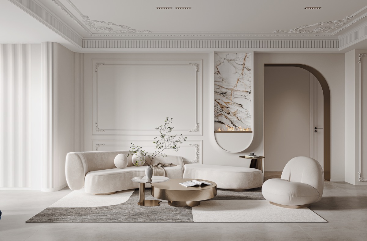
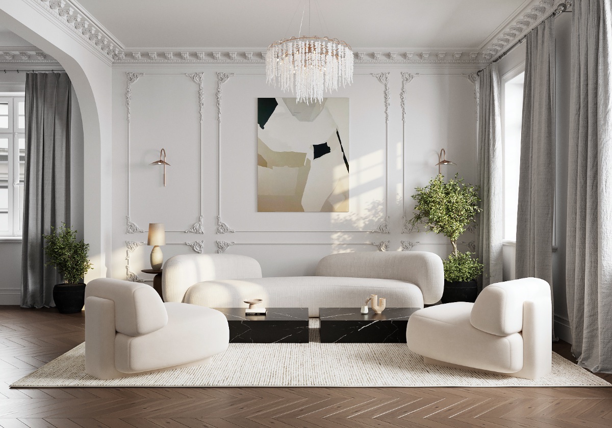
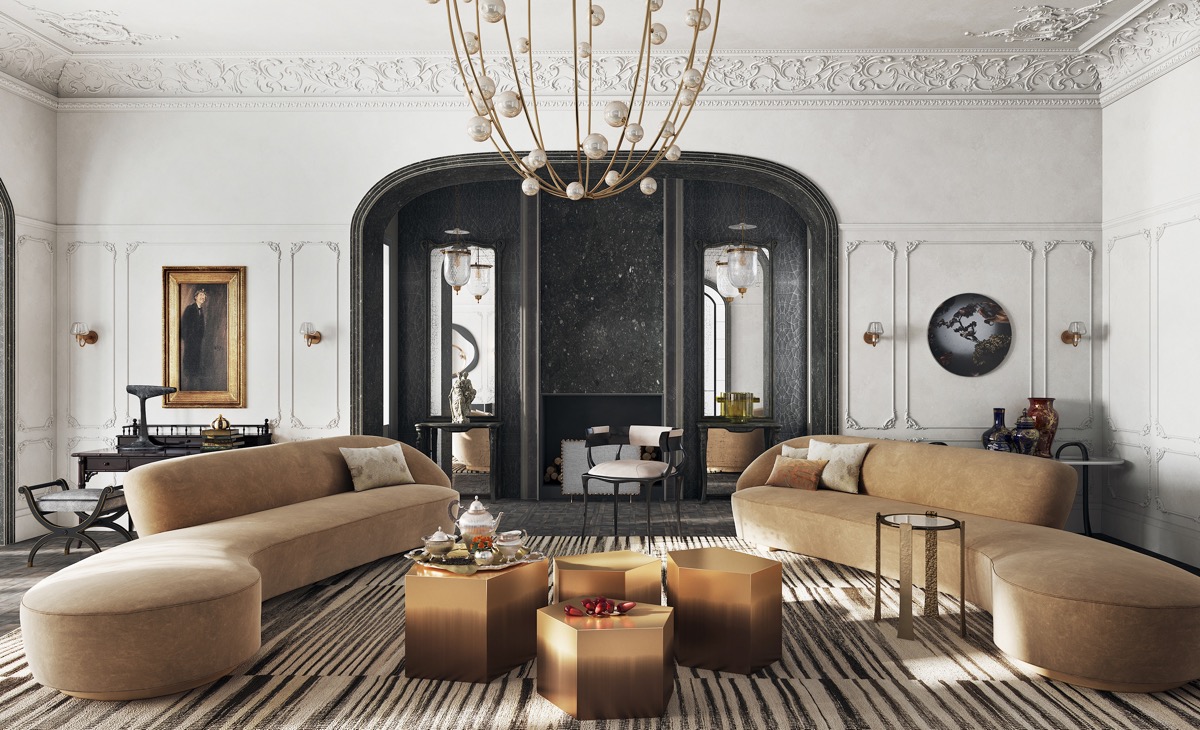
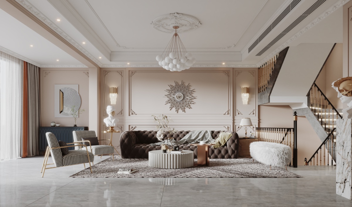
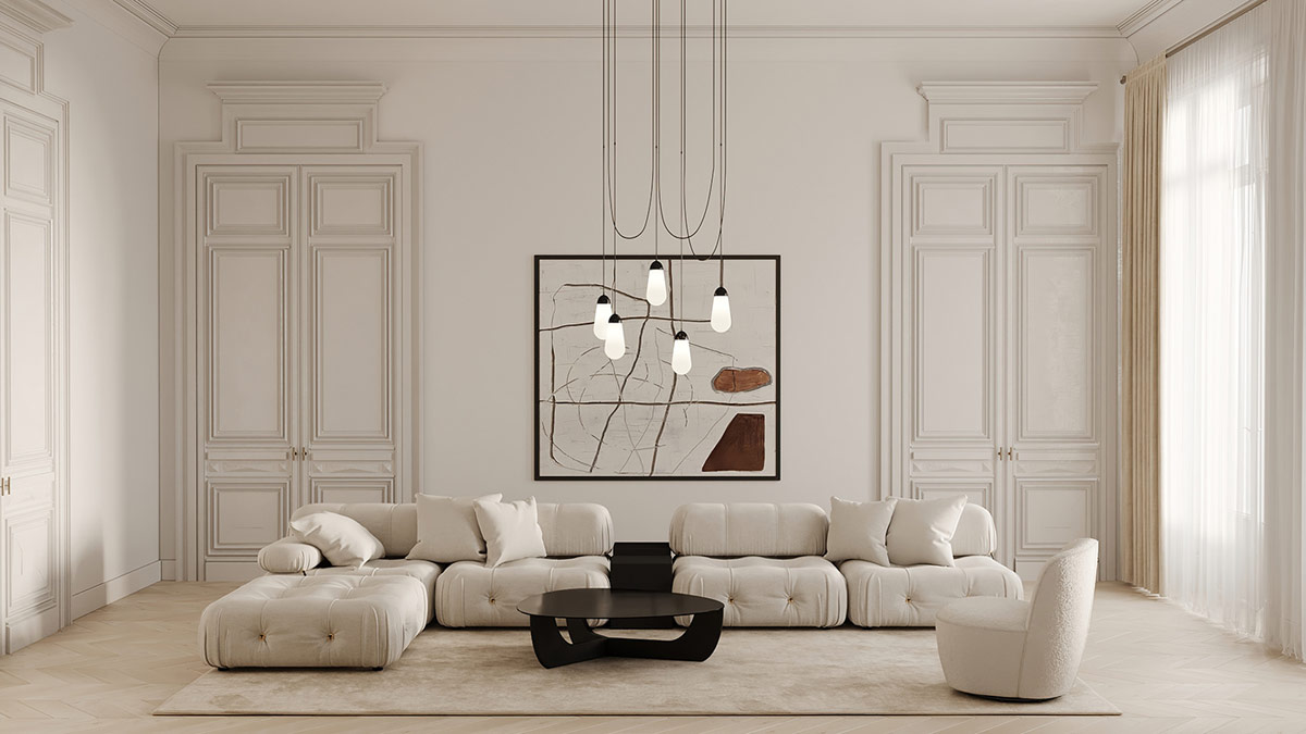
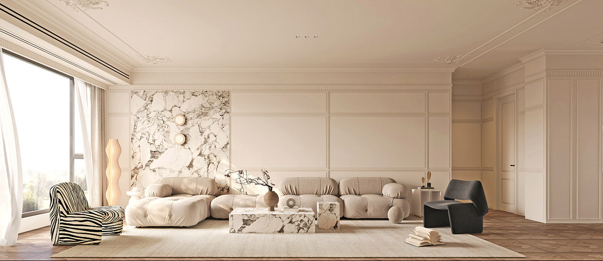
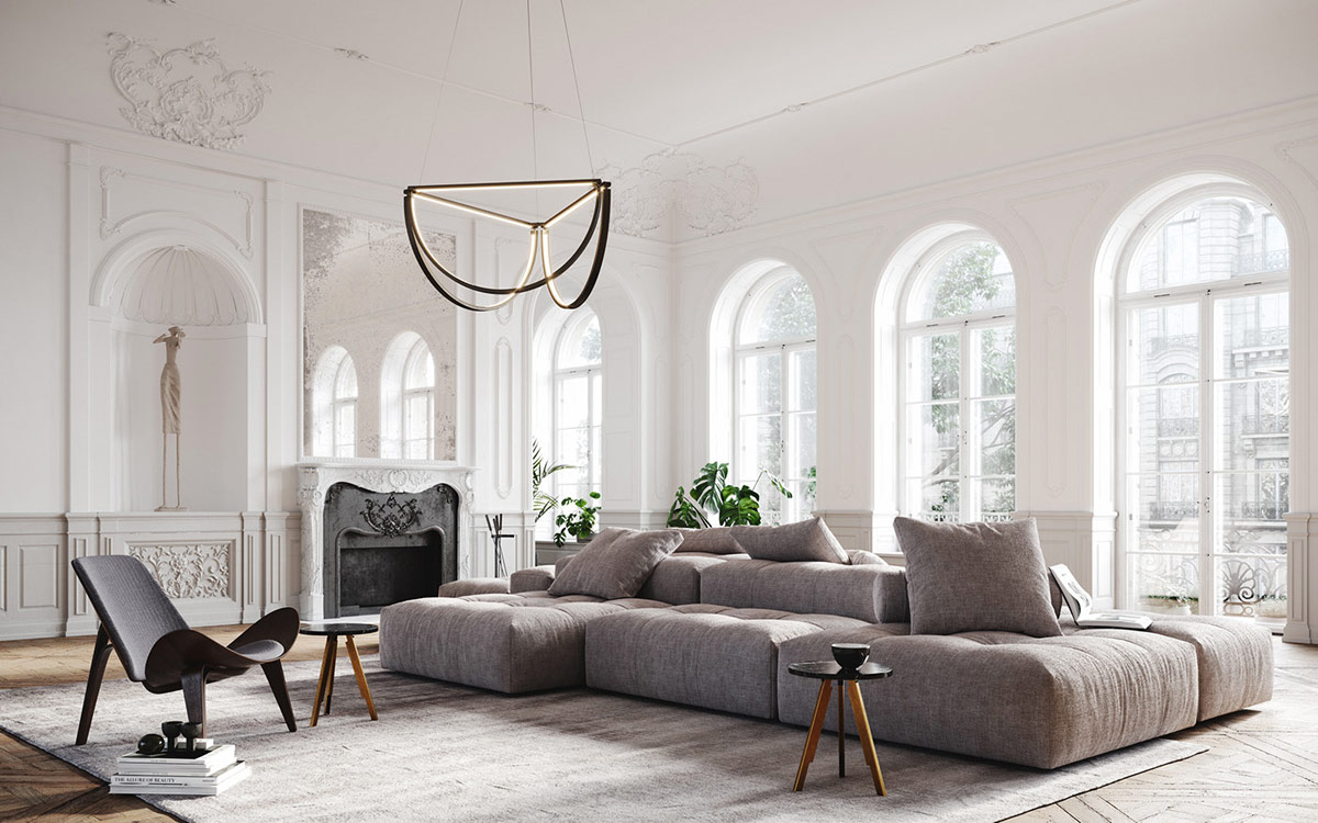
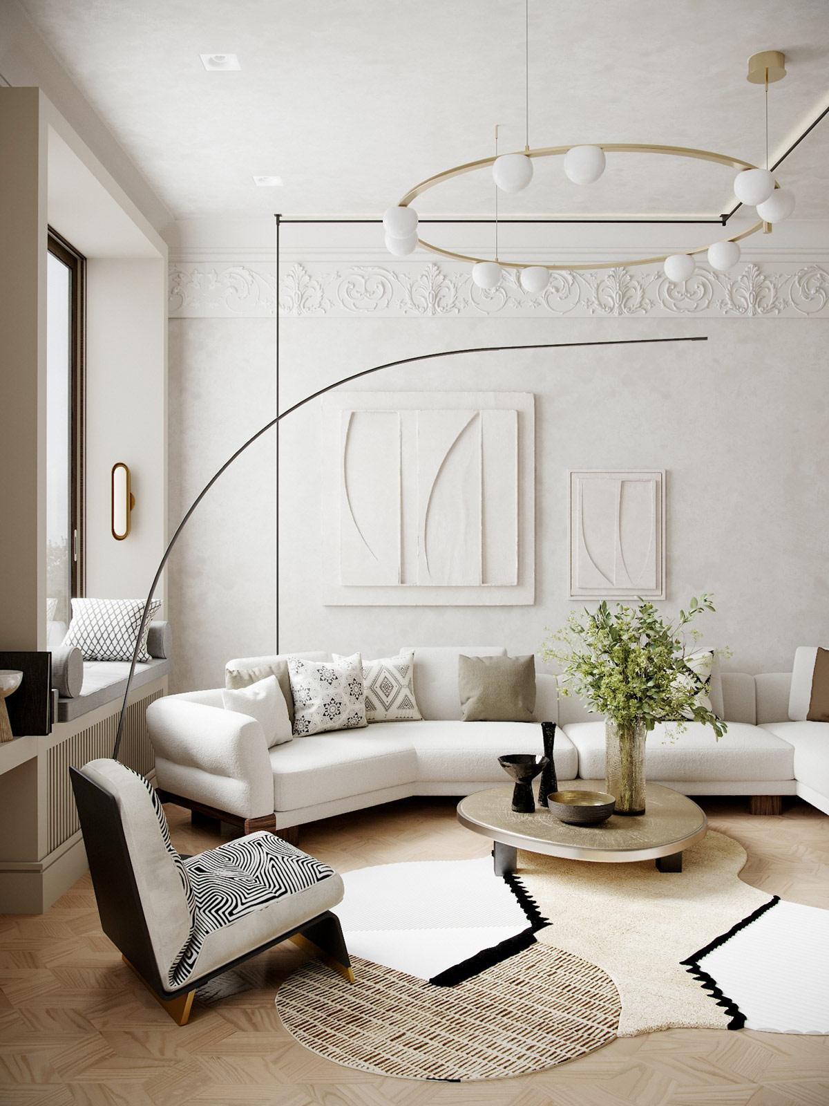
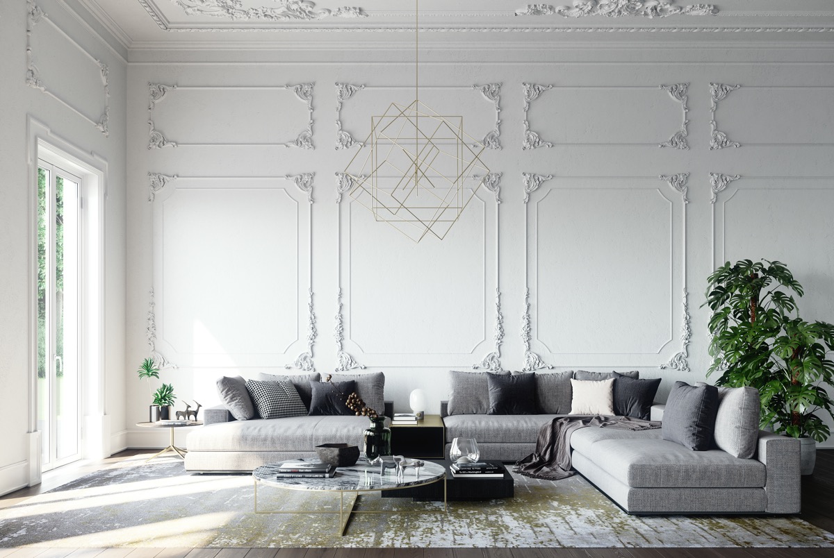
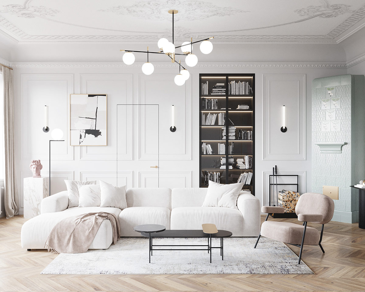
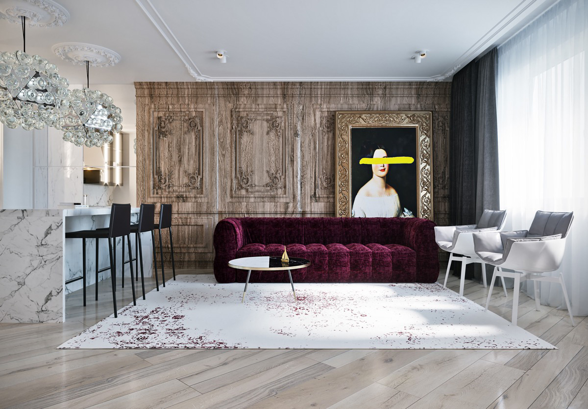
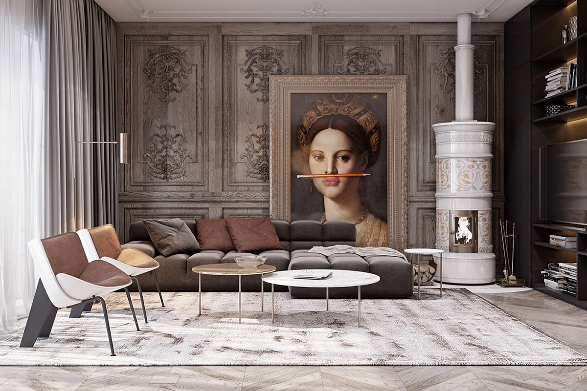
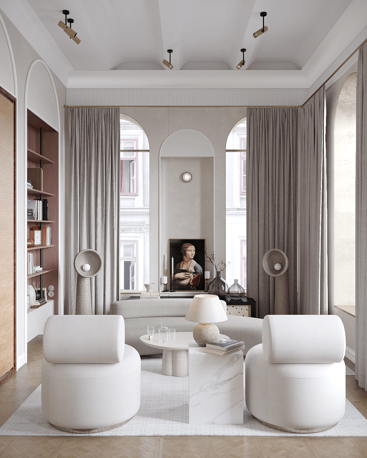
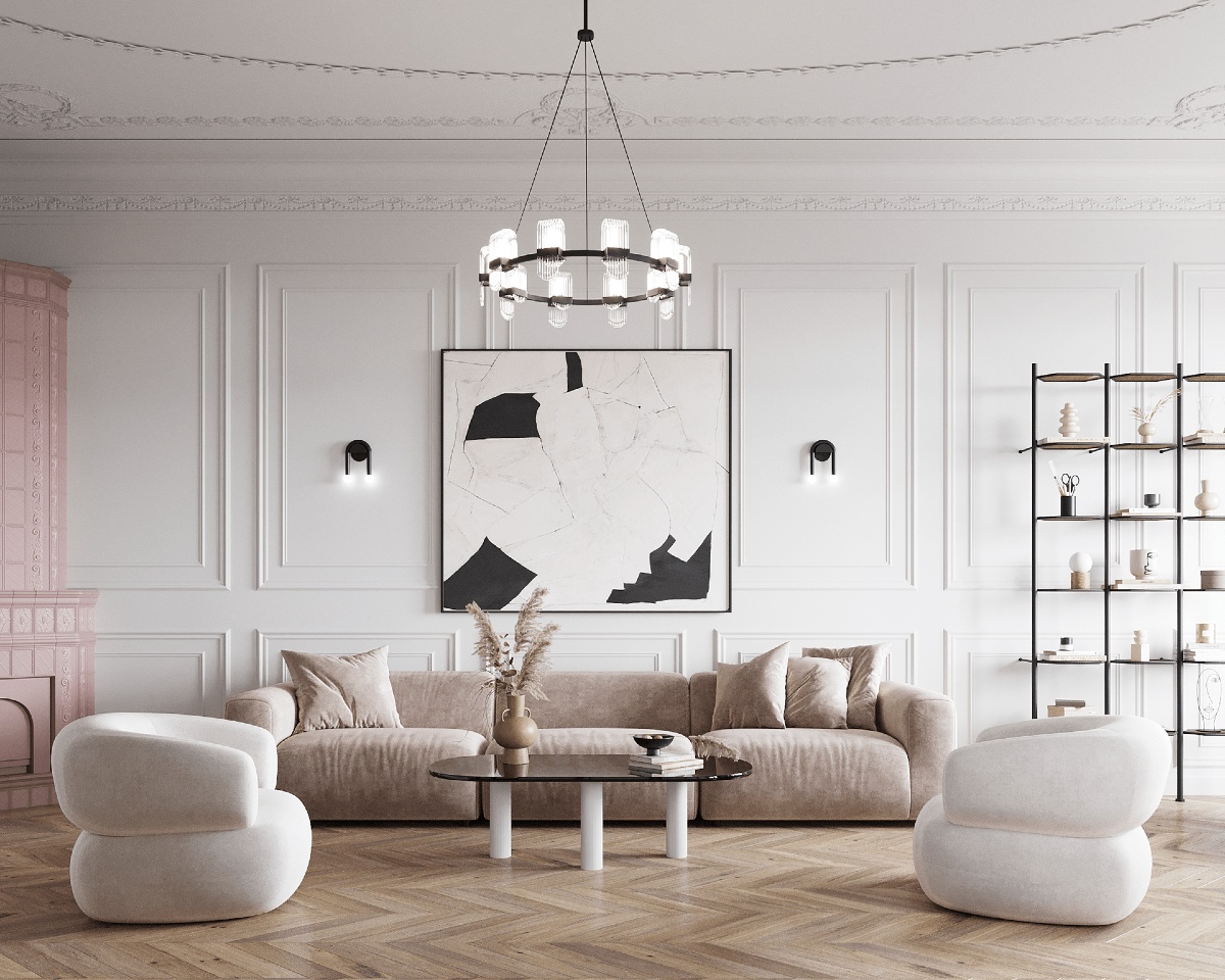
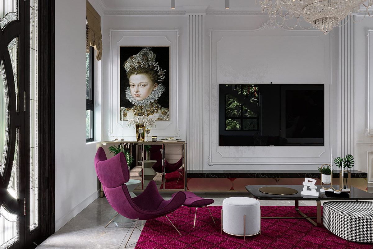
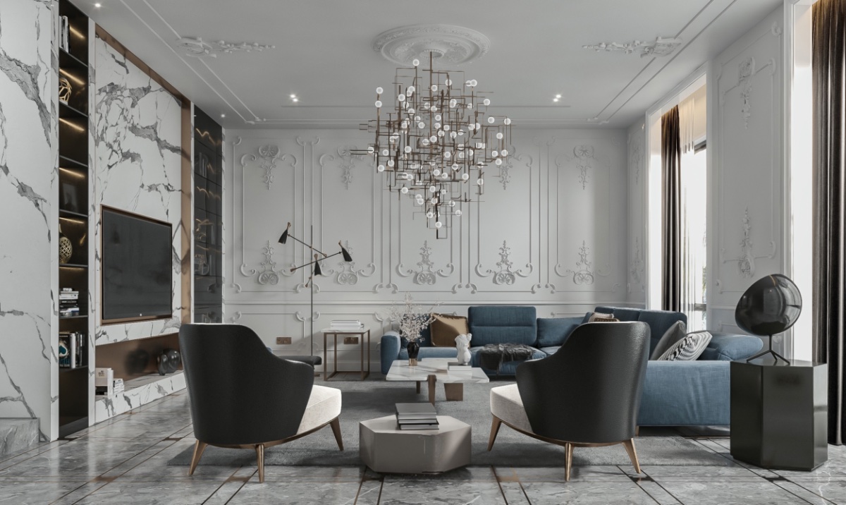
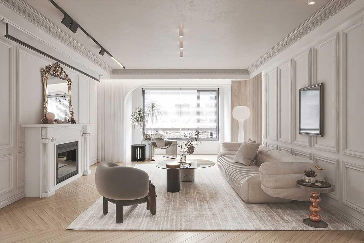
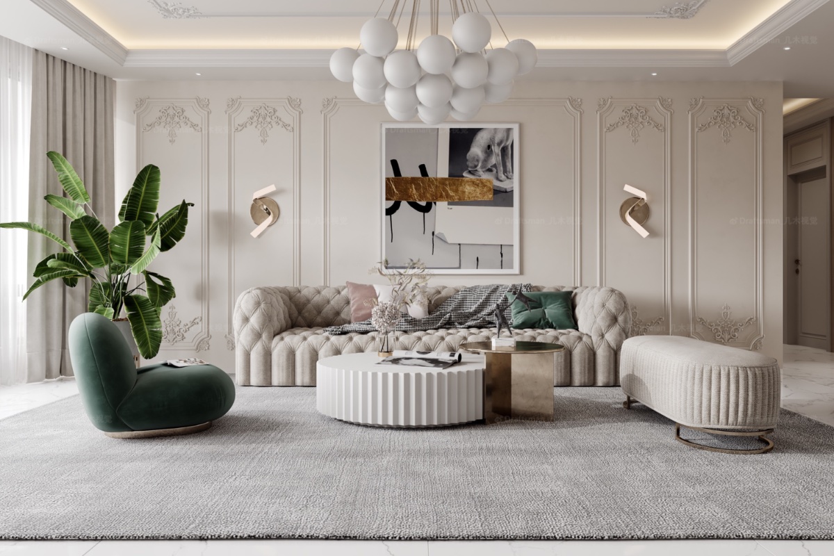
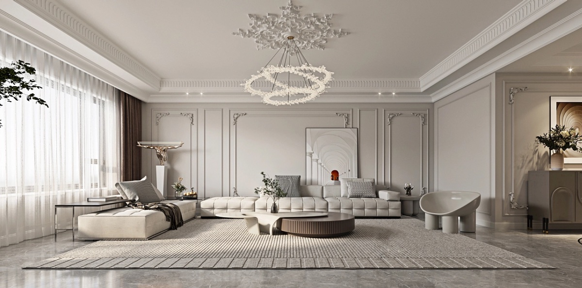
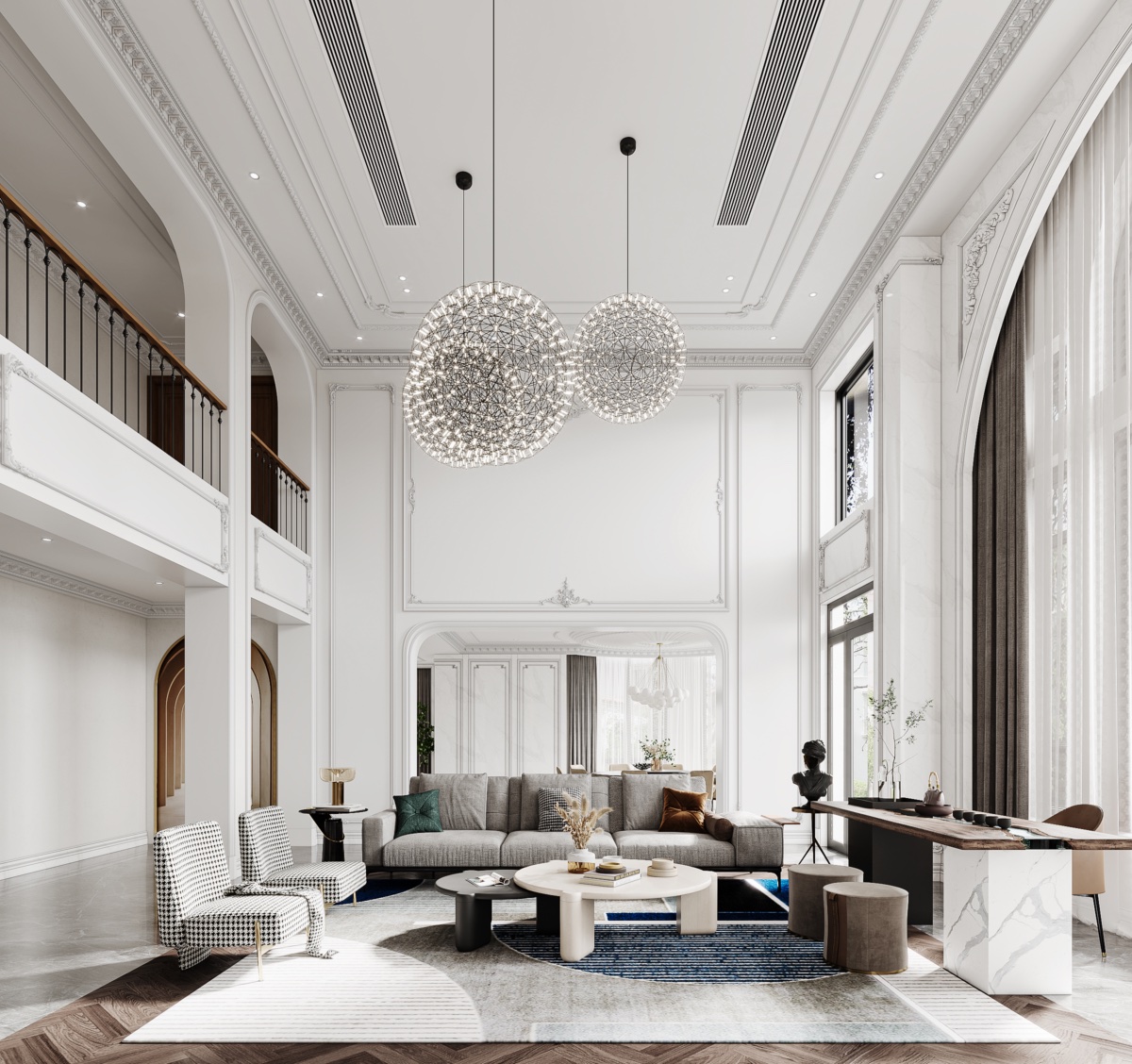
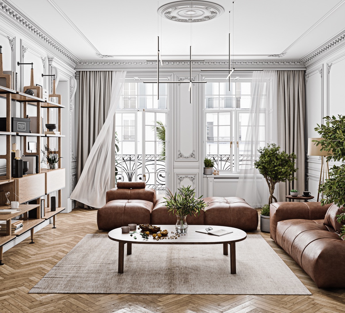
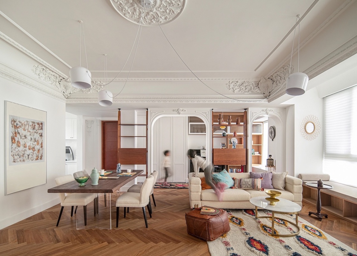
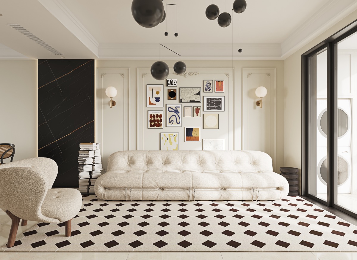
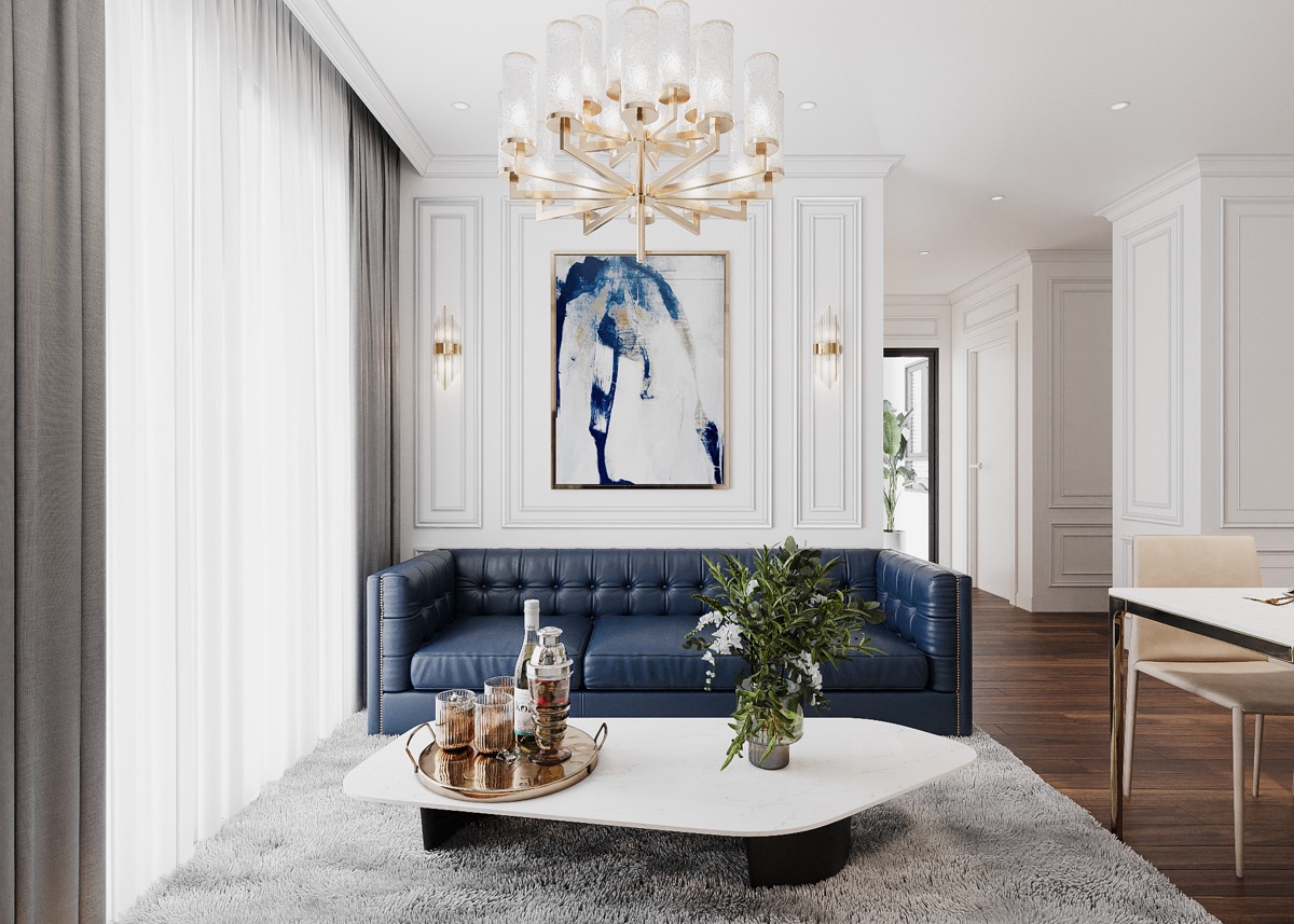
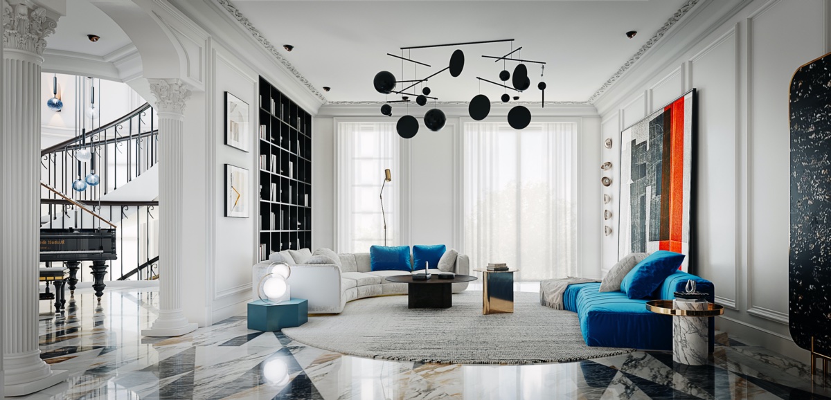
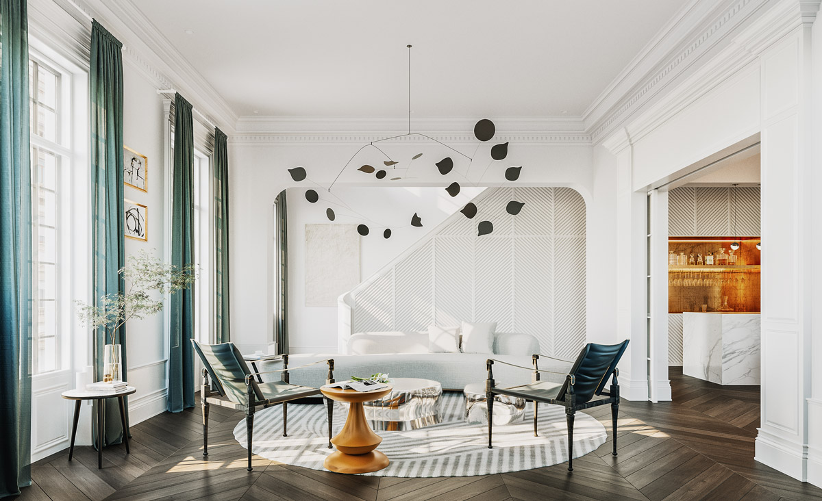
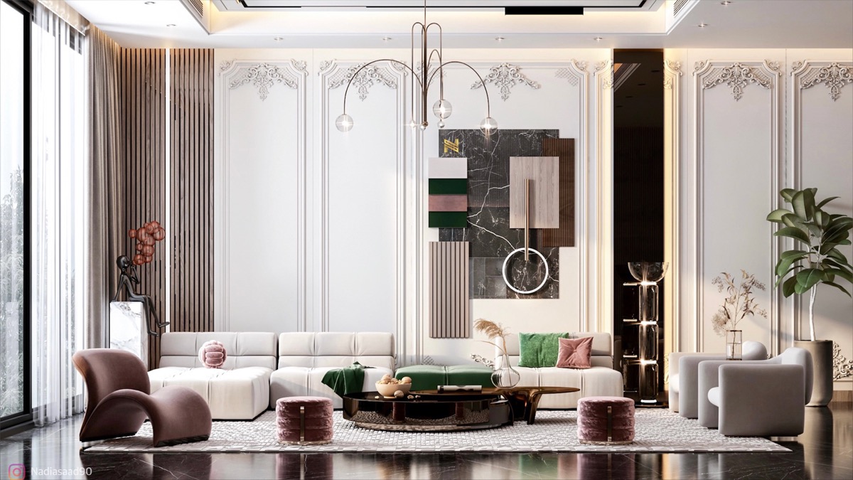
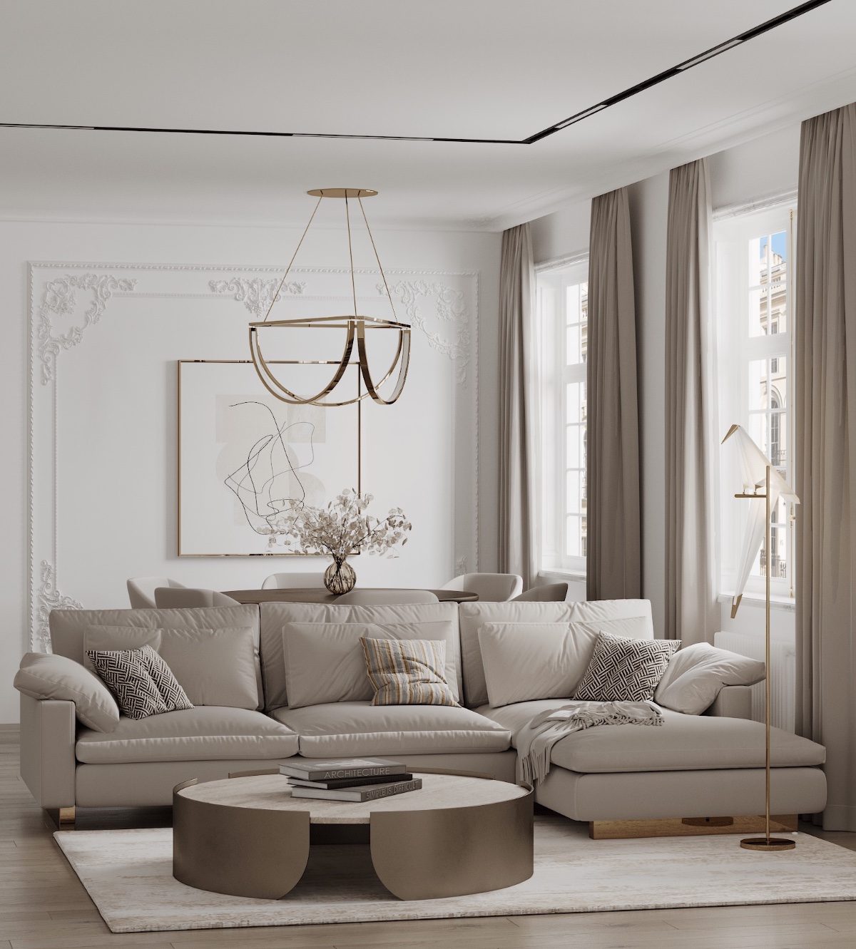
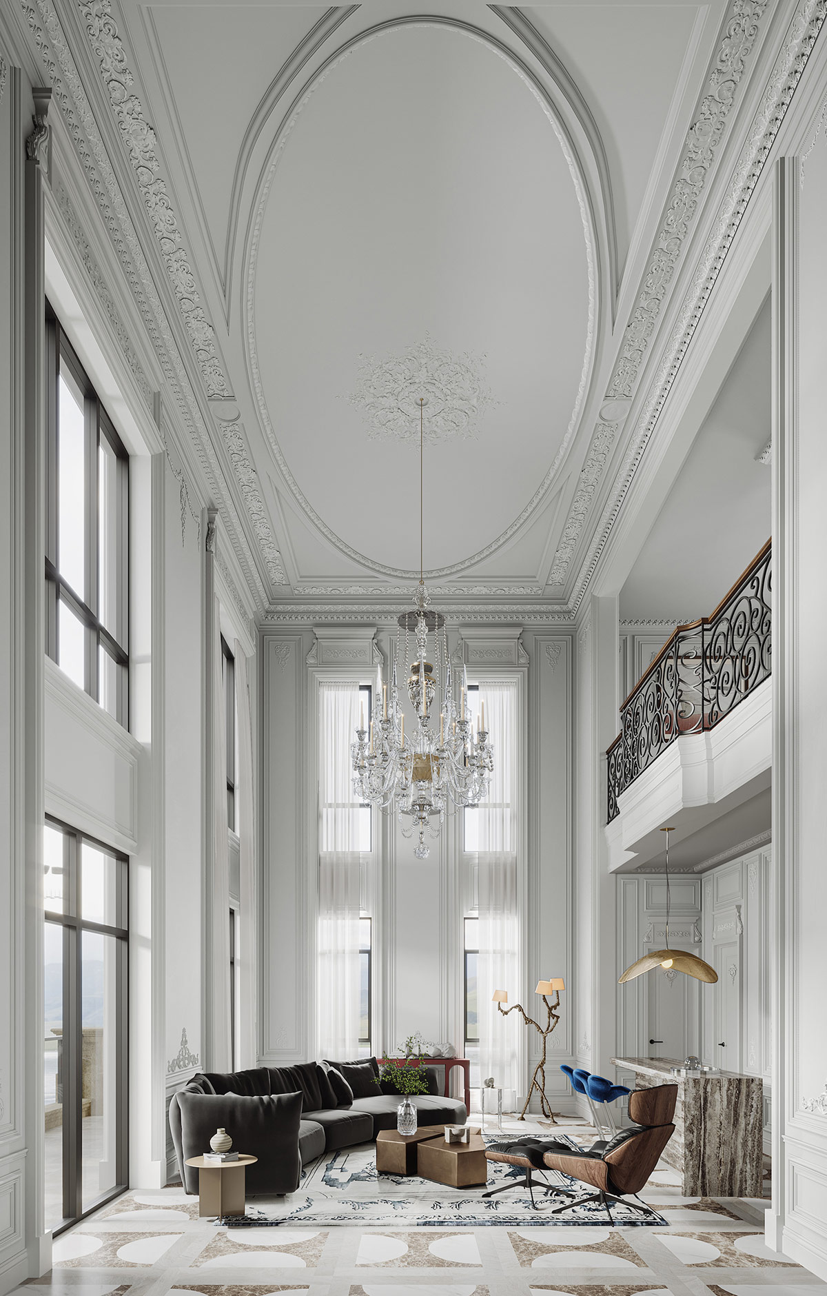
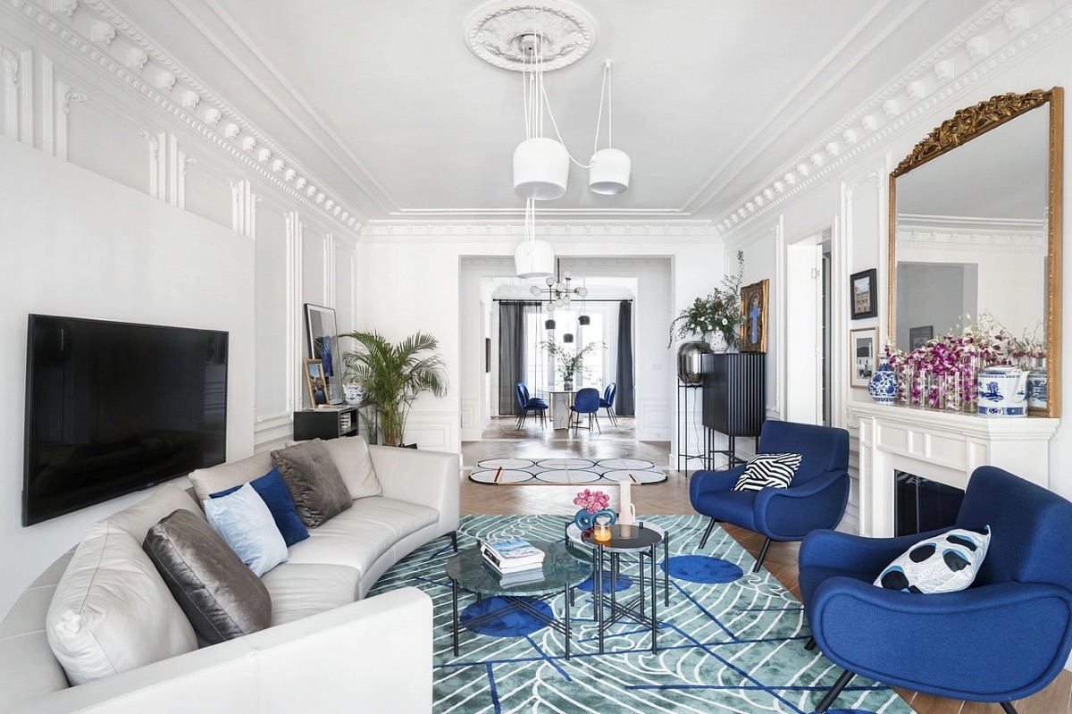
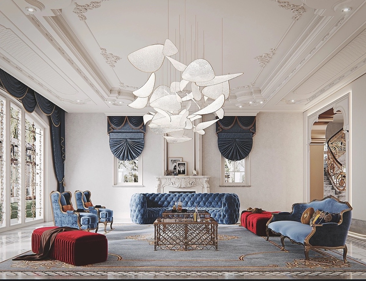
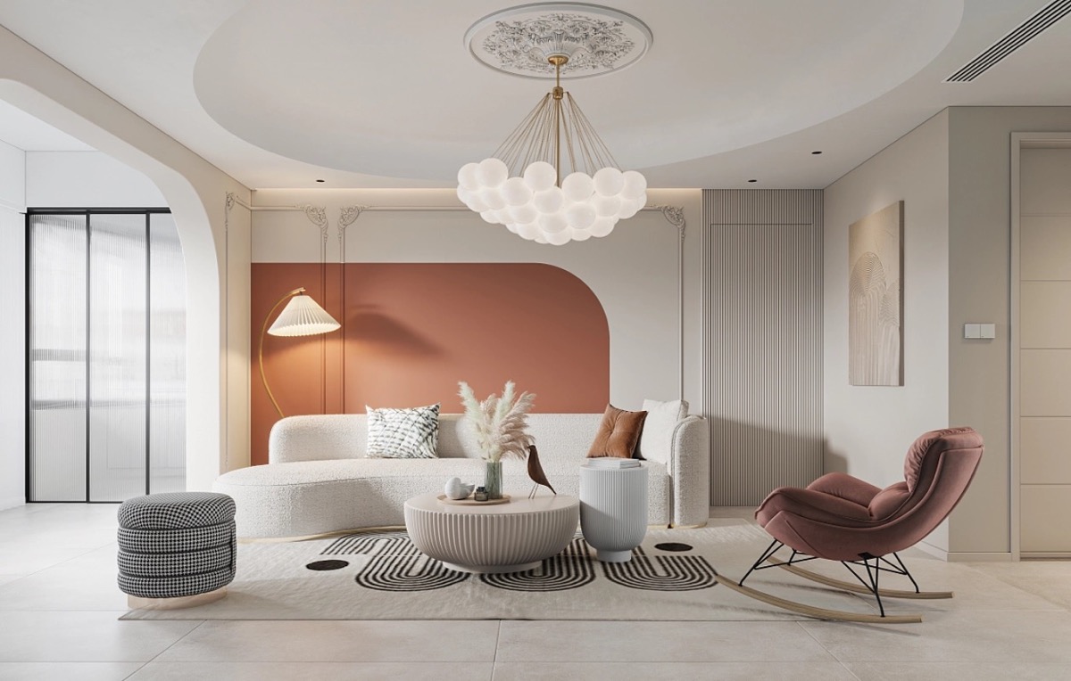
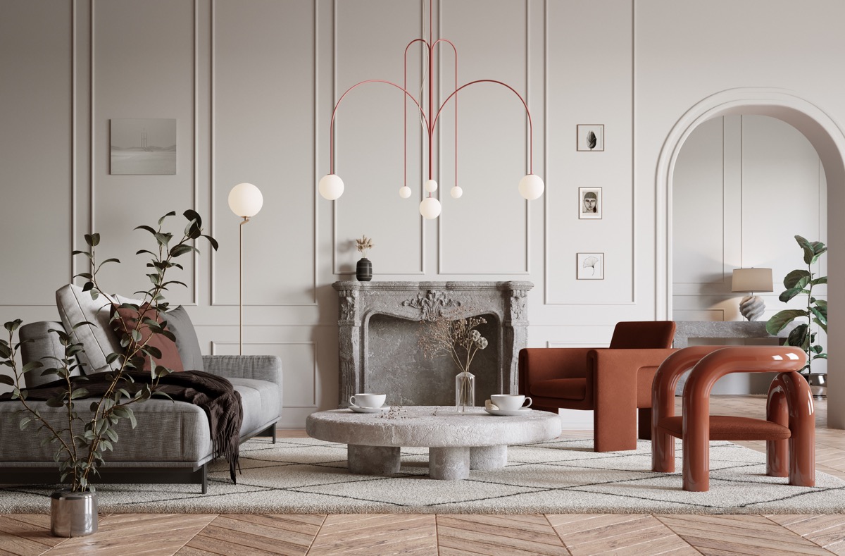
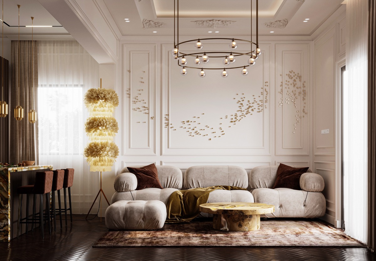
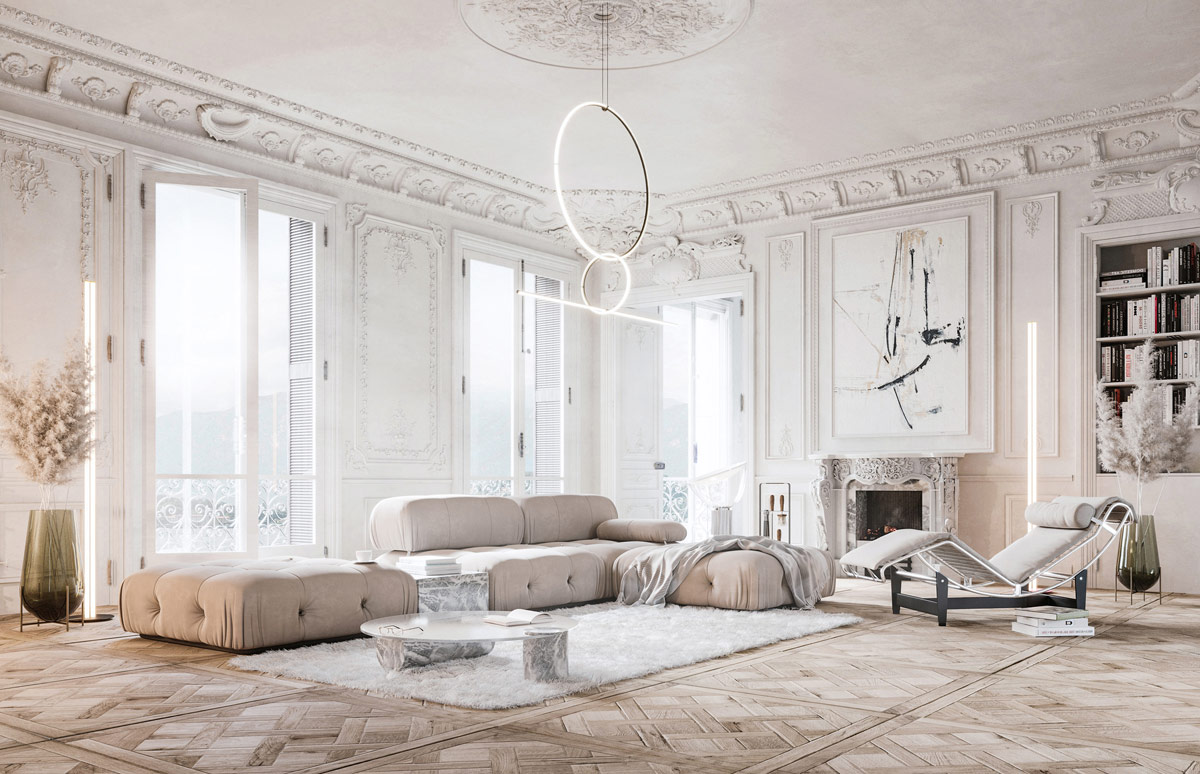
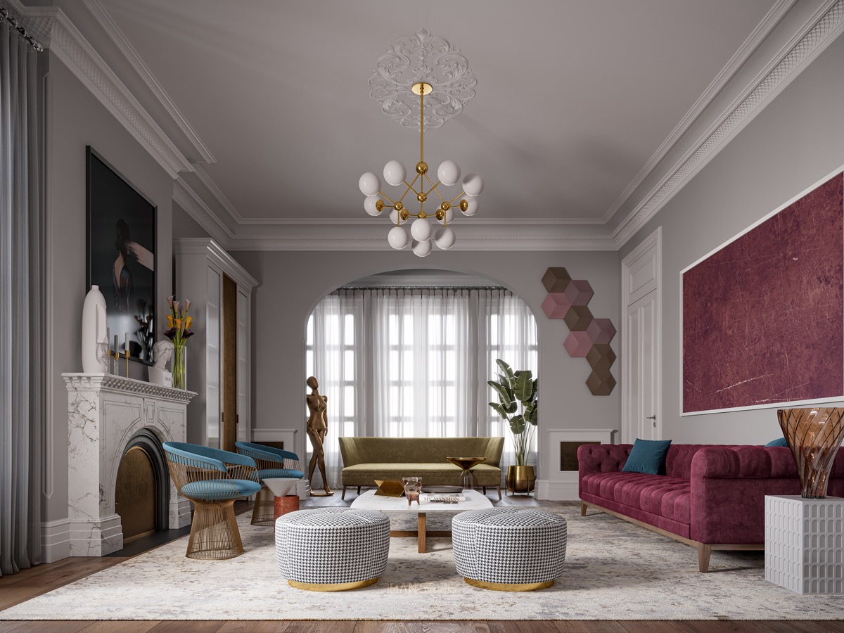
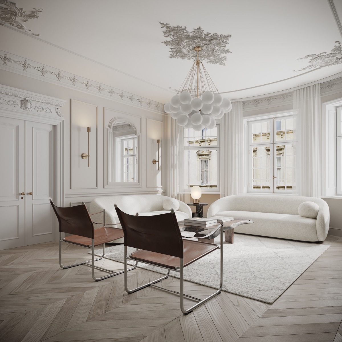
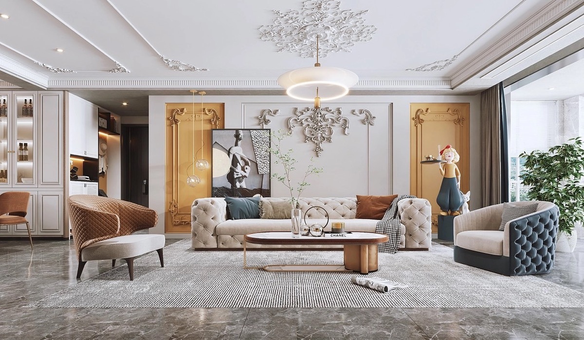
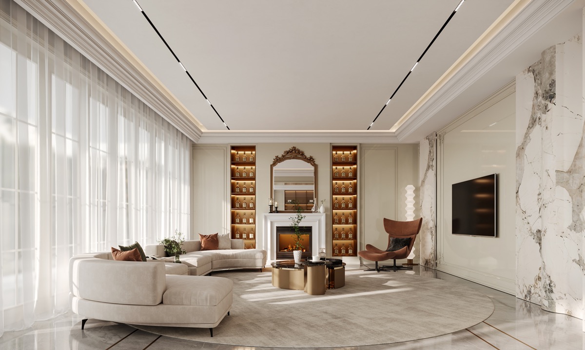
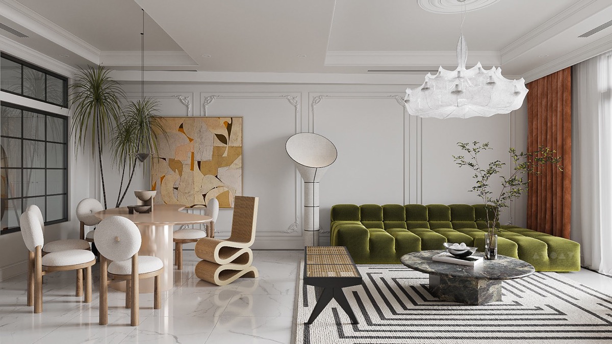
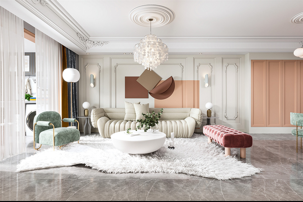
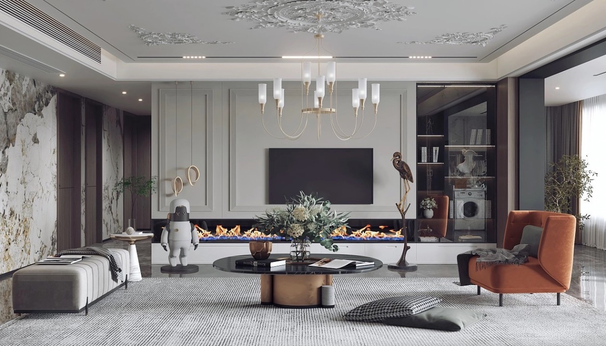
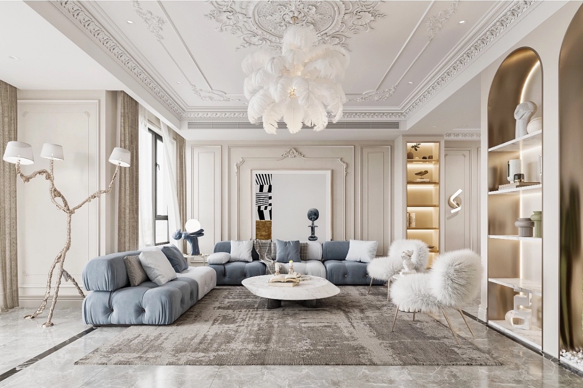
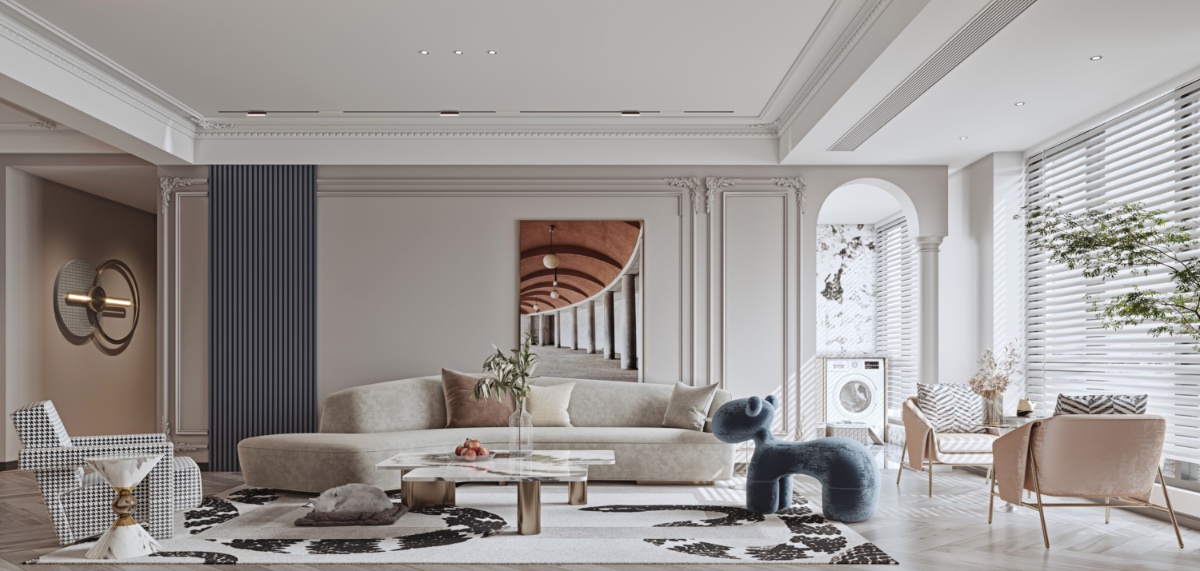
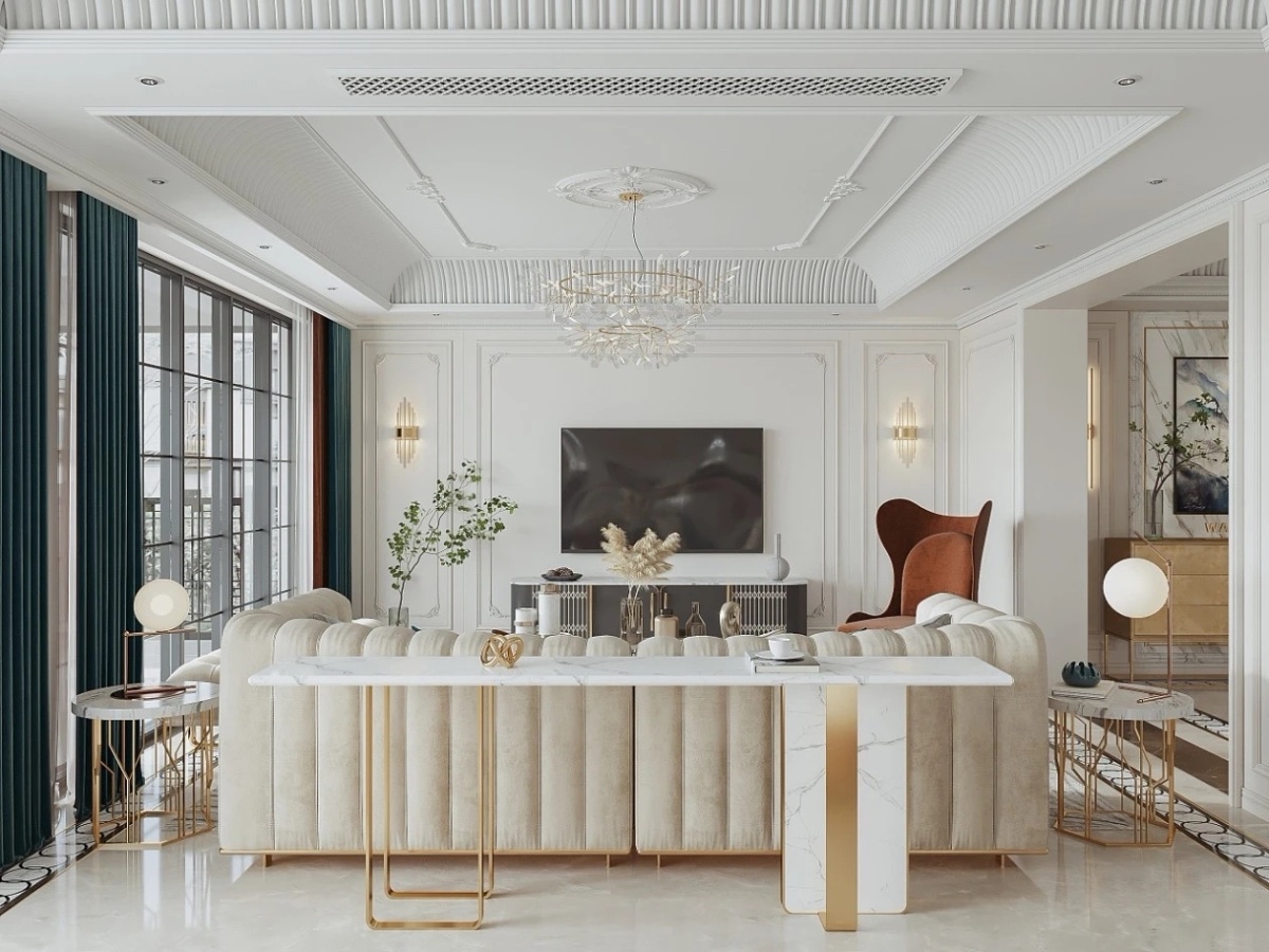
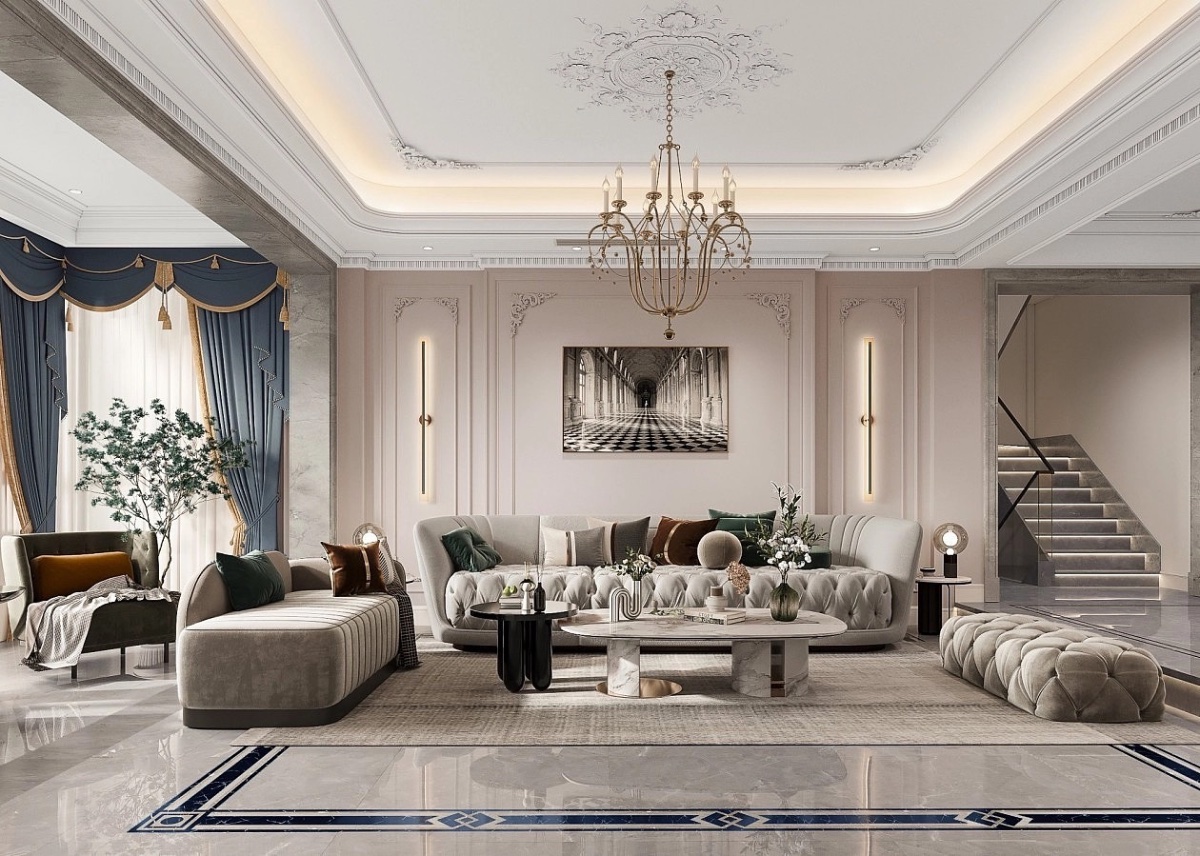
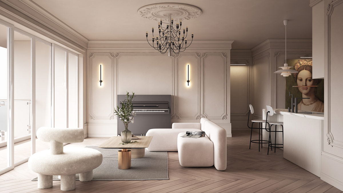
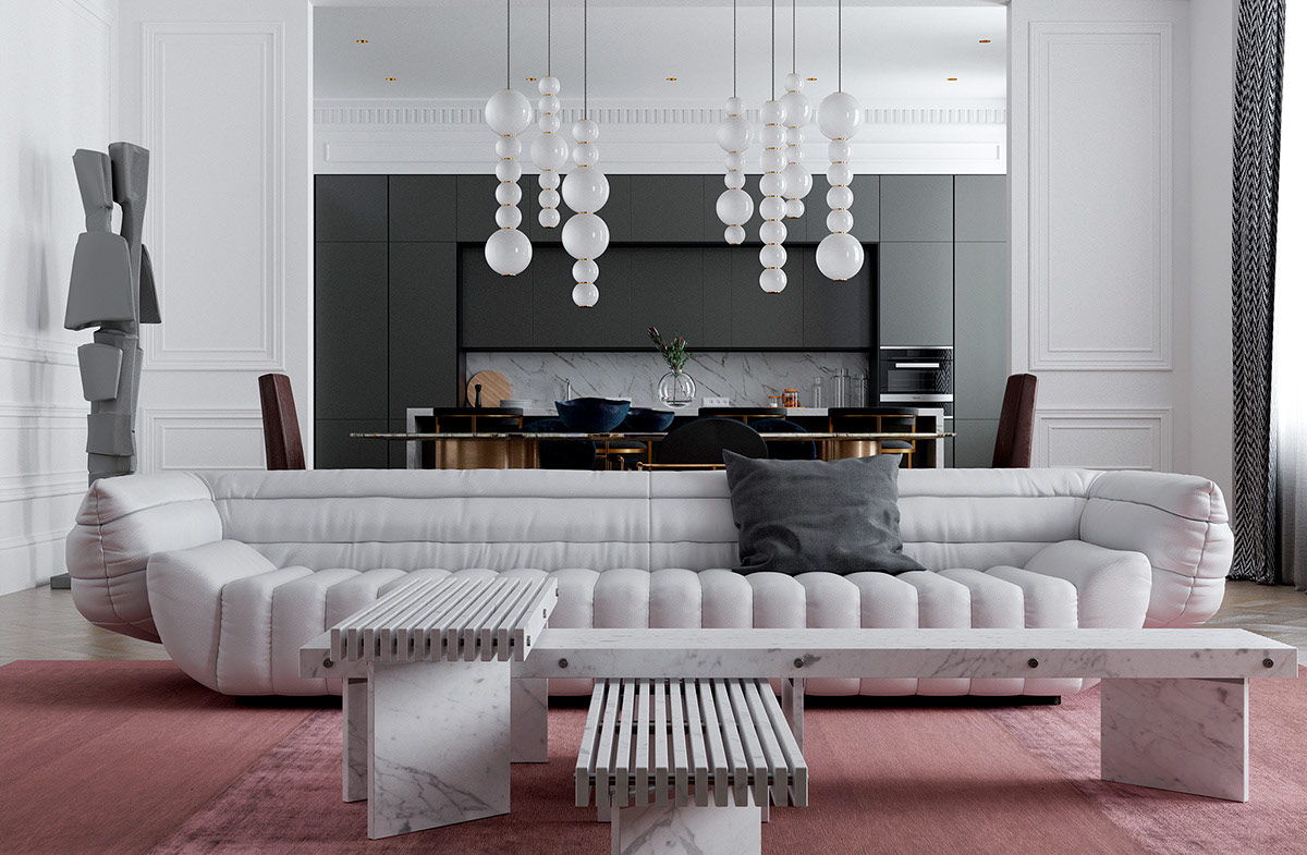
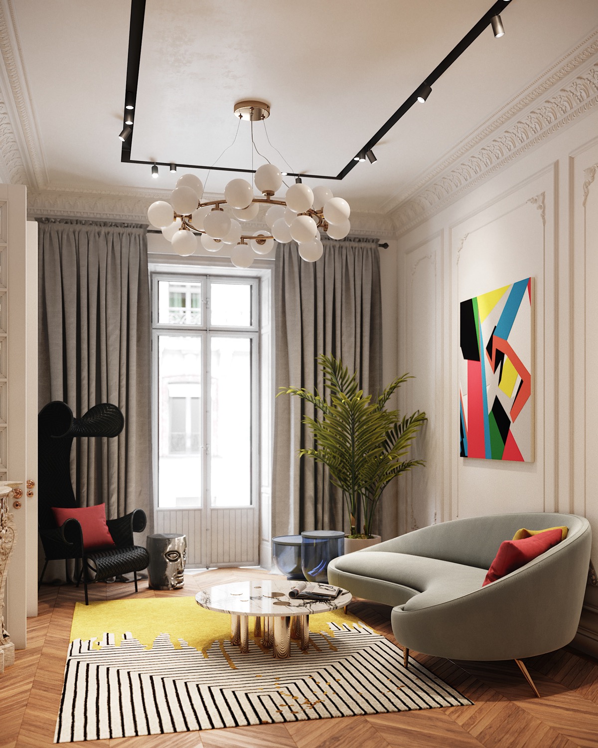
Neoclassical Living Rooms are all about elegance and sophistication, but what are some of the key elements that bring this look together successfully? In this collection of 51 stunning neoclassical living rooms, we’ll guide you through the design details that will help you create your own. From highly decorative boiserie and deep crown molding to fabulous furniture and attractive lighting, we’ll see how these interiors are layered into a look of luxury. We’ll also study the architectural features that take neoclassical living rooms to the next level, including stunning windows, beautiful archways and grand doors, in addition to the exquisite accessories that finish the neoclassical style with flair.
Did you like this article?
Share it on any of the following social media channels below to give us your vote. Your comments help us improve.
Meanwhile, if you want to read more such exciting lifestyle guides and informative property updates, stay tuned to Feeta Blog — Pakistan’s best real estate blog.
51 Neoclassical Living Rooms With Tips And Accessories
- Published in Accessories, Designs by Style, interiors, neoclassical, trend, Trends, uk, USA, wall decor, White House, Zillow
Designers Show How The White House Could Have Looked Different If These 5 Plans Weren’t Rejected
We are all accustomed to the look of the White House, and most of us appreciate its modest neoclassical design. In 1792, the first president of the United States George Washington held a contest for the design of the White House, which an Irishman James Hoban won. But the seat of the world’s most powerful nation might look different. Many architects offered their own versions of the White House, including polyhistorical president Thomas Jefferson, who lived in the same White House nearly 10 years after the contest. But as with all competitions, the winner is long remembered, and the ideas of the losers are almost always forgotten. These rejected plans remained obscure until HouseFresh decided to revive them in digital form and show us what the White House could be like. So look!
Jefferson’s plan for the White House
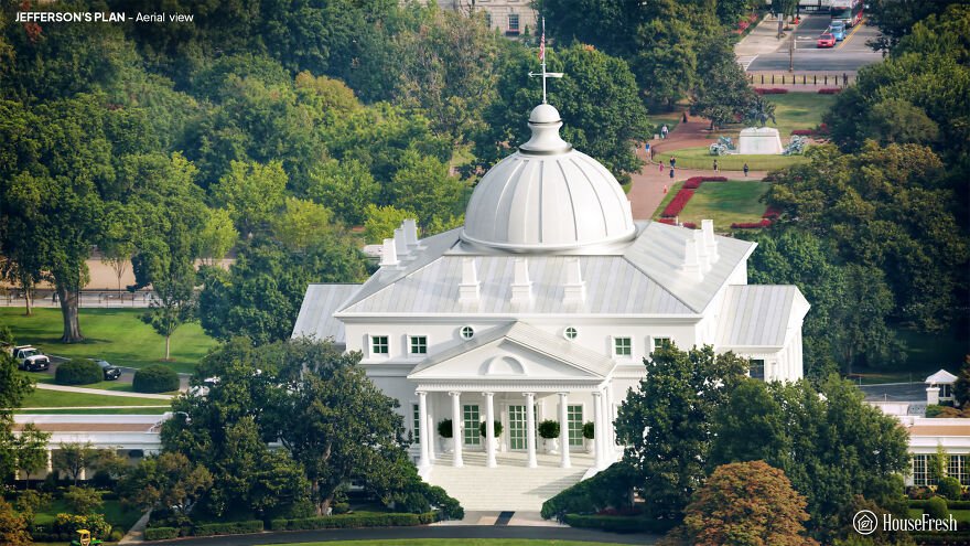
Thomas Jefferson was Secretary of State at the time, and was closely involved with the management of the competition. But he was also an architect and an enthusiast of classical European design. Experts attribute a losing entry with the name “Abraham Faws” to Jefferson. The “real” Faws sent their own, amateur entry, and Jefferson’s anonymous project was later attributed to Faws due to a clerical error.
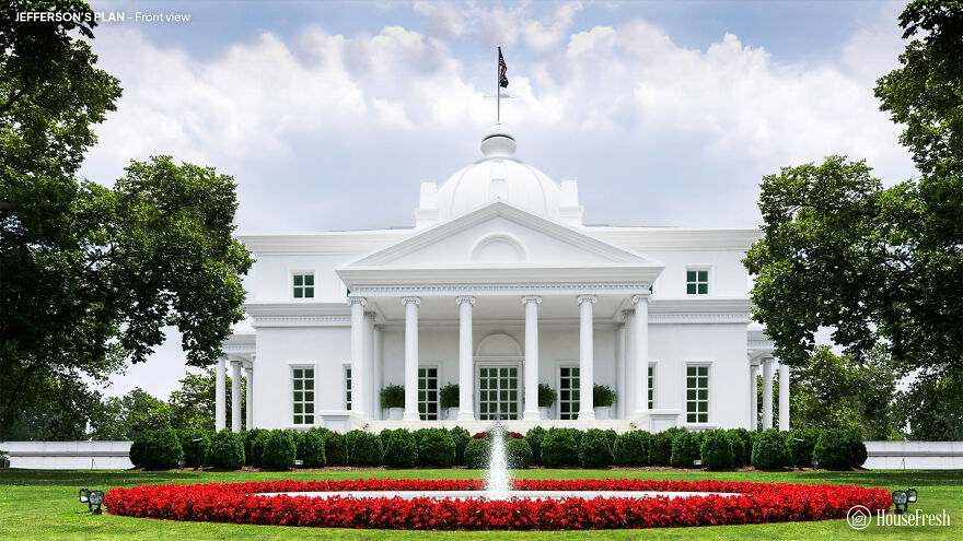
Jefferson would move to the White House as president in 1801, describing the mansion as “large enough for two emperors, one pope and the great lama.” However, he couldn’t help but expand it, adding an arcade and other features to form the White House as it looks now.
Philip Hart’s plan for the White House
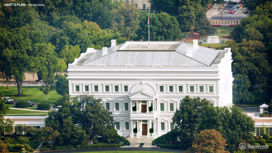
The competition to design the White House was part of a broader challenge to suggest an architecture for Washington’s powerful headquarters. Phillip Hart was an amateur architect – more likely a professional builder – who submitted proposals for both the president’s house and the Capitol.
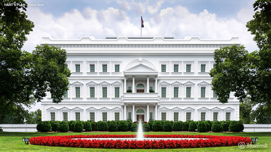
Hart’s White House repeats its vaguely absurd capital sketches. The abbreviated upper floor and faux-Renaissance style lacks the style and complexity that Washington wanted from a building that should, “in terms of size, shape and elegance … look beyond the present.”
Andrew Mayfield’s plan
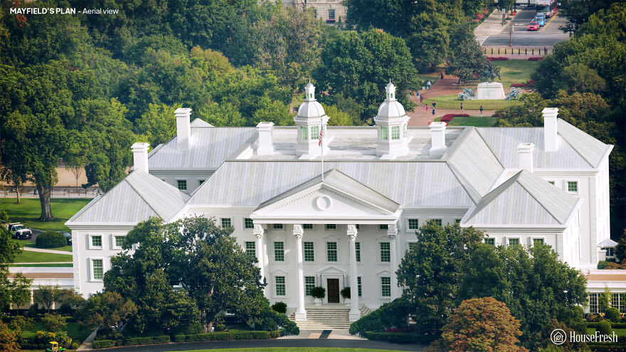
Andrew Mayfield Carshores was a linguist and former British soldier and teacher. Its simple design reflects the pre-revolutionary military architecture, characterized by the colonial period of American buildings Georgian, and English.
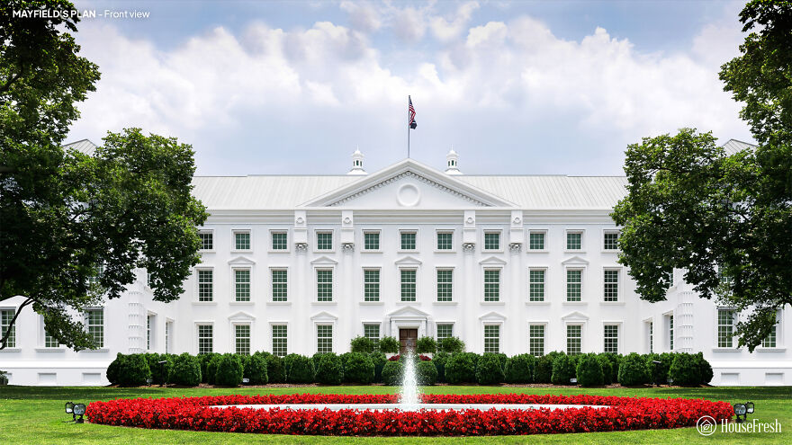
Carshore’s steep roofs border a lead footpath, with a rainwater reservoir on the roof of the main block. But the judges lacked a vital spark to his work. According to architectural historian Hugh Howard, Carshore was an ‘amateur gentleman’ and his rejected entrance may be the only building he has ever designed.
Jacob Small’s plan
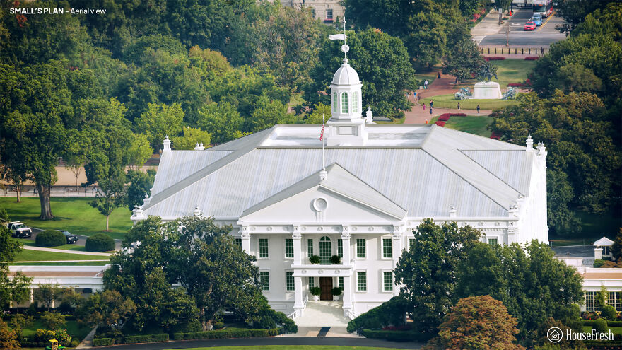
Jacob Small submitted four entries to the 1792 contest. Author Patrick Phillips-Shrock points out that the designs of the Small White House were inspired by two iconic buildings of that time: Mount Vernon, George Washington’s plantation mansion, and the Maryland State House in Annapolis.
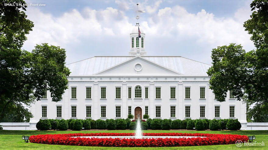
A small one connects the stable and kitchen blocks to the main house with arcades. But its labyrinthine interior of corridors and mysterious stairs would be unpleasant for the president. Interestingly, Little envisioned oval-shaped rooms for the White House – but he failed to integrate them into his broader design in any significant way.
James Diamond’s plan
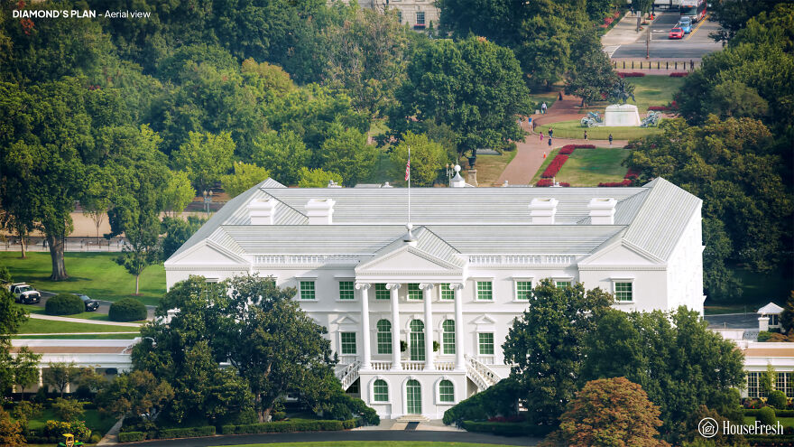
Originally from Ireland, James Diamond was an architect and builder. The White Diamond House stands around a rectangular courtyard. However, Diamond notes in his project that “the Open Court can be changed to a Picture Gallery and Illuminated from the Top, which would have a great Effect.”
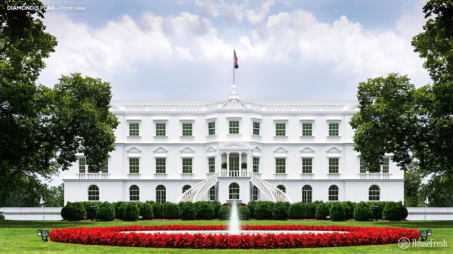
Diamond’s design incorporates complex design elements such as Ionic columns and window frames covered with pediments. But the stairs are located awkwardly away from the entrance, and the overall size is supposed to be too ornate for George Washington’s tastes.
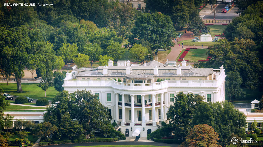
This is what it looked like. Aerial view
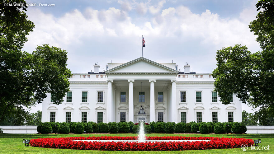
An actual white house, front view
Also, if you want to read more informative content about construction and real estate, keep following Feeta Blog, the best property blog in Pakistan.
Designers Show How The White House Could Have Looked Different If These 5 Plans Weren’t Rejected
- Published in Architecture, buildings, competition, Different, five, full-page, Homepage featured, house fresh, housefresh, jefferson, rejected designs, rejected ideas, Washington, What if, White House


